Get Premium
Dark mode theme is available exclusively for premium users. Learn more about the benefits of subscribing.
No fees, cancel anytime.

 Dark Mode Ad-Free Browsing Unlimited Content
 Ad-Free Browsing Unlimited Content Dark Mode
Join 1.2 million Panda readers who get the best art, memes, and fun stories every week!
Once upon a line…
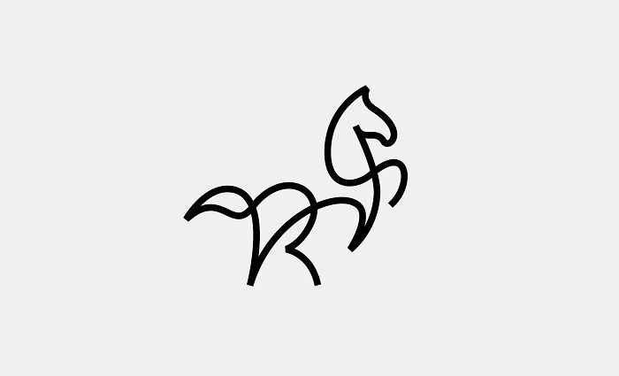
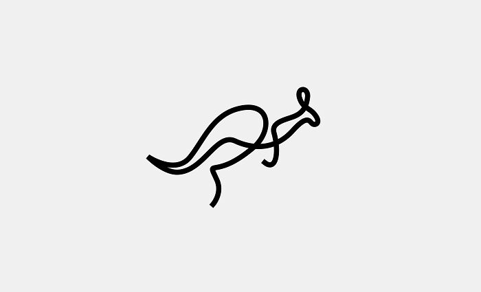
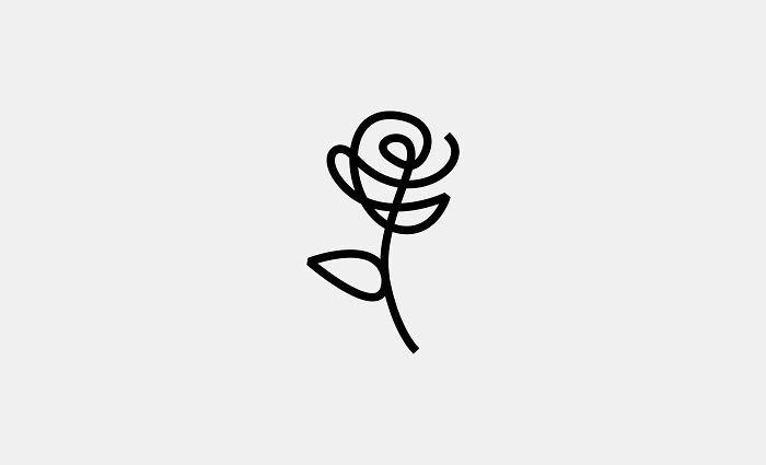
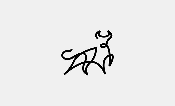
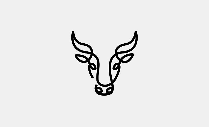
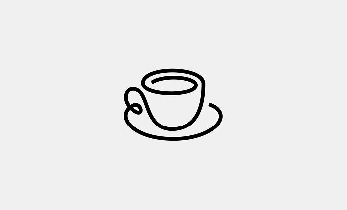
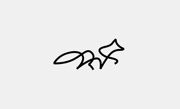
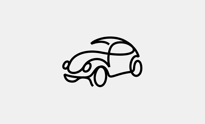
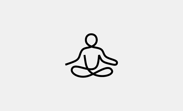
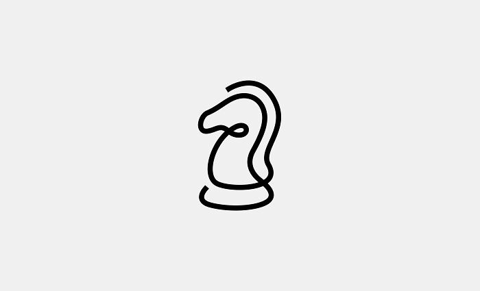
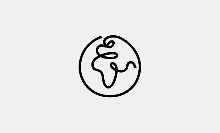
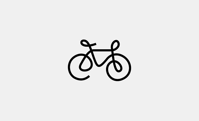
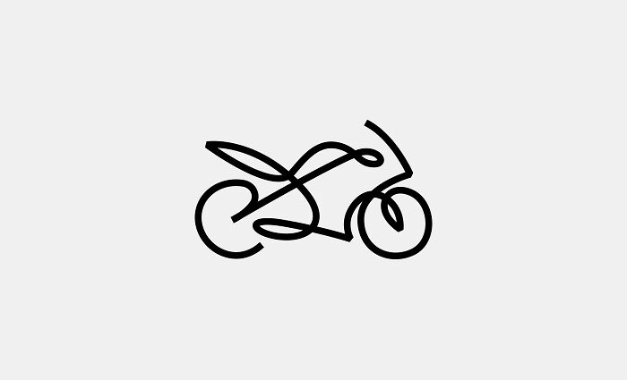
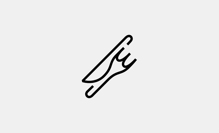
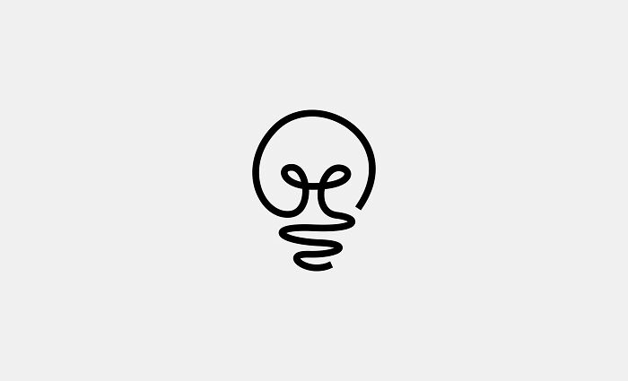
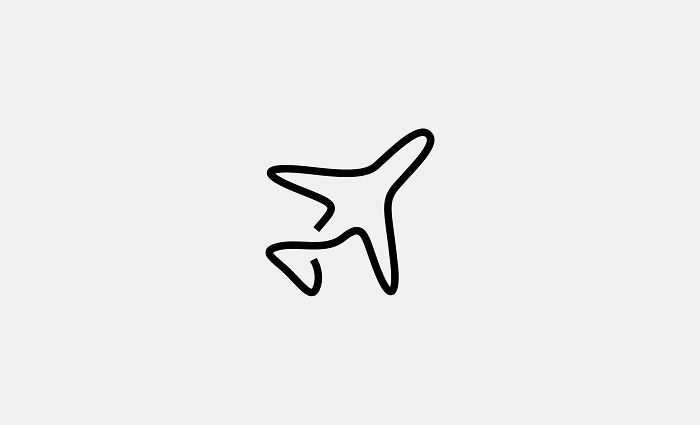
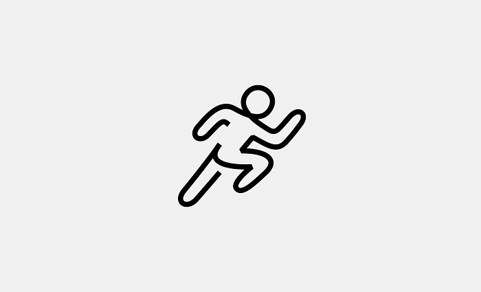
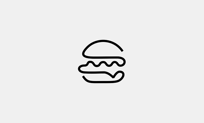
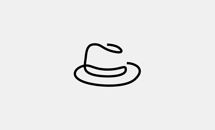
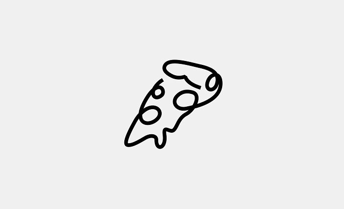
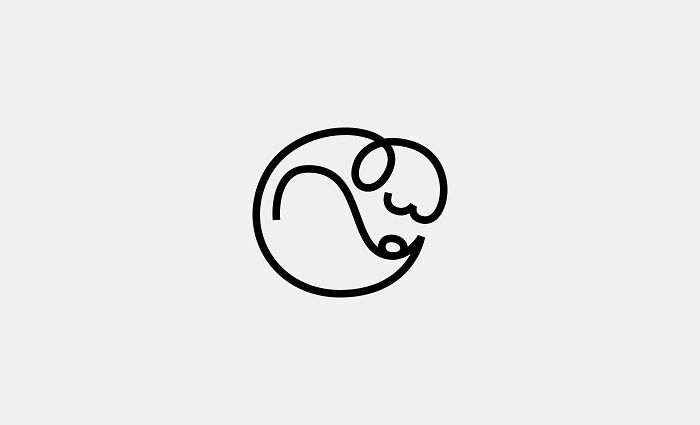
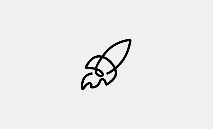
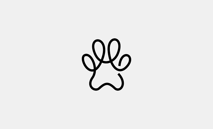
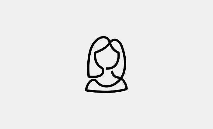
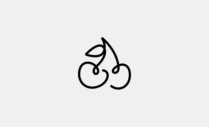
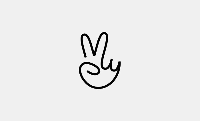
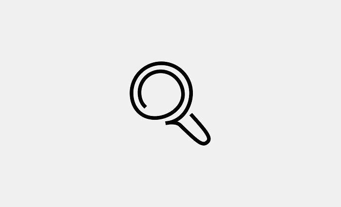
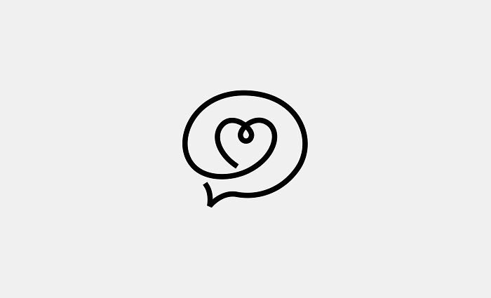
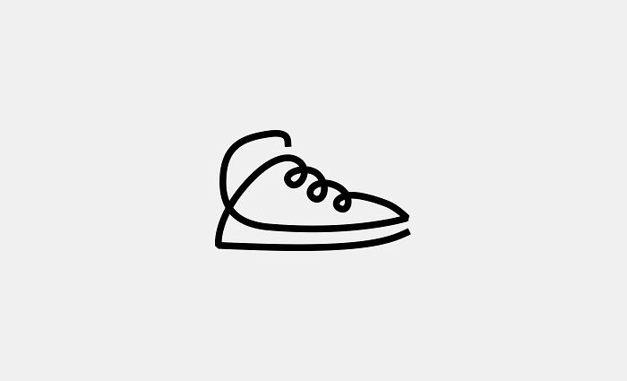
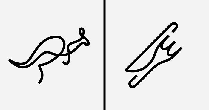
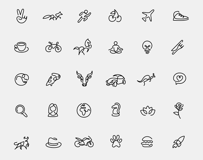
We embarked on a creative journey to design minimalist one-line logos that convey their essence in the simplest visual form. Inspired by the challenge of creating intricate designs with a single continuous stroke, we crafted 30 unique and figurative logos. This project is an exploration of how minimalism can transform complex ideas into iconic and impactful visuals.
Creating each logo can take hours of trial and error before finding the best one-line path. The goal was to highlight the power of simplicity and to show that less can indeed be more. We hope these designs resonate and inspire others to embrace the beauty in minimalism.
Thank you!
More info: loooop.studio | Instagram | behance.net
This post may include affiliate links.
I like the concept, it seems a hard work behind. And i don't know why so much hate in the comments, or i'm missing something? Even the @ with a heart is easy to catch. Or maybe The word logo was taken as "brand"?

I like the concept, it seems a hard work behind. And i don't know why so much hate in the comments, or i'm missing something? Even the @ with a heart is easy to catch. Or maybe The word logo was taken as "brand"?






 No fees, cancel anytime