Get Premium
Dark mode theme is available exclusively for premium users. Learn more about the benefits of subscribing.
No fees, cancel anytime.

 Dark Mode Ad-Free Browsing Unlimited Content
 Ad-Free Browsing Unlimited Content Dark Mode
Join 1.2 million Panda readers who get the best art, memes, and fun stories every week!
Logo design is deceptive. You’d think a tiny, quite minimal thing such as a logo would be easy to create using MS Paint—and while that is quite possible, if you have enough dedication to using simplistic tools—it is an entire science in and of itself.
Besides all of the artistic prowess and tools (and the skills to use those tools) you need to even start a logo design, there’s also things like significations and the meanings and the connotations and everything else that the logo represents explicitly and implicitly. And you gotta do all of it to have a significantly memorable logo.
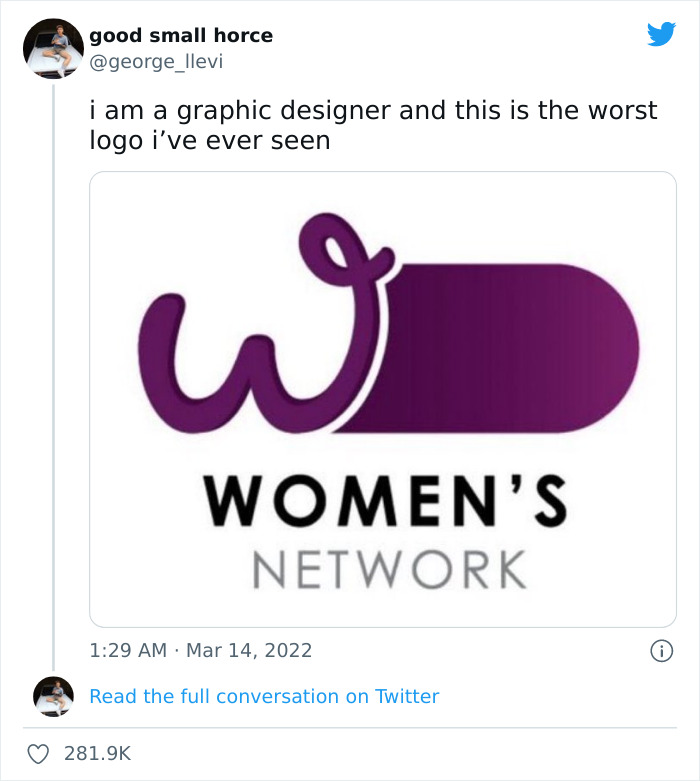
Image source: george_llevi
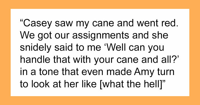
But there are also times when someone says “screw that” and creates a logo that causes an uproar. Like that one for the Women’s Network that, despite quite literally being dedicated to the concept of womanhood, has a huge symbol of masculinity kinda-sorta masked under it.
And graphic designers took note of it.
More Info: Twitter
This post may include affiliate links.
ok why does it look like a giant butt eating the empire state building whole
Ohhhhhhhh. Yeah that took forever even after they described what it was supposed to depict
Sadly, I don't have a picture, but in my old school town there was a hairdressers that had the same font but was called ' a cut above' (with the font it looked like ' a Clit above')
Well, technically, it is. Above the "business hole".
Load More Replies...I always wanted them long 90 degree angle boobies :( maybe someday
Load More Replies...i never want to see this again, the entire thing is just.... wrong
The Prime Minister and Cabinet’s “Women's Network” is a volunteer-based organization, an equal rights entity empowering cultural change and gender equality, inclusion and diversity. Quite recently, they have revealed their logo and… well, it was something.
In particular, while the logo was dedicated to the women’s network, it was vaguely reminiscent of a symbol for the opposite gender. And it wasn’t long till the internet took note of it.
Priest in court ......it's not our fault we gave you more clues than R.Kelly when he made bump and grind. Ps. If you or someone you know have been sexually assaulted please speak to someone about it
Load More Replies...So the catholic church decided to include a child that comes right up to the priest's mid section. Smart.
I've looked at this at least 4 times and only just now did I read what it was for and then immediately saw it. Duh!
Clearly this and many of the other bizarrely sexual logos have got to be FREUDIAN slips by some guilty parties!!
launching missile strike on target “Lee Marco”
Load More Replies...I'll fill up all of your holes and it will only hurt a little bit.
A drilling for the filling {i left that comment on this same pic about 3 years ago on this same site}
Twitter user and graphic designer @george_llevi shared the controversial logo, saying that this is the worst logo he has ever seen. And he wasn’t kidding, as a lot—like, a lot—of people jumped in to agree and discuss the issue.
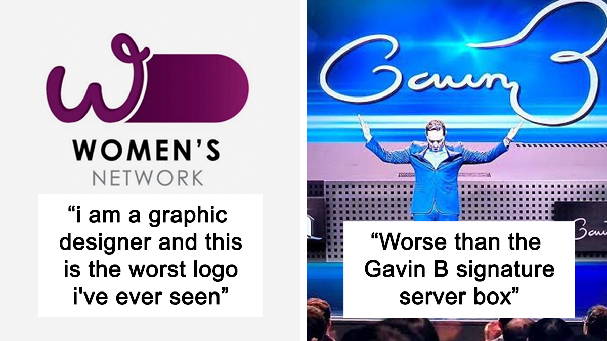
George’s tweet sparked quite a hailstorm of responses, mostly including tweets of other logo or graphic design fails around the world.
As of this article, the tweet got a whopping 282,200 likes since its posting on March 14th with over 16,000 retweets and several thousands of quoted tweets on top of it all.
Patient to psychologist: I want to tell you I can't see a monkey, but I'm afraid you'll lock me up.
Load More Replies...I thought many people would be familiar with Silicon Valley.
My brain couldn't stop but recognise that's the ankatoria font on Canva 😂
Used by rape defense lawyers to pin the blame on the victim. She said no but her eyes said yes. She wanted it.
Nathanial your comments 😂 IS THIS REAL!! that is 110% a set of labia aaaand I’m going to bed now
Load More Replies...Images of Mary have a long tradition of looking like vulvas. This one is a bit more obvious.
Okay, I have never heard of that. Do you have any other examples (asking for a friend...)
Load More Replies...I understand this is a girls' school? I wonder what the school for boys logo looks like. :)
Saint Mary's silhouette. Looks like something only women have.
Load More Replies...Now, at first people thought it was some sort of form of satire and a joke. But nope, it wasn’t, adding even more fuel to the PR nightmare that the PM&C was getting.
A spokesperson to the PM&C Department told News.com.au that rebranding was done entirely internally, using existing resources (like the W that existed in previous iterations), and the design was consulted on widely. The PM’s office was also not a part of the design process.
Since the backlash, the logo was taken down.
How. I would assume one hand would be busy
Load More Replies...Haha! Also dude I see you all over BP. You’re funny
Load More Replies...A: "Naaw, that's way to suggestive..." B: "You're right, let's add a second sausage to make it clearer."
Omg, I think this is Czech and I can't believe I managed to forget it and/or block it out!
How is that a tree? How is s that bird flying with no wings? What the HELL?
Yeah, that's my school. We tend to make fun of it a lot at first and then forget about it.
If you're innocent you see a thumbs up. If you're not... Well good luck getting that out of your head.
If you have to rotate it and then still explain, you are the problem, not the logo
The tweet did, however, inspire a bunch of people to post design fails they saw around the world or on the internet. And as it seems, this isn’t the first time sexually suggestive content has popped up in public in logo form.
Many pointed out businesses and organizations that have had everything from pee-pees and bajingos to suggestive poses to abbreviation fails to straight up ugly choices in their logo designs.
You can check out the now-viral tweet in context here, but before you go, keep scrolling, there’s more, and why not upvote the logos that cracked you up the most and leave a comment with some design fails you’ve witnessed in the comment section below!
Are u refering to the certain German kids club that Germany had in the 40s
Load More Replies...This is even funnier because a friend's kids kept calling Hugh Jackman Huge Jackman.
These need to hire one person with a "dirty" mind. So they can tell them well.........
They need to hire some high school and middle school kids. If they laugh, you probably need to rethink your design.
Load More Replies...reminds me of that shirt that said " Hillary Clinton + tree = Country "
Given how the name is spelled, I don't see any way this could've gone well.
This one is a reach. Sorry, but if you see anything other than Snoopy, you're simply perverted.
Took me a second to see Snoopy lol and I'm very familiar with his shape 🤣
Load More Replies...wienerman, we need the weinermobile to get to the weinercave!
Why make advertising on a car for something called "collision"? And why do it with a wiener? @_@
We call it "Dachhase" (roof-bunny) in German. Edit: it was the name used shortly after WWII, when people were so poor they'd even eat roof-bunnies. >.
Load More Replies...Reminds me of a scene from Jackie Chan's "SuperCop" ... Khan: "Order something, Chan." Chan: "Roast cat with string beans!" Khan: "What???? Yes I'll have that too"
You work hard for your money. Ask about our fee automatic deposit service. You can watch your money grow with our high interest earning rates and Free checking. Come in today and open an account and get your free bonus savings account.
Given that a trump is a fart in the UK, I still can't get my head around that name. I know it's just a word and names are names, but if I was Pratt, D**k, Trump... I'd have changed it.
They DID change it!!! It was originally Drumpf. HAHAHAHAHAHA!!!! Morons.
Load More Replies...I’m genuinely still confused about the “great again” part. Sure, America’s young & has a lot of growing to do. There’s plenty of travesty to go around, but it’s better than it was. So, the “again” part throws me off. What should America be reverting to that was better? The things I think of are mostly economic and have to do with the structure of its economic system, which needs to grow and expand, not revert to time ago.
Reagan also used that phrase. Reagan and his wife were the original Trumps. I just finished a book and it’s amazing. As a matter fact, Donald Trump only became a billionaire because of Ronald Reagan’s tax loopholes for his rich friends.
Load More Replies...Trumpty Dumpty. "To know me is to blow me". You're fired. He keeps coming back like a bad check. Guess Rutin' Tutin' Putin' won't be building his Ruskie Golf Resort. He's a little busy blowing up stuff. Even he couldn't believe what a moron he picked.
I know I’m kinda slow but I just don’t get this. And what is so funny about the syllable “FAP”?
Load More Replies...I'm going to make a list of the things wrong with this photo- #1. Feminists know that men don't deserve that s**t #2. THE ACRONYM IS FAP #3. a man definitely made this logo
Reminds me of the early feminist moments when everyone thought a feminist was a grumpy lesbian in sensible shoes and no makeup FAP. What could go wrong with a classy word like FAP. Say it and it sounds like there's phlegm or a hairball waiting to come up. Tiger Woods ex at least hit his car with his own golf club.
I'm having trouble spotting the reproductive organ in this one. My mind is just not dirty enough
The fact that the name is Volda.... Makes you wonder, doesn't it?
the tail, looks like an erect male member.
Load More Replies..."yes lad, your absolutely right lad" (props to whoever gets that reference)
Load More Replies...Nothing beats this Swedish ad. Nothing. (The company's name was Locum.) locum-6239...a1cc53.jpg 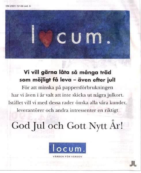
Oof dah. Ikea was thinking of putting this on their big blue shopping bags.
Load More Replies...Yes the word should be spelled in a straight line. This gets on my nerves
Which one? There are possibly FOUR in this sign (each word, plus the O in "local").
Load More Replies...It's okay for the guys to sit and watch the girls work out here
Yeah I'm not seeing it in my opinion. Maybe I've just had the frequency signal icon image in my head for too long.
They seem to be getting worse...or better depending on how you want to look at it.
To be fair, the Washington monument was phallic way before these logo designers got started with it.
Shouldn't this look more like a guy in a white sheet with a pointed hood covering his face?
I'm no expert, but I would guess buttplugs are not Halal.
Load More Replies...It is the word "halal" in Arabic calligraphy, one of the most common halal Islamic art forms. Halal = allowed in Arabic. It is likely a certifying body for meat.
How about no! Well at least I made it to the end an got my participation 🏆
I like to think I'm as filthy minded and perverted as the next person but a lot of these had to be explained and even then it was a stretch.
Just a reminder, It's only a "fail" if it's accidental. 99% of these are absolutely on purpose.
I'm sorry, maybe I'm oblivious but what is wrong with the original logo? The women network one
if you absolutely want to, of course you see something sexual everywhere. but seriously- YMMV
This seems less of "bad logo design", and more of "why do you keep showing me pictures of people having sex, doctor?" vibe. The design is ok, your brain is a bit broken.


 No fees, cancel anytime


")
")