50 Epic and Hilarious Design Fails, As Shared On This Online Group
Interview With OwnerGood design, when executed properly, draws away from itself, a good chair shouldn’t make you feel where it begins and ends, and a good user interface should not confuse and annoy. But for every ingenious solution, there are ten products that mostly just raise questions.
The “Design Failures” Instagram account shares prime examples of why it’s best to leave making stuff up to professionals. So get comfortable with your best chair, sofa, or stool and scroll through this list of mistakes, bad ideas made real, and downright failures. We also got in touch with Dáithí, who manages the account. Be sure to upvote your favorites and comment your thoughts below.
More info: Instagram
This post may include affiliate links.


Bored Panda got in touch with Dáithí, the person behind the "Design Failures" account and they were kind enough to answer some of our questions. Naturally, we were curious if any specific incident or experience was behind creating a page dedicated to bad design.
"Nothing interesting," they shared with us. "The goal was to shed light on design fails. It all started as a way to share the failures I found, but soon, people sent me their own design fails." Which, incidentally, one can still do, if they encounter something similar in the wild and want to share it with the world.


We also wanted to know why and how these fails happened in the first place in their opinion and what draws the average viewer to the page. "I think it’s a mixture of deadlines, budget, and lack of attention to detail. As it turns out, our brains release a dopamine hit when something terrible happens to others. Basically, we enjoy seeing people fail. We are all terrible human beings, lol."


One of the primary reasons these terrible ideas see the light of day is that usability was never made a priority. At some level, the manager, chief designer, or whoever else was calling the shots decided that getting the product out the door was their chief concern. So the focus shifted from “On a scale of 1 to 10, how well does it work?” to a binary, “Does it function, yes/no.”
A lot of nuances are lost in that gap, since, technically, most of the things in this list do work, just with pretty obvious, glaring, and annoying flaws. In a few cases, these fails serve as a pertinent reminder that it never hurts to get a second pair of eyes on something, as a fresh opinion might notice all the little mistakes, typos, or suggestive content.


Very often, poorly thought-out design doesn’t even come from laziness, but from a certain eagerness. Old, pre-2000s websites, if they are still around, often suffered from this, way too many lights, images, and little animations that ended up cluttering the screen. A good designer would know when to cut their losses and just remove the “unnecessary” features, but an enthusiast might find that difficult.
New writers are often told to “kill their darlings,” meaning to remove things that don’t serve the piece, no matter how much you might like it. Normally, this applies to characters or even passages, but perhaps this idea can be transmitted to people designing things as well. Sometimes a simpler font, fewer images, and clearer messages are just better, no matter how attached you are to it.


Good grief. It is totally Photoshopped. You can find images of all these online. The text actually says: "Can you peel a string cheese rope? How long? EvRrEyYUUA...7e6e67.jpg 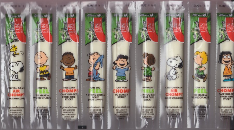
On the other hand, some designers are obsessed with minimalism to such a degree that they make things that don’t even convey the message needed or have any indication of how the item works. Sleep touchscreens, for example, can be very cool, but only if everything is labeled correctly and most of us have encountered a sink that at first glance does not seem to have a faucet.
Other times, the real issue is that no one thought about how something would look at a distance, or how it would look when the color started to fade. This highlights the importance of good research, but obviously, one can’t account for everything. In other cases, such as the anti-plastic cover, wrapped in plastic, alterations are made further down the line.


More complex designs tend to suffer from feature creep, cooked up by medaling marketing teams or engineers that got carried away. It’s always cool to have, say, a microwave or coffeemaker with a sea of options, but it’s pretty easy to get washed away with confusion the first time you use it, nevermind weeks later when you’ve already discarded the manual.


This trend becomes particularly clear when applied to older technology that could possibly “benefit” from modern innovations, for example, not only is the modern TV remote pretty heavy with buttons, but now come with hundreds of options, menus, and “features” to dig through, which is all well and good, however, the actual user interface of these things is seldom well designed.


Whelp, I must have a dirty mind because that was the first thing I saw...
Load More Replies...
Yeah, I knew what was coming before I even saw the picture. So, then of course, I immediately saw it. I don't know if my mind would have went there otherwise.
Load More Replies...The OP of the image came up with "Platrofm". Design failception
you innocent person....you have no idea how lucky you are
Load More Replies..."Platrofm"? No one hires editors anymore? (Also, it took me a couple of minutes to figure out WTF she was griping about. It's a massive stretch, and says more about how the internet ruined that one woman than anything else.)
Since I speak and write Typonese it took me forever to figure out what you were talking about, I read over that.
Load More Replies...Yes, well if they'd gone to Specsavers in the first place, that logo wouldn't have happened!
Load More Replies...As good as it is to have cool features, something as simple as a pot of coffee shouldn’t take more time than it did two decades ago just because you have to fight your way through multiple menus. It’s even more distressing when the complicated, annoying device is “replacing” a bit of hardware that used to be incredibly simple, for example, a kettle one puts on the stove, versus a button-laden machine with a two-hundred-word instruction manual.


This is also why, in ideal circumstances, there is some degree of prototyping and testing before release. However, there is a stage in development where it’s no longer possible to really change fundamentals, in which case the people in charge prefer to close their eyes and just hope for the best.


The start button on my microwave is red and the cancel is green. Some mornings I clear it several times before I realize what I am doing wrong.

However, one fringe benefit is that every bad design can reveal an idea that doesn't work or highlight a concept that other designers would be wise to not ignore. Plus, like the fresh air after the rain, suffering through a bad coffee maker, for example, makes one really appreciate replacing it with something better. So if you want to see more examples of terrible design, don’t fear, Bored Panda has got you covered, you can find our other articles here and here.


Could you work that into an "R" rated version of the song "12 days of Christmas" ?


Took me waaay too long to see it because of the shïtty sepia-toned picture


Worked at a party City. This was… common. I think it’s on purpose at this point


Even though we are closed, I assure you that you can come in!


Once you realize that it's stairs, the person clutching the railing makes sense.


Who comes decides who country who comes this to. Can’t argue with that.

Oh yes. See those all the time. Multiply awful. Especially the Muzak.