Get Premium
Dark mode theme is available exclusively for premium users. Learn more about the benefits of subscribing.
No fees, cancel anytime.

 Dark Mode Ad-Free Browsing Unlimited Content
 Ad-Free Browsing Unlimited Content Dark Mode
Join 1.2 million Panda readers who get the best art, memes, and fun stories every week!
When you think of a lush green garden, a calm blue ocean, a bright yellow flower, or a light pink toy, the colors seem so prominent. People are drawn to tones, and even a soft brush of color can have a significant impact on your mood. That’s why it’s so important to surround ourselves with hues and shades that have a positive effect on our minds. The home is one of the main places you should infuse with a happy color scheme.
Image credits: Spacejoy.
We interviewed two psychologists, Nethra Menon, and Nishtha Bhatt, to understand how different hues affect emotions and what color is happy enough to brighten a home. Certain shades can boost your mood, and others can bring you down. The first step to understanding how to choose happy paint colors for your home is to figure out what a joyful color is.
Joyful hues are those which have a natural source of positive energy. They might bring a sense of balance or lift peoples’ spirits. When you decorate your home with a happy color palette, it can create the perfect ambiance or bring harmony to the space.
Image credits: Inside Out.
Nethra states, “Movies like Inside Out, with their emotion-based characters, would have you thinking colors are simplistic—such as anger being red, sadness being blue, disgust being green, but when it comes to joy, she was yellow with a mop of blue hair. It showed there’s complexity to colors and emotions. That’s why the color that makes a room look “happy” can have more than one answer; it’s a bit tricky.”
Image credits: Jean-Philippe Delberghe and Spacejoy.
“The obvious answer to this would be warm tones such as yellow, orange, and red. That elicit feelings of sunshine & evening skies with their cheer, warmth, excitement, passion, which are all synonymous to happiness. But at the same time, these colors might be too loud and overwhelming for personal taste or too inappropriate for a professional setting.”
“That’s why healthcare settings, business corporations, and education settings prefer whites, pastels (soft pink or lavender), blues & greens to elicit a peaceful, content, soothing response which reminds people of greenery, skies, oceans—which in turn makes them feel joyful,” she also mentions.
There are two main categories of interior paint colors to choose from—warm or cool colors. Warm colors like red, orange, or yellow brighten and energize spaces. Cool colors like green, purple, or blue bring a calming feeling. There are so many colors under the spectrum that it can be hard to keep track. But one writer developed a useful color thesaurus to help you name any color imaginable.
Color theory has existed since the time of the ancient Egyptians. It has also been associated with Eastern healing practices like chakras, where each type is associated with a different color.
Image credits: Chastity Cortijo.
Nishtha says, “As much as I have been able to observe the world around me and the people I have interacted with, I have always sensed a deep connection between our emotions and colors. Whether it’s a color I have chosen to wear on a particular day or colors that I would like to see around my home. A very concrete example comes to mind. When I was studying abroad for a year, I stayed in a single ensuite room in which the walls were the color green. I felt that green brought in a lot calmness and warmth to the room.”
Image credits: Carter Baran.
“Unfortunately, I had to move out of that room for a week because of certain repairs that were to be done. I was allotted a space that had red walls. This instantly had an effect on how I felt about my space. I no longer felt at ease. The color red brought up a small amount of anxiety within me. This is when I truly started noticing the connection between colors and emotions. Ever since, I intentionally surround myself with colors that bring up calmness and ease for me. I have found this to be a very common perspective when I’ve had conversations with friends and family,” she says.
Image credits: Annie Spratt.
Nethra says, “One of the most fundamental tools I use in a therapy setting is the feelings wheel, which not only categorizes primary emotions into different umbrellas such as happy/sad/angry, etc. but also looks like a rainbow due to the colors that denote these various divisions. No points for guessing that happy feelings are shaded yellow while sad ones are blue and angry ones are red, etc.”
“But this is just one of the many associations we have with these colors; what’s less known is that colors not only help in identifying mood but also in evoking different feelings; while yellow is associated with happiness, it can be anxiety-inducing as it’s intense and grabs attention while red is associated with anger, but it can still evoke feelings of love & attraction not simply danger.”
Image credits: Jopwell.
“With the help of clients, including their personal associations with various colors, I use colors during visualizations, breath work, journaling, etc. For most clients, blue and green prove as the most grounding and calming colors. These concepts, which are broadly known as color psychology, influence not only our mood but also our attention, perception of temperature, appetite, marketing, and consumer choices, as well as aesthetics in terms of clothing, design, architecture & more,” she says.
That’s why it’s essential to understand what color makes you happy and add those shades to your home. We’ve put together this list of 10 mood-boosting colors that can make you feel happy when you walk into any room.
It’s time to add a pop of color to every room in your home and make it a cheerful place. Pick a color that represents you best, and weave it into your decor.
Pink is a happy paint color with a lot of personality. A lighter shade of pink can add depth and bring a sense of optimism to your space. Pastel pink is a warm color that will remind you of fresh flowers or a blush on rosy cheeks. Pink can also evoke feelings of nostalgia or love. Since it is generally associated with romance, it might make you feel joyous and secure. Imagine a world where everything is pink; how vibrant and exciting would that be?
Image credits: Stefen Tan.
Best Places to Use Pink
Pink is the perfect color for bedrooms or living rooms because it creates a light and airy atmosphere. Avoid bright or heavy shades of pink because it can create a sickly sweet effect. You can pair this color with cool hues to create a balanced and harmonious space.
Lilac is a neutral color known for creating a sense of tranquility. Unlike dark shades of purple or violet, this hue is light and soothing. It can make a room feel balanced because this calm color is easy on the eyes. Since people feel secure and relaxed with this color, it is also known to promote good sleep.
Image credits: Alberto Eger.
Best Place to Use Lilac
Lilac makes us feel a sense of calmness and relaxation, which is why it is best suited for bedrooms. You don’t have to pair other colors with it because it works best on its own. Ensure you aren’t choosing dark shades of lilac; otherwise, you might create a bedroom with a threatening aura.
Yellow is a natural source of cheerfulness and positivity. It is a warm color that is known to increase energy and motivation. When you think of different shades of yellow, you might imagine the sun, buttercups, sunflowers, smiley faces, and fruits. It has a bright, luminous quality that helps raise our spirits.
Image credits: Max Rahubovskiy.
Best Places to Use Yellow
This color is excellent for dark spaces like bathrooms or the entryway to a house. Use light shades of yellow because darker paint can create a heavy atmosphere. You can also paint the kitchen cabinets bright yellow for a pop of color. Subtle or soft lighting can make the lively yellow stand out better.
Image credits: Beazy.
“Typically speaking, warm tones such as yellow, red, orange evoke joy, energy, passion, stimulation, creativity, and sometimes danger and attention. They tend to increase appetite and make people feel warmer in terms of temperature, cozier, and packed space-wise, and make perfect setups for friendly and joyful socializing while also being a show of strength and power,” says Nethra.
Green reflects nature, and it can rejuvenate rooms and make them feel fresh. It is a very versatile hue with many beautiful shades, such as mint green, sage green, or mossy green. These happy paint colors can improve your overall well-being and boost your mood. Green is also a stimulating color that reminds people of newness and growth.
Nethra mentions, “Cool tones such as blue, green, purple evoke calmness, increase focus, invoke healing and freshness, make people feel like they’re in a cooler temperature and open space while representing reliability & trust.”
Image credits: Spacejoy.
Best Places to Use Sage Green
Green works best in bedrooms, bathrooms, and living rooms. Light hues of green can transform your home’s vibe and make it feel more positive. You can use shades of green to add more depth and texture to your walls. Incorporate more plants to create a welcoming and natural space. Here are some more green design ideas you can incorporate into your everyday life.
Sky blue is one of the paint colors that will make any room feel large, airy, and inviting. It can lead to an instant mood shift because light blue is associated with peace, calm, and rest. When you paint your room blue, it can evoke images of calming skies, peaceful flowing water, bright flowers or butterflies, and falling rain.
Image credits: Chastity Cortijo.
Best Places to Use Sky Blue
Sky blue is the best choice for bedrooms because it helps restore the natural rhythms of the body. A darker shade of blue, like teal, can be used for kitchens because it can help to hide stains and provide a calming atmosphere. You can also get a lot of color inspiration from the sea with its shades of blue.
You might not have expected this monochromatic color to be a happy shade, but it is a strong and stable choice for many homes. Gray is often seen in offices or formal settings, but if it’s done right, it can create a crisp and refreshing atmosphere. Light gray or a subtle shade of beige can make you feel tranquil. This color can make a busy room feel more peaceful and stable.
Image credits: Spacejoy.
Best Places to Use Gray
When using gray in interior design, it works especially great in rooms with a lot of natural lighting because it reflects light well. It can also be used in bathrooms or smaller spaces to make a room feel bigger. Pair it with colors like beige, taupe, charcoal, white, or black to add depth to any room.
Bright colors like orange can make you feel like you have endless energy. This color is full of vibrancy, and it brings out intense emotions. Since it is a mix of red and yellow, orange often combines the passion of the former and the cheerfulness of the latter. A golden orange or ochre can also make rooms feel royal and prestigious.
It is also a controversial color because of its ability to bring about an instant mood shift. Interestingly enough, orange is sometimes seen as a color that people despise wearing. Some people love it, while others hate it.
Image credits: Maor Attias.
Best Place to Use Orange
Use this overly vibrant color to transform your home office from a dull space into an exciting room. Combine orange with darker colors like black or brown to create a contrast. Decorate with darker furniture so that they can tone down the brightness of the orange.
Earthy brown creates a sense of comfort, serenity, and freshness. It is known to promote a sense of balance and harmony. When you look at nature, you’ll find certain shades of brown in fresh soil, tree barks, animal fur, and old leaves, creating a cozy atmosphere. These nature-inspired color palettes are perfect colors to make your home feel like a haven.
Image credits: Xiaocong Yan.
Best Places to Use Brown
Avoid using darker shades of brown because they can make a space look dull. Light brown undertones work best for a large sitting room to make it feel sophisticated. You can also use clay brown to paint a nook in your home to create a restful spot.
“Home is where we spend the maximum amount of time hence, it’s quite necessary to cater the paints & interior decor to taste as it vastly impacts our emotions. So far, neutral, earthy, and pastel shades are most commonly used to appeal to a wide audience with their evergreen appeal and sophisticated charm. However, nowadays, with the popularity of color psychology, more thought is being given to colors in homes and how they change perceptions and behavior of the inhabitants,” says Nethra.
Silver is a powerful color that you can use to make a home feel happy and secure. It can make your space look sophisticated with its natural elegance. People often combine a silver and gold palette because they balance each other well. This regal color can also promote imagination and foster creativity.
Image credits: Francesca Tosolini.
Best Place to Use Silver
Use silver in a home office or a dining room. It will help create a secure and calming space. You should pair the color with gold or black to bring out the shiny nature of silver. Include silver and copper ornaments as decor pieces, but avoid going overboard with them. If these ornaments have lost their shine, learn how to clean silver and copper to make them dazzle again.
Peach is an excellent color for a room because it is fun, lively, and bright. Lighter shades of peach can make you happier and make a room to feel bigger. This beautiful color might not work well with all types of decor, so it is best to test a few shades and see what works best. Subtle colors like peach sorbet, pale apricot, or creamsicle can create a playful vibe in your home. You can also make the hue yourself by mixing equal parts of red and yellow with a base of white paint.
Image credits: Croissant.
Best Places to Use Peach
This color is perfect for a bedroom, living room, or entryway because of its lively nature. You should pair it with clean lines and minimalist decor to create a sleek and sophisticated look. If you want more color, you can add accent pillows or rugs.
“Reflecting over these examples, I feel that the shades we surround ourselves with can surely have an impact on how we feel in our homes. In most homes, I have seen this to be a conscious choice because a lot of people want to make their homes feel like a safe haven,” says Nishtha.
Image credits: Jens Behrmann.
“I also feel that the entire concept of warm colors, cold colors, pastels, etc, have been influenced greatly by social media, advertisements, and the movies we watch. All this surely has an impact on what we associate each color with. Everything we see around us, what we perceive as popular opinion, popular demand can often clash with our personal choice,” she says.
However, in the end, it all comes down to…
Ultimately, you should pick colors that make you happy, positive, and full of life. The colors above are suggestions that you can build upon to create a cozy home that reflects who you are. Find even more options with these color palettes from popular movies. Who knows, you might end up finding a unique, happy color!
We’d love to learn what colors make you the happiest! Let us know in the comments. Also, consider sharing this article with a friend or family member who could use some colorful inspiration to brighten their day if they’ve been feeling a bit blue.
Yellow is often considered the happiest color. It is associated with the sun and warmth. That is why people often feel optimistic and cheerful when surrounded by yellow.
Warm colors like red, pink, orange, and yellow can help make you feel more optimistic. These paint colors can transform a room and add vibrancy.
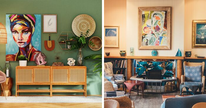
Greens are often a popular color in living rooms, but you can also use brown and pink. These shades create an atmosphere of peace and calm that will make guests feel welcome.
Peach, lilac, green, and blue are the best happy paint colors for a bedroom. These colors are soothing and relaxing. They also don’t strain the eyes and can help you sleep better.


 No fees, cancel anytime


10
1