Get Premium
Dark mode theme is available exclusively for premium users. Learn more about the benefits of subscribing.
No fees, cancel anytime.

 Dark Mode Ad-Free Browsing Unlimited Content
 Ad-Free Browsing Unlimited Content Dark Mode
Join 1.2 million Panda readers who get the best art, memes, and fun stories every week!
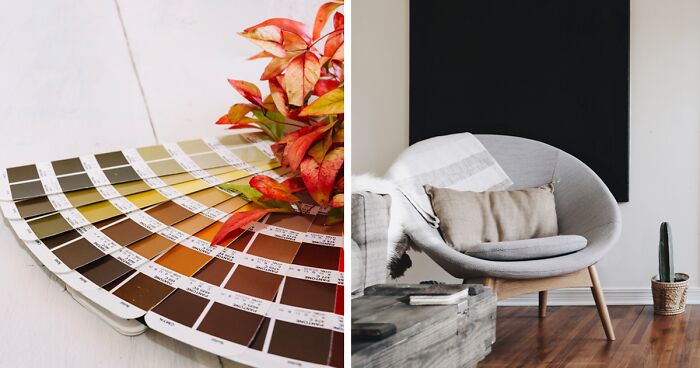
“I believe that color affects people’s moods,” said Lilly Pulitzer. Here at Bored Panda, we, too, believe that warm colors are the secret to creating positive vibes in your home.
We all enjoy and applaud a well-decorated room. But often, we perceive colors as just another element of the interior design. In fact, colors are the key to making a difference.
Being your own space designer can be fun but also challenging. So, let’s list combinations of warm colors for each type of room and how to use them to create a bright and cozy room.
Image source: scandi_uk
First things first, let’s understand how colors came to light. Aristotle is often credited as one of the earliest figures to propose a theory of colors. He thought of colors as God’s gifts originating from celestial rays of light. According to Aristotle, colors came from the four elements: water, air, earth, and fire. Aristotle’s beliefs were backed up by Newton’s later theories and scientific experiments.
Image source: wikipedia
In the 1660s, Isaac Newton conducted experiments involving sunlight and prisms, revealing that white light consisted of seven colors. Newton’s influential work “Opticks” documented these experiments and identified the six colors (red, orange, yellow, green, blue, and violet) that form the range of colors in the visible spectrum.
Image source: Braxton Apana
Newton created the color wheel with six colors as the primary ones. Still, Johann Wolfgang von Goethe had a different approach to color theory. He deemed yellow and blue the primary colors. For Newton, color theory was firmly rooted in science. In contrast, Goethe’s perspective of primary colors took a more physiological approach, focusing on what people see and feel when looking at these colors.
Warm colors fall on the red, orange, and yellow side of the spectrum. These hues are often associated with warmth and positive energy. Warm colors evoke emotions like excitement, happiness, and passion. In contrast, cool colors, which lean towards blue, green, and purple tints, create a sense of calmness and make the room look more spacious.
Neutrals are often considered when discussing warm colors because they are essential in balancing and complementing warm color schemes in interior design. Unlike cool or warm colors that lean towards specific ends of the spectrum, neutrals don’t have a dominant undertone and act as a balancing element in a color palette.
The six neutral colors you must know are white, beige, taupe, gray, black, and ivory.
Image source: avery klein
Neutrals are like the bridge between the colors on both sides of the wheel. The natural light and the surrounding colors influence whether a neutral shade is closer to warm or cool colors. However, if there’s still some confusion, let’s answer some of the most common questions regarding neutral colors.
Let’s answer this question with an example. Imagine a bright room with white walls, red furniture, and orange accents. These warm colors make the white also feel warm. The saturation a neutral color gets from the other colors in the room affects its individual temperature and visual perception for the human eye. If you walk into a room as such (our example), your eyes will tend to perceive the warm white walls as pink or peach due to the bold, warm colors surrounding it.
Image source: lifeforstock
Beige is often considered a warm neutral because it is formed as a creamy white with sandy undertones. Many designers combine beige with taupe and warm undertone colors. They go for such combos to enhance the cozy feel of the house. Beige is a popular choice in home decor because it’s also easy to combine with green, blue, and violet undertones (mauve, for instance). Hence, this makes it a perfect neutral for both sides of the color wheel.
Image source: Spacejoy
Black is as neutral as white, although it’s the opposite of it. Black doesn’t have a temperature like warm or cool colors. It’s defined as “the absence of color.” However, regarding its emotional and visual impact on design, black is often associated with the feeling of power and elegance. It’s a universal addition to any color palette, providing a strong contrast in the overall look.
Image source: freepik
Gray is the perfect neutral. Depending on its undertones, it can lean towards both cool and warm colors. There is not one specific type of gray color. Gray with blue or green undertones is a cool color, evoking a sense of calmness and serenity. On the other hand, gray with red or brown undertones tends to embrace warm colors and make a room feel cozier.
So, gray can play well in cool and warm color palettes, making it a popular choice in interior design. Plus, it changes its individual temperature based on the colors around it. Even if it’s a cool gray, a combination of bold red and dark chocolate furniture can turn it into a warm neutral in a second.
Image source: Spacejoy
Valid question! How do you identify that a cherry red sofa or an autumn-themed wallpaper falls within the category of warm colors? These five elements will help you define the temperature of every shade in the color wheel.
Warm colors are on the right side of the wheel, together with bright and bold red, orange, and yellow tones. Cool colors such as green, blue, and violet are situated on the wheel’s left side.
Warm colors are the ones with longer wavelengths in the spectrum. Cool colors have a limited ability to reach the human eye due to their shorter wavelengths.
Warm colors often make us feel more energetic, excited, passionate, and comfortable. Cool shades evoke a sense of calm, peace, and tranquility. Think of warm colors linked with elements like fire and sun, while the cool cousins are closer to water and nature.
Warm colors are often used to create particular focal points and spice up a space. In contrast, cool colors help create a calm ambiance and blend the decor elements.
Cool colors can make a room look more spacious. They are best used in private, small spaces, bathrooms, bedrooms, and offices. Warm colors work best in spacious rooms to create a bold and friendly design. Think halls, gyms, living rooms, restaurants, and other social spaces.
Image source: freepik
Once you walk into a place, its colors impact you. Color psychology explains the connection between colors’ impact on human emotions. Here are feelings and emotions we often associate with specific warm colors:
Each warm color brings unique emotions to us. They can be the ace under the sleeves to influence mood and behavior in various spaces.
The color wheel, as we know it today, is a model designed in a circle to illustrate 12 colors as primary, secondary, and tertiary with their individual temperature. Color temperature impacts how we perceive them both psychologically and visually.
The primary colors are red, blue, and yellow. From these original three main colors arise all the rest. They cannot be made by mixing different colors together.
Secondary colors are formed by mixing two main colors. There are three secondary colors: green (blue + yellow), orange (red + yellow), and purple (red + blue).
Tertiary colors are the results of combining a main color with a secondary one. This results in six tertiary colors: red-orange, yellow-orange, yellow-green, blue-green, blue-purple, and red-purple.
The first thing to keep in mind when choosing the overall decor is understanding the differences between warm vs cool colors. Why? Because Ruthie Sommers once said, “Color is the least expensive thing to put in a house.”
Whether starting a new home design project or revamping an existing space, warm tones are a great choice to make a significant difference without spending a fortune. Let’s break down six tips on effectively using warm colors in home decor.
Long story short, yes, you can pair warm and cool colors in the same room. Mixing warm blue with yellow and red can create a striking combination. However, if it’s not a daring artwork, you should combine one bold, warm color with secondary or tertiary cold colors and vice versa. Mix warm and cool shades only if you want your room to be extravagant.
Image source: Guven Gunes
If Doja Cat could Paint the Town Red, you can paint any room red. Stick to hues of a single warm color for a harmonious look. Paint the walls in a light shade of red and combine the rest of the decor in similar hues for a unified monochromatic look.
Image source: wuttichai1983
When renovating an existing room, it’s best to paint with a neutral base on the walls. Thus, it can easily match the existing furniture pieces. Then, add pops of color through accessories like throw pillows, artwork, and decorative accents.
Image source: rawpixel.com
Rooms with ample natural light need bold, warm colors. In contrast, spaces with limited light may benefit from softer, cool hues. In this case, use the 80/20 rule. Go 80% with one shade and 20% with exciting pops of primary warm colors.
Image source: throughthegreydoor
Going for bold combos is about creating focal points and drawing attention to specific areas in the house. An effective way is through an accent wall in a bold, warm hue like a rich terracotta or deep red. Alternatively, use warm-toned furniture, like a vibrant orange sofa or a cozy red armchair, for a cozy spot. This creates an eye-catching corner for whoever walks into the room.
Image source: cocon.magnolia
Playing with patterns and textures should hold the crown of these tips. These playful and daring decors are best in social spaces. Here are some ways to incorporate patterns and textures into your interior space:
Image source: Spacejoy
Henry Matisse once said: “Colors help to express light—not the physical phenomenon, but the only light that really exists, that in the artist’s brain.” Below, we’ve compiled a list of 20 decorating ideas that will help you bring out your brightest and most creative side.
Our first choice (always the go-to option) is a beautiful taupe setting with pops of fiery red tones in accents and accessories. Taupe walls, a plushy pink sofa with soft red throw pillows, an orange round rug, and abstract artwork will create an eye-catching room. We also suggest a low-lighting floor lamp for extra romantic vibes.
Image source: rawpixel.com
Warm neutrals are ideal in modern minimalistic decor. Start by selecting neutral-toned and marble materials for your furniture. Warm neutrals that create a serene and cozy place are soft grays, warm beiges, and muted taupe shades for walls and large furniture pieces. A minimalist look requires having an outstanding decor with very few elements. Still, ample natural light will help enhance the warmth of the space.
Image source: throughthegreydoor
We bet your first thought of warm colors in a living room was an elegant, creamy-painted space with a beige and brown backdrop. Pair this with light-toned wood flooring, accents in beige, burgundy, deep terracotta, and bronze frames or gold chandeliers.
Image source: Collov Home Design
Create a bold space with the striking contrast of the warm red bricks of your fireplace against dramatic black walls in the living room. The rustic charm of red bricks brings an earthy warmth, while the black backdrop adds a touch of mystery. Choose furnishings in deep, warm tones like burgundy, terracotta, and burnt orange. Add metallic accents in bronze or copper for a luxurious living room design.
Image source: senivpetro
A rustic kitchen is all about wooden tools and cabinets with a palette of earthy, warm tones on the walls. We suggest pairing these elements with natural stone countertops and backsplashes in warm, sandy hues to add a touch of nature to the kitchen. You can add pops of vibrant yellow through decorations like ceramic dishes, sunflower-themed removable wallpaper, or bright dish towels.
Image source: houseofedencourt
Oranges can be in your fruit bowl while their color is on your walls. This joyful, vibrant color can add to the kitchen the vivacious energy that will lead to more enjoyable hours of cooking. Opt for sleek, modern cabinets in shades of orange, crisp white countertops, and a light kitchen backsplash to balance the vibrancy. Add warm wood accents through shelves, cutting boards, and barstools. For a playful look, get creative with vibrant orange accessories like cookware, dishware, and utensils.
Image source: lisalovesorange
Terracotta tiles are a highly sought-after element in the kitchen. Imagine a terracotta flooring with warm, sandy beige walls that make you feel like you are entering a sunbaked room. Choose wooden cabinetry in warm shades of deep olive green. Add accents in golden yellow shades through pottery, dishes, and utensils. Pendant lights with iron details will make the space feel even more traditional and typical of the Mediterranean kitchens.
Image source: cotswoldinterior
Burgundy is “the salty ingredient” in a modern dining room. A good combination of burgundy spots starts by settling neutral shades like soft grays or creamy beiges. Once you’ve got a clean, contemporary backdrop, add pops of burgundy in the form of stylish tableware or an area rug. Moreover, add wood elements to the dining table and chairs and a sleek, modern chandelier with metallic accents as the “dark” cherry on top.
Image source: benjaminmoorepaints.uae
If there’s a place you want to decorate with positive vibes, that’s your kids’ room. Decorating means turning the room into a vibrant playground with warm colors. Start by selecting a cheerful base color like sunny yellow or vibrant orange for the walls. Opt for colorful, kid-friendly furniture in soft, warm pastels (peach undertone, for example). Have fun with your kids by combining patterns and textures. It can be through bedding, rugs, curtains, wall decals, or art featuring playful animals or characters.
Image source: the_whiteleaf
Neutral shades can get warmed up, but cool shades can do so too. Choose a cool pastel color for the walls, like soft blue, faded green, or light purple. A light shade as a base will create an easy backdrop to merge other bold accents and still maintain a calming decor. Opt for bedding in cool, soft pastels like mint or lavender to feel relaxed anytime you walk into the bedroom. Wooden furniture and pillows in teal, yellow, and red shades will enhance the coziness you need in your bedroom.
Image source: oursomersetnest
If you want to feel like a Barbie or your teen daughter wants a Barbie bedroom, then a dreamy, feminine room is easy to get with soft pink and peach tones. Opt for blush pink walls, peach curtains, white furniture for a sweet contrast, and gold or rose gold metallic accents. For an extra Barbie touch, consider adding pink floral patterns.
Image source: thejollytownhouse
Whatever the primary color is, gold will always add a touch of luxury to the room. The bathroom is ideal for gold pops through fixtures like faucets, handles, towel bars, and mirror frames. Since you’re already going extra with vibrant gold pops, you might as well add gold-trimmed accessories like soap dispensers, trays, bath mats, and decorative bowls to enhance the bathroom. A neutral base of creamy whites is always great for a timeless backdrop.
Image source: kirkenesveien
Turn your farmhouse outdoors into a vibrant, green space with a blend of soft green tones and strong, warm colors. Natural decor elements like potted plants, shrubs, and vines will help bring life to your space. Choose outdoor furniture in warm, earthy hues like terracotta, orange, or brown. Moreover, add vibrant yellow cushions for a pop of color and soft outdoor lighting like string lights or lanterns to create a warm, cozy evening ambiance.
Image source: Jana Heinemann
Create a cozy reading nook or a home library with a rich palette of reds and browns. Consider painting the walls in a dark cherry red to evoke a sense of warmth and a classic vibe from old times. Furnish the space with brown leather armchairs, dark wood bookshelves, and coffee tables for extra storage and a modern look.
Image source: Mariia Zakatiura
Craft a stylish and productive home office with warm, muted tones. Opt for a soft, neutral base like warm taupe or muted gray for the walls to create a calming backdrop. Select sleek, modern furniture in warm wood tones to bring a contemporary touch. Add ample lighting through desk lamps or pendant lights to ensure a well-lit and inspiring home office space.
Image source: michsoledesign
If you’re repainting your interiors, use warm colors for a cheerful and cozy space. When designing a room, factors like the room’s size, position, natural light, personal style preferences, and existing furnishings play crucial roles in selecting a suitable warm color scheme. However, our best suggestion is to let your imagination and creativity go wild. Follow Mehmet Murat Ildan’s advice: “To shine like the sun, use the power of bright colors.”
13Kviews
Share on Facebook


 No fees, cancel anytime


7
0