
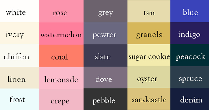
Writer Creates “Color Thesaurus” To Help You Correctly Name Any Color Imaginable
Ingrid Sundberg, a writer and children’s book illustrator, created a very useful infographic chart for anyone struggling with color names. The writer says that she loves to collect words that can help give her stories variety and depth.
“I’ve learned that we all have different associations with color words,” Sundberg told Bored Panda. “For example the color sapphire is a light blue to me (since that’s the color of the sapphire on my engagement ring), but a sapphire can also be a very dark blue. I doubt there can be an ‘official color guide,’ as color is so subjective.” Regardless of the subjectivity of color, however, Sundberg’s guide will help expand your descriptive vocabulary beyond green, red and blue.
Read on to see all of these colors’ names as well as Sundberg’s interview with Bored Panda.
More info: ingridsnotes.wordpress.com | sundbergstudio.com | Facebook (h/t: lustik)
“There was no official color guide,” Sundberg told Bored Panda. “This was something I made for myself based on color words I liked and the colors the words evoked for me.”
“I use it all the time when I write. It really helps in revision as I try to make my work fresh and vibrant. My blog readers say they’ve been using the thesaurus in their writing processes as well.”
“I’ve learned that we all have different associations with color words. For example the color sapphire is a light blue to me (since that’s the color of the sapphire on my engagement ring), but a sapphire can also be a very dark blue. I doubt there can be an “official color guide,” as color is so subjective.”
“I’m currently working on a visual hair-color thesaurus and a visual emotions/facial expressions thesaurus. They’re really fun to make.”
Love it, but see almost no difference in almost all of the 'black' ones.
I can see some variation in blacks, but yes, they are subtle. And I never heard of jade as black.
Jade is usually a pale green color, but it can also appear as a glossy black.
My Ipad makes all the black ones the same, but my dell computer shows the differences.
That is the point. There is no difference with all the back ones as they are all the same.
there is so much difference between them, its different when you see colors in the screen and when they are printed
Not all, but "black", "ink" and "jet black" are exactly the same. With a color picker you get #000000 for the three of them.
I can see the difference in all the blacks
If you can't see the difference it's more than likely because you suffer from Color Vision Deficiency which affects 1/12 men and 1/255 women
Huge difference, your monitor just doesn't display them all correctly.
black, not back.
Most likely your device capability or limitations, or your settings, just as 'standard' screen may NOT be capable of accurately displaying HD images.
Weird, I see a difference in each of the black rectangles. Maybe your gamma is off on your monitor.
Probably because your monitor can't differentiate the more subtle hues. They're very limited.
The blacks are mostly identical for me as well. But if I click through to the original blog, the blacks are differentiated there.
The blacks are mostly identical for me as well. But if I click through to the original blog, the blacks are pretty differentiated there.
Yea doing that changed the blacks for me too. Before, just the charcoal was different.
It's your computer screen's limitation in representing true color...
That's cause everybody knows.. All Black's are the Same. ;)
I sincerely hope you are not referring to black people...
Calibrate your screen and you will see the difference.
I think that's the point. They are all synonyms for black.
The difference is black gets the most attention... Duh
looks like your monitor needs callibrating :p
It might be matter of image compression. Subtle differences in hues are easily lost in such over-compressed jpg files.
I tried so hard but could not find MAROON & BURGUNDY, time to start over...
"fuscia"??? I'll better stick to fuchsia...