Get Premium
Dark mode theme is available exclusively for premium users. Learn more about the benefits of subscribing.
No fees, cancel anytime.

 Dark Mode Ad-Free Browsing Unlimited Content
 Ad-Free Browsing Unlimited Content Dark Mode
Join 1.2 million Panda readers who get the best art, memes, and fun stories every week!
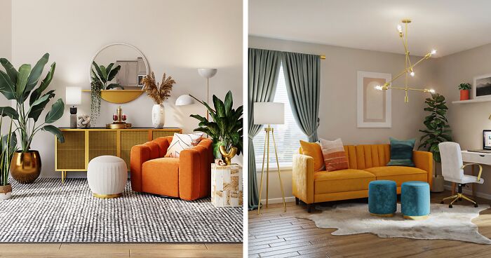
In interior design, the concept of greige color has emerged as a transformative force, becoming a canvas upon which decorators paint myriad possibilities. It’s a color and a nuanced exploration of shades and tones.
The diverse palette of greige paint colors offers an expansive range, allowing for personalization to suit the unique character of any space. Paint colors like greige are at the heart of its popularity, making it a go-to choice for those seeking a neutral backdrop that transcends the boundaries of traditional beige or gray.
Are you, too, looking for a wall color and thinking about going with greige? In this decor guide, we navigate through the best greige paint colors. Greiges on this list unveil the subtleties that distinguish each and explore the transformative power they bring to various spaces. Join us on this journey through each shade of greige, where color meets design and spaces transform with sophistication and warmth!
Image credits: Spacejoy.
Beige, greige, or gray—seriously, what’s the difference? So, is greige more gray or beige? In fact, this is a color that blends the warmth of beige with the coolness of gray. The term “greige” itself is a portmanteau of “gray” and “beige.” This hybrid hue offers a sophisticated and contemporary alternative to traditional neutral colors.
Its adaptability makes it a sought-after choice in interior design, particularly for wall paints, as it complements a wide range of color schemes and furnishings. Whether used in modern or classic settings, greige brings a timeless and elegant touch to any space.
Image credits: Spacejoy.
Beige, a softer, warmer form of white, represents simplicity and serenity. It is often used to denote plainness. Beige is bare, unpretentious, and doesn’t command attention. Gray is another component of greige—the color of conformism and neutrality. It can be unresponsive, unattached, and indecisive. However, it encourages focus, calmness, and stability.
Greige, the mix of gray and beige, can have different psychological effects depending on how it’s used and with what other colors it’s paired. We can perceive greige as a “happy color” when combined with different colors that evoke soothing and relaxing atmospheres and positive emotions, such as yellow, blue, and green.
The happy appearance also depends on the color temperature, so you might be curious: Is greige a cool or warm color? A little bit of both. Generally, greige is influenced by beige undertones, so it’s considered a warm color. On the other hand, greige paint can also be cool due to the undertone of green and blue colors.
Interior designers have used this color for a while, and it seems it will continue to be popular. At first glance, it may appear that greige is too flat and boring. However, it remains a versatile and modern color that can also be used as a neutral base, enhanced by pops of other trendy colors.
Therefore, greige will still be popular in 2024, but it may need some updates and variations to keep up with the changing preferences and tastes.
If you’re looking for the perfect greige, we’re here to help you narrow down a wide selection by picking the 11 best greige paint colors of all time! Neutral greige comes in many shades, undertones, and various paint brands, such as Benjamin Moore, Farrow & Ball, Sherwin-Williams, among others, offer a large greige color palette.
You can choose just one paint or pick a few—it’s up to you, as there is nothing easier than combining these shades. So, what are your favorite paint colors? Let us know in the comments!
Image credits: John Cameron.
If you were to ask what is the most popular greige color, Revere Pewter HC-172 was probably one of the iconic paints for many years. This light greige paint has warm undertones. It’s a versatile, classic, calming, and room-unifying shade, working well with white or off-white trim and wood and composite materials.
Image credits: Spacejoy.
Looking for a greige that’s both modern and cozy? Check out this warm-hued pale greige that can match any style or vibe! It’s also one of our favorite light-greige paint colors with a warm undertone, slightly colder than the previously mentioned Revere Pewter. However, Balboa Mist OC-27 has a hint of beige, making it warmer than some other greiges with blue or purple undertones.
Image credits: deborah cortelazzi.
Farrow & Ball Elephant’s Breath No.229 is a warm, contemporary, greige color created by the famous English designer John Fowler. It has a hint of magenta that makes it darker and more lively than other greige colors.
Tip: Prior to settling on this color, create a sample and see how it looks in your space, as it may display a lilac hue under certain lighting conditions.
Image credits: Spacejoy.
Clare’s Greige paint color is a perfect mix of gray and beige, creating a warm and cozy medium hue that looks great in any room. It’s reflective but not too light. This classic and versatile color can harmonize well with different colors and styles.
Image credits: reisetopia.
Benjamin Moore Pale Oak OC-20 is a lighter greige paint color with warm gray undertones. It exudes elegance, tranquility, and coziness and, frankly, is so similar to Balboa Mist. In bright, natural light, it can look like a warm off-white. However, this color can look like a soft light greige in rooms with less natural light. Pale Oak works well with white or off-white trim, wood and composite materials, and bright furniture.
Tip: You can pair this color with Chantilly Lace OC-65, Timber Wolf 1600, Dinner Party AF-300, and Wrought Iron 2124-101.
Image credits: Spacejoy.
Sherwin-Williams claims that Agreeable Gray SW 7029 is their best-selling neutral paint, suitable for any interior, from the bathroom to the guest bedroom. This everybody’s favorite greige paint has a beige undertone and radiates with an elegant, warm undertone.
Tip: Neutral Agreeable Gray, the most frequently used paint, works well with Extra White SW 7006, Coral Rose SW 9004, and Incredible White SW 7028.
Image credits: Gian Paolo Aliatis.
As the title suggests, this greige paint is a classic! Classic Gray 1548 is a very light greige paint with warm, passive violet-pink undertones, functioning as an off-white color with an average reflectance value. This paint would stand out in any interior, from vintage to contemporary.
Image credits: Element5 Digital.
Although the paint color Silver Drop 790C-2 is the lightest shade in this greige color palette, its super warm gray tone makes it an ideal choice for creating cozy interiors. This paint color may look different in various spaces; however, you can be sure it compliments contemporary lighting, other furniture, and a range of warm, cool, and bright colors.
Image credits: Sven Brandsma.
The versatility of this perfect greige color is unbelievable. Although all greiges differ, they are all flexible and adaptable, like Anew Gray SW 7030! Discover the versatile charm of a mid-tone gray that elevates any room with inviting warmth. Even in low light, its peaceful energy radiates, thanks to its higher light reflectance value.
Tip: The Anew Gray will look deeper and richer in rooms with less natural light. If your space is very bright, it’ll appear as soft beige-gray.
Image credits: Valspar Canada.
Cadet Gray 4001-2A is a paint color that is a darker shade of gray with warm undertones. Although it’s more gray than beige, the color also has subtle green undertones, making it warmer than some other grays with blue or purple undertones.
Tip: Because this greige paint has a dark hue and isn’t very reflective, it’s a perfect match for interiors full of light. Cadet Gray can make rooms with less natural light feel dim.
Image credits: Francesca Tosolini.
Unlike other greiges, Accessible Beige SW 7036 has undertones with an inviting gray shade that can make any space feel cozy and welcoming. Part Sherwin-Williams’ Neutral Paint Colors collection, it has an average light reflectance value.
Tip: Accessible Beige is ideal for Boho and Scandinavian interiors. To create a unique atmosphere, pair this greige paint color with earthy tones.
Image credits: Blue Bird.
As we already know, greige, composed of warm beige and cold gray color, is one of the most versatile shades that create a homey atmosphere in any space. However, even if there are some differences, greiges often appear similar. However, with a wide range of colors available in paint palettes, choosing the perfect match for your interior can be challenging.” Here are some tips to ease the process.
Different spaces serve various purposes. If you want to paint a sunroom, the best match would be light, reflective paint. For a modern kitchen interior, feel free to use darker greige shades. If you focus on the living room or master bedroom, wrap it in light, off-white paint. When choosing a color for the bathroom, corridor, or other small space, also opt for light paint colors. Furthermore, continually evaluate your floor plan and space size.
The reflectance value (LRV) measures how much light a color can reflect or absorb. A higher LRV means a lighter and brighter color, while a lower LRV means a darker and moodier color. Choose a greige color with an appropriate LRV for your room’s size and natural light.
Some greige colors have green, blue, purple, or pink undertones, making them look cooler or warmer. You want to choose a greige color with a balanced undertone that complements your home and fixed elements, such as flooring, cabinetry, and furniture. Look at the darkest shade on the paint sample to get an idea of the undertone.
Using samples is the best way to test paint colors and ensure your chosen greige fits your place. Paint a large sample on your walls and observe it at different times of the day and under various lighting conditions. You’ll notice that each color can appear differently in various lighting. An effective way to test multiple colors is to paint a large sheet of paper, allowing you to easily peel and stick it in different areas for thorough evaluation.
Once you’ve applied your paint sample on the wall, you can compare it with other colors in your room, such as walls, furniture, curtains, rugs, and accessories. This will help you see how they harmonize or contrast with each other. To be accurate, use the COLOR MUSE Colorimeter.
Discovering the perfect paint color for your home has never been simpler with this color-matching tool. It effortlessly helps you to find the closest matching shade for your project. Scan smooth, flat surfaces for best results. With this Colorimeter, you can access a wide range of paint and product colors from top brands like Sherwin-Williams, Behr, Valspar, and Benjamin Moore.
Image credits: Tiana.
Whether you’re seeking advice on application techniques, color combinations, or maintenance tips, this conclusive FAQ section is your go-to resource for mastering the subtle art of greige in home decor!
This versatile neutral color is truly amazing and can pair well with many other colors. But did you know that specific colors can make it pop even more? Consider painting a single wall to create an accent wall using these specific colors.
Create a clean and crisp or warm and inviting look using the timeless white color. It can help brighten up a room with greige walls, is suitable for trim, molding, curtains, bedding, cabinets, or accessories.
Black can help create a dramatic contrast and draw attention to the greige elements in a room. It can also add sophistication and elegance to the color scheme. Black can be used for accent walls, furniture, rugs, lamps, or frames.
Blue is a versatile color that complements greige well by creating different moods depending on the shade used. It can also enhance the modern look of greige by bringing out its gray undertones. Blue can be used in various ways, such as for walls, pillows, throws, art, or vases.
Yellow, the happy color, contrasts nicely with the coolness of greige, creating a cheerful or cozy mood. Additionally, yellow can bring out the beige undertones in greige, making it look even richer. Use yellow for decor elements like curtains, chairs, flowers, candles, or dishes.
The complementary color of greige is found opposite it on the color wheel. These colors can create a strong contrast and make greige stand out more. Greige complementary colors are dark grayish blue or silver sand. They help to balance greige’s warmth and coolness, creating a sophisticated and elegant look. Use these colors for accent walls, furniture, pillows, or art to enhance the greige color scheme in your room.
No, greige and taupe are two different colors. They are neutral colors that mix gray and beige but have different undertones. Greige tends to have a green undertone, while taupe tends to have a purple undertone. Greige is a cooler and more modern color, while taupe is a warmer and more traditional color.
Graige….. the catch all color for straight white people 🤣🤣🤣 Graige….. is your house boring… Let’s make it more boring
Greige! The unseasoned chicken of colors! Greige! For if you hate joy!
Load More Replies...Graige….. the catch all color for straight white people 🤣🤣🤣 Graige….. is your house boring… Let’s make it more boring
Greige! The unseasoned chicken of colors! Greige! For if you hate joy!
Load More Replies...


 No fees, cancel anytime


5
3