Get Premium
Dark mode theme is available exclusively for premium users. Learn more about the benefits of subscribing.
No fees, cancel anytime.

 Dark Mode Ad-Free Browsing Unlimited Content
 Ad-Free Browsing Unlimited Content Dark Mode
Join 1.2 million Panda readers who get the best art, memes, and fun stories every week!
Are you in need of a new paint color for your home reconstruction or DIY project? Undoubtedly, gray is one of the past decade’s most popular, versatile, and classic colors. Its neutrality can create a sophisticated vibe and an elegant look for any space. However, bold, extraordinarily bright, deep colors are confidently making a comeback.
So, suppose you are considering choosing something different and exciting for your space. In that case, you might want to check the best Sherwin-Williams paint colors. Sherwin-Williams is one of the leading paint manufacturers in the world, derived from the surnames of its two founders, Henry Sherwin and Edward Williams.
They established the company in Cleveland, Ohio, in 1866 and have pioneered many innovations in the paint industry, such as the resealable paint can, the ready-mixed colors, and the iconic “Cover the Earth” logo. Recently, the company announced 2024 color trends. Spoiler alert, those are not limited to just gray!
Sherwin-Williams has recently announced its color forecast for 2024 — Anthology: Volume One. The company has created 4 color palettes, each with 12 relative hues that reflect the trends and shifts in the design landscape. The palettes are inspired by various themes, such as nature, wellness, technology, and culture.
“These color trends are poised to play a significant role in tomorrow’s designs. From blues and greens to delicate tints, the leading shades of Anthology: Volume One are setting the color direction as we move into a new era of trend reporting,” says Sue Wadden, Sherwin-Williams Director of Color Marketing.
In a press release, Sue Wadden also said, “In releasing a new volume of the Anthology collection every other year, we hope to bring new color insight to the distinct chromatic families that our designers, industry pros, and savvy DIYers have come to know and love.”
So, whether you are looking for a new paint color for your master bedroom, home office, or any other space, you can find inspiration from these palettes and make a color choice that suits your taste and personality. Here’s a list of Sherwin-Williams paint colors and palettes that will be hot in 2024.
Palette No. 1 is a collection of 12 hues inspired by the natural connection between blues and greens shared across various organic, calming, yet invigorating shades. It reflects the global trend of embracing nature and sustainability and the desire for calmness and serenity in a chaotic world.
This palette revolves around a central color connection, blending and dispersing across a broad range of organic gray blues to bluish-greens. Create a harmonious, soothing atmosphere, and find crystal clarity and balanced natural influences!
Palette No. 2 is a collection of 12 colors inspired by the poetry and passion of warm colors, ranging from red tones to soft, cheerful pinks and purples. Balanced by the growing popularity of natural and earthy pigments, the palette leans toward muted yet expressive.
It reflects the global trend of embracing warmth, energy, and optimism and the desire for creativity and expression in a changing world. The palette is crafted for your maximum creativity. Perfectly balanced with neutrals, it’s sure to elevate any design project. Let your imagination run wild and explore the endless possibilities!
Palette No. 3 is a collection of 12 hues inspired by depth and darkness, creating a powerful and mysterious atmosphere. These colors range from rich and intense shades of black, charcoal, and dark gray to lighter and brighter accents of warm browns.
It’s a bold palette, reflecting today’s uncertainty, complexity, desire for drama, classic look, and dreamy nostalgia. Mix these colors and see the powerful contrast, otherworldly hues, and intrigue!
Palette No. 4 is a collection of 12 hues inspired by delicate tints’ hushed and airy atmosphere. These colors range from subtle shades of Light French Gray SW 0055 and greige to lighter, brighter accents of warm white and beige. The palette embodies a perfect balance of cool and warm colors.
It also accurately reflects the trend, embracing minimalism, simplicity, sophistication, and striving for calmness and serenity in a hectic world. As gray undertones were prevalent in interior design in the past decade and still are, explore some of the most popular and timeless grays!
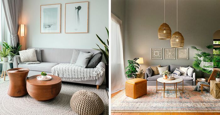
The Sherwin-Williams gray paint colors collection exemplifies the enduring popularity of this versatile and timeless shade in interior design. Hues with a slight gray undertone can adapt to any space’s mood and style. It’s no wonder that decorating with gray color remains a staple in interior design. Let’s explore the top paint colors in this palette, from deep to light grays!

Image credits: ian dooley
Digging deeper into the world of 50 shades of gray, you might ask, what is Sherwin-Williams most popular color? Undoubtedly, it is one of the best Sherwin-Williams gray paint colors — Agreeable Gray!
This is the best-selling and most loved neutral from Sherwin-Williams, and for good reason. It strikes the perfect balance between gray and beige paint with a touch of warmth. That’s why Agreeable Gray can be assigned to a greige paint color group. As the name suggests, it is agreeable with any color and decor, be it the kitchen or the living room design.
Image credits: Spacejoy
One of the top 50 fan-favorite colors, Repose Gray, is a light and soft shade with a warm beige undertone that gives it a subtle warmth and coziness. This neutral color is an excellent choice for creating a cozy and relaxing space, making the room feel bigger and brighter.
Image credits: Max Rahubovskiy
One of the most popular Sherwin-Williams paint colors of all time, Gray Clouds is a nature-inspired gray with a slight blue undertone, making it a calm and sleek modern hue.
Considering Gray Clouds?You might be interested to learnwhat colors go well with Sherwin-Williams Gray Clouds paint color. If so, feel free to pair Gray Clouds wall color withTruepenny SW 6355 for accessories, Eider White SW 7014 for ceilings, or Mindful Gray SW 7016 for furniture.

Image credits: Sidekix Media
Offered by experts, Homburg Gray is a neutral color with a cool, dark gray hue and blue undertones. Indeed, it would add a graceful and mysterious atmosphere to a well-lit room.
Interesting fact — Homburg Gray can change its appearance depending on the lighting conditions, ranging from a deep green to a smoky blue-gray or teal. It is a perfectly fitting color for spaces with natural wood kitchen cabinets, stone tiles, or other raw materials.
Image credits: Spacejoy
Decorating with a taupe color can be so much fun, as it’s one of the most versatile gray shades. Its brown hue creates a warm and cozy look for your outdoor space.
Yes, Taupe Gray belongs to Sherwin-Williams exterior paint colors. It works perfectly outside the building, complementing colors like Creamy SW 7012, Sandbar SW 7547, and Rookwood Dark Green SW 2816. You’ll truly appreciate the beauty of Taupe Gray when it’s bathed in natural light.
Sherwin-Williams white paint colors embody this classic shade’s timeless elegance and versatility. Whether you want to create a sheen, minimalist look or add warmth or cool white to your space, these popular shades will be a perfect canvas for endless design possibilities.
Image credits: Trend
The designers have fallen in love with one of the 10 best Sherwin-Williams white paint colors. Those looking for a warm, yellow undertone might consider painting common areas in Pure White. This versatile, bright white hue works well for white trim, walls, cabinets, and exteriors. Natural or artificial light can create a crisp and clean atmosphere in any room painted with Pure White!

Image credits: Spacejoy
The Sherwin-Williams Color of 2016, Alabaster, is a timeless, versatile shade still relevant in interior design. This warm, creamy white has a natural and organic feel. It is a perfect neutral for painting a living room, bedroom, or powder room in a coastal-style home.

Image credits: altogetherlovelyhome
Sherwin-Williams white paint colors like Snowbound are modern, sleek, and neutral and pair well with dark or bold colors. A bit more yellowish than Alabaster, Snowbound gives the brightness without losing a coziness. The warm, well-balanced white will help you achieve a peaceful ambiance.

Image credits: interqualitypainting
Looking for a bright white color with a high LRV (Light Reflectance Value)? Extra White will do the trick! Its LRV makes this color an ideal choice for trim and ceilings. This white is a neutral shade with no undertone. It’s clean and crisp and will easily serve a friendly, sharp contrast to anything you care to lay against it.

Image credits: Isaac Martin
One of the most popular white Sherwin-Williams exterior paint colors, Shoji White gives a light glow without looking stark. However, Shoji White can also be used in painting interiors. This is a warm, off-white shade with yellow and beige undertones, considered greige. It goes perfectly well with Pure White SW 7005 and Perle Noir SW 9154.
Sherwin-Williams green paint colors collection encapsulates the essence of nature’s beauty, offering a diverse spectrum of shades inspired by the lush landscapes and foliage surrounding us. From gray or blue green to warmer hues, this palette evokes feelings of serenity, vitality, and harmony, making some of them a popular choice.

Image credits: Minh Pham
Recommended by the experts, Sea Salt was one of the most popular colors in 2022. This particular shade of light green is quite versatile and can function as a neutral color. Its hue is reminiscent of a tranquil, pale green sea and has been highly regarded for quite some time. This serene shade of green, with hints of blue, evokes a sense of calmness reminiscent of a day spent at the beach. Pair it with white trim to create a stunning contrast.

Image credits: alliebnc06
Contented SW 6191 belongs to the green color family. As a neutral color, this sage green shade can make your home feel calm and poised. The color resembles the grayish-green mix with a deep, muted, subtle look. The complex of blue-gray undertones can soothe the tension in any space. Its sophisticated and charming look adds depth and character to your interior spaces.

Image credits: Spacejoy
This is another sage color that is more bluish than Contented. Its hint of blue-green can create a relaxing and soothing atmosphere, bringing a serene and natural feel to your interior spaces. As an airy color, it perfectly suits painting a bathroom or a bedroom. Rainwashed can coordinate well with First Star SW 7646 and Pewter Cast SW 7673.

Image credits: Sophia Kunkel
This one of the most popular green shades of 2022 is also handpicked by the Sherwin-Williams color experts. Because of its versatility, this color looks like a true chameleon of gorgeous green-meets-gray with just a bit of blue. With a lot of gray, Evergreen Fog can create a cozy and welcoming feeling in your home.

Image credits: butlerandco_
It is one of the most warm and tropical of Sherwin-Williams green paint colors, bringing the lushness of a jungle into your home. This vibrant and lively shade will surely add a touch of nature to any space, creating a calming and rejuvenating atmosphere. Secret Garden is a sophisticated and charming color that can add depth and character to your interior spaces.
In conclusion, when choosing paint colors for your home, we’ve addressed all your burning questions in this paragraph. We’ve got you covered, from understanding the latest trends to exploring different brands. So, embark on your painting project confidently, armed with the knowledge to make your space shine with the perfect colors.
There is no definitive answer to the most neutral color from Sherwin-Williams, as different colors may appear more or less neutral depending on the lighting, the surrounding colors, and the viewer’s preference. However, some of the most popular and versatile neutrals from Sherwin-Williams are Agreeable Gray SW 7029, Repose Gray SW 7015, Accessible Beige SW 7036, and Alabaster SW 7008.
Frankly, neutrals are among the most popular and best-selling Sherwin-Williams interior paint colors, such as Agreeable Gray SW 7029, Repose Gray SW 7015, Sea Salt SW 6204, and Alabaster SW 7008. However, cool denim blue Naval SW 6244 is also highly desired.
From classic to bold, Color Experts have selected these winning Sherwin-Williams exterior paint colors: Extra White SW 7006, Pure White SW 7005, Alabaster SW 7008, Agreeable Gray SW 7029, Repose Gray SW 7015, Accessible Beige SW 7036, Colonnade Gray SW 7641, Light French Gray SW 0055, Shiitake SW 9173 and deep Foggy Day SW 6235.
Sherwin-Williams and Benjamin Moore are the US’s most popular and reputable paint brands. They both offer a wide range of products and colors for various painting projects. However, their differences may affect your choice depending on your preferences and needs.
Ultimately, the best color for your project depends on your preference, budget, and desired outcome. You can order paint samples to test paint colors before making a final decision. This is the best way to test paint colors and ensure your selected shades match your interior and specific lighting!
Gray is already passé… And that other color palette… No… We need to leave the 1980s in the 1980s.
Our builders painted our entire house in agreeable gray, but in flat, which I hate more than I can say. It shows every scuff and mark but you can’t clean it because the paint will literally come off the wall.
I’m sorry to hear that, Rebecca… My neighbors painted their kitchen, gray a year ago and regret it. In their words, “we thought it would be cool and neutral, but it’s just nothing. Just nothing. “
Load More Replies...Gray is already passé… And that other color palette… No… We need to leave the 1980s in the 1980s.
Our builders painted our entire house in agreeable gray, but in flat, which I hate more than I can say. It shows every scuff and mark but you can’t clean it because the paint will literally come off the wall.
I’m sorry to hear that, Rebecca… My neighbors painted their kitchen, gray a year ago and regret it. In their words, “we thought it would be cool and neutral, but it’s just nothing. Just nothing. “
Load More Replies...


 No fees, cancel anytime


-2
3