ADVERTISEMENT

H ow lo ng di dit t ake yo u to r ea d t his sent en ce? (How long did it take you to read this sentence?) That, right there, was an example of how NOT to use letters if you want someone to understand your message. Now imagine that printed on a coffee cup or a poster.

Text design can be hit or miss. When done well, you glide over the words, absorb them and move on with your life. When done wrong, it can not only be jarring or annoying, but can also cause the sentence/word/phrase to take on a whole new and unintended meaning. Sometimes with hilarious results.

If you've ever had your brain doing backflips while trying to decipher a badly designed sign, you'll understand exactly what we're talking about. But just to drive the message home, Bored Panda has put together a bunch of perfect examples of typography trying to say, "I said what I said... but I absolutely did not mean to say that." You may have to read some of them a few times to figure out what exactly is going on. Others might never make sense. Ev er.

#1

If Only There Was A Letter In That Word That Resembled A Football

Chalkboard sign with text errors showing designers trying to write but failing miserably in street advertising.

iMaelstrom Report

WaxyJo
Community Member
Premium
11 hours ago Created by potrace 1.15, written by Peter Selinger 2001-2017

Obviously you go there for the sOort!

Glix Drap
Community Member
Premium
7 hours ago Created by potrace 1.15, written by Peter Selinger 2001-2017

Snorts in amusement.

Reading something shouldn't leave you feel like you've been flung around in a washing machine and then hung out to dry. But too often, designers get carried away when trying to get a message across. There are loads of ways typography can ruin an otherwise great design...

Perhaps it's a poor choice of font, or someone's attempt at playing Cupid with fonts that are simply incompatible. Then there are those who don't believe in the "less is more rule," and try to cram as many words as possible into a small space.

RELATED:
    #2

    Definitely Not A Safe Space

    Sign reading F ART SPACE with Chinese characters, highlighting designers tried to write something and failed miserably.

    JulineBernier Report

    #3

    When You Skip The Typography Section Of Your Groupon Graphic Design Course

    Sign on brick wall for Magic Of Art tattoo and permanent makeup studio with a skull graphic, illustrating design writing fails.

    xkelsx1 Report

    on second thought....
    Community Member
    Premium
    4 hours ago Created by potrace 1.15, written by Peter Selinger 2001-2017

    Nice name for a bean dish too!

    Glix Drap
    Community Member
    Premium
    7 hours ago Created by potrace 1.15, written by Peter Selinger 2001-2017

    One of the more specialist types of magic.

    ADVERTISEMENT

    "Typography that is difficult to read renders the message ineffective. Overly decorative fonts, poor colour contrast, or excessively small type sizes can all hinder readability," explains Melanie Downing, Creative Director/Owner of The Design Hive. "Prioritise clarity by choosing legible fonts and ensuring sufficient contrast between text and background. Avoid placing light-coloured text on busy or vibrant backgrounds, and stick to a minimum font size that is readable on all devices."

    The experts over at U.K-based design studio, Infinity Creative agree. To them, "readability is Queen." As the site notes, cou could have the world’s most powerful message… but if your audience can’t read it, it may as well be invisible ink.

    #4

    Choosing The Best Way To Split A Word

    Gift bags with designer writing fail showing "CONG RATS!" message in a store display with other colorful bags.

    chiyukichan Report

    Fungus John
    Community Member
    10 hours ago Created by potrace 1.15, written by Peter Selinger 2001-2017

    just don't give it to your vietnamese friend

    ADVERTISEMENT
    #5

    Herpes

    Green mug with a misspelled label herbes and a hand-drawn plant, showcasing designers' writing fails humorously.

    staylovelys Report

    Raven Sheridan
    Community Member
    11 hours ago Created by potrace 1.15, written by Peter Selinger 2001-2017

    I like a nice, strong cup of herpes in the morning.

    Bonesko
    Community Member
    6 hours ago Created by potrace 1.15, written by Peter Selinger 2001-2017

    🎶Best part of waking up, is Herpes in your cup🎶

    Load More Replies...
    Ghostchaplain16
    Community Member
    Premium
    9 hours ago Created by potrace 1.15, written by Peter Selinger 2001-2017

    Sigh! There are no heroes anymore.

    ADVERTISEMENT
    #6

    Came Across This In My Literature Book At School

    Photo of a book page showing a failed attempt at writing a poem with mostly nonsense text by a designer.

    SpectreOfMalta Report

    Ace
    Community Member
    Premium
    7 hours ago Created by potrace 1.15, written by Peter Selinger 2001-2017

    Almost as good as Prostetnic Vogon Jeltz's epic that opens with "Oh freddled gruntbuggly. . . . Thy micturations are to me . . . . As plurdled gabbleblotchits on a lurgid bee. "

    Kirsten Kerkhof
    Community Member
    9 hours ago Created by potrace 1.15, written by Peter Selinger 2001-2017

    I have seen that one before, and I think it's really funny!

    DeZeCrATioN
    Community Member
    54 minutes ago Created by potrace 1.15, written by Peter Selinger 2001-2017

    When it said "Drublhaflablhaflubhafgabhaflhafl", I really felt that u_u

    Jan Rosier
    Community Member
    6 hours ago (edited) Created by potrace 1.15, written by Peter Selinger 2001-2017

    I would have a good laugh, let out one long raspberry for as long as my longs would be able to, and that would be it. Djeez, if only they had tried this nonsense when I was in school...

    Lee Gilliland
    Community Member
    Premium
    6 hours ago Created by potrace 1.15, written by Peter Selinger 2001-2017

    Written by creative AI.

    Glix Drap
    Community Member
    Premium
    6 hours ago Created by potrace 1.15, written by Peter Selinger 2001-2017

    Edwin needs to get a proper job.

    The Infinity Creative team also cautions against what they call "Font Gluttony" or using too many fonts at the same time. Doing so can create visual overwhelm, inconsistency, confusion and pure chaos. "It makes your brand feel amateur rather than aligned," they explain.

    It's best to stick to a core set of 3–4 fonts, say the experts. Using this rule would look something like this: A headline font that lets your brand personality shine, a clean, simple and legible font for the body of the text, and an optional accent font that you can use for special touches.

    "Once you’ve picked your magic trio, use them consistently across your branding," advises the Infinity Creative site. "Think of them as your signature spell ingredients — repeat them in every potion (aka design) and your audience will start to [recognize] your vibe instantly."

    #7

    If Only There Was A Way To Make A Pizza Slice Look Like A Letter A

    Pizza restaurant storefront with menu boards displaying various pizza deals and prices, showcasing design and writing fails.

    flopsychops Report

    ADVERTISEMENT
    #8

    This New Wall Art In My Office

    Wall art with a confusing message showing the phrase "NO EVERYTHING IS POSSIBLE" in a modern office space, design fail example

    Bitemarkz Report

    Bonesko
    Community Member
    6 hours ago Created by potrace 1.15, written by Peter Selinger 2001-2017

    I knew everything was impossible!

    David Paterson
    Community Member
    10 hours ago (edited) Created by potrace 1.15, written by Peter Selinger 2001-2017

    Good art. Deliberately self-contradictory.

    Nicely
    Community Member
    7 hours ago Created by potrace 1.15, written by Peter Selinger 2001-2017

    Data and Lore in the hallway

    Trillian
    Community Member
    7 hours ago Created by potrace 1.15, written by Peter Selinger 2001-2017

    No everything im is possible

    ADVERTISEMENT
    #9

    I Left The Union Under The Tadpole

    Wooden alphabet puzzle showing misspelled words like Yawl and Union illustrating design fails and writing mistakes by designers.

    N1NJACQUES Report

    WindySwede
    Community Member
    5 hours ago Created by potrace 1.15, written by Peter Selinger 2001-2017

    "The square goes in the round hole!"

    You should always make sure the fonts you choose work well together. "Selecting fonts that clash in style or tone can confuse the audience and weaken the design’s cohesiveness," explains Downing. "For instance, combining a highly decorative script font with a bold geometric font may create unnecessary tension."

    The trick is to select fonts with similar characteristics or complementary styles, they say.

    #10

    Beautiful "Car Spa Pan" Board At The Italian Restaurant, I've Visited Yesterday

    Wooden panels with jumbled letters showcasing designers' failed attempts at writing, highlighting design mistakes and creativity.

    VaultVulp Report

    Upstaged75
    Community Member
    9 hours ago Created by potrace 1.15, written by Peter Selinger 2001-2017

    Carbonara. Spaghetti. Pannetone. (which is spelled wrong) But why would you do it like that??

    Bonesko
    Community Member
    6 hours ago Created by potrace 1.15, written by Peter Selinger 2001-2017

    Thank you. I spent way too long wondering what a car spa pan was and if BGN meant anything.

    Load More Replies...
    ADVERTISEMENT
    #11

    This Clock At My Aunt's House

    Clock with text design showing a failed writing attempt by designers spelling a common phrase incorrectly.

    kevindatfkommem Report

    Bonesko
    Community Member
    6 hours ago (edited) Created by potrace 1.15, written by Peter Selinger 2001-2017

    I'm home. Let's get her! Seriously every way I read this is just weird!

    Load More Replies...
    #12

    Like, Eat Milk

    Striped shirt with confusing black text printed on it, showing an example of designers failing at writing and design.

    malgreezy Report

    Sawdust
    Community Member
    11 hours ago Created by potrace 1.15, written by Peter Selinger 2001-2017

    Marie Antoinette as a Valley Girl?

    Bonesko
    Community Member
    6 hours ago Created by potrace 1.15, written by Peter Selinger 2001-2017

    Yeah, like totes let them like eat cake or whatevs

    Load More Replies...
    ADVERTISEMENT

    If you've ever misread or struggled to read a sign or sentence because the letter-spacing was all whack, you might understand how important kerning is. That spacing between letters, characters or words often goes unnoticed when done right. But when done wrong it totally shows.

    "Letters that are either crammed together like a panicked hug or spaced so far apart they feel like strangers at a networking event" is a cardinal sin when it comes to text design, warns the Infinity Creative crew.

    #13

    A Poster At My Moms Audiology Office

    Wall text with various font sizes and colors displaying mixed and poorly arranged words, showcasing failed designer writing attempts.

    coolrooman Report

    Glix Drap
    Community Member
    Premium
    7 hours ago Created by potrace 1.15, written by Peter Selinger 2001-2017

    The words "complete" and "bollocks" are missing from this.

    Fellfromthemoon
    Community Member
    4 hours ago Created by potrace 1.15, written by Peter Selinger 2001-2017

    It seems to me this word cloud gives the feeling of not hearing well.

    Bonesko
    Community Member
    6 hours ago Created by potrace 1.15, written by Peter Selinger 2001-2017

    So obvious. The ability to hear the universe is in Italy with my dog, my wife, my children as they do in Prague. And some other stuff I guess

    Starbug
    Community Member
    4 hours ago Created by potrace 1.15, written by Peter Selinger 2001-2017

    And "Hearing aid batteries last as long as my grandma in the Grand Canyon". So simple!

    Load More Replies...
    Corwin 02
    Community Member
    7 hours ago Created by potrace 1.15, written by Peter Selinger 2001-2017

    Word cloud but no clue what it has to do with an Audiology Office

    ADVERTISEMENT
    #14

    Or... Y'know... The Her In Hero

    A person’s hand wearing a watch with a cartoon character, next to a red tumbler with a logo, showcasing design fails.

    Dyltendo64 Report

    GalPalAl
    Community Member
    1 minute ago

    This comment is hidden. Click here to view.

    Or take the men out of patricarchy. Should we suggest Shetriarchy? Sigh

    #15

    The Fact That It's Trendy To Do This Right Now Doesn't Make It Any Less Crappy

    Hand holding a candle jar with a label showing a design fail in text spacing and layout by designers.

    TechnicalDimension56 Report

    The same applies to the spaces between lines. There's a fine line between too much and too little space.

    "Tightly spaced lines of text, known as leading, can make reading strenuous, particularly in longer passages," says Downing. "When text lines are too close together, the reader’s eye has difficulty distinguishing where one line ends and the next begins."

    The expert suggests adjusting the line spacing to create a more comfortable reading experience. She says that a general rule is to set leading at about 120–150% of the font size. However, Downing notes that this may vary depending on the font and context.
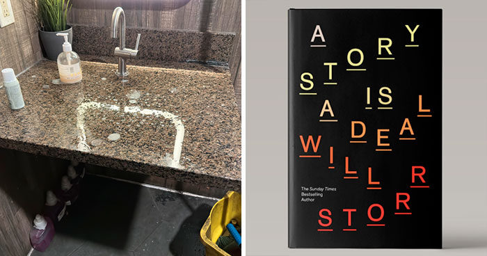
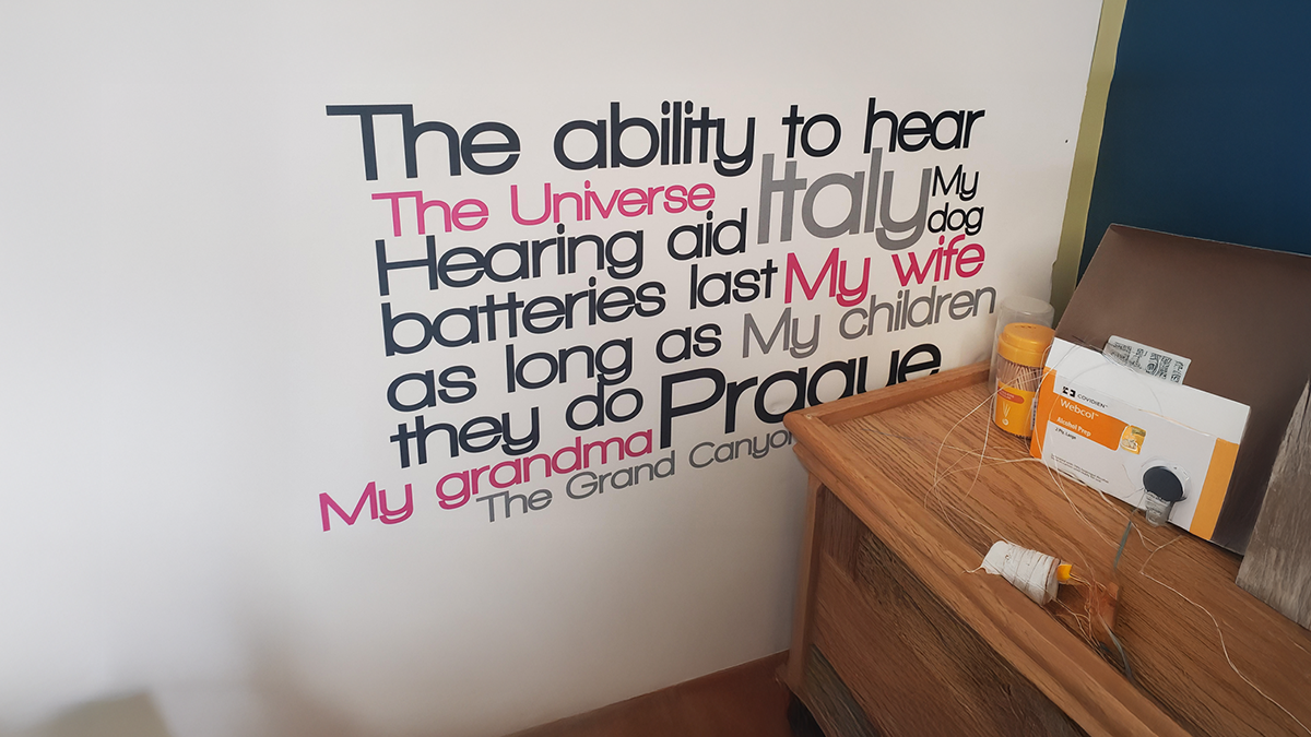
    ADVERTISEMENT
    ADVERTISEMENT
    #17

    One Of My Shoes Is Missing A Letter

    Close-up of designer shoes showing a failed design with misspelled brand name, highlighting design mistakes by designers.

    Oc7ave Report

    #18

    "Adida" Adidas Jacket Is Missing An "S" (Bought From The Official Website)

    Black jacket with a misspelled Adidas logo embroidered, highlighting design fails and branding mistakes by designers.

    MessagesFromLife Report

    Apatheist
    Community Member
    5 hours ago Created by potrace 1.15, written by Peter Selinger 2001-2017

    That's a singlet - one adida, two adidas...

    #19

    We Is Se Words

    Man wearing a red shirt with a failed design of miswritten words, illustrating designers' writing mistakes outdoors.

    SkepticWolf Report

    Bonesko
    Community Member
    5 hours ago Created by potrace 1.15, written by Peter Selinger 2001-2017

    We is sewords! We wants it! My precious!

    ADVERTISEMENT
    ADVERTISEMENT
    #20

    Since A Wine Glass Naturally Looks Like The Letter "H" And An Aircraft Like A "Y"

    Sign showing failed designer writing with text relax, refres, and fl alongside icons of utensils, a glass, and a plane.

    CaptainPonahawai Report

    Bonesko
    Community Member
    5 hours ago (edited) Created by potrace 1.15, written by Peter Selinger 2001-2017

    I don't think you should refres🍷and fl✈️

    #21

    That’s Not How Letters Work

    Sign with misspelled words follow, ceck, and rate displayed on a restaurant window showing design fails.

    miss-spell Report

    Bonesko
    Community Member
    5 hours ago Created by potrace 1.15, written by Peter Selinger 2001-2017

    The last one is unsettling 😨

    Stardust she/her
    Community Member
    Premium
    5 hours ago Created by potrace 1.15, written by Peter Selinger 2001-2017

    Ra_e, I’m thankful to god that the establishment isn’t on Pinterest

    #22

    This Porch Board My Mom Got For The Front Door

    Wooden sign spelling welcome with the letter L replaced by a Florida state silhouette, a design fail by designers.

    RatMan05 Report

    WaxyJo
    Community Member
    Premium
    11 hours ago Created by potrace 1.15, written by Peter Selinger 2001-2017

    Doesn’t seem very welcoming.

    Fat Harry (Oi / You)
    Community Member
    6 hours ago Created by potrace 1.15, written by Peter Selinger 2001-2017

    That's Florida, not a gun, if that's what you're thinking.

    Load More Replies...
    Corwin 02
    Community Member
    7 hours ago Created by potrace 1.15, written by Peter Selinger 2001-2017

    Well Florida is a stand your ground state, so they warn upfront they are armed and will shoot you if you are eating m&m's

    #23

    This Isn't How Wordle Works

    Close-up of a design fail showing a mug with a misspelled Wordle-style game reading LUCKY GUESS.

    VRZcuber14 Report

    Jim Alves
    Community Member
    2 hours ago Created by potrace 1.15, written by Peter Selinger 2001-2017

    Am I missing something here? That's exactly how Wordle works.

    Carey Jacksonn
    Community Member
    1 hour ago Created by potrace 1.15, written by Peter Selinger 2001-2017

    The yellow means the letters are somewhere in the word. However, the letters L, C, K, Y are not in the word “guess”

    Load More Replies...
    ADVERTISEMENT
    ADVERTISEMENT
    #24

    The Decorative Letting Around The Edge Of This Poster Completely Changes The Meaning Of Intelligent

    Poster with motivational words arranged vertically and horizontally, showcasing design text fails by designers trying to write.

    sprogger Report

    Bonesko
    Community Member
    5 hours ago Created by potrace 1.15, written by Peter Selinger 2001-2017

    Before I leave the house every day I say determined yes I can successful learner empowered eXcellent intelligent ambitious

    #25

    Who Thought That Silver Text On Yellow Packaging Was A Good Idea? I Guess Its A Mystery Serum

    Bright yellow serum packaging with poorly designed, hard-to-read text showcasing designer writing fails.

    WickedAmbiguous Report

    #26

    It Took A Couple Minutes To Get The Message LOL

    Blue spiral notebook with a humorous design fail where the text says "DON'T WORRY YOU'LL ABOUT IT BE OK" showing design writing mistakes.

    GlitchedBugs Report

    Bonesko
    Community Member
    5 hours ago Created by potrace 1.15, written by Peter Selinger 2001-2017

    Don't worry you'll about it. Be ok

    #27

    Cheat Yonur GF Not Yonur Workouts

    Funny gym wall text with design fail showing confusing typography and spelling errors by designers trying to write.

    Crowdie_ Report

    Fat Harry (Oi / You)
    Community Member
    6 hours ago Created by potrace 1.15, written by Peter Selinger 2001-2017

    I actually read this correctly the first time, so it can't be that awful.

    Bonesko
    Community Member
    5 hours ago Created by potrace 1.15, written by Peter Selinger 2001-2017

    Depends on how your GF reacts I guess

    Load More Replies...
    ADVERTISEMENT
    ADVERTISEMENT
    #29

    I Spent Half My Meal Trying To Decipher This

    Wooden wall art with jumbled letters in a restaurant setting illustrating designers failing to write correctly

    InspectorGoole Report

    Bonesko
    Community Member
    5 hours ago Created by potrace 1.15, written by Peter Selinger 2001-2017

    I got nothing. Anyone??

    Starbug
    Community Member
    4 hours ago Created by potrace 1.15, written by Peter Selinger 2001-2017

    I think it's just like a jigsaw, the letters are the same on both and you have to fit them all in the frame

    Load More Replies...
    #30

    Don’t Want To Go Near The Playground In Case I Catch Faki STDs

    Open book with oversized, misaligned text over photos of children, illustrating design fails from designers writing attempts.

    jamelza11 Report

    Bonesko
    Community Member
    5 hours ago Created by potrace 1.15, written by Peter Selinger 2001-2017

    Better than REALI STDS I guess 🤷‍♀️

    #31

    The Rewards Of Hypnotherapy

    Poster showing common issues like anxiety, depression, and confidence with hypnotherapy benefits, highlighting design text fail.

    goobzilla91 Report

    Juls
    Community Member
    7 hours ago Created by potrace 1.15, written by Peter Selinger 2001-2017

    Another word cloud. Word clouds are super useful to find what words you are using a lot in your writing, but I don't think they make good signage.

    Bonesko
    Community Member
    5 hours ago Created by potrace 1.15, written by Peter Selinger 2001-2017

    Thanks to hypnotherapy I'm panicked, depressed, but confidently anxious 👍

    ADVERTISEMENT
    ADVERTISEMENT
    See Also on Bored Panda
    #32

    The Simfsons

    Cartoon character with American flag background and failed typography spelling Simpsons in a designer’s attempt.

    Xatolos Report

    #33

    These Four "Letters" Are Supposed To Spell Out "Nova"

    Sign for Huawei nova 7 Series 5G with confusing, poorly designed text that designers tried to write and failed miserably.

    TrashKetchoi Report

    Ace
    Community Member
    Premium
    7 hours ago Created by potrace 1.15, written by Peter Selinger 2001-2017

    Rotate 90degrees to right, then rotate one lette 90 degree more. But why?

    Fat Harry (Oi / You)
    Community Member
    6 hours ago Created by potrace 1.15, written by Peter Selinger 2001-2017

    Trying to be as clever as the Sony VIAO logo, I think.

    #34

    I Guess We Dont Need Spacing Between Go On

    Illustration of a green witch holding a staff with the incorrect wording "G**N YOU'RE FREE" showing design writing fail.

    Blue_Storybook Report

    Corwin 02
    Community Member
    6 hours ago Created by potrace 1.15, written by Peter Selinger 2001-2017

    And nobody is talking about the rather suggestive grip she has on the rather phallic looking object in combination with the words "you are free" (and yes I know it is supposed to be a broom handle)

    Corvus
    Community Member
    3 hours ago Created by potrace 1.15, written by Peter Selinger 2001-2017

    Perhpas that's where thewhole "g**n" thing comes from :P

    Load More Replies...
    #35

    This Won The Design Competition

    Poster with designer fail text playfully reading DON’T DRIVE with a yellow SAFELY road sign illustrating design mistakes.

    chica420 Report

    ADVERTISEMENT
    ADVERTISEMENT
    See Also on Bored Panda
    #36

    It’s Not Like There’s A Shared Letter

    White ceramic jars labeled with vertical and horizontal text displaying sugar and tea, showcasing designers' writing fails.

    lpf2g Report

    #37

    When You Perfect Your Wordart Skills And Go Retail

    Pink framed design with the phrase I love you to the moon and back featuring bold and 3D text styles, showcasing design fails.

    OnceKittenTwiceHigh Report

    #38

    Yuokyol Orcmwrd, Such An Inspirational Quote From A Magazine

    Wooden sign with distorted text spelling a mixed-up message, illustrating designers writing failures and errors.

    purerainfall Report

    #39

    Show Your N Maryland Ative Pride

    Sign with a design fail showing the word native missing the A replaced by a map, highlighting designers' writing mistakes.

    Medical_Solid Report

    ADVERTISEMENT
    ADVERTISEMENT
    See Also on Bored Panda
    #41

    And Make Believe Always It Happen

    Black fabric with a faded motivational phrase containing a spelling error, illustrating designers failed attempts at writing.

    misterpants8 Report

    Bonesko
    Community Member
    5 hours ago Created by potrace 1.15, written by Peter Selinger 2001-2017

    That's my life motto. Now I must make myself another margarita

    #42

    Wild Er Into The Ness

    Black hoodie with a design displaying the phrase wild er ness with text placement errors, showcasing designer writing fails.

    SpongeGob Report

    #43

    This Company’s URL Can Be Any Combination Of These Letters. Guess Which One It Is

    White vehicle side with a poorly designed logo where the word "COMPASS" is jumbled, showcasing designer writing fails.

    darlzC Report

    Stardust she/her
    Community Member
    Premium
    4 hours ago Created by potrace 1.15, written by Peter Selinger 2001-2017

    There are 40,320 possible permutations for this if we ignore the octagon. Since there is an octagon, there would be roughly 5040 permutations.

    ADVERTISEMENT
    ADVERTISEMENT
    See Also on Bored Panda
    #44

    The An Needs M

    Bathroom door with a design fail showing incomplete WOMAN text, highlighting designers trying to write and failing miserably.

    32oz____ Report

    Bonesko
    Community Member
    5 hours ago Created by potrace 1.15, written by Peter Selinger 2001-2017

    This is just f*****g stupid 🤦‍♀️

    Ana Clara Rad
    Community Member
    2 hours ago Created by potrace 1.15, written by Peter Selinger 2001-2017

    Kinda sounds like a antitransgender argument XD

    Bonesko
    Community Member
    2 hours ago Created by potrace 1.15, written by Peter Selinger 2001-2017

    Yeah, and one that makes even less sense if possible

    Load More Replies...
    #45

    When You Need To Grab Someone's Attention And Make Them Read A Lot Of Words While They're In Their Car... Definitely Don't Choose This Kind Of Font

    Stop sign above a confusing private property sign with poorly written text showing design fail by designers.

    dubautia Report

    Whatshername
    Community Member
    9 hours ago Created by potrace 1.15, written by Peter Selinger 2001-2017

    Obviously, you'd have to STOP to read the sign. /s

    Lee Gilliland
    Community Member
    Premium
    6 hours ago Created by potrace 1.15, written by Peter Selinger 2001-2017

    There are also easier fonts.

    #46

    How Are You Even Supposed To Read This?

    Wall clock with jumbled letters instead of numbers, showing a design fail by designers attempting to write something.

    username5391 Report

    Greg
    Community Member
    10 hours ago Created by potrace 1.15, written by Peter Selinger 2001-2017

    If you read it anticlockwise it says Minneapolis.

    #47

    That's Not How Mirrors Work

    Book cover showing a design fail with words Noel and Leon on a boy's shirt, illustrating designers trying and failing at writing.

    SpaceIsTooFarAway Report

    ADVERTISEMENT
    ADVERTISEMENT
    See Also on Bored Panda
    #48

    My Mum Bought This At A Home Decor Shop Years Ago. I Never Read What It’s Intended To Say

    Wooden decorative letters arranged incorrectly with a small bird on top, showcasing designers' writing fails.

    noviboy123 Report

    #49

    If Only Louisiana Were Shaped Like A Letter In The Word Love, This Would Have Worked Much Better

    Home decor sign showing the word love with the letter O replaced by a state shape, a common designers writing fail example.

    BeerandGuns Report

    #50

    This Is A Poster By A Design School

    Designer sign with confusing text saying Be Who Yourself Choose To Be hung in an industrial space illustrating design fails.

    Dofke132 Report

    NightOwlPanda
    Community Member
    8 hours ago Created by potrace 1.15, written by Peter Selinger 2001-2017

    It's good when people put their mistakes out for the world to see. Buyer beware.

    #51

    No Need To Measure, There’s Plenty Of Space For All The Letters

    Sign with a design fail showing incomplete lettering for Raleigh Tobacco store outside a retail building.

    darwinpatrick Report

    ADVERTISEMENT
    ADVERTISEMENT
    See Also on Bored Panda
    #52

    I Almost Missed The Traffic Light Just Trying To Read This

    Colorful sign with mixed letters spelling confusing words, showcasing designers' attempts that failed writing clearly outside on the street.

    meowions Report

    #53

    Worksheet My Kindergartner Brought Home Today

    Missing letters worksheet filled with alphabet letters inside apple shapes, showing design mistakes and handwriting errors.

    Suitable_Visit_9990 Report

    NightOwlPanda
    Community Member
    8 hours ago Created by potrace 1.15, written by Peter Selinger 2001-2017

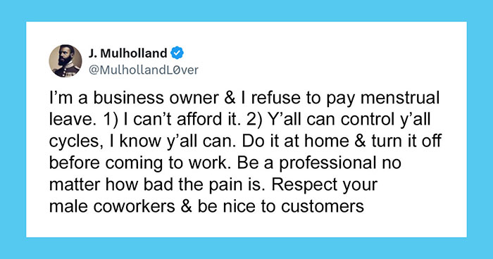
    “Rarely is the question asked: Is our children learning?” ― George W. Bush

    Bonesko
    Community Member
    5 hours ago Created by potrace 1.15, written by Peter Selinger 2001-2017

    Quite a M Night Shyamalan twist after X

    #54

    Bought Some Jammies For My Grandson

    Folded kids pajama with a Marvel Spider-Man design showing reversed and confusing text by designers.

    gronk087 Report

    Sawdust
    Community Member
    11 hours ago Created by potrace 1.15, written by Peter Selinger 2001-2017

    It's the First Leon all over again!

    #55

    Missed The Obvious “Bright”

    List of company values with words starting with BRIPHT, showing a design fail by designers trying to write.

    bgolbov Report

    ADVERTISEMENT
    ADVERTISEMENT
    See Also on Bored Panda
    #56

    Christian Shirt Where The Words Form An Upside-Down Cross

    White and gray raglan shirt with a failed design spelling JESUS and TRUST in a confusing layout on the front.

    manchild1116 Report

    Sawdust
    Community Member
    11 hours ago Created by potrace 1.15, written by Peter Selinger 2001-2017

    Is this the logo for a religious bank?

    Corvus
    Community Member
    3 hours ago Created by potrace 1.15, written by Peter Selinger 2001-2017

    St. Peter was (allegedly) crucified upside-down, so it's not entirely wrong...