Get Premium
Dark mode theme is available exclusively for premium users. Learn more about the benefits of subscribing.
No fees, cancel anytime.

 Dark Mode Ad-Free Browsing Unlimited Content
 Ad-Free Browsing Unlimited Content Dark Mode
Join 1.2 million Panda readers who get the best art, memes, and fun stories every week!
Being a designer – whether it's interior, graphic, advertising, or public space – takes a lot of creativity and skill. Sure, lots of people are good at their jobs, but only a few might be geniuses. This time, we're highlighting the best of the best in design: creations so practical and satisfying to look at that one can't help but say, "Wow."
The pics come to you from the subreddit whose name we can't really mention here, but let's just say that it rhymes with "Design Horn." It's a subreddit dedicated to amazing "architectural, graphic, industrial, furniture, & product design." So scroll down and be inspired or simply marvel at the things the human mind and hands are able to create!
More info: Reddit
This post may include affiliate links.
That signature is interesting. Look at how small and closed in it is, like there's something that needs to be hidden. And so tightly controlled.
Lol does your name describe what your brains were replaced with
Load More Replies...If there's one thing Mad Men taught us (aside from how to cheat on your wife with multiple women), it's that working in advertising takes a lot of creativity and pizzazz. Some of the awesome design examples you see on this list are from advertisements, and their genius often lies in a perfectly executed idea through beautiful graphic design.
Take the WWF campaign urging people to protect wildlife. The Twitter bird turning into an X is a clever representation of what happens when we ignore conservation efforts, but in the animal kingdom. The campaign was created by a German chapter of WWF in 2023 together with the advertising agency McCann Germany.
"The whole world mourns the loss of the Twitter bird," the caption of the ad reads. "Around 1 million real animal species are threatened with extinction. Today we are in the midst of the greatest extinction of species since the end of the dinosaur era. A quarter of mammal species, one in eight bird species, more than 30 percent of sharks and rays, and 40 percent of amphibian species are threatened. Help us save the animals. An initiative of WWF Germany & us!"
There's a really good documentary about this issue. I think it's called "Seaspiracy", and basically all the sea creatures that unalive due to plastic waste are a direct result of the waste left behind by the commercial fishing industry. This ad itself was paid for by subsidiaries of the commercial fishing industry. Plastic straws and bags are infinitesimal (tried to think of the "smallest" word I knew) in comparison.
I feel like an idiot, but for this I require an explanation, if someone happens to know what this means.
Fvck Elon (Musk) and the felon (convicted felon Donald Trump)
Load More Replies...Fountains shaped like dandelions sure look pretty. Many cities know that; that's why they've built similar versions of the one you see in this list. Our example is from Baku, Azerbaijan, aptly named Fountains Square. There's also one in Houston, a small version in Dresden, and one along 6th Avenue in Manhattan.
Sydney, Australia, also has one. It was built in 1961 as a commemoration of the Battle of El Alamein in Egypt during WWII. It has 211 "stalks," but it's the hundreds of saucer-shaped films that extrude water, making it look like a giant thistledown. The fountain's artist, architect Robert (Bob) Woodward AM, became so famous after designing this piece that he gained prominence internationally.
I'm watching a slasher flick as I go through this list, so the safety message of this picture is on a back burner to seeing other ways that a spine gets severed. Merry Christmas, everyone!
I think it's time to stop telling people to buckle up. It's 2025. This way nature will just take its course with the people who don't want to.
Some public service messages need to be constantly repeated because each year new people join the relevant cohort. For example, a young person with their first car and driving for the first time without mum or dad might be tempted to not wear a seat belt.
Load More Replies...It took a power outage to discover this? Does the poster never turn the kitchen lights off?
They probably hadn't been looking at the magnet to notice. And usually you aren't in the room if the lights are off.
Load More Replies...The "Less Plastic" campaign in the UK that depicts plastic knife heads as shark fins was created by a U.S. ad agency, Project Worldwide, in 2018. Other posters included in the campaign used other plastic cutlery as symbols. Forks resembled the hands and arms of a possibly drowning person. A plastic straw looked like the Loch Ness monster. And a plastic bag formed a wave, reminding people that there might soon be more plastic in the oceans than water.
The "One click could change your future. Belt up. Drive safe. Arrive safe" poster you see on this list is one of three that Western Australia's Road Safety Council made for its road safety campaign in 2008. It was the creative baby of the Perth-based agency Marketforce, and the other two posters depicted X-rays of a brain and a skull detached from the cervical spine.
BP automatically hides comments with URLs in them, so I will reply to my own comment with the video links ;)
Load More Replies...The incredible posters for the Korean stage production of Macbeth are the creation of the Japanese photographer Yuni Yoshida. Many experts praised Yoshida's use of negative space and incorporation of the play's themes into the artwork. The director of the play, Yang Jung-woong, described how his staging is still relevant to modern audiences. "It vividly portrays the inescapable downfall that follows ambition, along with the sense of loss, guilt and moral conflict that come afterward."
Found in Somerville, MA, near the Union Sq. T stop.
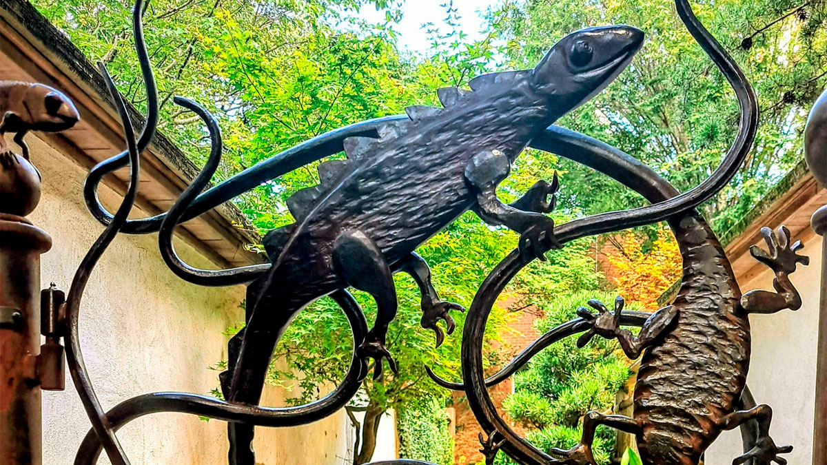
The lizard gate at the Atlanta Botanical Garden looks cool and fits its location perfectly. Created by blacksmith Andrew Crawford, it was installed at the Gardens' entrance to the Japanese Garden in 2012. That year, an Atlanta Blooms event took place, and the gate was the addition to the Gardens for that occasion. Crawford has also designed another gate for the Atlanta Botanical Gardens, the "Herb Garden Gate."
Very effective. I've never seen a drunk driver anywhere in India. That's either due to the poster, or the fact that I've never been there.
Looks great and stylish but not so useful if you're someone who needs to use a handrail to get up and down
I was going to say the same thing. It's beautiful but I'd rather not risk the fall.
Load More Replies...Which of these showcases of excellent design impressed you the most, Pandas? Rank your favorites in the comment section below! And while you're here, don't forget to visit our previous design appreciation posts featuring pics from the very risqué-titled subreddit here and here!
Good idea when you're in a fog getting morning coffee so don't mix it up with milk carton.
I have creamer and egg whites in blue and white containers. Yeah one is round and the other square but I have started to make scrambled creamer on at least one 'firing on 3 cylinders' morning.
Load More Replies...The better one was the Time Magazine cover from his first incumbency, where his image was positioned so the spikes of the 'M' in 'TIME' looked like horns coming out of his head. If memory serves, the editor claimed it was 'accidental', but I think he had his fingers crossed behind his back when he said it 🤞🏼
I love all you pussies that can’t take his existence. So many d*******g whining a******s on this website. Blue-hairs unite!!!
I'd say he won't suck your d**k, but based on recent emails, he just might.
Load More Replies...I’ve always hated the electricity pylons in this country (UK). They’ve always scared me.
I always thought they were like big aliens stomping through the landscape
Load More Replies...That’s a good idea, but I don’t know how closely people will be checking his helmet if he gets in an accident bad enough to warrant a transfusion!
I imagine at least one of the EMS workers would notice. Even if they do not, it does no harm to have the sticker on there. Perhaps this has become a common-enough practice that EMS would check the helmet. I've heard stories from my dad (he was in the Vietnam War) about how soldiers would write their blood types on their helmets or their boots, and medics knew to check those places first. I have a small medical/personal info ID tag clipped to my wallet that gives my blood type and also notes that I have no known allergies and no medical conditions. It also lists phone numbers for my next of kin. I don't know if EMS workers would check that tag, but it's reassuring to have it there just in case.
Load More Replies...As a Paramedic I always want to see the helmet of any motorcyclist involved in a collision, as damage can be a good indicator of the forces that the head has gone through. I was taught that the helmet always travels with the patient, as the medical staff in ED will do the same check, so it makes perfect sense to have blood group on the helmet. You can get Helmet ID tags in the UK as well, which can have vital emergency information on them, ideal for construction workers and motorcyclists (search helmet ID tag if interested...)
A better sticker would be one saying "do not remove helmet" - this has reminded me I need to get one for my current lid. Point is, if you've crashed wearing a motorcycling helmet and you're unconscious, there's a good chance you've got some sort of spinal injury. Leave the helmet removal to those with the training to do it safely.
Was on a hwy rescue for years. We did not care about blood type or med alert bracelets, DNRs etc. Our main focus was getting you out, stabilized as much as possible and into an ambulance with the medics and on the way to the hospital, although if time and conditions allowed we would start to collect info beyond vitals. It might be of use in the hospital but why trust a helmet that for all they know you borrowed from a friend?
Good point - from straight on, it could look like it actually read "919"!
Load More Replies...I just used the multiplication table printed on the inside of my PeeChee, but this is funner
Located in Peachtree Center (originally named Garden Mall), the restaurant opened in 1968. Later, the restaurant closed in the late 1980s.
They're very well known in the UK, so much so that a lot of residents will recognise the company even when it's this blurred. Their TV adverts are funny, worth a look on YouTube!
Load More Replies...I hope those ripples are only on the underside and not on the surface of the seat
Great shape, but if you really want to make the point, they should be all gray and black.
they will be, after a few days use.
Load More Replies...It's a Polish ad, so presumably they mean recipe. All ingredients are grown locally. In some languages translations for receipt, recipe and prescription are mixed up. In Dutch for example 'recept' means 'recipe'. not 'receipt'. A prescription is also called a 'recept'.
Load More Replies...In Toronto, the shelter is a box of glass, tempered so it smashes most spectacularly, and the Advertisement is on the up-street side, so you Can't See the bus coming from inside.
and it is huge and doent fit in small pockets or tiny bags..so unnecessary.
Note: this post originally had 66 images. It’s been shortened to the top 50 images based on user votes.
I ɢᴇᴛ ᴘᴀɪᴅ ᴏᴠᴇʀ $120 ᴘᴇʀ ʜᴏᴜʀ ᴡᴏʀᴋɪɴɢ ғʀᴏᴍ ʜᴏᴍᴇ. I ɴᴇᴠᴇʀ ᴛʜᴏᴜɢʜᴛ ɪ'ᴅ ʙᴇ ᴀʙʟᴇ ᴛᴏ ᴅᴏ ɪᴛ ʙᴜᴛ ᴍʏ ʙᴜᴅᴅʏ ᴍᴀᴋᴇs ᴏᴠᴇʀ $13,453 ᴀ ᴍᴏɴᴛʜ ᴅᴏɪɴɢ ᴛʜɪs ᴀɴᴅ sʜᴇ ᴄᴏɴᴠɪɴᴄᴇᴅ ᴍᴇ ᴛᴏ ᴛʀʏ. sᴛᴀʀᴛ ᴇᴀʀɴɪɴɢ ᴍᴏʀᴇ ᴄᴀsʜ ɪɴ ᴘᴀʀᴛ ᴛɪᴍᴇ. ᴄʜᴀɴɢᴇᴅ ᴍʏ ʟɪғᴇ.....➤➤ 𝗟𝗶𝘃𝗲𝗝𝗼𝗯𝟭.𝗰𝗼𝗺
Load More Replies...The message on ads should be clear and legible. Some of the designs on this post were visually appealing, but the message was lost. Took a graphic design class years ago and they always said, if you are designing for a billboard, you have limited time to get your message across to someone driving by. Great advice


 No fees, cancel anytime


")
")


")
")