Get Premium
Dark mode theme is available exclusively for premium users. Learn more about the benefits of subscribing.
No fees, cancel anytime.

 Dark Mode Ad-Free Browsing Unlimited Content
 Ad-Free Browsing Unlimited Content Dark Mode
Join 1.2 million Panda readers who get the best art, memes, and fun stories every week!
Being ‘born’ with bad taste, growing up aesthetically challenged creates a lot of problems: you think you’re doing fine, but you’re actually creating super crappy designs that end up scaring half the internet. Grab the holy water and repeat Dieter Rams’ 10 Principles for Good Design, Pandas, because we’re about to cross the Rubicon into the Wastelands of Crappy Design.
We’re featuring the most awful posts from these three design-oriented subreddits over here, here, and here, to prove to you that just because you can make something doesn’t necessarily mean that you should. Creativity, editing, feedback, having an understanding of how function vs. form works—these are all needed to satisfy your customer. And it’s exactly what you won’t find in this list.
From horrible signs and furniture to funky yet confusing products, we’ve got a bit of everything for everyone. This is the perfect chance to prove that you’ve got great taste, so remember to upvote the pics you hate the most. And tell us in the comments which of these horrendous designs you wouldn’t come near even with a ten-foot pole.
This post may include affiliate links.
Interior design expert Ariane Sherine, the editor at These Three Rooms, was kind enough to answer Bored Panda's questions about good taste, design, and aesthetics.
"Taste is a very subjective thing. For instance, I don't like bright or dark colors on walls, but plenty of people love the maximalist look," she shared that it's important to consider what each person thinks, individually.
"The only true way to ascertain whether a design is going to be a commercial success is to make it available for sale, market it widely, and see how many people buy it. But success is different to taste. Personally, I think taste is all about understatement, minimalism, and neutral decor. But again, that's only my personal opinion!"
The design expert shared her thoughts about the line between what's tasteful and tacky. "This will differ for each person, but for many people, loud and garish colors used liberally in the home would signify a lack of taste. Then again, I can think of designers who have based their entire career around the use of color and loud prints," she pointed out that things aren't as clear-cut as some might think.
"So there's no hard and fast rule," she said, adding that there are examples of avant-garde design becoming popular later on. That means that some design decisions really are ahead of their time (and some might have their time in the spotlight in the future! Maybe!).
According to Ariane, from These Three Rooms, it's important to consider not just taste and aesthetics when looking at furniture, but functionality, as well. "Does the furniture function as it should? Is it likely to collapse or break easily? If seating, is it comfortable? I mean, my idea of aesthetic hell would be a bright purple inflatable sofa with lime green spots, but your mileage may vary! The question of comfort and function is a less subjective one."
The three subreddits we’re featuring today are clearly inspired by the ridiculously popular r/CrappyDesign sub, an online community of over 3 million people. It’s somewhat ironic that someone copies what a more popular community does when the topic is all about bad design decisions… some of which are due to others copying good designers, poorly.
Tbh I’d freak out if my dog smiled like that with those unrealistic teeth!
Good design, according to Dieter Rams, is innovative, aesthetic, and makes a product useful. What’s more, the product has to be understandable, unobtrusive, honest, long-lasting and is thorough down to the last detail. Finally, good design means that the item is environmentally friendly and actually involves as little design as possible. If you use that as a framework, you quickly realize that most—if not all—of the pictures in this list fail with flying colors.
Tim Antoniuk, from the University of Alberta, explained to Bored Panda during an earlier interview that people can intuitively tell if something is designed well or poorly. First impressions really do matter in the world of design.
The design studies expert told us that he personally believes Rams does a great job of determining what makes good design good. At the same time, Antoniuk feels that Rams may not have been able to foresee how the world would change in the future.
"That said, given the speed of change that we encounter today in our lives in the digital environment that we live in, I believe that some great design is not necessarily timeless. One example is seen in Interface Design, Ux Design, and in-service design. As new layers get added into our lives, things naturally have an evolutionary cycle,” Antoniuk shared his thoughts with Bored Panda.
This is absolutely horrifying and I need one for my front yard please
“This is different from furniture which naturally can be more ubiquitous and designed to fit the human body. There is a great deal of fuzziness in this discussion but I do believe that the essence of this idea is true.”
The expert feels that good and bad product design definitely exists. However, we all have personal preferences, too. This added layer of subjectivity creates a gray area between quality products and those that lack quality.
"The gray area comes in when people start to talk about taste and about degrees of aesthetic. I may love the design of Bauhaus furniture, for example, while somebody may feel that it is too cold and void of personality,” he said.
“Not unlike great art, I believe that much of what came from this era is ‘great design,’ in part because it represents an era and a philosophy. When we start to mix in discussions of taste and preference, that is where the gray areas of good and bad design get blurred,” Antoniuk noted why there’s some confusion as to whether or not some design decisions are good or bad.
The expert told Bored Panda that people can “feel” and sense good design, intuitively. "Quite often, this relates to ergonomics and the usability or functionality of the products and services and systems. Having said that, I think far too many people expect poor design that doesn’t really work well," he said.
"For me, great design is what Dieter [Rams] talks about—it is also intuitive, it is deeply sympathetic and empathetic to the user at all levels, and at some level, it is emotional. It is a catalyst for giving us feelings."
So, Pandas, which of these designs did you think were the worst of the bunch? Were there any that you actually liked and would be happy to have at home? Why do you personally think it's so hard for designers to notice their mistakes? Share your thoughts in the comments!
Just... why? You figure once they see it doesn't really is how it's supposed to be, they solve the problem first... nope.
The concept of bad design resonates strongly across both of these pieces. As we explore a plethora of design mishaps, it becomes evident that many products suffer due to poorly thought-out creation processes.
If you're keen on further dissecting what exactly makes some designs so ineffective, consider looking into the discourse surrounding design mistakes that seem disconnected from the user's needs.
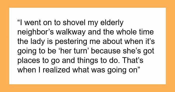
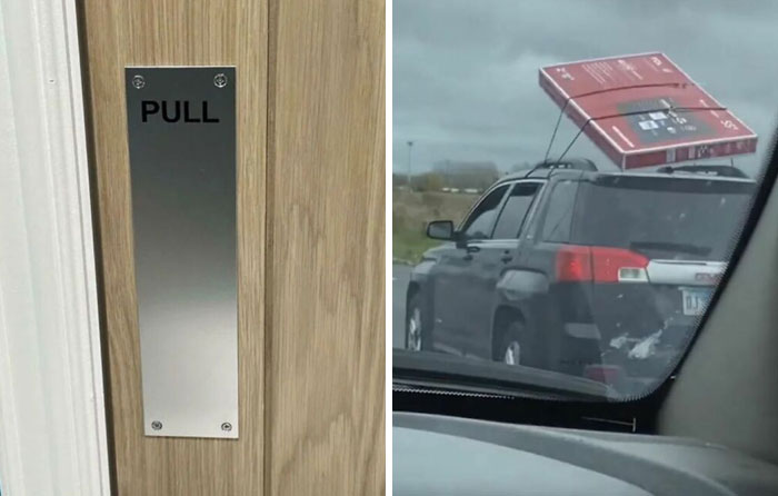
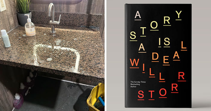
What do you do? Do you get a four by one or place it down? And if so, where? 😵💫
If you wanna see another one , look up "Wasilla high school statue" it's a statue someone designed at the local high school down the street from my house and it got SO much controversy... you'll see why lol
That's not the one of the priest giving bread to a small boy?
Load More Replies...If you wanna see another one , look up "Wasilla high school statue" it's a statue someone designed at the local high school down the street from my house and it got SO much controversy... you'll see why lol
That's not the one of the priest giving bread to a small boy?
Load More Replies...


 No fees, cancel anytime


")
")


