Get Premium
Dark mode theme is available exclusively for premium users. Learn more about the benefits of subscribing.
No fees, cancel anytime.

 Dark Mode Ad-Free Browsing Unlimited Content
 Ad-Free Browsing Unlimited Content Dark Mode
Join 1.2 million Panda readers who get the best art, memes, and fun stories every week!
40submissions
Finished
Have you ever picked up a nice-looking product and thought it would be a blast to use it, only to learn the hard way that it's just pretty, but not very usable? It might be even the tiniest of flaws that makes an object borderline unusable, just because that small flaw drives you insane...
That's what today's list is all about - people sharing their stories of such objects. What s***s the most is that these were supposed to be things that were used day-to-day. But how can you use something that annoys the h**l out of you?
More info: Reddit
Discover more in 41 Times Designers Messed Up In A Minor Way, But It Ruined User Experience In A Big Way
Click here & follow us for more lists, facts, and stories.
This post may include affiliate links.
 Not tiny, but touchscreens in cars. I'm sure they are cheaper to manufacture, but it's a safety concern when you have to take your eyes off the road to do even the most simple thing on the touchscreen. Buttons and knobs are 1 billion times better.
 I can never just get one wet wipe out cleanly, it brings six others with it and I have to cram them back in the packaging…plus the sticky clear plastic cover always ends up falling off!
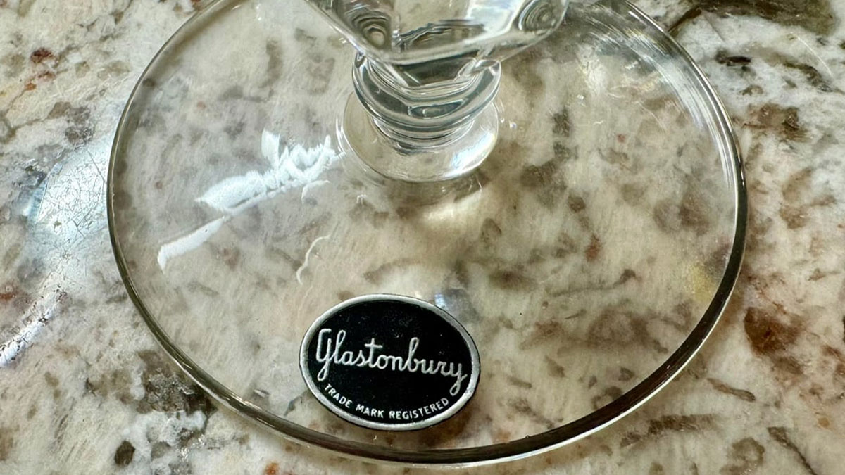
 The sticker they put on new glassware or plates. It's not the normal, satisfying-to-peel kind. It's the evil, paper-based kind that's designed to tear into 50 tiny pieces and leave behind a permanent, sticky residue that will outlive civilization itself.
Some people say they don’t care about how a certain product they buy looks – they’re all about functionality, not the looks. You know, as the saying goes, don’t judge a book by its cover.
At the same time, it’s also said that sometimes you should judge a book by its cover. Or at least it should be considered during the whole judgment of the creation. After all, the cover is what gives off the first impression; it’s supposed to entice you to pick up the book.
 Plastic sealed food packaging where there’s a tab to peel off the lid, but when you pull it, it just peels off the edge and leaves the package sealed. Fall for it every time.
 The pedestal of a toilet having the nooks/crannies of the internal piping so it catches dust, dirt, grime, and other horrible bathroom mess. Why not a smooth column to the floor?
The same goes for any other object – its looks are supposed to give you a good impression, even if you claim not to care about it. Plus, sometimes the design is something more than just the appearance – they tend to carry certain functionality too.
A good design is more than a product looking pretty; it's supposed to bring a seamless, simple experience. On the other hand, a bad design can not only displease one’s eye, but also affect their experience and harm brand perception in the long run.
 Every company that manufactures things should post a video of their CEO opening one of each product.
things would change real quick
Kraft "open here" Mac and Cheese, for example.
 The fact that cars are still built with all these cracks and crevices that you can drop stuff down into and never retrieve.
How can that experience be ruined, you might wonder? Well, just imagine, you use a product that has decent looks, but has even a small quirk, like a detaching part or something like that, that drives you mad every time you use it. Or better yet, don't just imagine it, but simply check out today’s list – it’s filled with stories about design flaws that annoy people, to the brim.
This doesn’t just apply to physical objects – it touches on digital ones too. That’s where the profession of UI/UX designers comes into play. Basically, UI refers to the user interface or the look, feel, and interactive elements of a product.
 Surprised no one has said *cereal bags* yet. It’s been said before but I’ll repeat it here: big cereal needs to hook up with ziploc.
 When they package orders in the dumbest possible way. You want a fragile item? Sure, we'll just put it in a shoe box and tell the UPS guy to drop kick it to your door. You want a tiny bag of polyester stuffing for a stuffed animal? Sure, let me put that literally unbreakable tiny thing in a refrigerator box with more packing peanuts than you've ever seen in your life. The polyester stuffing probably did more protection for the packing peanuts than the opposite.
 I don't need every electronic object in my kitchen to have a clock. Microwave, coffee maker, oven, range... It's just too much, and they all end up being a couple minutes off from one another.
Meanwhile, UX is the user experience that's the overall feeling and ease of use a person has with the entire product journey, including strategy, structure, and even emotion.
Granted, the latter can apply to the design of physical products as well, but the first is solely in regard to digital ones. When it comes to that, both of the practices are usually combined into one profession. As you can probably guess, these professionals are responsible for making your digital experience both pretty and useful — not annoying, unlike the products on today’s list.
"We just need this form filled out, so we will E-mail it to you" HOW is there no elegant and easy way to just TYPE on the form and send it back? NO, I don't want to buy adobe expert platinum subscription, no I don't want to download something. I HATE that I have to drive to a place with a printer, print it, fill it out, take a photo of it, then email that photo back.
 Microsoft Office: "Save As"
Always defaults to some remote directory (like a OneDrive Cloud directory) that's the furthest away from my most active parent folders.
It's like walking to the opposite side of the airport to catch your connecting flight. .
 Appliances that don't include any power cord management features (like a way to wrap and stow them).
It might seem a rather insignificant job for some, but when you are faced with a flawed design that drives you out of your mind, you realize that maybe it’s way more meaningful than you anticipated. After all, there are plenty of professions that might seem unimportant as long as you have people doing them, and only when there’s a lack of them do you understand how much you underappreciate them.
Do you have any more examples to add to today’s list? Please do so in the comments!
 Hand soap nozzles point strait out… why do I want soap launching out at my t-shirt? Point those things down… where my hand is.
The paper covers under lids like on peanut butter or ketchup. The teeny tiny little tabs for peeling them off are nearly impossible to grasp with fingers. I almost always end up using my teeth.
 I would've bet money at least one woman would mention the tiny little pockets in their clothes.
There needs to be a little colored mark on dental floss so you know the floss is about to run out.
 The power button on the Kindle being on the bottom where my support finger goes. It's hard not to take that one personally.
 My wife's 2025 Kia is riddled with design flaws. I'll pick one that p****s me off a lot:
When listening to music, there's a section of the 12" LCD which shows you the album art along with the artist and song name. This is limited to roughly the rightmost 3" of the screen, and the font size is such that you get maybe the first eight characters of each.
So, listening to Nathaniel Rateliff & the Night Sweats do "And It's Still Alright", the display will show:
**Nathan...**
And It's ...
It's infuriating enough that they bothered with this design in the first place, as there is a TON of wasted space, but at least that screen has some other useful functions.
Then there's a thing you can tap to make the music information take up the full screen. This shifts everything leftward and enlarges. But still, the area dedicated to the text is still relatively small, and due to the larger font size, you get *even fewer characters than before*:
**Natha...**
And It...
p*****g me off the most? A full 60% of that screen is just black except for a button "Enter Channel," which you can tap and then enter a station number on a numpad. A feature which I will literally never use.
Oh, and this full-screen music mode? It slides up from the bottom of the screen like it's some kind of accessory, and everything behind it darkens. The clock, outside temperature, and a few other things that would be useful remain visible on the edge of the screen, but because they're darkened, they're extremely hard to see, especially in bright light.
IDK who designed that screen, but they are not good at user interface design. At all. They're truly bad at it.
(I'm a software engineer, so bad software especially p****s me off.)
🤬.
 Websites with information in the footer that always disappears because the designers added infinite scrolling.
 The last half inch of product in the deodorant bottle that won't push up because they made the screw too short.
Tiny tools like screwdrivers that have a tiny little handle you can barely hold onto. It’s ridiculous, you might need a small screwdriver for a tiny job, but your hand is still the same size!
I’ll be watching a movie (or live Olympics) on my old Samsung TV, and suddenly, at the climatic moment, a window will pop up in the middle of the screen saying “Smarthub has updated. Do you want to start Smarthub?” and I will have to fumble around for wherever I put my remote down to dismiss it. When the revolution comes, there is a Samsung programmer somewhere who had better hide well.
[Because all humor will somehow be misinterpreted by someone on the internet: /j for the previous sentence.].
 I have a hydraulic log splitter. As a safety feature it requires 2 hands to operate, one to push a button and one to hold a lever down. The problem is that to do this I have to bend down and put my face distressingly close to the hunk of wood that it is trying to explode into 2 chunks. I've never gotten hit, but having my face that close to the violence fells like it should be avoided, like by not requiring to hands and just trusting people not to shove their hands in the way of an axe blade. .
 Brooms, mops, swiffers, are all made for right-handed use. When you use them left-handed the head unscrew from the handle while you're using them. Infuriating.
Why the h**l do I have to reauthenticate every phone application after it’s been updated? And why is it so difficult?
I simply don’t understand why I am constantly reauthenticating. I use different passwords for each app so having to constantly go look up the password in my vault is incredibly annoying.
For the life of me I do not understand the packaging bacon comes in. What j**k made the decision for every company to put bacon into a non resealable plastic pouch and then shroud it in cardboard or paper or whatever. Any time I make bacon I just make the entire package and put the leftovers in the fridge for later.
 I hate GM for making theirs cars' REVERSE LIGHTS come on after it's been PARKED and actually isn't REVERSING at all. This "feature" makes crowded parking lots very annoying.
 This is so absurdly niche, but it annoys me no end.
A website I occasionally use, has a log in screen that dramatically shakes if you enter the wrong details.
Like a big "nuh uh uh". Then after a couple of seconds, has a pop-up window to tell you, that you used the wrong password.
Such a weird thing to design into a website.
 Sleeping bag bags. While I appreciate the 1 inch of fabric saved by making it so the sleeping bag can only be easily put in if factory new and squeezed through a toothpaste tube, the weight restrictions on my backpacking gear do not facilitate me to bring the necessary equipment.
See also: sleeping pads
EDIT: Ya'll are amazing! I have thoroughly appreciated all the insight, advice, and gossip on the backpacking game.
Phones having their charging port at the bottom instead of the top so the cable bends and breaks faster while also not letting you orient your phone upside down to solve this issue.
I like to cook, nothing is made of solid metal anymore. Everything is cheap plastic or it has a plastic handle that breaks in two seconds. I’ve bought probably three different potato mashers and various price points over the past five years and they all keep breaking, melting, or are impossible to clean.
 Microsoft outlook- when I search for a word give me the MOST RECENT TIME THAT WORD WAS USED FIRST.
The pour spout on my glass measuring cup. If I don’t take my time and pay attention half of the contents will land on the counter instead of where I want it.
Had to get the gas cap on my car replaced, and the new one doesn't have that little strap holding it to the car. It's also a fraction of an inch too big to put into the hook on the cover. So now I just have to stand there, holding a gas cap while I wait.
You might also like: 50 People Who Tried To Be Creative With Their Homes And Failed (New Pics)


 No fees, cancel anytime


")
")


