35 Retro Advertisements That Show How Much Things Have Changed
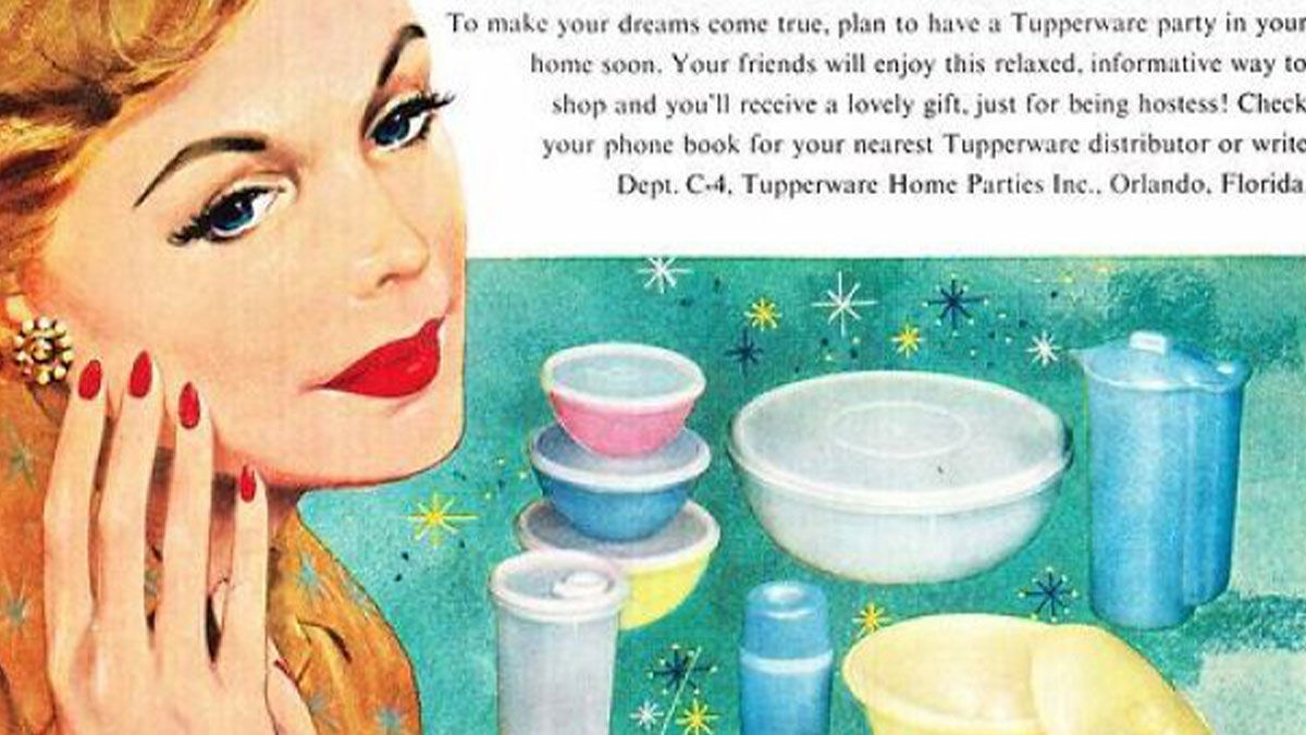
Interview With ExpertSome people may call them outdated, but vintage ads have a charm you won’t find in today’s bulletins or posters. They evoke a vibe that reminds those who lived it of a much simpler time, while introducing younger folks to what things looked like decades ago.
Check out some of the examples we’ve collected from this Facebook group, an online community all about vintage advertisements. It currently has just over 403,000 members, thriving on pure nostalgia.
We’ve collected some of the best images for a blast from the past today. Be sure to upvote those that catch your eye!
This post may include affiliate links.
The one common theme in these retro ads is that they all came about during a time when today’s technology was far from being developed. As cultural historian Allen J. Wiener tells Bored Panda, “print media filled the idle hours of the youth.”
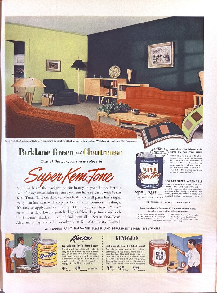
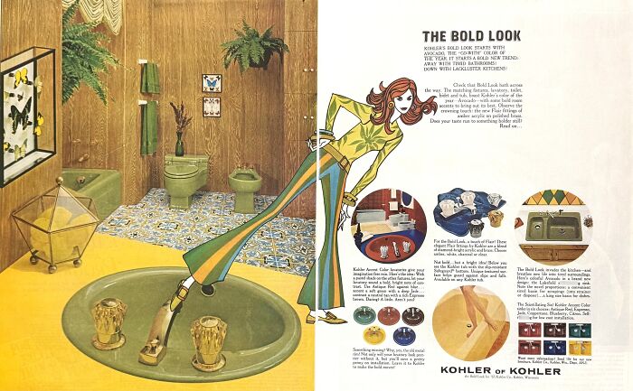
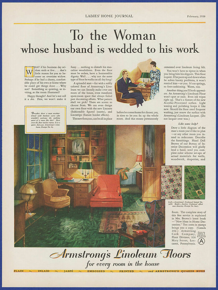
Paint colors being advertised haven't really changed much than what is being shown here. It's all "Admire our new color for this year, look how well it shows off your living room!"
“The post-World War II generation of kids was the first to have disposable income, making them a plum target for advertising,” Wiener said. “Comic books were particularly popular with kids and were illustrated with hand-drawn art from cover to the final page, with advertising typically appearing on the back cover, where sellers could provide everything from BB guns to ant ranches by mail.”
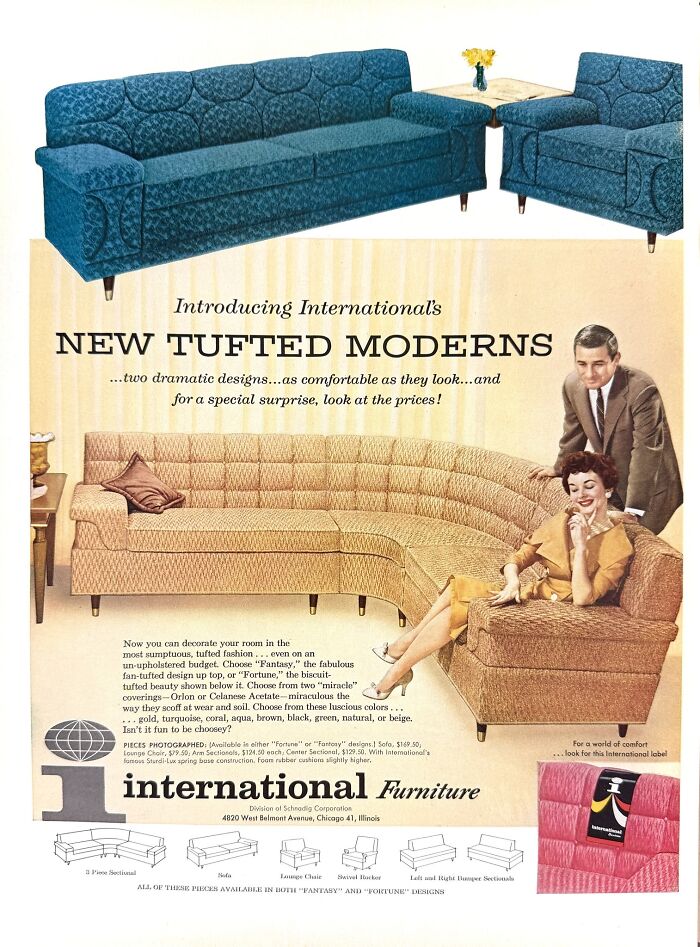
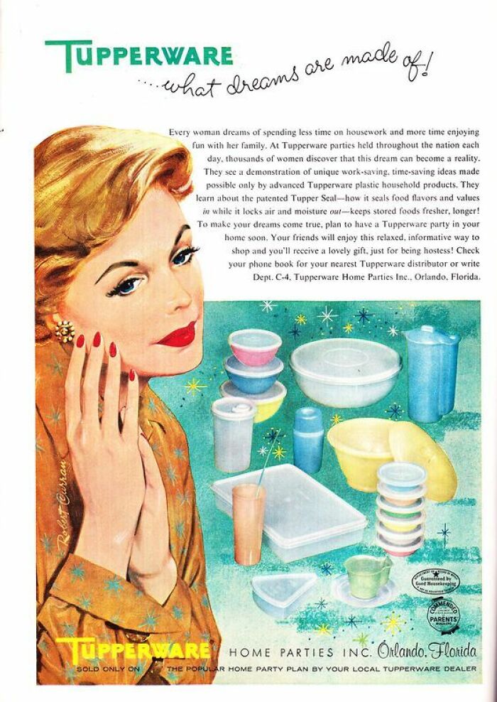
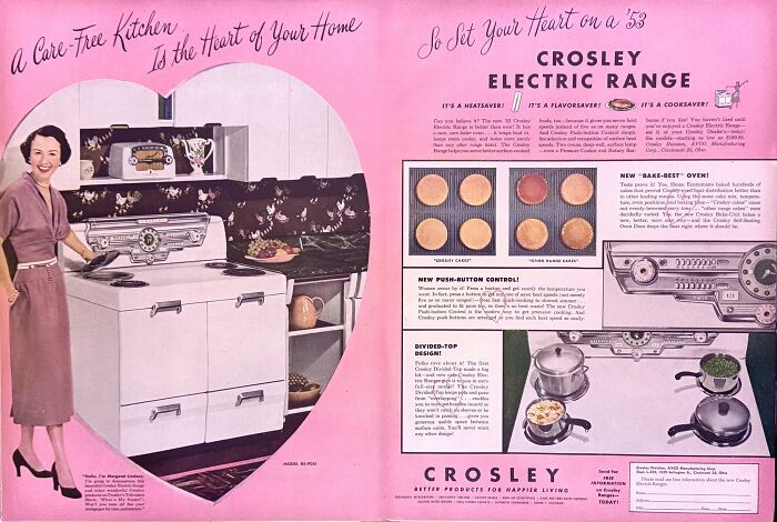
Looking at these ads in 2026 is essentially peering into a window to the past. According to digital marketing professional Victoria Morais, they provide clues about social hierarchies, ideals of home life, and design trends at the time.
“Suburban kitchens were elaborate sets; color televisions starred; men were strong; and women were homebound. And like popular culture, they mask power dynamics in a message of aspiration,” she said.
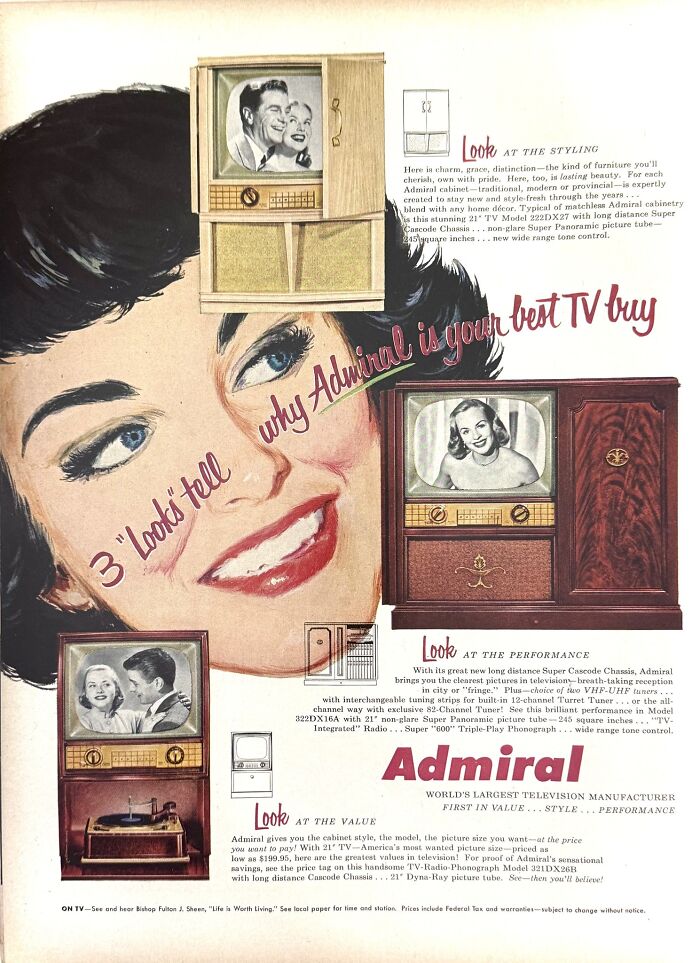
Our first TV as a child in Australia, never worked properly. It was continually out of order. I distinctly remember a repair man sitting on the floor reading "How to fix your Admiral TV."
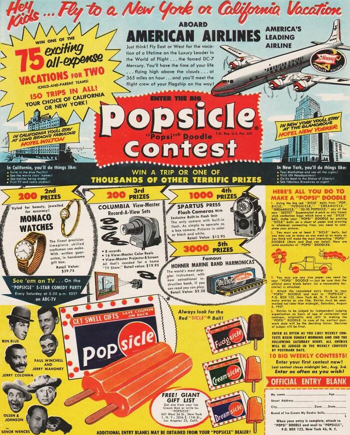
The ice cream man would drive his little truck (converted post-office trucks were common) playing Turkey in the Straw to summon customers and most of the offerings were this company's products, so you really could get a Popsicle for about 25 cents.[1960s western US] It's a different thing nowadays, some of those frozen treats are 5 dollars.
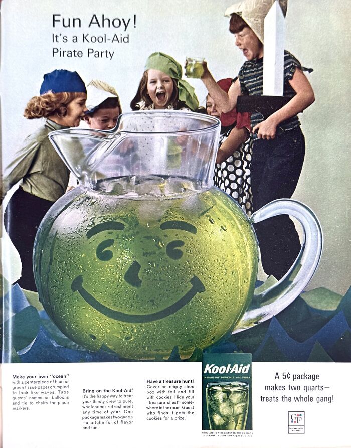
One thing that may not be as noticeable in these ads is the gender-targeting. Wiener says that children's publications directed to young males featured boys engaging in activities that included the advertised product.
The same thing applied to female-centric comics like Little Lulu, which showed more ads for trinkets that appealed to young girls.
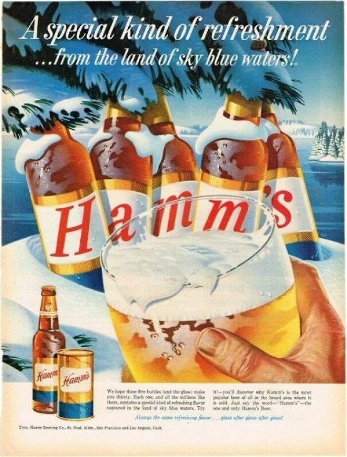
♪♫ From the land of sky-blue waters, Hamms, the beer refreshing!♫♪
I can hear this ad in my head. I have to give it to some of the jingle writers - those things will stick with you over the years.
There was also racial segregation at the time, which, according to Wiener, also showed in the ads. He notes that, save for a few publications that cater to African-Americans, most of the advertisements during the time were predominantly white.
“Except for a few Black-oriented publications (Jet and Ebony come to mind), which distributors rarely sold in predominantly white neighborhoods, all of the figures in these ads were white, whether in photographs or sketch art,” Wiener pointed out.
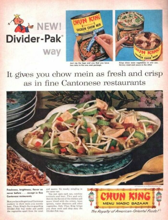
As Americans, this was a "taste of the Orient." Little did we know that no decent, upstanding Cantonese (or surrounding countries/cultures) person would eat anything of this sort. They have taste.
During a time when print media was king, advertisers had limited tools for disseminating information. However, these creative constraints assured that quality was on point.
“The hand-rendered lithography and succinct copywriting meant that the key visual and verbal elements of the campaign needed to be clear, compelling, coherent, and united in purpose,” Morais said. “I see each day how constraints can both clarify and magnify a story.”
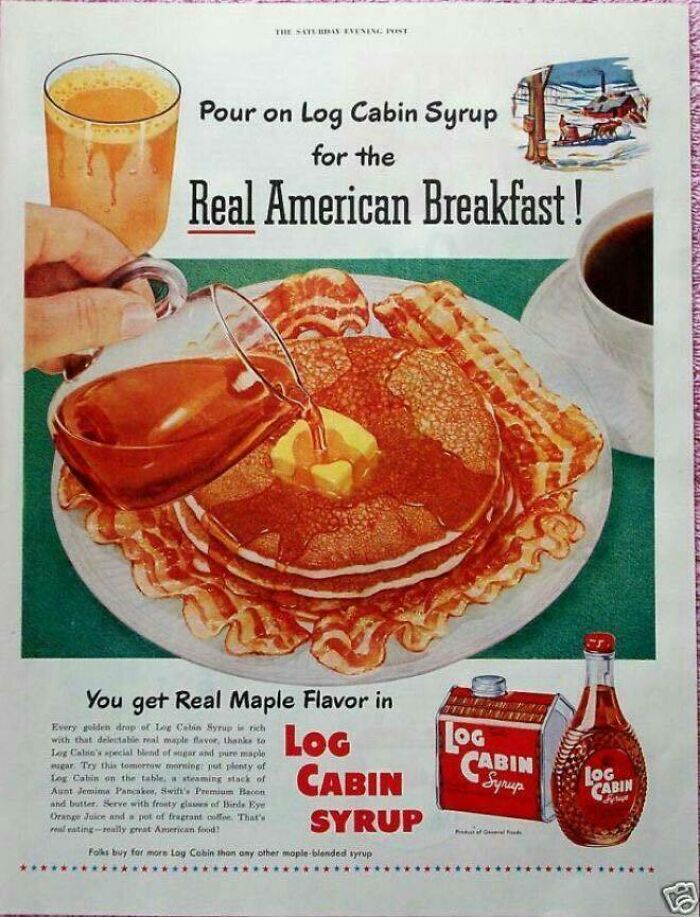
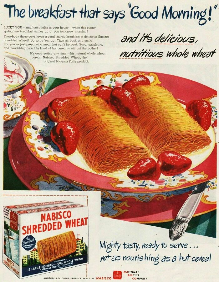
Ahhhh, colored corn syrup! Usually said something like 1% real maple syrup. I didn't have real maple syrup until was much older. We live in New England and it is plentiful here
Ahh, Avocado Green and Harvest Gold! The colors of my childhood.
My grandparents would eat these. We grew up on the farm and called them hay bales.
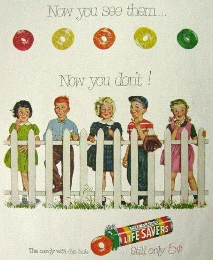
Ah, the Christmas gift exchange at elementary school… I would be super jealous of the kid that scored a book of Lifesavers.
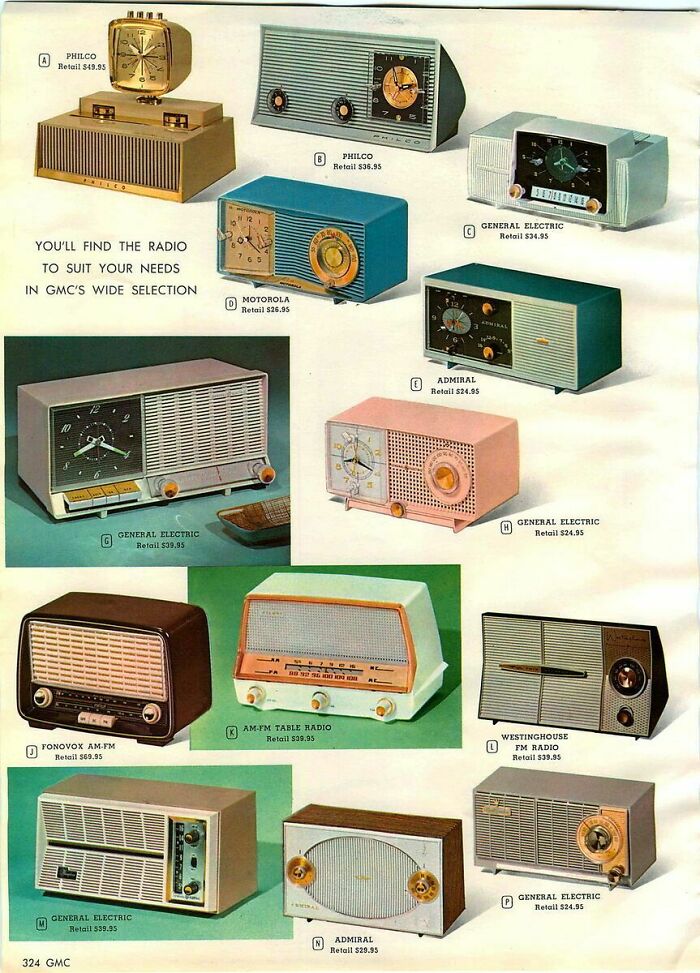
I have the one at the bottom right. Found it at a flea market a few years ago. Paid $15 bucks. The wiring was updated and it still works. I use it to listen to my Cubs.
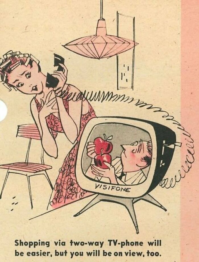
Jane Jetson had one. If she was messy when a call came through, she had fully made-up and coiffed masks on a stick to hold in front of the screen. I'll never Facetime until I get those.
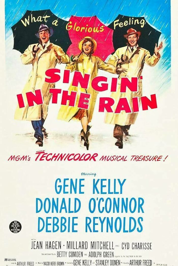
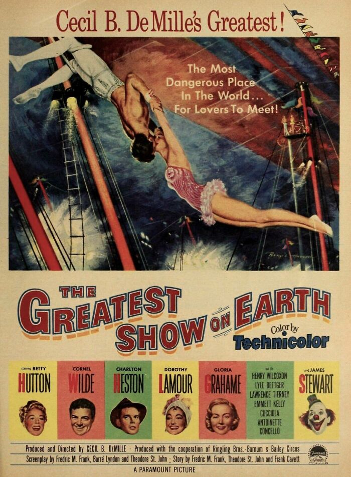
I absolutely love this movie. Betty Hutton's physical strength and presence is astounding.
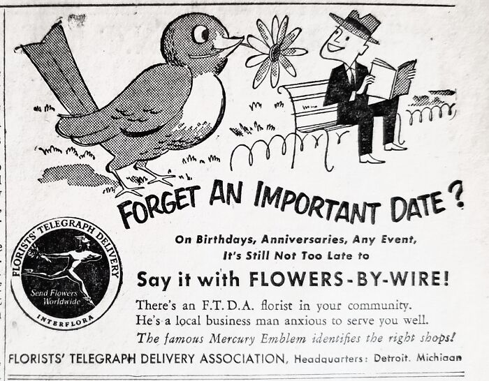
TIL that FTD stood for Floral Telegraph Delivery. And is see Mercury is being used as the symbol for speed
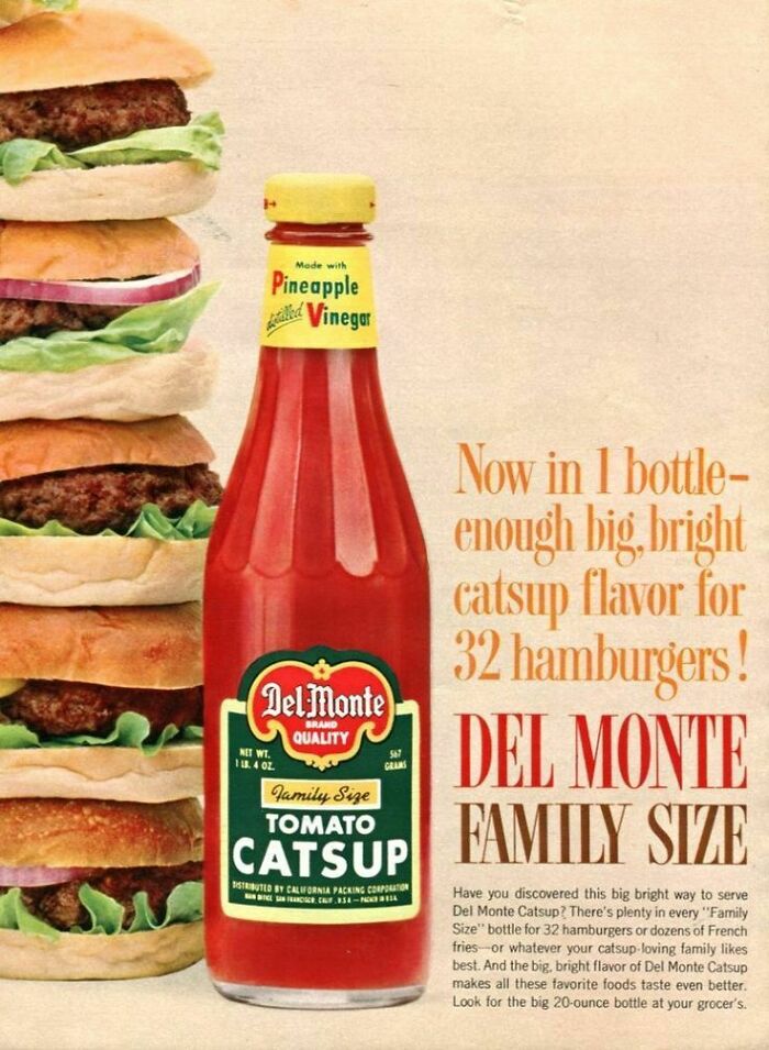
When I first saw this bottle I thought it said Pineapple Catsup, which might be something from the Philippines, like Banana Catsup
Note: this post originally had 118 images. It’s been shortened to the top 35 images based on user votes.

 Dark Mode

 No fees, cancel anytime


