Get Premium
Dark mode theme is available exclusively for premium users. Learn more about the benefits of subscribing.
No fees, cancel anytime.

 Dark Mode Ad-Free Browsing Unlimited Content
 Ad-Free Browsing Unlimited Content Dark Mode
Join 1.2 million Panda readers who get the best art, memes, and fun stories every week!
Kerning is the process of adjusting the spacing between individual characters in a font. This is done to achieve a visually pleasing and balanced appearance of the text. But as with most things, every now and then, things can go wrong.
Put the symbols too close or too far from one another and you end up with awkward or humorous typography. For example, if a company wanted to make a poster advertising their "cleaning" services but made the spacing between the letters "c" and "l" too tight, it can create the word "dining" instead.
The funny part is that such mistakes are more common than we might think. And the Facebook group 'The Real Crime Is That Kerning' has all the proof. Here are some of their finds.
This post may include affiliate links.
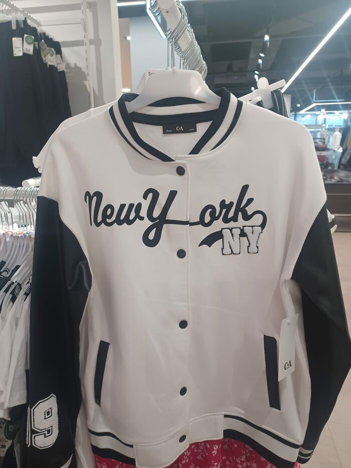
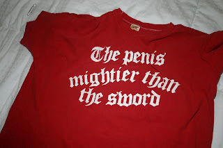
"The day is mine Trebek. I'll take penis mightier"
Load More Replies...Reminds me of the "Experts Exchange" website which was originally "www.expertsexchange.com"
I remember on a tv show someone had the website partsexchange.com when they were selling/swapping car parts
Load More Replies...BP didn’t censor this but censored the word “k**b”? Edit: I wasn’t the one who censored that. It’s supposed to say K-n-o-b
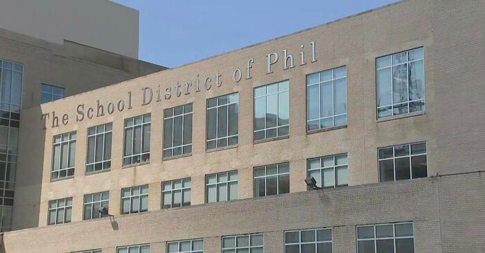
This reminds me of a great restaurant in Philly when they first got on Twitter. The restaurant name is "Han Dynasty", but when you hashtag it: #handynasty
Take a good long look at the word therapist. Unfortunate, isn’t it?
A buddy of mine worked for a hosting company. There was a place that sold used kids clothing... http://www.kidsexchange.com
Gotta hold in the joke, gotta hold it in... don't say it, don't say ittttt
Design is full of detail-level concepts that matter more than their superficial simplicity would suggest, and kerning is a great example. When used effectively, it can be a powerful tool to influence aesthetics and communication through type.
It’s one of those things that, when used well, shouldn't be noticed by the average reader.
"If you start to look for it," designer Madeline DeCotes said, "you’ll realize there’s so much more to letters than you thought possible."
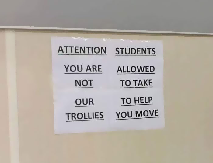
Attention Students: you are allowed not to take our to help trollies you move!
Load More Replies...This is not so much a kerning failure but word organisation. It looks like they needed to use multiple sheets and tape them together, but didn't sketch out how the words should be arranged first. Compounded the error by just sticking the nonsense up on the board
The order of the words is a much bigger issue here than the space between letters.
Attention Students You are not allowed to take our trollies to help you move
Load More Replies...Dollarama is great. It's pretty much the only game in town for dollar stores in Toronto and has pretty much everything.
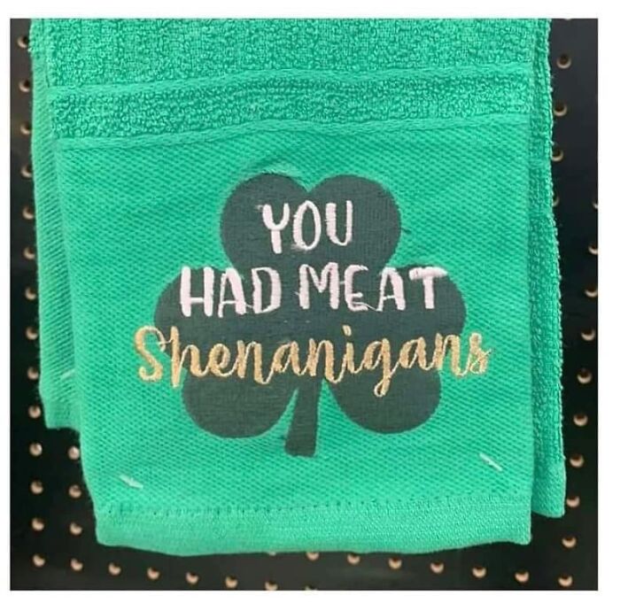
This is the meat shenanigan.... meat-patio...e74136.jpg 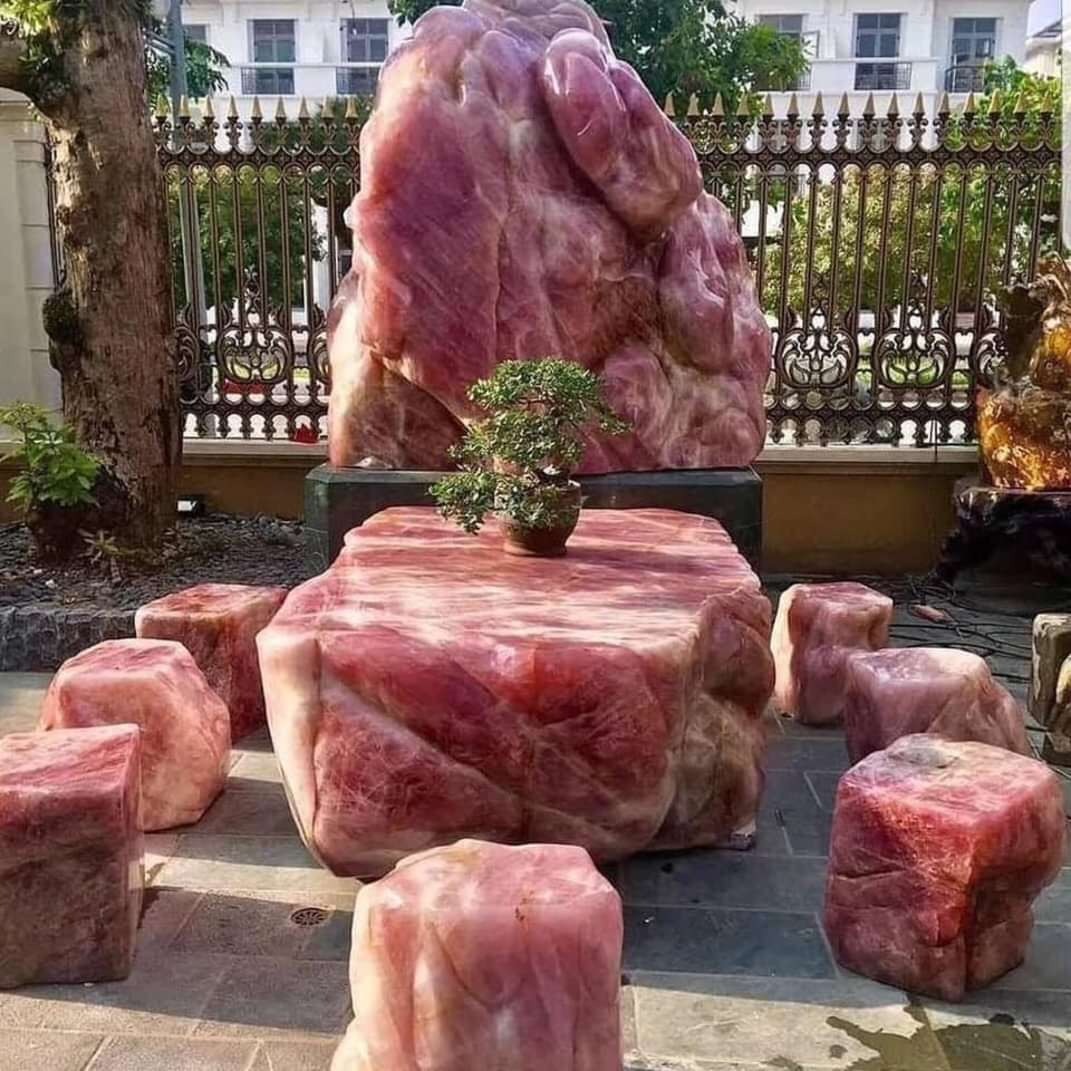
I have a t-shirt from this collection that says, "I'm only here for the shenanigans."
who wants to come with me and commit some meat shenanigans, i’ve got a raw turkey ready to go
Sounds like the burnt offerings I produced for dinner a few weeks ago.
Unlike tracking, which adjusts the amount of space between the letters of an entire word in equal increments, kerning focuses on how type looks — creating visually pleasing and readable text.
Typeface designers build spaces around each letter, and sometimes between pairs of letters. But as we can see in the pictures, those spaces don’t always work in all situations, especially if you’re using a typeface in a way the designer didn’t foresee.
That’s when manual kerning comes in. Because beauty is in the eye of the beholder, no two kerning jobs will be the same.
Tomorrow dish will be him. With a side serving of them.
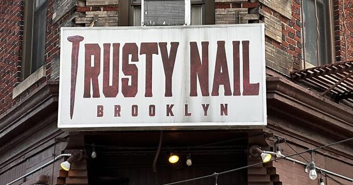
Load More Replies...Trusty Nail would be a good name for a Hardware Store or a pub. Or a Hardware Store with a pub in the back. Or a pub with a Hardware Store in the back. Or a vaccination site for tetanus shots.
Load More Replies...At first i read trusty nails, then I read rusty nails and was confused, and even after realizing it does say trusty I’m just as confused
"Kerning is a strikingly subjective art form," DeCotes explained.
"The designer needs to look at the space between each letter in a word and ask, 'Does this look like enough space? Does it look like too much? Are the letters too tight?'"
When you wonder how such a heinous smell can come from such a tiny body. "Damn, that kid is powerful".
My fiance has said the same of me and I'm far from childhood 🤷♀️
Load More Replies...They are hiring both lice and nsed stylists without applications, but hair needs to apply.
Very unfortunate placement of "lice" and "hair" on the first window
The caption on the pic is super dumb cuz the location to apply is literally just crossed out for privacy... But the rest of it is perfect
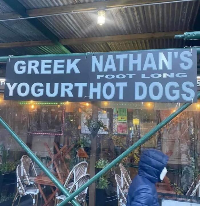
I'm more interested in why he has foot long yogurt hot dogs
Load More Replies...I got weird imagery in my head again but this time i couldn't make sense of it and i'm back at the jizz fest image....ahhhhh i need to get off this page..haha
Bad kerning is so common that graphic designers even have a name for it: keming (which looks like kerning has itself suffered from bad kerning).
If there were hard and fast rules around kerning, every font would automatically generate perfectly kerned character pairs. But because kerning is in many ways a subjective pursuit, the only thing anyone can say with certainty is that kerning is bad if it renders something unreadable.
This leaves a lot of (or a little) space for interpretation.
I was looking at this and thought somebody stole the 'H' and couldn't figure out why the 'G' had moved. Then I remembered.... Americans.
i didn't approve of that spelling. i like the right way better.
Load More Replies...I honestly cannot figure this one out - and as a language teacher I am used to some next-level spelling mistakes. Help?
What're you looking at, you giant Yorkshire pork!
Load More Replies...Sounds like someone wanted to provide a substitute for the vegetarians at dinner, and failed miserably.
Load More Replies..."Pudding Turkey" is another great band name! Opening for Meat Shenanigans!
Hi it's a whole roast in a giant Yorkshire pudding and you can choose what roast meats you want
So which is it? The French Department or a brave artist sharing intimate secrets?
I mean, they are French after all... And to make it even more on the nose, you could place a cat on the "R" before you take the picture (for the three people who know their French slang who are going to read this)
If those are the two options ~ either “I Love the French Department” or “I Love to Lick” ~ why is this even a huge sign in a park?
Not every project requires kerning by hand, but there are some instances when it may be better off if you give special time and attention to this detail:
One of my favorite Muppet routines. "I don't use SHAMpoo; I only use real poo. Only the best poo for my wigs."
Load More Replies...Pls tell me I'm not the only one who thought the bottom half of the bottle was chopped off
If you replace the watermelon with an o it says wateormelon, if u say it right like waht-eeyo-melon it sounds like water your melon lol
I read "font white" and assumed they'd just printed the instructions instead
Is it weird that I thought the artist misspelled "underrated"?
Load More Replies...I hate these signs that split words. They are just awful
"If you’re not a designer, it’s not something you think about," DeCotes said. "People don’t realize anytime they see giant text, whether it’s on a poster, a billboard, or a website, headline fonts have probably been thoughtfully kerned.”
Assuming it's been executed well, of course!
It says 'alignment' but they had to split the word because of the window size
Ahhhh, that's why my stuff ain't straight (no jokes please) can't even al ign what THEY do.
Has indicates one event in the past tense; is indicates a permanent state. Like "he has learned" is an event, but "he is learned" = a learned / educated person.
Load More Replies...I serve a trisen Savior He's in the world today. I know that He is tliving, Whatever men may tsay.
I thought he was Jesus....but from now on I will tell my Tristen friends to worship Trisen instead
I think a Tristen would be someone who worships Trist. So tell them to enjoy a trist. lol
Load More Replies...now i need to make a friend named Trisen just to give this to them
Telemedicine advertisement? I can only assume the company is named "Rush".
Load More Replies...It's Orush because go time. Obvious when you think about it, really... 🤔😬
Did this restaurant have a longer name and sell to new owners but the previous said please change the name so they just took letters out of it so they didn't have to buy new signage?
It has that radical S that everyone used to draw in their notebooks back when I was a kid.
Load More Replies...You can tell it's cool because they're using that thing all the cool kids drew when they were in high school, because nothing says cool like pop culture icons from 30 years ago. Cool.
First, marry me! Second, I didn’t know this was a thing until like ten years ago, and that was only because of websites like this. Was it a suburban thing? Edit: graduated high school in 98
Load More Replies...Pretty sure you did NOT find this in Georgia... It's French. Also the labels on the shelves are written in yet another language.
"shampooing" is the French word for "shampoo"--it is pronounced "shampwang"
It's soft and it's eggy or almondy, frequent usage, number one and two, or all types of horses - not really, chevaux versus cheveux, but it's still funny.😉
If they had left the spaces in, they would have had to adjust the kerning and page breaks just to be able to fit in the same space. (Possibly even the font size.)
Load More Replies...welcome to class we have death stare darcie didnt sleep sara jealous judie not cool carl crazy eye elina totally a kid kylie and nervous nancie and her sidekick even nervous neil ( there scaring me)
I think they're Bitmoji? They're very similar if not
Load More Replies...Workingtogetherto empower studentsto become successful lif elong learners.
I'm sure they're assisting their students with this example of writing.
On the letter spacing fails list? It fits the prompt, it's just not funny.
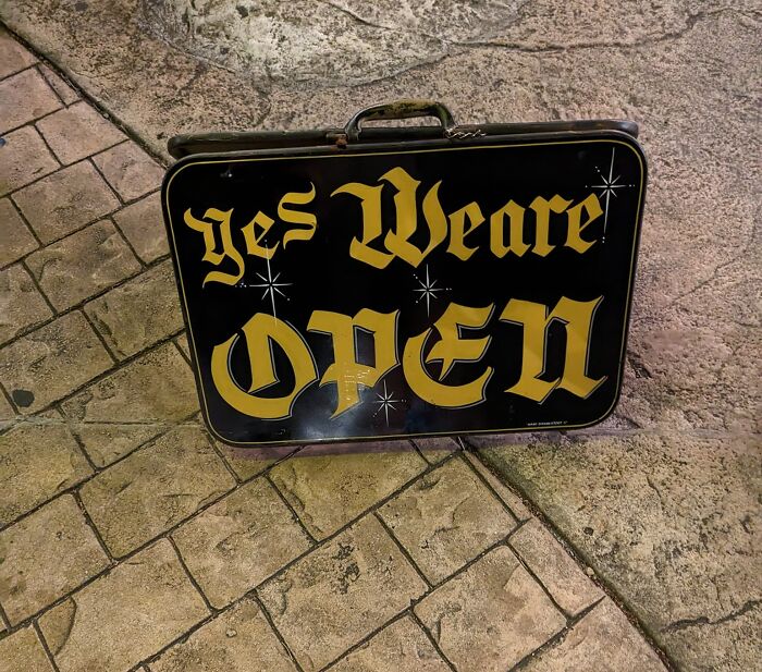
Load More Replies...I'm reading "Yesweare" in Mr. Humphries' voice and it's quite satisfying
This happens when people are not sure if there is supposed to be an apostrophe before the S, so they leave a gap just in case, to please both sides of the argument.
M W .... It's the lack of slant, I think, that makes the two distinguishable, regardless of upsidedown or right side up.
Load More Replies...If you read it the other way, it says "MO 75"... Don't ask me why I commented this.
what happen was:guy forgot the w stencil and used the M stencil. then went: Finished the sign boss.
It's french and english. It's a requirement of products sold in Canada. But the spacing/kernel is a little out of whack
"croustilles" means "chips' in French. In Canada, packaging includes French and English languages.
No spaces between you are and my, but it's still legible so doesn't belong here.
Load More Replies...That’s how my mother used to describe me as a child
Load More Replies...I kinda understand this one, although it looks strange. I used to have a greasy spoon cafe, on my road. It shut at 5pm and after that they rented it out to a Thai family, who sold Thai food. It's a clever way to reduce rent. That place would be packed in the evenings as it was low-priced, proper Thai, family food. Damn, I miss that place!
Maybe his twin brother works on Fantasy Island. Tattoo. "De plane! De plane! Here come de plane, boss!"
Ben Jamin........I want Ben Jamin with you.........Ben Jamin.......Jamin.......And I hope you're Ben Jamin too
From what I’ve read about Ben Franklin, he was “jamin” back in the 18th century, so I have no doubt he would STILL be “jamin” if he was alive today.
Load More Replies...I bet it cost £50m and was paid to the chancellors brothers company.
Load More Replies...Orks have taken over New York! Heresy! Ready up brother! Purge the filth! XD
It says "Church of God Youth Halls" and that H is capitalised. You can see the 4 ornate capitalised letter clearly.
Load More Replies...I’ve heard they do some crazy s**t up there in those northern cabins in the middle of winter😂
This is where you're only typing with two fingers, but sometimes you hold the key down while searching for the next letter.
I read this as smeeeells finer than the fineeeeest fragrrrrrances lmao
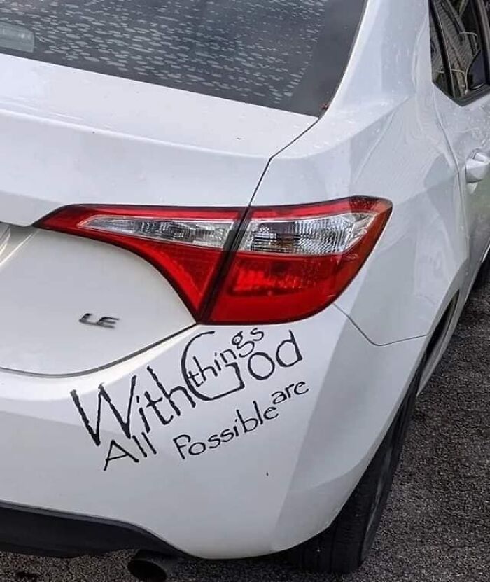
Except for creating a coherent sentence on a bumper sticker, apparently.
Did they give one piece each to the neighborhood kids and tell them to go "put them on the corner of the car closest seat to th Ega rAg e?"
Papyrus and, oddly enough, the font the band Lamb of God uses. The only good thing going for this shite lettering job.
Sadly, a lot of programs won't let you adjust the kerning of just one letter, so you have to pick better fonts.
In English, it means: a long, narrow, deep inlet of the sea between high cliffs, as in Norway, typically formed by submergence of a glaciated valley.
Load More Replies...Once you see it can never be unseen. Also, the arrow in the FedEx logo.
Apparently there is still time to fix it😂 (edit: my bad, typical American assuming it meant August and not April. God we are self centered!)
Idk... I grew up in said country and still can't, for the life of me, figure out why we're using a long past dead dudes foot for a system of measurement.....
Load More Replies...You can even see that it would be centred over the windows, as the T overhangs to the left, and the 'i a' will overhang to the right.
Load More Replies...Something about H pointing at the space after an F.... what did I miss?
So many of these are not kerning issues. Words out of order is not an example of bad kerning. Same for spelling errors or hard to read fonts. Really frustrating since the writer took the time to explain what kerning is, and then proceeded to give us a list that mostly has nothing to do with it.
I feel like that's most BP posts. The title and purpose are completely skewed by at least the third one down. I just try not to think about it, too much, and enjoy the funny posts. :/
Load More Replies...There is a hashtag for college sports team in Colorado (Thunderwolves) that is #Gothunderwolves. I know it is supposed to be “go thunderwolves” but it can also be read as “goth under wolves “ making it seem like twilight themed smut. It’s more of a phrasing error than a kerning error though.


 No fees, cancel anytime


 vs. I Love Lécher (To Lick)")


")
")