ADVERTISEMENT

Ever wondered which US states are the best and worst in terms of people's well-being? Or the European regions with the most significant number of willing organ donors? 

These may not be the questions you ask yourself daily, but these bits of information, at the very least, help us better understand the different regions of the world. This refreshing approach to geography is thanks to a massive and still-growing subreddit that features maps from around the globe. 

It’s always nice to learn something new, and scrolling through this list may do just that for you today.

#1

Map Of India, Hand-Drawn With Pen And Ink By Myself In The Style Of Tolkien's Fold-Out Maps

Detailed informative map of India showing geographical features and neighboring countries, held by a smiling man outdoors.

NACHODYNAMYTE Report

RELATED:
    #2

    A Logarithmic Map Of The Entire Observable Universe

    Informative cosmic map showing galaxies, star clusters, planets, and space objects that might change your perspective on our world.

    1Rab Report

    #3

    Map Of The Ocean Floors, As Published By National Geographic (1967 - 1971)

    Three detailed ocean floor maps showing Atlantic, Pacific, and Indian Ocean features from informative maps collection.

    Milhaud Report

    Many of you likely clicked on this article for the interesting trivia, so here are a few more. Did you know that the tallest mountain in the world isn’t Mount Everest?

    It is actually Hawaii’s Mauna Kea, which stands 33,500 feet (10,210 meters) above sea level when measured from the seafloor. It is technically taller by 4,471 feet, but since measurements are done above sea level, its official height is 13,796 (4,205 meters). Mount Everest stands at 29,029 feet (8,848 meters).

    ADVERTISEMENT
    #4

    Map Of (Almost) Every Bus Route In The UK And Ireland

    Colorful detailed map of the United Kingdom and Ireland highlighting intricate transport and road networks shared in informative maps.

    verum1gnis Report

    Elmo
    Community Member
    2 months ago Created by potrace 1.15, written by Peter Selinger 2001-2017

    No joke I think I see my London one

    View more comments
    #5

    Indonesia Laid Out Over Russia

    Map highlighting world regions in pink and green, showcasing informative maps that might change perspectives on our world.

    JoeFalchetto Report

    #6

    All The Roads In Canada (Posted By Col. Chris Hadfield On Fb)

    Canada map showing population density and connectivity patterns in an informative maps perspective on our world.

    nthensome Report

    Pedantic Panda
    Community Member
    2 months ago Created by potrace 1.15, written by Peter Selinger 2001-2017

    Maybe doc and marty were going to northern Canada?

    View more comments

    The Vatican may be referred to as a city, but it is actually the country in the world. It became a sovereign state in 1929 and is approximately one-eighth the size of NYC’s Central Park, with a total area of around 0.17 square miles (0.49 square kilometers). 

    ADVERTISEMENT

    As of 2025, the population in the Vatican is 764. It is also one of the last two countries (along with the Philippines) where divorce is illegal.

    #7

    The Most Common Occupational Related Surnames In Europe

    Map showing the most common occupational surnames in Europe highlighting regional surname patterns and professions.

    vladgrinch Report

    Jihana
    Community Member
    2 months ago Created by potrace 1.15, written by Peter Selinger 2001-2017

    Sea warrior! Ireland's going metal here. 😂

    View more comments
    #8

    Africa Is Humongous

    Map illustrating the true size of Africa compared with countries, a key informative map that changes perspective on our world.

    GamingDisruptor Report

    Rali Meyer
    Community Member
    2 months ago Created by potrace 1.15, written by Peter Selinger 2001-2017

    greetings from South Africa, which is a country!

    View more comments
    ADVERTISEMENT
    #9

    Great Wall Of South America

    3D informative map of South America showing elevation changes with Andes mountains highlighted, enhancing world perspective.

    Dry-Let-7718 Report

    Max Robitzsch
    Community Member
    2 months ago Created by potrace 1.15, written by Peter Selinger 2001-2017

    Needs info about the vertical exaggeration factor,

    View more comments

    Los Angeles, as we all know it today, had a much longer name. Back in its founding in 1781, the “City of Angels” was called “El Pueblo de Nuestra Señora la Reina de los Ángeles de Porciúncula.” 

    ADVERTISEMENT

    In English, it means “The Town of Our Lady the Queen of the Angels of Porciúncula.” Los Angeles became the city’s official name in 1850, which became much easier to say.

    #10

    Australia Mapped By Its 1.3 Million Rivers, Streams, Tributaries

    Detailed informative map of Australia showing rivers and water systems, highlighting geographic features that may change perspectives on our world.

    BufordTeeJustice Report

    Tucker Cahooter
    Community Member
    2 months ago Created by potrace 1.15, written by Peter Selinger 2001-2017

    To be honest, I live there and didn't know there were that many. Mind you they might not always have water in them (e.g. the Todd River, where they hold a "regatta" on the dry river bed, unless it actually has water in it!)

    View more comments
    #11

    Range Of European Bison (2020)

    Map highlighting crucifixion sites in Europe with informative maps that might change your perspective on our world.

    DistrictThen103 Report

    Jihana
    Community Member
    2 months ago Created by potrace 1.15, written by Peter Selinger 2001-2017

    It looks sad, but only a few decades ago they were extinct in the wild, with only 54 remaining in captivity. Now there are over 9100, around 7000 in the wild.

    View more comments
    #12

    The World Divided In 2 Equal Parts Of Population

    World population divided into two equal parts shown on an informative map highlighting global distribution of 4 billion people each.

    Twunkorama Report

    Max Robitzsch
    Community Member
    2 months ago Created by potrace 1.15, written by Peter Selinger 2001-2017

    A reminder why they went for the one-child policy in the first place, I guess, even though some of the results are now starting to cause them real head-aches.

    View more comments

    Global franchises like McDonald’s and Starbucks are both American-born, which makes it easy to assume that every corner in the country has at least one branch. However, there is actually one city where neither of these two franchises is present. 

    ADVERTISEMENT

    That place is the city of Montpelier, the capital of the state of Vermont. It is also the smallest US capital.

    #13

    Soil Quality In Europe

    Soil quality map of Europe with color-coded informative maps showing poor to very good soil ratings.

    vladgrinch Report

    Max Robitzsch
    Community Member
    2 months ago Created by potrace 1.15, written by Peter Selinger 2001-2017

    "Well, that's why we HAD to go shopping in Lindisfarne.' - Middle Ages Norwegian.

    View more comments
    #14

    Europe’s Metal Powerhouses

    Map showing the number of metal bands per million inhabitants in European countries with color-coded ranges.

    vladgrinch Report

    #15

    Aldi Equator In Germany

    Map showing Aldi store distribution divided by Aldi Nord and Aldi Süd regions in Germany, an informative map changing global perspective.

    Public_Research2690 Report

    Jihana
    Community Member
    2 months ago Created by potrace 1.15, written by Peter Selinger 2001-2017

    Aldi was founded by two brothers who didn't get along, so they split the company in Aldi North and Aldi South.

    View more comments

    There was a time in history when Canada’s population was smaller than that of California. In 2016, Canada reached a population of 36 million, a first in the country’s history. Meanwhile, California’s population at the time was 38.9 million. 

    Canada has since surpassed “The Golden State” in terms of residents, as recent statistics reveal an estimated population of over 40 million. California’s current estimated population, on the other hand, is 39.6 million.

    #16

    Countries Where Dinosaur Fossils Have Been Found

    World map highlighting countries where dinosaur fossils were found, part of informative maps changing perspective on our world.

    Calm_Astronomer3884 Report

    Mir Adwari
    Community Member
    2 months ago Created by potrace 1.15, written by Peter Selinger 2001-2017

    My village in South East England had an Iguanodon fossilised in clay.

    View more comments
    #17

    This Area Has Produced Every Waterpolo Olympic Champion Since 2000

    Map highlighting key locations in Central Europe, illustrating informative maps that offer new perspectives on our world.

    cooliocoe Report

    oktopus
    Community Member
    2 months ago Created by potrace 1.15, written by Peter Selinger 2001-2017

    Getting the horses in the pool takes special skills.

    View more comments
    #18

    The Red Area Is Home To Around 60% Of Icelanders, Despite Covering Just 1% Of The Land

    Map highlighting a specific region in Iceland, part of informative maps that offer new perspectives on our world.

    vladgrinch Report

    #19

    Countries Not Self Identified As Democratic

    Map highlighting countries not self-identified as democratic, featuring Afghanistan, Oman, Saudi Arabia, and more.

    vladgrinch Report

    Multa Nocte
    Community Member
    2 months ago Created by potrace 1.15, written by Peter Selinger 2001-2017

    I think there's another one that needs to be mentioned here . . . .

    View more comments
    #20

    Norway Overlaid On The Us

    Map showing Norway's size compared to the eastern United States, highlighting cities in both regions for perspective.

    plaev Report

    #21

    This Is What Google Maps Looked Like On Launch Day In 2005

    Google Maps interface showing a detailed map of the eastern United States and surrounding areas with state abbreviations.

    Mackelowsky Report

    Multa Nocte
    Community Member
    2 months ago Created by potrace 1.15, written by Peter Selinger 2001-2017

    Back in the olden days when it was "the Gulf of Mexico."

    View more comments
    #22

    Percent Of People Over 25 Who Have Completed High School In The Us

    US map showing high school completion rates by county for people aged 25 and over, informative map with educational data perspective

    vladgrinch Report

    Multa Nocte
    Community Member
    2 months ago Created by potrace 1.15, written by Peter Selinger 2001-2017

    It's amazing that all 10 people who live in Wyoming appear to have completed high school. Congratulations!

    View more comments
    #23

    The Roman Empire At His Peak 117 A.d

    Ancient Roman Empire territory map showing regions across Europe, North Africa, and the Middle East with detailed labels.

    summus_rex_etruriae Report

    #24

    Mobile Screen Time In Hours Per Day (2024)

    Mobile screen time hours per day in Europe map for 2024, showing regional variations with higher usage in Eastern countries.

    vladgrinch Report

    Multa Nocte
    Community Member
    2 months ago Created by potrace 1.15, written by Peter Selinger 2001-2017

    Interesting: "Americans spend an average of 5 hours and 16 minutes per day on their phones – a 14% increase from the 4 hours and 37 minutes people reported spending on their phones in 2024."

    View more comments
    #25

    Map Of The Distribution Of Ugric Languages

    Map highlighting historical regions in Europe and Russia, showcasing informative maps that change perspectives on the world.

    Grasshorse500 Report

    Toothless Feline
    Community Member
    2 months ago Created by potrace 1.15, written by Peter Selinger 2001-2017

    Interesting that the two main pockets are so widely separated.

    View more comments
    #26

    How Rich Is Bavaria Compared To The Rest Of Europe?

    Map showing European regions with higher or lower GDP per capita than Bavaria, highlighting economic differences in informative maps.

    vladgrinch Report

    #27

    Percentage Of People Optimistic About The Future Of The Eu

    Map showing the percentage of people optimistic about the future of the EU across European countries in 2023.

    Alarmed_Wish3294 Report

    michael Chock
    Community Member
    2 months ago Created by potrace 1.15, written by Peter Selinger 2001-2017

    French are allergic to Optimism and Greece knows they are pulling everyone else down, so no surprises.

    View more comments
    #28

    Dog Ownership In Europe

    Map of dog ownership percentages across European households shown with varying shades of green, highlighting informative maps on perspective.

    Mindful-Commander Report

    Toothless Feline
    Community Member
    2 months ago Created by potrace 1.15, written by Peter Selinger 2001-2017

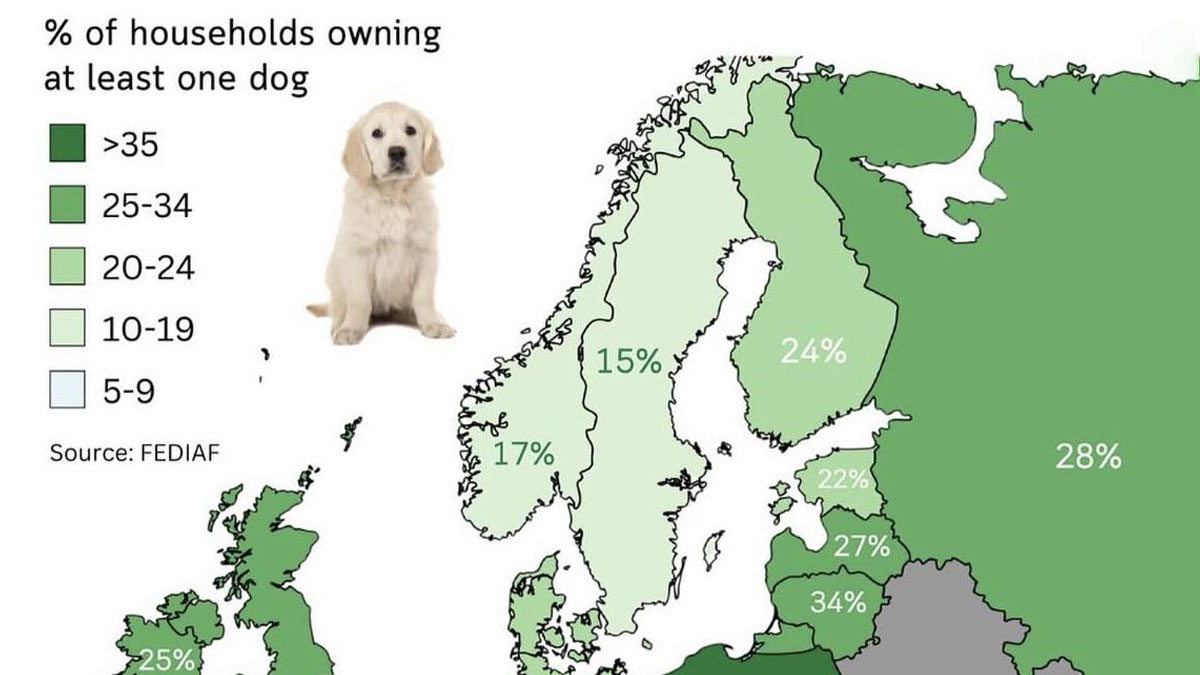
    Do Turks really not like dogs, or is there a more reasonable explanation for the low rate there?

    View more comments
    #29

    Share Of Cars Registered In 2024 In Europe That Are Full Electric

    Map showing the share of fully electric cars registered in European countries in 2024 with data visualization.

    Alarmed_Wish3294 Report

    Fransanchez
    Community Member
    2 months ago Created by potrace 1.15, written by Peter Selinger 2001-2017

    I'm not so convinced electric cars are the future, once the battery is rendered useless, and let's be honest, it will sooner or later, it is really hard to recycle/dispose of them. Not saying petrol is good, but electric is not the holy grail people things it is xx

    View more comments
    #30

    The Collapse Of The Soviet Union : Most Countries Declared Their Independence In 1991

    Informative map showing countries' independence dates during the collapse of the Soviet Union in 1991.

    vladgrinch Report

    #31

    Europe 21,000 Years Ago, During The Last Ice Age

    Map showing the Last Glacial Maximum paleoenvironment of Europe with climate zones and ice sheet coverage.

    Utturkce249 Report

    Jihana
    Community Member
    2 months ago Created by potrace 1.15, written by Peter Selinger 2001-2017

    That's a plus sized boot you have there Italy.

    View more comments
    #32

    Share And Number Of Foreign-Born Population In Western European Countries

    Map showing share and number of foreign-born population in Western European countries with percentages and total migrants.

    vladgrinch Report

    Ilan Elron
    Community Member
    1 month ago Created by potrace 1.15, written by Peter Selinger 2001-2017

    interesting, but iffy w/o mentioning year data was collected

    #33

    Annual Precipitation In Germany In 2024

    Informative map showing rainfall distribution across Germany with varying precipitation levels in millimeters.

    ExternalMethod6825 Report

    Ace
    Community Member
    2 months ago Created by potrace 1.15, written by Peter Selinger 2001-2017

    Correlates almost exactly with areas of forest.

    View more comments
    #34

    Map Of European Territories By The Number Of Years Spent Being Part Of France

    Map of European territories shaded by the number of years under French rule, showing historical influence and informative maps perspective.

    vladgrinch Report

    Historyherstory (old guy)
    Community Member
    2 months ago Created by potrace 1.15, written by Peter Selinger 2001-2017

    Does this take into account Napoleanic France where Nappy placed family on European thrones? Need clarity from our resident historians

    View more comments
    #35

    What Africa Might Look Like In 10 Million Years

    Satellite view of Africa highlighting its geographic features in an informative map that offers a new world perspective.

    vladgrinch Report

    #36

    How The Seasons Affect Iraq’s Greenery Over The Months

    Satellite maps showing monthly landscape changes across Iraq in 2019, highlighting seasonal variations and environmental patterns.

    Assyrian_Nation Report

    #37

    The Woolly & Columbian Mammoth's Range At Their Peak

    Map showing the range of woolly and Columbian mammoths at their peak in a detailed informative map perspective.

    Simple_Pension_1330 Report

    Auntriarch
    Community Member
    2 months ago Created by potrace 1.15, written by Peter Selinger 2001-2017

    I didn't even know there was a Colombian mammoth

    View more comments
    #38

    Who Wants To Join The Eu?

    Map showing support across Europe for EU accession, illustrating percentages of populations in favor by country.

    vladgrinch Report

    Owen
    Community Member
    2 months ago Created by potrace 1.15, written by Peter Selinger 2001-2017

    As a British man, I strongly believe we should never have left the EU. Apes stronger together.

    View more comments
    #39

    Alphabets Of The Balkans

    Map showing alphabets of the Balkans region with Latin, Cyrillic, Greek, Glagolitic, Rovás, and Elbasan scripts.

    vladgrinch Report

    #40

    Polish–lithuanian Commonwealth At Its Maximum Extent Over Modern Borders

    Map highlighting Eastern European countries including Poland, Belarus, Ukraine, Lithuania, Latvia, and Estonia in red.

    vladgrinch Report

    Ace
    Community Member
    2 months ago Created by potrace 1.15, written by Peter Selinger 2001-2017

    Between 1569 and 1795, apparently. I had no idea.

    View more comments
    #41

    Predominant Languages In Switzerland By Area And Share Of Speakers

    Map of Switzerland showing predominant languages by area and share of speakers with German, French, Italian, and Romansh population data.

    vladgrinch Report

    oktopus
    Community Member
    2 months ago Created by potrace 1.15, written by Peter Selinger 2001-2017

    And the "German" (Schwizerdütsch) is so German that German TV will add German subtitles if Swiss Germans speakers are speaking.

    View more comments
    #42

    East German Map Of Berlin, 1988 - West Berlin Is Missing, As It Wasn't Part Of The German Democratic Republic

    Vintage map showing Berlin and surrounding areas with detailed roads, borders, and landmarks in an informative map style.

    biwook Report

    Na Schi
    Community Member
    2 months ago (edited) Created by potrace 1.15, written by Peter Selinger 2001-2017

    This is what it means to live in an unfree country. You can't display West-Berlin because then people might get an idea of the roads/infrastructure which they then use to flee their country (edit: which was Eastern Germany - the Deutsche Demokratische Republik).

    View more comments
    #43

    Best And Worst Us States By Overall Well-Being

    US map showing best and worst states in well-being based on health, socio-economic, and environmental factors in 2024 rankings.

    _crazyboyhere_ Report

    Maartje
    Community Member
    2 months ago Created by potrace 1.15, written by Peter Selinger 2001-2017

    OMG how can you even read this when everything gets censored? In addition, I am just guessing that the more blue a state is, the better it is?

    View more comments
    #44

    Who Should Join The Eu Next?

    Map showing the share of EU residents supporting accession of candidate countries to the Union in an informative world map.

    vladgrinch Report

    WindySwede
    Community Member
    2 months ago Created by potrace 1.15, written by Peter Selinger 2001-2017

    How about the UK, now they have seen the other side?

    View more comments
    #45

    Willingness To Donate An Organ After Death In Europe

    Map showing percentages of Europeans willing to donate organs after death, highlighting key statistics in informative maps perspective.

    Alarmed_Wish3294 Report

    Toothless Feline
    Community Member
    2 months ago Created by potrace 1.15, written by Peter Selinger 2001-2017

    Now I really wonder what Latvians have against organ donation compared to Estonians and Lithuanians.

    View more comments
    #46

    Some Of The Many Languages Spoken In Mexico

    Informative maps showing the percentage of German, Spanish, Yucatec Maya, and French speakers across Mexico.

    Simple_Pension_1330 Report

    #47

    Metro Areas In The USA Where More Than 5% Of Population Uses Public Transit To Get To Work

    Map showing metro areas in the USA where more than 5% of the population uses public transit to get to work.

    Simple_Pension_1330 Report

    Maartje
    Community Member
    2 months ago Created by potrace 1.15, written by Peter Selinger 2001-2017

    May have something to do with the lack of quality public transportation.

    View more comments
    #48

    Bougainville, Soon To Be The Newest Nation In The World On September 2027

    Map of the Autonomous Region of Bougainville highlighted in red, illustrating an informative perspective on world regions.

    APrimitiveMartian Report

    Tim Douglass
    Community Member
    2 months ago Created by potrace 1.15, written by Peter Selinger 2001-2017

    A great-uncle of mine "vacationed" there in 1943-44 with the Seabees.

    View more comments
    #49

    Does Google Maps Consider Your Country To Have A Fixed Border?

    World map showing countries with fixed borders in green and those without fixed borders in red, informative maps perspective.

    ReindeerAvailable575 Report

    FreeDragon
    Community Member
    2 months ago Created by potrace 1.15, written by Peter Selinger 2001-2017

    Spain does not have a fixed border? What does that even mean?

    View more comments
    #50

    [oc] Approximation Of India's Continental Divide

    Satellite map of India showing the continental divide with river drainage directions, an informative map on world geography.

    pm_me_your_target Report

    #51

    The Global Spread Of The Practice Of Ululation

    World map showing cultural practices by majority, indigenous minorities, and historically attested regions in informative maps.

    R120Tunisia Report

    Charlie the Cat
    Community Member
    2 months ago Created by potrace 1.15, written by Peter Selinger 2001-2017

    Had to Google this. Ululation from Latin ululo, trilling or lele, is a long, wavering, high-pitched vocal sound resembling a howl with a trilling quality. It is produced by emitting a high pitched loud voice accompanied with a rapid back and forth movement of the tongue and the uvula.

    View more comments
    #52

    The Kakhovka Reservoir Then And Now

    Satellite images of Kakhovka Reservoir drying up, shown in two maps dated June 5 and June 20, illustrating environmental change.

    SummerAlternative699 Report

    Corwin 02
    Community Member
    2 months ago Created by potrace 1.15, written by Peter Selinger 2001-2017

    The Kakhovka Reservoir was drained due to the catastrophic destruction of the Kakhovka Dam on June 6, 2023. So guess who we have to blame for this one , looking at you Russia !

    View more comments
    See Also on Bored Panda
    #53

    Topographic Map Of Ukraine

    Topographic map of Ukraine showing elevation changes, rivers, and key cities as an informative map perspective on our world.

    vladgrinch Report

    #54

    Muslim Majority Regions In The Balkans

    Informative map showing regions of Greek language speakers across Southeast Europe and western Turkey.

    vladgrinch Report

    Sofia
    Community Member
    2 months ago

    This comment has been deleted.

    View more comments
    #55

    Aldi Nord vs. Aldi Sud

    Map showing Aldi Nord vs Aldi Süd store locations around the world, highlighting differences in presence across countries.

    vladgrinch Report

    #56

    Percentage Of Population Paying Income Tax [2024]

    Map showing the percentage of population paying income tax in several countries including Canada, France, and Germany.

    Mundane-Laugh8562 Report

    Michael Largey
    Community Member
    2 months ago Created by potrace 1.15, written by Peter Selinger 2001-2017

    In countries such as the US, those not paying any income tax includes some of the wealthiest.

    View more comments
    #57

    Average European Internet Speed By Country In 2024

    Map showing average internet speed in Mbps across Europe in 2024, highlighting fastest and slowest countries.

    vladgrinch Report

    Jihana
    Community Member
    2 months ago Created by potrace 1.15, written by Peter Selinger 2001-2017

    Germany complaining about it while having one of the fastest is very on brand.

    View more comments
    #58

    Germany's Economy Equals All Of These Countries Combined (2024)

    Map showing Germany's economy compared to combined GDP of multiple European countries in blue for informative maps perspective.

    vladgrinch Report

    Toothless Feline
    Community Member
    2 months ago Created by potrace 1.15, written by Peter Selinger 2001-2017

    Okay, we get it. Germany is the economic powerhouse of Europe.

    View more comments
    #59

    Density Of Pig Farms Across Europe

    Map of Europe showing population density with black dots on a yellow background, an informative map changing perspective.

    vladgrinch Report

    #60

    Map Of Arabic Language Expansion Between 540 And 2022

    Maps showing changes in Arabic-speaking populations with Arabic majority and significant speakers highlighted.

    vladgrinch Report

    Corwin 02
    Community Member
    2 months ago Created by potrace 1.15, written by Peter Selinger 2001-2017

    It is a bit skewed because somebody from Algeria will not understand somebody form Saudi Arabia , they may write the same , like the Chinese but have vastly different pronounciations

    #61

    China's Economy Is Bigger Than The Combined Economies Of All The Asian Countries In Red

    Map showing China’s economy compared to combined GDP of several Asian countries in an informative map about world economics.

    vladgrinch Report

    Rich Black
    Community Member
    1 month ago Created by potrace 1.15, written by Peter Selinger 2001-2017

    this map is sponsored and approved by the People's Republic of Communist China.

    View more comments
    #62

    Despite The Housing Shortage, In 85% Of San Francisco Bay Area, It Is Illegal To Build Anything Aside From Single Family Houses

    Map showing Bay Area zoning with single family residential areas highlighted, an informative map changing world perspective.

    Mongooooooose Report

    See Also on Bored Panda
    #63

    The Biggest Empires In History

    Map showing the peak territories of the largest empires in history with British Empire and Mongol Empire highlighted.

    HolyTamrah Report

    Ace
    Community Member
    2 months ago Created by potrace 1.15, written by Peter Selinger 2001-2017

    Fascinating look at the British empire over time for anyone interested. https://www.openculture.com/2018/05/watch-rise-fall-british-empire-animated-time-lapse-map-519-b-c-2014-d.html

    View more comments
    #64

    The Largest European Ports In Terms Of Annual Cargo Tonnage (In Millions Of Tons)

    Map of busiest European shipping ports by annual cargo tonnage, highlighting key global trade gateways and port sizes.

    vladgrinch Report

    #65

    Nunavut Is The Largest Electoral District On Earth (8 Times Larger Than The UK)

    Map of Nunavut and surrounding Canadian territories showing Arctic Ocean and major bays, part of informative maps collection.

    vladgrinch Report

    Greg Hedley
    Community Member
    1 month ago Created by potrace 1.15, written by Peter Selinger 2001-2017

    The electorate of Durack in West Australia is 1,480,000 sq km. With 8500 people..

    View more comments
    #66

    Change Of The Amount Of Jewish People Compared To Pre-Ww2 (Europe)

    Map showing change in the amount of Jewish people in Europe compared to pre-WW2 with increases and decreases highlighted.

    Wise_Ad8474 Report

    #67

    Treaty Of Alcáçovas, The World's First Colonial Partition Treaty

    Map showing the Treaty of Alcáçovas division in 1479, illustrating early world territories and historical borders.

    FairyCelebi Report

    Max Robitzsch
    Community Member
    2 months ago Created by potrace 1.15, written by Peter Selinger 2001-2017

    That screams "accept it or else". Someone was feeling big in their britches, then.

    View more comments
    #68

    Parts Of Antarctica Claimed By Countries

    Pie chart map showing territorial claims in Antarctica by countries including United Kingdom, Norway, Australia, and others in informative maps.

    JulioFranz Report

    RedHairedDragon
    Community Member
    2 months ago Created by potrace 1.15, written by Peter Selinger 2001-2017

    I'll take the unclaimed bit. Feel free to take walks through it and have picnics, but please clean up after you.

    View more comments
    #69

    Official Map Of The Argentine Republic

    Map of Argentina and Antarctic territorial claims with detailed provincial and maritime boundaries for informative maps perspective.

    Argentinotriste Report

    #70

    What Americans Call Shopping Carts

    Map showing regional terms used for wheeled grocery carriers in the US with color-coded results from 10,705 respondents.

    cookoutenthusiast Report

    Multa Nocte
    Community Member
    2 months ago Created by potrace 1.15, written by Peter Selinger 2001-2017

    When I was a child and lived in Pennsylvania/Maryland we called it a "buggy." Moved to Utah and it was a "cart." Now that I am in France, the British people I know call them "trolleys."

    View more comments
    #71

    Rank Of Volkswagen In Car Sales, Europe, 2024

    Map showing the rank of Volkswagen in car sales across Europe in 2024, highlighting regional differences in popularity.

    Alarmed_Wish3294 Report

    #72

    Homophobia Around The World

    World map showing homophobia levels by country in 2024, using color-coded percentages in an informative map perspective.

    _crazyboyhere_ Report

    Stardust she/her
    Community Member
    2 months ago Created by potrace 1.15, written by Peter Selinger 2001-2017

    Living in India as someone who’s bi, it’s really hard since people keep making super offensive jokes at my expense and others have the audacity to tell me my own identity as if I haven’t gone through years of self discovery. My family thinks I’m straight and confused and make faces whenever they mention any potential future partners of mine while my friends on the other hand call me gay as according to them being gay or bi means the same thing

    View more comments
    See Also on Bored Panda
    #74

    Top 3 Languages Taught In Australian School By State Or Territory

    Map showing top 3 languages taught in Australian schools by state with flags indicating each language’s presence across regions.

    vladgrinch Report

    Hugo
    Community Member
    2 months ago Created by potrace 1.15, written by Peter Selinger 2001-2017

    I take it English is not taught anywhere?

    View more comments
    #75

    Identified Settlements In 16th Century Palestine

    Map showing 16th century Palestine settlements with population data and demographics, an informative map changing world perspective.

    mzrvtfni Report

    Ilan Elron
    Community Member
    1 month ago Created by potrace 1.15, written by Peter Selinger 2001-2017

    the Ottomans never did call this place Palestine

    #76

    How Many Spouses Must Attend For A Marriage To Be Valid?

    US map showing spouse attendance requirements for valid marriage with three color codes, an informative map from shared collections.

    vladgrinch Report

    Toothless Feline
    Community Member
    2 months ago Created by potrace 1.15, written by Peter Selinger 2001-2017

    I’d love to know how that works in Montana…

    View more comments
    #77

    Protien Intake vs. Height Above 6ft In India

    Map of India showing average daily protein intake per capita in grams by state, an informative map changing world perspective.

    Soupchow1 Report

    Mreoww
    Community Member
    2 months ago Created by potrace 1.15, written by Peter Selinger 2001-2017

    Oh come on BP, the map about height is missing. Here it is: IMG_0374-6..._700-1.jpg IMG_0374-68df71a731f3c-jpeg__700-1.jpg

    View more comments
    #78

    How Many Electoral Votes Every State Would Gain/Lose If They Were Proportional To Population

    US map showing how many electoral votes each state would gain or lose if based on population, an informative map changing perspectives.

    vladgrinch Report

    Toothless Feline
    Community Member
    2 months ago Created by potrace 1.15, written by Peter Selinger 2001-2017

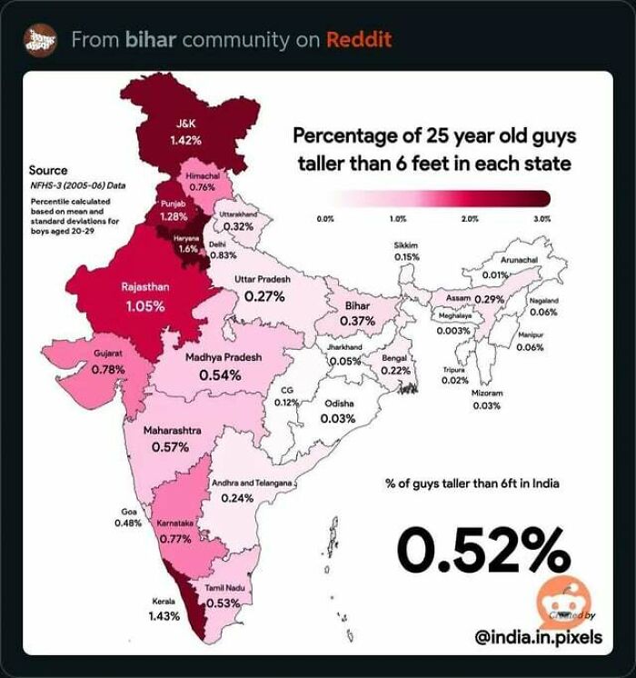
    I question the validity of this map. Every state’s electoral votes is supposed to be proportional to population after you subtract two, because it’s determined by the number of House members plus Senators. The latter is always two, and the former is reapportioned every ten years after the census. For California and Texas to be that far out of proportion would mean that either their populations have grown dramatically since 2020 (unlikely to this degree) or their census numbers are undercounted. I’ll grant that the latter isn’t out of the realm of possibility, as migrant workers are often undercounted, but it’s still a huge discrepancy that demands better documentation than a citation of an organization with the oddball name of “hobbyl0s” and no actual publication or website cited.

    View more comments
    #79

    Country Outside Southeast Asia That Wants To Join Asean

    Map showing ASEAN member states in Southeast Asia and Serbia as a country outside Southeast Asia wanting to join ASEAN.

    vladgrinch Report

    Max Robitzsch
    Community Member
    2 months ago Created by potrace 1.15, written by Peter Selinger 2001-2017

    Look, they just clicked the wrong link, okay?

    View more comments
    #80

    Mexico City Engulfing Lake Texcoco From The 16th Century To 2000

    Series of informative maps showing urban growth changes from the 16th century to 2000, highlighting perspective shifts on our world.

    Old-School8916 Report

    #81

    Largest Religion By District In India

    Map showing largest religion by district in India with Hinduism dominant, highlighting religious distribution in informative maps shared online.

    vladgrinch Report

    #82

    Map Of Heavens-Above.com Visitors, Showing Mirrored Anti-Continents Due To People Inputting Their Coordinates With The Wrong Sign

    World map showing over 100,000 man-made satellite trajectories in red on a dark backdrop, an informative map perspective.

    derekcz Report

    Maartje
    Community Member
    2 months ago Created by potrace 1.15, written by Peter Selinger 2001-2017

    EHm.. today must be my dumb day. What?

    View more comments
    See Also on Bored Panda
    #83

    The Fall Of +38 Calling Code

    Map showing new country calling codes after Yugoslavia dissolved, highlighting changes in informative maps that shift world perspective.

    vladgrinch Report

    Jihana
    Community Member
    2 months ago Created by potrace 1.15, written by Peter Selinger 2001-2017

    In case anybody else is wondering what happened to 384. That was already taken by Ivory Coast.

    View more comments
    #84

    What Americans Call Driving Around In Circles

    Map showing regional terms people use for driving in circles in a car, highlighting informative maps that change perspectives.

    cookoutenthusiast Report

    #85

    Indian States Compared To Countries By Land Area

    Map of India labeled with various countries showing an informative map that might change your perspective on our world.

    SuperYoman100 Report

    Stardust she/her
    Community Member
    2 months ago Created by potrace 1.15, written by Peter Selinger 2001-2017

    Are these countries really that small? Mercator projection at it again

    View more comments
    #86

    How Americans Get To Work

    Map showing the most common means of transportation to work by county across the US, an informative map that changes perspective.

    PowaStrokah Report

    Yrral Spavit
    Community Member
    2 months ago Created by potrace 1.15, written by Peter Selinger 2001-2017

    Have to walk when you haven't got roads or "across town" is 3 minutes.

    #87

    Half Of The World's Rice Is Produced In 2 Countries

    World map highlighting two countries producing 55% of the world's rice, illustrating informative maps on global agriculture.

    vladgrinch Report

    #88

    The Bro Map Of America

    Informative maps showing regional variations in how Americans refer to their bros using terms like bro, buddy, dude, fella, and pal.

    vladgrinch Report

    #89

    Poster Of The 2025 German Bundestag Election Results

    Map showing the 2025 Bundestag election results by constituency and vote distribution across Germany regions.

    Intelligent_Bowl_656 Report

    Toothless Feline
    Community Member
    2 months ago Created by potrace 1.15, written by Peter Selinger 2001-2017

    If CDU-CSU got the most seats, why do they show the fewest in the grid?

    View more comments
    #90

    Eastern Ukraine Exactly One Year Ago vs. Today

    Informative map showing territorial control and cities in eastern Ukraine highlighting conflict zones and regional divisions.

    CreativeStrain89 Report

    #91

    Largest Religion In Each Canadian Electoral Area

    Map showing largest religion per Canadian federal riding with color-coded regions, an informative map that reveals religious distribution.

    MongooseDear8727 Report

    Happy Onion
    Community Member
    2 months ago Created by potrace 1.15, written by Peter Selinger 2001-2017

    Well, now it's easy to find Brampton on a map.

    #92

    Population Density Of The World In A Unique Way

    Heatmap style informative world map with vertical data spikes highlighting population and activity density by region.

    Separate-Box-9181 Report

    See Also on Bored Panda
    #93

    America's Humidity Belt

    Heat map showing average number of summer days with dew point above 65°F across the United States, informative map.

    vladgrinch Report

    Multa Nocte
    Community Member
    2 months ago Created by potrace 1.15, written by Peter Selinger 2001-2017

    I lived in the state of Georgia for a number of years and betcha by golly wow it WAS in fact quite humid, thank you very much.

    View more comments
    #94

    The United Ecoregions Of America

    Colorful informative map showing the ecoregions of America with distinct regions labeled across the United States.

    Bradinator- Report

    #95

    Legal Status Of Conversion Therapy For Minors In The Us

    US map showing legal status of conversion therapy for minors with states color-coded by bans and restrictions as of March 2025.

    Heretostay59 Report

    #96

    Countries With A Lower Gdp Per Capita Than Mississippi

    World map showing countries with lower GDP per capita than Mississippi, highlighting economic comparisons in informative maps.

    vladgrinch Report

    Toothless Feline
    Community Member
    2 months ago Created by potrace 1.15, written by Peter Selinger 2001-2017

    And Mississippi is one of the more impoverished states in the US. That puts the state of the global economy in better perspective.

    View more comments
    #97

    Chinese American Population By County, 1870

    Map showing Chinese population percentage by county in the 1870 US census with color-coded informative data.

    RedHeadedSicilian52 Report

    #98

    Most Common Ethnicity Of White Americans By County

    Map showing the most common ethnicity of White Americans by county, an informative map changing world perspective.

    _Giulio_Cesare Report

    Toothless Feline
    Community Member
    2 months ago Created by potrace 1.15, written by Peter Selinger 2001-2017

    What’s the story about that one Dutch county in Iowa?

    View more comments
    #99

    Fort Wayne, In - Centrality To Major Cities

    Map showing distances from Fort Wayne, Indiana, to nearby cities including Milwaukee, Chicago, and Cleveland, part of informative maps.

    sarnobat Report

    Michael Largey
    Community Member
    2 months ago Created by potrace 1.15, written by Peter Selinger 2001-2017

    What this shows is how handy it is to leave Fort Wayne. I would strongly recommend it.

    View more comments
    #100

    White American Population 1790-2020 (Swipe)

    Map of the United States in 1860 showing population distribution with color-coded percentage ranges for informative maps.

    CombinationTime8064 Report

    Toothless Feline
    Community Member
    2 months ago Created by potrace 1.15, written by Peter Selinger 2001-2017

    There’s no swipe here. The images need to be posted individually.

    View more comments
    #101

    Election In New York 1892 vs. 2024 Showing Just How Much NY Politics Have Changed

    Comparison maps of New York election results in 1892 and 2024 highlighting political shifts and informative maps insights.

    PotsdamDefamation Report

    #102

    2024 Most Viewed Soccer Teams In Each Us State

    Map showing the 2024 most viewed soccer team pages in the US, highlighting fan preferences and perspectives across states.

    Critical_Mountain851 Report

    Toothless Feline
    Community Member
    2 months ago Created by potrace 1.15, written by Peter Selinger 2001-2017

    Funny how most of these are foreign teams, but Ohio prefers their homegrown team.

    View more comments
    See Also on Bored Panda