ADVERTISEMENT

Visual clarity is underrated. The exact way you present vast quantities of data is more important than you might think. It’s the difference between your audience seeing what you intended and your message getting lost in the digital void.

‘Data Stuff Plus’ is a well-established account on Instagram whose curator shares intriguing charts, graphs, and maps that show you a different perspective of the world. Scroll down to check out some of the coolest, most entertaining, and educational pics!

Bored Panda reached out to Kyle Pastor, the founder of ‘Data Stuff Plus,’ to learn more about the project. You'll find our full interview with him below. Meanwhile, don't forget to take a peek at his work on Instagram, Medium, and Kaggle.

More info: Instagram | Medium | Kaggle

#1

Fabric map of Africa showing different traditional textiles and patterns, presenting interesting information through maps and charts.

datastuffplus Report

Gossameringue
Community Member
6 months ago Created by potrace 1.15, written by Peter Selinger 2001-2017

Many of the cultural fabrics and patterns across Africa are also a form of language and could communicate history, cultural standards, and other important information.

Mel in Georgia
Community Member
Premium
6 months ago Created by potrace 1.15, written by Peter Selinger 2001-2017

For those who do the Spelling Bee puzzle, several of these are solutions!

T'Mar of Vulcan
Community Member
6 months ago Created by potrace 1.15, written by Peter Selinger 2001-2017

Shweshwe material is *amazing*! You can get it anywhere in Mzansi. (Mzansi is the Xhosa word we all use as shorthand for "South Africa". It just means "South"!)

Saint_Zipcodus
Community Member
6 months ago Created by potrace 1.15, written by Peter Selinger 2001-2017

Not many people will understand how interesting this is to me :o

Mounir Dadi
Community Member
6 months ago Created by potrace 1.15, written by Peter Selinger 2001-2017

Correct name for Berber tribes is Amazigh. Berber is the European (considered derogatory) name for these tribes. The Amazigh are about 100 tribes spread over North Africa and the Sahel including Kabyle and the Touareg.

Orysha
Community Member
6 months ago Created by potrace 1.15, written by Peter Selinger 2001-2017

I'd like to see a map of Africa with bordrers defined by the people living there and not that geometric non--sense white people are responsible for. I guess ther would be much less wars.

Auntriarch
Community Member
6 months ago Created by potrace 1.15, written by Peter Selinger 2001-2017

When the United Arab Emirates was divided into emirates, they went to each village and asked the inhabitants "who is your sheikh", and the borders drawn accordingly, which is why there were some enclaves of one emirate inside another.

Load More Replies...
View more comments
RELATED:
    #2

    3D visualization showing US Covid death toll with coffins stacked next to White House, sharing interesting information through charts.

    datastuffplus Report

    Glen Ellyn
    Community Member
    Premium
    6 months ago Created by potrace 1.15, written by Peter Selinger 2001-2017

    Just like we don't measure distance. We measure the time it takes to get there. "How far is it to Chicago?" "About 7 hours."

    BeesEelsAndPups
    Community Member
    6 months ago Created by potrace 1.15, written by Peter Selinger 2001-2017

    The point of this graphic is because the president at the time, Trump, made the pandemic so much worse, leading to the death of over 1 million Americans.

    ninjaTrashPandaBoom
    Community Member
    6 months ago (edited) Created by potrace 1.15, written by Peter Selinger 2001-2017

    To say that moron Trump and his idiotic *g o o n* squad completely and totally effed up the Covid-19 pandemic response would be a vast understatement. Politics does NOT belong in what should have been a strictly medical response to a global pandemic. Sad thing is, if this new Covid variant gains traction, we might get to do it all over again.

    Load More Replies...
    Trillian
    Community Member
    6 months ago Created by potrace 1.15, written by Peter Selinger 2001-2017

    Just switch to bananas already

    Tim Gibbs
    Community Member
    6 months ago Created by potrace 1.15, written by Peter Selinger 2001-2017

    Banana 🍌 for scale please 🤣

    TheGreaterDebater
    Community Member
    5 months ago Created by potrace 1.15, written by Peter Selinger 2001-2017

    As a German, I really don't understand why the US and UK still cling onto this outdated system.

    Jane Hower
    Community Member
    5 months ago Created by potrace 1.15, written by Peter Selinger 2001-2017

    Too bad this wasn't done for ALL the flu viruses we've had every year for the last 20+ years - for sure many would be bigger than this one - also because we know it was inflated in order for hospitals to get federal money - they LIED about why people DIED.

    Cydney Golden
    Community Member
    6 months ago Created by potrace 1.15, written by Peter Selinger 2001-2017

    So many bc idiots felt masks took away their freedoms, so they voted for people who are now taking so much more away.

    bernie bulk
    Community Member
    6 months ago Created by potrace 1.15, written by Peter Selinger 2001-2017

    in australia we measure distance by beer consumption..how far to benalla ???, 8 cans.

    Arne- Martinsen
    Community Member
    6 months ago

    This comment is hidden. Click here to view.

    Americans don't hate metrics - they just don't understand measurements used in school 😆

    Melissa Hollowell
    Community Member
    6 months ago Created by potrace 1.15, written by Peter Selinger 2001-2017

    Sorry you got so downvoted, I probably will be as well. But your point really applies to me. I have been a baker since a very young age. I could visualize a cup, teaspoon etc but we never got visual aids for liter, grams etc. The metric system was just a short unit over a day or two and then we moved on. I would like to be able to switch seemlessly but at 52, that learning window may be shut and painted over.

    Load More Replies...
    Teachzebra
    Community Member
    6 months ago

    This comment is hidden. Click here to view.

    The metric system is great for scientific purposes. But it’s not good for measuring daily household objects. The kilometer is fine for a long distance measurement. But using a meter and centimeter, or a kilograms and grams is not practical since there is a large difference between them. The foot and inch, and pounds and ounces are much more relatable to each other.

    Norm Gilmore
    Community Member
    6 months ago Created by potrace 1.15, written by Peter Selinger 2001-2017

    Well, the majority of the world is able to get by with that pesky metric system so.....

    Load More Replies...
    View more comments
    #3

    Top-down map projection showing continents with minimal distortion, illustrating interesting information presented through maps and charts.

    datastuffplus Report

    Jay Scales
    Community Member
    6 months ago Created by potrace 1.15, written by Peter Selinger 2001-2017

    Wouldn't want to set sail from Australia to New Zealand without a good following wind!

    TMMITW
    Community Member
    6 months ago Created by potrace 1.15, written by Peter Selinger 2001-2017

    At least New Zealand is on the map, this time.

    Load More Replies...
    Breadcrumb.
    Community Member
    6 months ago Created by potrace 1.15, written by Peter Selinger 2001-2017

    It's flat! The birds are government spies, vaccines are poison to control us!

    ninjaTrashPandaBoom
    Community Member
    6 months ago (edited) Created by potrace 1.15, written by Peter Selinger 2001-2017

    Vaccines cause autism (buy your MAHA supplements!), Jewish space lasers start forest fires in California, Democrats have *p e d o* parties in pizza restaurants, chemtrails, 5G is mind control, lizard people run everything behind the scenes...get out your tin foil hats!

    Load More Replies...
    Cip IESAN
    Community Member
    6 months ago Created by potrace 1.15, written by Peter Selinger 2001-2017

    So, the Earth is flat AND square!

    wayne whitson
    Community Member
    6 months ago Created by potrace 1.15, written by Peter Selinger 2001-2017

    🎼 "It's Hip To Be Square". (Apologies to Huey Lewis and The News..)

    Load More Replies...
    Glen Ellyn
    Community Member
    Premium
    6 months ago Created by potrace 1.15, written by Peter Selinger 2001-2017

    My "toughts" are...😉 Actually, I find it quite interesting.

    Jill Rhodry
    Community Member
    6 months ago Created by potrace 1.15, written by Peter Selinger 2001-2017

    My toughts? - I tought I saw a puddy tat🐥🐈‍⬛ 🤷🏻‍♀️

    Load More Replies...
    Joanne Mendonza-Earle
    Community Member
    6 months ago Created by potrace 1.15, written by Peter Selinger 2001-2017

    My toughts are that 'Thoughts' is spelled wrong.

    Captain Kakapo
    Community Member
    6 months ago Created by potrace 1.15, written by Peter Selinger 2001-2017

    you want shape and distortion right? get a globe

    Zaach
    Community Member
    6 months ago Created by potrace 1.15, written by Peter Selinger 2001-2017

    It shows the true size of land masses - in most maps Greenland is the size of Canada, and North America is larger than SA and Africa

    bernie bulk
    Community Member
    6 months ago Created by potrace 1.15, written by Peter Selinger 2001-2017

    well, we arent down under any more

    View more comments

    We were incredibly curious to hear about the origins of 'Data Stuff Plus,' so we asked Pastor about the inspiration behind his project. "Coding has always been a hobby for me, and generally I like to work on larger projects (websites, and tools etc.) but it is hard to stay motivated when the end product is far away and there is not a lot of feedback," he told Bored Panda.

    ADVERTISEMENT

    "I started to do mini projects to play with data and generate some of my own graphs and charts that I could share so that way I can at least get the sense of completion for a few things. The only downside is that I don't have a ton of time to focus on it (work, kids, life) so I have been reposting interesting stuff I find for a lot of it," Pastor said.

    "To keep on it, I just sort of note anything interesting I find online when perusing and keep an ongoing list. That and it helps when random people find out it is my account and say they follow it! I'm like, damn, that's crazy."

    #4

    Map of the Moon showing named seas visualized as real bodies of water, presenting interesting information with maps and charts.

    datastuffplus Report

    Saint_Zipcodus
    Community Member
    6 months ago Created by potrace 1.15, written by Peter Selinger 2001-2017

    Every time I see the depiction of a planet other than Earth, this is what I wonder about!

    #5

    Pie chart presenting interesting information on 2016 votes, showing distribution among candidates and non-voters.

    datastuffplus Report

    Day Andie
    Community Member
    6 months ago Created by potrace 1.15, written by Peter Selinger 2001-2017

    If you don't vote, you're an a*s.

    wayne whitson
    Community Member
    6 months ago Created by potrace 1.15, written by Peter Selinger 2001-2017

    AND, If you don't vote, "You Lose Your Right to Complain".

    Load More Replies...
    BeesEelsAndPups
    Community Member
    6 months ago Created by potrace 1.15, written by Peter Selinger 2001-2017

    In Brazil we have compulsory voting. People complain, but I'm my opinion it's a civic duty to your nation. If you want democracy, you must participate. Otherwise you get what you see above

    Judes
    Community Member
    6 months ago Created by potrace 1.15, written by Peter Selinger 2001-2017

    In Australia too. We also have people who whine about it, but I think it's the best option.

    Load More Replies...
    Saint_Zipcodus
    Community Member
    6 months ago Created by potrace 1.15, written by Peter Selinger 2001-2017

    As I understand it, registering to vote AND the process of voting are intentionally kept difficult in the US. This, no need to emphasize, is a problem.

    iseefractals
    Community Member
    6 months ago Created by potrace 1.15, written by Peter Selinger 2001-2017

    https://vote.gov/register you download the form, print it out, mail it in, you get your voter registration card and vote. If you're living or working outside the US you can get an absentee ballot. Voting stations are crowded and yes that takes time, but that doesn't mean it's difficult. The idea that it's difficult is based around requiring ID to vote.....despite the fact that most countries in the world require voters to have and show ID to vote.

    Load More Replies...
    Lady Eowyn
    Community Member
    6 months ago Created by potrace 1.15, written by Peter Selinger 2001-2017

    People need to get out and vote. I don't think you should be able to gripe about who is in office if you didn't do your part.

    basmilko
    Community Member
    6 months ago Created by potrace 1.15, written by Peter Selinger 2001-2017

    This is why we need to abolish the electoral college.

    Michael Largey
    Community Member
    6 months ago Created by potrace 1.15, written by Peter Selinger 2001-2017

    Once again, "None of the Above" leads the pack by a wide margin.

    Lena Flising
    Community Member
    6 months ago Created by potrace 1.15, written by Peter Selinger 2001-2017

    So, None of the Above won... Too bad that "party" can't do any governing.

    Alyce
    Community Member
    6 months ago Created by potrace 1.15, written by Peter Selinger 2001-2017

    No, but it would be nice if the parties paid attention and produced candidates that those people would make an effort for, instead of the same million-year-old career hacks

    Load More Replies...
    Silberwolf
    Community Member
    6 months ago Created by potrace 1.15, written by Peter Selinger 2001-2017

    Almost half of the population not voting is hard for a democracy.

    Breadcrumb.
    Community Member
    6 months ago Created by potrace 1.15, written by Peter Selinger 2001-2017

    Anyone but a woman. It's pretty clear.

    CD Mills
    Community Member
    6 months ago Created by potrace 1.15, written by Peter Selinger 2001-2017

    It so bass ackwards that we can't elect a woman to our highest office, you know? Some people act like every country that has EVER elected a woman Head of State just imploded and fell back to the Stone Age. Some men's massively fragile egos simply can't handle the thought.

    Load More Replies...
    View more comments
    ADVERTISEMENT
    #6

    Maps showing mysterious disappearances and major American cave systems presented through interesting information and visual data.

    datastuffplus Report

    W Smith
    Community Member
    6 months ago Created by potrace 1.15, written by Peter Selinger 2001-2017

    ...and that was the last time we heard from OP...

    Miki
    Community Member
    Premium
    6 months ago Created by potrace 1.15, written by Peter Selinger 2001-2017

    So the only logical solution is there are aliens in those caves!! ;)

    CD Mills
    Community Member
    6 months ago Created by potrace 1.15, written by Peter Selinger 2001-2017

    Oddly enough, I just brought this up this week. I'm not sure if it was here or on Fark.

    Marnie
    Community Member
    6 months ago Created by potrace 1.15, written by Peter Selinger 2001-2017

    If I remember correctly, this is very misleading. This is not a map of all missing people. It's a map of people who went missing in parks.

    Mike F
    Community Member
    6 months ago Created by potrace 1.15, written by Peter Selinger 2001-2017

    You might also be able to correlate between lakes and disappearances.

    Uncomfortable Panda
    Community Member
    6 months ago Created by potrace 1.15, written by Peter Selinger 2001-2017

    Well, compare to a map of mountains, rivers and desert wilderness areas and it will be even closer...

    Bored Panda asked the founder of 'Data Stuff Plus' for his opinion about what lies at the core of truly good data representation.

    "I think it has to be simple and visually engaging. Especially on Instagram and social media in general, people are not going to even stop if the chart doesn't make them stop. That visual grab is the first thing needed to engage. Then, if the chart tells a succinct visual story I think it becomes engaging," he explained.

    "Anything too complicated I find people can't/won't make the time to really dig in. If there is more nuance to the data that requires a bigger investigation I like platforms like Medium."

    #7

    Map and chart showing Africa's true size compared with selected countries and regions, highlighting land area differences.

    datastuffplus Report

    Mel in Georgia
    Community Member
    Premium
    6 months ago Created by potrace 1.15, written by Peter Selinger 2001-2017

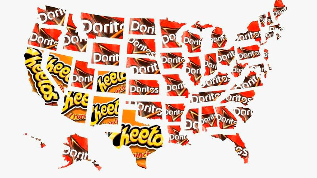
    Wow, this really puts things in perspective. The traditional world map doesn't show Africa's true size at all.

    Ace
    Community Member
    Premium
    6 months ago Created by potrace 1.15, written by Peter Selinger 2001-2017

    Every few years this apparently little-known fact raises it's head all over again. Yes, it's true, the standard mercator projection give a false perspective, but it's been known about forever. Why isn't it taught in schools?

    Load More Replies...
    martin734
    Community Member
    Premium
    6 months ago Created by potrace 1.15, written by Peter Selinger 2001-2017

    Europe size is incorrect though. Europe is actually 10.5 million square kilometres.

    PrettyJoyBird
    Community Member
    6 months ago Created by potrace 1.15, written by Peter Selinger 2001-2017

    That is impressive. Very helpful to understand.

    somed ay
    Community Member
    6 months ago Created by potrace 1.15, written by Peter Selinger 2001-2017

    This would make more sense if it compared continents to continents, and not countries to a continent. Africa vs North America, Africa vs. Asia, etc.

    CD King
    Community Member
    6 months ago Created by potrace 1.15, written by Peter Selinger 2001-2017

    Africa is a continent….. comparing it to countries seems a bit unfair.

    jimmy pop
    Community Member
    6 months ago Created by potrace 1.15, written by Peter Selinger 2001-2017

    That map of Europe is missing half of its size.

    General Anaesthesia
    Community Member
    6 months ago Created by potrace 1.15, written by Peter Selinger 2001-2017

    For the curious, compare them all: https://thetruesize.com/

    Chaska Peacock
    Community Member
    6 months ago Created by potrace 1.15, written by Peter Selinger 2001-2017

    Why compare the size of countries to a continent?

    Tanya Mattson
    Community Member
    6 months ago Created by potrace 1.15, written by Peter Selinger 2001-2017

    It's kind of senseless to compare a whole continent (Africa) to individual countries. Algeria, a country in Africa is the 10th largest country by land mass in the world and the largest country in Africa.

    Vylnce NA
    Community Member
    6 months ago Created by potrace 1.15, written by Peter Selinger 2001-2017

    That isn't the correct size of the US... What is depicted there is only 8 mil km² or so.

    View more comments
    ADVERTISEMENT
    #8

    Bar chart presenting interesting information through maps, charts and graphs comparing heights of famous landmarks and objects.

    datastuffplus Report

    Mel in Georgia
    Community Member
    Premium
    6 months ago Created by potrace 1.15, written by Peter Selinger 2001-2017

    These forests are so amazing to see. Go to northern California if you get the chance.

    Zaach
    Community Member
    6 months ago Created by potrace 1.15, written by Peter Selinger 2001-2017

    I have a picture of my car in the 'drive through the tree'

    Load More Replies...
    Giano
    Community Member
    6 months ago Created by potrace 1.15, written by Peter Selinger 2001-2017

    Banana tree for scale, please

    Tucker Cahooter
    Community Member
    6 months ago Created by potrace 1.15, written by Peter Selinger 2001-2017

    I saw a post in another thread about a bridge in Japan that had these sorts of comparisons and one of the comparison items was Godzilla and I think all of these sorts of comparison charts need to always have Godzilla

    Tim Gibbs
    Community Member
    6 months ago Created by potrace 1.15, written by Peter Selinger 2001-2017

    Banana 🍌 for scale please 🤣

    Apatheist Account2
    Community Member
    6 months ago Created by potrace 1.15, written by Peter Selinger 2001-2017

    The Shard is 1016ft - almost 3 times the height.

    Adrian
    Community Member
    6 months ago Created by potrace 1.15, written by Peter Selinger 2001-2017

    FFS that's NOT Big Ben!

    EJN
    Community Member
    5 months ago Created by potrace 1.15, written by Peter Selinger 2001-2017

    And yet humans continue to wantonly cut them to the ground...

    Maren Villadsen
    Community Member
    6 months ago Created by potrace 1.15, written by Peter Selinger 2001-2017

    The statue of liberty is smaller than Big Ben?? Never seen her, but Thought she was way taller

    View more comments
    ADVERTISEMENT
    #9

    Map showing 50 percent of Canadians living below a specific latitude line, presenting interesting information through maps.

    datastuffplus Report

    Robert Trebor
    Community Member
    6 months ago Created by potrace 1.15, written by Peter Selinger 2001-2017

    Neat how the population out west all lives within that maple leaf.

    Breadcrumb.
    Community Member
    6 months ago (edited) Created by potrace 1.15, written by Peter Selinger 2001-2017

    "Booo!" Says the one man living in the middle

    Jerzy Janeczko
    Community Member
    6 months ago Created by potrace 1.15, written by Peter Selinger 2001-2017

    Tells you all you need to know about the weather in Canada.

    blixten1982
    Community Member
    6 months ago Created by potrace 1.15, written by Peter Selinger 2001-2017

    What's the little tiny arrow on the east end of the line? I don't see it in the key.

    Fonzo
    Community Member
    6 months ago Created by potrace 1.15, written by Peter Selinger 2001-2017

    I love now the the key explains that the line is in fact a line

    Indi
    Community Member
    6 months ago Created by potrace 1.15, written by Peter Selinger 2001-2017

    Thank you for stating which object on the map is the line, I was getting confused

    Soosh_tr
    Community Member
    6 months ago Created by potrace 1.15, written by Peter Selinger 2001-2017

    the image is skewed the line is too low.

    Patricia
    Community Member
    6 months ago Created by potrace 1.15, written by Peter Selinger 2001-2017

    Look again. The line is in the correct place.

    Load More Replies...
    Thomas Teller
    Community Member
    6 months ago

    This comment is hidden. Click here to view.

    The smart ones live below the line!

    Bryn
    Community Member
    Premium
    6 months ago Created by potrace 1.15, written by Peter Selinger 2001-2017

    why do you say that?

    Load More Replies...
    View more comments

    Pastor also wanted to clear up a few details. He pointed out that 'Data Stuff Plus' had now mostly turned into a reposting account. "So, the majority of the things on there are now the work of others. I still think it is great to spread the word on interesting data, but I would much rather do my own stuff if I had more time," he said.

    "I have been posting more AI stuff recently and I get some pushback in the comments. The reason I am doing this is that AI is coming and progressing very fast and that people need to be exposed to it now when it is still discernible from reality. Almost like a way to train your eyes and mind to sniff it out while it is early enough."

    ADVERTISEMENT
    #10

    Series of maps and charts showing ozone layer changes from 1979 to 2019, illustrating interesting information through visual data.

    datastuffplus Report

    Trillian
    Community Member
    6 months ago (edited) Created by potrace 1.15, written by Peter Selinger 2001-2017

    If we tried to do that today in no time there would be a bunch of nutcakes questioning the existence of ozone and making a cult for people sniffing CFC while wearing poufy hair helmets that require tons of hair spray

    Orysha
    Community Member
    6 months ago Created by potrace 1.15, written by Peter Selinger 2001-2017

    They are here, always been even during the 1990's

    Load More Replies...
    Chris the Bobcat
    Community Member
    6 months ago Created by potrace 1.15, written by Peter Selinger 2001-2017

    Don't worry, the traitor trump will find a way to screw this up too.

    Cydney Golden
    Community Member
    6 months ago Created by potrace 1.15, written by Peter Selinger 2001-2017

    What happened in 1988 that almost healed it temporarily?

    Jerzy Janeczko
    Community Member
    6 months ago

    This comment is hidden. Click here to view.

    ....and we are arrogant enough to believe we had anything to do with it ?

    Cathy Null
    Community Member
    6 months ago Created by potrace 1.15, written by Peter Selinger 2001-2017

    It was caused by refrigerant/propellant CFC's. Once they were banned, the hole started to shrink. So yes, we not only caused it, but listened to scientists & worked together to try to restore it. Educate yourself.

    Load More Replies...
    #11

    Diagram showing where different English IPA letters and sounds are formed in the mouth with colorful labels and examples.

    datastuffplus Report

    wowbagger
    Community Member
    6 months ago Created by potrace 1.15, written by Peter Selinger 2001-2017

    I just figured out my lisp! I'm making my 's' sounds in the blue-green area instead of the green area. This could actually help me a lot!

    Huddo's sister
    Community Member
    6 months ago Created by potrace 1.15, written by Peter Selinger 2001-2017

    Speech pathologists use this diagram for that exact purpose

    Load More Replies...
    Auntriarch
    Community Member
    6 months ago Created by potrace 1.15, written by Peter Selinger 2001-2017

    Spy is not a good example. Listen to yourself really saying it. It comes out closer to sby

    martymcmatrix
    Community Member
    6 months ago Created by potrace 1.15, written by Peter Selinger 2001-2017

    Benedict Cumberbatch would have asked, »What about penguins?« 🐧 🕵🏽 🐧

    Load More Replies...
    Mark Hewis
    Community Member
    6 months ago Created by potrace 1.15, written by Peter Selinger 2001-2017

    That is so useful ! As singer in choir makes so much sense .

    T'Mar of Vulcan
    Community Member
    6 months ago Created by potrace 1.15, written by Peter Selinger 2001-2017

    The 'hl' sound found in South African vernac is very hard to say for English/Afrikaans speakers because it's made with the back of the tongue and some air through. Most white people use a "sh" sound instead as it's the closest.

    Auntriarch
    Community Member
    6 months ago Created by potrace 1.15, written by Peter Selinger 2001-2017

    I was just going to say I didn't have any trouble with it, then I remembered I was born in Wales, which probably explains it. However, the only click I could manage was 'c'.

    Load More Replies...
    Divado
    Community Member
    6 months ago Created by potrace 1.15, written by Peter Selinger 2001-2017

    No surprise uh-oh is so far back...

    martymcmatrix
    Community Member
    6 months ago Created by potrace 1.15, written by Peter Selinger 2001-2017

    💁🏽 Cat go sing 😻 happy uh-oh 🤷🏽

    pOtAtO kNiShEs
    Community Member
    6 months ago Created by potrace 1.15, written by Peter Selinger 2001-2017

    did anyone else go through every single word to fact check

    View more comments
    #12

    110 years of Australian temperatures shown through maps, charts, and graphs illustrating climate trends over time.

    datastuffplus Report

    Doodles1983
    Community Member
    6 months ago Created by potrace 1.15, written by Peter Selinger 2001-2017

    But global warming isn't happening...

    Bored Seb
    Community Member
    6 months ago Created by potrace 1.15, written by Peter Selinger 2001-2017

    I mean, it was cold last night. That's a good proof it's not happening, right?

    Load More Replies...
    Pieter LeGrande
    Community Member
    6 months ago Created by potrace 1.15, written by Peter Selinger 2001-2017

    I can't see how people can deny global warming. You might argue about causes, but the warming is undeniable.

    Nads
    Community Member
    6 months ago Created by potrace 1.15, written by Peter Selinger 2001-2017

    Climate change is definitely happing, but this is a bad map. We can’t see the temperatures, we are just going by the colors and what feeling they give us. Maybe this is all a tiny temperature variation. (But even if it is, climate change IS happening - crazy that I even need to state this).

    ttmgqb9dbv
    Community Member
    6 months ago Created by potrace 1.15, written by Peter Selinger 2001-2017

    It doesn't happen in America either - it gets in the way of profit. We may all die quite soon, but what's really important is that big oil, and other piggies, will die with enviable stock portfolios.

    cugel.
    Community Member
    6 months ago Created by potrace 1.15, written by Peter Selinger 2001-2017

    2019/20 was a real stinker, the next three summers were pretty mild

    Jill Rhodry
    Community Member
    6 months ago Created by potrace 1.15, written by Peter Selinger 2001-2017

    Last summer in victoria wasn't very pleasant

    Load More Replies...
    Breadcrumb.
    Community Member
    6 months ago Created by potrace 1.15, written by Peter Selinger 2001-2017

    Is it going to get unbearable?

    Huddo's sister
    Community Member
    6 months ago (edited) Created by potrace 1.15, written by Peter Selinger 2001-2017

    My state is currently having the driest year on record

    Jerzy Janeczko
    Community Member
    6 months ago

    This comment has been deleted.

    Michael Melfa
    Community Member
    6 months ago Created by potrace 1.15, written by Peter Selinger 2001-2017

    1956 looked like it was absolutely frigid.

    View more comments

    Visual clarity is so, so important. Especially in this day and age when people’s attention spans are short and at a premium. So, the more clearly you present your data in a chart, graph, or map, the quicker and better your message gets across.

    Typically, it’s a good approach to use fonts that are easy to read and contrasting colors that don’t get lost in the background. You want to create a user-friendly experience. In terms of the text itself, it should be edited down to the essentials where it’s short and snappy but fully encapsulates the main idea.

    #13

    Chart showing the minimum number of paid leave days by country with varying amounts highlighted using flags.

    datastuffplus Report

    Orange Mum
    Community Member
    6 months ago Created by potrace 1.15, written by Peter Selinger 2001-2017

    In Australia its 4 weeks annual leave throughout the year, 10 days sick leave, ten days personal leave. You can go on 12 months maternity leave too

    Ace
    Community Member
    Premium
    6 months ago Created by potrace 1.15, written by Peter Selinger 2001-2017

    In Europe (EU and most other non-EU countries like CH where I live) there is no limit to sick days. Various countries have different systems to recompense an employer for sick pay, be it through state social security of private health insurance, but in principal if you're sick for several weeks you're still going to be paid and you'll still have your job to go back to. I was off, but still on full pay, for two years at one point.

    Load More Replies...
    Saint_Zipcodus
    Community Member
    6 months ago Created by potrace 1.15, written by Peter Selinger 2001-2017

    These things weren't given to workers freely. They have been fought for and still are being fought for. Just saying.

    Lena Flising
    Community Member
    6 months ago Created by potrace 1.15, written by Peter Selinger 2001-2017

    In Sweden, we are assured by law four consecutive weeks in the summer months (employers must have very good reasons not to give us that). We are also REQUIRED to take at least three consecutive weeks. If we don't and get sick later (stress symptoms etc), we are seen as partly to blame for our own sickness.

    iseefractals
    Community Member
    6 months ago Created by potrace 1.15, written by Peter Selinger 2001-2017

    In Romania it's a minimum of 4 weeks paid vacation, 4 weeks paid sick leave (maximum of 183 paid sick days per year) Women are required to take 42 days after giving birth (full pay) but maternity leave goes up to 126 calendar days at 85% pay. But there is also child care leave, which extends for TWO YEARS (3 years if the child has a disability) these days can be used by either parent (one at a time) and they will receive 50% of their average wage over the 12 months before the child was born, up to 10,000 euro's per month. Maternity leave is paid by the government, through the national health insurance....and this is a big part of the reason why minimum wage workers shell out nearly 50% of the income to taxes (10% income tax, 10% health care contribution, 25% pension/unemployment/everything else)

    quentariel
    Community Member
    6 months ago Created by potrace 1.15, written by Peter Selinger 2001-2017

    Most countries in the 20 days' category actually have 25 days. Four weeks at summer and one week in winter/somewhere else.

    Alyce
    Community Member
    6 months ago Created by potrace 1.15, written by Peter Selinger 2001-2017

    Im sure I'll be downvoted beneath Hell, but a number of these countries are also economic blackholes. Anybody else remember the bailouts for Greece, Italy, Ireland? Not causation, but food for thought?

    rustyscate
    Community Member
    Premium
    6 months ago Created by potrace 1.15, written by Peter Selinger 2001-2017

    In Massachusetts if your full time you get 40 hrs sick time, annually. I thought it was like that everywhere.

    View more comments
    #14

    Map showing USA cultural regions with labeled areas like Deep South, Southwest, Rocky Mountains, and Great Lakes presented with interesting information.

    datastuffplus Report

    Mel in Georgia
    Community Member
    Premium
    6 months ago (edited) Created by potrace 1.15, written by Peter Selinger 2001-2017

    The Southern Alabama/Georgia/ Northwestern Florida region is unto itself. Was at a restaurant in Destin, FL when a table mate said he was from L.A. (as in Los Angeles, CA). In the sweetest Southern accent, she said, "Oh, I know lots of people from Lower Alabama!"

    Ashtophet
    Community Member
    6 months ago Created by potrace 1.15, written by Peter Selinger 2001-2017

    I dispute “Chesapeake” for southern NJ and so much of PA… we’re Mid-Atlantic…

    Deannamite
    Community Member
    6 months ago Created by potrace 1.15, written by Peter Selinger 2001-2017

    North Carolina is not Mid-Atlantic. We're Southeastern.

    geezeronthehill
    Community Member
    6 months ago Created by potrace 1.15, written by Peter Selinger 2001-2017

    "Lower" Appalachia? Never heard it called that. I live in Southern Appalachia.

    Auntriarch
    Community Member
    6 months ago Created by potrace 1.15, written by Peter Selinger 2001-2017

    Midwest looks pretty easterly

    geezeronthehill
    Community Member
    6 months ago Created by potrace 1.15, written by Peter Selinger 2001-2017

    I think the name dates to the 19th century, before we realized how dang big the continent is. Before statehood, Michigan, Wisconsin and parts of Iowa & Minnesota were once called 'The Northwest Territories ".

    Load More Replies...
    Satan Laughs
    Community Member
    6 months ago Created by potrace 1.15, written by Peter Selinger 2001-2017

    SoCal all the way. Come visit!

    DeoManus Argentem
    Community Member
    6 months ago Created by potrace 1.15, written by Peter Selinger 2001-2017

    "South Florida" is way smaller, generally only refers to three counties on the SE coast - Dade (Miami), Broward (Fort Lauderdale), and Palm Beach. Once you get north of Palm Beach County, hit the Everglades to the west, or get south of Dade County you're definitely in a distinctly different place!

    Michael Melfa
    Community Member
    6 months ago Created by potrace 1.15, written by Peter Selinger 2001-2017

    Lol, love the big scary red TEXAS.

    nottheactualphoto
    Community Member
    6 months ago Created by potrace 1.15, written by Peter Selinger 2001-2017

    In fairness, Texas actually is big, red and scary.

    Load More Replies...
    ttmgqb9dbv
    Community Member
    6 months ago Created by potrace 1.15, written by Peter Selinger 2001-2017

    I wasn't aware that Sonoma and Napa counties were considered the Bay Area -- I thought we were CA Wine Country

    Carl Roberts
    Community Member
    6 months ago Created by potrace 1.15, written by Peter Selinger 2001-2017

    The Bay Area consists of 9 counties. Alameda, Contra Costa, Marin, Napa, San Mateo, Santa Clara, Solano, Sonoma, and San Francisco.

    Load More Replies...
    View more comments
    #15

    Bar chart showing knowledge retention percentages over time, an interesting information presented through charts and graphs.

    datastuffplus Report

    BeesEelsAndPups
    Community Member
    6 months ago Created by potrace 1.15, written by Peter Selinger 2001-2017

    If you tell me your name I will forget 100% of it within 5 nanoseconds. If you tell me your pet's name I will remember it for life.

    Charlotte
    Community Member
    6 months ago Created by potrace 1.15, written by Peter Selinger 2001-2017

    Meanwhile, there’s part of my brain with no purpose but to remember bullshít 80s and 90s product jingles for some reason.

    Norm Gilmore
    Community Member
    6 months ago Created by potrace 1.15, written by Peter Selinger 2001-2017

    Or that embarrassing incident from twenty years ago....

    Load More Replies...
    Apatheist Account2
    Community Member
    6 months ago Created by potrace 1.15, written by Peter Selinger 2001-2017

    My wife said to me "You haven't listened to a word I said!" I thought "Funny way to start a conversation..." Seriously, the best way to remember is to see and hear something - twice the routes to remembering. Better still if you can smell it.

    Michael Largey
    Community Member
    6 months ago (edited) Created by potrace 1.15, written by Peter Selinger 2001-2017

    What good is a chart I won't remember a week from now?

    Leg less In Minneapolis
    Community Member
    6 months ago Created by potrace 1.15, written by Peter Selinger 2001-2017

    Here at the Nursing Home, I need to remember about 30-40 names, not easy. So when I work with someone new I try to repeat their name five times and that seems to help

    Abel
    Community Member
    6 months ago Created by potrace 1.15, written by Peter Selinger 2001-2017

    Learning is pretty much motivated by interest.

    Pieter LeGrande
    Community Member
    6 months ago Created by potrace 1.15, written by Peter Selinger 2001-2017

    I'm pretty good at remembering poetry - how does that work? Can't say I ever studied Applied Poetry.

    PrettyJoyBird
    Community Member
    6 months ago Created by potrace 1.15, written by Peter Selinger 2001-2017

    Wild to fatham the extent of this.

    View more comments

    According to one The Economist post on Medium, there are numerous ways to mess up when trying to visualize data. Probably the biggest mistake you can make is presenting your data in a misleading way.

    ADVERTISEMENT

    For example, you might (accidentally) draw bars that don’t quite match up with the actual size of the numbers. Then, some bars might look bigger or smaller relative to other bars, even if the numerical difference isn’t as vast or narrow in reality.

    #16

    Various international electrical outlets displayed with flags, presenting interesting information through maps, charts, and graphs.

    datastuffplus Report

    John Leavitt
    Community Member
    6 months ago Created by potrace 1.15, written by Peter Selinger 2001-2017

    Danish receptacle looks happy.

    basmilko
    Community Member
    6 months ago Created by potrace 1.15, written by Peter Selinger 2001-2017

    Even the outlet in Denmark are the happiest in the world!

    Load More Replies...
    CD Mills
    Community Member
    6 months ago Created by potrace 1.15, written by Peter Selinger 2001-2017

    You'd think that every country with electricity, which is all of them, would come up with a Universal plug arrangement. I guess we'll get those a month after we get world peace.

    Forrest Hobbs
    Community Member
    6 months ago Created by potrace 1.15, written by Peter Selinger 2001-2017

    The EU considered standardised mains electrical connectors and rejected the idea because it'd be too expensive. The slightly worrying thing is that India and some other nations are still using BS 546 round pin plugs and sockets from 1934, superseded in the UK by BS 1363 in 1947. https://en.wikipedia.org/wiki/AC_power_plugs_and_sockets#BS_546_and_related_types_(Type_D_and_M)

    Load More Replies...
    BeesEelsAndPups
    Community Member
    6 months ago Created by potrace 1.15, written by Peter Selinger 2001-2017

    Can we standardize around the Danish one. It makes me happy

    Mel in Georgia
    Community Member
    Premium
    6 months ago Created by potrace 1.15, written by Peter Selinger 2001-2017

    Electrical outlets were a relatively recent (industrial age) invention. Why, oh why weren't they standardized?

    Forrest Hobbs
    Community Member
    6 months ago Created by potrace 1.15, written by Peter Selinger 2001-2017

    Electrical mains connectors *were* standardised - by each country that needed them. If you think about it, there's no way you could have had a global standard for such things in the 1930s - which is roughly when a lot of the standards were created. By a quirk of history, Japan doesn't even have a single mains electricity standard: half the country's 50Hz, and the other half's 60Hz. https://en.wikipedia.org/wiki/Electricity_sector_in_Japan#Transmission

    Load More Replies...
    Khavrinen
    Community Member
    6 months ago Created by potrace 1.15, written by Peter Selinger 2001-2017

    I clearly don't know flags well enough to read this without text labels.

    Bored Seagull
    Community Member
    6 months ago Created by potrace 1.15, written by Peter Selinger 2001-2017

    Left to right, from top to bottom: First row: Italy, Canada/USA/Mexico, Japan, Switzerland/Brazil - Second row: UK, India/Pakistan/South Africa, Israel, Denmark - Third row: China/Australia, France/EU, Germany/South Korea/EU, Russia/EU

    Load More Replies...
    Bob Jones
    Community Member
    6 months ago Created by potrace 1.15, written by Peter Selinger 2001-2017

    Most outlets in China have multiple holes so will take most common shapes

    Forrest Hobbs
    Community Member
    6 months ago (edited) Created by potrace 1.15, written by Peter Selinger 2001-2017

    Bob Jones: you're right - and most mains sockets in China are horrifically dangerous as a result. Each modern national standard is more or less okay when done properly - but when you make a socket to accommodate all of them, the result is frighteningly unsafe. Don't take my word for it: https://www.worldstandards.eu/electricity/plugs-and-sockets/universal-sockets/

    Load More Replies...
    Scott Rackley
    Community Member
    6 months ago Created by potrace 1.15, written by Peter Selinger 2001-2017

    My concern is the ones without a ground

    Timbob
    Community Member
    6 months ago Created by potrace 1.15, written by Peter Selinger 2001-2017

    And our American one looks pĩssed !

    Gorgeous George
    Community Member
    6 months ago Created by potrace 1.15, written by Peter Selinger 2001-2017

    The only one that makes sense, is the Australian one, with a switch

    JoNo
    Community Member
    6 months ago Created by potrace 1.15, written by Peter Selinger 2001-2017

    It is completely illogical to not have switches. I did not know Australia was the only country with them (though there may be others that do, that aren't on this chart).

    Load More Replies...
    View more comments
    #17

    Map showing how much of the Earth's surface is covered in concrete, asphalt, and manmade surfaces in Europe.

    datastuffplus Report

    Trillian
    Community Member
    6 months ago Created by potrace 1.15, written by Peter Selinger 2001-2017

    Hey don't pour it all here

    CD Mills
    Community Member
    6 months ago Created by potrace 1.15, written by Peter Selinger 2001-2017

    I would have placed the example over the Sahara Desert. This placement seems mean.

    bernie bulk
    Community Member
    6 months ago Created by potrace 1.15, written by Peter Selinger 2001-2017

    where are the italians situated ??

    Lena Flising
    Community Member
    6 months ago Created by potrace 1.15, written by Peter Selinger 2001-2017

    That does not include cobble/stone, I assume.

    #18

    World map centered on Buenos Aires, Argentina, showing global geography with interesting information presented through maps.

    datastuffplus Report

    nut nibbler
    Community Member
    6 months ago Created by potrace 1.15, written by Peter Selinger 2001-2017

    New Zealand, not forgotten for a change.

    Rose the Cook
    Community Member
    6 months ago Created by potrace 1.15, written by Peter Selinger 2001-2017

    But Tasmania is. Or is that supposed to be it floating off the east coast?

    Load More Replies...

    Or, as a chart maker, you might use specific colors to denote something without actually mentioning what it is that they mean, in the legend. Sure, it might be obvious to a lot of people. But not everyone will ‘get it.’ Stating the obvious is often an important part of making clean, clear, and communicative charts. You don’t, in fact, know what other people don’t know. So, it’s best to be thorough! Though, that being said, being overly detailed can lead to too much visual noise, too. Aim for a balance between the two, ideally.

    Another way to mislead your audience is by using data scales and ranges that might make it seem like two factors are more closely correlated than they might actually be. For example, if two lines from two categories practically overlap on a chart, you might want to adjust the scale so that the data points are more visually distinct.

    #19

    Map showing rural equivalent of New York City population, presenting interesting information through maps, charts, and graphs.

    datastuffplus Report

    Bryn
    Community Member
    Premium
    6 months ago Created by potrace 1.15, written by Peter Selinger 2001-2017

    Things like this are important when it comes to voting maps.

    Lena Flising
    Community Member
    6 months ago Created by potrace 1.15, written by Peter Selinger 2001-2017

    The US Electoral College ought to be revised to be areas of equal actual registered voters in each. Something like One million voters, One Electoral Vote.

    David
    Community Member
    6 months ago Created by potrace 1.15, written by Peter Selinger 2001-2017

    The electoral college is literally based on population. Congressional representation is based on population and proportions (with each state getting a min of 1). Electoral College is the number of Senators (every state has 2) and the number in the House you have. It's why small states get 3, and California gets 54. It literally is based on population. Each state gets to decide how they want to divide it, most states are winner takes all, 2 are proportional.

    Load More Replies...
    View more comments
    #20

    Map showing the shortest route from A to B in Brazil without crossing the Amazon River, with interesting information presented.

    datastuffplus Report

    Jerzy Janeczko
    Community Member
    6 months ago

    This comment is hidden. Click here to view.

    Now this is stupid. The same map using this concept could be repeated thousands of places on earth.

    #21

    Map showing most characteristic words for dying in 2015 obituaries by state with charts and graphs.

    datastuffplus Report

    Len Hill
    Community Member
    6 months ago Created by potrace 1.15, written by Peter Selinger 2001-2017

    Oh my God! BP didn't censor DIED!

    W Smith
    Community Member
    6 months ago Created by potrace 1.15, written by Peter Selinger 2001-2017

    🚨 ***RED ALERT*** 🚨 "RELEASE THE CENSOR PANDAS!" 🚨 🐼 🚨 🐼 🚨

    Load More Replies...
    Glen Ellyn
    Community Member
    Premium
    6 months ago Created by potrace 1.15, written by Peter Selinger 2001-2017

    Popped his clogs.

    LooseSeal's $10 Banana
    Community Member
    6 months ago Created by potrace 1.15, written by Peter Selinger 2001-2017

    Excuse me, censors, can you take care of this please?

    Auntriarch
    Community Member
    6 months ago Created by potrace 1.15, written by Peter Selinger 2001-2017

    Joined the choir eternal , dropped off the twig

    Pandora
    Community Member
    6 months ago Created by potrace 1.15, written by Peter Selinger 2001-2017

    Kicked the bucket 🪣

    Mel in Georgia
    Community Member
    Premium
    6 months ago Created by potrace 1.15, written by Peter Selinger 2001-2017

    I kinda like this term - passed into whatever. The next life, the ground, passed on. Passed the stage of animate living. It seems gentler than died.

    Load More Replies...
    Bruce Mardle
    Community Member
    6 months ago Created by potrace 1.15, written by Peter Selinger 2001-2017

    "Have you seen Fred?" "He went home." "I'm sorry for your loss." "Don't worry; he'll be back tomorrow."

    Glix Drap
    Community Member
    Premium
    6 months ago Created by potrace 1.15, written by Peter Selinger 2001-2017

    Shuffled off this mortal coil.

    somed ay
    Community Member
    6 months ago Created by potrace 1.15, written by Peter Selinger 2001-2017

    I live in one of the “went home” states and I’ve never read that in an obituary.

    Gracie Jay
    Community Member
    6 months ago Created by potrace 1.15, written by Peter Selinger 2001-2017

    Yea. My state isn’t correct either. Maybe it’s from obituaries? They probably word it weird in there.

    Load More Replies...
    View more comments

    It’s also important to think about the correct way to visualize your data. Some methods aren’t as helpful as others to allow your audience to see the results. If your chart looks visually messy, then the odds are that your audience will feel lost. On the flip side, the clearer you are in your presentation, the ‘friendlier’ you are toward your audience, and the easier your findings will connect with them. You could, for instance, use empty space strategically, for the sake of better clarity.

    A good rule of thumb is to redesign charts that are simply too difficult to read. Less is often more. Maybe you’re referring to too many data points in the chart and there’s an over-abundance of information. You want to make it easy for your audience to follow along. If they feel like they have to do all the thinking for you, why bother making a chart in the first place instead of sharing the raw numbers?

    #22

    World maps displaying visualized data of roads in red, commercial flights in green, and shipping lanes in orange.

    datastuffplus Report

    Jay Scales
    Community Member
    6 months ago Created by potrace 1.15, written by Peter Selinger 2001-2017

    I would put the 3rd one on my wall as art.... Beautiful.

    Sapna Sarfare
    Community Member
    6 months ago Created by potrace 1.15, written by Peter Selinger 2001-2017

    Indian roads have improved massively under Nitin Gadkari.. Kudos to him

    Gossameringue
    Community Member
    6 months ago Created by potrace 1.15, written by Peter Selinger 2001-2017

    For the shipping lanes, I see two guys off to the right about to throw down an arm wrestle.

    Chewie Baron
    Community Member
    Premium
    6 months ago Created by potrace 1.15, written by Peter Selinger 2001-2017

    I would love to see this lit up.

    #23

    World map showing countries using US Letter and A4 paper sizes in a clear chart format.

    datastuffplus Report

    T'Mar of Vulcan
    Community Member
    6 months ago Created by potrace 1.15, written by Peter Selinger 2001-2017

    Stupid Mercator projection. Makes Greenland look as big as Africa. Greenland is about half the size of Australia.

    Forrest Hobbs
    Community Member
    6 months ago (edited) Created by potrace 1.15, written by Peter Selinger 2001-2017

    The Mercator projection was developed for navigational purposes, for which it is excellent - it preserves direction, not comparative area. If you want a map to compare land area, you need something like the Gall–Peters projection - which is less useful for navigation. https://en.wikipedia.org/wiki/Gall%E2%80%93Peters_projection

    Load More Replies...
    Miki
    Community Member
    Premium
    6 months ago Created by potrace 1.15, written by Peter Selinger 2001-2017

    I love how brilliant A system is. A0 having area of 1sq meter, and cutting them in half always gives the same proportion as beforehand. LOVE IT.

    Tim Douglass
    Community Member
    6 months ago Created by potrace 1.15, written by Peter Selinger 2001-2017

    Interestingly enough, that's exactly how the US dimensions work too.

    Load More Replies...
    Adrian
    Community Member
    6 months ago Created by potrace 1.15, written by Peter Selinger 2001-2017

    Has the UK fully adopted the metric versions?

    Forrest Hobbs
    Community Member
    6 months ago (edited) Created by potrace 1.15, written by Peter Selinger 2001-2017

    The UK's gave up on its old paper sizes back in the 1970s. All modern paper sizes including US paper sizes are defined in SI units - "metric" - since all modern measurement units are defined in terms of SI base standards. As it happens, US measurement units have been legally defined in terms of metric standards since 1893 - codifying a change which had already happened in practice: https://en.wikipedia.org/wiki/Mendenhall_Order

    Load More Replies...
    View more comments
    #24

    Bar chart showing federal income tax payments by US presidents in their first year, highlighting differences visually with data.

    datastuffplus Report

    BeesEelsAndPups
    Community Member
    6 months ago Created by potrace 1.15, written by Peter Selinger 2001-2017

    Obama needs a better accountant

    Onan Hag All
    Community Member
    6 months ago Created by potrace 1.15, written by Peter Selinger 2001-2017

    Not paying your taxes is considered an accomplishment in the US

    Cydney Golden
    Community Member
    6 months ago Created by potrace 1.15, written by Peter Selinger 2001-2017

    Most of us pay way more than trump.

    Alyce
    Community Member
    6 months ago Created by potrace 1.15, written by Peter Selinger 2001-2017

    Whats the point of this? That Trump is more focused on being President than making money from outside sources?

    Jerzy Janeczko
    Community Member
    6 months ago

    This comment is hidden. Click here to view.

    Trump is not taking a salary for his service to the nation, and meets large payrolls and pays property taxes all the other presidents cannot even contemplate as non-business men

    Donaven Staab
    Community Member
    6 months ago Created by potrace 1.15, written by Peter Selinger 2001-2017

    He is a criminal. Shouldn’t be anywhere near the White House.

    Load More Replies...
    Lyone Fein
    Community Member
    6 months ago

    This comment is hidden. Click here to view.

    Donald Trump does not accept his Presidential salary. Instead he donates the entire amount to various charities each year.

    General Anaesthesia
    Community Member
    6 months ago Created by potrace 1.15, written by Peter Selinger 2001-2017

    Thanks for the laugh, Lyone Fein. He robs from his own charities, scams everyone for millions, is busy plundering the US treasury.

    Load More Replies...
    View more comments

    Charts shouldn’t conceal their point. “Charts like these are not misleading, nor are they very confusing. They merely fail to justify their existence — often because they have been visualized incorrectly or because we tried to cram too much in too little space.”

    It’s also a bad idea to use too many colors. A change in color can often signify a change in category, according to The Economist. So, if this doesn’t happen, you shouldn’t be adding too many hues to your chart.

    #25

    Moon orientation differences shown through maps and charts comparing views from UK and Australia hemispheres.

    datastuffplus Report

    Tucker Cahooter
    Community Member
    6 months ago Created by potrace 1.15, written by Peter Selinger 2001-2017

    I guess that's what comes from standing on your head

    Skip Reynolds
    Community Member
    6 months ago Created by potrace 1.15, written by Peter Selinger 2001-2017

    They're standing on the planet Earth, not a head.

    Load More Replies...
    Jill Rhodry
    Community Member
    6 months ago (edited) Created by potrace 1.15, written by Peter Selinger 2001-2017

    Yep, we see a rabbit, not a man, on the moon

    Stephanie Did It
    Community Member
    6 months ago Created by potrace 1.15, written by Peter Selinger 2001-2017

    I've always seen the rabbit, reading his book. Never have found a man in the moon.

    Load More Replies...
    T'Mar of Vulcan
    Community Member
    6 months ago Created by potrace 1.15, written by Peter Selinger 2001-2017

    Why didn't I look at the moon when I was in England! (Because it was summer and I was asleep when it came out!!!)

    rustyscate
    Community Member
    Premium
    6 months ago Created by potrace 1.15, written by Peter Selinger 2001-2017

    Is this to scale?

    Breadcrumb.
    Community Member
    6 months ago Created by potrace 1.15, written by Peter Selinger 2001-2017

    Anyone get to stare at the moons hole directly?

    #26

    World map showing nations classified as masculine or feminine according to French, using colors in an interesting chart.

    datastuffplus Report

    Annik Perrot
    Community Member
    6 months ago Created by potrace 1.15, written by Peter Selinger 2001-2017

    UK in its whole is masculine "le Royaume Uni", because "royaume" is a masculine word, and so is Wales, "Pays de Galles", while England, Scotland and Northern Ireland are feminine, "Angleterre", "Ecosse", "Irlande du Nord". But I guess it's the same in those many languages where "common" names have genders. Even 3 of them in German, LOL.

    Owen
    Community Member
    6 months ago Created by potrace 1.15, written by Peter Selinger 2001-2017

    In WWII, Germany was famously (infamously) 'The Fatherland'. Hitler was very scared of Russia (Justifiably), because it was 'The Motherland' and he was highly superstitous. He had good reason to be scared of Russia, although not just because of the name. In western culture, we tend to focus on the British and US involvement, but the Russians sustained many more casualties, and were the first to reach Berlin. I am British, but in my eyes, Russia actually won the second world war. We just have selective memories in the West.

    David Bramhall
    Community Member
    6 months ago Created by potrace 1.15, written by Peter Selinger 2001-2017

    It is not sufficiently well understood that in languages that employ genders like this, there is not usually any suggestion that the object under discussion has masculine or feminine characteristics. Rather, it is the WORD itself that is feminine or masculine.

    Zaach
    Community Member
    6 months ago Created by potrace 1.15, written by Peter Selinger 2001-2017

    One of the reasons that English has few gendered nouns is it is a combination of languages that had different genders for the same noun

    JanuarySounds
    Community Member
    6 months ago Created by potrace 1.15, written by Peter Selinger 2001-2017

    English is at least three different languages in a trenchcoat pretending to be one language.

    Load More Replies...
    Peluka.uy
    Community Member
    6 months ago Created by potrace 1.15, written by Peter Selinger 2001-2017

    Wow! My country was use as an example... We're rarelly named anywhere (i'm from Uruguay)

    ί𝔫CίŦᵃт𝐔𝐬
    Community Member
    6 months ago Created by potrace 1.15, written by Peter Selinger 2001-2017

    Hey, I think about you often in the US! I hear great things about Montevideo!

    Load More Replies...
    Abel
    Community Member
    6 months ago Created by potrace 1.15, written by Peter Selinger 2001-2017

    Ĺe Australiette 😘

    Cydney Golden
    Community Member
    6 months ago Created by potrace 1.15, written by Peter Selinger 2001-2017

    Why can't countries be called what ever they are in their native language??

    bernie bulk
    Community Member
    6 months ago Created by potrace 1.15, written by Peter Selinger 2001-2017

    australia a sheila ???doubt it mate...its a bloke country for sure...how sheilas are better blokes than most of europe

    View more comments
    #27

    Statue of Liberty color changes shown through maps and charts illustrating effects over years from unexposed to 30 years.

    datastuffplus Report

    Paul C.
    Community Member
    6 months ago Created by potrace 1.15, written by Peter Selinger 2001-2017

    Englishman here, just my opinion but I think she is one of the most beautiful structures in the world. Whatever her colour.

    Timbob
    Community Member
    6 months ago Created by potrace 1.15, written by Peter Selinger 2001-2017

    How nice of you Paul. It’s a shame that many of us Americans don’t deserve her.

    Gianluca Meroni
    Community Member
    6 months ago Created by potrace 1.15, written by Peter Selinger 2001-2017

    great statue, "inspired" by a statue on Milan Duomo: https://themilancityjournal.com/statue-liberty-milan/ https://it.wikipedia.org/wiki/Legge_Nuova

    Divado
    Community Member
    6 months ago Created by potrace 1.15, written by Peter Selinger 2001-2017

    The exact number of cans of Brasso theoretically needed to clean the Statue of Liberty is not quantifiable, as it is a theoretical scenario and Brasso is not used for such large-scale cleaning projects on architectural monuments like the Statue of Liberty.

    rustyscate
    Community Member
    Premium
    6 months ago Created by potrace 1.15, written by Peter Selinger 2001-2017

    It would have been amazing to see it before oxidation

    Apatheist Account2
    Community Member
    6 months ago Created by potrace 1.15, written by Peter Selinger 2001-2017

    I wonder why 7 and 30 have to be pronounced as "yeaars"...

    The Canada-based ‘Data Stuff Plus’ account is practically ancient. It was initially created in the autumn of 2017 (which now feels like almost a few decades ago). Over the years, the account has drawn in over 66k followers. According to the curator of the account, Pastor, he focuses on sharing interesting data and sometimes he finds the time to make his own charts as well.

    #28

    World map showing citizenship rules by land or blood with blue and red colors, presented through maps and charts.

    datastuffplus Report

    Annik Perrot
    Community Member
    6 months ago Created by potrace 1.15, written by Peter Selinger 2001-2017

    France has both, for now, though some people would like to have rule of the land repelled.

    Orysha
    Community Member
    6 months ago Created by potrace 1.15, written by Peter Selinger 2001-2017

    Yeah Bruno Gestapo ang Gèrard Dard Malsain would love to remove that. They already started in Mayotte.

    Load More Replies...
    Depressed Lesbian(she/they/he)
    Community Member
    6 months ago (edited) Created by potrace 1.15, written by Peter Selinger 2001-2017

    Not anymore in the US. Republicans are trying to change it to land of the blood.

    Foxglove🇮🇪
    Community Member
    6 months ago Created by potrace 1.15, written by Peter Selinger 2001-2017

    Ireland had rule of the land until 15-20 years ago. There was a perception that heavily pregnant women were coming here from poor countries so they could claim residency due to their child being born here. Law was changed to rule of blood.

    Nads
    Community Member
    6 months ago Created by potrace 1.15, written by Peter Selinger 2001-2017

    It seems like everyone really hates poor people, uh? Btw, I usually hear about rich people doing this.

    Load More Replies...
    Cydney Golden
    Community Member
    6 months ago Created by potrace 1.15, written by Peter Selinger 2001-2017

    USA about to end automatic citizenship.

    SchadenFreudian Psychology
    Community Member
    6 months ago (edited) Created by potrace 1.15, written by Peter Selinger 2001-2017

    I wish everybody on earth was allowed one free citizenship change per lifetime, in adulthood. It sucks that we’re trapped (unless we spend a lot of money and jump through a lot of hoops.)

    ί𝔫CίŦᵃт𝐔𝐬
    Community Member
    6 months ago Created by potrace 1.15, written by Peter Selinger 2001-2017

    I have no idea why someone would downvote you. I'd give a lot to get out of here. It's almost impossible to move to a different country and find work.

    Load More Replies...
    #29

    Circle chart comparing estimated civilian-owned firearms and population in the US and India, interesting information through maps and charts.

    datastuffplus Report

    Glen Ellyn
    Community Member
    Premium
    6 months ago Created by potrace 1.15, written by Peter Selinger 2001-2017

    Unfortunately, we know. 😞

    Jerzy Janeczko
    Community Member
    6 months ago

    This comment is hidden. Click here to view.

    My guns have never shot anyone, nor has anyone elses. People k**l not guns.

    Load More Replies...
    Cip IESAN
    Community Member
    6 months ago Created by potrace 1.15, written by Peter Selinger 2001-2017

    A black CD and a vinyl record.

    Michael Largey
    Community Member
    6 months ago Created by potrace 1.15, written by Peter Selinger 2001-2017

    That's because people don't reduce the number of guns, but guns reduce the number of people.

    FreeDragon
    Community Member
    6 months ago Created by potrace 1.15, written by Peter Selinger 2001-2017

    And The Netherlands is the only nation with more bicycles than people.

    Nikki Sevven
    Community Member
    6 months ago Created by potrace 1.15, written by Peter Selinger 2001-2017

    If the population v. ownership stats were shown by state, it would be even more revealing. In my state (Massachusetts), only 10% of the population owns guns. In Montana, fully two-thirds of the population owns guns.

    iseefractals
    Community Member
    6 months ago Created by potrace 1.15, written by Peter Selinger 2001-2017

    Switzerland has a population of about 9 million, and with roughly 2.5 million civilians owning a firearm.The population 18 or older, is 7 million. Meaning that 35% of adults in switzerland, own a firearm, and 48% of households. Compare that to the 31.8% of the american population who owns a firearm and 44% of households. In 2022, Switzerland saw 220 firearm related deaths, 200 of those were suicides. In the US in any given year, 52-60% of all gun related homicides and EIGHTY PERCENT of non-fatal firearm violence are committed by a very small number of african americans....acknowledging this fact is now, somehow, viewed as racist, despite the fact that the majority of those being victimized are also african americans. For all the coverage that mass shootings see in the news (something that isn't even consistently defined) Between 1966 and 2025, fatalities from mass shootings are 1,694 https://rockinst.org/gun-violence/mass-shooting-factsheet/

    Hugo
    Community Member
    2 months ago Created by potrace 1.15, written by Peter Selinger 2001-2017

    The reason Switzerland has so many guns is that most adult males are members of the militia, have to do a couple of weeks of service each year, and keep their weapons at home. The 2nd amendment to the US constitution probably had a similar intention, but the reality is very different.

    Load More Replies...
    rustyscate
    Community Member
    Premium
    6 months ago Created by potrace 1.15, written by Peter Selinger 2001-2017

    Now with “ghost guns” the numbers way higher but we will never have a true count

    View more comments
    #30

    Tally marks from around the world shown in charts displaying interesting information through maps and graphs.

    datastuffplus Report

    Broccoli
    Community Member
    6 months ago Created by potrace 1.15, written by Peter Selinger 2001-2017

    Why is Japan getting censored (forgive me for asking dumb questions)

    Jay Scales
    Community Member
    6 months ago Created by potrace 1.15, written by Peter Selinger 2001-2017

    Possibly because 'J*p' is considered an insult?

    Load More Replies...
    W Smith
    Community Member
    6 months ago Created by potrace 1.15, written by Peter Selinger 2001-2017

    Nucking futs on your censorship, bored panda...

    Vanesa Soto
    Community Member
    6 months ago Created by potrace 1.15, written by Peter Selinger 2001-2017

    In Spain we use the first one... I have never seen the second one in my life

    zzbc6m22fq
    Community Member
    6 months ago Created by potrace 1.15, written by Peter Selinger 2001-2017

    Why is the "Ja" in Japan blurred out? What trigger could a country name provide and to whom?

    Annik Perrot
    Community Member
    6 months ago Created by potrace 1.15, written by Peter Selinger 2001-2017

    I use n°1. Am I French or European???

    BeesEelsAndPups
    Community Member
    6 months ago Created by potrace 1.15, written by Peter Selinger 2001-2017

    First, Brazil is in South America, so why list us separately? Also I've never done it that way, but I like it so maybe I'll try it. Everyone in my family, and everyone I know does it the "Australian" way.

    Peluka.uy
    Community Member
    6 months ago Created by potrace 1.15, written by Peter Selinger 2001-2017

    Brazil is part of S. America...

    Stephanie Did It
    Community Member
    6 months ago Created by potrace 1.15, written by Peter Selinger 2001-2017

    I've always seen & drawn the tally with its cross piece going down right to left. Anyone else?

    Bruce Mardle
    Community Member
    6 months ago Created by potrace 1.15, written by Peter Selinger 2001-2017

    I like the middle one. You can draw all 5 lines without taking the pen(cil) off the page.

    View more comments

    What do you think about all of these maps and charts, dear Pandas? Which ones did you personally find to be the most educational? Which ones do you feel presented the data in the clearest and also most aesthetic way possible? Were there any charts that made you want to dig deeper into the topic?

    What's the best map you've ever seen? You can share your thoughts in the comments section at the very bottom of this list.

    ADVERTISEMENT
    #31

    Line chart showing average age at first marriage for males and females in England and Wales from 1890 to 2017 with key historical data.

    datastuffplus Report

    BeesEelsAndPups
    Community Member
    6 months ago Created by potrace 1.15, written by Peter Selinger 2001-2017

    My recommendation is to wait until you're at least 75.

    Paul C.
    Community Member
    6 months ago Created by potrace 1.15, written by Peter Selinger 2001-2017

    Just four years to go.....Oh no, I've been married for nearly 40 years.

    Load More Replies...
    Delta Dawn
    Community Member
    6 months ago Created by potrace 1.15, written by Peter Selinger 2001-2017

    Everyone getting married so young in the 60s and 70s

    Becky Samuel
    Community Member
    6 months ago Created by potrace 1.15, written by Peter Selinger 2001-2017

    A séxual revolution combined with 'shotgun weddings' and the shaming of unwed mothers and children of single mothers was not healthy for anyone.

    Load More Replies...
    Michael Melfa
    Community Member
    6 months ago Created by potrace 1.15, written by Peter Selinger 2001-2017

    Apparently I was working with 1966 numbers when I got married 15 years ago.

    Breadcrumb.
    Community Member
    6 months ago Created by potrace 1.15, written by Peter Selinger 2001-2017

    Unplanned babies cause people to marry young.

    2econdSelf
    Community Member
    6 months ago Created by potrace 1.15, written by Peter Selinger 2001-2017

    *FIRST marriage is worth noting.

    View more comments
    #32

    Map showing Google trends search frequency for Pepsi vs Coke by county, using charts and graphs for interesting information.

    datastuffplus Report

    LooseSeal's $10 Banana
    Community Member
    6 months ago Created by potrace 1.15, written by Peter Selinger 2001-2017

    I realize I have no scientific data, but in my experience, Eastern North Carolina is heavy Pepsi country since it was created in New Bern.

    Stephanie Did It
    Community Member
    6 months ago Created by potrace 1.15, written by Peter Selinger 2001-2017

    In Texas, Dr Pepper would edge out both of them.

    Mel in Georgia
    Community Member
    Premium
    6 months ago Created by potrace 1.15, written by Peter Selinger 2001-2017

    I don't always drink soda, but when I do, I prefer Coke. Also - Atlantan here.

    Chuck
    Community Member
    6 months ago Created by potrace 1.15, written by Peter Selinger 2001-2017

    I love ordering a Pepsi in Atlanta. The look on their faces. Priceless.

    Load More Replies...
    Uncomfortable Panda
    Community Member
    6 months ago Created by potrace 1.15, written by Peter Selinger 2001-2017

    Map based on Google searches? Not even sales?

    T'Mar of Vulcan
    Community Member
    6 months ago Created by potrace 1.15, written by Peter Selinger 2001-2017

    Pepsi tastes better IMO. But I remember the study where people tried the taste test - if the subjects didn't know which was which, they preferred Pepsi. But if they knew, they would prefer Coke. Your brain lights up differently when it's Coke. These days most carbonated cold drink in South Africa tastes like cr@p because they put aspartame in it (due to sugar tax).

    CD Mills
    Community Member
    6 months ago Created by potrace 1.15, written by Peter Selinger 2001-2017

    We always drank Coke, except...for when we drank Pepsi. I'm not sure exactly when or even why we switched.

    Kit-Ginevra
    Community Member
    6 months ago Created by potrace 1.15, written by Peter Selinger 2001-2017

    What are the white splodges? Are they areas where another cola is more popular than either Pepsi or Coke?(the only one I can think of is Royal Crown? And wouldn't Utah have neither of them being as cola is caffeinated and it's Mormon country...

    Deep One
    Community Member
    6 months ago Created by potrace 1.15, written by Peter Selinger 2001-2017

    I prefer to drink pepsi unless it is in my rum.

    ElfVibratorGlitter
    Community Member
    6 months ago Created by potrace 1.15, written by Peter Selinger 2001-2017

    There is actually Pepsi here , Colorado. It's usually a disappointment 😞

    View more comments
    #33

    Map showing an unintuitive triangle with distances between Portugal, South Africa, and Chukotka in kilometers, illustrating interesting information through maps.

    datastuffplus Report

    Lyone Fein
    Community Member
    6 months ago Created by potrace 1.15, written by Peter Selinger 2001-2017

    It looks out of proportion because, once again, Africa is being portrayed as being smaller than its actual size.

    nottheactualphoto
    Community Member
    6 months ago Created by potrace 1.15, written by Peter Selinger 2001-2017

    Looks like our old friend, the Mercator Projection.

    Load More Replies...
    Silberwolf
    Community Member
    6 months ago Created by potrace 1.15, written by Peter Selinger 2001-2017

    The mercator projection is one of the worst displays of earth.

    Noltha
    Community Member
    6 months ago Created by potrace 1.15, written by Peter Selinger 2001-2017

    It preserves angles, which was-before GPS-important for navigation.

    Load More Replies...
    rustyscate
    Community Member
    Premium
    6 months ago Created by potrace 1.15, written by Peter Selinger 2001-2017

    Well the earth is round, so it makes sense!

    SchadenFreudian Psychology
    Community Member
    6 months ago Created by potrace 1.15, written by Peter Selinger 2001-2017

    Stuff like this makes me wonder why I had to take geometry in high school.

    #34

    Line graph showing interesting information with a rise in online chess memberships after The Queen’s Gambit release.

    datastuffplus Report

    2econdSelf
    Community Member
    6 months ago Created by potrace 1.15, written by Peter Selinger 2001-2017

    I don’t care about the validity of this stat, it’s a fantastic show.

    Marnie
    Community Member
    6 months ago Created by potrace 1.15, written by Peter Selinger 2001-2017

    Why BS? I joined chess.com after watching this show. I played most nights for a few weeks. Then I realized it was not for me and stopped playing. I would guess it was a trend for a while, but is probably back down close to the old level now.

    Load More Replies...
    #35

    Map of Europe showing a straight line from northernmost to southernmost points missing the continent, with interesting information.

    datastuffplus Report

    Chewie Baron
    Community Member
    Premium
    6 months ago Created by potrace 1.15, written by Peter Selinger 2001-2017

    Shouldn’t the line be further down? To the Azores perhaps? They belong to Portugal.

    Annik Perrot
    Community Member
    6 months ago Created by potrace 1.15, written by Peter Selinger 2001-2017

    Then it would have to pass through French Polynesia and St Pierre et Miquelon, to mention only two.

    Load More Replies...
    Pieter LeGrande
    Community Member
    6 months ago Created by potrace 1.15, written by Peter Selinger 2001-2017

    try westernmost and easternmost points - French Polynesia and New Caledonia, either side of the International Date Line. Direct line is entirely in the South Pacific and passes close to Fiji.

    Bored Seagull
    Community Member
    6 months ago (edited) Created by potrace 1.15, written by Peter Selinger 2001-2017

    Irregardless of how you define "Souternmost point of Europe", it's not Madeira. If you define it as the southernmost point to territory belonging to an European country: that would likely be on Cook Island, part of the South Sandwich Islands (UK). If it's the southernmost point on the Eurasian plate: tough luck, Madeira is on the African plate. In this case, the southernmost point would be Tarifa, which is slightly more south than the Azores, and still on the continent itself.

    Jerzy Janeczko
    Community Member
    6 months ago Created by potrace 1.15, written by Peter Selinger 2001-2017

    Only due to man's self made lines. Another strech to get a map.

    View more comments
    #36

    US map showing past-week Google search interest in the solar eclipse, visualizing data through maps, charts, and graphs.

    datastuffplus Report

    #37

    World map showing cultures motivated by guilt, shame, and fear with color-coded charts explaining each motivation type.

    datastuffplus Report

    BeesEelsAndPups
    Community Member
    6 months ago Created by potrace 1.15, written by Peter Selinger 2001-2017

    Brazilian here. Guilt for what? What motivates us? Samba, cachaça, food, friends, and samba.

    Orysha
    Community Member
    6 months ago (edited) Created by potrace 1.15, written by Peter Selinger 2001-2017

    The only guilt you may feel is not being able to win the World Cup when it takes place at home but everywhere else. ;-)

    Load More Replies...
    Ham Fright
    Community Member
    6 months ago Created by potrace 1.15, written by Peter Selinger 2001-2017

    In Svalbard control is maintained by fear of Polar Bears

    Orysha
    Community Member
    6 months ago Created by potrace 1.15, written by Peter Selinger 2001-2017

    This map forgets the fear culture in the Usa right now if you're not a wealthy straight white man.

    Lyone Fein
    Community Member
    6 months ago Created by potrace 1.15, written by Peter Selinger 2001-2017

    I suspect there are several Fear cultures in the various countries dominated by religious fundamentalists.

    Delta Dawn
    Community Member
    6 months ago (edited) Created by potrace 1.15, written by Peter Selinger 2001-2017

    wtf is happening in Svalbard?

    Bruce Mardle
    Community Member
    6 months ago Created by potrace 1.15, written by Peter Selinger 2001-2017

    They're afraid they'll be deported to Suriname, and vice versa!

    Load More Replies...
    ttmgqb9dbv
    Community Member
    6 months ago Created by potrace 1.15, written by Peter Selinger 2001-2017

    Umm, I think the US is in the zone of, "who cares what they think -- just make something up"

    Dragons Exist
    Community Member
    5 months ago Created by potrace 1.15, written by Peter Selinger 2001-2017

    I hate how common and accepted making people feel guilty is

    Uncle Schmickle
    Community Member
    6 months ago Created by potrace 1.15, written by Peter Selinger 2001-2017

    I think more countries should be red !

    View more comments
    #38

    Chart showing how much personal data Google, Facebook, Tinder, Uber, Spotify, and Netflix actually and predictively know.

    datastuffplus Report

    nut nibbler
    Community Member
    6 months ago Created by potrace 1.15, written by Peter Selinger 2001-2017

    Funny how every time I have a conversation with my mother on the phone that topic mentioned suddenly appears on YT. ;)

    Luke Branwen
    Community Member
    6 months ago Created by potrace 1.15, written by Peter Selinger 2001-2017

    My favorite story about this: my students like fun facts, so I told them about how the legend of Cyclops stemmed from the findings of elephant skulls where the trunk hole looks like one big eye socket. Later that day, I got a facebook ad about some museum in America (I'm European) displaying elephant skull and mentioning the same fun fact. I wasn't talking on the phone, all I did was mention the topic in the presence of my phone and tablet.

    Load More Replies...
    Orysha
    Community Member
    6 months ago Created by potrace 1.15, written by Peter Selinger 2001-2017

    I swear Facebook knows very well my politicical opininions since I share every crime commited by Israel in Palestine. They don't like it.

    azubi
    Community Member
    6 months ago Created by potrace 1.15, written by Peter Selinger 2001-2017

    Wow that's something to do. Imagine if you did it that way with every conflict, it wouldn't be feasible. Is that why you are solely enraged by this one, or is there any other reason? Just curious.

    Load More Replies...
    Rika
    Community Member
    6 months ago Created by potrace 1.15, written by Peter Selinger 2001-2017

    Tinder is a dating app based on your location. Are people really shocked the app needs to know info that matters in dating like their age, hobbies, orientation and of course their location ?! Also, those apps don't actually need to know your bank account details: you can just buy a gift card to pay for your subscription. They know so much because they count on people being lazy: going out to the store to buy a gift card might take 10 minutes and some walking, filling in your debit card details will only take one minute, and you don't even to move from your couch.

    Huddo's sister
    Community Member
    6 months ago Created by potrace 1.15, written by Peter Selinger 2001-2017

    I presume Spotify only has bank details if you have premium, which is the only one I have so my bank details are at least safe.o

    Liliko
    Community Member
    6 months ago Created by potrace 1.15, written by Peter Selinger 2001-2017

    What do predicted and actual mean? Did they ask people what they predict is true and then checked the facts? In that case, did none fall in the category of not predicted, but turns out to be true?

    BeesEelsAndPups
    Community Member
    6 months ago Created by potrace 1.15, written by Peter Selinger 2001-2017

    My guess? It means the companies can inner infer this data from the data they already have. They don't need to directly collect it.

    Load More Replies...
    View more comments
    #39

    Map showing most productive film industries by number of films produced per year in Hollywood, Nollywood, and Bollywood.

    datastuffplus Report

    Jude Corrigan
    Community Member
    5 months ago Created by potrace 1.15, written by Peter Selinger 2001-2017

    The number of films produced per year in USA, Nigeria and India.

    Load More Replies...
    #40

    Map of North America showing landlocked, doubly landlocked, and not landlocked regions with color-coded chart for easy reference.

    datastuffplus Report

    DeoManus Argentem
    Community Member
    6 months ago (edited) Created by potrace 1.15, written by Peter Selinger 2001-2017

    Landlocked means "has no territory bordering an ocean" - lakes and rivers don't count. To respond to multiple comments.

    Michael Largey
    Community Member
    6 months ago (edited) Created by potrace 1.15, written by Peter Selinger 2001-2017

    Most of the Delaware "River" on Pennsylvania's east border is in fact an estuary, which is an arm of the ocean. The Philadelphia Naval Yard used to produce battleships and aircraft carriers, vessels that can't sail on something as shallow as a river.

    Load More Replies...
    basmilko
    Community Member
    6 months ago Created by potrace 1.15, written by Peter Selinger 2001-2017

    Um Wisconsin and Minnesota would like to have a word with the map maker.

    Jerzy Janeczko
    Community Member
    6 months ago (edited)

    This comment is hidden. Click here to view.

    Based on political lines crossed, but still another stretch of a map.

    Load More Replies...
    Michael Largey
    Community Member
    6 months ago Created by potrace 1.15, written by Peter Selinger 2001-2017

    If you're afraid of sharks, head for Nebraska.

    Lyone Fein
    Community Member
    6 months ago Created by potrace 1.15, written by Peter Selinger 2001-2017

    How can a state that borders one of the Great Lakes be considered land locked?

    Ace
    Community Member
    Premium
    6 months ago Created by potrace 1.15, written by Peter Selinger 2001-2017

    Err, by definition? Everywhere has rivers, after all.

    Load More Replies...
    Edward LePontney
    Community Member
    6 months ago (edited) Created by potrace 1.15, written by Peter Selinger 2001-2017

    This map's "landlocked" meaning shows the number of states or territories you have to cross to get to a body of salt water, not lakes or fresh water for those who may question it. Thank you DeoManus.

    Edward LePontney
    Community Member
    6 months ago Created by potrace 1.15, written by Peter Selinger 2001-2017

    This is showing how many states/territories have to be crossed to reach sea water - not lakes.

    basmilko
    Community Member
    6 months ago

    This comment has been deleted.

    View more comments
    #41

    Map of America's favorite vegetables by state, showing data through colorful charts and graphs for easy comparison.

    datastuffplus Report

    Ian Webling
    Community Member
    6 months ago Created by potrace 1.15, written by Peter Selinger 2001-2017

    As a pedant, I would like to point out that tomatoes and cucumbers are fruits.

    Lyone Fein
    Community Member
    6 months ago Created by potrace 1.15, written by Peter Selinger 2001-2017

    And did they even consider potatoes?

    Khavrinen
    Community Member
    6 months ago Created by potrace 1.15, written by Peter Selinger 2001-2017

    I was going to say, how are they defining "vegetables"?

    Load More Replies...
    LooseSeal's $10 Banana
    Community Member
    6 months ago Created by potrace 1.15, written by Peter Selinger 2001-2017

    Iowa really playing into the stereotypes here.

    Daniela Lavanza
    Community Member
    6 months ago Created by potrace 1.15, written by Peter Selinger 2001-2017

    Corn as a vegetable? In europe, it’s considered a cereal.

    Marnie
    Community Member
    6 months ago Created by potrace 1.15, written by Peter Selinger 2001-2017

    It's definitely not a vegetable. There are some people in the US who honestly think it is. So bizarre.

    Load More Replies...
    CD Mills
    Community Member
    6 months ago Created by potrace 1.15, written by Peter Selinger 2001-2017

    New Mexico is wrong, Replace it with Hatch Green Chilis!

    Janissary35680
    Community Member
    Premium
    6 months ago (edited) Created by potrace 1.15, written by Peter Selinger 2001-2017

    Broccoli's come a long way since an early New Yorker cartoon that had: "It's called "broccoli", dear. It's good." "I say it's spinach and to hẹll with it."

    Marnie
    Community Member
    6 months ago (edited) Created by potrace 1.15, written by Peter Selinger 2001-2017

    Corn is not a vegetable, smh. (It's a grain, like wheat, oatmeal, etc.)

    View more comments
    See Also on Bored Panda
    #42

    Map showing largest ancestry by county in the US with various ethnic groups using color-coded charts and graphs.

    datastuffplus Report

    Barbara Burns
    Community Member
    6 months ago (edited) Created by potrace 1.15, written by Peter Selinger 2001-2017

    Ugh. Too hard to tell the colors apart. Need a different chart style.

    Bryn
    Community Member
    Premium
    6 months ago Created by potrace 1.15, written by Peter Selinger 2001-2017

    For many, German was widely taught up until WW 2.

    Kenneth Smith
    Community Member
    6 months ago Created by potrace 1.15, written by Peter Selinger 2001-2017

    When you stop to think why the South is blue...

    #43

    US map showing interesting information on regional terms for household item sales like garage, yard, tag, and rummage sales.

    datastuffplus Report

    Bryn
    Community Member
    Premium
    6 months ago Created by potrace 1.15, written by Peter Selinger 2001-2017

    If it's on the yard, it's a yard sale. If it's on the driveway/in the garage, it's a garage sale.

    CD Mills
    Community Member
    6 months ago Created by potrace 1.15, written by Peter Selinger 2001-2017

    In a town of a bit under fifty thousand in SE New Mexico, you can find ads under all four titles. I am more likely to say Yard Sale.

    Nikki Sevven
    Community Member
    6 months ago Created by potrace 1.15, written by Peter Selinger 2001-2017

    Greetings from the Tag Sale District!

    Michael Largey
    Community Member
    6 months ago Created by potrace 1.15, written by Peter Selinger 2001-2017

    I bought something at a garage sale, and then I had to go to a yard sale to buy a yard to put the garage I'd just bought at the garage sale.

    nottheactualphoto
    Community Member
    6 months ago Created by potrace 1.15, written by Peter Selinger 2001-2017

    I've only ever lived in one place that had a garage. That was in "tag sale" territory.

    Lady Eowyn
    Community Member
    6 months ago Created by potrace 1.15, written by Peter Selinger 2001-2017

    Yard sale/garage sale used interchangeably in a lot of places.

    Divado
    Community Member
    6 months ago Created by potrace 1.15, written by Peter Selinger 2001-2017

    We call it Aldi's Middle Aisle.

    View more comments
    #44

    World map displaying length of constitutions in words using color-coded charts and graphs for countries globally.

    datastuffplus Report

    Eastendbird
    Community Member
    6 months ago Created by potrace 1.15, written by Peter Selinger 2001-2017

    The UK doesn't have a single, codified constitution so counting the words would be a difficult task.

    Forrest Hobbs
    Community Member
    6 months ago Created by potrace 1.15, written by Peter Selinger 2001-2017

    The UK doesn't have a written constitution, but Ireland does - yet Ireland's constitutional word count isn't given: https://www.gov.ie/en/department-of-the-taoiseach/publications/constitution-of-ireland/

    Load More Replies...
    Onan Hag All
    Community Member
    6 months ago Created by potrace 1.15, written by Peter Selinger 2001-2017

    The UK doesn't have a written constitution.

    Georgy
    Community Member
    6 months ago Created by potrace 1.15, written by Peter Selinger 2001-2017

    Yes it does: https://en.m.wikipedia.org/wiki/Constitution_of_the_United_Kingdom

    Load More Replies...
    Mark Howell
    Community Member
    6 months ago Created by potrace 1.15, written by Peter Selinger 2001-2017

    N Korea is pretty wordy way of saying, "Do as I say"

    Spencer's slave no longer
    Community Member
    6 months ago Created by potrace 1.15, written by Peter Selinger 2001-2017

    New Zealand has an unwritten and uncodified constitution that is not a single document.

    Trophy Husband
    Community Member
    6 months ago Created by potrace 1.15, written by Peter Selinger 2001-2017

    India throwing off the curve for the rest of us ;)

    Kit-Ginevra
    Community Member
    6 months ago Created by potrace 1.15, written by Peter Selinger 2001-2017

    At that many words, I want fleshed out characters, gripping plots, personal development...

    Load More Replies...
    David
    Community Member
    6 months ago Created by potrace 1.15, written by Peter Selinger 2001-2017

    Canada does not have a constitution, neither does the UK, NZ, or Israel, they have defacto constitutions that operate like one, but are not. In Canada, some provinces have them, in the UK, Wales, Scotland, and Northern Ireland do, but not England.

    ί𝔫CίŦᵃт𝐔𝐬
    Community Member
    6 months ago Created by potrace 1.15, written by Peter Selinger 2001-2017

    Greenland doesn't have one, so that means trump can just take it, right? Right?

    Huddo's sister
    Community Member
    6 months ago (edited) Created by potrace 1.15, written by Peter Selinger 2001-2017

    If Labor hadn't stuffed up and lost the referendum, Australia would have had more word in their constitution, acknowledging Aboriginals as traditional custodians of the land.

    Pieter LeGrande
    Community Member
    6 months ago Created by potrace 1.15, written by Peter Selinger 2001-2017

    Constitutional studies in India would be a long course.

    View more comments
    #45

    Map showing the most popular chip brand in every US state, using images of Doritos and Cheetos bags for visualization.

    datastuffplus Report

    Ellen Townsend
    Community Member
    6 months ago Created by potrace 1.15, written by Peter Selinger 2001-2017

    My guess is the data came from Frito-Lay.

    wowbagger
    Community Member
    6 months ago Created by potrace 1.15, written by Peter Selinger 2001-2017

    Well, Frito-Lay owns entire shelves in the chip aisle. It's hard to find other brands.

    Paul C.
    Community Member
    6 months ago Created by potrace 1.15, written by Peter Selinger 2001-2017

    Sorry guys, these are crisps. Chips are potatoes, as in Fish and Chips. I will not be taking questions or wrong opinions. Thank you! 😂😂😂

    Judes
    Community Member
    6 months ago Created by potrace 1.15, written by Peter Selinger 2001-2017

    I wouldn't consider Cheetos a 'chip'. They're just Cheetos.

    JoNo
    Community Member
    6 months ago Created by potrace 1.15, written by Peter Selinger 2001-2017

    My state - South Australia - isn't shown on this map. Oh, it's for USA! The heading should have said that.

    Tussilago
    Community Member
    6 months ago Created by potrace 1.15, written by Peter Selinger 2001-2017

    In Sweden its OLW and Estrella.

    Lyone Fein
    Community Member
    6 months ago Created by potrace 1.15, written by Peter Selinger 2001-2017

    Only two were compared? What about potato chips?

    Glen Ellyn
    Community Member
    Premium
    6 months ago Created by potrace 1.15, written by Peter Selinger 2001-2017

    Says who?? Apparently I need to move. 😉 And why are there only two kinds??

    View more comments
    #46

    Map of the US showing regional differences in how many syllables are used to pronounce caramel colored by blue and green tones.

    datastuffplus Report

    Orange Mum
    Community Member
    6 months ago Created by potrace 1.15, written by Peter Selinger 2001-2017

    Im from Australia, 3 syllables

    Ace
    Community Member
    Premium
    6 months ago (edited) Created by potrace 1.15, written by Peter Selinger 2001-2017

    There's a clue in the spelling. I was genuinely shocked when I first realised that some USians pronounced it car-mell. It's like, do they just not see the letter A in the middle of the word?

    Load More Replies...
    CD Mills
    Community Member
    6 months ago Created by potrace 1.15, written by Peter Selinger 2001-2017

    Let's see, cArAmEl. That would be three. I have never lived in the green areas, but they are correct in their pronunciation.

    Jill Rhodry
    Community Member
    6 months ago Created by potrace 1.15, written by Peter Selinger 2001-2017

    I can't figure out how to say it in two🤷🏻‍♀️

    Load More Replies...
    Sam Todd
    Community Member
    6 months ago Created by potrace 1.15, written by Peter Selinger 2001-2017

    I am from Indiana, but say it as three syllables. That's not so odd. The odd bit is that my wife is Japanese and has lived her life in Japan, but she says it with two syllables.

    Bruce Mardle
    Community Member
    6 months ago Created by potrace 1.15, written by Peter Selinger 2001-2017

    Never mind the pronunciation. What about the definition? Dairy or not? And what about dulce de leche?

    Glen Ellyn
    Community Member
    Premium
    6 months ago Created by potrace 1.15, written by Peter Selinger 2001-2017

    How many would you like? 😜

    Hugo
    Community Member
    2 months ago Created by potrace 1.15, written by Peter Selinger 2001-2017

    I would never ask a US citizen how to pronounce anything.

    Divado
    Community Member
    6 months ago Created by potrace 1.15, written by Peter Selinger 2001-2017

    Dromedary camels have one hump, while Bactrian camels have two humps.

    Lena Flising
    Community Member
    6 months ago Created by potrace 1.15, written by Peter Selinger 2001-2017

    In northern Sweden, people say "kara" for candy (short for Karameller). The rest of the country says "godis", for candy.

    Miki
    Community Member
    Premium
    6 months ago Created by potrace 1.15, written by Peter Selinger 2001-2017

    They have no rules for it in murica?

    Meyrin
    Community Member
    6 months ago Created by potrace 1.15, written by Peter Selinger 2001-2017

    I'm from common sense - Cara is 2

    View more comments
    #47

    Map showing regional terms for athletic footwear across the US, presenting interesting information through charts and graphs.

    datastuffplus Report

    Jay Scales
    Community Member
    6 months ago Created by potrace 1.15, written by Peter Selinger 2001-2017

    In the UK it's usually 'Trainers'.

    Cee Cee
    Community Member
    6 months ago Created by potrace 1.15, written by Peter Selinger 2001-2017

    Tackys in Uganda when I was a child. Daps in some parts of SW England.

    Jill Rhodry
    Community Member
    6 months ago Created by potrace 1.15, written by Peter Selinger 2001-2017

    In Australia generally runners or sometimes trainers - tennis shoe used to be sand shoes

    CD Mills
    Community Member
    6 months ago Created by potrace 1.15, written by Peter Selinger 2001-2017

    I was born in Indiana and raised in New Mexico, I've always called them sneakers. ¯\_(ツ)_/¯

    rustyscate
    Community Member
    Premium
    6 months ago Created by potrace 1.15, written by Peter Selinger 2001-2017

    We say a mix of all in Massachusetts I’m going to guess most a lot of places are the same?

    View more comments
    #48

    Bar chart showing LGBT identification percentages in U.S. adults by generation from 2014 to 2020 with key data points.

    datastuffplus Report

    Luke Branwen
    Community Member
    6 months ago Created by potrace 1.15, written by Peter Selinger 2001-2017

    I'd say that if we lived in a world where being queer is 100% safe, without legal problems and social stigma, it'd be easily 20% AT LEAST. (Also people don't "identify as" queer, they ARE queer. "Identifies as" is conservative microaggression that translates to "they think they're something they're actually not".)

    πφ 𝐌𝐨𝐨𝐧𝐣𝐚𝐲
    Community Member
    6 months ago Created by potrace 1.15, written by Peter Selinger 2001-2017

    no, the term identify is correct here, because - like you said - social stigma and legal problems may make people afraid to identify as queer

    Load More Replies...
    Carl Roberts
    Community Member
    6 months ago

    This comment is hidden. Click here to view.

    If I point out the reason why GenZ has so many, I'll get downvoted

    basmilko
    Community Member
    6 months ago Created by potrace 1.15, written by Peter Selinger 2001-2017

    It's because they were raised in a culture were it was safe to come out and not live in the closet. I knew a silent gen who was married for 40 years - had a wife, kids....finally came out in his 60s when he saw how the world was changing. It says how many people IDENTITFY as LGBTQIA+. It does not say TOTAL amount of LGBTQIA+ cause there are still people terrified of coming out.

    Load More Replies...
    #49

    Map chart showing the probability of a white Christmas across the USA with color-coded percentages and interesting information presented through maps.

    datastuffplus Report

    Mel in Georgia
    Community Member
    Premium
    6 months ago Created by potrace 1.15, written by Peter Selinger 2001-2017

    I was visiting Arizona (SW US, <10% probability) in 1988. Had a Christmas Eve snowfall. Saguaro cacti were blanketed in snow. So amazing.

    Mike F
    Community Member
    6 months ago Created by potrace 1.15, written by Peter Selinger 2001-2017

    My mother's youngest sister came to Michigan for Christmas to experience a white Christmas. It was the warmest Christmas in almost a century, we didn't even wear jackets.

    Load More Replies...
    CD Mills
    Community Member
    6 months ago Created by potrace 1.15, written by Peter Selinger 2001-2017

    I was up in the Hondo Valley(in SE New Mexico) in July of 1975. We were fishing and in shorts, we had a freak snow squall blow up, and it got so cold. Two hours later, the snow is melting under a hot July Sun.

    #50

    Line graph showing 20 years of price changes in the US with data presented through maps, charts, and graphs.

    datastuffplus Report

    Glen Ellyn
    Community Member
    Premium
    6 months ago Created by potrace 1.15, written by Peter Selinger 2001-2017

    Definitely an outdated graphic. ¯\_(ツ)_/¯

    Bryn
    Community Member
    Premium
    6 months ago Created by potrace 1.15, written by Peter Selinger 2001-2017

    It's 20 years of data, they never said it was going to be up to date.

    Load More Replies...
    Rob Walton
    Community Member
    6 months ago Created by potrace 1.15, written by Peter Selinger 2001-2017

    Not really a complete picture of the US without Ammo and small coffins on there though

    Trophy Husband
    Community Member
    6 months ago Created by potrace 1.15, written by Peter Selinger 2001-2017

    The new cars one is certainly not true. In 1997 the camery was $22k and today it is 28k. The mustang has gone up even more percent wise.

    Tyranamar
    Community Member
    6 months ago Created by potrace 1.15, written by Peter Selinger 2001-2017

    It's only $28k. Sounds like it's keeping pace with inflation.

    Load More Replies...
    Hugo
    Community Member
    2 months ago Created by potrace 1.15, written by Peter Selinger 2001-2017

    So they're giving away televisions now?

    #51

    Color-coded chart presenting interesting information through graphs showing accuracy of true stories in Hollywood films.

    datastuffplus Report

    nut nibbler
    Community Member
    6 months ago Created by potrace 1.15, written by Peter Selinger 2001-2017

    So by the same process Jurassic Park can be based on a true story if you say the true part was someone digging up dinosaur bones and the rest is just raptorpoop

    Trophy Husband
    Community Member
    6 months ago Created by potrace 1.15, written by Peter Selinger 2001-2017

    Or it was written by a time traveler and it's 100% true...

    Load More Replies...
    Luke Branwen
    Community Member
    6 months ago Created by potrace 1.15, written by Peter Selinger 2001-2017

    Wanna see the score for Cool Runnings. Probably 90% pink, still the best comedy ever.

    See Also on Bored Panda
    #53

    Bar chart presenting interesting information on attitudes toward one night stands by age and gender with color-coded segments.

    datastuffplus Report

    CD Mills
    Community Member
    6 months ago Created by potrace 1.15, written by Peter Selinger 2001-2017

    This layout is terrible.

    Trillian
    Community Member
    6 months ago Created by potrace 1.15, written by Peter Selinger 2001-2017

    Wrong in general or in a 'not for me' sense?

    Eastendbird
    Community Member
    6 months ago Created by potrace 1.15, written by Peter Selinger 2001-2017

    Yes, that was my immediate thought too. Morally wrong? "A bad idea" wrong? "Wrong choice for me" wrong?

    Load More Replies...
    Uncle Panda
    Community Member
    6 months ago Created by potrace 1.15, written by Peter Selinger 2001-2017

    What young men did they talk to? The first datum brings the rest of the chart into question.

    #54

    World map with interesting information presented through charts showing most-watched cartoons by country in 2021.

    datastuffplus Report

    Heir of Durin
    Community Member
    6 months ago Created by potrace 1.15, written by Peter Selinger 2001-2017

    Throw Bluey in there and the entire world will be one color! 😂

    Norm Gilmore
    Community Member
    6 months ago Created by potrace 1.15, written by Peter Selinger 2001-2017

    Kiwi can't fly but our country is able to transport itself to the other side of Australia.. :-)

    TMMITW
    Community Member
    6 months ago Created by potrace 1.15, written by Peter Selinger 2001-2017

    Without Bluey on the list this is not a valid survey.

    wayne whitson
    Community Member
    6 months ago Created by potrace 1.15, written by Peter Selinger 2001-2017

    "Bricka-Bracka, Fire Cracka, Sis-Boom-Bah; Bugs Bunny, Bugs Bunny Rah, Rah, Rah"!!

    #55

    Bar chart showing percentages of Americans wanting flags banned, presenting interesting information through maps, charts, and graphs.

    datastuffplus Report

    Manos
    Community Member
    6 months ago Created by potrace 1.15, written by Peter Selinger 2001-2017

    None should be banned. I want to see who thinks it is a good idea to fly a N**i flag.

    Mel in Georgia
    Community Member
    Premium
    6 months ago Created by potrace 1.15, written by Peter Selinger 2001-2017

    The problem with this is that it encourages neo-Zanis to come out from under their rocks and it makes them feel legitimized. I'd rather them stay under there with the worms.

    Load More Replies...
    Cip IESAN
    Community Member
    6 months ago Created by potrace 1.15, written by Peter Selinger 2001-2017

    It's better to let the neon-atzi fly their flags: this way, we'll all know (the law enforcers also) who they are. Remember what Lt. Aldo Raine (Inglorious Basterds) drew with his knife on their foreheads.

    #57

    Chart showing password safety with time estimates to crack based on character types and length, featuring data in a colorful table.

    datastuffplus Report

    BeesEelsAndPups
    Community Member
    6 months ago Created by potrace 1.15, written by Peter Selinger 2001-2017

    That's why I use "Abc123!" Impossible to guess.

    Norm Gilmore
    Community Member
    6 months ago (edited) Created by potrace 1.15, written by Peter Selinger 2001-2017

    Who do you bank with? And your mothers maiden name? Asking for a friend.... :-)

    Load More Replies...
    CD Mills
    Community Member
    6 months ago Created by potrace 1.15, written by Peter Selinger 2001-2017

    I make up words with upper and lowercase, numbers, and symbols. You aren't finding my passwords in any Dictionary.

    Ace
    Community Member
    Premium
    6 months ago Created by potrace 1.15, written by Peter Selinger 2001-2017

    For certain values of "crack" which assume multiple login attempts are tolerated.

    Pieter LeGrande
    Community Member
    6 months ago Created by potrace 1.15, written by Peter Selinger 2001-2017

    Of course its a long time - Day-1: Guess-1 (fail), Guess-2 (fail), Guess-3 (fail), Account locked for 24 hours. Day-2: Guess-4 (fail), Guess .......... Guess-37,452 (fail), Guess-37,453 Account does not exist (owner died of old age).

    Load More Replies...
    #58

    Map showing the most famous television shows set in each US state with interesting information presented through charts and graphs.

    datastuffplus Report

    Lunar Rat
    Community Member
    6 months ago Created by potrace 1.15, written by Peter Selinger 2001-2017

    Surely it's Murder She Wrote for Maine?

    Russ Kincade
    Community Member
    6 months ago Created by potrace 1.15, written by Peter Selinger 2001-2017

    And if you want to visit "Cabot Cove" go to Mendocino California where the outdoor scenes were actually filmed. No stoplights and awesome restaurants.

    Load More Replies...
    basmilko
    Community Member
    6 months ago Created by potrace 1.15, written by Peter Selinger 2001-2017

    Sorry it's any and all of the Law and Orders for New York. Those shows started in 1990 and are actually FILMED in NYC/NJ.

    nottheactualphoto
    Community Member
    6 months ago Created by potrace 1.15, written by Peter Selinger 2001-2017

    I can't read that low-resolution text off the tip of Long Island. It should read "Family Guy" if there's any justice (I know, I know)

    nottheactualphoto
    Community Member
    6 months ago Created by potrace 1.15, written by Peter Selinger 2001-2017

    It's deliberately unclear in what state The Simpsons is set.

    Load More Replies...
    Day Andie
    Community Member
    6 months ago Created by potrace 1.15, written by Peter Selinger 2001-2017

    With a couple exceptions: Golden Girls, Grey's Anatomy, Northern Exposure, That 70's Show--most of them are mediocre or just downright not worth watching. Hardly anybody in my neck of the woods (Idaho) confesses to having watch Wayward Pines. Agreed that Murder She Wrote would work better for Maine

    Fred L.
    Community Member
    6 months ago Created by potrace 1.15, written by Peter Selinger 2001-2017

    I'd say it is a highly subjective topic. Many are very well produced, regardless of people liking them or not. I for one would say there are some really great ones in there, beside the mentioned ones (e.g. Longmire, Yellowstone, also BB except Season 5).

    Load More Replies...
    #59

    Bar chart presenting interesting information through maps, charts and graphs about the age of major tech companies in 2021.

    datastuffplus Report

    Jill Rhodry
    Community Member
    6 months ago Created by potrace 1.15, written by Peter Selinger 2001-2017

    Nintendo: 136 years (131 in 2021)

    Wild Cream
    Community Member
    6 months ago Created by potrace 1.15, written by Peter Selinger 2001-2017

    I joined Facebook in 2006. That seems wild to me 😅

    #60

    Color-coded maps showing percent voting for Trump and Clinton, presenting interesting information through detailed charts and graphs.

    datastuffplus Report

    Mel in Georgia
    Community Member
    Premium
    6 months ago Created by potrace 1.15, written by Peter Selinger 2001-2017

    Percentage is not population.

    Bryn
    Community Member
    Premium
    6 months ago Created by potrace 1.15, written by Peter Selinger 2001-2017

    Many of hte red places for trump have low population.

    Michael Largey
    Community Member
    6 months ago Created by potrace 1.15, written by Peter Selinger 2001-2017

    Be careful. The Supreme Court has told us that corporations are people.

    Load More Replies...
    See Also on Bored Panda
    #62

    US map showing the largest generation by county with data presented through colorful maps, charts, and graphs.

    datastuffplus Report

    Eastendbird
    Community Member
    6 months ago Created by potrace 1.15, written by Peter Selinger 2001-2017

    They're not, the map was made in 2014, so completely out of date.

    Load More Replies...
    Nikki Sevven
    Community Member
    6 months ago Created by potrace 1.15, written by Peter Selinger 2001-2017

    Those generations are absolutely wrong. Boomers are 61yo and older. GenX is 45-60yo. Basically, this map is useless.

    #63

    Map showing fall colors and peak autumn foliage times across the United States with charts and interesting information.

    datastuffplus Report

    #64

    Area chart showing the slow decline of comedy movies in the U.S. with market share data presented through maps and graphs.

    datastuffplus Report

    TotallyNOTAFox
    Community Member
    6 months ago (edited) Created by potrace 1.15, written by Peter Selinger 2001-2017

    It became harder to make jokes without Twitter going into a rage and we did end up with either dry or fart humour. It's ok to take a p**s out of groups if it's done tasteful and/or in a clever way in my opinion. And yeah, you might say "don't be so sour, kraut" but german humour isn't a laughing matter to begin with so we have to rely on international productions

    PeepPeep the duck
    Community Member
    6 months ago (edited) Created by potrace 1.15, written by Peter Selinger 2001-2017

    So true I was watching “problem child” today on tv 😂 it would not fly upon release today. But I miss the late 90s early 2000s stuff like Comedy Central and white chicks, biodome 😂 all the stupid stuff. One modern one that is good “dale and tucker vs evil” - too funny

    Load More Replies...
    Ace
    Community Member
    Premium
    6 months ago Created by potrace 1.15, written by Peter Selinger 2001-2017

    That explains why I've been so uninspired by any movies for the last ten or fifteen years,

    Carl Roberts
    Community Member
    6 months ago Created by potrace 1.15, written by Peter Selinger 2001-2017

    This is 100% the result of an entire generation of sensitive babies being offended by everything

    Luke Branwen
    Community Member
    6 months ago Created by potrace 1.15, written by Peter Selinger 2001-2017

    Or a result of directors thinking that bigotry thinly masked as humor is the most hilarious thing ever.

    Load More Replies...
    #65

    Color-coded map showing breakfast chains with most locations by state in the US, using charts and graphs for data visualization.

    datastuffplus Report

    Mel in Georgia
    Community Member
    Premium
    6 months ago Created by potrace 1.15, written by Peter Selinger 2001-2017

    Locally, we literally have 2 Waffle Houses diagonally opposite to each other on the same road off the highway.

    BeesEelsAndPups
    Community Member
    6 months ago Created by potrace 1.15, written by Peter Selinger 2001-2017

    I live in Philadelphia now. I don't know where to find any of these places.

    Michael Largey
    Community Member
    6 months ago (edited) Created by potrace 1.15, written by Peter Selinger 2001-2017

    You don't need them. In Philly. The magic word at breakfast is "Scrapple".

    Load More Replies...
    #66

    Map and chart showing squirrel to human ratio by state with color-coded graph and data visualization details.

    datastuffplus Report

    Mel in Georgia
    Community Member
    Premium
    6 months ago Created by potrace 1.15, written by Peter Selinger 2001-2017

    The squirrels in my backyard in Georgia could easily overwhelm us. Luckily, we keep a respectful distance.

    #67

    Map showing regional names for Nestle water brands in the USA, presenting interesting information through maps and charts.

    datastuffplus Report

    Day Andie
    Community Member
    6 months ago Created by potrace 1.15, written by Peter Selinger 2001-2017

    Nestle should be taken down. Definitely scum

    W Smith
    Community Member
    6 months ago Created by potrace 1.15, written by Peter Selinger 2001-2017

    Obligated F*UCK NESTLE!!!

    Mel in Georgia
    Community Member
    Premium
    6 months ago Created by potrace 1.15, written by Peter Selinger 2001-2017

    Just get a water bottle and drink filtered tap water, people.

    Kalikima
    Community Member
    Premium
    6 months ago Created by potrace 1.15, written by Peter Selinger 2001-2017

    I don't care how thirsty I am, I won't drink Arrowhead water. It's the nastiest water I've ever had, tastes like tap water, and not the fresh kind.

    MargyB
    Community Member
    6 months ago Created by potrace 1.15, written by Peter Selinger 2001-2017

    I think I just identified the origin of a joke in Seinfeld. Mr Pitt decides to call his new spring water brand Moland Springs. I can picture Elaine saying with a disgusted, confused look, "Moland????"

    #68

    Map showing American football vs soccer preferences across the United States using color-coded visual data.

    datastuffplus Report

    CD Mills
    Community Member
    6 months ago Created by potrace 1.15, written by Peter Selinger 2001-2017

    And I am the only person in the entire country who doesn't like ANY type of football?

    basmilko
    Community Member
    6 months ago Created by potrace 1.15, written by Peter Selinger 2001-2017

    I grew up on Long Island - and our football team was HORRIBLE, but our guys soccer team were NYS champs like 4 years in a row while i was in school.

    Carl Roberts
    Community Member
    6 months ago (edited) Created by potrace 1.15, written by Peter Selinger 2001-2017

    This is BS. I assure you, California has a massive NFL fanbase. The local NFL team is part of a regions cultural distinction. Most people in CA couldn't even name a soccer team.

    #69

    Heat map showing how far you can drive out of major US cities in one hour, with interesting information presented through maps and charts.

    datastuffplus Report

    #70

    Map showing states Scooby Doo has visited or lived in, using charts and graphs to present interesting information visually.

    datastuffplus Report

    Mel in Georgia
    Community Member
    Premium
    6 months ago Created by potrace 1.15, written by Peter Selinger 2001-2017

    Who even thought to compile this trivia? lol

    Bryn
    Community Member
    Premium
    6 months ago Created by potrace 1.15, written by Peter Selinger 2001-2017

    i'm guessing someone who likes scooby do

    Load More Replies...
    Joanne Mendonza-Earle
    Community Member
    6 months ago Created by potrace 1.15, written by Peter Selinger 2001-2017

    Unless he flew into Maine, he would've had to go thru NH to get to or from MA.

    #71

    Brand colors and logos shown in a chart presenting interesting information through maps, charts, and graphs on emotions.

    datastuffplus Report

    Day Andie
    Community Member
    6 months ago Created by potrace 1.15, written by Peter Selinger 2001-2017

    Different emotions? So Apple focuses on depression?

    nut nibbler
    Community Member
    6 months ago Created by potrace 1.15, written by Peter Selinger 2001-2017

    maybe....oh my charge cable has broken again...my update has slowed my phone again

    Load More Replies...
    Ace
    Community Member
    Premium
    6 months ago Created by potrace 1.15, written by Peter Selinger 2001-2017

    I must be missing something here, where are the emotions even mentioned?

    nottheactualphoto
    Community Member
    6 months ago Created by potrace 1.15, written by Peter Selinger 2001-2017

    These are color schemes, not emotions.

    Carl Roberts
    Community Member
    6 months ago Created by potrace 1.15, written by Peter Selinger 2001-2017

    Pretty sure CNN focuses exclusively on fear

    See Also on Bored Panda
    #72

    Map and chart showing Colorado's 697-sided border with dots marking twists in its supposedly straight lines.

    datastuffplus Report

    Robert Trebor
    Community Member
    6 months ago Created by potrace 1.15, written by Peter Selinger 2001-2017

    How the States Got Their Shapes, by William Kuhn. I was interested to read that every single border of Maryland was the result of a losing battle with the bordering state.

    #73

    Daily routine of famous creative people shown through colorful charts, presenting interesting information through maps, charts, and graphs.

    datastuffplus Report

    JoNo
    Community Member
    6 months ago Created by potrace 1.15, written by Peter Selinger 2001-2017

    How can anyone remotely know this information? Maybe Mozart, Darwin, Picasso and friends completed an online survey?

    #74

    US map showing differences in driver license terminology across states using clear colors in an interesting information chart.

    datastuffplus Report

    Hugo
    Community Member
    2 months ago (edited) Created by potrace 1.15, written by Peter Selinger 2001-2017

    Führerschein (because a driver is a "leader" of the vehicle)

    Load More Replies...
    Ace
    Community Member
    Premium
    6 months ago Created by potrace 1.15, written by Peter Selinger 2001-2017

    "Driving Licence".

    #75

    Map and chart showing the cost to propose at every Major League Baseball stadium, presenting interesting information visually.

    datastuffplus Report

    Joanne Mendonza-Earle
    Community Member
    6 months ago Created by potrace 1.15, written by Peter Selinger 2001-2017

    You have to pay to propose at a major league ballpark? Or is that if you want it on the jumbotron?

    Bryn
    Community Member
    Premium
    6 months ago Created by potrace 1.15, written by Peter Selinger 2001-2017

    Yup - public announcement, the jumbotron & sometimes on field things.

    Load More Replies...
    Glen Ellyn
    Community Member
    Premium
    6 months ago Created by potrace 1.15, written by Peter Selinger 2001-2017

    The teams along the first base line have it right.

    Gossameringue
    Community Member
    6 months ago Created by potrace 1.15, written by Peter Selinger 2001-2017

    I agree. I always thought those huge crowd proposals are such an ego trip that have little to do with the feelings of the one being proposed to

    Load More Replies...
    basmilko
    Community Member
    6 months ago Created by potrace 1.15, written by Peter Selinger 2001-2017

    woot my boys only charge 100 bucks - figures the mets don't allow it. GO YANKEESS (Please don't downvote me just cause you're not a yankees fan)

    Ace
    Community Member
    Premium
    6 months ago Created by potrace 1.15, written by Peter Selinger 2001-2017

    I'm pretty sure you're allowed to propose anywhere you want to. I mean, how would anyone know what's being said between two individuals in a crowd?

    Michael Largey
    Community Member
    6 months ago Created by potrace 1.15, written by Peter Selinger 2001-2017

    How much for divorces? (Or is it, "If you have to ask you can't afford it"?)

    #76

    World map chart showing the most famous US states globally with California, New York, Texas, and Florida highlighted.

    datastuffplus Report

    Heir of Durin
    Community Member
    6 months ago Created by potrace 1.15, written by Peter Selinger 2001-2017

    So this is saying the most famous state to those living in the US is Texas? I don’t get it.

    Bored Seb
    Community Member
    6 months ago Created by potrace 1.15, written by Peter Selinger 2001-2017

    I'm pretty sure that people will think of the city of New York way before thinking about the state of New York, and that's why NY state is so high.

    Sapna Sarfare
    Community Member
    6 months ago Created by potrace 1.15, written by Peter Selinger 2001-2017

    Most of the IT professionals from India would know

    nut nibbler
    Community Member
    6 months ago Created by potrace 1.15, written by Peter Selinger 2001-2017

    Surely the most famous 'state' should be the state of expensive housing, expensive education and expensive health care,

    #77

    Area chart showing unit sales of popular video game consoles worldwide from 2006 to 2018 with interesting information presented.

    datastuffplus Report

    basmilko
    Community Member
    6 months ago Created by potrace 1.15, written by Peter Selinger 2001-2017

    I miss the wii - as someone with AD/HD and hand/eye coordination issues - the wii controller was soooooooo much easier for me to use.

    #78

    Map showing closest capitals when in the USA with color-coded regions and flags, presenting interesting information through maps and charts.

    datastuffplus Report

    basmilko
    Community Member
    6 months ago Created by potrace 1.15, written by Peter Selinger 2001-2017

    I am confused by the top of Alaska. wouldn't moscow, oslo, and a few other capitals be closer than iceland? I don't think I am completely understanding the map.

    #79

    Map showing Google search trends in America by country, using charts and graphs to present interesting information.

    datastuffplus Report

    Lyone Fein
    Community Member
    6 months ago Created by potrace 1.15, written by Peter Selinger 2001-2017

    I can’t believe that these are the most googled. What about Russia, Israel, France, Iran, Ukraine, ?

    Heir of Durin
    Community Member
    6 months ago Created by potrace 1.15, written by Peter Selinger 2001-2017

    My guess is that New Mexico is dark red bc people are looking up “New Mexico” and not just “Mexico.”

    #80

    Bar chart showing IMDb ratings of Friends episodes across five seasons with data presented through maps, charts and graphs.

    datastuffplus Report

    Joanne Mendonza-Earle
    Community Member
    6 months ago Created by potrace 1.15, written by Peter Selinger 2001-2017

    Wow it dropped ALOT at the end of season 4.

    Lucas Jackson
    Community Member
    6 months ago Created by potrace 1.15, written by Peter Selinger 2001-2017

    Think Ross engagement to Emily nd the london stuff wasn’t the best.

    Load More Replies...