ADVERTISEMENT

Visual clarity is underrated. The exact way you present vast quantities of data is more important than you might think. It’s the difference between your audience seeing what you intended and your message getting lost in the digital void.

‘Data Stuff Plus’ is a well-established account on Instagram whose curator shares intriguing charts, graphs, and maps that show you a different perspective of the world. Scroll down to check out some of the coolest, most entertaining, and educational pics!

Bored Panda reached out to Kyle Pastor, the founder of ‘Data Stuff Plus,’ to learn more about the project. You'll find our full interview with him below. Meanwhile, don't forget to take a peek at his work on Instagram, Medium, and Kaggle.

More info: Instagram | Medium | Kaggle

RELATED:
    #2

    3D visualization showing US Covid death toll with coffins stacked next to White House, sharing interesting information through charts.

    datastuffplus Report

    Add photo comments
    POST
    Glen Ellyn
    Community Member
    Premium
    3 weeks ago DotsCreated by potrace 1.15, written by Peter Selinger 2001-2017

    Just like we don't measure distance. We measure the time it takes to get there. "How far is it to Chicago?" "About 7 hours."

    View more commentsArrow down menu
    #3

    Top-down map projection showing continents with minimal distortion, illustrating interesting information presented through maps and charts.

    datastuffplus Report

    Add photo comments
    POST
    Jay Scales
    Community Member
    3 weeks ago DotsCreated by potrace 1.15, written by Peter Selinger 2001-2017

    Wouldn't want to set sail from Australia to New Zealand without a good following wind!

    View more commentsArrow down menu

    We were incredibly curious to hear about the origins of 'Data Stuff Plus,' so we asked Pastor about the inspiration behind his project. "Coding has always been a hobby for me, and generally I like to work on larger projects (websites, and tools etc.) but it is hard to stay motivated when the end product is far away and there is not a lot of feedback," he told Bored Panda.

    ADVERTISEMENT

    "I started to do mini projects to play with data and generate some of my own graphs and charts that I could share so that way I can at least get the sense of completion for a few things. The only downside is that I don't have a ton of time to focus on it (work, kids, life) so I have been reposting interesting stuff I find for a lot of it," Pastor said.

    "To keep on it, I just sort of note anything interesting I find online when perusing and keep an ongoing list. That and it helps when random people find out it is my account and say they follow it! I'm like, damn, that's crazy."

    ADVERTISEMENT
    ADVERTISEMENT

    Bored Panda asked the founder of 'Data Stuff Plus' for his opinion about what lies at the core of truly good data representation.

    "I think it has to be simple and visually engaging. Especially on Instagram and social media in general, people are not going to even stop if the chart doesn't make them stop. That visual grab is the first thing needed to engage. Then, if the chart tells a succinct visual story I think it becomes engaging," he explained.

    "Anything too complicated I find people can't/won't make the time to really dig in. If there is more nuance to the data that requires a bigger investigation I like platforms like Medium."

    #7

    Map and chart showing Africa's true size compared with selected countries and regions, highlighting land area differences.

    datastuffplus Report

    Add photo comments
    POST
    Mel in Georgia
    Community Member
    Premium
    3 weeks ago DotsCreated by potrace 1.15, written by Peter Selinger 2001-2017

    Wow, this really puts things in perspective. The traditional world map doesn't show Africa's true size at all.

    View more commentsArrow down menu
    ADVERTISEMENT
    #8

    Bar chart presenting interesting information through maps, charts and graphs comparing heights of famous landmarks and objects.

    datastuffplus Report

    Add photo comments
    POST
    Mel in Georgia
    Community Member
    Premium
    3 weeks ago DotsCreated by potrace 1.15, written by Peter Selinger 2001-2017

    These forests are so amazing to see. Go to northern California if you get the chance.

    View more commentsArrow down menu
    ADVERTISEMENT

    Pastor also wanted to clear up a few details. He pointed out that 'Data Stuff Plus' had now mostly turned into a reposting account. "So, the majority of the things on there are now the work of others. I still think it is great to spread the word on interesting data, but I would much rather do my own stuff if I had more time," he said.

    "I have been posting more AI stuff recently and I get some pushback in the comments. The reason I am doing this is that AI is coming and progressing very fast and that people need to be exposed to it now when it is still discernible from reality. Almost like a way to train your eyes and mind to sniff it out while it is early enough."

    ADVERTISEMENT
    ADVERTISEMENT

    Visual clarity is so, so important. Especially in this day and age when people’s attention spans are short and at a premium. So, the more clearly you present your data in a chart, graph, or map, the quicker and better your message gets across.

    ADVERTISEMENT

    Typically, it’s a good approach to use fonts that are easy to read and contrasting colors that don’t get lost in the background. You want to create a user-friendly experience. In terms of the text itself, it should be edited down to the essentials where it’s short and snappy but fully encapsulates the main idea.

    #13

    Chart showing the minimum number of paid leave days by country with varying amounts highlighted using flags.

    datastuffplus Report

    Add photo comments
    POST
    Orange Mum
    Community Member
    3 weeks ago DotsCreated by potrace 1.15, written by Peter Selinger 2001-2017

    In Australia its 4 weeks annual leave throughout the year, 10 days sick leave, ten days personal leave. You can go on 12 months maternity leave too

    View more commentsArrow down menu
    #15

    Bar chart showing knowledge retention percentages over time, an interesting information presented through charts and graphs.

    datastuffplus Report

    Add photo comments
    POST
    BeesEelsAndPups
    Community Member
    3 weeks ago DotsCreated by potrace 1.15, written by Peter Selinger 2001-2017

    If you tell me your name I will forget 100% of it within 5 nanoseconds. If you tell me your pet's name I will remember it for life.

    View more commentsArrow down menu
    ADVERTISEMENT
    ADVERTISEMENT

    According to one The Economist post on Medium, there are numerous ways to mess up when trying to visualize data. Probably the biggest mistake you can make is presenting your data in a misleading way.

    For example, you might (accidentally) draw bars that don’t quite match up with the actual size of the numbers. Then, some bars might look bigger or smaller relative to other bars, even if the numerical difference isn’t as vast or narrow in reality.

    ADVERTISEMENT

    Or, as a chart maker, you might use specific colors to denote something without actually mentioning what it is that they mean, in the legend. Sure, it might be obvious to a lot of people. But not everyone will ‘get it.’ Stating the obvious is often an important part of making clean, clear, and communicative charts. You don’t, in fact, know what other people don’t know. So, it’s best to be thorough! Though, that being said, being overly detailed can lead to too much visual noise, too. Aim for a balance between the two, ideally.

    ADVERTISEMENT

    Another way to mislead your audience is by using data scales and ranges that might make it seem like two factors are more closely correlated than they might actually be. For example, if two lines from two categories practically overlap on a chart, you might want to adjust the scale so that the data points are more visually distinct.

    #19

    Map showing rural equivalent of New York City population, presenting interesting information through maps, charts, and graphs.

    datastuffplus Report

    Add photo comments
    POST
    Bryn
    Community Member
    Premium
    3 weeks ago DotsCreated by potrace 1.15, written by Peter Selinger 2001-2017

    Things like this are important when it comes to voting maps.

    View more commentsArrow down menu
    ADVERTISEMENT

    It’s also important to think about the correct way to visualize your data. Some methods aren’t as helpful as others to allow your audience to see the results. If your chart looks visually messy, then the odds are that your audience will feel lost. On the flip side, the clearer you are in your presentation, the ‘friendlier’ you are toward your audience, and the easier your findings will connect with them. You could, for instance, use empty space strategically, for the sake of better clarity.

    ADVERTISEMENT

    A good rule of thumb is to redesign charts that are simply too difficult to read. Less is often more. Maybe you’re referring to too many data points in the chart and there’s an over-abundance of information. You want to make it easy for your audience to follow along. If they feel like they have to do all the thinking for you, why bother making a chart in the first place instead of sharing the raw numbers?

    ADVERTISEMENT
    #23

    World map showing countries using US Letter and A4 paper sizes in a clear chart format.

    datastuffplus Report

    Add photo comments
    POST
    T'Mar of Vulcan
    Community Member
    3 weeks ago DotsCreated by potrace 1.15, written by Peter Selinger 2001-2017

    Stupid Mercator projection. Makes Greenland look as big as Africa. Greenland is about half the size of Australia.

    View more commentsArrow down menu

    Charts shouldn’t conceal their point. “Charts like these are not misleading, nor are they very confusing. They merely fail to justify their existence — often because they have been visualized incorrectly or because we tried to cram too much in too little space.”

    ADVERTISEMENT
    ADVERTISEMENT

    It’s also a bad idea to use too many colors. A change in color can often signify a change in category, according to The Economist. So, if this doesn’t happen, you shouldn’t be adding too many hues to your chart.

    #26

    World map showing nations classified as masculine or feminine according to French, using colors in an interesting chart.

    datastuffplus Report

    Add photo comments
    POST
    Annik Perrot
    Community Member
    3 weeks ago DotsCreated by potrace 1.15, written by Peter Selinger 2001-2017

    UK in its whole is masculine "le Royaume Uni", because "royaume" is a masculine word, and so is Wales, "Pays de Galles", while England, Scotland and Northern Ireland are feminine, "Angleterre", "Ecosse", "Irlande du Nord". But I guess it's the same in those many languages where "common" names have genders. Even 3 of them in German, LOL.

    View more commentsArrow down menu
    #27

    Statue of Liberty color changes shown through maps and charts illustrating effects over years from unexposed to 30 years.

    datastuffplus Report

    Add photo comments
    POST
    Paul C.
    Community Member
    3 weeks ago DotsCreated by potrace 1.15, written by Peter Selinger 2001-2017

    Englishman here, just my opinion but I think she is one of the most beautiful structures in the world. Whatever her colour.

    View more commentsArrow down menu
    ADVERTISEMENT

    The Canada-based ‘Data Stuff Plus’ account is practically ancient. It was initially created in the autumn of 2017 (which now feels like almost a few decades ago). Over the years, the account has drawn in over 66k followers. According to the curator of the account, Pastor, he focuses on sharing interesting data and sometimes he finds the time to make his own charts as well.

    #28

    World map showing citizenship rules by land or blood with blue and red colors, presented through maps and charts.

    datastuffplus Report

    Add photo comments
    POST
    Annik Perrot
    Community Member
    3 weeks ago DotsCreated by potrace 1.15, written by Peter Selinger 2001-2017

    France has both, for now, though some people would like to have rule of the land repelled.

    View more commentsArrow down menu
    ADVERTISEMENT
    #30

    Tally marks from around the world shown in charts displaying interesting information through maps and graphs.

    datastuffplus Report

    Add photo comments
    POST
    Broccoli
    Community Member
    3 weeks ago DotsCreated by potrace 1.15, written by Peter Selinger 2001-2017

    Why is Japan getting censored (forgive me for asking dumb questions)

    View more commentsArrow down menu
    ADVERTISEMENT

    What do you think about all of these maps and charts, dear Pandas? Which ones did you personally find to be the most educational? Which ones do you feel presented the data in the clearest and also most aesthetic way possible? Were there any charts that made you want to dig deeper into the topic?

    What's the best map you've ever seen? You can share your thoughts in the comments section at the very bottom of this list.

    #32

    Map showing Google trends search frequency for Pepsi vs Coke by county, using charts and graphs for interesting information.

    datastuffplus Report

    Add photo comments
    POST
    LooseSeal's $10 Banana
    Community Member
    3 weeks ago DotsCreated by potrace 1.15, written by Peter Selinger 2001-2017

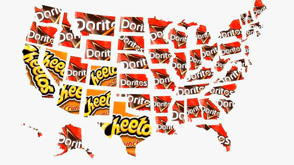
    I realize I have no scientific data, but in my experience, Eastern North Carolina is heavy Pepsi country since it was created in New Bern.

    View more commentsArrow down menu
    ADVERTISEMENT
    #33

    Map showing an unintuitive triangle with distances between Portugal, South Africa, and Chukotka in kilometers, illustrating interesting information through maps.

    datastuffplus Report

    Add photo comments
    POST
    Lyone Fein
    Community Member
    3 weeks ago DotsCreated by potrace 1.15, written by Peter Selinger 2001-2017

    It looks out of proportion because, once again, Africa is being portrayed as being smaller than its actual size.

    View more commentsArrow down menu
    ADVERTISEMENT
    #34

    Line graph showing interesting information with a rise in online chess memberships after The Queen’s Gambit release.

    datastuffplus Report

    Add photo comments
    POST
    2econdSelf
    Community Member
    3 weeks ago DotsCreated by potrace 1.15, written by Peter Selinger 2001-2017

    I don’t care about the validity of this stat, it’s a fantastic show.

    View more commentsArrow down menu
    #35

    Map of Europe showing a straight line from northernmost to southernmost points missing the continent, with interesting information.

    datastuffplus Report

    Add photo comments
    POST
    Chewie Baron
    Community Member
    Premium
    3 weeks ago DotsCreated by potrace 1.15, written by Peter Selinger 2001-2017

    Shouldn’t the line be further down? To the Azores perhaps? They belong to Portugal.

    View more commentsArrow down menu
    ADVERTISEMENT
    #37

    World map showing cultures motivated by guilt, shame, and fear with color-coded charts explaining each motivation type.

    datastuffplus Report

    Add photo comments
    POST
    BeesEelsAndPups
    Community Member
    3 weeks ago DotsCreated by potrace 1.15, written by Peter Selinger 2001-2017

    Brazilian here. Guilt for what? What motivates us? Samba, cachaça, food, friends, and samba.

    View more commentsArrow down menu
    ADVERTISEMENT
    #38

    Chart showing how much personal data Google, Facebook, Tinder, Uber, Spotify, and Netflix actually and predictively know.

    datastuffplus Report

    Add photo comments
    POST
    nut nibbler
    Community Member
    3 weeks ago DotsCreated by potrace 1.15, written by Peter Selinger 2001-2017

    Funny how every time I have a conversation with my mother on the phone that topic mentioned suddenly appears on YT. ;)

    View more commentsArrow down menu
    #40

    Map of North America showing landlocked, doubly landlocked, and not landlocked regions with color-coded chart for easy reference.

    datastuffplus Report

    Add photo comments
    POST
    DeoManus Argentem
    Community Member
    3 weeks ago (edited) DotsCreated by potrace 1.15, written by Peter Selinger 2001-2017

    Landlocked means "has no territory bordering an ocean" - lakes and rivers don't count. To respond to multiple comments.

    View more commentsArrow down menu
    ADVERTISEMENT
    ADVERTISEMENT
    See Also on Bored Panda
    #42

    Map showing largest ancestry by county in the US with various ethnic groups using color-coded charts and graphs.

    datastuffplus Report

    Add photo comments
    POST
    Barbara Burns
    Community Member
    3 weeks ago (edited) DotsCreated by potrace 1.15, written by Peter Selinger 2001-2017

    Ugh. Too hard to tell the colors apart. Need a different chart style.

    View more commentsArrow down menu
    #43

    US map showing interesting information on regional terms for household item sales like garage, yard, tag, and rummage sales.

    datastuffplus Report

    Add photo comments
    POST
    Bryn
    Community Member
    Premium
    3 weeks ago DotsCreated by potrace 1.15, written by Peter Selinger 2001-2017

    If it's on the yard, it's a yard sale. If it's on the driveway/in the garage, it's a garage sale.

    View more commentsArrow down menu
    #44

    World map displaying length of constitutions in words using color-coded charts and graphs for countries globally.

    datastuffplus Report

    Add photo comments
    POST
    Eastendbird
    Community Member
    3 weeks ago DotsCreated by potrace 1.15, written by Peter Selinger 2001-2017

    The UK doesn't have a single, codified constitution so counting the words would be a difficult task.

    View more commentsArrow down menu
    ADVERTISEMENT
    See Also on Bored Panda
    ADVERTISEMENT
    See Also on Bored Panda
    #48

    Bar chart showing LGBT identification percentages in U.S. adults by generation from 2014 to 2020 with key data points.

    datastuffplus Report

    Add photo comments
    POST
    Luke Branwen
    Community Member
    3 weeks ago DotsCreated by potrace 1.15, written by Peter Selinger 2001-2017

    I'd say that if we lived in a world where being queer is 100% safe, without legal problems and social stigma, it'd be easily 20% AT LEAST. (Also people don't "identify as" queer, they ARE queer. "Identifies as" is conservative microaggression that translates to "they think they're something they're actually not".)

    View more commentsArrow down menu
    ADVERTISEMENT
    See Also on Bored Panda
    #49

    Map chart showing the probability of a white Christmas across the USA with color-coded percentages and interesting information presented through maps.

    datastuffplus Report

    Add photo comments
    POST
    Mel in Georgia
    Community Member
    Premium
    3 weeks ago DotsCreated by potrace 1.15, written by Peter Selinger 2001-2017

    I was visiting Arizona (SW US, <10% probability) in 1988. Had a Christmas Eve snowfall. Saguaro cacti were blanketed in snow. So amazing.

    View more commentsArrow down menu
    ADVERTISEMENT
    See Also on Bored Panda
    Continue reading with Bored Panda Premium
    Unlimited content
    Ad-free browsing
    Dark mode
    #51

    Color-coded chart presenting interesting information through graphs showing accuracy of true stories in Hollywood films.

    datastuffplus Report

    Add photo comments
    POST
    nut nibbler
    Community Member
    3 weeks ago DotsCreated by potrace 1.15, written by Peter Selinger 2001-2017

    So by the same process Jurassic Park can be based on a true story if you say the true part was someone digging up dinosaur bones and the rest is just raptorpoop

    View more commentsArrow down menu
    #54

    World map with interesting information presented through charts showing most-watched cartoons by country in 2021.

    datastuffplus Report

    Add photo comments
    POST
    Heir of Durin
    Community Member
    3 weeks ago DotsCreated by potrace 1.15, written by Peter Selinger 2001-2017

    Throw Bluey in there and the entire world will be one color! 😂

    View more commentsArrow down menu
    #55

    Bar chart showing percentages of Americans wanting flags banned, presenting interesting information through maps, charts, and graphs.

    datastuffplus Report

    Add photo comments
    POST
    Manos
    Community Member
    3 weeks ago DotsCreated by potrace 1.15, written by Peter Selinger 2001-2017

    None should be banned. I want to see who thinks it is a good idea to fly a N**i flag.

    View more commentsArrow down menu
    See Also on Bored Panda
    #63

    Map showing fall colors and peak autumn foliage times across the United States with charts and interesting information.

    datastuffplus Report

    Add photo comments
    POST
    #64

    Area chart showing the slow decline of comedy movies in the U.S. with market share data presented through maps and graphs.

    datastuffplus Report

    Add photo comments
    POST
    TotallyNOTAFox
    Community Member
    3 weeks ago (edited) DotsCreated by potrace 1.15, written by Peter Selinger 2001-2017

    It became harder to make jokes without Twitter going into a rage and we did end up with either dry or fart humour. It's ok to take a p**s out of groups if it's done tasteful and/or in a clever way in my opinion. And yeah, you might say "don't be so sour, kraut" but german humour isn't a laughing matter to begin with so we have to rely on international productions

    View more commentsArrow down menu
    #65

    Color-coded map showing breakfast chains with most locations by state in the US, using charts and graphs for data visualization.

    datastuffplus Report

    Add photo comments
    POST
    Mel in Georgia
    Community Member
    Premium
    3 weeks ago DotsCreated by potrace 1.15, written by Peter Selinger 2001-2017

    Locally, we literally have 2 Waffle Houses diagonally opposite to each other on the same road off the highway.

    View more commentsArrow down menu
    #66

    Map and chart showing squirrel to human ratio by state with color-coded graph and data visualization details.

    datastuffplus Report

    Add photo comments
    POST
    Mel in Georgia
    Community Member
    Premium
    3 weeks ago DotsCreated by potrace 1.15, written by Peter Selinger 2001-2017

    The squirrels in my backyard in Georgia could easily overwhelm us. Luckily, we keep a respectful distance.

    #68

    Map showing American football vs soccer preferences across the United States using color-coded visual data.

    datastuffplus Report

    Add photo comments
    POST
    CD Mills
    Community Member
    3 weeks ago DotsCreated by potrace 1.15, written by Peter Selinger 2001-2017

    And I am the only person in the entire country who doesn't like ANY type of football?

    View more commentsArrow down menu
    #69

    Heat map showing how far you can drive out of major US cities in one hour, with interesting information presented through maps and charts.

    datastuffplus Report

    Add photo comments
    POST
    See Also on Bored Panda
    #73

    Daily routine of famous creative people shown through colorful charts, presenting interesting information through maps, charts, and graphs.

    datastuffplus Report

    Add photo comments
    POST
    JoNo
    Community Member
    3 weeks ago DotsCreated by potrace 1.15, written by Peter Selinger 2001-2017

    How can anyone remotely know this information? Maybe Mozart, Darwin, Picasso and friends completed an online survey?

    #75

    Map and chart showing the cost to propose at every Major League Baseball stadium, presenting interesting information visually.

    datastuffplus Report

    Add photo comments
    POST
    Joanne Mendonza-Earle
    Community Member
    3 weeks ago DotsCreated by potrace 1.15, written by Peter Selinger 2001-2017

    You have to pay to propose at a major league ballpark? Or is that if you want it on the jumbotron?

    View more commentsArrow down menu
    #76

    World map chart showing the most famous US states globally with California, New York, Texas, and Florida highlighted.

    datastuffplus Report

    Add photo comments
    POST
    Heir of Durin
    Community Member
    3 weeks ago DotsCreated by potrace 1.15, written by Peter Selinger 2001-2017

    So this is saying the most famous state to those living in the US is Texas? I don’t get it.

    View more commentsArrow down menu
    #77

    Area chart showing unit sales of popular video game consoles worldwide from 2006 to 2018 with interesting information presented.

    datastuffplus Report

    Add photo comments
    POST
    basmilko
    Community Member
    3 weeks ago DotsCreated by potrace 1.15, written by Peter Selinger 2001-2017

    I miss the wii - as someone with AD/HD and hand/eye coordination issues - the wii controller was soooooooo much easier for me to use.

    View more commentsArrow down menu
    #78

    Map showing closest capitals when in the USA with color-coded regions and flags, presenting interesting information through maps and charts.

    datastuffplus Report

    Add photo comments
    POST
    basmilko
    Community Member
    3 weeks ago DotsCreated by potrace 1.15, written by Peter Selinger 2001-2017

    I am confused by the top of Alaska. wouldn't moscow, oslo, and a few other capitals be closer than iceland? I don't think I am completely understanding the map.

    View more commentsArrow down menu
    #79

    Map showing Google search trends in America by country, using charts and graphs to present interesting information.

    datastuffplus Report

    Add photo comments
    POST
    Lyone Fein
    Community Member
    3 weeks ago DotsCreated by potrace 1.15, written by Peter Selinger 2001-2017

    I can’t believe that these are the most googled. What about Russia, Israel, France, Iran, Ukraine, ?

    View more commentsArrow down menu