ADVERTISEMENT

There’s something deeply satisfying about taking a huge amount of data and turning it into a gorgeous, easily understandable, educational graph. Presenting vast swathes of info in a way that everyone can understand is an incredibly skill.

The team behind the ‘Information Is Beautiful’ project are masters of data visualization, showing you the world in ways you might not have seen it before. Today, we’re featuring some of the intriguing graphs and diagrams that they’ve shared online to show you fresh new perspectives. Scroll down to check them out. And if you love what you’re seeing, be sure to visit their site and follow their socials for more.

Bored Panda has reached out to the ‘Information Is Beautiful’ team via email to learn more about their awesome project, and we’ll update the article as soon as we hear back from them.

More info: Facebook | Instagram | X | Books | InformationIsBeautiful.com

#1

Truthpaste! Love This Labelling - Let's Roll It Out Across All Products

List of toothpaste ingredients with their sources and functions shown in an infographic style for data perspective.

informationisbeautiful Report

Mreoww
Community Member
6 months ago Created by potrace 1.15, written by Peter Selinger 2001-2017

This should be far more common

Delta Dawn
Community Member
6 months ago Created by potrace 1.15, written by Peter Selinger 2001-2017

this is something MAHA could work on that would be helpful, but no, let’s just ban science instead

Anonymous
Community Member
6 months ago Created by potrace 1.15, written by Peter Selinger 2001-2017

"Mom Mom Mom can we get the fennel, lemon, mint toothpaste!?"

RELATED:
    #2

    Har Har Yes

    Infographic showing perks of being an artist with data on money, work-life balance, and making family proud in a pie chart.

    informationisbeautiful , art_storefronts Report

    Schnitzel
    Community Member
    6 months ago Created by potrace 1.15, written by Peter Selinger 2001-2017

    So it’s alcohol/d***s, late with rent and canned mackerel??

    #3

    Revealing Cross Section Of A Road In England

    Cross-section infographic showing historical road layers from natural chalk to modern A road with related era illustrations.

    informationisbeautiful Report

    Delta Dawn
    Community Member
    6 months ago Created by potrace 1.15, written by Peter Selinger 2001-2017

    I’d love to know the scale

    Cronecast AtTheRisingMoon
    Community Member
    6 months ago Created by potrace 1.15, written by Peter Selinger 2001-2017

    I think the thickness of the modern road indicates something that you could base the scale around. A quick google search indicates that the minimum thickness would be 4 inches and the maximum 12 for asphalt or concrete. So guessing a foot on that first layer would be a high estimate 4 inches likely too low. Sorry to take the question super seriously, I was wondering too so I tried to figure it out.

    Load More Replies...
    Al Fun
    Community Member
    Premium
    6 months ago Created by potrace 1.15, written by Peter Selinger 2001-2017

    Love the Jaguar xj220 supercar representing today’s England

    Nicholas Rodrigo
    Community Member
    6 months ago Created by potrace 1.15, written by Peter Selinger 2001-2017

    Go to #16, it will reveal how they got the cross section.

    ‘Information Is Beautiful’ is the brainchild of David McCandless. He is the author of three best-selling infographic books:

    1. Knowledge Is Beautiful: Impossible Ideas, Invisible Patterns, Hidden Connections - Visualized;
    2. The Visual Miscellaneum: A Colorful Guide to the World's Most Consequential Trivia;
    3. And—most recently—Beautiful News: Positive Trends, Uplifting Stats, Creative Solutions.
    ADVERTISEMENT

    The founder has also spoken at TED Global, as well as at 200+ conferences and events. What’s more, he runs the startup VizSweet, “a lovely artisan tool for creating beautiful interactive data visualisation.” McCandless, along with his dedicated team at ‘Information Is Beautiful,’ aims to explain, distill, and clarify data, information, and knowledge into beautiful and useful graphics and diagrams.

    #4

    Beautiful Elevation Art

    3D infographic of South America showing elevation data with vibrant colors, part of interesting infographics and data collection.

    informationisbeautiful , cstats1 Report

    Multa Nocte
    Community Member
    Premium
    6 months ago Created by potrace 1.15, written by Peter Selinger 2001-2017

    I like that - it really gives a good perspective.

    BrunoVI
    Community Member
    6 months ago Created by potrace 1.15, written by Peter Selinger 2001-2017

    The only thing I don't like about it as that those mountains in Southern Brazil and Venezuela are quite formidable and pretty much unknown of by anyone outside of South America. This map keeps them hidden by coloring them so similarly to coastal plains and the Amazon basin.

    Load More Replies...
    Pyla
    Community Member
    6 months ago Created by potrace 1.15, written by Peter Selinger 2001-2017

    Now we see why they call it the amazon basin.

    Nicole Weymann
    Community Member
    6 months ago Created by potrace 1.15, written by Peter Selinger 2001-2017

    And the mountains in the east are much older than the Andes!

    Load More Replies...
    nope
    Community Member
    6 months ago Created by potrace 1.15, written by Peter Selinger 2001-2017

    Don't get me wrong, I love the purpose of this, but it is a visual map with data. This one specifically I would not call art

    Susan Reid Smith
    Community Member
    6 months ago Created by potrace 1.15, written by Peter Selinger 2001-2017

    Cartography is an art as well as a science. It starts with the data but then like graphic design all of the elements have to balance with the actual map being most prominent of course.

    Load More Replies...
    Lil be lil
    Community Member
    6 months ago Created by potrace 1.15, written by Peter Selinger 2001-2017

    The Andes mountains must cast some shadow!

    Nitka Tsar
    Community Member
    6 months ago Created by potrace 1.15, written by Peter Selinger 2001-2017

    Wow…. I knew there were mountains, but I never knew it looked quite like that.

    #5

    Because Vaccines Work

    Infographic showing data on vaccine effectiveness with yearly cases before and after vaccine introduction.

    informationisbeautiful Report

    The Darkest Timeline
    Community Member
    6 months ago Created by potrace 1.15, written by Peter Selinger 2001-2017

    The anti-science and anti-intellectual attitudes among far too many people is sad and enraging.

    amy lee
    Community Member
    6 months ago Created by potrace 1.15, written by Peter Selinger 2001-2017

    Making information accessible (simple) is the only way to fight misinformation

    Load More Replies...
    SouthernGal
    Community Member
    6 months ago Created by potrace 1.15, written by Peter Selinger 2001-2017

    That measles number is going to start changing if antivaxers don’t wise up.

    CP
    Community Member
    6 months ago Created by potrace 1.15, written by Peter Selinger 2001-2017

    It just upsets me that we have robbed our immune systems of glorious battle and a seat at Valhalla.

    Robert Benson
    Community Member
    6 months ago Created by potrace 1.15, written by Peter Selinger 2001-2017

    The vaccines allow our immune system to prepare for the battle beforehand, instead of just tossing a desk worker into a glorious battle without training.

    Load More Replies...
    Jenna
    Community Member
    6 months ago Created by potrace 1.15, written by Peter Selinger 2001-2017

    A graphic of the world would really be enlightening enlightening to many! Unfortunately for other countries, this isn't always the case.

    Jane Hower
    Community Member
    5 months ago Created by potrace 1.15, written by Peter Selinger 2001-2017

    These are TRUE VACCINES - one shot and done - these UNTESTED Covid/Flu 'shots' are NOT VACCINES!!! Because you still get it, still spread it, and have to take boosters!!!!!!! IT WAS A SCAM!!!!!

    Lil be lil
    Community Member
    6 months ago Created by potrace 1.15, written by Peter Selinger 2001-2017

    Chicken pox took over! It was ubiquitous in the 50's we kids all got it! Btw, I got vaxed against the Shingles.

    HardBoiledBlonde
    Community Member
    6 months ago Created by potrace 1.15, written by Peter Selinger 2001-2017

    The US no longer vaccinates for TB.

    Pursuing Peonies
    Community Member
    6 months ago Created by potrace 1.15, written by Peter Selinger 2001-2017

    That's because, like measles, mumps, rubella, and polio, it was nearly eradicated from this country. Or should I say like small pox, which was eradicated (which is why we stopped mass vaccines for it) from the US and anti vaxxers brought it back.

    Load More Replies...
    whiterabbit
    Community Member
    6 months ago Created by potrace 1.15, written by Peter Selinger 2001-2017

    Ok now add COVID to that list.

    Ravenkbh
    Community Member
    6 months ago

    This comment has been deleted.

    View more comments
    ADVERTISEMENT
    #6

    Most Offensive Types Of Pillow Cases

    Illustration showing the most offensive types of pillow cases with captions in an interesting infographic style.

    informationisbeautiful , beckybarnicomics Report

    The Darkest Timeline
    Community Member
    6 months ago Created by potrace 1.15, written by Peter Selinger 2001-2017

    I like the kind that has the flap that closes up the end where the pillow goes in

    Don't listen to me
    Community Member
    6 months ago Created by potrace 1.15, written by Peter Selinger 2001-2017

    All the actual pillowcases I've ever had are like that. Not the cushion covers.

    Load More Replies...
    Mreoww
    Community Member
    6 months ago Created by potrace 1.15, written by Peter Selinger 2001-2017

    Don’t forget the one with decorative beads and buckles and other hard, shiny things.

    Nitka Tsar
    Community Member
    6 months ago Created by potrace 1.15, written by Peter Selinger 2001-2017

    Those things are not for sleeping. They are purely ornamental

    Load More Replies...
    Cydney Golden
    Community Member
    6 months ago Created by potrace 1.15, written by Peter Selinger 2001-2017

    The kind with the floppy edges is a sham, for decoration only. I use it to prop up in bed to read. It's not for actually sleeping on.

    Lil be lil
    Community Member
    6 months ago Created by potrace 1.15, written by Peter Selinger 2001-2017

    My pillow is a stuffed pink owl! Can't sleep with any pillows I tried, even a babies flat pillow found on Amazon. Pink owl ends up under my arm anyways.

    Jill Rhodry
    Community Member
    6 months ago Created by potrace 1.15, written by Peter Selinger 2001-2017

    Flappy edges is a sham for decorative pillows, not sleeping ones, if you use two this one goes on the bottom - zips closure, just poke the zip pulling thingy inside - lace edge, flip it over - too small, check sizes before buying

    View more comments
    ADVERTISEMENT

    According to the team running the project, all of their visualizations are based on facts and data. They constantly update and revise them. McCandless and his team members actually mostly create their graphics by hand, using the Illustrator program (a personal favorite of some of us, too).

    Meanwhile, many of the interactive data visualizations they make are actually created using their proprietary VizSweet software.

    #7

    In The First Half Of The 20th Century, Tens Of Thousands Of People (Mostly Children) Suffered Paralysis From Polio. The First Vaccine Was Introduced In The USA In 1955

    Line graph showing reported polio cases in the US from 1910 to 2022 with drastic decline after vaccine introduction.

    informationisbeautiful , ourworldindata Report

    The Darkest Timeline
    Community Member
    6 months ago Created by potrace 1.15, written by Peter Selinger 2001-2017

    We’ve been so successful at eradicating and mitigating so many diseases, far too many people think they don’t have to do anything

    lwolf1952
    Community Member
    6 months ago Created by potrace 1.15, written by Peter Selinger 2001-2017

    Make polio great again. -- RFK Jr.

    Lil be lil
    Community Member
    6 months ago Created by potrace 1.15, written by Peter Selinger 2001-2017

    You mean RFrankensteinK? "I swim in toxic cesspool", brain worm rfk?

    Load More Replies...
    Karl der Große
    Community Member
    6 months ago Created by potrace 1.15, written by Peter Selinger 2001-2017

    Years ago, I worked with a woman who was an unapologetic anti-vaxxer. She said, "People really didn't get that sick with polio. For most people, it was just like a little flu." I offered to introduce her to my friend, who was an older fellow who had been quite disabled by the disease. She accused me of bullying her, and she said, "People die of the common cold, too. That doesn't mean it's bad."

    Lotekguy
    Community Member
    Premium
    6 months ago Created by potrace 1.15, written by Peter Selinger 2001-2017

    And she has a vote like the rest of us.

    Load More Replies...
    Giles McArdell
    Community Member
    6 months ago Created by potrace 1.15, written by Peter Selinger 2001-2017

    Wait for a new spike in 2025 now the Orange 4rsehole and his vaccine denying cronies are in charge.

    IORN
    Community Member
    6 months ago Created by potrace 1.15, written by Peter Selinger 2001-2017

    Doesn't mean the virus is extinct. If you remove vaccination, you get it back.

    Nitka Tsar
    Community Member
    6 months ago Created by potrace 1.15, written by Peter Selinger 2001-2017

    Ooooh my goodness, today I finally googled what Polio is called in my native language, German, and it is Kinderlähmung! (Child paralysis). I never connected the two before.

    Miki
    Community Member
    Premium
    6 months ago (edited) Created by potrace 1.15, written by Peter Selinger 2001-2017

    In PL there are two names: Polio and Heine-Medin disease

    Load More Replies...
    Jane Hower
    Community Member
    5 months ago Created by potrace 1.15, written by Peter Selinger 2001-2017

    Again, this is a TRUE VACCINE!! One shot and done!! Not so with the 'flu shots' like Covid. It was a horrible thing to misname these ineffective and bad side effect untested 'SHOTS' to be called 'vaccines'. It was a scam on the population - the shots are DESIGNED to depopulate the world - make infertility common, cause heart issues, etc etc. If you took one and survived, you are lucky - don't take any more.

    Lil be lil
    Community Member
    6 months ago Created by potrace 1.15, written by Peter Selinger 2001-2017

    Seems I was born during the peak of polio infections. I got vaxxed in '55 or 56.

    Monosyllabicgirl
    Community Member
    6 months ago Created by potrace 1.15, written by Peter Selinger 2001-2017

    My daughter's step grandma had polio around that time, she was part of the last wave. Knowing her in my late teens is what fully made me understand how important vaccines are and that it's not just something you do or are told to do. She didn't have full use of her legs, was on oxygen, and passed away before all of her other siblings pretty young, around 50 ish

    Load More Replies...
    View more comments
    #8

    True? True

    Text infographic showing the creative process in six steps with varying emotions, part of interesting infographics and data.

    informationisbeautiful Report

    Jaya
    Community Member
    6 months ago Created by potrace 1.15, written by Peter Selinger 2001-2017

    2 days later: 7. Is it really awesome? Does it actually suck? Do I suck?

    #9

    Map infographic comparing Africa’s size to countries like the United States, China, and India for perspective on data.

    informationisbeautiful , Medium Report

    Glix Drap
    Community Member
    Premium
    6 months ago Created by potrace 1.15, written by Peter Selinger 2001-2017

    Africa is big. Really big. You just won't believe how vastly hugely mind-bogglingly big it is. I mean, you may think it's a long way down the road to the chemist, but that's just peanuts to Africa.

    Auntriarch
    Community Member
    6 months ago Created by potrace 1.15, written by Peter Selinger 2001-2017

    I'd say upvote for the reference, but I can't remember where it's from. HHGTTG?

    Load More Replies...
    Cronecast AtTheRisingMoon
    Community Member
    6 months ago Created by potrace 1.15, written by Peter Selinger 2001-2017

    You know, this is the first time I have really understood just how big Africa is, thank you for this. I know people come to the states not understanding the size but this really puts that in perspective.

    BrunoVI
    Community Member
    6 months ago Created by potrace 1.15, written by Peter Selinger 2001-2017

    To emphasize that overpopulation is about resources, not land area: Take the wealthiest, poshes, low-rise neighborhood in Europe, a suburb of Paris. Now, go to Madagascar, that little chip off the Southeastern coast of Africa. Preserve fully half of the land for all those crazy, wonderful animals unique to Madagascar. On only the remaining half of Madagascar, and use it to build a city that's exactly like that Parisian suburb, except sprawled out to cover that area. That new city you just built would have a population equivalent to the ENTIRE PLANET EARTH. The entire rest of the Earth could be used for wildlife refuge, parks, farmland, whatever.

    Phyzzi
    Community Member
    6 months ago Created by potrace 1.15, written by Peter Selinger 2001-2017

    A substantial amount would have to be farmland. You can put people in a fairly small space, especially if you use some verticality, but our food takes up a much more substantial chunk of land, especially if we (as a species) keep insisting on eating meat.

    Load More Replies...
    Glen Ellyn
    Community Member
    Premium
    6 months ago Created by potrace 1.15, written by Peter Selinger 2001-2017

    Sorry, Australia. We ran out of room. ¯\_(ツ)_/¯

    Miki
    Community Member
    Premium
    6 months ago (edited) Created by potrace 1.15, written by Peter Selinger 2001-2017

    I think I see Poland on top of that, so that's central Europe.

    Load More Replies...
    Tim Steil
    Community Member
    6 months ago Created by potrace 1.15, written by Peter Selinger 2001-2017

    Cartographers for Social Equality?

    View more comments
    ADVERTISEMENT
    ADVERTISEMENT

    Something else that’s mindblowing is that the founder of the project, McCandless, actually made The Helicopter Game. It’s something that we’ve played and thoroughly enjoyed during breaks in between IT classes at school.

    At the time of writing, the ‘Information Is Beautiful’ Facebook page boasts 531k followers from all over the globe. Meanwhile, 232k social media users follow the project on Instagram, while another 119k do so on X (formerly Twitter).

    #10

    Lovely Chart Of Doggie Body Language

    Infographic illustrating various dog emotions and behaviors with illustrated Boston Terrier in a colorful data format.

    informationisbeautiful , Lili Chin Report

    Jenna
    Community Member
    6 months ago Created by potrace 1.15, written by Peter Selinger 2001-2017

    Showing their belly could also indicate them opting out or saying "no thank you" (I'm a professional service dog trainer of 13 years). Also remember wagging tail really only indicates arousal and not "happy" - so yes it might mean happy/excited but it also might mean I might bite you

    Glen Ellyn
    Community Member
    Premium
    6 months ago Created by potrace 1.15, written by Peter Selinger 2001-2017

    Okay. Where's the one for cats? 🐈🐈‍⬛

    XenoMurph
    Community Member
    6 months ago Created by potrace 1.15, written by Peter Selinger 2001-2017

    Where is the "Dog h*****g leg" one?

    Karl der Große
    Community Member
    6 months ago Created by potrace 1.15, written by Peter Selinger 2001-2017

    It's a lot of little pictures to filter through if I think I'm about to get bitten.

    J3447
    Community Member
    6 months ago Created by potrace 1.15, written by Peter Selinger 2001-2017

    You're missing one, my dog sometimes puts his forehead in my lap or on a pillow.

    Glix Drap
    Community Member
    Premium
    6 months ago Created by potrace 1.15, written by Peter Selinger 2001-2017

    You missed The Flying Freddie (in homage to the K9 agent who was kicked by an Egyptian visitor at Dallas).

    #11

    Wait, Who Is My Third Cousin Twice Removed? Oh

    Infographic showing a detailed cousin explainer chart with family relationships and cousin removal levels.

    informationisbeautiful Report

    JayhawkJoey
    Community Member
    6 months ago Created by potrace 1.15, written by Peter Selinger 2001-2017

    It's still too complicated.

    Ripley
    Community Member
    6 months ago Created by potrace 1.15, written by Peter Selinger 2001-2017

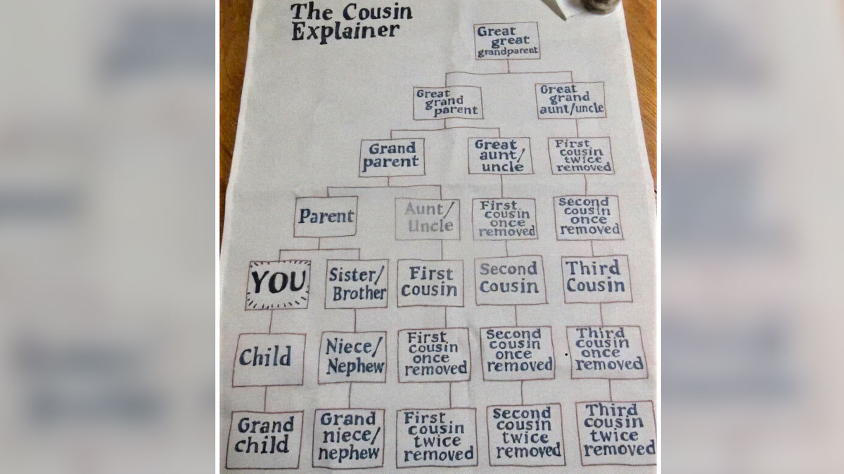
    It all makes perfect sense when I'm looking at the graphic, and the *second* it's out of sight I've forgotten everything and they're all just cousins.

    Load More Replies...
    Ravenkbh
    Community Member
    6 months ago Created by potrace 1.15, written by Peter Selinger 2001-2017

    My third cousin was twice removed by child protective services

    Joe Russo
    Community Member
    6 months ago Created by potrace 1.15, written by Peter Selinger 2001-2017

    Very confusing in Greece getting introduced to my wife's extended family. Anyone who is a type of cousin that is not a first cousin that is older than her is an uncle or aunt. If much older, is a grandparent of some kind. Everyone younger, no matter how distantly related is a cousin. Simple for the labels...but no clue how they're related.

    No Man
    Community Member
    6 months ago Created by potrace 1.15, written by Peter Selinger 2001-2017

    Ahhh! I had the 1st, 2nd, 3rd cousin thing down, but never understood the "removed" bit before now!

    The Majestic Opossum
    Community Member
    Premium
    6 months ago Created by potrace 1.15, written by Peter Selinger 2001-2017

    This is so helpful! My kids have been debating for years what the children of my husband's cousins are to them (sadly, no cousins of their own, so it's the closest they have).

    Monosyllabicgirl
    Community Member
    6 months ago Created by potrace 1.15, written by Peter Selinger 2001-2017

    I was given a chart like this while i was waitressing by an older gentleman who was researching his genealogy. After a while I felt like I knew his whole family back in Belgium lol. It was of particular interest to me because I carried as a surrogate for one of my mom's (regular cousin, child of her aunt) cousins, using my own eggs and donor s***m. I was curious how my daughter was related to the adoptive parents and kind of to herself. Her parents are my first cousins once removed and she is my own second cousin. Lol. No need for banjos in background as it's through adoption 🤣

    Marnie
    Community Member
    6 months ago Created by potrace 1.15, written by Peter Selinger 2001-2017

    My ex-husband couldn't quite even figure out what it meant when I referred to my nieces and nephews. And, he didn't understand that I loved them very much. He thought I was just being emotional and attention-seeking by saying that. He didn't have any nieces or nephews. He did have siblings, aunts, and uncles.

    Jenna
    Community Member
    6 months ago Created by potrace 1.15, written by Peter Selinger 2001-2017

    Sounds like he's better as an ex then! Good for you!

    Load More Replies...
    Caro Ansaldo
    Community Member
    4 months ago Created by potrace 1.15, written by Peter Selinger 2001-2017

    I don't understand why in English you "remove cousins" lol

    Holly Herr
    Community Member
    6 months ago Created by potrace 1.15, written by Peter Selinger 2001-2017

    As soon as I saw this as a college student I copied it. (Pre-internet)

    Rianna Lewis
    Community Member
    6 months ago Created by potrace 1.15, written by Peter Selinger 2001-2017

    I get it but at the same time it’s so confusing.. especially having the same title like “First Cousin one removed” but being related in that way as your first cousin is the reason their baby is related to you, but also you can be a “first cousin once removed” also by having a Great Auntie/Uncle’s kid having the same title as your first cousins kid.. who made this rule 😂

    Monosyllabicgirl
    Community Member
    6 months ago Created by potrace 1.15, written by Peter Selinger 2001-2017

    once removed is for generation, regardless of age. so my moms cousins are cousins once removed because they are one generation from me

    Load More Replies...
    View more comments
    #12

    Classic Isotype Infographic From The 1940s

    Infographic showing animal lifespans with mammals, birds, vertebrates, and invertebrates in a visual data format.

    informationisbeautiful Report

    Laura Gillette
    Community Member
    6 months ago Created by potrace 1.15, written by Peter Selinger 2001-2017

    I thought cats generally live longer than dogs

    Dragons Exist
    Community Member
    6 months ago Created by potrace 1.15, written by Peter Selinger 2001-2017

    Camels used to be called dromedaries?

    Lil be lil
    Community Member
    6 months ago Created by potrace 1.15, written by Peter Selinger 2001-2017

    These are averages. Where do humans come in? I'm older than a whale, so I guess I'm above average

    Jenna
    Community Member
    6 months ago Created by potrace 1.15, written by Peter Selinger 2001-2017

    Hmm, wonder how many chickens live to be almost 20 years old 🤔

    Glen Ellyn
    Community Member
    Premium
    6 months ago Created by potrace 1.15, written by Peter Selinger 2001-2017

    Where's the giraffe? 🦒

    MsPlants
    Community Member
    6 months ago (edited) Created by potrace 1.15, written by Peter Selinger 2001-2017

    ugh alligators and crocodiles live up to 70 years in the wild, longer in captivity, alligators on the other hand live 50 years in the wild and longer in captivity... im not even going to touch the fact that the whales numbers are way off and so are the parrots so im just going to say this whole list is junk.

    Pursuing Peonies
    Community Member
    6 months ago Created by potrace 1.15, written by Peter Selinger 2001-2017

    To be fair, it's from the 40s when they didn't really pay too much attention to wildlife (or the people who did pay attention to wildlife, unfortunately)

    Load More Replies...
    Tim Steil
    Community Member
    6 months ago Created by potrace 1.15, written by Peter Selinger 2001-2017

    Slow and steady wins the race.

    View more comments
    ADVERTISEMENT

    With so much information flooding our social media and news feeds daily, it’s impractical to double-check and cross-reference every single bit of info we stumble across.

    So, it’s much more time-efficient to evaluate the reliability of the sources you come across. Although all sources, even the best ones, make mistakes, not all sources are equal.

    Reliable sources do their best to get to the truth, link to the info they use, and make corrections whenever they slip up. On the flip side, bad sources care only about sensationalism, clicks, and moving whatever agenda they have further.

    ADVERTISEMENT
    #13

    How Rich People Avoid Paying Tax

    Infographic explaining how rich people pay no taxes using company stock and borrowing strategies in financial data.

    informationisbeautiful , newmoney.blog Report

    Multa Nocte
    Community Member
    Premium
    6 months ago Created by potrace 1.15, written by Peter Selinger 2001-2017

    Grrrrrr . . . . . .

    Giles McArdell
    Community Member
    6 months ago Created by potrace 1.15, written by Peter Selinger 2001-2017

    1) The income tax calc is wrong, but that's not what they're trying to show, so we can forgive that. 2) In "No Tax" he has to pay interest on the loan, probably still less than the other taxes though.

    martin734
    Community Member
    Premium
    6 months ago Created by potrace 1.15, written by Peter Selinger 2001-2017

    The income tax % in normal is wrong. Nobody pays 40% income tax on their whole salary. My salary is £67000, I pay £3000 in pension contributions and £12500 of my income is tax free. This means that my taxable income is £51430. £37701 of my income is in the basic tax band which means I pay 20% tax on it, which is £7540. The remaining £13729 of my salary is in the higher tax bracket and I pay 40% tax on it, which is £5492. The total income tax I pay is £13032, which is 19.5% of my total income. Most countries use these progressive tax bands including the USA.

    RedMarbles
    Community Member
    6 months ago Created by potrace 1.15, written by Peter Selinger 2001-2017

    Yeah, I get the impression most people don't know that the highest tax rate is only applied to the money earned over a certain amount. It should be mentioned more often.

    Load More Replies...
    Delta Dawn
    Community Member
    6 months ago Created by potrace 1.15, written by Peter Selinger 2001-2017

    Not quite. You pay regular income tax when your stock options are vested (fully given to you), and then capital gains tax on any increase in value when you sell it. But the capital gains tax is much less than 25% if you’ve held the stock for at least a year.

    Robert Benson
    Community Member
    6 months ago Created by potrace 1.15, written by Peter Selinger 2001-2017

    Are you speaking from a US perspective? I have stocks that I am fully vested in, that I haven't paid any taxes on. They are part of my 401(k) or similar and won't be taxed until I liquidate them. I'm just a low-level worker, so I don't know what options the "big guys" have.

    Load More Replies...
    Jane Hower
    Community Member
    5 months ago Created by potrace 1.15, written by Peter Selinger 2001-2017

    And whil running their companies, or investing in companies, they are providing JOBS FOR THE REST OF US!!!!!!!!!!!!!!!!!! Stop being mad at rich people. WE NEED THEM!!!

    Lil be lil
    Community Member
    6 months ago Created by potrace 1.15, written by Peter Selinger 2001-2017

    Not intended to be an accurate picture. But I certainly get the "picture" now! 👿👿👿

    Pirate Luxe
    Community Member
    6 months ago Created by potrace 1.15, written by Peter Selinger 2001-2017

    This is a bit disingenuous... You borrow the money collateralized by the stocks. You still have a monthly payment on that loan. The money to make the payment comes from.....? Some use the proceeds from the loan to both live on and then make the monthly, then when the reserved funds get low they borrow more? How exactly does this work... Borrow til you die.

    Michael Largey
    Community Member
    6 months ago (edited) Created by potrace 1.15, written by Peter Selinger 2001-2017

    The third one doesn't tell the whole picture. He will be paying interest to the bank every year, possibly more than the amount the stocks will increase in value. The stocks may fall in value, in which case the bank will insist that he make up the difference in collateral. To regain the stock to sell it, he must get the money from somewhere to repay the $1 million to the bank. He will pay a capital gains tax on everything he gets when he sells the stock. He's really no different from the second one, except that he sells the stock later in hopes of a bigger cash in and paying loan interest for the privilege.

    Riley Quinn
    Community Member
    6 months ago Created by potrace 1.15, written by Peter Selinger 2001-2017

    Can't speak for other countries, but here in the US all you need are a bevy of lawyers in constant search of legal loopholes (i.e. poorly written laws that no one has bothered to correct) and a greedy Congress kowtowing to your lobbyists (and pocketing a substantial chunk of change).

    whiterabbit
    Community Member
    6 months ago (edited) Created by potrace 1.15, written by Peter Selinger 2001-2017

    For the US in 2022, the top 5% of earners — people with incomes $261,591 and above — collectively paid over $1.3 trillion in income taxes, or about 61% of the national total. If you include the top 10% — everyone who made at least $178,611 — that figure rises to $1.5 trillion, or 72% of the total. The top 50% of earners contributed 97% of federal income tax revenue. The top 1% of earners pay 40% of income taxes. So, in other words, the bottom 50% of earners only paid 3% of the total federal income tax collected.

    RedMarbles
    Community Member
    6 months ago Created by potrace 1.15, written by Peter Selinger 2001-2017

    Given how extreme wealth inequality has become, I wouldn't expect them to be a big percentage.

    Load More Replies...
    View more comments
    #14

    Design Costs

    Price list infographic showing design service options with increasing costs from 500 to 8000 EUR displayed on a black board.

    informationisbeautiful Report

    #15

    Periodic Table By Lickability

    Periodic table infographic showing elements color-coded by safety of licking them as part of interesting infographics and data.

    informationisbeautiful , Wellihol Report

    Remi (He/Him)
    Community Member
    6 months ago Created by potrace 1.15, written by Peter Selinger 2001-2017

    It's always funny how sodium and chlorine are both so dangerous alone, but get them together and it's just a bit salty

    MsPlants
    Community Member
    6 months ago Created by potrace 1.15, written by Peter Selinger 2001-2017

    this is actually so funny! this is why I love science and especially chemistry. you take 2 dangerous substances and put them together and bam! you ahve something humans cant live without. to me that is amazing. just moving a few electrons around to bond the elements together and you get something essential to human life. on the flip side you can take something humans need and move just one thing and make it deadly. its such an amazing puzzle

    Load More Replies...
    Miki
    Community Member
    Premium
    6 months ago Created by potrace 1.15, written by Peter Selinger 2001-2017

    You can lick everything. Just sometime only once.

    Riley Quinn
    Community Member
    6 months ago Created by potrace 1.15, written by Peter Selinger 2001-2017

    The answer is Yes. How many times you can lick it depends on the element.

    BrunoVI
    Community Member
    6 months ago Created by potrace 1.15, written by Peter Selinger 2001-2017

    just try to lick elemental hydrogen.

    ADVERTISEMENT

    Basic media literacy and the ability to recognize (un)reliable sources are skills that absolutely everyone should have. In this day and age of scandalous headlines, intentional misinformation, polarization, biases, and AI slop, there are so many ways to misinterpret information and mix up fact with fiction.

    #16

    Love A Revealing Cut-Away! (From A London Transport Museum Poster By Gavin Dunn)

    Cutaway infographic showing an underground metro station beneath a busy city square with detailed infrastructure and crowds.

    informationisbeautiful Report

    Monosyllabicgirl
    Community Member
    6 months ago Created by potrace 1.15, written by Peter Selinger 2001-2017

    Id love to see this cutaway of the tracks under central park new york. Have heard its more than 5 tunnels deep and that some people live under there and never leave. Have kids down there. Send runners to surface to get food/d***s/cash ssi checks. Mind boggling

    ADVERTISEMENT
    #17

    Measurement Unit Differences Between The U.s.a. And Most Of The World

    Infographic comparing United States and rest of world measurement units with data visualizations and scales.

    informationisbeautiful Report

    The Darkest Timeline
    Community Member
    6 months ago Created by potrace 1.15, written by Peter Selinger 2001-2017

    We Americans are such rebels, for better or worse

    Tim Steil
    Community Member
    6 months ago Created by potrace 1.15, written by Peter Selinger 2001-2017

    "The smoot /ˈsmuːt/ is a nonstandard, humorous unit of length created as part of an MIT fraternity pledge to Lambda Chi Alpha by Oliver R. Smoot, who in October 1958 lay down repeatedly on the Harvard Bridge between Boston and Cambridge, Massachusetts, so that his fraternity brothers could use his height to measure the length of the bridge.[1]"

    Karl der Große
    Community Member
    6 months ago Created by potrace 1.15, written by Peter Selinger 2001-2017

    When I worked in a lab in the US, we used metric all the time. I think the American calendar system has to go - it makes no sense.

    Alex Ruddies
    Community Member
    6 months ago Created by potrace 1.15, written by Peter Selinger 2001-2017

    Well, the best way I was explain was that Fahrenheit was how feels for humans, Celsius was for water and Kelvin was for atoms. In all honesty, when it comes to temperature outside of professional settings, Fahrenheit works best. The rest, on the other hand, metric is the way to go. Although, it would be interesting if we used Kelvin for just a year. Like, it's about 87f, or about 31c, but imagine hearing that it's 304k outside...

    Joe Russo
    Community Member
    6 months ago Created by potrace 1.15, written by Peter Selinger 2001-2017

    Having used both, I'd take all metric except temperature. Not being a scientist, Fahrenheit ranges lend themselves to 10s, and temperature differences of 10 are meaningful. The 70s are comfortable, for example. 80 starts to be a bit too hot. 90 it's freaking hot. 100 stay safe during the heat wave. That same range is 20 to 40 in Celsius, which feels too narrow...

    MoBeLa
    Community Member
    6 months ago Created by potrace 1.15, written by Peter Selinger 2001-2017

    This reminds me of my all-time favorite SNL sketch about choosing the U.S. system of weights and measures 😂 https://www.youtube.com/watch?v=JYqfVE-fykk&t=22s

    Marissa Camacho
    Community Member
    6 months ago Created by potrace 1.15, written by Peter Selinger 2001-2017

    Oh, yes! Love that! They prove how silly Americans are.

    Load More Replies...
    Stephen Hutchison
    Community Member
    6 months ago Created by potrace 1.15, written by Peter Selinger 2001-2017

    Celsius is STILL based on water freezing. It's less logical for measuring human temperatures because the scale is too coarse.

    TheReader19
    Community Member
    6 months ago Created by potrace 1.15, written by Peter Selinger 2001-2017

    All I ask from you America, is that you get the date right. dd/mm/yyyy

    Lil be lil
    Community Member
    6 months ago Created by potrace 1.15, written by Peter Selinger 2001-2017

    It's too complicated for me to convert! And it would be difficult. Like New Coke vs Original (classic) Coke, when that happened, omg!

    Nicholas Rodrigo
    Community Member
    6 months ago Created by potrace 1.15, written by Peter Selinger 2001-2017

    Make America great again, we're they great, tell me

    View more comments
    #18

    Global Antidepressant Use

    Bar chart showing global antidepressant users per 1,000 people by country, highlighting data from various nations.

    informationisbeautiful Report

    Multa Nocte
    Community Member
    Premium
    6 months ago Created by potrace 1.15, written by Peter Selinger 2001-2017

    You gotta admit - Americans need an antidepressant just about now.

    Marnie
    Community Member
    6 months ago Created by potrace 1.15, written by Peter Selinger 2001-2017

    Or to move. I am now seriously working on moving to another country. I will be an immigrant and hope they don't treat me as crappy as we treat them here now!

    Load More Replies...
    Nikki Sevven
    Community Member
    6 months ago Created by potrace 1.15, written by Peter Selinger 2001-2017

    Well, it's fücking depressing to live in the US, isn't it? There's so much that's awesome, but so much more potential that goes unrealized, largely due to greed and willful ignorance.

    Gen X Feral
    Community Member
    Premium
    6 months ago (edited) Created by potrace 1.15, written by Peter Selinger 2001-2017

    Boy isn't it? I mean there was just a mass shooting at a shopping mall yesterday and another one outside a bar last night with 4 deadd so far and like 14 people injured. There are so many absolutely awesome things here, but your risking your live just going outside.

    Load More Replies...
    Nitka Tsar
    Community Member
    6 months ago Created by potrace 1.15, written by Peter Selinger 2001-2017

    Finland, Sweden and Iceland might be because there is less sun, mighned it?

    CultOfBambi
    Community Member
    5 months ago (edited) Created by potrace 1.15, written by Peter Selinger 2001-2017

    That possibly has something to do with it - but if so, they should switch to a Vitamin D supplement rather - way fewer side-effects than with anti-depressants. Maybe (at least for Finland) it's the fact that they have Russia as a neighbour and are concerned about being invaded?

    Load More Replies...
    Ange Marsden
    Community Member
    6 months ago Created by potrace 1.15, written by Peter Selinger 2001-2017

    This would be interesting to compare to the availability of mental health care - the two together would really make a difference

    SouthernGal
    Community Member
    6 months ago (edited) Created by potrace 1.15, written by Peter Selinger 2001-2017

    And also the cultural attitudes about mental health and medication. Do some countries really have fewer depressed people or do they just go untreated?

    Load More Replies...
    geezeronthehill
    Community Member
    6 months ago Created by potrace 1.15, written by Peter Selinger 2001-2017

    I was missing Russia until I realized you can't trust stats from that government, anyway.

    Jane Hower
    Community Member
    5 months ago Created by potrace 1.15, written by Peter Selinger 2001-2017

    Does this measure how AVAILABLE or how EASY TO GET?? Maybe we just have more of it and can get it more easily.

    Chey Monks
    Community Member
    6 months ago Created by potrace 1.15, written by Peter Selinger 2001-2017

    Says global but this is majority European countries

    View more comments

    A good rule of thumb to keep in mind is to always consider what the source you’re looking at might be hoping to accomplish, and what their intentions are. According to archival expert Margot Note, you should ask yourself the following questions when gauging the reliability of a source:

    ADVERTISEMENT
    1. Who made the record? When did they make it and why?
    2. Was the source actually created at the same time as the event that’s described in it?
    3. Does the source have an agenda, and did they take part in the original event, or are they using secondhand info?
    4. Is the information logical? Does it make sense in the context of the people, places, and timeframe being researched?
    #19

    One 18 Inch Pizza Has 'More Pizza' Than 2 X 12 Inch Pizzas!

    Comparison of pizza areas using infographics and data, illustrating perspective changes with circle size calculations.

    informationisbeautiful , fermatslibrary Report

    The Darkest Timeline
    Community Member
    6 months ago Created by potrace 1.15, written by Peter Selinger 2001-2017

    Who says you’ll never use something you learn in school? Learning is a CHOICE.

    SouthernGal
    Community Member
    6 months ago Created by potrace 1.15, written by Peter Selinger 2001-2017

    I hate geometry. And now I crave pizza.

    Jane Hower
    Community Member
    5 months ago Created by potrace 1.15, written by Peter Selinger 2001-2017

    More pieces to divide up and share in the two

    #20

    Telling. Quantity Of Male Versus Female Dialogue In Best Picture Films Of Recent Decades

    Bar chart showing men speak more than women in best picture winning films by year, data infographic from interesting infographics and data.

    informationisbeautiful , puddingviz Report

    Multa Nocte
    Community Member
    Premium
    6 months ago Created by potrace 1.15, written by Peter Selinger 2001-2017

    Whoa! Shock me with new information!

    Jaya
    Community Member
    6 months ago (edited) Created by potrace 1.15, written by Peter Selinger 2001-2017

    Movies with a lot of female characters are considered 'movies for women', yet movies with a lot of male characters are considered 'universal movies'. It sucks that men are seen as the default human. The amount of men and women in the world is about half-half, so it makes no sense.

    Wild Cream
    Community Member
    6 months ago Created by potrace 1.15, written by Peter Selinger 2001-2017

    Yeah I remember reading some thing that said JK Rowling made Harry Potter a boy, because if she had still written the exact same story but made him a girl character, they’d be considered “books for girls” and boys wouldn’t want to read them

    Load More Replies...
    Bigfoot87
    Community Member
    6 months ago Created by potrace 1.15, written by Peter Selinger 2001-2017

    Can we see the metrics for the Barbie movie? that'd be interesting

    Parmeisan
    Community Member
    6 months ago Created by potrace 1.15, written by Peter Selinger 2001-2017

    Now let's see in the rest of the movies released that year. I bet these are simply representative of what's being made.

    Monosyllabicgirl
    Community Member
    6 months ago Created by potrace 1.15, written by Peter Selinger 2001-2017

    Yeah i don't see like, Annihilation in there. Main characters all female

    Load More Replies...
    Az
    Community Member
    6 months ago Created by potrace 1.15, written by Peter Selinger 2001-2017

    Therefore, make a movie with only men speaking and win an Oscar.

    Jane Hower
    Community Member
    5 months ago Created by potrace 1.15, written by Peter Selinger 2001-2017

    WOW. Well, the movie industry is mostly male so I guess it's to be expected.

    Marissa Camacho
    Community Member
    6 months ago Created by potrace 1.15, written by Peter Selinger 2001-2017

    Well, if you want something said, talk to a man. If you want something done, talk to a woman.

    Lil be lil
    Community Member
    6 months ago Created by potrace 1.15, written by Peter Selinger 2001-2017

    Two thousand women simultaneously shouting "no"!!!

    MagicJacket
    Community Member
    6 months ago Created by potrace 1.15, written by Peter Selinger 2001-2017

    Weird that The Hurt Locker, directed by a woman, has no speaking female roles. Did Evangeline Lilly use sign language?

    View more comments
    ADVERTISEMENT
    #21

    May I Present To You, The Potsdam Gravity Potato? Areas Of The Earth Where The Gravitational Field Is Mysteriously Weaker (Blue) Or Stronger (Orange)

    3D infographic of Earth showing topographic and ocean depth data with vibrant colors highlighting elevation changes.

    informationisbeautiful , earthlymission Report

    Karl der Große
    Community Member
    6 months ago Created by potrace 1.15, written by Peter Selinger 2001-2017

    I can't see my office on this globe, but I know that there is a lot of gravity in there. Not a day goes by without me dropping something.

    Nitka Tsar
    Community Member
    6 months ago Created by potrace 1.15, written by Peter Selinger 2001-2017

    Does it have any impact on those areas? For plants, wildlife or people?

    john doe
    Community Member
    6 months ago Created by potrace 1.15, written by Peter Selinger 2001-2017

    No, it's a very scant difference, normal gravity is 9.8ms2 in the "less gravity areas" is 9.799999999ms2 it's nothing detectable by anything but the most precise instruments.

    Load More Replies...
    Nicholas Rodrigo
    Community Member
    6 months ago Created by potrace 1.15, written by Peter Selinger 2001-2017

    Not in India, in Sri Lanka. It is in the center, that is why we play cricket.

    ADVERTISEMENT

    Broadly speaking, information that is overly sensational and plays on your emotions is likely to be misunderstood by the person, biased, or even outright wrong. If something sounds too good or bad to be true, it likely is.

    Real life is rarely—if ever—black and white. It’s nuanced. It’s subtle. It’s full of shades of gray and complexities that can’t be explained away so easily.

    #22

    What Mood Will Your TV Detective Be In?

    Map infographic showing European countries colored by detectives' emotions investigating murders, using data from interesting infographics.

    informationisbeautiful , Alasdair Beckett-King Report

    Remi (He/Him)
    Community Member
    6 months ago Created by potrace 1.15, written by Peter Selinger 2001-2017

    Is the censored sëxy? Asking for a friend

    Riley Quinn
    Community Member
    6 months ago Created by potrace 1.15, written by Peter Selinger 2001-2017

    Apparently, Lithuanians tend to be prudish people, which would account for their over-the-top censoring. BP is a Lithuanian website.

    Load More Replies...
    Nicholas Rodrigo
    Community Member
    6 months ago Created by potrace 1.15, written by Peter Selinger 2001-2017

    James Bond in England he is happy and drunk

    Lotekguy
    Community Member
    Premium
    6 months ago Created by potrace 1.15, written by Peter Selinger 2001-2017

    A lot of truth here but France also has some surprisingly funny ones.

    Judes
    Community Member
    6 months ago (edited) Created by potrace 1.15, written by Peter Selinger 2001-2017

    Based on this map, the dectives in Iceland maybe should be sad and drunk?

    geezeronthehill
    Community Member
    6 months ago Created by potrace 1.15, written by Peter Selinger 2001-2017

    They wound off the coast of France, so they're probably confused.

    Load More Replies...
    Lil be lil
    Community Member
    6 months ago Created by potrace 1.15, written by Peter Selinger 2001-2017

    My tv detective would be on antidepressants!

    Riley Quinn
    Community Member
    6 months ago Created by potrace 1.15, written by Peter Selinger 2001-2017

    It's a cross between Sad & Wet and Sad & Drunk. I watch a lot of Britbox.

    MoBeLa
    Community Member
    6 months ago Created by potrace 1.15, written by Peter Selinger 2001-2017

    Definitely true for all the Scandinavian countries 😆

    Miki
    Community Member
    Premium
    6 months ago Created by potrace 1.15, written by Peter Selinger 2001-2017

    Wet...?

    Fellfromthemoon
    Community Member
    6 months ago Created by potrace 1.15, written by Peter Selinger 2001-2017

    In the eighties, a German crime series "Ein Fall für Zwei" started, the main plot played in Frankfurt, and the detective was always very wet.. on the inside. The amount of alcohol that went down in every character's throat was something (checks infographics above) incredible.

    View more comments
    #23

    How Reliable Is The Us Weather Temperature Forecast? Didn't Know That About Florida

    US map infographic showing temperature forecast accuracy from 2 to 7 days out in different regions with data visualization.

    informationisbeautiful Report

    Giraffe Sitter
    Community Member
    6 months ago Created by potrace 1.15, written by Peter Selinger 2001-2017

    I’ve had the weather app tell me there’s a 0% chance of rain while it was raining outside.

    Nikki Sevven
    Community Member
    6 months ago Created by potrace 1.15, written by Peter Selinger 2001-2017

    I live in the western part of Massachusetts in a region known as Pioneer Valley. It's east of the Berkshire Mountains (which run north-south) and south of the Holyoke Range (which runs east-west). No commercial or government forecast is ever accurate, largely because of the configuration of mountain ranges that partially protects us, often causing storms to blow north or south of us.

    Vinny DaPooh
    Community Member
    6 months ago Created by potrace 1.15, written by Peter Selinger 2001-2017

    For 10.months of the year you can just say its gonna be hot as hades and get it right

    Glen Ellyn
    Community Member
    Premium
    6 months ago Created by potrace 1.15, written by Peter Selinger 2001-2017

    Arizona has only two seasons: hot, and not as hot. I lived there for 8 years and I swear the most frequent phrase said by the TV weathercaster was "High pressure dominates." Every single day for months at a time.

    Shaggy
    Community Member
    6 months ago Created by potrace 1.15, written by Peter Selinger 2001-2017

    AZ is funny, The "Weather Guy" (Corey) is more of a restaurant critic/entertainer/weather guy. He is great!!!! Goes on site 4-5 days a week to different restaurants/fairs/Professional venues (sports etc..) and does 4-5 hits showing off the staff/customers/food. The weather is a 2nd thought... Good stuff.

    Wild Cream
    Community Member
    6 months ago Created by potrace 1.15, written by Peter Selinger 2001-2017

    In my part of Canada, we get every kind of weather in the same hour

    DeoManus Argentem
    Community Member
    6 months ago Created by potrace 1.15, written by Peter Selinger 2001-2017

    Because Florida only has one temperature - hot.

    Chris Landrum
    Community Member
    6 months ago Created by potrace 1.15, written by Peter Selinger 2001-2017

    it's hotter in the southwest, Florida rarely gets days over 100

    Load More Replies...
    howdylee
    Community Member
    6 months ago Created by potrace 1.15, written by Peter Selinger 2001-2017

    I (in OH) can check the weather app at bedtime, and check again in the morning and the forecast has changed! It used to be okay for a couple days, but it has steadily gotten worse.

    View more comments
    #24

    Africa Is Big

    Infographic showing Africa’s true size compared to countries including Russia, US, China, Brazil, Europe, and India.

    informationisbeautiful Report

    SaladSpinnerDeux
    Community Member
    6 months ago Created by potrace 1.15, written by Peter Selinger 2001-2017

    Africa is a continent. How do other continents compare to the size of Africa (Europe shown).

    marcelo D.
    Community Member
    6 months ago Created by potrace 1.15, written by Peter Selinger 2001-2017

    yeah, but the problem arises that the most used map proyection is Mercantor, which shows the US as bigger than the whole continent of Africa, same as showing Europe bigger, and others

    Load More Replies...
    Glen Ellyn
    Community Member
    Premium
    6 months ago Created by potrace 1.15, written by Peter Selinger 2001-2017

    Once again...sorry, Australia!

    Lil be lil
    Community Member
    6 months ago Created by potrace 1.15, written by Peter Selinger 2001-2017

    How does South America compare?

    ADVERTISEMENT
    ADVERTISEMENT

    According to the BBC, there are 3 main things to check for when you want to find out whether a source is reliable or not:

    1. Check who made the claim. Dig into the person or organization’s background and previous work to see if it’s accurate and unbiased;
    2. Check multiple sources to see what conclusions they come to. Having more sources report the same info increases the likelihood that a claim may be true;
    3. Check for reliable evidence. Look at the information that the source is using to back up their claims.

    “It’s also good to ask yourself if what the source is saying sounds believable. If it appears a bit out of this world or too good to be true, then the chances are that it might well be,” the BBC writes.

    #25

    Yet Another Reason To Tut At The Mercator Map Projection

    World Mercator projection map showing true country sizes with infographics and data to change perspectives on geography.

    informationisbeautiful , Brilliant Maps Report

    Toika Gao
    Community Member
    6 months ago Created by potrace 1.15, written by Peter Selinger 2001-2017

    There's a reason why world powers prefer this projection

    Ace
    Community Member
    Premium
    6 months ago Created by potrace 1.15, written by Peter Selinger 2001-2017

    Yes. It's called navigation. The whole point of it is to enable sailors more easily to work out where they are. That is the only reason it was introduced.

    Load More Replies...
    Alewa
    Community Member
    6 months ago Created by potrace 1.15, written by Peter Selinger 2001-2017

    The Mercator projection is probably why Trump wants Greenland.

    Miki
    Community Member
    Premium
    6 months ago Created by potrace 1.15, written by Peter Selinger 2001-2017

    Oh god... I bet he thinks it's that big.

    Load More Replies...
    Jaya
    Community Member
    6 months ago Created by potrace 1.15, written by Peter Selinger 2001-2017

    I am 100% convinced that politics played a part in this becoming the most popular one. It makes the first world countries seem bigger and therefor more important, helping justify why it's okay for those countries to overpower third world countries and turn them into our colonies. If the first world countries had been the one who'd look smaller in comparison, I'm convinced they would have made another type of map popular.

    Earonn -
    Community Member
    6 months ago Created by potrace 1.15, written by Peter Selinger 2001-2017

    They do that often on the BBC with the map of Britain: it's angled in a way that makes England look much bigger and Scotland smaller. Accidentally, a lot of Scots have doubts that we're "big enough" to stand on our own...

    #26

    Frequency Of Red Hair In Europe

    Map of Europe showing frequency of red hair by region with color-coded infographic data for perspective changes.

    informationisbeautiful Report

    Karl der Große
    Community Member
    6 months ago Created by potrace 1.15, written by Peter Selinger 2001-2017

    I think this is also a map of all of the countries that Ed Sheeran visited on tour. I don't think that can be a coincidence.

    ADVERTISEMENT
    #27

    The World’s Solar Capacity Reached 1,419 Gigawatts In 2023, Way Beyond Any Predictions. 1 Gigawatt = Power For A Medium Sized City

    Graph showing solar PV capacity added yearly, with reality surpassing predictions by over three times, highlighting interesting infographics.

    informationisbeautiful Report

    The Darkest Timeline
    Community Member
    6 months ago Created by potrace 1.15, written by Peter Selinger 2001-2017

    And the Republicans want to move backwards on renewables. Idiots.

    Nikki Sevven
    Community Member
    6 months ago Created by potrace 1.15, written by Peter Selinger 2001-2017

    I'm thankful my city has its own non-profit electric company. My rates are half those of neighboring cities, and we have our own solar farm. The power almost never goes out, and when it does, it's fixed quickly. They also text us about power outages and fixes, along with a timetable.

    Parmeisan
    Community Member
    6 months ago Created by potrace 1.15, written by Peter Selinger 2001-2017

    Forecasters in the 2010s: "It's seen a bit of a bump, but it'll probably go down again." "Ok, well, but this is probably the cap." "No, it'll go down this time for *sure*!"

    Paul Kinnear
    Community Member
    6 months ago Created by potrace 1.15, written by Peter Selinger 2001-2017

    But those windmills give you cancer maaaaannnnn!!!!

    Khavrinen
    Community Member
    6 months ago (edited) Created by potrace 1.15, written by Peter Selinger 2001-2017

    And the off-shore ones k i l l whales!!!!

    Load More Replies...
    Earonn -
    Community Member
    6 months ago Created by potrace 1.15, written by Peter Selinger 2001-2017

    I think it's the Netherlands who produce so much "green" electricity that they make its use free on weekends during the day. Meanwhile Scotland, with a similarly high output, pays some of the highest prices in Europe (and London the lowest).

    View more comments

    Are you big fans of interesting graphs and cool visual data design like we are, dear Pandas? Which of these graphics impressed you the most? What’s something new that you learned today, all thanks to these visuals? Do you typically prefer look at graphs or maps? We’d love to hear your thoughts.

    ADVERTISEMENT

    So, if you have a moment, swing by the comments at the bottom of this post to share yours. Oh, and don’t forget to check out the ‘Information Is Beautiful’ site and socials for their latest awesome stuff!

    #28

    South America Is Big

    Infographic showing South America shaped and labeled with countries resembling other global countries, changing perspective on geography.

    informationisbeautiful , amazingmap Report

    #29

    One Of Humanity's Greatest Achievements

    Line graph infographic showing the decline in percentage of children dying before age five worldwide from 1820 to 2020 data.

    informationisbeautiful , informationisbeautiful Report

    detective miller's hat
    Community Member
    6 months ago Created by potrace 1.15, written by Peter Selinger 2001-2017

    Of course with USAID gone, and the existence of antivaxxers in general, I imagine we're about to see a new spike.

    Jane Hower
    Community Member
    5 months ago Created by potrace 1.15, written by Peter Selinger 2001-2017

    Yes, for sure - they won't be showing gay movies etc with our US tax money. The waste is UNBELIEVEABLE - I'm sure even YOU wouldn't like YOUR money spent so stupidly.

    Load More Replies...
    Parmeisan
    Community Member
    6 months ago Created by potrace 1.15, written by Peter Selinger 2001-2017

    I... I didn't realize that nearly FOUR PERCENT of children die before the age of 5. This is terrifying knowledge.

    Pursuing Peonies
    Community Member
    6 months ago Created by potrace 1.15, written by Peter Selinger 2001-2017

    If it is any very very very small solace, it's mainly not from known preventable diseases or such issues. Things like cancer and other such terrible things. And unfortunately many of that number is before the first birthday.

    Load More Replies...
    LamarrKee
    Community Member
    6 months ago Created by potrace 1.15, written by Peter Selinger 2001-2017

    One Major reason the world is so overpopulated. Birth control should be mandatory until parenting tests are given and passed.

    View more comments
    ADVERTISEMENT
    #30

    The Nearest Other Country...

    Map infographic showing North American countries including Canada, Mexico, Bahamas, Cuba, and Russia borders data visualization.

    informationisbeautiful , amazingmap Report

    Bored Seb
    Community Member
    6 months ago (edited) Created by potrace 1.15, written by Peter Selinger 2001-2017

    I agree with this way of spliting everything. When do we start ?

    StretcherBearer
    Community Member
    6 months ago Created by potrace 1.15, written by Peter Selinger 2001-2017

    I would gladly be part of Canada and I would sit quietly and shut my d**n mouth.

    Load More Replies...
    #31

    Damn ... How Far Bilbo And Frodo Actually Walked (If The Shire Is Kansas, Mordor Is Jacksonville)

    Vintage-style map infographic showing routes of Bilbo, Frodo, and Sam across Middle Earth with labeled regions and landmarks.

    informationisbeautiful , fussomoro Report

    Multa Nocte
    Community Member
    Premium
    6 months ago Created by potrace 1.15, written by Peter Selinger 2001-2017

    I always DID envision Mordor as being in Florida.

    Tim Fawcett
    Community Member
    6 months ago Created by potrace 1.15, written by Peter Selinger 2001-2017

    With the Dark Tower somewhere around Mar-A-Largo?

    Load More Replies...
    Khavrinen
    Community Member
    6 months ago Created by potrace 1.15, written by Peter Selinger 2001-2017

    "Frodo, I've a feeling we're not in Kansas any more!" ( I must have missed the part where the Shire went from black & white to color. )

    Ellinor
    Community Member
    6 months ago Created by potrace 1.15, written by Peter Selinger 2001-2017

    So Frodo and Sam's path was longer but Bilbo had to do the way back, so technically his journey was longer.

    robyn.fraser
    Community Member
    6 months ago Created by potrace 1.15, written by Peter Selinger 2001-2017

    I see they’ve been to Jacksonville.

    Delta Dawn
    Community Member
    6 months ago Created by potrace 1.15, written by Peter Selinger 2001-2017

    Ok but they did a lot of it by boat, so…. yes I’m that nerd

    Pursuing Peonies
    Community Member
    6 months ago Created by potrace 1.15, written by Peter Selinger 2001-2017

    Doesn't that just mean they went down the Mississippi and along the Gulf coast (basically) lol I appreciate your nerd lol

    Load More Replies...
    View more comments
    ADVERTISEMENT
    #32

    Rubbish? Fine? Brilliant? British Superlatives Graded And Ranked

    Infographic showing data on how people rate positive and negative words on a scale from very negative to very positive.

    informationisbeautiful , yougov Report

    Craig Aitken
    Community Member
    6 months ago Created by potrace 1.15, written by Peter Selinger 2001-2017

    Not to mention putting f*****g in front and adding a sarcastic tone can make f*****g perfect either double positive or supremely negative

    The Darkest Timeline
    Community Member
    6 months ago Created by potrace 1.15, written by Peter Selinger 2001-2017

    The Brits just use so much more of the language than most Americans. Having limited language limits thought and feelings.

    Dragons Exist
    Community Member
    6 months ago Created by potrace 1.15, written by Peter Selinger 2001-2017

    I like how "average" is the closest to the middle

    Marissa Camacho
    Community Member
    6 months ago Created by potrace 1.15, written by Peter Selinger 2001-2017

    How about a graph of Trump’s very limited vocabulary ?

    #33

    Woah Australia - Global Cancer Rates In People Under 50

    World map infographic showing global cancer rates in people under 50 with color-coded cases per 100,000 people data.

    informationisbeautiful , World Health Org Report

    Az
    Community Member
    6 months ago Created by potrace 1.15, written by Peter Selinger 2001-2017

    The sun punishes us in Aus/NZ

    Ange Marsden
    Community Member
    6 months ago Created by potrace 1.15, written by Peter Selinger 2001-2017

    I think Slip, Slop, Slap only started with Millennials

    Load More Replies...
    BoredPangolin
    Community Member
    6 months ago Created by potrace 1.15, written by Peter Selinger 2001-2017

    Careful, that could be caused by screening that doesn't necessarily exist in country with more modest health care systems.

    El Dee
    Community Member
    6 months ago Created by potrace 1.15, written by Peter Selinger 2001-2017

    Sunshine Versus amount of Melanin..

    Craig Aitken
    Community Member
    6 months ago Created by potrace 1.15, written by Peter Selinger 2001-2017

    Ironically there are white supremacists in Australia who believe they're superior to Aborigines. The Sun would disagree.

    Load More Replies...
    Jane Hower
    Community Member
    5 months ago Created by potrace 1.15, written by Peter Selinger 2001-2017

    I imagine a lot of cancer goes undetected in alot of the countries in yellow, etc.

    Huddo's sister
    Community Member
    6 months ago Created by potrace 1.15, written by Peter Selinger 2001-2017

    I just heard that in Australia there has been a big increase in cancer in people aged 20-40, likely caused by early exposure to forever chemicals and microplastics.

    Uncle Schmickle
    Community Member
    6 months ago Created by potrace 1.15, written by Peter Selinger 2001-2017

    Just watched a TV doco about this tonight. Scary.

    Riddle Me Fish
    Community Member
    6 months ago Created by potrace 1.15, written by Peter Selinger 2001-2017

    Then don't move to Australia (Before I'm crucified this is a joke)

    Zero Costa
    Community Member
    6 months ago Created by potrace 1.15, written by Peter Selinger 2001-2017

    it's that delightful sun exposure

    Parmeisan
    Community Member
    6 months ago Created by potrace 1.15, written by Peter Selinger 2001-2017

    Seems to be the exact opposite, actually. At least, I thought that being at the equator would give you more sun?

    Load More Replies...
    View more comments
    ADVERTISEMENT
    #34

    Every Hotel Bar Ever

    Diagram of a hotel bar layout humorously illustrating different social groups and behaviors in an infographic style.

    informationisbeautiful , Matt Surelee Charts Report

    The Darkest Timeline
    Community Member
    6 months ago Created by potrace 1.15, written by Peter Selinger 2001-2017

    The orange dot: “I scored four touchdowns in a game against Polk High.”

    Bigfoot87
    Community Member
    6 months ago Created by potrace 1.15, written by Peter Selinger 2001-2017

    awww... poor brown dot guy

    #35

    Ever Heard Of The Butter Line?

    Map of Europe showing regions where olive oil, butter, or both are the most consumed fats, infographic with interesting data perspective.

    informationisbeautiful Report

    nottheactualphoto
    Community Member
    6 months ago Created by potrace 1.15, written by Peter Selinger 2001-2017

    Eastern Europe is the sour cream zone (not shown)

    Multa Nocte
    Community Member
    Premium
    6 months ago Created by potrace 1.15, written by Peter Selinger 2001-2017

    We live smack dab in the middle of the olive oil and butter zone.

    Ace
    Community Member
    Premium
    6 months ago Created by potrace 1.15, written by Peter Selinger 2001-2017

    I'm just a few hundred metres away from the oil/butter mix, on th butter side.

    Load More Replies...
    DeoManus Argentem
    Community Member
    6 months ago Created by potrace 1.15, written by Peter Selinger 2001-2017

    Imagine people using more olive oil in places where olives grow!

    General Anaesthesia
    Community Member
    6 months ago (edited) Created by potrace 1.15, written by Peter Selinger 2001-2017

    Judging by supermarket shelves there should be a 'margarine and butter' zone, too.

    ADVERTISEMENT
    #36

    If You're Aged 30 Or More, Then 50% Of All Human Fossil Fuel Emissions Happened During Your Lifetime

    Bar chart showing global fossil fuel emissions percentage by age, highlighting data in interesting infographics that might change perspectives.

    informationisbeautiful Report

    Lost Panda
    Community Member
    6 months ago Created by potrace 1.15, written by Peter Selinger 2001-2017

    The year of publishment would be helpful. (Still believing that I fall in the greater than 50% area, but yeah)

    #37

    We Were Curious

    Infographic showing birth defect chances by parent relation and age, highlighting data that might change your perspective.

    informationisbeautiful Report

    The Darkest Timeline
    Community Member
    6 months ago Created by potrace 1.15, written by Peter Selinger 2001-2017

    This should go without saying but: don’t fück your relatives, y’all

    Robert Benson
    Community Member
    6 months ago Created by potrace 1.15, written by Peter Selinger 2001-2017

    At least don't have kids with them, right? ;)

    Load More Replies...
    Jane Hower
    Community Member
    5 months ago Created by potrace 1.15, written by Peter Selinger 2001-2017

    Since women have the same eggs all their life I would have thought as they aged the problems would be more than men since they produce new s***m all the time, don't they?

    Deep One
    Community Member
    6 months ago Created by potrace 1.15, written by Peter Selinger 2001-2017

    Baseline is actually much higher than I expected. I though it was like 1 in 10,000. (.01%)

    Monosyllabicgirl
    Community Member
    6 months ago Created by potrace 1.15, written by Peter Selinger 2001-2017

    was actually reading the other day about men who over donate s***m and have hundreds or thousands of kids, many of them in grouped geographical areas. This is a pretty big fear for all those moms who discovered they used a Johnny Appleseed who lied about number of offspring. There is something called like familial attraction where these half siblings are slightly more likely to be attracted to each other unknowingly, because the person may share some physical traits and even pheromones.

    ADVERTISEMENT
    #38

    How The World Will Look In 250 Million Years

    Upside-down world map infographic displaying countries and continents with vibrant colors for interesting infographics and data perspective.

    informationisbeautiful , Individual-Sun-9426 Report

    howdylee
    Community Member
    6 months ago Created by potrace 1.15, written by Peter Selinger 2001-2017

    Where is the equator? Thinking some of countries in Northern Africa are going to in for a shock being moved to the arctic!

    Jaya
    Community Member
    6 months ago Created by potrace 1.15, written by Peter Selinger 2001-2017

    So if I manage to become immortal, I can just walk to England from my home country (Netherlands), sweet!

    Nicholas Rodrigo
    Community Member
    6 months ago Created by potrace 1.15, written by Peter Selinger 2001-2017

    Me Sri Lankan, proud to be an island nation still, now really a frog in the well.

    Glen Ellyn
    Community Member
    Premium
    6 months ago Created by potrace 1.15, written by Peter Selinger 2001-2017

    Yay! Australia enters the room.

    Robert Benson
    Community Member
    6 months ago Created by potrace 1.15, written by Peter Selinger 2001-2017

    I'm curious where the equator will be

    Ouija 147
    Community Member
    6 months ago (edited) Created by potrace 1.15, written by Peter Selinger 2001-2017

    Read something about once pangea happens the climate change will cause all life to go extinct no ocean circulation and stagnant atmosphere

    Earonn -
    Community Member
    6 months ago Created by potrace 1.15, written by Peter Selinger 2001-2017

    Probably no total extinction, because we had these conditions before, but yeah, it could be as bad as the Permian extinction, and compared to that, the one that killed the non-avian dinosaurs was like puff rice vs a nuclear warhead.

    Load More Replies...
    Lil be lil
    Community Member
    6 months ago Created by potrace 1.15, written by Peter Selinger 2001-2017

    Well that's the whole ball of wax right there!

    MoBeLa
    Community Member
    6 months ago Created by potrace 1.15, written by Peter Selinger 2001-2017

    Or it will all be underwater.

    View more comments
    #39

    Warning! This Image May Trigger Pinsecurity. From An Analysis Of 3.4m Pin Code Leaked From Several Data Breaches

    Heatmap infographic showing the most to least common 4-digit PIN numbers based on analyzed data breaches.

    informationisbeautiful , informationisbeautiful Report

    Wild Cream
    Community Member
    6 months ago Created by potrace 1.15, written by Peter Selinger 2001-2017

    Oh interesting, my PIN is fairly uncommon :) it’s honestly just the first two and last two digits of one of my childhood best friend’s phone numbers lol

    Neva Crook
    Community Member
    6 months ago Created by potrace 1.15, written by Peter Selinger 2001-2017

    Same! Even SHE doesn’t remember her old phone number lol

    Load More Replies...
    The Phantom Stranger
    Community Member
    6 months ago Created by potrace 1.15, written by Peter Selinger 2001-2017

    My pin is the birth year of a character from a story I wrote 30 years ago. Only he's an alien from a planet with an entirely different calendar.

    Monosyllabicgirl
    Community Member
    6 months ago Created by potrace 1.15, written by Peter Selinger 2001-2017

    i used my best friend's card once, liked the pattern of his pin and over the years slowly changed all my numbers to his. i finally asked what it symbolized or if it was random... it's the numberic equivalent on old phones of the letters of nickname he calls me. i just about melted from the sweetness ❤️

    Khavrinen
    Community Member
    6 months ago Created by potrace 1.15, written by Peter Selinger 2001-2017

    "That's amazing! I've got the same combination on my luggage!"

    LittleTeapot
    Community Member
    6 months ago Created by potrace 1.15, written by Peter Selinger 2001-2017

    The black dots are fascinating! Like, why? Inquiring minds want to know! 9629? 9480? 3794?

    ADVERTISEMENT
    #40

    What’s Actually Worth Doing To Make A Climate Difference, According To Data?

    Infographic showing data on personal actions to reduce emissions and save tonnes of CO2e per year visually.

    informationisbeautiful , informationisbeautiful Report

    Toika Gao
    Community Member
    6 months ago Created by potrace 1.15, written by Peter Selinger 2001-2017

    Eat the rich = 10000 tonnes

    Nikki Sevven
    Community Member
    6 months ago (edited) Created by potrace 1.15, written by Peter Selinger 2001-2017

    I recommend an extremely flavorful marinade!

    Load More Replies...
    Riley Quinn
    Community Member
    6 months ago Created by potrace 1.15, written by Peter Selinger 2001-2017

    Why are we supposed to bear this burden? Yes, we all need to pitch in and live more sustainably, but give me a break. It's not us little people causing this much pollution. It's the wealthy, and until those greedy bastards are reeled in, we won't make a dent in climate change.

    marcelo D.
    Community Member
    6 months ago Created by potrace 1.15, written by Peter Selinger 2001-2017

    making meaningful regulation so that factories have to actually lower their emissions, since the industry is actually orders of magnitude more than car usage.

    Seedy Vine
    Community Member
    6 months ago Created by potrace 1.15, written by Peter Selinger 2001-2017

    "Stop making more human beings" is not even on the list. Surprise, surprise /s

    Inigo Montoya
    Community Member
    6 months ago Created by potrace 1.15, written by Peter Selinger 2001-2017

    "Have one less child" would make all these other bars look like specs of dust.

    Load More Replies...
    Catherine Maven
    Community Member
    6 months ago Created by potrace 1.15, written by Peter Selinger 2001-2017

    I hate graphs like this that ignore industrial and commercial factors and make us feel like it's all our fault, somehow ... Not to say that we shouldn't help, but let's get REAL about the REAL causes of emissions. For example, we're encouraged to buy an electric car to reduce emissions, but producing electricity accounts for 30% of total emissions in the U.S. (2023 data)

    Marnie
    Community Member
    6 months ago Created by potrace 1.15, written by Peter Selinger 2001-2017

    Cumulatively, most of these WON'T HELP. Because when you do these, you save money. Do you just throw that money in the garbage? No, you don't. You spend it, which just means you're using fossil fuel somewhere else (an extra vacation, or flying further away, or purchasing something you wouldn't have otherwise purchased).

    Jenna
    Community Member
    6 months ago Created by potrace 1.15, written by Peter Selinger 2001-2017

    Takeaway - everything/anything helps! (Yes, some more than others)

    Nick Hinkell
    Community Member
    6 months ago Created by potrace 1.15, written by Peter Selinger 2001-2017

    This is not accurate by a long shot. Eating a plant based diet is far more impactful than every other change we can make combined. The "studies" that show the animal agriculture industry as being less problematic than the fossil fuel industry are highly flawed, which makes sense because they are paid for by the animal agriculture industry. In truth, reducing methane and nitrous oxide emissions and rewilding the 83% of ag land used for farming animals an their feed crops is the only feasible way to reduce heating before we trigger multiple catastrophic tipping points that make climate collapse accelerated and irreversible. Fortunately, since so many large corporations rely on this incredibly inefficient industry to maintain their profits, this would also help create a degrowth economy that would break capitalism and allow us to build a better, solar punk style economy in its place, and rich people would no longer exist. Resources would be plentiful for all.

    Ravenkbh
    Community Member
    6 months ago Created by potrace 1.15, written by Peter Selinger 2001-2017

    Stop eating avocado sandwiches!!!

    Nick Hinkell
    Community Member
    6 months ago Created by potrace 1.15, written by Peter Selinger 2001-2017

    Climate collapse is caused by farming animals, not plants. Stop regurgitating industry propaganda.

    Load More Replies...
    George Costanza
    Community Member
    6 months ago Created by potrace 1.15, written by Peter Selinger 2001-2017

    How is buying a hybrid car somehow less impactful than "buy a more efficient car"? I went from a 28 mpg Camry to a 53 mpg Prius. I can't imagine how it would have been better for me to get a "more efficient" non-hybrid car instead. Especially since the battery in a Prius is only 1.4 kWh, which couldn't have much CO2 impact at all overall.

    marcelo D.
    Community Member
    6 months ago Created by potrace 1.15, written by Peter Selinger 2001-2017

    probably cause of all the parts needed to make a electric car, specially the lithium, are more wasteful and poluting than regular car parts, with less time between needed to replace them.

    Load More Replies...
    View more comments
    #41

    Al-Barquq > Albercoc > Aubercot > Apricot

    Map showing the linguistic evolution of the word apricot across languages with informative infographic and data visualization.

    informationisbeautiful Report

    Jaya
    Community Member
    6 months ago Created by potrace 1.15, written by Peter Selinger 2001-2017

    So interesting! I love seeing things like this. I also think it's funny how the Arabic 'al' (meaning "the") often becomes part of the word when it gets to another language like Spanish, because they didn't realize that was just the particle and not actually part of the word itself. Most Spanish words that start with 'al' come from Arabic.

    Delta Dawn
    Community Member
    6 months ago Created by potrace 1.15, written by Peter Selinger 2001-2017

    does… does Albuquerque mean apricot?? (Google says the city was named after a town in Spain and the literal translation is “white oak”)

    Jaya
    Community Member
    6 months ago Created by potrace 1.15, written by Peter Selinger 2001-2017

    It makes sense to assume that, because they look quite similar, but it's just a coincidence. It comes from alb + quercus, not al + barquq.

    Load More Replies...
    Stephen Hutchison
    Community Member
    6 months ago Created by potrace 1.15, written by Peter Selinger 2001-2017

    So there's a city in New Mexico called Albuquerque. From a Spanish root, so clearly also Apricot.

    Miki
    Community Member
    Premium
    6 months ago Created by potrace 1.15, written by Peter Selinger 2001-2017

    An then polish: "morela" ;D

    ADVERTISEMENT
    #42

    Guess What % Of Plastics Have Been Recycled

    Infographic showing plastic production and usage with stats on single-use, recycling, incineration, and plastics still in use.

    informationisbeautiful Report

    The Darkest Timeline
    Community Member
    6 months ago Created by potrace 1.15, written by Peter Selinger 2001-2017

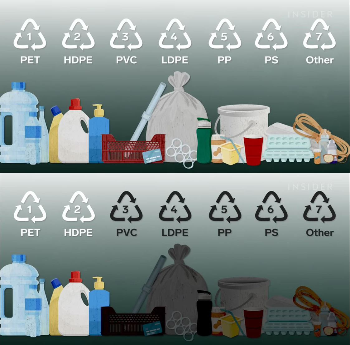
    And plastic can be recycled only a certain number of times. We’ve got to get off hydrocarbons.

    Deep One
    Community Member
    6 months ago Created by potrace 1.15, written by Peter Selinger 2001-2017

    There have been a number of plastics created from plants/plant waste that are biodegradable. We need to focus on increasing research into that.

    Load More Replies...
    marcelo D.
    Community Member
    6 months ago Created by potrace 1.15, written by Peter Selinger 2001-2017

    the problem with recycling in general is that it put the work, and the blame, on the user, not the manufacturer, even though it was the manufacturer that decided to use non sustainable materials for the product (when they use to do glass, or metal, and a lot of the times, reusable containers)

    #43

    Oil

    Infographic showing the percentage of the world’s proven oil reserves divided between OPEC and Non-OPEC countries.

    informationisbeautiful Report

    Earonn -
    Community Member
    6 months ago Created by potrace 1.15, written by Peter Selinger 2001-2017

    Scotland: lots if England wants to borrow money against it, running out whenever Scottish Independence gets a bit too high in the polls....

    ADVERTISEMENT
    #44

    Africa's Most Dominant Religions

    Map of dominant religions in Africa by country showing Christianity, Islam, traditional religions, and no dominant religion data.

    informationisbeautiful Report

    Lil be lil
    Community Member
    6 months ago Created by potrace 1.15, written by Peter Selinger 2001-2017

    Is "tradional religion" Voodou? If so can you please make some voodou dolls of a certain politician?

    Eva Sawyer
    Community Member
    6 months ago Created by potrace 1.15, written by Peter Selinger 2001-2017

    that's not really how Voodou works in real life...

    Load More Replies...
    #45

    How The Concept Of Marriage Has Changed Across Centuries

    Infographic showing the evolution of marriage with data on love, romance, s*x, and societal changes over centuries.

    informationisbeautiful Report

    ocean todd
    Community Member
    Premium
    6 months ago Created by potrace 1.15, written by Peter Selinger 2001-2017

    Ha! Did anyone else accidentally read the first one as Courtney Love?

    The Majestic Opossum
    Community Member
    Premium
    6 months ago Created by potrace 1.15, written by Peter Selinger 2001-2017

    I didn't, but I went back and reread it as that and it makes the whole chart way better

    Load More Replies...
    Al Fun
    Community Member
    Premium
    6 months ago Created by potrace 1.15, written by Peter Selinger 2001-2017

    There was no sėx before the sixties

    Lil be lil
    Community Member
    6 months ago (edited) Created by potrace 1.15, written by Peter Selinger 2001-2017

    Love, A divine madness! I'm for it! (always found outside of marriage)

    Luke Branwen
    Community Member
    6 months ago Created by potrace 1.15, written by Peter Selinger 2001-2017

    For me the optimal is Romance > Love > S*x > Marriage

    ADVERTISEMENT
    #46

    Cars Per 1,000 Inhabitants

    Map infographic showing cars per 1,000 people across Europe with varying data in a color-coded format.

    informationisbeautiful Report

    nottheactualphoto
    Community Member
    6 months ago Created by potrace 1.15, written by Peter Selinger 2001-2017

    The color of Crimea is not so beautiful.

    Luke Branwen
    Community Member
    6 months ago Created by potrace 1.15, written by Peter Selinger 2001-2017

    Czechia, blackout drunk as usual

    Khavrinen
    Community Member
    6 months ago Created by potrace 1.15, written by Peter Selinger 2001-2017

    Oh, darn, I originally read that as "CATS per 1000 people".

    Lee Gilliland
    Community Member
    Premium
    6 months ago Created by potrace 1.15, written by Peter Selinger 2001-2017

    This certainly explains Italy.

    MoBeLa
    Community Member
    6 months ago Created by potrace 1.15, written by Peter Selinger 2001-2017

    I assume this is per 1,000 adults of driving age?

    Nitka Tsar
    Community Member
    6 months ago Created by potrace 1.15, written by Peter Selinger 2001-2017

    Now compare to the other continents, please

    #47

    Some Interesting Variations Here

    Map infographic showing the mean age of women at birth of first child across Europe with color-coded data points.

    informationisbeautiful , theworldmaps Report

    Bigfoot87
    Community Member
    6 months ago Created by potrace 1.15, written by Peter Selinger 2001-2017

    I am pleasantly surprised by thes

    MontanaMariner
    Community Member
    6 months ago Created by potrace 1.15, written by Peter Selinger 2001-2017

    Dang. I'm 40 with no kids, but most of the c****h goblin manufacturers I know started business in their early 20's. 'Murica!

    MontanaMariner
    Community Member
    6 months ago Created by potrace 1.15, written by Peter Selinger 2001-2017

    Heaven forbid I use the word crøtch as an adult, in front of adults. BP, get over yourself.

    Load More Replies...
    ADVERTISEMENT
    #48

    Deep Truth

    Infographic showing monitor arrangements categorized by lawful, neutral, chaotic, good, and evil alignments with varied screen setups.

    informationisbeautiful Report

    Deep One
    Community Member
    6 months ago Created by potrace 1.15, written by Peter Selinger 2001-2017

    I am lawful good with neutral good tendencies (one of my monitors is not working). :)

    john doe
    Community Member
    6 months ago Created by potrace 1.15, written by Peter Selinger 2001-2017

    What if you have a 40inch wide narrow curves screen that is basically 3 screens

    Glix Drap
    Community Member
    Premium
    6 months ago Created by potrace 1.15, written by Peter Selinger 2001-2017

    I'm chaotic good but can pivot to chaotic neutral very easily.

    Auntriarch
    Community Member
    6 months ago Created by potrace 1.15, written by Peter Selinger 2001-2017

    I was lawful neutral before I retired 😊

    Robert Benson
    Community Member
    6 months ago Created by potrace 1.15, written by Peter Selinger 2001-2017

    What about neutral good + chaotic good?

    #49

    Sweet Teeth In The East. How Much Sugar In Fanta

    Map infographic showing sugar content in Fanta Orange by European country in grams per 100ml with varying levels highlighted by color.

    informationisbeautiful , Simon shows you maps Report

    Christophe Beunens
    Community Member
    6 months ago Created by potrace 1.15, written by Peter Selinger 2001-2017

    I poured a bottle of Fanta away recently, as it is was too sweet. I need to buy Slovenian Fanta, I guess.

    Ace
    Community Member
    Premium
    6 months ago Created by potrace 1.15, written by Peter Selinger 2001-2017

    The problem with a lot of these is that the sugar has simply been replaced with artificial sweetener. The UK is particularly bad in this respect, nearly all soft drinks and even cordial/squash/syrup had fallen victim to the "sugar tax" but is still ridiculously over-sweet. And undrinkable for some of us, not because it's too sweet per se, but because all the sweeteners leave a disgusting aftertaste,

    Load More Replies...
    Jenna
    Community Member
    6 months ago Created by potrace 1.15, written by Peter Selinger 2001-2017

    The US isn't on here because it's not sugar in Fanta, it's high-fructose corn syrup - and that's why I don't drink soda 🙂

    Nitka Tsar
    Community Member
    6 months ago Created by potrace 1.15, written by Peter Selinger 2001-2017

    Interesting. Need to tell my aunts to bring me a fanta from Poland, when they visit in a month. Then I can compare to our German one. Hmm… I wonder if I could get one from Italy or Switzerland, too… hmmmm

    ADVERTISEMENT
    See Also on Bored Panda
    #50

    Which Countries Have The Most Cat Owners? Maybe Not What You Expect

    Bar chart showing cat ownership percentages by country, illustrating infographics and data that might change your perspective on things.

    informationisbeautiful Report

    Nicole Weymann
    Community Member
    6 months ago Created by potrace 1.15, written by Peter Selinger 2001-2017

    Turkey may not have many cat owners, but (from my trip to Istanbul) BOY, do they ever have cats!

    Toika Gao
    Community Member
    6 months ago (edited) Created by potrace 1.15, written by Peter Selinger 2001-2017

    First nice thing about Russia I have ever learned

    #51

    Not Sure About "Cold Shower" But These Seem Like Intuitive Fixes

    Infographic showing ways to instantly feel better with actions like sing, walk, write, breathe, and exercise for different feelings.

    informationisbeautiful Report

    Jaya
    Community Member
    6 months ago Created by potrace 1.15, written by Peter Selinger 2001-2017

    Not really factual information, just a suggestion of what has worked for some people.

    Delta Dawn
    Community Member
    6 months ago Created by potrace 1.15, written by Peter Selinger 2001-2017

    zero chance I’m taking a cold shower when I’m feeling lazy

    Toika Gao
    Community Member
    6 months ago (edited) Created by potrace 1.15, written by Peter Selinger 2001-2017

    Hórny... Cold shower?

    TheGreaterDebater
    Community Member
    6 months ago Created by potrace 1.15, written by Peter Selinger 2001-2017

    I suck at singing. It's even worse when I'm mad, which will p**s me off even more. I don't think I should try it.

    Khavrinen
    Community Member
    6 months ago Created by potrace 1.15, written by Peter Selinger 2001-2017

    I thought a cold shower was supposed to be for ... something else.

    Sarah Kathrin Matsoukis
    Community Member
    6 months ago Created by potrace 1.15, written by Peter Selinger 2001-2017

    I just want to play PlayStation with a bag of chips

    ADVERTISEMENT
    See Also on Bored Panda
    #52

    The True Digital Divide In Europenote: Oct 2022 Data

    Map infographic showing Android vs iOS popularity across Europe, highlighting mobile operating system trends and data insights.

    informationisbeautiful , theworldmaps Report

    Glix Drap
    Community Member
    Premium
    6 months ago Created by potrace 1.15, written by Peter Selinger 2001-2017

    What does the Vatican use then?

    ADVERTISEMENT
    See Also on Bored Panda
    #53

    Population Density Of Africa

    Infographic showing African population density with color-coded heatmap highlighting areas of high and low population per square kilometer.

    informationisbeautiful Report

    #54

    This Made Us Think

    Diagram illustrating human experience within vast scales of space and time, highlighting perspective in interesting infographics and data.

    informationisbeautiful Report

    ADVERTISEMENT
    See Also on Bored Panda
    #56

    Another Reasons To Tut At The Mercator Map Projection - How A Circle With A Radius Of 5,000km, Centred On Paris, Looks According The Mercator Map

    World map infographic showing distances with highlighted regions, part of interesting infographics and data perspective changes.

    informationisbeautiful Report

    Az
    Community Member
    6 months ago Created by potrace 1.15, written by Peter Selinger 2001-2017

    Ah, the giant guitar pick in the sky.

    Christophe Beunens
    Community Member
    6 months ago Created by potrace 1.15, written by Peter Selinger 2001-2017

    Every maps has it's purpose. For Mercator it was navigation purposes. If you can map a globe on a flat map, you will be the richest person on earth (an opportunity for a flat earth believer maybe)

    ADVERTISEMENT
    See Also on Bored Panda
    #57

    Most Popular Car Colours By Year. Purple And Green Cars Rip. Note: Data From Poland.

    Stacked bar chart showing car color distribution by production year with multiple colors in an infographic style data visualization.

    informationisbeautiful , feemiror. Report

    Shaggy
    Community Member
    6 months ago Created by potrace 1.15, written by Peter Selinger 2001-2017

    My Jeep is Grey/gold. Thought it was unique-ish when I bought it in 2018(only 45k Covid car). Now it is the same as everyone else's. Gonna go neon green next time to make up for the boring... LOL

    aubergine10003
    Community Member
    Premium
    6 months ago Created by potrace 1.15, written by Peter Selinger 2001-2017

    Why don't people have green cars!? If I had a car (which I don't because NYC), it would be green.

    Wild Cream
    Community Member
    6 months ago Created by potrace 1.15, written by Peter Selinger 2001-2017

    The sad thing is, these are the colour choices we have because these are the colours people buy 😅 people love to complain that cars are boring colours these days, which is very true, but if car companies made more exciting colours, they wouldn’t sell as many vehicles. I’d love a brightly coloured car but most people don’t 😅

    Jaya
    Community Member
    6 months ago Created by potrace 1.15, written by Peter Selinger 2001-2017

    In the Netherlands it's much worse. There are pretty much no coloured cars anymore, everything is black and grey and white, ugh! So boring!

    Auntriarch
    Community Member
    6 months ago Created by potrace 1.15, written by Peter Selinger 2001-2017

    Never understood why anyone would want a car the colour of tarmac

    #58

    A Woman's Age vs. The Age Of The Men Who Look Best To Her vs. The Same Chart For Men

    Infographic showing a woman's age vs preferred age of men and a man's age vs preferred age of women, data perspective.

    informationisbeautiful , Okcupid data Report

    Multa Nocte
    Community Member
    Premium
    6 months ago (edited) Created by potrace 1.15, written by Peter Selinger 2001-2017

    OMG! Does this mean that Leonardo DiCaprio is just "one of the guys"?

    Jaya
    Community Member
    6 months ago Created by potrace 1.15, written by Peter Selinger 2001-2017

    I'd love to see the one for lesbian&bi women and gay&bi men. To see whether it's about the looks or about the beholder.

    LooseSeal's $10 Banana
    Community Member
    6 months ago Created by potrace 1.15, written by Peter Selinger 2001-2017

    I know I'm only a single data point, but even in my mid 30s I'm finding women under 25 to look like high schoolers.

    Robert Benson
    Community Member
    6 months ago Created by potrace 1.15, written by Peter Selinger 2001-2017

    Note that it says "looks best", not "would be ideal partner". I'm not saying the data would change, but just clarifying what the statistics are reporting. I am fully comfortable with concluding that "men are pigs".

    Ace
    Community Member
    Premium
    6 months ago Created by potrace 1.15, written by Peter Selinger 2001-2017

    And there was me thinking it was just Hollywood sexism.

    View more comments
    #59

    The Lethal Doses Of 55 Substances

    Infographic showing lethal doses of 55 substances with toxicity levels and examples for perspective-changing data.

    informationisbeautiful Report

    Multa Nocte
    Community Member
    Premium
    6 months ago (edited) Created by potrace 1.15, written by Peter Selinger 2001-2017

    What is the blacked out one - me‍tham‍‍p‍he‍tam‍ine? OK, I checked with the source. The one is indeed me‍tham‍‍p‍he‍tam‍ine and the other one is MD‍MA/Ec‍st‍acy

    Fellfromthemoon
    Community Member
    6 months ago Created by potrace 1.15, written by Peter Selinger 2001-2017

    So, I can consume more gasoline (and live) than lactose and Vitamin C? Allright.

    meeeeeeeeeeee
    Community Member
    6 months ago Created by potrace 1.15, written by Peter Selinger 2001-2017

    I'll make sure not to take 0.096g of the thing that looks like snow, but since cocane isn't here, I assume I can have as much as possible.

    El Dee
    Community Member
    6 months ago Created by potrace 1.15, written by Peter Selinger 2001-2017

    Glad to see that cannabis (THC) is actually included. So many people think you can't OD on it..

    ADVERTISEMENT
    See Also on Bored Panda
    #60

    Seems To Fit?

    Clothing tag showing different size labels for EU, US, and Asia, illustrating interesting infographics and data differences.

    informationisbeautiful Report

    Nicole Weymann
    Community Member
    6 months ago Created by potrace 1.15, written by Peter Selinger 2001-2017

    My several-X L self ordered some lined 5XL leggings from Amazon for homewear. My mother likes and wears them a lot. She's a EU size 42/44, US 10/12.

    Wild Cream
    Community Member
    6 months ago Created by potrace 1.15, written by Peter Selinger 2001-2017

    I have a lovely jacket that’s an XXL but fits me perfectly (I usually wear an S or M). Found out it’s because it’s from Asia haha

    DeoManus Argentem
    Community Member
    6 months ago Created by potrace 1.15, written by Peter Selinger 2001-2017

    I wear a size 11.5 shoe in US, 11 in UK, but 46 in EU lol

    ADVERTISEMENT
    See Also on Bored Panda
    #61

    Pain Is Temporary, Tattoos Are Forever

    Infographic showing tattoo pain levels on different body parts with color-coded areas from least to most pain.

    informationisbeautiful Report

    The Darkest Timeline
    Community Member
    6 months ago Created by potrace 1.15, written by Peter Selinger 2001-2017

    I have no idea how or why people get tattoos on their junk

    Ace
    Community Member
    Premium
    6 months ago Created by potrace 1.15, written by Peter Selinger 2001-2017

    I have no idea how or why people get tattoos.

    Load More Replies...
    Ellinor
    Community Member
    6 months ago Created by potrace 1.15, written by Peter Selinger 2001-2017

    I kinda think it depends on the person, I'm known around me for being really (really) sensitive but when I did my spine tattoo I actually fell asleep.

    Bigfoot87
    Community Member
    6 months ago Created by potrace 1.15, written by Peter Selinger 2001-2017

    I call so much BS on this... shoulders were very painful, small of back was VERY painful, stomach area is VERY painful. THEY ARE ALL PAINFUL!!

    Wyrdwoman
    Community Member
    6 months ago Created by potrace 1.15, written by Peter Selinger 2001-2017

    Yeah, I found out about the calf the hard way :|

    lwolf1952
    Community Member
    6 months ago

    This comment is hidden. Click here to view.

    Tattoos, once a symbol of rebellion are now a symbol of how stupid you are.

    Don Golosso
    Community Member
    6 months ago Created by potrace 1.15, written by Peter Selinger 2001-2017

    Generalizing comments on other peoples life choices, always a sign of how stupid you are.

    Load More Replies...
    View more comments
    #62

    Accurate

    Infographic showing differences in areas of the body where being shot has no consequences in movies versus real life.

    informationisbeautiful Report

    Robert Benson
    Community Member
    6 months ago Created by potrace 1.15, written by Peter Selinger 2001-2017

    I'm pretty sure the earlobe should be on there. Am I wrong?

    #63

    The Age You Peak

    Infographic showing peak ages for skills and traits like language, memory, strength, and happiness based on scientific data.

    informationisbeautiful Report

    Nadine Lynch
    Community Member
    6 months ago Created by potrace 1.15, written by Peter Selinger 2001-2017

    Where is male attractiveness to women?

    Nina
    Community Member
    6 months ago Created by potrace 1.15, written by Peter Selinger 2001-2017

    I always wanted to know at what age strange men found me most attractive...

    ADVERTISEMENT
    #64

    World's Most Contagious Falsehoods

    Infographic displaying common mythconceptions with icons and facts, highlighting interesting infographics and data perspective shifts.

    informationisbeautiful , informationisbeautiful Report

    Jaya
    Community Member
    6 months ago Created by potrace 1.15, written by Peter Selinger 2001-2017

    Here's a version that is actually legible: https://informationisbeautiful.net/visualizations/common-mythconceptions/

    Hanken
    Community Member
    6 months ago Created by potrace 1.15, written by Peter Selinger 2001-2017

    Would be cool if we could read this

    CP
    Community Member
    6 months ago Created by potrace 1.15, written by Peter Selinger 2001-2017

    Where is pro-life cares about life falsehood?

    ADVERTISEMENT
    #65

    Countries Where Non-Voters Would Be The Strongest Voting Bloc / Party

    Map of Europe showing countries where non-voters are the strongest party in recent parliamentary elections, visual data infographic.

    informationisbeautiful Report

    Tucker Cahooter
    Community Member
    6 months ago Created by potrace 1.15, written by Peter Selinger 2001-2017

    If you can't be bothered voting, don't whinge and moan about the government you end up with

    lwolf1952
    Community Member
    6 months ago Created by potrace 1.15, written by Peter Selinger 2001-2017

    America has apathied ourselves right into fascism.

    Jan Rosier
    Community Member
    6 months ago Created by potrace 1.15, written by Peter Selinger 2001-2017

    Wondering why our Belgian triangle shows red? We are obligated to show up to governmental votes (until recently also for local community/mayoral votes). And when you're there, most people do vote.

    Steve H
    Community Member
    6 months ago Created by potrace 1.15, written by Peter Selinger 2001-2017

    BP, when stealing content from other sites, save the original image not the thumbnail

    Jaya
    Community Member
    6 months ago (edited) Created by potrace 1.15, written by Peter Selinger 2001-2017

    Parliamentary election for what? If it's for the national election, then the Dutch one is wrong, it's never dipped below 70%.

    #66

    How To Say The Number 92 In Various European Languages

    Map infographic showing how the number 92 is expressed mathematically across different European countries.

    informationisbeautiful , Brilliant Maps Report

    Pernille
    Community Member
    6 months ago Created by potrace 1.15, written by Peter Selinger 2001-2017

    Yes, but shortened tp halvfems. And I never thought about it until BP told me.

    Load More Replies...
    Glix Drap
    Community Member
    Premium
    6 months ago Created by potrace 1.15, written by Peter Selinger 2001-2017

    Surely Rome should be XCII (100 - 10 + 2).

    Ace
    Community Member
    Premium
    6 months ago Created by potrace 1.15, written by Peter Selinger 2001-2017

    I hate French numbering system really annoys me. I recall once a French radio station was giving out its number for a phone-in competition, The number was red out, quatre-vingt-quinze quatre-vingt quinze. 95 90 15. Renders in English as four twenty fifteen four twenty fifteen. You need to be able to 'hear' the dash or to mentally insert a comma to get it right.

    #67

    The Climate Colours Of Africa

    Color-coded Africa climate map infographic showing diverse climate classes and zones based on Koppen-Geiger data 1991-2020

    informationisbeautiful Report

    Az
    Community Member
    6 months ago Created by potrace 1.15, written by Peter Selinger 2001-2017

    Interesting when compared to the population density map.

    ADVERTISEMENT
    #68

    World Population Visualized

    Infographic showing global population distribution of countries with over 20 million people, highlighting data insights and perspectives.

    informationisbeautiful , informationisbeautiful Report

    lwolf1952
    Community Member
    6 months ago Created by potrace 1.15, written by Peter Selinger 2001-2017

    Please stop f**king, people! 8 billion is enough!

    Jaya
    Community Member
    6 months ago Created by potrace 1.15, written by Peter Selinger 2001-2017

    Keep f**cking but use a reliable form of protection :)

    Load More Replies...
    ADVERTISEMENT
    #69

    Should You Trust That Doctor? (Maybe More Relevant Today Than Ever)

    Infographic categorizing doctors by trustworthiness and medical training in interesting data that might change your perspective on things.

    informationisbeautiful Report

    General Anaesthesia
    Community Member
    6 months ago (edited) Created by potrace 1.15, written by Peter Selinger 2001-2017

    With your life, yes. College humor can be quite cynical.

    Load More Replies...
    Multa Nocte
    Community Member
    Premium
    6 months ago Created by potrace 1.15, written by Peter Selinger 2001-2017

    Dr. Pepper, for sure.

    Michael Largey
    Community Member
    6 months ago Created by potrace 1.15, written by Peter Selinger 2001-2017

    Where does Doctor Kevorkian fit it?

    BS Detector
    Community Member
    6 months ago Created by potrace 1.15, written by Peter Selinger 2001-2017

    I'd trust Dr. Huxtable at the same level as Dr. Hannibal Lector

    Hey Kat
    Community Member
    6 months ago Created by potrace 1.15, written by Peter Selinger 2001-2017

    I'd trust Tennant over Capaldi but that's just me. :)

    Glix Drap
    Community Member
    Premium
    6 months ago Created by potrace 1.15, written by Peter Selinger 2001-2017

    I agree - Tennant's is better than Campari.

    Load More Replies...
    Caffeinated Ape
    Community Member
    6 months ago Created by potrace 1.15, written by Peter Selinger 2001-2017

    Hey, to be fair to Zoidberg he DID have a doctorate! In art, but still!

    View more comments
    #70

    Lord Of The Rings Characters: Screen Time vs. Mentions In The Book. The Further From The Dotted Line, The Further Off Trend

    Scatter plot infographic showing Lord of the Rings characters' screen time versus book mentions highlighting over and under representation in movies.

    informationisbeautiful , austinw-8 Report

    Glix Drap
    Community Member
    Premium
    6 months ago Created by potrace 1.15, written by Peter Selinger 2001-2017

    I think they got it right with Tom Bombadil.

    Jaya
    Community Member
    6 months ago Created by potrace 1.15, written by Peter Selinger 2001-2017

    I like how Frodo is 100% correct.

    #71

    How The Makeup Of Us Households Have Changed 1960 vs. Today

    Infographic showing how U.S. households have changed from 1960 to 2023 with data on family and living arrangements.

    informationisbeautiful , VisualCapitalist Report

    BoredPangolin
    Community Member
    6 months ago Created by potrace 1.15, written by Peter Selinger 2001-2017

    Interesting that the amount of couple with no kids has remained the same.

    El Dee
    Community Member
    6 months ago Created by potrace 1.15, written by Peter Selinger 2001-2017

    Lots of single parents after the wars..

    ADVERTISEMENT
    #72

    Didn't Realise That About The East Coast... Topographical Map Of Australia

    3D topographic infographic of Australia highlighting elevation and terrain features with detailed data visualization.

    informationisbeautiful , cstats1 Report

    Judes
    Community Member
    6 months ago Created by potrace 1.15, written by Peter Selinger 2001-2017

    But they're pretty small compared to many of the world's mountain ranges (they're very old and erroded), with the maximum height only 2228m. Fun fact: the highest mountain in Australian territory is not on the mainland but on tiny, uninhabited Heard Island (Mawson Peak, 2745m) way out to the south west.

    ADVERTISEMENT
    #74

    Australia Is Big

    Infographic showing the true size of Australia with country comparisons to change perspective on geography.

    informationisbeautiful Report

    Az
    Community Member
    6 months ago Created by potrace 1.15, written by Peter Selinger 2001-2017

    According to this I live in Ireland

    #75

    Demographic Time Bombs Ahoy! Woah China.

    Infographic showing projected populations of most populous countries in 2025, 2050, and 2100 with data trends.

    informationisbeautiful , visualcapitalist Report

    MichelleDonut
    Community Member
    6 months ago

    This comment has been deleted.

    ADVERTISEMENT
    #76

    Faces Of Women, Averaged From Thousands Of Photos

    Composite facial images representing diverse ethnicities and nationalities, illustrating data in interesting infographics.

    informationisbeautiful Report

    Mreoww
    Community Member
    6 months ago Created by potrace 1.15, written by Peter Selinger 2001-2017

    How come South India gets its own face :)? There’s already another one for India.

    Auntriarch
    Community Member
    6 months ago Created by potrace 1.15, written by Peter Selinger 2001-2017

    South African? Did they miss a word out

    Robert Benson
    Community Member
    6 months ago Created by potrace 1.15, written by Peter Selinger 2001-2017

    It is unclear if they are referring to the country, South Africa, or to the southern part of Africa

    Load More Replies...
    ocean todd
    Community Member
    Premium
    6 months ago Created by potrace 1.15, written by Peter Selinger 2001-2017

    What?! No Walmart American? https://e3.365dm.com/16/07/1600x900/obesity-1_3526683.jpg?20160704144416

    ADVERTISEMENT
    #77

    Hmmm. Greenland Possesses Significant, Largely Untapped, Mineral Resources, Inc. Rare Earth Elements, Graphite, Lithium, And Other Critical Minerals

    Map of Greenland highlighting mineral resources including iron, gold, uranium, zinc, copper, and other minerals in infographics data.

    informationisbeautiful , Wall St Journal Report

    Multa Nocte
    Community Member
    Premium
    6 months ago Created by potrace 1.15, written by Peter Selinger 2001-2017

    I know - let's invade them!

    Pernille
    Community Member
    6 months ago Created by potrace 1.15, written by Peter Selinger 2001-2017

    You'll have to get past me first, and I'm wide, and my battle axe is sharp.

    Load More Replies...
    Abdullah Abd Rahman
    Community Member
    6 months ago Created by potrace 1.15, written by Peter Selinger 2001-2017

    No wonder Trump wants to annex Greenland ! No deal, says Denmark.

    #78

    Checks Out

    Infographic showing ingredient proportions of Mexican food items with cheese, tortilla, and meat in tacos, burritos, quesadillas, and nachos.

    informationisbeautiful , mattsurelee Report

    #79

    Interesting Reframing. Cost Of Aid To #ukraine In Cups Of Coffee Per Month

    Infographic showing aid to Ukraine in cups of coffee per month across countries with data and perspective insights.

    informationisbeautiful , topleadEU Report

    whiterabbit
    Community Member
    6 months ago Created by potrace 1.15, written by Peter Selinger 2001-2017

    Not much compared to how much US citizens have given.

    ADVERTISEMENT
    #80

    A Spot In The Gurbantünggüt Desert Approximately 320 Km (200 Mi) North Of The City Of Ürümqi, In Xinjiang Region, China, Is (Likely) The Farthest Point In The World From Any Coast

    Globe infographic highlighting a circular data area on Asia with country borders for perspective change.

    informationisbeautiful , Wikipedia Report

    ADVERTISEMENT
    #81

    Be Careful Valentines!

    Infographic showing most common break-up times from Facebook data with spikes around holidays and special dates.

    informationisbeautiful Report

    #82

    China’s Westernmost Point Is Closer To Germany Than To Its Easternmost Point

    Map infographic showing distances between Görlitz, Akto, and Fuyuan across Asia and Europe on a globe view.

    informationisbeautiful , amazingmap Report

    #83

    Faces Of Men, Averaged From Thousands Of Photos

    Composite faces representing different nationalities and ethnicities in an infographic showcasing diverse data and interesting perspective changes.

    informationisbeautiful Report

    Kit-Ginevra
    Community Member
    6 months ago Created by potrace 1.15, written by Peter Selinger 2001-2017

    Interesting that they don't have the same categories as for the same one with the women's faces

    Robert Benson
    Community Member
    6 months ago Created by potrace 1.15, written by Peter Selinger 2001-2017

    I think I know some of these dudes :)

    ADVERTISEMENT
    #84

    Dude, Bro, Buddy, Fella

    US heat maps showing regional popularity of slang terms bro, buddy, dude, and fella in an infographic about interesting data trends.

    informationisbeautiful , Quartz Report

    The Darkest Timeline
    Community Member
    6 months ago Created by potrace 1.15, written by Peter Selinger 2001-2017

    Is the use of “pal” statistically insignificant? I feel like it’s used mostly in confrontational situations; “Listen, PAL; don’t tell me what to do!”

    ocean todd
    Community Member
    Premium
    6 months ago Created by potrace 1.15, written by Peter Selinger 2001-2017

    I think Bruh is taking over all over

    ADVERTISEMENT
    #85

    UK Dialect Map

    Colorful map of British English dialects showing regional language variations, part of interesting infographics and data visualization.

    informationisbeautiful , starkeycomics Report

    #86

    Consumption Of Ultra-Processed Foods (Upfs). Wtf UK?

    Map infographic showing the percentage of ultra-processed food in household purchases across European countries.

    informationisbeautiful , Guardian Report

    Multa Nocte
    Community Member
    Premium
    6 months ago Created by potrace 1.15, written by Peter Selinger 2001-2017

    No wonder the UK visitors are always complaining about French food when they come here.

    Ace
    Community Member
    Premium
    6 months ago Created by potrace 1.15, written by Peter Selinger 2001-2017

    IME they're usually the opposite, but maybe that's just the sort of people I get visiting. But yes, I'm shocked by some of those numbers just to the North of us.

    Load More Replies...
    Pernille
    Community Member
    6 months ago Created by potrace 1.15, written by Peter Selinger 2001-2017

    And now superpose a map of who is the healthiest.

    #87

    Music Sales By Format From 1973+

    Infographic showing music sales trends and revenue by format from 1973 to 2022 with data visualization circles and graphs.

    informationisbeautiful , visualcapitalist Report

    ADVERTISEMENT
    #88

    Alligator Population By State... Good To Know!

    US map infographic showing data distribution with varying numbers highlighted in southern states in green shades.

    informationisbeautiful , Nanakatl Report

    Michael Largey
    Community Member
    6 months ago Created by potrace 1.15, written by Peter Selinger 2001-2017

    40 states said "See you later, ..."

    ADVERTISEMENT
    #89

    Really Liked These Radiohead Song Visualisations, Using Midi Data & Colour Intensities To Give Each Song A Beautiful Digital Signature

    Colorful infographics visualizing Radiohead songs with data patterns, part of interesting infographics that change perspective.

    informationisbeautiful , Marcin Pielużek Report

    #90

    A Different View Of The USA

    3D topographic infographic of the United States showing elevation data with mountains and plains in detailed visualization.

    informationisbeautiful , cstats1 Report

    #91

    Love It As A Teen, Love It Forever

    Infographic showing music preference influences by age and gender with peak influence at 13 for females and 14 for males.

    informationisbeautiful , nytimes Report

    Wild Cream
    Community Member
    6 months ago Created by potrace 1.15, written by Peter Selinger 2001-2017

    I’ll always be an angsty emo kid, even though I’m in my 30s now lmao

    ADVERTISEMENT
    #92

    Simple Egg-Boiling Chart. If You Can Afford Them

    Infographic showing boiled eggs cooked from 4 to 15 minutes with changes in yolk texture and firmness.

    informationisbeautiful , carolinagelen Report

    Don Golosso
    Community Member
    6 months ago Created by potrace 1.15, written by Peter Selinger 2001-2017

    But is this when you add the egg to boiling water or when you start with cold water and eggs together?

    Ace
    Community Member
    Premium
    6 months ago Created by potrace 1.15, written by Peter Selinger 2001-2017

    At Sea Level, presumably. A four-minute egg where I live would barely even hold together, certainly not edible.

    nottheactualphoto
    Community Member
    6 months ago Created by potrace 1.15, written by Peter Selinger 2001-2017

    This looks like a low-rent version of Kenji Lopez-Alt's work. And that trope is getting old; prices have been coming down.

    ADVERTISEMENT
    #93

    A Different Manifestation Of The Political Compass

    Colored political compass infographic with wordplay on men in authoritarian, left, right, and libertarian quadrants reflecting interesting infographics.

    informationisbeautiful Report