40 Times People Summarized Data In Interesting Charts That Might Clear Some Things Up For You
InterviewStruggling to remember or make sense of complicated information? Maybe a visual makeover with an eye-catching chart or graph will help! And if you have doubts about its effectiveness, allow us to introduce you to a subreddit called “Data Art”. It's a community dedicated to sharing “aesthetically satisfying data visualizations that you'd be proud to hang on your wall”.
Since its creation in 2017, "Data Art" has grown into a thriving community of over 65 thousand members who share passion for blending aesthetics and data. From evolution of the Shanghai Metro to the largest empires of history, these visualizations are not only informative but also pleasing to the eye. Scroll down to experience the beautifully presented data.
This post may include affiliate links.
How Different Piano Notes Reverberate Through A Bowl Of Water


U.S. Flag But Each Star Is Scaled Proportionally To Their State’s Population, In Roughly It’s Geographical Position

European Roads To Rome

The subreddit “Data Art” has become really popular over the years. When r/DataArt reached 10,000 subscribers, the moderator u/jmerlinb decided to personally send out a DataVizDigest email summarizing the top posts of that season every 3 months. “Because data should not only be informative, but also beautiful.” If you're interested, you can sign up for their mailing list. Also, make sure to check out the most upvoted posts on the "ArtyCharty" Twitter page!
Long Exposure Of A Roomba Vacuum With A Color Changing Light On Top

Language Family Tree

Literal Art!

Bored Panda got in touch with Jack Merlin Bruce, also known as u/jmerlinb, the moderator of the "Data Art" subreddit. We were intrigued to learn about the inspiration behind the creation of this subreddit. Jack revealed that during the early stages of his career in data visualization, he crafted a lot of designs for various fandom communities on Reddit, such as r/GameOfThrones, r/Pokemon, and r/Chess. “I wanted to show them their passion in a new way, and for me to get a chance to design stuff I thought looked really cool. Stuff you might want to hang up on your wall, or that you would see in a coffee table book.”
“It was great fun,” the moderator continued, “And these works I produced tended to be quite successful in these fan communities, but were significantly less successful in the one place I thought they would have been a natural fit for - and that was (at the time) the world's largest data visualization: r/DataIsBeautiful. And this was strange to me, seeing as they were so well received in other spaces.”
“But this isn't actually a surprise once you look into the stated aim on the sidebar of r/DataIsBeautiful: ‘Aesthetics are an important part of information visualization, but pretty pictures are not the sole aim of this subreddit.’ In other words, there are two sides to all data visualizations: the story, and the aesthetics. On one extreme, you can have a chart made in 1990s Microsoft Excel that looks horrendous but yet tells a great story. On the other extreme, you can have a chart meticulously designed by a world-class graphics designer which looks stunning in the aesthetics department but has no meat to it, no story. There's nothing inherently wrong with either type, it just depends on what your audience is expecting - and r/DataIsBeautiful catered to the first example... but I soon came to realize there was no community at the time that catered to the second example, to the ‘pretty pictures’. And so /r/DataArt was born - a subreddit for visualizations you ‘could hang up on your living room wall’.”
All These Countries Fit Inside Africa

Fun fact: at the population density of the most expensive neighborhood on Earth (a suburb of Paris with no high rises), the entire Earth's population could live on HALF on Madagascar, that little chip overlaid by the UK. Overpopulation is not about space; it's about the technology to judiciously use and continuously reuse resources. Right now, the average American's ecological footprint is dozens of acres. It could be a fraction of a single acre. If we could build a self-sustaining terrarium habitat for humans on Mars, imagine how much easier it would be to do it on Earth! The key to sustainability is increased resource effectiveness, which relies on economic growth.
Nyt's Front Page For 21 Feb. Each Dot Represents A Life Lost To Covid-19 In The Us

should be seperated by colours; one for ignorant and mentally enslaved fools who denied the virus' danger, and those who sadly died from being unjustly exposed...
Paths Of 800 Unmanned Bicycles Being Pushed Until They Fall Over

Two comments: Firstly, who pays for this sort of "research"? Secondly, and more importantly, can I have some cash for my project of tracking wave patterns on golden sandy beaches in the South Pacific?
According to Jack, the main goal of r/DataArt is to offer people a space where they can try out new ideas and approaches to thinking about and working with data. “While our primary aim is to allow people to share artworks, we also make an exception for data visualization that might not necessarily be aesthetically pleasing, but which pushes the boundaries of the medium itself.
We've had people posting all sorts of amazing and unique work - charts that they knitted with colored thread, 3D-printed earthquake seismograms, data sonification (where sound is used to encode numeric values as opposed to color/shape/size, etc.), VR-based visualizations - all of this stuff was welcome in our community. I wanted r/DataArt to as closely mimic the experience of walking through a modern art exhibition but for data.”
These Diagrams Show The Paths Traced By Mercury, Venus, Mars, Jupiter And Saturn As Seen From Earth

I'm just wondering how these pictures correspond with the ones of the notes of the musical scale.
A Map Of Finland's Bear Population, Made Up Of Bears

This Map Is Drawn Entirely From Shipping Logs From 1945

The last year of World War II: May in Europe, September in the Pacific.
In addition to sharing visually appealing visualizations, r/DataArt distinguishes itself as a community that prioritizes content curation more than others. “But as aesthetics are (by and large) subjective, this can be difficult when confronted with what is probably the bane of our moderation team (shout out to u/OdBox), and that is the infographic,” Jack shared.
“There is nothing inherently wrong with infographics. When done well, they can be amazing at conveying complex information in easily digestible ways. However, for some reason they tend to attract a spammy crowd, and /r/DataArt gets our fair share of these submissions, most of which we remove. There are times when these removal decisions might seem arbitrary - as it is impossible to pinpoint the exact moment when an infographic becomes a piece of ‘data art’ and vice versa. But alas, a line has to be drawn somewhere. I guess it really goes back to the reason why I created this sub in the first place: there was no centralizing community for data art, but there were plenty of communities online for infographics (e.g. Reddit’s own /r/Infographics). r/DataArt - as with all communities - is ultimately defined by what it is not.”
Hey Jude Lyrical Composition [oc]
![Hey Jude Lyrical Composition [oc]](https://www.boredpanda.com/blog/wp-content/uploads/2023/07/64a66051e7751_wrwx5n6c38c51-png__700.jpg "Hey Jude Lyrical Composition [oc]")
Makes me think about the movie "Yesterday". "Hey, Dude?" "That was bloody Ed Sheeran!"
[oc] My Wife Made This Blanket That Indicates A Certain Temperature For Every Day Of The Year. 2016 Pennsylvania
![[oc] My Wife Made This Blanket That Indicates A Certain Temperature For Every Day Of The Year. 2016 Pennsylvania](https://www.boredpanda.com/blog/wp-content/uploads/2023/07/64a6669c33c6f_qe72iF2__700.jpg "[oc] My Wife Made This Blanket That Indicates A Certain Temperature For Every Day Of The Year. 2016 Pennsylvania")
Do the cats move to show today's high and low temperature? If not, why not! 🤭
[oc] I Rendered Every Single Road In Tokyo Area On One Map. Love The Results
![[oc] I Rendered Every Single Road In Tokyo Area On One Map. Love The Results](https://www.boredpanda.com/blog/wp-content/uploads/2023/07/64a66147169b0_w75y93cxuda41-png__700.jpg "[oc] I Rendered Every Single Road In Tokyo Area On One Map. Love The Results")
If not for the title of the post or on the image itself, I wouldn't think this was a creepy cool monster, getting ready to chomp on someone -- I do like the image.. what it represents gives me heart hiccups..
Aesthetics is all about making things look pleasing. When we apply aesthetics to data, we can transform dull numbers into visually attractive and easier-to-comprehend elements. We asked Jack about his thoughts on how the combination of aesthetics and data enhances our understanding and appreciation of information. According to the moderator, we are all inundated, overloaded and overstuffed with content. “From the moment we wake to the moment we sleep we are often hooked into a near-constant stream of information. And the reality is most data in its raw form can actually be pretty dry, it just can't compete. Our monkey brains just aren't wired that way.
But what our brains are fantastic at interacting with are things like color, shape, size, patterns, orientation, and all the facets that sum up to create our sense of sight. That's why so much of our brain power is dedicated to vision, more than any of our other senses. As such, data visualization is how we use our brain's architecture to get it to understand and interact with traditionally dry, data-based, complex topics. In other words: aesthetics are to data what touch screens are to computers.”
Without the visualization aspect of data, we'd be left navigating an endless roiling ocean of meaningless digits without a map or even a paddle to orient us. But while proper visualization does have far-reaching implications in big important areas of society - like multi-billion dollar government infrastructure investments or medical imaging - I believe there should always be space for that cool-looking poster you just wanted to hang up on your wall, and that's why r/DataArt exists.”
How Long Animals Live - The Lifespan Of 50 Animals Visualized On A Spiral

Smarties Colour Distribution

Aren't "Smarties" the little chalky disc's that vaguely resemble a fruit flavor. Like it has an idea of what the flavor is.
Those are Necco Wafers. We have chocolate Smarties in the US too. https://nuts.com/chocolatessweets/old-time-candy/necco-wafers.html?utm_source=google&utm_campaign=Nuts_g_usa_Performance-Max_nc&utm_medium=cpc&gclid=EAIaIQobChMIp9jKxaf-_wIVjN-GCh2Ncwk0EAQYASABEgLnO_D_BwE&utm_campaignid=17316642221&utm_adgroupid=&utm_adid=&utm_keyword=&utm_matchtype=&utm_adgroup=&utm_content=17316642221
Load More Replies...not US smarties ours curve in like reverse ufos
Load More Replies...Fun fact. Did you know that, back in the olden days, Smarties used to be flavoured - orange, of course, but also plain chocolate for the brown, and there was a light brown which was coffee flavoured. The rest were just milk chocolate
But this is one bag. It's not science unless you eat at least 30 bags and take the average! And source them from different stores. Now I'm hungry, anyone have a bag of smarties I can borrow in the name of science??
I’ve never had smarties of any of these colors, the ones here are pastel colors
America doesn’t have the same smarties as the rest of us
Load More Replies...They are no Longer Tasty like they were and The colours are way Off from when I was a kid!! Reds;Greens; Yellows;Orange; Deep Chocolate Browns All Different and TAsty Now more colours and Horrid Tasting!! Tastebuds Remember The Great Things they Tasted!! Candy Makers Have no Idea any Longer!!
These sort of look like a gross combination of skittles and m&ms. Also, is the coating fruit flavored?
I always do this with any candy/individually wrapped sweets. :)) I like to work out which colour I like best and eat it in that order.
not in my country... we have orange still and no light green, nor indigo. Only five colours, I think
Every Lighthouse In Ireland, With Accurate Timings, Flash Patterns And Colours

Anatomy Of The Human Body, In The Style Of The London Underground Map

[oc] Words For "Mother" Descended From A Common Proto-Indo-European Root
![[oc] Words For "Mother" Descended From A Common Proto-Indo-European Root](https://www.boredpanda.com/blog/wp-content/uploads/2023/07/64a661fddbecf_mrudx5athzx41-png__700.jpg "[oc] Words For \"Mother\" Descended From A Common Proto-Indo-European Root")
And then Finnish which is not part of the group does it's own thing with "Äiti"
[oc] This World Map Is Made Of Only Air Currents. If You Look Closely, You'll See Country Outlines
![[oc] This World Map Is Made Of Only Air Currents. If You Look Closely, You'll See Country Outlines](https://www.boredpanda.com/blog/wp-content/uploads/2023/07/64a660f914c23_tclltzf1cqy41-png__700.jpg "[oc] This World Map Is Made Of Only Air Currents. If You Look Closely, You'll See Country Outlines")
Morse Code Guide By Google

I've read somewhere that distress call SOS (... --- ...) doesn't actually stand for anything, it was used because how easy/simple/unique/whatever it was to communicate in Morse code
Wow!!!

History Of The Mississippi River, As Drawn In 1944

I Made This Poster After Researching The Origins Of Santa Claus

Worldwide Earthquake Density 1965-2006 [oc]
![Worldwide Earthquake Density 1965-2006 [oc]](https://www.boredpanda.com/blog/wp-content/uploads/2023/07/64a662458168c_z8qud92tbej31__700.jpg "Worldwide Earthquake Density 1965-2006 [oc]")
From Flowing Data. Coral-Like Cities To Show Road Networks

Real Proportions Of All Land Masses Revealing Actual Areas Of Countries, Territories And Major Islands Without Any Distortions (By Art.lebedev)
")
How To Build A Human

People, please don't start kicking off about whether it is a foetus or a baby. Just enjoy the interesting image.
I Made A Bar Graph Of My Favorite Quarantine Beers

"Bar" being the operative word! Also, where does the dog bowl fit in? 🤔
The Globe Centred On Honolulu - Topographic Map From A Single Spiral Line

This "Photo" Of The Sun Uses Neutrinos Instead Of Light, And Is Taken At Night By Looking Through The Earth

Well, as Col. Jack O'Neill said, "Nintendos pass through everything!"
The Sentiment Scale: How Positive Or Negative A Word Sounds

World Temperature Anomalies [oc]
![World Temperature Anomalies [oc]](https://www.boredpanda.com/blog/wp-content/uploads/2023/07/64a660db76582_s7jb6mn7mcb41-png__700.jpg "World Temperature Anomalies [oc]")
139 Years Of Global Temperatures Knit Into A Baby Blanket

I wonder if you could use thicker yarn depending on the colour. A baby wouldn't necessarily appreciate it, but it would be interesting for a larger blanket. Feeling hundreds of years of temperature differences all at once.
Lat And Long Data Of Every Town In The World With More Than 1000 People

(Some Of) The Largest Empires Of History, Visualised As Planets Orbiting Earth
 The Largest Empires Of History, Visualised As Planets Orbiting Earth")
The smaller planets on the left are the modern countries for scale: Great Britain, Mongolia, Spain, Italy…
90 Minute Public Transit Commuter Zone For London vs. San Francisco

I can get from Stafford, Staffordshire on a train in 1h10 so this map is wrong. It extends a lot further!
The Colors Of "2001: A Space Odyssey" (1968)
")
Most Common Themes Of 8000 Picasso Paintings, Visualised In The Style Of Picasso

Us Elevation Tiles: Would Definitely Have This As A Poster

110 Years Of Australian Temperatures

Everybody pointing out that climate change isn't new, it happened all the time and humankind is still there, might want to consider this: Did the humans in the past enjoy the conditions? Did they go on with daily business or did it affect their style of living, health, food? Might today's society be capable to endure a century of uncomfortable living conditions? Be aware, oil and gas to run airco's will be depleted at a certain moment. Drinking water and food will get scarce. Animals will die.
Mars: Mapping The Geology Of The Red Planet

Can’t read it properly sadly but I’d love to have this as a poster in my room
River Basins In Italy

A Laser-Mapped History Of The Mississippi River

How Old Are The Women Of Mambo Number 5? [oc]
![How Old Are The Women Of Mambo Number 5? [oc]](https://www.boredpanda.com/blog/wp-content/uploads/2023/07/64a660fe078fa_h4kwlay5dk941-png__700.jpg "How Old Are The Women Of Mambo Number 5? [oc]")
so apparently Lou Bega likes his ladies a bit older? Mary you go girl.
Women & Men In Football/Soccer

the women's game seems to me more offensive, more towards the goal
Temperature Log Blanket Made By My Mother From January 1st 2020 To December 31st 2020

I am amazed that so many people have been doing this. Had no idea this was a thing!
I Drew Every Icon I Saw In A Single Day

What Countries Spend On Healthcare vs. Military Around The World

This one is mind blowing. Not for the military spending part (an arbitrary political decision) but because it clearly shows the true cost of universal healthcare. From Norway to Czechia (the first five lines), it is roughly the same, adjusted for the cost of life. About 4000 dollars/euros a year per capita. And yet, the only developed country with no universal healthcare because it’s too expensive/socialist is already spending twice this amount, for an inferior level of care. There is something deeply wrong.
Companies Owned By The Walt Disney Company

Gosh, and people worry about bureaucrats establishing a 'world government'.
Evolution Of Crayola

fun fact: the creator of crayola was colorblind, specifically blue-green colorblind.
Map Of Current Time Zone Borders

Remoteness

Map Of India From All Its Roads


Harmonic Series [oc]
![Harmonic Series [oc]](https://www.boredpanda.com/blog/wp-content/uploads/2023/07/64a65e65e7dc4_qtxqu9e0eff31__700.jpg "Harmonic Series [oc]")
Abstract Art Visualising California Topography

The 100 Most-Spoken Languages In The World


This Belongs Here For Sure

I have two Nando's within 5 minutes of my house. (I'm not in the UK.)


I Transformed The Org Chart Of The Company I Work For Into An Art Piece

[oc] I Made A Star Wars Expanded Universe Data Artwork Based On Wookieepedia
![[oc] I Made A Star Wars Expanded Universe Data Artwork Based On Wookieepedia](https://www.boredpanda.com/blog/wp-content/uploads/2023/07/64a661e31b59a_es84fs6mee541__700.jpg "[oc] I Made A Star Wars Expanded Universe Data Artwork Based On Wookieepedia")
A Movie Barcode Showing The Difference In Color Between The First And Last Harry Potter Movie!

Reflects the trend in film making: Dark. It's gotta be dark. People won't take me seriously as as director if it isn't dark. So, we now have a lot of films that look like they were filmed at midnight by the light of a half-moon during a thick fog.
3D Surface Produced From Wind Speed Data Over At 100m Altitude Over The Continental Us

[oc] Music Industry Revenue By Format '73 - 2019
![[oc] Music Industry Revenue By Format '73 - 2019](https://www.boredpanda.com/blog/wp-content/uploads/2023/07/64a664756bcdc_moyai8a4dat81-png__700.jpg "[oc] Music Industry Revenue By Format '73 - 2019")

History Of Pandemics

The worldwide Covid-19 death toll is nearly 7 million, and still continues to rise to this day. This graphic is from the early days of Covid.
The Genres Of Shakespeare’s Plays He Wrote Throughout His Career

1601-1611...looks like poor Will was depressed for an entire decade.
Avatar: The Last Airbender | First Episode [oc]
![Avatar: The Last Airbender | First Episode [oc]](https://www.boredpanda.com/blog/wp-content/uploads/2023/07/64a6622158a0f_mx2dauj7bz051-png__700.jpg "Avatar: The Last Airbender | First Episode [oc]")
[oc] Central London, Colored By Street Orientation
![[oc] Central London, Colored By Street Orientation](https://www.boredpanda.com/blog/wp-content/uploads/2023/07/64a662c307244_7boWDPq__700.jpg "[oc] Central London, Colored By Street Orientation")


1920s Map Of Australia And Its Vegetation Zones

Candle Fire Graph Made Of Candles

I Made This Poster From My Whatsapp Chat Analysis With My Girlfriend Over The Years. Finally Gave It To My Her Past Weekend


Color Matters - Visualizing Colorblindness [oc]
![Color Matters - Visualizing Colorblindness [oc]](https://www.boredpanda.com/blog/wp-content/uploads/2023/07/64a66489700bd_5yvjtbnjboz31-png__700.jpg "Color Matters - Visualizing Colorblindness [oc]")
The Number Of Times The Narrator Of Moby-Dick Says “I”, By Chapter

Population Density Of India Shown In 3D

The Solar System Map (Showing *very Rough* Locations Of Celestial Objects)
")
Every Mention Of The 4 Harry Potter Houses, As Featured In The Philosopher's Stone [oc]
![Every Mention Of The 4 Harry Potter Houses, As Featured In The Philosopher's Stone [oc]](https://www.boredpanda.com/blog/wp-content/uploads/2023/07/64a661030a7e1_eQ54DfC__700.jpg "Every Mention Of The 4 Harry Potter Houses, As Featured In The Philosopher's Stone [oc]")
[oc] Visual Studio Code - Monthly Code Changes By Hour
![[oc] Visual Studio Code - Monthly Code Changes By Hour](https://www.boredpanda.com/blog/wp-content/uploads/2023/07/64a6614243302_g3h223gvpzq61-png__700.jpg "[oc] Visual Studio Code - Monthly Code Changes By Hour")


Topographic Colorado Flag

Our Eroded Mental Health Care System [oc]
![Our Eroded Mental Health Care System [oc]](https://www.boredpanda.com/blog/wp-content/uploads/2023/07/64a662525f259_dq7q8c0m1kd41-png__700.jpg "Our Eroded Mental Health Care System [oc]")
This is so outrageous. This is also a huge aspect of America's homelessness problem. I remember the whole drive to deinstitutionalize everyone who was living in mental health hospitals back in the 1980s. There were huge problems with the system and tons of abuse, but instead of fixing the problems the government just closed down the hospitals and tens of thousands of vulnerable people ended up living on the streets.
Age Of The Buildings In Paris [oc]
![Age Of The Buildings In Paris [oc]](https://www.boredpanda.com/blog/wp-content/uploads/2023/07/64a662d76bd9f_g5rlyvaf5x271-png__700.jpg "Age Of The Buildings In Paris [oc]")

[oc] 10 Years Of Tesla Stock Prices
![[oc] 10 Years Of Tesla Stock Prices](https://www.boredpanda.com/blog/wp-content/uploads/2023/07/64a666ae86508_al5alazjxrh51-png__700.jpg "[oc] 10 Years Of Tesla Stock Prices")
August 2019 Is Continuing An Active Amazon Fire Season, With Large And Intense Fires Burning In The Region. Nasa Satellites Tracked Actively Burning Fires Across South America And Captured Images Of Smoke In The Last Week

So worrying. We need to restore these forests, in Africa and Asia as well.
% Of Your Life The United States Has Been At War, By Birth Year

Every Frame From Each Star Wars Film Displayed In A Disk. The Opening Frame Is At The Border Of The Disk, The End Credits At The Center

Seriously, if you're going to do this type of article, you need to present each graph with a MUCH better explanation.
Elevation Lines Of Oahu Island, Hawaii

City Constellations: The 5 Largest Cities In Each American State, Mapped

Where's the point of origin so we can get there from the Pegasus Galaxy?


Map Of Night Trains In Europe

Timelines Of Average Color Of Frames Of 2020 Academy Awards Contenders

The British Empire, At Its Territorial Peak In 1922, Covered Nearly The Same Surface Area As The Moon [oc]
![The British Empire, At Its Territorial Peak In 1922, Covered Nearly The Same Surface Area As The Moon [oc]](https://www.boredpanda.com/blog/wp-content/uploads/2023/07/64a6647a80e3e_fMieJNV-png__700.jpg "The British Empire, At Its Territorial Peak In 1922, Covered Nearly The Same Surface Area As The Moon [oc]")
Well, you know the joke about why the pyramids are still standing in Egypt? Because they're too big to fit in the British Museum.
Evolution Of The Population Of Belgium [oc]
![Evolution Of The Population Of Belgium [oc]](https://www.boredpanda.com/blog/wp-content/uploads/2023/07/64a6669616fbf_h66ucho3uo451__700.jpg "Evolution Of The Population Of Belgium [oc]")
I'm Trying To Recreate The First Paper Ever To Simulate A Black Hole Image (Luminet, 1979) In Python. This Is One Of My First Results. Values Of E/L (Energy / Angular Momentum) Of Photons Emitted At A Fixed Radius From A Spherical Black Hole
 In Python. This Is One Of My First Results. Values Of E/L (Energy / Angular Momentum) Of Photons Emitted At A Fixed Radius From A Spherical Black Hole")
![Here Is What The Conservative Leadership Contest (UK) Looks Like On Twitter [oc]](https://www.boredpanda.com/blog/wp-content/uploads/2023/07/64a66496efb0d_furuvh1qa8b31-png__700.jpg "Here Is What The Conservative Leadership Contest (UK) Looks Like On Twitter [oc]")

All Bitcoin Ever Spent

Now show us the graph of all Bitcoin worth that could disappear in an instant.

Every Color Mentioned In The Book Infinite Jest


This Developer’s Heat Map Of Apex Legends

114 Dog Breeds Ranked By Temperament

To the wise people who thought of that page-filler here. How on earth are we supposed to read it? Useless!
I Draw A Line From The Centre Of The UK To The Centre Of Every Other Country On Earth, Then Coloured Them By Their Position On A Compass [oc]
![I Draw A Line From The Centre Of The UK To The Centre Of Every Other Country On Earth, Then Coloured Them By Their Position On A Compass [oc]](https://www.boredpanda.com/blog/wp-content/uploads/2023/07/64a6627b1814d_cjc83cq14kw31-png__700.jpg "I Draw A Line From The Centre Of The UK To The Centre Of Every Other Country On Earth, Then Coloured Them By Their Position On A Compass [oc]")

Most Prominent Colours Appearing In Official Presidential Portraits Of The Past 16 Presidents


Coronavirus Infection Map (Link In Comments)
")
Inspired By Recent Blade Runner Barcode - Both Films Together [oc]
![Inspired By Recent Blade Runner Barcode - Both Films Together [oc]](https://www.boredpanda.com/blog/wp-content/uploads/2023/07/64a666e7360ff_2xighgbi9mo31__700.jpg "Inspired By Recent Blade Runner Barcode - Both Films Together [oc]")
Movie Colour Barcodes Of Studio Ghibli Films: Each Horizontal Line = The Dominant Colour Of A Single Frame

[oc] Marvel Character's Team Membership
![[oc] Marvel Character's Team Membership](https://www.boredpanda.com/blog/wp-content/uploads/2023/07/64a664e2906f9_ubkf6uekbd941__700.gif "[oc] Marvel Character's Team Membership")
I believe that this chart will not 'Change (My) Perspective On Things' one tiny bit.


![Avatar Season 1 [oc]](https://www.boredpanda.com/blog/wp-content/uploads/2023/07/64a666a3e7d3c_ohUFol9__700.jpg "Avatar Season 1 [oc]")


Heatmap Of The Most Changed Pixels On R/Place

")
Recreating Lenore Tawney's 1964 Drawing 'Reflected Ray' In Ggplot And Ggpomological [link In Comments]
![Recreating Lenore Tawney's 1964 Drawing 'Reflected Ray' In Ggplot And Ggpomological [link In Comments]](https://www.boredpanda.com/blog/wp-content/uploads/2023/07/64a6677a18ff5_h008jawu2bb31__700.jpg "Recreating Lenore Tawney's 1964 Drawing 'Reflected Ray' In Ggplot And Ggpomological [link In Comments]")
Beautiful Chart Of The Counter For Almost Every Character In Overwatch! Done By: Nekoryuk For The Metabomb.net Article. Research Comes From John Bedford In His Overwatch Counters Articles (There Are A Few Missing And This List May Not Be Accurate For The Current 2020 Meta)
")
Radix Sort


Probably what an AI sees when it watches a movie. Like a summary of the visual experience.
Load More Replies...Anybody else try to guess what each is about before reading the captions?
One of the best charts I know is from Charles Joseph Minard. It's from 1869(!) and depicts Napoleon 's Russia campaign of 1812 ( Minard.png 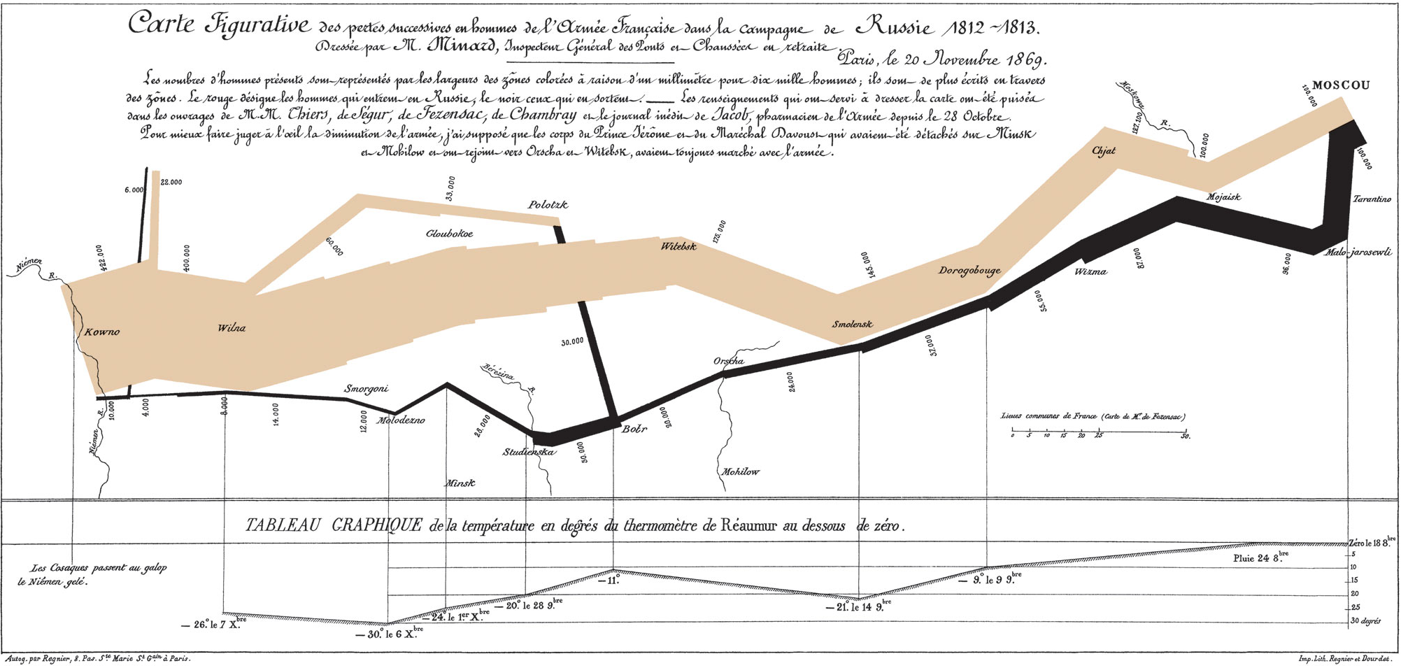 ).
).
Probably what an AI sees when it watches a movie. Like a summary of the visual experience.
Load More Replies...Anybody else try to guess what each is about before reading the captions?
One of the best charts I know is from Charles Joseph Minard. It's from 1869(!) and depicts Napoleon 's Russia campaign of 1812 ( Minard.png ).
