Get Premium
Dark mode theme is available exclusively for premium users. Learn more about the benefits of subscribing.
No fees, cancel anytime.

 Dark Mode Ad-Free Browsing Unlimited Content
 Ad-Free Browsing Unlimited Content Dark Mode
Join 1.2 million Panda readers who get the best art, memes, and fun stories every week!
Struggling to remember or make sense of complicated information? Maybe a visual makeover with an eye-catching chart or graph will help! And if you have doubts about its effectiveness, allow us to introduce you to a subreddit called “Data Art”. It's a community dedicated to sharing “aesthetically satisfying data visualizations that you'd be proud to hang on your wall”.
Since its creation in 2017, "Data Art" has grown into a thriving community of over 65 thousand members who share passion for blending aesthetics and data. From evolution of the Shanghai Metro to the largest empires of history, these visualizations are not only informative but also pleasing to the eye. Scroll down to experience the beautifully presented data.
This post may include affiliate links.
I wonder how these patterns match up with what people with synesthesia see when they hear these notes.
Very pretty but doesn't the pattern change depending on the diameter of the bowl (or how full it is)?
Cellular organisms meet fractals. No wonder mandalas are so revered.
That *IS* a very pleasing map/flag. IT would have been great to get Alaska and Hawaii involved too.
And each star has a completely equal vote in the senate which does things like confirm Supreme Court justices.
But votes are based on population in the House of Representatives (California has fifty some, my state has 2)
Load More Replies...It is beautiful, but populations change. The most obvious example is that two/three years ago New York's star would have been very noticeably larger than Florida's instead of smaller.
They’re on there, just small because of their populations.
Load More Replies...The subreddit “Data Art” has become really popular over the years. When r/DataArt reached 10,000 subscribers, the moderator u/jmerlinb decided to personally send out a DataVizDigest email summarizing the top posts of that season every 3 months. “Because data should not only be informative, but also beautiful.” If you're interested, you can sign up for their mailing list. Also, make sure to check out the most upvoted posts on the "ArtyCharty" Twitter page!
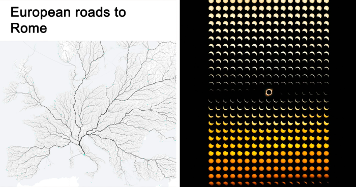
Correction: “all European (and maybe Asian) roads lead to rome” we don’t want to be confusing Americans who think that the hiking trail in a random national park leads to Rome
Load More Replies...While this is clearly not what the European road network looks like, I would love to see that Roman road across the English channel.
I think that is the channel tunnel. It is not a road, but a railway tunnel. Some others of these are not roads, but ferry routes: f.ex look at Italy mainland and Sardinia.
Load More Replies...In fact, all roads led FROM Rome. Rome exported nothing but conquest. In order to conquer, they built roads to farther and farther reaches of the near world.
This is a map of my neuronal connections wherein all thoughts lead to cheese.
I have map of the major roads of the Roman Empire drawn in the style of the London Underground map.
„Viele Wege führen nach Rom“ - „many roads lead to Rome“ a German proverb meaning that you can reach your goal in many different ways and all are valid and good
Looks exactly like the vascular structure of the eye! An Italian eye, I guess
essentially, yes. It drives in a straight line until it hits something and then it 'bounces' off with a random angle. When it senses a particularly dirty spot it spirals around for a bit.
Load More Replies...I really want one, but I already know it'll clog with dog hair in the first few minutes.
I want one just to freak out the cats.
Load More Replies...How is That a Clean Room when Every Piece of Furniture in it's Way Changes it's Bloody Direction?? My Furniture doesn't Hang from the Ceiling!!
This is from the science fiction webcomic Stand Still, Stay Silent. "Year 0" refers to the first year of the fictional virus outbreak from the story. They did this drawing because they thought it was neat, not to be used as an academic source.
"Language is a source of misunderstandings." Antoine de Saint-Exupéry
Before year 0? I don't see latin? Or maybe i don't understand what they really mean. Also isn't missing group with Chinese/Japanese/Korean languages?
Nope. It only refers to indoeuropean and uralic languages. Those three are yet another pair of shoes
Load More Replies...Maybe it'll be interesting to know: these trees were drawn by Minna Sundberg as an illustration for "Stand Still Stay Silent" webcomics. Its characters are from Nordic countries, hence only two trees, representing native language families there. Year Zero refers to comic plot.
Where are the African, Polynesian and other indigenous languages? I'm not angry just confused as to where they were
was going to ask similar .. there are literally thousands of languages that don't get a mention.
Load More Replies...This is one language family tree. There are others. There are languages that developed further east than India. There are languages that developed in Africa and so on. Though, this is definitely the part of the world considered the most important in my history books.
I speak Finnish, the fresh stem in the Finno-ugric bonsai. You want to learn a really really hard language, in an environment that automatically wants to switch to English as soon as we notice that you aren't fluent? Welcome, and good luck!
Bored Panda got in touch with Jack Merlin Bruce, also known as u/jmerlinb, the moderator of the "Data Art" subreddit. We were intrigued to learn about the inspiration behind the creation of this subreddit. Jack revealed that during the early stages of his career in data visualization, he crafted a lot of designs for various fandom communities on Reddit, such as r/GameOfThrones, r/Pokemon, and r/Chess. “I wanted to show them their passion in a new way, and for me to get a chance to design stuff I thought looked really cool. Stuff you might want to hang up on your wall, or that you would see in a coffee table book.”
“It was great fun,” the moderator continued, “And these works I produced tended to be quite successful in these fan communities, but were significantly less successful in the one place I thought they would have been a natural fit for - and that was (at the time) the world's largest data visualization: r/DataIsBeautiful. And this was strange to me, seeing as they were so well received in other spaces.”
“But this isn't actually a surprise once you look into the stated aim on the sidebar of r/DataIsBeautiful: ‘Aesthetics are an important part of information visualization, but pretty pictures are not the sole aim of this subreddit.’ In other words, there are two sides to all data visualizations: the story, and the aesthetics. On one extreme, you can have a chart made in 1990s Microsoft Excel that looks horrendous but yet tells a great story. On the other extreme, you can have a chart meticulously designed by a world-class graphics designer which looks stunning in the aesthetics department but has no meat to it, no story. There's nothing inherently wrong with either type, it just depends on what your audience is expecting - and r/DataIsBeautiful catered to the first example... but I soon came to realize there was no community at the time that catered to the second example, to the ‘pretty pictures’. And so /r/DataArt was born - a subreddit for visualizations you ‘could hang up on your living room wall’.”
You can get African wax print cotton in London super cheap. It's so in approx 5m lengths, and sometimes for as little as £5. When I was learning to sew I used loads of Nigerian prints.
Load More Replies...Interestingly, Ankara and Aso-oke are extensively used in Nigeria. Akwete I have never heard of.
I am loving Shweshwe, Leteisi and Tuareg. It's the northerly and southerly blue that sing to me.
interestingly you get any colours of shweshwe. sample https://www.dagama.co.za/
Load More Replies...I have a bag made from Shweshwe material. Very hard-wearing and gorgeous.
I love this! I decided a few years ago to try to collect a handmade fabric sample from every country that I visit. Haven’t been able to put it into practice yet though.
I like that Egyptian cotton comes from Egypt, someone should tell a lot of manufacturers who seem to source it from India, China, Pakistan and in one instance Portugal.
Fun fact: at the population density of the most expensive neighborhood on Earth (a suburb of Paris with no high rises), the entire Earth's population could live on HALF on Madagascar, that little chip overlaid by the UK. Overpopulation is not about space; it's about the technology to judiciously use and continuously reuse resources. Right now, the average American's ecological footprint is dozens of acres. It could be a fraction of a single acre. If we could build a self-sustaining terrarium habitat for humans on Mars, imagine how much easier it would be to do it on Earth! The key to sustainability is increased resource effectiveness, which relies on economic growth.
Except that this is utter horse poop. I was looking at a map the other day showing that Italy is about the same size and shape as Florida plus a bit of Georgia. It definitely is not the entire length of the East coast of the US minus Florida! If you keep 'ing about with the scale, anything would fit!
Italy is about 1200km in length. The distance between Bangor (Maine) and Charleston (South Carolina) which the mainland Italy seems to cover is 1200 miles. I'm gonna bet on conversion error
Load More Replies...should be seperated by colours; one for ignorant and mentally enslaved fools who denied the virus' danger, and those who sadly died from being unjustly exposed...
Oooooph that's harsh. Regardless if you think they are idiots
Load More Replies..."look ! Grandpa is in the Nyt's front page" (dark humor relieves pain)
Rest in peace to all those have died. Forever empathy to those who lost someone to covid.
I had a friend who got covid four times. She was fully vaccinated. There is room for discussion. Got the vaccines myself, but I still nearly died.
My father was told it was a garraunteed death for him due to numerous underlying health issues if he didn't get vaccinated. He caught it and didn't even know (got tested because my mom found had to get tested cause a coworker had it), and was actually healthier after. It truly depends on the person. My neice got vaccinated and ended up in the hospital.
Load More Replies...Suppose that would depend on the timeframe. US COVID deaths 2020: 350,831 US gun deaths 2020: 45,222
Load More Replies...Flu deaths annually: 12,000-52,000 Average COVID deaths annually: 1,985,361
Load More Replies...According to Jack, the main goal of r/DataArt is to offer people a space where they can try out new ideas and approaches to thinking about and working with data. “While our primary aim is to allow people to share artworks, we also make an exception for data visualization that might not necessarily be aesthetically pleasing, but which pushes the boundaries of the medium itself.
We've had people posting all sorts of amazing and unique work - charts that they knitted with colored thread, 3D-printed earthquake seismograms, data sonification (where sound is used to encode numeric values as opposed to color/shape/size, etc.), VR-based visualizations - all of this stuff was welcome in our community. I wanted r/DataArt to as closely mimic the experience of walking through a modern art exhibition but for data.”
Two comments: Firstly, who pays for this sort of "research"? Secondly, and more importantly, can I have some cash for my project of tracking wave patterns on golden sandy beaches in the South Pacific?
A lot of the times you see something like this it's people who have to publish a science paper to graduate, it's a test in applying the methodology more than anything else. And yes If you have the relevant degree, secure a sponsor (or pay it yourself) and wirte down the results you can make science out of a surfing trip.
Load More Replies...there is actually still a thing or two to unpack when it comes to trajectory of unmanned bike. We still don't quite understand why and how they move in these patterns before falling down
Of course, this would just be the initial data. Then you take into account other factors (just on that same specific bike of course) such as the materials used in the making of the bike, and how precise the angles are, the torque of the push, the level of the "road" etc etc. so much would have to be understood first
Load More Replies...The is the research paper that corresponds to the image "It takes two neurons to ride a bicycle" https://www.paradise.caltech.edu/~cook/papers/TwoNeurons.pdf
Looks like when I clean out my empty wallet. This is probably for a bachelor's degree. In the master's we seek explanation, why (forces of gravity, coriolis, gyro, centripetal, probability)
I'm just wondering how these pictures correspond with the ones of the notes of the musical scale.
Can you now see why Ptolemy in ancient times described the orbits of planets as epicycles? His view was discarded post-Copernicus, but it accurately described these graphs.
This is where the concept of planets being in retrograde comes from. In order for the geocentric model of the universe to work, the other planets would have to reverse their orbits to match what we see from Earth.
It would be nice if this described what it's actually supposed to depict, because it's not "the paths traced as seen from Earth". Since all of the planets are in the plane of the ecliptic, the paths we see are in the plane of the ecliptic basically lines that go back and forth. For the planets farther from the sun the line would go behind us (imagine it on the wall of a circular room) because they can be opposite the sun depending on where they and the Earth are in their respective orbits. Depending on whether the view is based simply on the Earth's orbit or accounts for the Earth's axial tilt the lines would be either flat or cover an range of +/- 23.5º, just as the noon Sun's position in the sky varies through the year.
The magnificent bears of glorious Finland seem to be creating a defensive wall against Russia.
you'll note that they are red, so probably soviet spies...
Load More Replies...Anyone else worried about the color scale going to infinity for some of the red parts?
That's ado. I would hang a print of this on my wall.
In addition to sharing visually appealing visualizations, r/DataArt distinguishes itself as a community that prioritizes content curation more than others. “But as aesthetics are (by and large) subjective, this can be difficult when confronted with what is probably the bane of our moderation team (shout out to u/OdBox), and that is the infographic,” Jack shared.
“There is nothing inherently wrong with infographics. When done well, they can be amazing at conveying complex information in easily digestible ways. However, for some reason they tend to attract a spammy crowd, and /r/DataArt gets our fair share of these submissions, most of which we remove. There are times when these removal decisions might seem arbitrary - as it is impossible to pinpoint the exact moment when an infographic becomes a piece of ‘data art’ and vice versa. But alas, a line has to be drawn somewhere. I guess it really goes back to the reason why I created this sub in the first place: there was no centralizing community for data art, but there were plenty of communities online for infographics (e.g. Reddit’s own /r/Infographics). r/DataArt - as with all communities - is ultimately defined by what it is not.”
The last year of World War II: May in Europe, September in the Pacific.
The ships didn't stop, countries would have starved if they had. have a look at this link - it shows the live AIS tracking of (mostly commercial) shipping. Shipping routes haven't changed significantly for hundreds of years (our ancestors were actually quite efficient in route planning, the methods haven't really changed - just an improvement of technology) ignoring the invent of the Suez and Panama canal. https://www.marinetraffic.com/en/ais/home/centerx:2.1/centery:26.8/zoom:3
Load More Replies...For a second I read "shipping LOGOS" and let me tell you I was VERY confused.
Makes me think about the movie "Yesterday". "Hey, Dude?" "That was bloody Ed Sheeran!"
I much prefer this pic as I can sing along to it too...
🎶 10625083_1...018b44.jpg 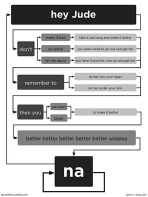
And you know what? Still one of the best songs ever written or performed. My favorite recording: https://m.youtube.com/watch?v=A_MjCqQoLLA
Do the cats move to show today's high and low temperature? If not, why not! 🤭
I see you have cats and is therefore pinned to the floor, just as my runners are!
Aesthetics is all about making things look pleasing. When we apply aesthetics to data, we can transform dull numbers into visually attractive and easier-to-comprehend elements. We asked Jack about his thoughts on how the combination of aesthetics and data enhances our understanding and appreciation of information. According to the moderator, we are all inundated, overloaded and overstuffed with content. “From the moment we wake to the moment we sleep we are often hooked into a near-constant stream of information. And the reality is most data in its raw form can actually be pretty dry, it just can't compete. Our monkey brains just aren't wired that way.
But what our brains are fantastic at interacting with are things like color, shape, size, patterns, orientation, and all the facets that sum up to create our sense of sight. That's why so much of our brain power is dedicated to vision, more than any of our other senses. As such, data visualization is how we use our brain's architecture to get it to understand and interact with traditionally dry, data-based, complex topics. In other words: aesthetics are to data what touch screens are to computers.”
Without the visualization aspect of data, we'd be left navigating an endless roiling ocean of meaningless digits without a map or even a paddle to orient us. But while proper visualization does have far-reaching implications in big important areas of society - like multi-billion dollar government infrastructure investments or medical imaging - I believe there should always be space for that cool-looking poster you just wanted to hang up on your wall, and that's why r/DataArt exists.”
The real crime here (and, as far as I'm concerned, conclusive proof there is no god) is the massive discrepancy between human and dog.
For my 60th birthday present my colleagues gave me a ticket to visit a bird wildlife park which has flamingos. I was utterly charmed to find out that some of the flamingos were also 60
The rate we're going the life spans of a good deal these animals will be much shorter.
If not for the title of the post or on the image itself, I wouldn't think this was a creepy cool monster, getting ready to chomp on someone -- I do like the image.. what it represents gives me heart hiccups..
Old salt here. The lighthouses in the same area have different flashing patterns, for easier recognition and identification in the chart. The red sector indicates danger and must be avoided.
Thank you for the explanation! I'm landlocked so I was just about to ask about it.
Load More Replies...Aren't "Smarties" the little chalky disc's that vaguely resemble a fruit flavor. Like it has an idea of what the flavor is.
Those are Necco Wafers. We have chocolate Smarties in the US too. https://nuts.com/chocolatessweets/old-time-candy/necco-wafers.html?utm_source=google&utm_campaign=Nuts_g_usa_Performance-Max_nc&utm_medium=cpc&gclid=EAIaIQobChMIp9jKxaf-_wIVjN-GCh2Ncwk0EAQYASABEgLnO_D_BwE&utm_campaignid=17316642221&utm_adgroupid=&utm_adid=&utm_keyword=&utm_matchtype=&utm_adgroup=&utm_content=17316642221
Load More Replies...Fun fact. Did you know that, back in the olden days, Smarties used to be flavoured - orange, of course, but also plain chocolate for the brown, and there was a light brown which was coffee flavoured. The rest were just milk chocolate
not US smarties ours curve in like reverse ufos
Load More Replies...But this is one bag. It's not science unless you eat at least 30 bags and take the average! And source them from different stores. Now I'm hungry, anyone have a bag of smarties I can borrow in the name of science??
I’ve never had smarties of any of these colors, the ones here are pastel colors
Don't know about this map but I know my body works like MBTA in Massachusetts.
And then Finnish which is not part of the group does it's own thing with "Äiti"
This is pretty universal, because mmmm is the first sound kids make. Chinese 母 mother, and related sounds: mu. It's the exceptions that are rare. In Tayal (an ancient Austronesian language in Taiwan), mother is yaya. Mama means uncle.
Marathi has “Aai” and it’s a language that’s similar to Hindi, Kannada, Gujrati and Konkan
I can clearly see the resemblance to meter in greek (and méh ter)... Almost a ´s close as Äiti! :-)
I'm not sure what you mean by 'proof for the existence of Ïndo-European". If you mean 'was there a language called Indo-european?' Then the answer is indeed 'no'. The term is used to describe a collective of languages that appear to share similarities in a number of words. The suggestion is not that one language evolved into all others, rather that one language had such a profound impact on others that it's influence can still be seen in modern languages. 'chronological consistency'? This is merely an image to give you an idea of how 1 word can spread, change, and develop. As for the differences, It's an image not a essay! There are plenty of papers covering the differences and similarities of the Indo-European languages if you want more detail than a simple picture designed to give you an idea how something more complex works.
Load More Replies...Not national boundaries - geographical boundaries :) air acts differently over different kinds of land and sea
Load More Replies...I've read somewhere that distress call SOS (... --- ...) doesn't actually stand for anything, it was used because how easy/simple/unique/whatever it was to communicate in Morse code
Save our souls is what I have always heard.
Load More Replies...It is, the dots and dashes are just included in the illustration. Ex: A: •- B: -••• C: -•-• Etc
Load More Replies...fun fact: on google experiments, you can find this program to teach you morse code. as long as you have a computer and google you can do it
The other day in a big city I found the Google building without Maps
Load More Replies...sos definitely stands for save our souls and mayday comes from the french m'aidez, meaning help me. (maidaiz? really?)
Hahá, my language has short and long syllables so the mnemonic is coded directly in the word: akát, blýskavice, cílovníci, dálava... This is the only reason I'm more or less fluent in morse. I should *czech* my privilege. 😅
Took me too long to realize it's not about pronunciation of the words.
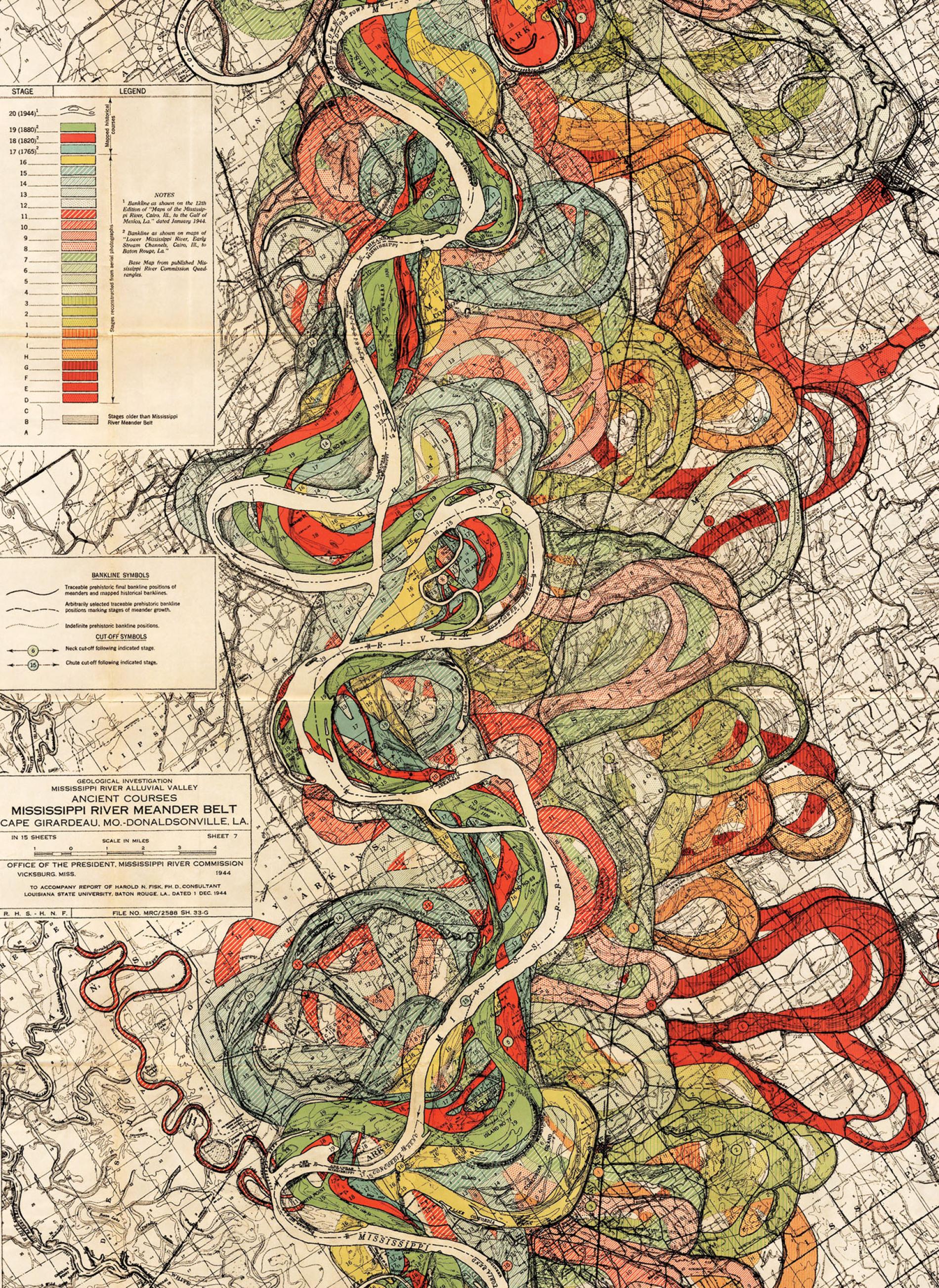
Guessing it’s something to do with phases of the moons / eclipses, but agree that an explanation would be helpful - especially given the article is about making sense of data!
The link bottom left of the image: "425 photos of the moon crossing the sun and a few other Total Eclipse comps" Then there's https://mymodernmet.com/solar-eclipse-photo-charts-dan-marker-moore/
Load More Replies...You are looking at "425 photos of the moon crossing the sun and a few other total eclipse compilations"
A picture may be worth 1000 words, but only if you know what the picture is supposed to be showing you.
An Explanation would Help what we are Looking at!! Pretty but Of WHAT??
I’m not 100% but I think it’s the movement of the river (as they move over time) and each colour represents where it was at a certain time periods. I could be wrong
Load More Replies...She used to Run like a Snake along the Land But People Changed her Natural Coarse & then Complain of Serious Flooding!!!
King's X - Mississippi Moon https://www.youtube.com/watch?v=D-wTrcJ_Lns
they are actually Icelandic-we have 13 of them
Load More Replies...I heard once that Saint Nicholas is the patron saint of prostitutes… I don’t know if that’s true or not
That is true. He is the patron saint of Amsterdam, the city famous for its red light district. (He is also the patron saint of sailors and Amsterdam is a port city. That is the real and more boring reason they chose him as patron saint)
Load More Replies...Sinterklaas is not the same as Santa Clause. Sinterklaas visits the Netherlands on December 5th and after he leaves to go home to Spain, the kerstman (Santa) arrives on December 24th.
So Sinterklaas is like Germanys (Sankt) Nikolaus (St. Nicholas)
Load More Replies...Seeing it like this… some countries have really gotten the „Arschkarte“ didn‘t they? (Lets see if BP censors non English swear words)
Do one of those for any given Texas city and it will inevitably look like a huge spiderweb...
But, it's impossible to draw flat representations without distortions. The distortion is a lot smaller than in the classic world map, but especially for the bigger countries, it's still distorted by removing the curvature of the earth.
Is Canada not the second largest populated country in size after Russia?
As I always suspected: the United States and Australia are the same place.
I mean, both land masses were used as places to get rid of "criminals"
Load More Replies...Umm, I'm not Canadian, but isn't Canada bigger than depicted?
Also, Alaska isn't there. That state is Huge!
Load More Replies...People, please don't start kicking off about whether it is a foetus or a baby. Just enjoy the interesting image.
As a woman (60) who has had both abortion and miscarriage, the question about foetus vs baby is a profound one for me even 40 years later. As I perused this chart, I found myself counting days and factoring out weeks vs. months and comparing those numbers to the pictures and descriptions on the chart. The termination of a pregnancy, no matter how it comes about, is a profound experience for many women who go through it. The question of when in the development the embryo becomes sentient in a human way is part of my own personal ethical mathematics, as I know it is for others. So "enjoyment" is certainly not what I am getting out of the chart. But it is providing me with information that is still vital to me. I hope you think that is appropriate, Christopher Preston.
Load More Replies...Now imagine, the woman's body that houses all of this and the effect it has on her body, mind and personality. Extraordinary sacrifice by the Mother for new life.
You’re right. In a country where abortion is being outlawed, sometimes the “Mother” is FORCED to make extraordinary sacrifice for “new life”. Sometimes “the Mother” dies when she shouldn’t have if she’d been allowed an abortion. Sometimes the baby comes out with severe congenital defects that wouldn’t have happened if “the Mother” was allowed an abortion. And sometimes “the Mother” doesn’t want the baby, so she throws it in a dumpster to die slowly, which wouldn’t have happened if she’d been allowed an abortion. Sometimes “the Mother” got raped and commits suicide after the birth because she was not allowed an abortion. “Extraordinary sacrifice” that didn’t have to happen.
Load More Replies...wouldn't it have been more obvious to start at the center of the spiral?
I was viewing it like a whirlpool or plughole. When it gets to the middle, the baby plops out of the hole!
Load More Replies...We all start off as a circle, the most important of all beings in flatland!!
Behold….THE PREGNANCY LINE. (Not coming soon to any parables of Stanley.)
"Bar" being the operative word! Also, where does the dog bowl fit in? 🤔
I admire the dedication. The data collection must have been arduous.
I think my homeless fellows got you guys beat by a long mile. With bud light free beer month
Right on Nat ! Coors and Lite ? Not really beer, are they ? Wonder what he would say to a Trappist from Belgium ?
That's New Zealand down there. We often get left off US maps altogether. Even the BBC has sometimes forgotten us. But this map gives us some wrinkled glory.
Well, as Col. Jack O'Neill said, "Nintendos pass through everything!"
Neutrinos are extremely small and neutrinos detector are insanely huge, that's way that pictures take so few but still big pixels
Load More Replies...This image should be banned as it could be used as ammunition by Flat Earthers, as it implies that if Neutrinos can be 'seen' through the Earth, then it must be paper thin. /j
I love particle physics. Boring-looking yet amazing pictures like this make me love it even more.
This is very cool but I'm sure there's an easier way to get a better picture.
love how "awesome" also has a negative sound. For irony/sarcasm? (asking as a non-native speaker)
All positive sounding words can be made to sound negative depending on the tone the speaker gives, i.e. ironic/sarcastic (like here in Australia we especially love sarcasm. But we can often use it in a positive way for close friends...)
Load More Replies...I wonder how different this graph would be for different demographics. Ie, US vs UK vs SA vs ... etc
I also wonder this. I'm guessing this was done in the UK based on inclusion of brilliant and rubbish.
Load More Replies...Some people hate the word moist. Wonder where it would fit on that graph.
Only if you know English. Somebody asked people who didn't speak English what the most beautiful word in English is. The winner: diarrhea.
Even if it wasn't the chart perfectly illustrates the growing change. It's obvious when you see it presented this way that it's steadily getting worse over time and in fact appears to be spiking dramatically over the last 15ish years. With no indication that it's going to let up. So that .5 - 1 degree isn't going to stay that way.
Load More Replies...The colours, from black to white, represent a change of a full 1.5 degrees. And the data goes all the way back to 1850.
1850 - 2015? Proof we can NOT stop GLOBAL WARMING while Still Mining all earth's Minerals & Sending C**p up through OUR Precious OZONE LAYER that Blocks UV RAYS!! Thanks Super Rich Dumbasses fro Creating Bigger Holes in it!!
not good news, planet has and is heating up far too fast now
I wonder if you could use thicker yarn depending on the colour. A baby wouldn't necessarily appreciate it, but it would be interesting for a larger blanket. Feeling hundreds of years of temperature differences all at once.
took a long time to knit...i kid knitting gifts to give for christmas
It should all be blue, but slightly lighter at the top. This is just false and scaremongering
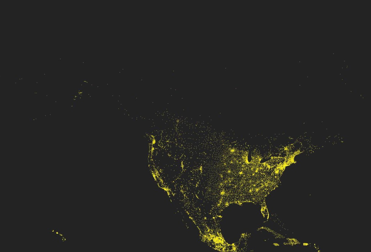
Europes towns are mostly eaten by cities but still counted as separate places, whether the USA has big blobs around big cities, but because it is much larger there are a lot more smaller towns not counted with cities and/or with each other
Load More Replies...Based off this map, I live in a very quiet and peaceful city. Wish someone would tell all the loud and irrational humans that keep sprouting from everywhere. 😮💨
Load More Replies...About 90% of Canadians live within 100 miles of the US/Canada border, and perhaps you don't know where that border is.
Load More Replies...Something is off here, all of Ukraine is almost dark while the Crimea is lit up like fireworks. The peninsula has one of the lowest population density in the country, let alone big cities.
This shows what I've repeatedly said, that the US is both larger in area and much less densely populated than Europe. Can you now see how difficult it would be to establish a national high speed rail system? You'd be laying thousands of kilometers of track through wasteland. It's not cost effective. It would be in limited areas with large populations, like New England. We're built more like European cities, being the oldest part of the US, and 3 of our 6 states are among the most densely populated in the country.
Anyone else notice how dark Russia is? I just find it interesting and wonder what their actual population numbers are
Didn't make the cut. The Roman Empire dwarfed his conquests. He only had one abbreviated lifespan to conquer.
Load More Replies...Missed the American Empire. Countries that have to do what America tells them to do.
Replace the word Empire with colonies, and Britain's is still going strong.
Load More Replies...THE BRIGADES - empires always fall https://www.youtube.com/watch?v=Xrnomv0Hxmk
I can get from Stafford, Staffordshire on a train in 1h10 so this map is wrong. It extends a lot further!
This isn’t surprising public transportation sucks In pretty much most of the US. My European wife really struggled with this when she first moved here as she used public transportation exclusively in her country.
And London isn’t mountainous, either. SF is notorious for its hills.
Load More Replies...45 miles is 45 miles, wouldn't the more interesting question be what distance can one travel in average from city center in a given amount of time?
And CA takes up 2\3 of the US west coast. Not a fair comparison distance-wise.
Nonsense. The high speed rail link can have you from Folkestone in the south east corner to London in less than hour...must be 70 miles.
Looks as though it's zoomed in on London but not San Francisco. WTDF
Check the source, they have a larger version of the image you can zoom out.
Load More Replies...8,000 paintings by one man? That's like a painting every day for 22 years, or every other day for 44 years. Is that accurate? Amazing!
Reminds me when I heard once a man was trying to prove a point about cheap plastic and said “a good razor lasts a long time whereas those cheap plastic ones are so bad I went through a hundred in 2 weeks, you know what I mean? And the other man said “you shaved a hundred times in two weeks?” Ok kinda lame but 8,000 paintings does seem like he was very busy.
Load More Replies...Everybody pointing out that climate change isn't new, it happened all the time and humankind is still there, might want to consider this: Did the humans in the past enjoy the conditions? Did they go on with daily business or did it affect their style of living, health, food? Might today's society be capable to endure a century of uncomfortable living conditions? Be aware, oil and gas to run airco's will be depleted at a certain moment. Drinking water and food will get scarce. Animals will die.
Makes sense that 2009 and 2019 were some of our worst years with bushfires (black saturday and the black summer)
Can’t read it properly sadly but I’d love to have this as a poster in my room
http://tabletopwhale.com/2019/06/24/a-geologic-map-of-mars.html It's $13 for a map
Load More Replies...Cuz Italy is "the boot"! Which also is if course why Italian made shoes are the best shoes. It was clearly Italy's fate.
Load More Replies...😯 oooooo Mississippi River is so beautiful... Let's do this for all the rivers in the be world >_< !! I'm visually needy.. and want to see them all do badly!!
so apparently Lou Bega likes his ladies a bit older? Mary you go girl.
Look at the sharp drop-off in Monica right around 1998. Wonder why. Looking at you, Bill.
Lou Bega has Latin ancestry but is a German National so likely wasn’t using Latin versions of names
Load More Replies...it just goes to show that Women are just as good as Men are at whatever they are interested in
'We've have carried extensive research and have concluded that: Men and women play the same game, in the same way! At this time, we are unsure if this may have something to do with them using the same rules, or if the woman's brain malfunctions when playing sports instead of focusing on their needlework!'
OMG do you want to say that women's football isn't all gossiping on the field and knitting and the occasional kicking of the football, but is actually played on the same athletic/strategic level as men's football?!?!?
I am amazed that so many people have been doing this. Had no idea this was a thing!
I'm part way through one for my 45th year. I'm using two strands per day, one each for lowest and highest temperature for that day.
This one is mind blowing. Not for the military spending part (an arbitrary political decision) but because it clearly shows the true cost of universal healthcare. From Norway to Czechia (the first five lines), it is roughly the same, adjusted for the cost of life. About 4000 dollars/euros a year per capita. And yet, the only developed country with no universal healthcare because it’s too expensive/socialist is already spending twice this amount, for an inferior level of care. There is something deeply wrong.
It’s because the graph is per capita (per person in the country). They still spend billions of dollars on their military and healthcare, but because their population is so large, per person it ends up being much less.
Load More Replies...No one is surprised to see the exceedingly enormius amount the US spends on military, but I'm disgusted that without universal health care, we still spend the gigantmo amount we do, on health care. Cuz who would want to spend less per capita on better universal health care? Not us apparently. Just gross. Coming from a US constituent: Get it together USA. we're all sick of ur s**t.
We (belgium) ratio mil/health care : 100/11. us ratio : 100/22. Yet still their healthcare sucks?
The healthcare itself in the US is excellent. It’s the cost that sucks.
Load More Replies...How can Israel afford to spend less on military than healthcare when it spends so much of its time invading Palestine?
You mean “defending itself from terrorist attacks on a daily basis?”
Load More Replies...Gosh, and people worry about bureaucrats establishing a 'world government'.
Considering Disney isn’t a government but a company, yeah. The people in charge of military and economic decisions are more worrisome than a bunch of morons working for the mouse.
Load More Replies...What about the shell companies used for laundering profits, or don't they have any?
fun fact: the creator of crayola was colorblind, specifically blue-green colorblind.
I'd like to know the chemical formulae of the dyes they use to create those colours.
In the Netherlands the sun is highest at 12.45 (and during artificial summertime 13.45). It is worse for France and Spain. Technically, all countries between the west of Germany and the Atlantic Ocean belong to the UK time zone. Due to political/economic reason they all follow the MET...
I guess Indiana really is the crossroads of America, roads everywhere, mostly between the cornfields though
About the only interesting thing about my state..
Load More Replies...I'm highly doubting the accuracy of Michigan's upper peninsula.
I grew up in the woods of Maine and now live in the Rocky Mountain West. It's so much more urban here (Front Range of Colorado) People never believe it though. The East is known for people, not remoteness.
I think they're just measured different frequencies of sound waves... But I'm not hip, so it could be measuring human behavior? O_O;;
Load More Replies...Sound view is beautiful until you are actually listening to people mindlessly chit-chat.
My part of Southern California appears to be flat and/or underwater XD
It's "Nïger-Congo"... censor bot is a dumbäss
Load More Replies...Hey, BP, N-i-g-e-r is the name of a country, a river and a language family. It is NOT the n-word.
I have two Nando's within 5 minutes of my house. (I'm not in the UK.)
South African / Portuguese chicken restaurant chain. Everything is drowned in periperi
Load More Replies...There's no point in posting some of these without a better explanation as to what's being represented and how.
Reflects the trend in film making: Dark. It's gotta be dark. People won't take me seriously as as director if it isn't dark. So, we now have a lot of films that look like they were filmed at midnight by the light of a half-moon during a thick fog.
Yes, very annoying. To me, however, the worse crime is acoustics. Music drowning out dialogues, people's voices tuned down as to be almost inaudible - and once I adjust the volume I run the risk of my eardrums hitting the walls with the first shot fired or car honking.
Load More Replies...the colour shift was most noticeable between 2 and 3. Instant shift to green.
Too near the ground and the wind speed is dominated by ground roughnesses, which isn't very useful. This chart gives the wind speed 100 meters above ground level, which is ideal for studying the best place to site wind turbines. So, which city is REALLY the windy city?
Load More Replies...I remember when they said CDs would kill the music industry…
The worldwide Covid-19 death toll is nearly 7 million, and still continues to rise to this day. This graphic is from the early days of Covid.
Oh look we have a new plague...."but it hasn't killed many people". Said weeks after the discovery. Sounds so Trumpian, it will all be over by April..
Load More Replies...Wasn't it odd when they discovered a potential cure for HIV through stem cell transplantation, then proceeded to cure several people, and nobody seemed to notice or care?
I believe a few who had cancer and then a bone marrow transplant.
Load More Replies...Am i reading this right? COVID-19 killed only 4,700 people? BULLS**T!
It’s an old graphic, before it had killed the many millions it has.
Load More Replies...Colors used in the film throughout the playing time
Load More Replies...Somebody should do one about all their things in nature that can kill you !
Humans, dogs and honeybees are the deadliest three animals in Australia, responsible for more deaths than any other animals.
Load More Replies...I didn't know there was mallee in states other than Victoria! Beautiful area, dry but good for grapes, citrus and almonds. Gets frosty mornings, with fog, and then by mid-late morning it can get to 30c!
Is the next graph going to be stacks of corpses of victims of gun violence to represent victims of gun violence?
sorry, had to finish a call. sorry, no more of your favorite chocolate at the store, want something else, sorry, stuck in traffic, will be late for our date. sorry, I love you so much, just needed to tell you again.
Load More Replies...It’s talking about red-green colour blindness. (You’ll need to have normal vision to perceive this chart properly.) Top left is what red and green look like to us with normal vision, and the other three are what red and green look like to those with 3 kinds of colour blindness - deuteranopia, protonopia, and tritanopia :)
Load More Replies...Not impressed, not amazed, nothing but that the narrator was pretty egotistical, I think. Dunno.
Chartmaker probably chose purple for higher visibility.
Load More Replies...I was wondering what I was looking at, and then I realised the grey stuff is words! LOL
because similar to this graphic is the cover art for their most famous works
Load More Replies...Joy Divisions not so successful album after Unknown Pleasures..😁 JoyDivisio...48381f.jpg 
This is so outrageous. This is also a huge aspect of America's homelessness problem. I remember the whole drive to deinstitutionalize everyone who was living in mental health hospitals back in the 1980s. There were huge problems with the system and tons of abuse, but instead of fixing the problems the government just closed down the hospitals and tens of thousands of vulnerable people ended up living on the streets.
Same thing happened in Australia around that time. The patients became either homeless or imprisoned.
Load More Replies...In 1981, I visited New York City. We stayed in a loft in Soho. There was garbage piled up everywhere in lower Manhattan, and the city was so dirty that I took two showers every day. I experienced lurid catcalling from adult men, and I was 16yo. But I only saw four homeless people in the entire week I was there.
Why am I not surprised that every one spending less than $75 is a red state?
Not happening, because this will negatively affect the freedom of spending your money. I am European, have a mandatory health insurance plan to which both the employer and the employee contribute, with the result that I cannit spend a part of my money as I want. BUT get full payment up to six weeks of sick leave and a slightly reduced payment up to two years and all medical costs of a good, solid quality treatment will be paid for including emergency treatment in whatever country I stay. This is freedom for me.
So worrying. We need to restore these forests, in Africa and Asia as well.
Forests grow faster when atmospheric CO2 is increased (plant food).
Load More Replies...Seriously, if you're going to do this type of article, you need to present each graph with a MUCH better explanation.
Where's the point of origin so we can get there from the Pegasus Galaxy?
Well, you know the joke about why the pyramids are still standing in Egypt? Because they're too big to fit in the British Museum.
At least if an artefact is in a British museum, it’s not being bulldozed to build a highway.
Load More Replies...Now show us the graph of all Bitcoin worth that could disappear in an instant.
To the wise people who thought of that page-filler here. How on earth are we supposed to read it? Useless!
Do you know how links work? Click on the link below the picture, then you can open it. You can then zoom in if you wish.
Load More Replies...Sorry, but you have misunderstood the graph. It's temperament by popularity. The closer to the right, the better the temperament, the closer to the top, the more popular the dog. So GSD is high on popularity, but more or less middle of the pack for temperament. I do love them though. I've had 2 of them before.
Load More Replies...I believe that this chart will not 'Change (My) Perspective On Things' one tiny bit.
A project on Reddit where everyone placed a single colored pixel at a time, and everyone made a giant collage of pixel art.
Load More Replies...Golly. That looks familiar. I don't know where from, but it was about 40 years back.
Probably what an AI sees when it watches a movie. Like a summary of the visual experience.
Load More Replies...One of the best charts I know is from Charles Joseph Minard. It's from 1869(!) and depicts Napoleon 's Russia campaign of 1812 ( Minard.png 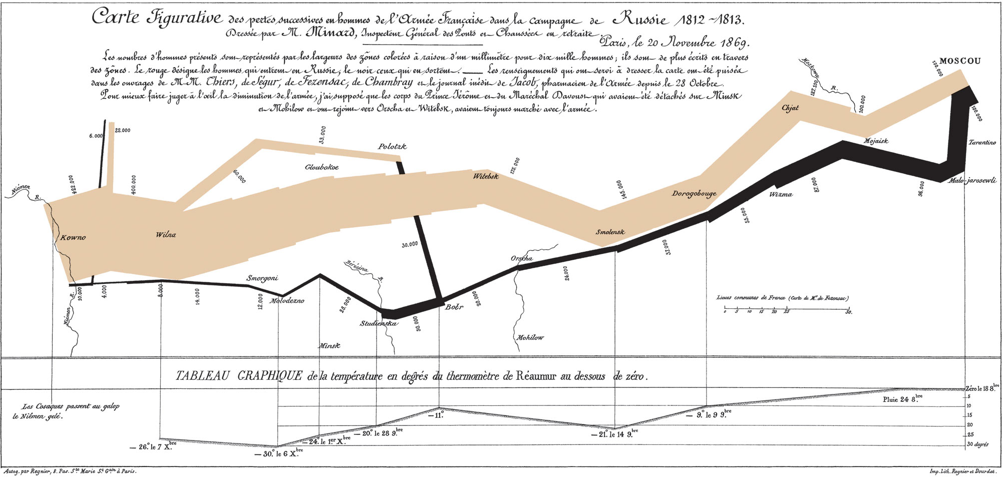 ).
).
Probably what an AI sees when it watches a movie. Like a summary of the visual experience.
Load More Replies...One of the best charts I know is from Charles Joseph Minard. It's from 1869(!) and depicts Napoleon 's Russia campaign of 1812 ( Minard.png ).


 No fees, cancel anytime


![Hey Jude Lyrical Composition [oc]](https://www.boredpanda.com/blog/wp-content/uploads/2023/07/64a66051e7751_wrwx5n6c38c51-png__700.jpg "Hey Jude Lyrical Composition [oc]")
![[oc] My Wife Made This Blanket That Indicates A Certain Temperature For Every Day Of The Year. 2016 Pennsylvania](https://www.boredpanda.com/blog/wp-content/uploads/2023/07/64a6669c33c6f_qe72iF2__700.jpg "[oc] My Wife Made This Blanket That Indicates A Certain Temperature For Every Day Of The Year. 2016 Pennsylvania")

![[oc] I Rendered Every Single Road In Tokyo Area On One Map. Love The Results](https://www.boredpanda.com/blog/wp-content/uploads/2023/07/64a66147169b0_w75y93cxuda41-png__700.jpg "[oc] I Rendered Every Single Road In Tokyo Area On One Map. Love The Results")


![[oc] Words For "Mother" Descended From A Common Proto-Indo-European Root](https://www.boredpanda.com/blog/wp-content/uploads/2023/07/64a661fddbecf_mrudx5athzx41-png__700.jpg "[oc] Words For \"Mother\" Descended From A Common Proto-Indo-European Root")
![[oc] This World Map Is Made Of Only Air Currents. If You Look Closely, You'll See Country Outlines](https://www.boredpanda.com/blog/wp-content/uploads/2023/07/64a660f914c23_tclltzf1cqy41-png__700.jpg "[oc] This World Map Is Made Of Only Air Currents. If You Look Closely, You'll See Country Outlines")


![Worldwide Earthquake Density 1965-2006 [oc]](https://www.boredpanda.com/blog/wp-content/uploads/2023/07/64a662458168c_z8qud92tbej31__700.jpg "Worldwide Earthquake Density 1965-2006 [oc]")

")


![World Temperature Anomalies [oc]](https://www.boredpanda.com/blog/wp-content/uploads/2023/07/64a660db76582_s7jb6mn7mcb41-png__700.jpg "World Temperature Anomalies [oc]")


 The Largest Empires Of History, Visualised As Planets Orbiting Earth")


![How Old Are The Women Of Mambo Number 5? [oc]](https://www.boredpanda.com/blog/wp-content/uploads/2023/07/64a660fe078fa_h4kwlay5dk941-png__700.jpg "How Old Are The Women Of Mambo Number 5? [oc]")


![Harmonic Series [oc]](https://www.boredpanda.com/blog/wp-content/uploads/2023/07/64a65e65e7dc4_qtxqu9e0eff31__700.jpg "Harmonic Series [oc]")


![[oc] I Made A Star Wars Expanded Universe Data Artwork Based On Wookieepedia](https://www.boredpanda.com/blog/wp-content/uploads/2023/07/64a661e31b59a_es84fs6mee541__700.jpg "[oc] I Made A Star Wars Expanded Universe Data Artwork Based On Wookieepedia")


![[oc] Music Industry Revenue By Format '73 - 2019](https://www.boredpanda.com/blog/wp-content/uploads/2023/07/64a664756bcdc_moyai8a4dat81-png__700.jpg "[oc] Music Industry Revenue By Format '73 - 2019")


")
")


![Avatar: The Last Airbender | First Episode [oc]](https://www.boredpanda.com/blog/wp-content/uploads/2023/07/64a6622158a0f_mx2dauj7bz051-png__700.jpg "Avatar: The Last Airbender | First Episode [oc]")
![[oc] Central London, Colored By Street Orientation](https://www.boredpanda.com/blog/wp-content/uploads/2023/07/64a662c307244_7boWDPq__700.jpg "[oc] Central London, Colored By Street Orientation")


![Color Matters - Visualizing Colorblindness [oc]](https://www.boredpanda.com/blog/wp-content/uploads/2023/07/64a66489700bd_5yvjtbnjboz31-png__700.jpg "Color Matters - Visualizing Colorblindness [oc]")


")
![Every Mention Of The 4 Harry Potter Houses, As Featured In The Philosopher's Stone [oc]](https://www.boredpanda.com/blog/wp-content/uploads/2023/07/64a661030a7e1_eQ54DfC__700.jpg "Every Mention Of The 4 Harry Potter Houses, As Featured In The Philosopher's Stone [oc]")


![[oc] Visual Studio Code - Monthly Code Changes By Hour](https://www.boredpanda.com/blog/wp-content/uploads/2023/07/64a6614243302_g3h223gvpzq61-png__700.jpg "[oc] Visual Studio Code - Monthly Code Changes By Hour")

![Our Eroded Mental Health Care System [oc]](https://www.boredpanda.com/blog/wp-content/uploads/2023/07/64a662525f259_dq7q8c0m1kd41-png__700.jpg "Our Eroded Mental Health Care System [oc]")
![Age Of The Buildings In Paris [oc]](https://www.boredpanda.com/blog/wp-content/uploads/2023/07/64a662d76bd9f_g5rlyvaf5x271-png__700.jpg "Age Of The Buildings In Paris [oc]")


![[oc] 10 Years Of Tesla Stock Prices](https://www.boredpanda.com/blog/wp-content/uploads/2023/07/64a666ae86508_al5alazjxrh51-png__700.jpg "[oc] 10 Years Of Tesla Stock Prices")


![The British Empire, At Its Territorial Peak In 1922, Covered Nearly The Same Surface Area As The Moon [oc]](https://www.boredpanda.com/blog/wp-content/uploads/2023/07/64a6647a80e3e_fMieJNV-png__700.jpg "The British Empire, At Its Territorial Peak In 1922, Covered Nearly The Same Surface Area As The Moon [oc]")
![Evolution Of The Population Of Belgium [oc]](https://www.boredpanda.com/blog/wp-content/uploads/2023/07/64a6669616fbf_h66ucho3uo451__700.jpg "Evolution Of The Population Of Belgium [oc]")
 In Python. This Is One Of My First Results. Values Of E/L (Energy / Angular Momentum) Of Photons Emitted At A Fixed Radius From A Spherical Black Hole")
![Here Is What The Conservative Leadership Contest (UK) Looks Like On Twitter [oc]](https://www.boredpanda.com/blog/wp-content/uploads/2023/07/64a66496efb0d_furuvh1qa8b31-png__700.jpg "Here Is What The Conservative Leadership Contest (UK) Looks Like On Twitter [oc]")


![I Draw A Line From The Centre Of The UK To The Centre Of Every Other Country On Earth, Then Coloured Them By Their Position On A Compass [oc]](https://www.boredpanda.com/blog/wp-content/uploads/2023/07/64a6627b1814d_cjc83cq14kw31-png__700.jpg "I Draw A Line From The Centre Of The UK To The Centre Of Every Other Country On Earth, Then Coloured Them By Their Position On A Compass [oc]")


")
![Inspired By Recent Blade Runner Barcode - Both Films Together [oc]](https://www.boredpanda.com/blog/wp-content/uploads/2023/07/64a666e7360ff_2xighgbi9mo31__700.jpg "Inspired By Recent Blade Runner Barcode - Both Films Together [oc]")

![[oc] Marvel Character's Team Membership](https://www.boredpanda.com/blog/wp-content/uploads/2023/07/64a664e2906f9_ubkf6uekbd941__700.gif "[oc] Marvel Character's Team Membership")
![Avatar Season 1 [oc]](https://www.boredpanda.com/blog/wp-content/uploads/2023/07/64a666a3e7d3c_ohUFol9__700.jpg "Avatar Season 1 [oc]")


")
![Recreating Lenore Tawney's 1964 Drawing 'Reflected Ray' In Ggplot And Ggpomological [link In Comments]](https://www.boredpanda.com/blog/wp-content/uploads/2023/07/64a6677a18ff5_h008jawu2bb31__700.jpg "Recreating Lenore Tawney's 1964 Drawing 'Reflected Ray' In Ggplot And Ggpomological [link In Comments]")
")