ADVERTISEMENT

Design is a field that runs on creativity. But as with anything, too much of a good thing can quickly become a bad thing—and it turns out, you can absolutely have way too much creativity.

If you need proof, look no further than r/DesignDesign, a subreddit dedicated to what happens when designers try a little too hard and end up with something nobody can actually use. We’ve rounded up some of the funniest and worst offenders below. Scroll down and upvote the ones that left you the most baffled.

#1

Having To Scan A Qr Code In Case Of Emergency

Red emergency evacuation instructions sign with a QR code placed next to a metal handle, showing poor design usability.

y4s4f4e Report

Francois
Community Member
6 hours ago Created by potrace 1.15, written by Peter Selinger 2001-2017

Probably you'll need to set up an account too.

View more comments
RELATED:
    #2

    What Is Even The Goal Of The Photographer Here?

    Double exposure wedding photo and sketch where designers went too far creating impossible-to-use visual illusions.

    FreddThundersen Report

    Bianca
    Community Member
    6 hours ago Created by potrace 1.15, written by Peter Selinger 2001-2017

    Whoa! Looks like someone didn't pay the wedding photographer 😬 Ouch!

    View more comments
    #3

    Blueberry Casserole

    Small handles on a slippery Le Creuset blueberry casserole make it a design fail that's impossible to use.

    rub-by Report

    Kristiina Männiste
    Community Member
    3 hours ago Created by potrace 1.15, written by Peter Selinger 2001-2017

    The top could work... But the side handles give me stress and I am just looking at a picture of the thing.

    View more comments
    ADVERTISEMENT
    #5

    This “Dynamic” Clock

    Clock with too many numbers extending outward in a confusing design, showcasing designers going too far and impossible to use.

    LeBateleur1 Report

    Carrie de Luka
    Community Member
    7 hours ago Created by potrace 1.15, written by Peter Selinger 2001-2017

    The visual embodiment of my brain on a bad day... crowded, overwhelmed, muddled and impossible to get right. 🫤

    View more comments
    ADVERTISEMENT
    #6

    Expect To Respect

    Meme showing confusing text designs with characters, illustrating how designers went too far with impossible to use layouts.

    nico-ghost-king Report

    Carrie de Luka
    Community Member
    7 hours ago Created by potrace 1.15, written by Peter Selinger 2001-2017

    Nah, bugger off. You can have courtesy. Respect is earned.

    View more comments
    #8

    Open / Closed Door Sign

    Abstract text design with unusual typography, showcasing a creative example of designers going too far in usability.

    Red-42 Report

    Mike F
    Community Member
    6 hours ago Created by potrace 1.15, written by Peter Selinger 2001-2017

    There's a special square in h3ll for the individual who designed that abomination.

    View more comments
    ADVERTISEMENT
    ADVERTISEMENT
    #10

    What Is This Oddly Shaped Sink Used For?

    Kitchen countertop with a curved sink design making usability difficult, showcasing design gone too far.

    c_h_a_r_ Report

    #11

    Fully Transparent Urinal Glass Partition. More Stupid Than Interesting Imo

    Two urinals separated by a glass panel creating an impossible to use design in a public restroom.

    wingsoverpyrrhia Report

    BC_Animus
    Community Member
    1 hour ago Created by potrace 1.15, written by Peter Selinger 2001-2017

    I don't know, to stop people from peeing on me in public, I say any protection is better than no protection...

    View more comments
    #12

    This Whisky Glass

    Two modern designer glasses with angled bases, one tipped over, showcasing a design that makes them difficult to use.

    skan76 Report

    Carrie de Luka
    Community Member
    7 hours ago Created by potrace 1.15, written by Peter Selinger 2001-2017

    Glasses you can't really knock over. Perfect for us clumsy people.

    View more comments
    ADVERTISEMENT
    #13

    A Bathroom Sign My Friend Came Across

    Metal sign with fish symbols labeled W and M, an example of designers went too far and made things impossible to use.

    SrvniD Report

    ADVERTISEMENT
    #14

    Why Does The Logo Look Like It Belongs To A Keratin-Enriched Conditioner Bottle?

    Paris 2024 Olympic logo with stylized gold flame and Olympic rings representing a challenging designer choice.

    bubblyboiyo Report

    Mrreoww
    Community Member
    5 hours ago Created by potrace 1.15, written by Peter Selinger 2001-2017

    It’s the lips. I don’t know why there are lips in a fire.

    View more comments
    #15

    This Handrail

    Wavy purple handrail along concrete stairs showing a designer fail making the staircase impossible to use safely.

    ekkki Report

    Fred
    Community Member
    29 minutes ago Created by potrace 1.15, written by Peter Selinger 2001-2017

    It's to stop people sliding down it.

    View more comments
    #16

    Minimalist Nativity Sets

    Tweet showing minimalist nativity sets with simple wooden shapes, highlighting designers who went too far in impractical design.

    OrwellianWiress Report

    Mrreoww
    Community Member
    5 hours ago Created by potrace 1.15, written by Peter Selinger 2001-2017

    I don’t know what to feel. I love it and I hate it. I want to laugh and groan at the same time.

    View more comments
    ADVERTISEMENT
    #17

    Handrail With Gaps And Sharp Edges

    Modern staircase with minimalist black railings illustrating designers going too far and making things impossible to use.

    acidiola Report

    ADVERTISEMENT
    #18

    This Was The “Sink” In A Restaurant

    Granite bathroom sink with a design flaw causing water to pool on the flat surface, showcasing impossible to use design.

    VVA9999 Report

    #19

    Opaque Bottle Has Drinking Goal Marks

    Water bottle with time markers and motivational phrases, featuring a typo that makes it impossible to use effectively.

    noyza2132 Report

    #20

    Square Toilet Is Really Uncomfortable

    Black toilet with a square-shaped bowl and reflective lid, an example of designers going too far and making things impossible to use.

    chillpill_23 Report

    Greymom
    Community Member
    5 hours ago Created by potrace 1.15, written by Peter Selinger 2001-2017

    My booty is big but it ain’t square!🤣

    ADVERTISEMENT
    #21

    W The In R

    Black tote bag with orange handles featuring a confusing design missing letters, showcasing impossible to use designer creativity.

    giereck Report

    ADVERTISEMENT
    #22

    Chairs In Despair

    Wooden bench with attached chair backs making it impossible to sit properly, showcasing a design gone too far.

    jibcheese Report

    #24

    This Clock When Its 12

    Minimalist wall clock design with complex geometric shapes illustrating designer creativity gone too far.

    missile-gap Report

    Sparky
    Community Member
    6 hours ago Created by potrace 1.15, written by Peter Selinger 2001-2017

    Nope, that's cool. A bit hard to tell the big hand from the little hand, but still cool.

    View more comments
    ADVERTISEMENT
    #25

    Panthermobile

    Futuristic pink car with an unusual door design making it impossible to use comfortably and efficiently.

    StephenMcGannon Report

    Sparky
    Community Member
    6 hours ago Created by potrace 1.15, written by Peter Selinger 2001-2017

    It doesn't go anywhere, but it sure is comfortable.

    View more comments
    ADVERTISEMENT
    #26

    A Story A Is Will Deal Storr

    Book cover design with scrambled letters spelling a phrase, showcasing a designer who went too far and made it hard to use.

    tor-ak Report

    Mrreoww
    Community Member
    5 hours ago Created by potrace 1.15, written by Peter Selinger 2001-2017

    I was able to read it correctly, albeit with some effort.

    View more comments
    #27

    What Is Supposed To Be Good In This Design?

    Sugar packet with confusing vertical text design, an example of designers going too far and making things impossible to use.

    Red-42 Report

    #28

    Local Burger Place’s Graphic Menu

    Burger menu showing various creative burger designs, illustrating designers going too far and making things impossible to use.

    TheWaterUser Report

    Sparky
    Community Member
    6 hours ago Created by potrace 1.15, written by Peter Selinger 2001-2017

    I'll have the Charred Brussels, please.

    View more comments
    ADVERTISEMENT
    #29

    Is This Too Literal?

    Packaging for plastic items on a display rack showing poor design with hooks making items impossible to use or access.

    Accurate_Koala_4698 Report

    ADVERTISEMENT
    #30

    This Is Probably The Funniest And Weirdest Washroom Sign

    Restroom signs with confusing abstract icons making the bathroom impossible to identify, showing design gone too far.

    portal742 Report

    #31

    Rip White Shirts

    White coffee mug with a smiling face that becomes coffee stains, showcasing a design that is impossible to use.

    braveNewWorldView Report

    Beak Hookage
    Community Member
    5 hours ago Created by potrace 1.15, written by Peter Selinger 2001-2017

    I knew someone who owned a mug with a hole in it a bit like this. It was specifically a left-handed mug. A right-hander who used it would get the drink all over themselves while a lefty would be fine.

    View more comments
    #32

    The Entire Hotel Room Lights Up When Someone Turns On The Bathroom Light

    Bedroom design with a bright perforated window panel shining directly on the bed disrupting sleep in a poor designer choice.

    MarchogGwyrdd Report

    ADVERTISEMENT
    #33

    The Dune Popcorn Bucket

    Impractical designed coffee cup shaped like a sandworm with popcorn boxes, showing impossible to use design elements.

    ryansc0tt Report

    ADVERTISEMENT
    #34

    Sunglasses, Mask, Face Shield

    Person wearing an impossible to use rainbow reflective face shield covering the entire face, demonstrating flawed designer concept.

    Sufficient-Cress1958 Report

    Beak Hookage
    Community Member
    5 hours ago Created by potrace 1.15, written by Peter Selinger 2001-2017

    At least those creepy surveillance cameras can't identify you?

    View more comments
    #35

    Just Saw This Bench Made Of Playground Slide

    Metal bench with a sharp edge and no proper seating, an example of designers going too far in usability.

    SirCalvin Report

    Stephanie Did It
    Community Member
    5 hours ago Created by potrace 1.15, written by Peter Selinger 2001-2017

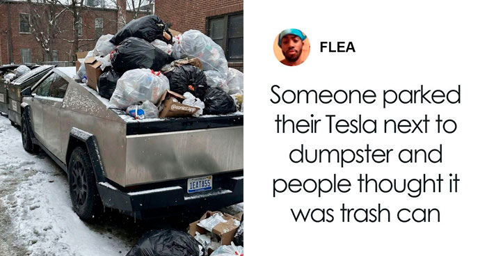
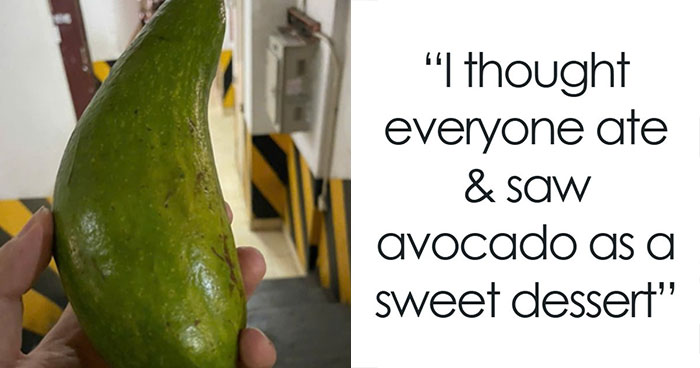
    Oh boy, freshly grilled thighs in summer or flagpole b**t in winter!

    View more comments
    #36

    This House, Where You Will Never See Any Sun Or Sky, Complete With Unusable Pool

    Futuristic house with impossible to use floating swimming pool design surrounded by forest and mountains.

    ruumoo Report

    ADVERTISEMENT
    See Also on Bored Panda
    ADVERTISEMENT
    See Also on Bored Panda
    #38

    Beer Qr Code Doesn't Work With Most Qr Scanners

    QR code shaped like a beer mug next to text, demonstrating design gone too far and impossible to use effectively.

    ransoing Report

    Beak Hookage
    Community Member
    6 hours ago Created by potrace 1.15, written by Peter Selinger 2001-2017

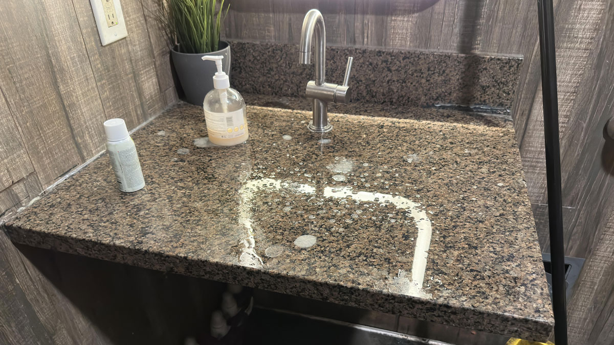
    I had a go and my phone couldn't detect that there's supposed to be a QR code even when zoomed in all the way so that "relevant" part was front and centre.

    View more comments
    ADVERTISEMENT
    See Also on Bored Panda
    #40

    New Store At My Mall. I Have No Idea What Its Called

    Sign spelling movement with unclear lettering above a store entrance, illustrating poor design making it impossible to use or read.

    Snoo-35252 Report

    Bianca
    Community Member
    6 hours ago Created by potrace 1.15, written by Peter Selinger 2001-2017

    2nd word is movement, no idea what the 1st scribble is tho.. 🤔

    View more comments
    ADVERTISEMENT
    See Also on Bored Panda
    #42

    Great Ergonomics

    Woman using awkwardly designed furniture for working and writing, showcasing designers went too far and made things impossible to use.

    OverR2b Report

    pelemele
    Community Member
    1 hour ago Created by potrace 1.15, written by Peter Selinger 2001-2017

    I doubt your neck will thank you.

    ADVERTISEMENT
    See Also on Bored Panda
    #43

    Coffee Table With Bonus Mountain Range

    Wooden coffee table with a mountain carved into the surface, showcasing designers who went too far and made things impossible to use.

    acidiola Report

    Mrreoww
    Community Member
    5 hours ago Created by potrace 1.15, written by Peter Selinger 2001-2017

    I mean I guess I like it but I don’t see the point.

    View more comments
    #44

    I’m Bothered By Like Three Things

    Packaging label with letters shaped like animals, showing a designer choice that may be difficult to read or use.

    Aristocration Report

    Beak Hookage
    Community Member
    5 hours ago (edited) Created by potrace 1.15, written by Peter Selinger 2001-2017

    MOPPYA AND MNANA. Sounds like the name of a children's TV show from the 90s.

    #45

    "Hoopla" Doughnuts Made With "Doughnut Quarters" Apparently

    Confusing donut shop menu with difficult-to-read font and unclear pricing, showing designers going too far in usability.

    kioku119 Report

    ADVERTISEMENT
    See Also on Bored Panda
    #46

    No One Can See Your Cards, Including You

    Hand holding a black playing card with barely visible details, showcasing a designer fail making things impossible to use.

    Gunsh0t Report

    ADVERTISEMENT
    See Also on Bored Panda
    #47

    Because People Love Sitting On Bike Seats When They Don’t Have To

    Row of stools with bicycle seats and footrests under a countertop with power outlets, showing designers went too far in usability.

    DrLeisure Report

    LALALand
    Community Member
    Premium
    4 hours ago Created by potrace 1.15, written by Peter Selinger 2001-2017

    Looks like “hostile architecture” to me, seen here in the States to keep people from staying in the cafe, restaurants, etc for too long

    View more comments
    #48

    The Most Important Information Is Harder To Read Than The Regular Font

    Instructions about chocolate storage on a product label, showing design flaws making text hard to read clearly.

    asskkculinary Report

    Mrreoww
    Community Member
    5 hours ago Created by potrace 1.15, written by Peter Selinger 2001-2017

    It’s annoying, but not hard to read.

    View more comments
    #49

    "Wonderfully" Designed Staircase

    Modern staircase with impossible-to-use design featuring wooden and white geometric steps and glass panels in a living space.

    rvinenlvst Report

    Francois
    Community Member
    7 hours ago Created by potrace 1.15, written by Peter Selinger 2001-2017

    I think the staircase is perfectly find to use.

    View more comments
    ADVERTISEMENT
    #50

    Creature Cups

    Four coffee cups with detailed sea creature shapes inside, showcasing designers gone too far making things impossible to use.

    PresentSecretary44 Report

    Stephanie Did It
    Community Member
    5 hours ago Created by potrace 1.15, written by Peter Selinger 2001-2017

    My aunt made a mug in ceramics class that had a fat green worm on the bottom. This was in the 1960s and we thought it was hikarious.

    View more comments
    ADVERTISEMENT
    #51

    Achieve Ylur Dreams

    Billboard with impractical design where text is partially obscured by a large book graphic, illustrating designers going too far.

    spatula-tattoo Report

    michael Chock
    Community Member
    5 hours ago Created by potrace 1.15, written by Peter Selinger 2001-2017

    Achieve ylur dreams! Ylu can do it

    #53

    The Forks They Had At The Restaurant This Guy Went To

    Fork and knife combined into one utensil, showcasing a designer fail that makes it impossible to use properly.

    glemau Report

    ADVERTISEMENT
    #54

    New Brutalism By In Vivo

    Minimalist lighter with unconventional design making it difficult to use, an example of designers going too far in usability.

    invivo_works Report

    WindySwede
    Community Member
    4 hours ago (edited) Created by potrace 1.15, written by Peter Selinger 2001-2017

    A steam punk-ish phone edit:a smartwatch?

    ADVERTISEMENT
    #55

    Floor Mat With Folding-Up Furniture

    Innovative but impractical designer workspace featuring angled tables and floor seating, highlighting design gone too far challenges.

    Fit22b Report

    Barbara Wilcock
    Community Member
    6 hours ago Created by potrace 1.15, written by Peter Selinger 2001-2017

    They use them a lot in Japan when I was there 2yrs ago

    View more comments
    #56

    Re-Imagining The Egg Carton

    Egg carton packaging design showing impractical and impossible to use features by designers in cardboard.

    lasercat_pow Report

    Gail Lott
    Community Member
    Premium
    5 hours ago Created by potrace 1.15, written by Peter Selinger 2001-2017

    That already slipped out of my hand

    #57

    Worst Designed Remote Ever

    Hand holding a minimalist remote control with difficult-to-use button design in a poor lighting setting.

    opinionated-dick Report

    ADVERTISEMENT
    #58

    Why Ux Research Is Important It Really Is!!

    Man drinking from a cup shaped like a face mask, showcasing a designer fail making things impossible to use.

    samiksha_designer Report

    ADVERTISEMENT
    #59

    This Keyboard With Blurry Keycaps Made To Look Like Early 3D Video Game Graphics

    Blurred keyboard with unclear key labels, showcasing a design flaw that makes the device impossible to use properly.

    glyph1234 Report

    Beak Hookage
    Community Member
    5 hours ago Created by potrace 1.15, written by Peter Selinger 2001-2017

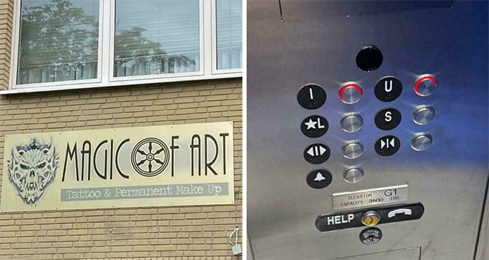
    aka the keyboard that makes users think they've forgotten their glasses or are in need of glasses.

    View more comments
    #60

    These Sliding Door Handles (Tilted Top = Unlocked, Straight = Locked)

    Door handles with flawed design making it impossible to use, example of designers going too far in usability.

    hecka-tea Report

    #61

    I Mean, Someone Did This On Purpose, Right?

    Outdoor staircase design gone wrong with unreachable door, an example of designers going too far and making things impossible to use.

    PelicanDesAlpes Report

    ADVERTISEMENT
    ADVERTISEMENT
    #63

    Surely These Uncustomisable Chocolate Squares Belong Here?

    Chocolate bar with confusing size labels carved into the pieces, an example of designers going too far in usability design.

    tameyzin Report

    #64

    Meatball Plate By Gustav Westman X IKEA

    Blue IKEA meatball plate held in hand with meatballs lined up and illustrated instruction booklets on a blue background.

    krampaus Report

    zatrisha
    Community Member
    Premium
    48 minutes ago Created by potrace 1.15, written by Peter Selinger 2001-2017

    Swedish meatballs without the sauce are just wrong.

    View more comments
    #65

    This Simpsons Mug

    Hand holding an impossible to use mug featuring Homer Simpson with a donut-shaped hole in the center, showcasing flawed design.

    NeoTFG Report

    Sparky
    Community Member
    6 hours ago Created by potrace 1.15, written by Peter Selinger 2001-2017

    Wait, isn't this supposed to be a list of *bad* designs?

    View more comments
    ADVERTISEMENT
    #66

    Man Ray Chess Set (1926)

    Chess set with unique abstract pieces showing designers went too far making it impossible to play or recognize the game pieces.

    StephenMcGannon Report

    ADVERTISEMENT
    #67

    Found At My Doctor Today - I Think It's A Umbrella Holder

    Trash bin with a decorative metal cover that makes it impossible to use, showing design gone too far and unusable concepts.

    LivingDecent9828 Report

    #68

    Idk If This Fits In Here But Hey

    Glass and wood side table with a Z-shaped base showcasing a designer fail making it impossible to use properly.

    balthaharis Report

    zatrisha
    Community Member
    Premium
    47 minutes ago Created by potrace 1.15, written by Peter Selinger 2001-2017

    I think it's a side table for a couch, so the design is okay.

    ADVERTISEMENT