40 Graphic Designers Who Should Have Thought Twice Before Putting These Logos Out For The World To See
Hey there, logo enthusiasts! We sincerely hope you've had your daily dose of coffee because we're about to take a wild ride through the weird and wacky world of logo design fails (I mean, who doesn’t like funny things?). So Pandas, strap in, because we're about to showcase some examples where designers took 'thinking outside the box' a little too literally.
This post may include affiliate links.
Vermont Maple Syrup Logo


I thought it was Canadians who had maple in their blood. And their urine...
South Dakota’s Logo For A New Anti-Meth Campaign

Ordered Jordan's Online. Got Fake Ones, Jordan Logo Has An A*s Crack. Wtf Lol
But how do these unfortunate logos come to be, you may wonder? And more puzzling, how do they get past marketing teams and into the public eye? Well, usually one of the main reasons these logo fails occur is due to lack of research and planning. A well-designed logo requires a deep understanding of the brand, its values, target audience, industry trends, and things alike.
iSmart's Logo Really Thew Me For A Second

oh damn, it's upside down! i was like "how the hell is this ismart?" (at least is +jews and not -jews)
Not The Greatest Logo

An Unfortunate Logo For A Fitness Center
It's not just about creating something visually pleasing (well, in the case of this post, perhaps this shouldn't be applied); it's about creating something that accurately represents the business and resonates with its consumers. When these factors aren't considered, you end up with logos that seem simply absurd or just highly inappropriate in context...
Unfortunate Placement Of The Facebook Logo
Logo Of My Local Doctor's Office
Don't Overthink This, It's Just A Handball Club Logo
Of course, another case for failure may be due to the design being reviewed in isolation without considering how it might be perceived in the real world, or it might be that those reviewing the logo are too close to the project to see potential problems. Like when you are working on something for such a long time that your perception of it becomes frazzled (especially if you don't get feedback on it).
The Logo For The 1973 Archdiocese Youth Commission
This Store Is Called Jupiter, Their Logo Is The Moon

"Yes, A Hanged Family Would Make A Great Logo For Our Company"
So Pandas, with all of that out of the way, tell us, which of the failed design logo was your favorite and why? We will be looking forward to your answers both under the photos and the post itself.
And remember, even if something doesn't turn out perfect on the first try, it's always possible to learn from the mistakes of others and make necessary adjustments. As these examples show, even the best of us can fail at times when working on something for far too long...
This Logo Of A Turkish Water Brand. It Obviously Sucks
Age is just a number, jail is just a place... (brilliant title)
This Logo Design!!

Logo For A Children’s Hospital. Right Side Up Is A Man Juggling/Playing With Kids. Upside Down Is An Angry Man Stomping On Kids

Your Logo Designer Is Still Laughing

I Just Feel Like Someone Should’ve Noticed How Bad The Logo Is

This is why we need more chicks making the important decisions out there. No way this would have passed otherwise!
Why tf are these all penises tho?! Is it really that hard to see if something looks a little off in a logo you will spend so much money marketing?!
Hmmm. So, do you see a penis in this particular logo? Interesting. Oh, don't mind me, just taking my little notes, carry on.
Load More Replies...This Dentist's Choice Of Logo Near My House
You guys notice how most of these are in the boring corprate art style?
This Logo Of Czech Sausage Company

This Church Near My House Should Probably Rethink Their Logo

The Unfortunate Logo Of A Florists Near Me. I've Been Calling It Std's For Years. It's Sid's
I have a florist near me that has zebra finches in the shop. sometimes i stop by just to look at the little cuties.
This Is The Logo From A Local Dispensary

The Logo For My Son’s IT Class At School

Probably The Worst Logo I've Ever Seen. It's For A Plastic Surgeon

"Cass Toys" Didn't Think Their Logo Design Through Too Well
This Horrific Logo
To reach the optimum level of wellness, you must gain the ability to mutate into.......
This New Sushi Restaurant Logo Has A Racist Cra*py Design

This Kids Society Logo... The Bullet Holes Are An Interesting Touch

Logo Is Having A Bad Case Of Diarrhea

This Bank Logo In My Hometown

Never ever separate the C and A in the word canal. It happens way too often.
Ontario’s Logo (Trillium Flower) Looks Like 3 Dudes In A Hot Tub
 Looks Like 3 Dudes In A Hot Tub")
Someone Paid Money For This To Be Their Sign And Logo/Mascot. I’m Convinced This Is Drug Lord’s Money Laundering Business

This Pet Supplies Company's Logo Is Meant To Depict A Cat And A Dog, But What I See Is A Dead Bird

Business Center Logo Looks Like A Guy Taking A Dump

They Really Need A New Logo

Then Why Use The Recyclable Logo?

Russian Bread Company Logo. Literally Cra**y Design
Looks like the Edinburgh golden turd! https://www.edinburghnews.scotsman.com/business/consumer/you-cant-polish-a-turd-but-you-can-clad-it-in-bronze-coloured-steel-3301450
My School's Logo Looks Like A Crying Face

Why did they have to draw the bodies like this?? There are literally so many other, more reasonable ways. Did they just want to be original or sthng?
Quite A Bizarre Logo

The heck is this? The red F kind of looks terrified, blue F looks creepy like he knows what he’s doing and the C is just staring out into the distance because he doesn’t have a mouth so he can’t use the pacifier
This Logo Of A Bird Also Looks Like A Character Wearing A Hat Puking

Rodent Logo With Teeth Coming Out Of It's Nose Instead Of Mouth

This Disability Logo

This Backpack Logo

Good morning, today could I please have 200g of your finest Sample Text? Oh and could I please buy a backpack with the Sample Text logo? Thx
This Logo Design By Square Enix

Well as long as you are not allergic to polyester fiber it should be safe to use. So, have fun.
The Logo For Wheelchair Rugby Looks Like A Guy Falling Off A Wheelchair

Childcare Logo Looks Like XXX

This Kindergarten Logo

The Brazilian Cinematheque Logo
y'all see a too much in everything lol, looks like the symbol of division to me
What Does This Logo Even Say?

The New Logo Of My University
to pass the entrance exam one must decipher the code to prove one's intellectual skills and patience. they award scholarships to those that can do it in under 1 hour.


Client: So For My Logo I Want A Bird, The Moon, And A Toilet. Designer: I Mean Ok, But Are You Sure, It'll Look A Bit Odd? Client: Yes

I Love Eating At Restaurant Logo Here

Hp New Logo Can Be Either Hp Or Bp Or Lqi Or Lip

I Always Thought My Old High School's Logo Was An Abomination. (It's Supposed To Read Bhs)
")
This Graphic Design Company Sabotaged Themselves From The Very Start With One Of The Worst Logos Of All Time

New England Airways’ Logo Just Looks Like Paint Chipping Off The Tail

Saw This Terrifying Logo Today

If Only There Was A Letter In The Logo That Looked Like A Dollar $ign

"Let’s Put The Logos Behind The Buttons"

wait what is that lol is it a calculator or fake credit card
The New Logo For Arhus University


Instead Of Using The University’s Logo To Replace The “C” In Central, They Just Kind Of Threw It On There

This Logo Is Actually Kind Of Sad

Youtube Sports Logo Looks Like Biohazard Warning Logo

I dunno, you ever smelled the boys locker room at high school after a game? Might just be pretty accurate.
The 1928 Nfl Champion Providence Steam Rollers Logo

This Idiotic Logo For An Eyewear Store. Music Notes? What?

The Clothing Company “Stay Wear” Encourages People To Stay Who They Are... And Uses The The Mathematical Symbol For Change In Their Logo

Why would you want to stay who you are? You're supposed to grow and change as a person! If you're the same as you were ten years ago, you're doing it wrong.
I Hate This Logo So Muc H…

omg I love that place, they have the best blood baths and their weekly summoning rituals are to DIE FOR. 5/5
My Hometown’s New Logo Which Cost Them $97,000

When A 6 Year Old Designs Your "Signature" Logo

Actual Logo For A Mexican Restaurant In My Town

His hat looks like a thin steak with a hole in the middle to accommodate his massive bald head. At least that explains his facial expression, but if it makes him happy, who am I to judge?


The Actual Logo Of A School Near Me

The Most Redundant Logo Ever? Baked Goodies Were Delicious Though

My Glasses Have An Oakley’s Logo In The Bottom Left Lens. I Frequently Think There Is A Smudge On My Glasses, But Nope!

When I was 10, I picked my first pair of glasses for one reason only: the Snoopy sticker on the left lens. No one told me that was coming off when they fitted the prescription lenses..
Putting Your Brown Logo On White Shoes

Gin Ooo Ng - Even Trying I Can't Make This Logo Work

Hah, this place is just off Carnaby street in London. They make a great lychee martini
Let's Try The Logo Upside Down, It's Gonna Be So Edgy

A Logo Including A Globe Where Greenland, Iceland And The UK Have Decided To Fly Away Into The Arctic

Stutterstock's Logo Looks Better Than Ours Anyway

Crappy Website Logo

Cafe Logo: Halfcup Brunch


This Logo Is For A Band Called "Fade"

The Shoe Placement On This Local Pizza Joint Logo

If It Were Level With Karma I'd Feel Better, But There's No Way To Balance This Logo

Prints Company Logo On "Transparent" Background

Delivery Company Copied Their Logo Too, But From Ie And FedEx

Copied from Fedex is a strong word... What makes the FEDEX logo is the arrow formed by the whitespace (negative space) between the E and the X - They didn't copy it, because they were trying to cram in the Exxon logo as well !!!!!! Here is an explainer I made (too much time on my hands!) mix-646ccc...a96d40.jpg 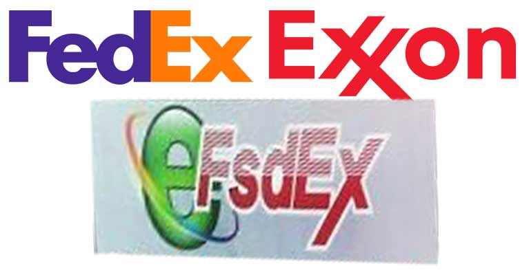
The Atheist Monument In Florida. All Of That Money Spent And Nobody Thought To Center The Logo


In the USA graphic designers are notoriously under paid & under appriciated. I wonder how many of these the designer knew exactly what they were doing for a company that had pissed them off
A lot of these i see are just businesses looking to do a logo on the cheap or they think graphic design is super easy.
People. Search Google for "polish post logo" it should be a horn. I am always seeing there a relaxed person and a second head doing blow job.
Lol, true, I forgot about that. It's hilarious 😆
Load More Replies...Topics like this always remind me of the stupid design decision of a Swedish company called Iocum back in the early 2000s. They replaced the O in their logo with a heart. You can probably put together what it looked like it said after that change.
My dad's a graphic designer (professional, 20+ years of experience, went to art school) and he would have a fit by the time he would reach number 15 on this list.
This Week At Nasa has a perfectly fine acronym, TWAN. So why did they choose to use TW@N instead? Twat'n!
Quite a few of these seem to have been ai generated, those being: the soccer logo, the florist, and the plastic surgeon. They all have a janky feel that I’ve only seen on ai generated pictures.
Several of these are fine, dirty minded people just see p****es in them.
