Get Premium
Dark mode theme is available exclusively for premium users. Learn more about the benefits of subscribing.
No fees, cancel anytime.

 Dark Mode Ad-Free Browsing Unlimited Content
 Ad-Free Browsing Unlimited Content Dark Mode
Join 1.2 million Panda readers who get the best art, memes, and fun stories every week!
Kerning is the process of adjusting the spacing between individual characters in a font. This is done to achieve a visually pleasing and balanced appearance of the text. But as with most things, every now and then, things can go wrong.
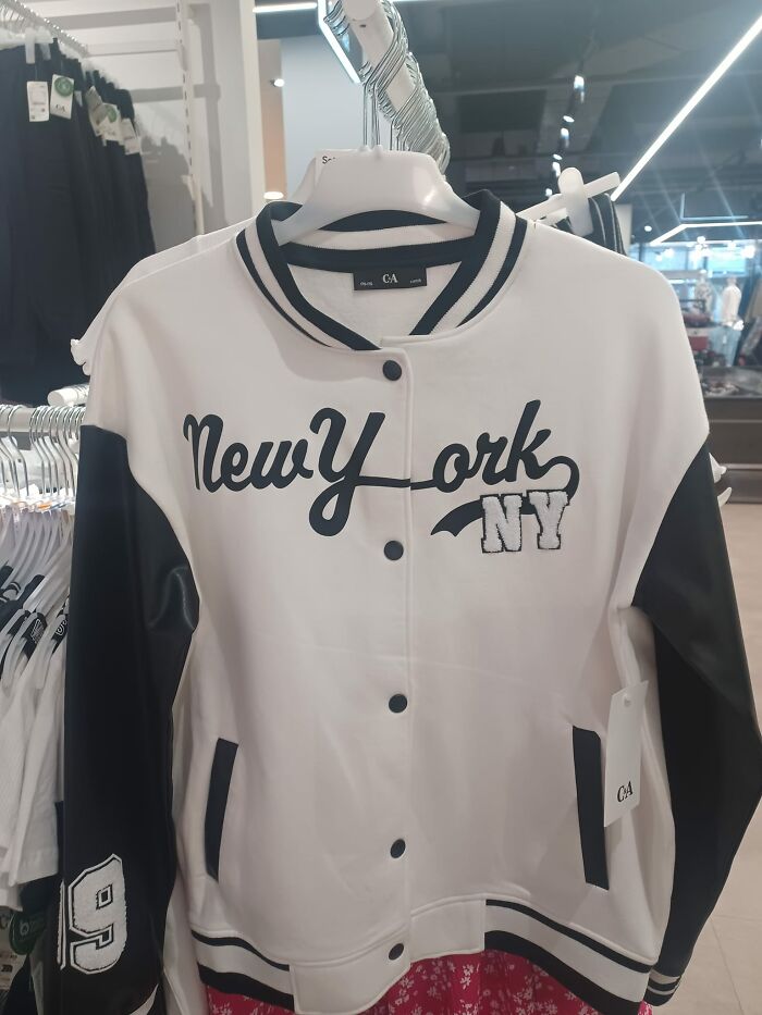
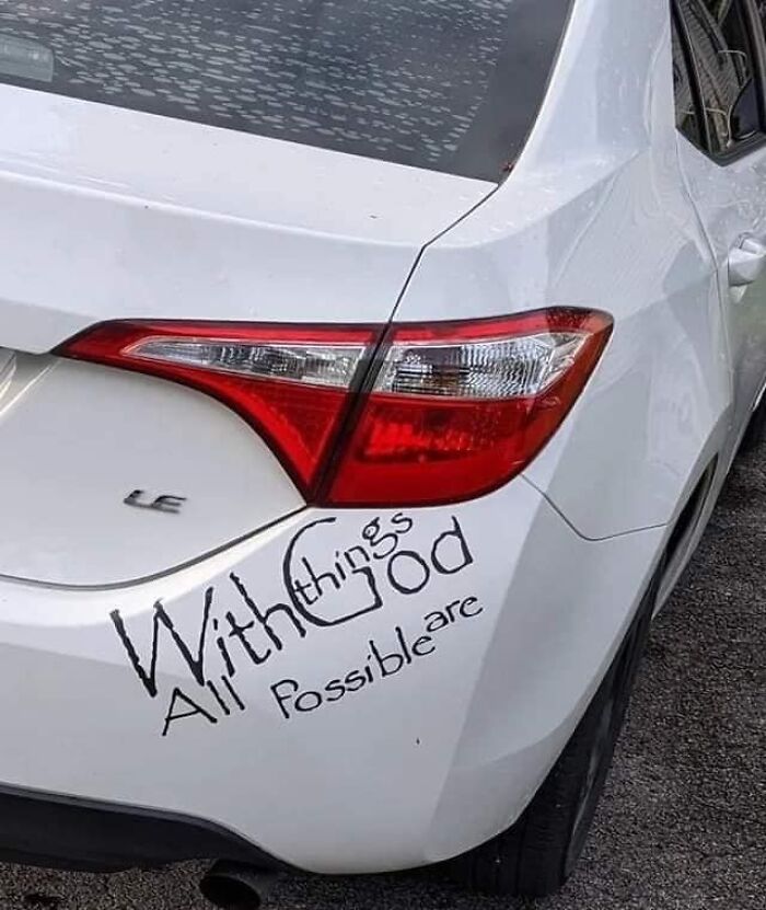
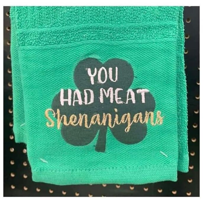
Put the symbols too close or too far from one another and you end up with awkward or humorous typography. For example, if a company wanted to make a poster advertising their "cleaning" services but made the spacing between the letters "c" and "l" too tight, it can create the word "dining" instead.
The funny part is that such mistakes are more common than we might think. And the Facebook group 'The Real Crime Is That Kerning' has all the proof. Here are some of their finds.
This post may include affiliate links.
Design is full of detail-level concepts that matter more than their superficial simplicity would suggest, and kerning is a great example. When used effectively, it can be a powerful tool to influence aesthetics and communication through type.
It’s one of those things that, when used well, shouldn't be noticed by the average reader.
"If you start to look for it," designer Madeline DeCotes said, "you’ll realize there’s so much more to letters than you thought possible."
Unlike tracking, which adjusts the amount of space between the letters of an entire word in equal increments, kerning focuses on how type looks — creating visually pleasing and readable text.
Typeface designers build spaces around each letter, and sometimes between pairs of letters. But as we can see in the pictures, those spaces don’t always work in all situations, especially if you’re using a typeface in a way the designer didn’t foresee.
That’s when manual kerning comes in. Because beauty is in the eye of the beholder, no two kerning jobs will be the same.
"Kerning is a strikingly subjective art form," DeCotes explained.
"The designer needs to look at the space between each letter in a word and ask, 'Does this look like enough space? Does it look like too much? Are the letters too tight?'"
They are hiring both lice and nsed stylists without applications, but hair needs to apply.
Bad kerning is so common that graphic designers even have a name for it: keming (which looks like kerning has itself suffered from bad kerning).
If there were hard and fast rules around kerning, every font would automatically generate perfectly kerned character pairs. But because kerning is in many ways a subjective pursuit, the only thing anyone can say with certainty is that kerning is bad if it renders something unreadable.
This leaves a lot of (or a little) space for interpretation.
I honestly cannot figure this one out - and as a language teacher I am used to some next-level spelling mistakes. Help?
Not every project requires kerning by hand, but there are some instances when it may be better off if you give special time and attention to this detail:
"If you’re not a designer, it’s not something you think about," DeCotes said. "People don’t realize anytime they see giant text, whether it’s on a poster, a billboard, or a website, headline fonts have probably been thoughtfully kerned.”
Assuming it's been executed well, of course!
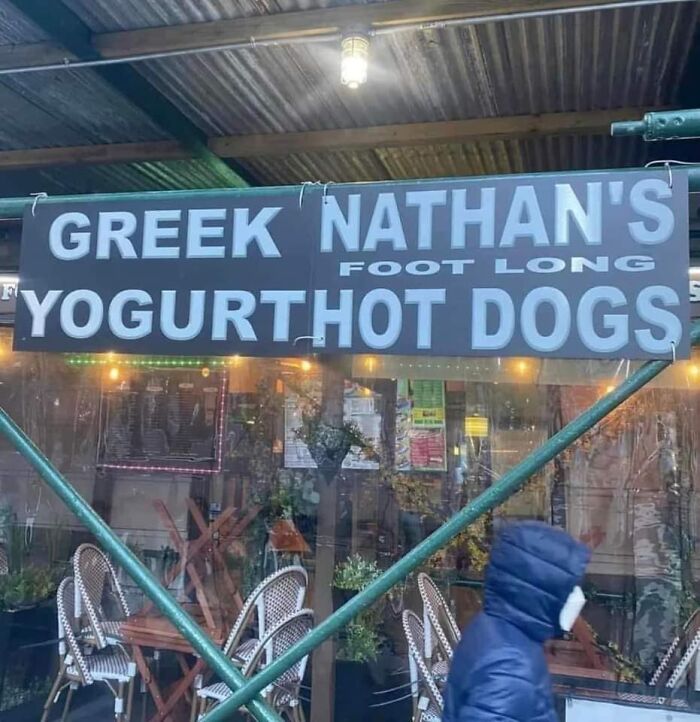
Did this restaurant have a longer name and sell to new owners but the previous said please change the name so they just took letters out of it so they didn't have to buy new signage?
welcome to class we have death stare darcie didnt sleep sara jealous judie not cool carl crazy eye elina totally a kid kylie and nervous nancie and her sidekick even nervous neil ( there scaring me)
This happens when people are not sure if there is supposed to be an apostrophe before the S, so they leave a gap just in case, to please both sides of the argument.
It's french and english. It's a requirement of products sold in Canada. But the spacing/kernel is a little out of whack
Ben Jamin........I want Ben Jamin with you.........Ben Jamin.......Jamin.......And I hope you're Ben Jamin too
Sadly, a lot of programs won't let you adjust the kerning of just one letter, so you have to pick better fonts.
Once you see it can never be unseen. Also, the arrow in the FedEx logo.
Apparently there is still time to fix it😂 (edit: my bad, typical American assuming it meant August and not April. God we are self centered!)
So many of these are not kerning issues. Words out of order is not an example of bad kerning. Same for spelling errors or hard to read fonts. Really frustrating since the writer took the time to explain what kerning is, and then proceeded to give us a list that mostly has nothing to do with it.
I feel like that's most BP posts. The title and purpose are completely skewed by at least the third one down. I just try not to think about it, too much, and enjoy the funny posts. :/
Load More Replies...There is a hashtag for college sports team in Colorado (Thunderwolves) that is #Gothunderwolves. I know it is supposed to be “go thunderwolves” but it can also be read as “goth under wolves “ making it seem like twilight themed smut. It’s more of a phrasing error than a kerning error though.


 No fees, cancel anytime


 vs. I Love Lécher (To Lick)")


")
")