Get Premium
Dark mode theme is available exclusively for premium users. Learn more about the benefits of subscribing.
No fees, cancel anytime.

 Dark Mode Ad-Free Browsing Unlimited Content
 Ad-Free Browsing Unlimited Content Dark Mode
Join 1.2 million Panda readers who get the best art, memes, and fun stories every week!
Most of us have a general idea of how we learn best. Some might retain information better by listening or taking notes, while others may prefer being hands-on with the topic or looking at tables and diagrams. When it comes down to it, there’s no one size fits all.
Today, visual learners are in luck because we’re looking at a subreddit called “Infographics,” a collection of data visualizations in various forms, like bar charts and heat maps. Full of colors and creative imagery, they’re both educational and fun. Scroll down to find the best ones that might change the way you see the world.
This post may include affiliate links.
The date format is worse in Canada because it is supposed to be day/month/year but because of how much we trade with the US, you'll see a combination of the 2 formats being used. So fun trying to guess the date for the 1st-12th of the month
Infographics are a creative way to display data that breaks up complex information into bite-sized pieces. For this reason, it can be a great learning tool in education.
For one, such visualization can hold a person’s attention for longer. As people are exposed to more and more information every day, it’s hard to keep them focused and prevent them from quickly moving on to the next shiny piece of statistics.
Just for us to imagine how distracting it can get, 2.5 quintillion bytes of data were created daily in 2021, according to The Next Tech. Therefore, infographics can help by taking an overwhelming amount of facts and presenting them with engaging images and colors.
Yeah we have a terrible system and its not likely to change anytime soon.
Besides, most people process visual material much faster and tend to recall it better.
Neuroscientists from MIT found that the brain analyzes an image in 13 milliseconds, making these visuals a great learning aid. Our mind also tends to attach emotion to pictures, which explains why the average person remembers 65% of visual information ten days later, while they can recall only 10% of something they heard ten days ago.
Furthermore, they often prove effective in education because they use images to highlight, explain, or enhance text-based information, which also encourages data retention for many learners.
Poor Oscar "Unsinkable Sam" must have wondered why they kept bringing him back onto boats!
In addition, these visuals can be applied for a variety of uses. They are ideal for foregrounding important events in a historical period. They help us understand how certain occurrences interconnect and influence each other and how they have affected the world.
By using infographics, number-heavy statistics can be made more interesting, and adding diagrams and short text makes them easier to process and remember.
Like Rose told Jack in Titanic, "Just start from the outside and work your way in".
Teachers can also use them as assignments for homework. Giving students a long text and letting them transform it into something more appealing provides them with the opportunity to be more creative and shakes up the ordinary routine.
While doing it, they also conduct research and try different applications of information. As a result, learners demonstrate critical thinking by filtering data, identifying patterns, and presenting carefully curated projects.
If it so happens that children are only taught through lectures or text, teachers are neglecting 65% of visual learners, and they miss the opportunity to increase retention rates, which are essential in the assessment strategies of schools.
Even though infographics might seem intimidating, there are plenty of tools online that can be helpful, such as Infogram, Canva, Easelly, and Edraw.
Their designers advise having an outline before starting the creative process. Try to decide which points are essential. Then, you can move on to ensuring that the readers are guided through the visuals and that the story you’re telling is coherent and has a gradual ending.
I miss the look of cars in the fifties- seventies. Not the pollution though. All those white, grey, black cars are so boring. Ours is bright blue and I never have problems to find it at the parking lot 😀
That's because manufacturers only SELL cars in white, black, gray and silver! It's getting quite long in the tooth, but I love my dark green Subaru.
I make car paint and red is very expensive to make and white is the most inexpensive to make
Anybody noticed how colour options changed in last 15-20 years? It used to be white, black, silver, and the bright, vibrant colours - green, yellow, blue, red. Nowadays you got three shades of primer grey, two indistinguishable whites, with odd blue or red.
I've never bought a new car, so other people are deciding this for me. I'd probably go for more unusual colors if I could.
Surprised red isn't more popular. Also surprised black is so popular. I can't imagine owning a black car here in Texas. It would get so hot inside one.
I can't understand why so many people here in Texas have black cars. And roofs! All my neighbors are getting black roofs. They are annoyed with me for getting a light colored roof because we all won't match!
Load More Replies...My cars have been red, tan, silver, silver, green, and white, in that order.
Green, light blue, grey/silver, dark blue, red, silver.
Load More Replies...Silly gauge. Personally I've bought cars that were available.....and most of the options are black, white, gray & silver.... sooooo guess what colors I've always gotten. Betcha lots of folks are the very same.
“Ask a child to draw a car, and certainly he will draw it, red.” - Enzo Ferrari
Load More Replies...I wouldn't say these were popular colours, they're just default colours that cars usually come in. Colours outside of white, black, grey etc cost $$$$ so people just stick with the default.
Sometimes you dont have a choice when buying a car, especially if buying used. Yo take what you can get. To me colour is the last thing on the list.
I'm so tired of all the silver/grey cars around, including my own. There are a few more brighter coloured cars around these days, but back in the 90s, it was worse, more like 'you can have any colour as long as it's grey'
Wow. And I only purchase white vehicles. And no reason as to why. Has to be something in my subconscious.
And the auto companies only offer Black and white and 15 shades of gray in between. And don't get me started on "Arctic White" and "Ivory" or "Black", "Onyx" or "Obsidian."
I only buy used cars and the last thing I look at is color, I just don't care. There are more important things to look for in a car.....and the one I chose happened to be white. But I had almost all sorts of colors in the cars I owned, black, maroon (alfa romeo in 1980), blue, beige, red, yellow.....
Don't know about the rest of the world, but here you have to pay extra if you want a colour that deviates from the manufacturers boring standard
If they did good green colors it would go up. OD green is ugly aa ia avo green.
They're 'popular' because they're the only colors offered. I guarantee if consumers could custom choose their color the graph would be different.
My favorite cars have been my green ones. I usually take pot luck, what ever is on the lot, that has the options I want for the price I want to pay. I've only ever said no to a black one, for two reasons: heat retention here in the south and difficulty finding it in a parking lot of other black cars.
I only buy white cars as I live in a hot, sunny climate. Try getting into a black car with black upholstery in Palm Springs or Phoenix after its been in the sun for a few hours
This chart is availability, you can only select from what the car makers choose.
My first car was yellow. One does not see many yellow cars anymore - which makes them stand out.
9/10 of cars have no colors... ...just a range from light to dark boredom
Used to be able to get all kinds of colours, all so boring now in shades of white, grey, silver, black. My favourite was the purple Opel Corsa, not that I ever had one.
My first car was red. After that it's been boring - black, silver, white. My current white car constantly looks dirty no matter how much I clean it.
Silver shows almost no road dirt/salt/grime. I'd buy every car in silver.
One time I was car shopping for a particular model. I was INCREDIBLY disappointed that they only had them in white.
i miss my green C3, my little turtle Capture-65...b71f7a.jpg 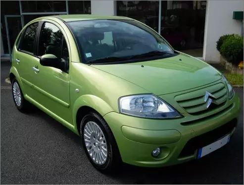
Hey! Elvis isn't dead! He's retired and living the quiet life in Erie, Indiana.
This is across all brands though and Pepsi has a ton of brands that aren't Pepsi. Not just beverages like Mtn. Dew and Gatorade, but they own DORITOS and Frito Lay. They own Rice-A-Roni and Quaker Oats. They are a massive food conglomerate.
As for the aesthetic part, a step in the right direction would be choosing the right fonts. Two are more than enough – one for the title and one for the body text. A more fun and decorative one can be used for the header, while the remaining information can be formatted with a simpler one so it’s easily readable. The typeface should also reflect the topic. Storytelling that’s more youthful and entertaining deserves a font that portrays this.
The implication seems to be that the helmet was invented in 600 CE. Did the Romans and Greeks wear tam-o'-shanters into battle, then?
The same goes for colors – try to keep them visually appealing and stick with three or four that work well together. Finally, the goal with these visual aids is to portray data in a simple way, so don’t overcrowd it. Leave plenty of space between images and statistics, and use as little text as possible.
I remember when O'Hare was busiest in the world. Doesn't seem that long ago.
Good to see the old Nokia bricks still at the top of the list.
https://ourworldindata.org/co2-emissions. "More populous countries with some of the highest per capita emissions – and therefore high total emissions – are the United States, Australia, and Canada which on average have emissions that are around 3 times higher than the global average."
I once made friends with an older man over the garden back fence because I took his gardening advice and tended the basil and mint he gifted me. It turned out he was a local high-level mobster and made sure no one messed with me as an outsider in his neighborhood. I did get followed by authorities in unmarked cars, though.
To clarify for those who don't read, this are not actual risks, these are the things people think are concerned about right now. the title is misleading.
OP forgot the "buy them and bury them" part of Microsoft's business plan for dealing with disruptive startups.
10 years ago, Idaho was one of the cheapest states to live in. Then, a bunch of Californians moved there and drove home prices through the roof, pricing out many Idaho natives.
Why, why, why doesn't BP do more of these type of posting and a whole lot less of the Gossip column nonsense.
Why, why, why doesn't BP do more of these type of posting and a whole lot less of the Gossip column nonsense.


 No fees, cancel anytime


")


![Coca-Cola vs. Pepsi Revenue [oc]](https://static.boredpanda.com/blog/wp-content/uploads/2024/02/65cb14f79c1fc_0ubop32cakyb1__700.jpg "Coca-Cola vs. Pepsi Revenue [oc]")


")
")


")