Get Premium
Dark mode theme is available exclusively for premium users. Learn more about the benefits of subscribing.
No fees, cancel anytime.

 Dark Mode Ad-Free Browsing Unlimited Content
 Ad-Free Browsing Unlimited Content Dark Mode
Join 1.2 million Panda readers who get the best art, memes, and fun stories every week!
There’s something deeply satisfying about taking a huge amount of data and turning it into a gorgeous, easily understandable, educational graph. Presenting vast swathes of info in a way that everyone can understand is an incredibly skill.
The team behind the ‘Information Is Beautiful’ project are masters of data visualization, showing you the world in ways you might not have seen it before. Today, we’re featuring some of the intriguing graphs and diagrams that they’ve shared online to show you fresh new perspectives. Scroll down to check them out. And if you love what you’re seeing, be sure to visit their site and follow their socials for more.
Bored Panda has reached out to the ‘Information Is Beautiful’ team via email to learn more about their awesome project, and we’ll update the article as soon as we hear back from them.
More info: Facebook | Instagram | X | Books | InformationIsBeautiful.com
This post may include affiliate links.
‘Information Is Beautiful’ is the brainchild of David McCandless. He is the author of three best-selling infographic books:
The founder has also spoken at TED Global, as well as at 200+ conferences and events. What’s more, he runs the startup VizSweet, “a lovely artisan tool for creating beautiful interactive data visualisation.” McCandless, along with his dedicated team at ‘Information Is Beautiful,’ aims to explain, distill, and clarify data, information, and knowledge into beautiful and useful graphics and diagrams.
The anti-science and anti-intellectual attitudes among far too many people is sad and enraging.
I like the kind that has the flap that closes up the end where the pillow goes in
According to the team running the project, all of their visualizations are based on facts and data. They constantly update and revise them. McCandless and his team members actually mostly create their graphics by hand, using the Illustrator program (a personal favorite of some of us, too).
Meanwhile, many of the interactive data visualizations they make are actually created using their proprietary VizSweet software.
We’ve been so successful at eradicating and mitigating so many diseases, far too many people think they don’t have to do anything
Something else that’s mindblowing is that the founder of the project, McCandless, actually made The Helicopter Game. It’s something that we’ve played and thoroughly enjoyed during breaks in between IT classes at school.
At the time of writing, the ‘Information Is Beautiful’ Facebook page boasts 531k followers from all over the globe. Meanwhile, 232k social media users follow the project on Instagram, while another 119k do so on X (formerly Twitter).
With so much information flooding our social media and news feeds daily, it’s impractical to double-check and cross-reference every single bit of info we stumble across.
So, it’s much more time-efficient to evaluate the reliability of the sources you come across. Although all sources, even the best ones, make mistakes, not all sources are equal.
Reliable sources do their best to get to the truth, link to the info they use, and make corrections whenever they slip up. On the flip side, bad sources care only about sensationalism, clicks, and moving whatever agenda they have further.
It's always funny how sodium and chlorine are both so dangerous alone, but get them together and it's just a bit salty
Basic media literacy and the ability to recognize (un)reliable sources are skills that absolutely everyone should have. In this day and age of scandalous headlines, intentional misinformation, polarization, biases, and AI slop, there are so many ways to misinterpret information and mix up fact with fiction.
A good rule of thumb to keep in mind is to always consider what the source you’re looking at might be hoping to accomplish, and what their intentions are. According to archival expert Margot Note, you should ask yourself the following questions when gauging the reliability of a source:
Who says you’ll never use something you learn in school? Learning is a CHOICE.
Broadly speaking, information that is overly sensational and plays on your emotions is likely to be misunderstood by the person, biased, or even outright wrong. If something sounds too good or bad to be true, it likely is.
Real life is rarely—if ever—black and white. It’s nuanced. It’s subtle. It’s full of shades of gray and complexities that can’t be explained away so easily.
I’ve had the weather app tell me there’s a 0% chance of rain while it was raining outside.
Africa is a continent. How do other continents compare to the size of Africa (Europe shown).
According to the BBC, there are 3 main things to check for when you want to find out whether a source is reliable or not:
“It’s also good to ask yourself if what the source is saying sounds believable. If it appears a bit out of this world or too good to be true, then the chances are that it might well be,” the BBC writes.
I think this is also a map of all of the countries that Ed Sheeran visited on tour. I don't think that can be a coincidence.
And the Republicans want to move backwards on renewables. Idiots.
Are you big fans of interesting graphs and cool visual data design like we are, dear Pandas? Which of these graphics impressed you the most? What’s something new that you learned today, all thanks to these visuals? Do you typically prefer look at graphs or maps? We’d love to hear your thoughts.
So, if you have a moment, swing by the comments at the bottom of this post to share yours. Oh, and don’t forget to check out the ‘Information Is Beautiful’ site and socials for their latest awesome stuff!
Of course with USAID gone, and the existence of antivaxxers in general, I imagine we're about to see a new spike.
Not to mention putting f*****g in front and adding a sarcastic tone can make f*****g perfect either double positive or supremely negative
The orange dot: “I scored four touchdowns in a game against Polk High.”
The year of publishment would be helpful. (Still believing that I fall in the greater than 50% area, but yeah)
This should go without saying but: don’t fück your relatives, y’all
So interesting! I love seeing things like this. I also think it's funny how the Arabic 'al' (meaning "the") often becomes part of the word when it gets to another language like Spanish, because they didn't realize that was just the particle and not actually part of the word itself. Most Spanish words that start with 'al' come from Arabic.
And plastic can be recycled only a certain number of times. We’ve got to get off hydrocarbons.
Is "tradional religion" Voodou? If so can you please make some voodou dolls of a certain politician?
I poured a bottle of Fanta away recently, as it is was too sweet. I need to buy Slovenian Fanta, I guess.
OMG! Does this mean that Leonardo DiCaprio is just "one of the guys"?
What is the blacked out one - methamphetamine? OK, I checked with the source. The one is indeed methamphetamine and the other one is MDMA/Ecstacy
My several-X L self ordered some lined 5XL leggings from Amazon for homewear. My mother likes and wears them a lot. She's a EU size 42/44, US 10/12.
If you can't be bothered voting, don't whinge and moan about the government you end up with
Interesting that the amount of couple with no kids has remained the same.
But they're pretty small compared to many of the world's mountain ranges (they're very old and erroded), with the maximum height only 2228m. Fun fact: the highest mountain in Australian territory is not on the mainland but on tiny, uninhabited Heard Island (Mawson Peak, 2745m) way out to the south west.
Interesting that they don't have the same categories as for the same one with the women's faces
Is the use of “pal” statistically insignificant? I feel like it’s used mostly in confrontational situations; “Listen, PAL; don’t tell me what to do!”
No wonder the UK visitors are always complaining about French food when they come here.
But is this when you add the egg to boiling water or when you start with cold water and eggs together?


 No fees, cancel anytime


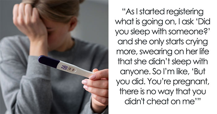
")
")