Get Premium
Dark mode theme is available exclusively for premium users. Learn more about the benefits of subscribing.
No fees, cancel anytime.

 Dark Mode Ad-Free Browsing Unlimited Content
 Ad-Free Browsing Unlimited Content Dark Mode
Join 1.2 million Panda readers who get the best art, memes, and fun stories every week!
Wordplay is a never-ending source of amusement for me, with funny puns, spoonerisms, and double entendres bringing a little extra color and life to the everyday language that we sometimes take for granted.
Swedish graphic designer Daniel Carlmatz also loves to get creative with words but in a different way. He set himself a challenge to create a new typographic logo design each day for 365 days, using a common word and adding related visual elements through symbolism, creative use of negative space, and geometry. The inspiration for the 365-day challenge came from trying to challenge myself to look at type and design from a different perspective, Daniel told Bored Panda. The challenge was just an outlet for my personal, minimalist design thinking. And yes, I did manage to finish it without missing a day!
The logo ideas are truly remarkable in their creativity and simplicity, proving that inspiration for the design is all around us. For Daniel though, the process was anything but simple. I struggled, he told us. I didn't want them to take up too much of my time so I used to do them in my head or sketch them down on my way to work, and then finalize them on my way home from work. But sometimes you just end up with nothing.
"I had a few words I felt I wanted to do, but a lot of the design ideas came from having a solution first - and trying to find a suitable word that could support it. One of the hardest words was Panda, which was with me from day one but wasn't published until day 251."
Some of Daniel's logos make you look twice before you make the connection, and are a lot of fun to try to find. Can you spot them all? Scroll down to check out his work for yourself, and let us know what you think in the comments!
More info: Instagram
(h/t: Digital Synopsis)
This post may include affiliate links.
In my opinion, this is the most creative one out this list. Make no mistake though, all of these are awesome.
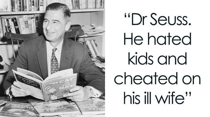
I think "ill" stands out, which is unfortunately not a good word when food is involved.
"ill" is also an old slang term for good, cool, and other word that mean "good". "That's ill bro".
Load More Replies...Oh dear... I saw a hand flipping the bird, and now I can't get the image out of my mind!
Update: I see it! I finally see it! Thought you’d be pleased to know.
Load More Replies...So, I wonder why he made 'ill' stand out. Maybe he had a bad experience with a grill?
My first thought looking at this was that it looked like a middle finger.
Really cool. I like how the letters i, l, and l are part of the spatula.
it only takes one tree to make a thousand matches, only takes one match, to burn a thousand trees.
I thought that was a "G" at the end, and that's a completely different word.
Tetris isn't that simple - the 'I' should have been tilted by 90 degrees!
What's even more aesthetically pleasing is that there are three and a half letters on each side!
Try make some corporate or product words with it. Like windows, google, apple, sony, ferrary, BMW, nokia, chipotle, KFC, etc. And let's see how it works.
The first few j was thinking "these are cool" then after about four of them I realized it's basically one design done 100 different ways... A little variety would be nice
I know therse are just random words - but as an example of what he can do - say for a job interview in design and marketinging - it's perfect
Great Designs. Away from the conventional. Can I use any of them, or are they trademarked?
Please BP, I love your content, but enough with the "I Challenged Myself" c**p! How about just "Artist creates ______ every day..."
Why the negative comments? I bet those ppl can't even write their own names readable enough. I hope you do realize that compannies like apple, windows etc are have WORDS as brandnames too. And their logos looks like what? Apple's logo is a what? A foking apple ffspl with zero designing skills believe logos should look like DaVinci paintings, include 10 characters and 50 objects, but still look good in tiny scale as a smartphone icon. Why so hard to recognize the brilliance of simplicity?
Thanks for sharing your Design 101 homework journal. Every design school in the world make their beginner designers do exercises like this one. Most of these were boring as hell, a few stand out so maybe this person will survive competing again 3rd world countries where there are designers that are just as talented, yet willing to work for $1 or $2 per hour.
These look really nice and some of them are especially creative, like the "noodle" one or the "fire" one.
Inspiring - simple yet powerful - and it shows how much you can accomplish with a little bit of effort over a period of time
I made this one at school :3 (this is rabbit in french). 300007_101...ca43a6.jpg 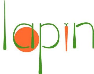
Boring. Let's see his skills in real world. When client wants a logo for "Amiplasa" or "Himiscill". Can you do that? And yes, I'm a graphic designer.
Those words are a tad more difficult to convey in a simple “play on words”, but it could be done. And I’m a Graphic Designer as well- 20 years real world experience!
Load More Replies...These are all fun very amusing. Though it seems kinda easy to pick a random word and do something fun with it. I'd be interested to see if the artist could make with logos of real companies, like the one for Ikea on his Instagram.
I did that for my kind of stuff for my résumé, I redesigned the FTD Florist logo. It was super fun to create.
Load More Replies...Try make some corporate or product words with it. Like windows, google, apple, sony, ferrary, BMW, nokia, chipotle, KFC, etc. And let's see how it works.
The first few j was thinking "these are cool" then after about four of them I realized it's basically one design done 100 different ways... A little variety would be nice
I know therse are just random words - but as an example of what he can do - say for a job interview in design and marketinging - it's perfect
Great Designs. Away from the conventional. Can I use any of them, or are they trademarked?
Please BP, I love your content, but enough with the "I Challenged Myself" c**p! How about just "Artist creates ______ every day..."
Why the negative comments? I bet those ppl can't even write their own names readable enough. I hope you do realize that compannies like apple, windows etc are have WORDS as brandnames too. And their logos looks like what? Apple's logo is a what? A foking apple ffspl with zero designing skills believe logos should look like DaVinci paintings, include 10 characters and 50 objects, but still look good in tiny scale as a smartphone icon. Why so hard to recognize the brilliance of simplicity?
Thanks for sharing your Design 101 homework journal. Every design school in the world make their beginner designers do exercises like this one. Most of these were boring as hell, a few stand out so maybe this person will survive competing again 3rd world countries where there are designers that are just as talented, yet willing to work for $1 or $2 per hour.
These look really nice and some of them are especially creative, like the "noodle" one or the "fire" one.
Inspiring - simple yet powerful - and it shows how much you can accomplish with a little bit of effort over a period of time
I made this one at school :3 (this is rabbit in french). 300007_101...ca43a6.jpg
Boring. Let's see his skills in real world. When client wants a logo for "Amiplasa" or "Himiscill". Can you do that? And yes, I'm a graphic designer.
Those words are a tad more difficult to convey in a simple “play on words”, but it could be done. And I’m a Graphic Designer as well- 20 years real world experience!
Load More Replies...These are all fun very amusing. Though it seems kinda easy to pick a random word and do something fun with it. I'd be interested to see if the artist could make with logos of real companies, like the one for Ikea on his Instagram.
I did that for my kind of stuff for my résumé, I redesigned the FTD Florist logo. It was super fun to create.
Load More Replies...


 No fees, cancel anytime


")
")


