Get Premium
Dark mode theme is available exclusively for premium users. Learn more about the benefits of subscribing.
No fees, cancel anytime.

 Dark Mode Ad-Free Browsing Unlimited Content
 Ad-Free Browsing Unlimited Content Dark Mode
Join 1.2 million Panda readers who get the best art, memes, and fun stories every week!
It’s no secret that artists tend to have an eye for detail. That’s why where you see a street, they see a painting; where you hear a bird, they hear a masterpiece; and where you see nothing out of the ordinary, they see an opportunity to create something beautiful.
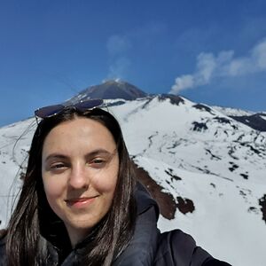
A London-based photographer, Andreea Badiu, has recently gone viral on TikTok for her ability to see great shots in seemingly mundane settings. She lets her followers in on what she sees versus what she takes a picture of, showing that an eye for detail can really come in handy when taking pictures. And if you don’t want to take my word for it, see for yourself by looking at Andreea’s works on the list below.
This post may include affiliate links.
Mostly I guess is exposure, then changing levels on things in Lightroom? Then perhaps some editing?
Load More Replies...The photographer would've had better color if they'd taken the whole scene and cropped the photo. What they took looks washed out.
What is your major malfunction? If you can point to photography from yourself, you are welcome to post it somewhere and let people take pot shots at everything you do. All your negative comments just show how petty and jealous you must be of the various photographers on here. Therefore, STFU
Load More Replies...Nowadays, pictures—be it taking or looking at them—are something most people can’t imagine their lives without. For many, grabbing their camera or phone is their first instinct whenever they see a beautiful sunset or their child doing something silly.
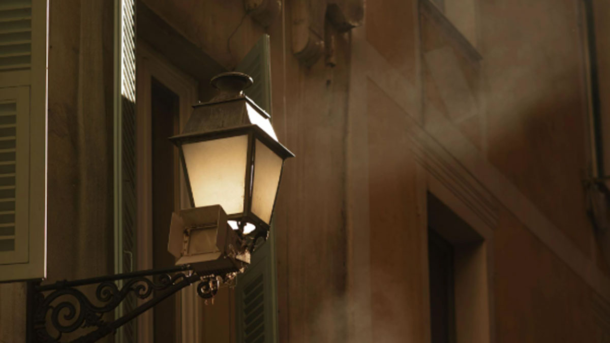
That’s because pictures allow us to freeze in time all the important moments in our lives and capture the beauty around us, be it nature, people, buildings, or even lamps.
All of the above have been captured in Andreea’s pictures, too, which she has shared with her TikTok audience. Revealing exactly what she focuses on when taking a picture, she showed her followers not only how good of an eye for detail she has, but also how beauty can be found nearly everywhere.
Your predilection to bashing other photographers shows that you are both clueless and jealous
Load More Replies...Not necessarily. Cropping is an important tool too, but framing is crucial if you need to get a certain angle, details, light, etc.
Load More Replies...But when it comes to photography, an eye for detail is not always enough. There are certain principles of photography that can take one’s pictures to the next level, and quite a few of them are related to composition, allowing the artist to learn to take the perfect shot.
Take the rule of thirds, for instance. Considered one of the fundamental principles of photography, it’s more of a guideline than a rule, but it can be a great starting point for learning and working with composition.
According to the Digital Photography School, the rule of thirds is a compositional guideline that breaks the image into thirds both horizontally and vertically, rendering the image divided into nine pieces by four gridlines.
“According to the rule, by positioning key elements along the gridlines, you’ll end up with better compositions. Therefore, to apply the rule to your photos, simply use the gridlines to position essential compositional elements,” the aforementioned source read.
What's wrong with moving to get the shot you see in your head?
Load More Replies...According to The Digital Photography School, the great thing about the rule of thirds—in addition to nailing the composition—is that it’s an effective yet simple way to improve your photographs that don’t require a lot of training or experience in photography.
Though, as with most rules, this one, too, is meant to be broken, and that, based on the source, won’t result in your composition being bad or uninteresting.
Google Image Search also suggests this is Whitby in North Yorkshire. And, if you get the opportunity, I heartily suggest you visit there, as it is a great little place, and the home to Whitby Abbey, which was the inspiration for Carfax Abbey in Bram Stoker's Dracula.
Load More Replies...If you want to take your pictures even further, a step over the rule of thirds is the so-called golden ratio. Talking about it, Photography Hero noted that using said ratio can make the quality and appeal of your images grow exponentially.
The golden ratio, reportedly having been used by artists for centuries now, is a ratio of approximately 1.618 to 1. If that’s difficult to comprehend, imagine an arm divided into two sections, using the ratio of 1.618 to 1 – the former being the part from your elbow to your wrist and the latter from your wrist to your fingertips. Using the ratio might help you create even better compositions for your pictures.
Another thing aspiring photographers might want to delve deeper into is negative space – the area in the picture that surrounds the main subject. “It's the empty space that helps define the positive space, which is the main focus of the photograph,” UK-based photographer and qualified photography tutor Alan Ranger explained.
“This concept plays a crucial role in composition, allowing photographers to create visually compelling contrast photos that draw the viewer's attention to the intended subject,” he added.
The aforementioned practices are just a few examples of what can take one’s images to the next level, but as with most things, practice makes perfect. So, if you, too, would like to try your hand at photography, make sure to read more about all sorts of rules and guidelines, but most importantly, go out there and shoot! Just like Andreea did, walking around, spotting cinematic masterpieces where many would least expect to find them.
Strictly personal, but it's often the colors that catch the eye, in the "what I see". Desaturating, underexposing, adding a color cast doesn't always help in the "what I take". Again, personal.
I agree. I didn't care for any of the "what I take" pictures.
Load More Replies...I feel like many of these were cropped (zoomed in) way too much. For example the ones of Yorkshire and Venice, it is interesting to see some of the setting aswell, like the water, and the cliffs and village / castle. Too much is taken away, to focus on some person or detail. For me it would be more interesting to see that thing more in relation to the setting. Maybe not as wide as in the "what I see" example. But somewhere in the middle of that and "what I take" Other pictures were good tho.
For at least an half of them, i would had keep the uncropped ones... Nice point of view anyway
In many cases I wouldn’t have kept the fully uncropped versions but wouldn’t have cropped them as much.
Load More Replies...I think I lack the ability to appreciate the art here, but I am glad someone else can appreciate the art here. I suppose art, like life and beliefs is not a one size fits all.


 No fees, cancel anytime


")
")


")
")