Get Premium
Dark mode theme is available exclusively for premium users. Learn more about the benefits of subscribing.
No fees, cancel anytime.

 Dark Mode Ad-Free Browsing Unlimited Content
 Ad-Free Browsing Unlimited Content Dark Mode
Join 1.2 million Panda readers who get the best art, memes, and fun stories every week!
Since the last time we wrote about Terrible Maps, a project that is dedicated to sharing maps no one asked for or needs, they've kept themselves rather busy. So it's only natural we created a follow-up article about the cartographers who are so bad, they're actually good. After all, what is the Internet for if not to poke fun at politics and our geographical illiteracy?
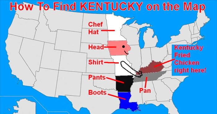
From hilarious guides on how to find the state of Kentucky to showing how many Switzerlands fit in Brazil, continue scrolling and check out these gems and tell us which one would you hang on your office wall!
More info: Facebook | Instagram
This post may include affiliate links.
OK. We can clearly see these are bad maps. But how to know you're looking at a good one? Brant Scheidecker, a sales engineer at Cartegraph, highlighted some of the main essentials for accurate and easily interpretable map use.
"Every map should have a title. It allows the user to assess the purpose of the map quickly; allowing them to determine if it meets their needs," Scheidecker wrote.
Next, origin. A fancy name for a compass or the North arrow. "This allows the user to determine the maps reference to the earth. While most maps these days have North being straight up, occasionally you will encounter a map that has a skewed orientation, perhaps to better fit it on the physical medium it's presented on (i.e. paper), or simply because it’s easier to interact with the map in that orientation."
When it comes to the source, it's a two-fold element. "It allows the map maker to provide the map viewer an idea where the data the map is representing is from; a necessity in determining the accuracy of a map. It also allows the map maker a way to cite the source of their data, avoiding all those pesky cries of plagiarism and the ensuing lawsuits," Scheidecker explained. "You have better uses for your time, like ensuring the rest of the T.O.S.S.L.A.D. elements are on your maps."
Let's not forget the legend (the area where a user can determine what a particular color or symbol represents on the map). "Without a legend, a user cannot successfully interpret what your map is trying to represent, 'Does the red skull and crossbones over my favorite restaurant mean what I think it means?'"
You should also know when was the map that you're analyzing made. If it was created in 1962 and shows commuter levels in Chicago—it might not be such a valid source for the traffic data you are looking for today, unless you are feeling nostalgic, Scheidecker joked.
There you have it. You may now have become a cartographic genius, but you should be able to tell if you're looking at a terrible map or not!
I don't understand why Iceland is not green, but Spitsbergen is
No surprise, if the person with this opinion is a believer, that the Earth is flat...
Nah. We see a giant a*s bible for most of those middle states. Oh and guns. Lots and lots of guns.
i don't even want to try saying that one. you know which one I'm talking about.
Early Y2K problem: They had only two spaces on the form to number the counties. You don't want to live in county "00", do you? Hence, 99 tops...
Load More Replies...Iowa originally platted 100 counties as expected, but one of them (Bancroft County) was mostly glacial wetlands unsuitable for farming or habitation, so for jurisdictional practicality it got merged into its southern neighboring county (Kossuth County). Many squabbles, reversals and lawsuits later, by the late 1800’s Iowa settled down with the 99 counties it has today. Source: https://who13.com/news/what-ever-happened-to-iowas-100th-county/amp/
I'm Hungarian and I just now learn there is a county named after a famous Hungarian statesman O.o
Serious question from foreigner here. Are all the counties square because there are no real natural features in Iowa? Or was it just drawn up by some civil servant who had never been there and lacked a map/imagination?
I've done a little research and it seems most states and their counties that have straight lines are because the region had been inhabited primarily by indigenous people and not much was known about the local landmarks by the white folks who were establishing the boundaries. Since the US didn't have much cash to pay the soldiers who had fought in the American Revolution, War of 1812, and Indian Wars of the early 19th century, the territory was divided up into land parcels by latitude and longitude lines to be given to the veterans. You can actually see if your ancestors inherited some of these land parcels at the Bureau of Land Management here -> http://www.glorecords.blm.gov/default.aspx
Load More Replies...Honestly, you know its a "new" country when borders are oddly straight like that. Historically borders go with the terrain and are negotiated trough wars, with much back and forth. But of course, as we see on the Native American territories map, a natural seperation of borders looked much different. Frankly, this map angers me, and I'm appaled my own country was such a huge contribution to the systematic genocide. (1/3 of Norwegians emigrated to the American landmass when land was said to be "free"...)
When Europeans talk about U.S. states being too boxy, just show them this pic. It's worse than you think
Pottawattamie obviously needs to be wider so they can fit the name in.
Load More Replies...Probably done to prevent the deadlock of a 50/50 split in politics. Even if it's only 1, there will always be a majority.
99 is two figures, 100 is 3 figures. I'm sure some form with limited space was responsible for this.
Well the other county lines are very neatly organized. Hat tip to whomever did that.
Probably because an even number could lead to a deadlock. Imagine if they were divided 50/50 on an issue.
According to my dots in MS Paint over each: 132. Might be wrong, but I am not doing it again. EDIT: Did it again and Beto River is right, I missed 10 at some point. Thank you Beto!
I understand mistaking it with Iraq or Afghanistan, but how the f**k did they go to Africa and the Balkans? A couple are even in the UK, for crying out loud.
Sadly the U.K. after Brexit is now the direct to video sequel staring the likes of Tara Reed that nobody wants.
I knew about Australia and the emu war, but not about China. I need to find the story.
In Dutch coma is spelled with a c instead of a k, so I don't really trust de rest of this map...
That has changed after Baltic states also got Euro as our currency. But these are funny and still around
Weird. It's as if the person is jealous of us having so many historical buildings and interesting places.
If this map doesn't help you to find the nearest one, just walk down the street and there it is.
In 60 million years it would be recognizable, but in 200 million years it's going to look really stupid.
i get the joke. so, if yall need it explaining: sin/cos=tan (sin cos and tan are on most scientific calculators but idk what they do)
Wow! No wonder it was down graded. How on earth did they ever see it?
Is there like some Lizard-proof border there? Do lizards know when to stop going north?
This is where I live! (Not in the harbour, but the city) I'm proud of us being the catalyst for this.
Scarborough Reef is a country? It is a disputed territory with claims from The Philippines and China, and it has a population of exactly 0.
The good old days when the country was made entirely from minced beef.
Makes absolutely no sense. Southern Europe is often nowhere near the green zone in data such as economy, unemployment etc.
Nooo, we (EU) want Scotland back. Anyone can have England and Wales, though.
So many of these look like regular phenomena experienced by someone with the worst hangover...
Did someone drop this map on the floor? France has broken off, Africa has acquired an extra bit on the west coast, America seems to have been eaten by the dog.
Jakub Marian makes a lot of good maps, but this one was posted a few years ago on April Fools' day.
yup spent 40 years in the right start and now being in the left one it often lead to a weird "dance" when I'm saying hello and even ended once with a stealthy one on the mouth... but hey corona has solved the issue
Two continents. I'm pretty sure South America was also pillaged. And don't put this on white people. War and slavery have been parts of humanity throughout history. Ignoble, terrible parts, but still parts.
It's a nightmare trying to get across Europe as you're always disturbing matches on the way.
So are we assuming that The Netherlands is gone by then? Cheerful...
Ask an American to say 'squirrel'. You'll be laughing for the rest of the day.
I’m still not over the lazy, lazy research that brought us “mahoutokoro”. She literally just found out what the Japanese for “magic” and “place” was.
Ninth way: You CAN read the charts: 0% - You CAN´T read the charts: 100%
The kind of thing where you think it's a good idea at first, then when you've finished it, you think you've just wasted two hours of your life.
No. There are a few hanging about in orbit. They're the ones who see the world like this map. Black lines and giants words and everything.
The main reason almost all of these maps are so terrible are the emoji, which (apart from they're extremely annoying) sometimes cover text.
I can now recognize Rokas Laurinavičius' posts after the first three entries.
Many of these maps would only be considered terrible from a geological point of view. A lot of them are demographic which, I find fascinating.
Found the anti-intellectual, liberal-hating conservative crusader who’s going to change us all by mocking us...
Load More Replies...The main reason almost all of these maps are so terrible are the emoji, which (apart from they're extremely annoying) sometimes cover text.
I can now recognize Rokas Laurinavičius' posts after the first three entries.
Many of these maps would only be considered terrible from a geological point of view. A lot of them are demographic which, I find fascinating.
Found the anti-intellectual, liberal-hating conservative crusader who’s going to change us all by mocking us...
Load More Replies...


 No fees, cancel anytime


")
")