Get Premium
Dark mode theme is available exclusively for premium users. Learn more about the benefits of subscribing.
No fees, cancel anytime.

 Dark Mode Ad-Free Browsing Unlimited Content
 Ad-Free Browsing Unlimited Content Dark Mode
Join 1.2 million Panda readers who get the best art, memes, and fun stories every week!
38submissions
Finished
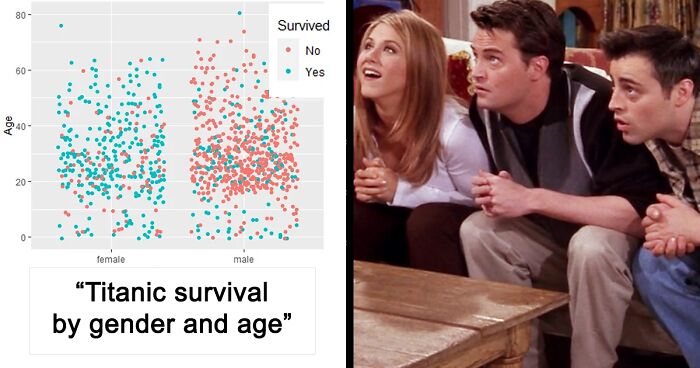
So if you’re a graph enthusiast, you’re in luck. Down below, we’ve gathered some of the most gorgeous and satisfying displays of information that have been shared on the “Data is Beautiful” subreddit. Enjoy learning something new from these stunning charts, be sure to upvote the ones you find equally informative and aesthetically pleasing!
This post may include affiliate links.


 No fees, cancel anytime


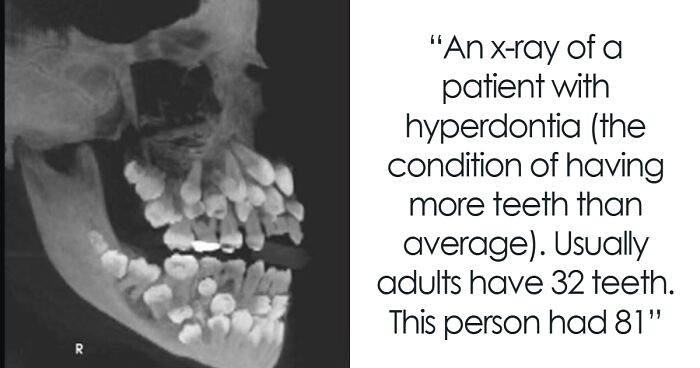
")
")


