ADVERTISEMENT

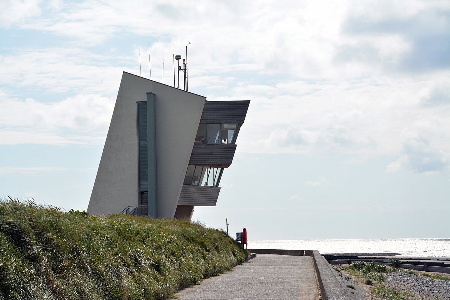
Designing a product or structure is more than just aesthetics. Functionality and safety are also prerequisites. Lack at least one of them and you have something that’s bound to fail, if not cause harm or injury, sooner or later. 

These photos show what poor and dangerous designs look like. Just browsing through may make you think to yourself, “What was the person who came up with this thinking?” 

If you’re a product designer or anyone tasked to ensure structural integrity, let these images be your stark reminder of what NOT to do.

#1

Battery Acid Looks Like A Refreshing Bottle Of Water

Hand holding a clear bottle labeled battery acid in a poorly designed packaging, illustrating terrible product design.

CityDismal5339 Report

RELATED:
    #2

    Long Invisible Steps

    Sidewalk with stairs embedded awkwardly into the flat path, showing terrible product design that lacks logical sense.

    roman_pokora Report

    winterwidow87
    Community Member
    2 weeks ago Created by potrace 1.15, written by Peter Selinger 2001-2017

    This is a hazard especially for elderly and disabled people.

    View more comments
    #3

    This Entrance Sign Looks Like A “Do Not Enter” Sign

    Confusing traffic sign showing enter here with a no entry symbol in a parking lot, illustrating terrible product design.

    LinkDude80 Report

    Since we’re on the topic of design fails, here are some other famous ones, beginning with the Samsung Galaxy Note 7. It received high praise for its dual-curved screen and 4GB of RAM, among other features. 

    However, its major design flaw was its battery system, which caused multiple overheating incidents, including fires and explosions.

    ADVERTISEMENT
    #4

    Hair Dye Which Looks Like Cereal Box

    Cereal box designed as hair bleach with cartoon character, star-shaped cereal, and milk splash on store shelf.

    alfuciic Report

    winterwidow87
    Community Member
    2 weeks ago Created by potrace 1.15, written by Peter Selinger 2001-2017

    Korea why? Do you want kids to drink this? (Writing is in korean).

    View more comments
    #5

    Terrible Design For A Hand Gel I Got As A Freebie From A Rep

    Hand sanitizer bottle labeled for dry mouth relief, illustrating a terrible product design that causes confusion.

    PendragonVc Report

    Upstaged75
    Community Member
    2 weeks ago Created by potrace 1.15, written by Peter Selinger 2001-2017

    Someone is definitely going to put that in their mouth.

    View more comments
    #6

    Unbalanced Pan. Only Stands Correctly When There Is Weight In It - Pretty Annoying And Even Dangerous With Hot Oil

    Small frying pan with a broken handle resting on a table outdoors, showing a terrible product design flaw.

    fluppe-roochen Report

    Shark Lady
    Community Member
    2 weeks ago Created by potrace 1.15, written by Peter Selinger 2001-2017

    I had a whole set like this, i replaced it after a week.

    View more comments

    Hoverboards became a trend among young people in the mid-2010s. By 2015, these self-balancing scooters were ubiquitous and had become a must-have, driven in part by celebrity influence. 

    In 2023, approximately 25,000 Hover-1 Helix hoverboards were recalled. The reason: the lithium-ion battery was prone to overheating, and like the Galaxy Note 7, it posed a fire hazard.

    ADVERTISEMENT
    #7

    Been To This Guy’s Place Twice And Have On Multiple Occasions Fallen Victim To The Shin-Blaster 2000

    Corner of bed frame with sharp metal piece posing safety hazard, example of terrible product design without practical sense.

    thegreatjamoco Report

    sturmwesen
    Community Member
    2 weeks ago Created by potrace 1.15, written by Peter Selinger 2001-2017

    I baby proofed the toe crusher part of my bed. Enough was enough.

    View more comments
    #8

    This Gardening Nutrient Mix That Looks Like Ketchup. It Even Says "Great Flavour"

    Hand holding a red bottle with tomato images showing terrible product design with confusing packaging.

    DaFreakingFox Report

    Mrs Irish Mom
    Community Member
    2 weeks ago Created by potrace 1.15, written by Peter Selinger 2001-2017

    I would 100% grab that and splosh it all over my chips

    View more comments
    ADVERTISEMENT
    #9

    The Staircase At My Hotel Room Just Drops Off

    Narrow staircase with awkward turn and uneven steps showcasing terrible product design and poor usability.

    Opposite_Strategy_43 Report

    William
    Community Member
    2 weeks ago Created by potrace 1.15, written by Peter Selinger 2001-2017

    I’d love to see the final architectural meeting.

    View more comments

    When the Nap Nanny came out at the beginning of 2009, it was well on its way to becoming a breakthrough in putting babies to sleep. It included an inclined seat purported to help infants sleep better, particularly during car rides. 

    ADVERTISEMENT

    However, things took a tragic turn in 2010, when an infant lost its life due to positional asphyxia. The US Consumer Product Safety Commission immediately ordered a recall of 30,000 units after concluding that the recliners put children at risk for entrapment, suffocation, and fall hazards. 

    By 2014, the fatality count had risen to six, yet many parents continued to use it.

    #10

    This Black Lodge Floor Tiling That Supermarkets In My City Have Now

    Patterned floor in a store with confusing geometric tile design causing visual disorientation terrible product design.

    A certain supermarket chain went through rebranding and is now changing all floor tiling to this. Yes, this is on purpose. Yes, it being uneven is ALSO on purpose. All of this is outlined in a brand book. Basically, it's specifically designed to be uncomfortable to look at to draw shoppers' gaze to the shelves to increase sales. Guess what? They're about to lose sales because this gives me migraines.

    backroom_mushroom Report

    #11

    Why Put Meltable Plastics On A Thing That Gets Hot?

    Blue butane torch with a metal nozzle held indoors, illustrating terrible product designs that make no sense.

    Unscripted9211 Report

    WindySwede
    Community Member
    2 weeks ago Created by potrace 1.15, written by Peter Selinger 2001-2017

    Same on the one here, but it has fiber-reinforced composit, and never had a problem • But is an Sievert

    View more comments
    ADVERTISEMENT
    #12

    A Bicycle Path In Belgium

    Bike lane with a pole blocking the path and a car parked on it, showing a terrible product design mistake outdoors.

    CraftingTableGuy Report

    WindySwede
    Community Member
    2 weeks ago Created by potrace 1.15, written by Peter Selinger 2001-2017

    OK,,,, 😶 *you shall not pass*

    View more comments

    Car enthusiasts will remember the Chevrolet Cobalt, the compact vehicle produced from 2005 to 2010. However, a major design defect in its ignition system put its drivers at significant risk. 

    The vehicle’s ignition reportedly turned off while driving because of the weight of a heavy key chain or when accidentally bumped by the driver’s knee. It causes a sudden stop, and the driver loses complete control of the vehicle. 

    General Motors issued a recall on 700,000 Chevy Cobalts, as the company discontinued its production soon after.

    #13

    Dangerous Design For A Surface Cleaner

    Hand holding a surface cleaner can designed like a soda can, illustrating terrible product designs concept.

    toscanius Report

    winterwidow87
    Community Member
    2 weeks ago (edited) Created by potrace 1.15, written by Peter Selinger 2001-2017

    The EU has regulations that prevent things that aren't edible/drinkable from coming in a package that resembles food/drinks. Now i understand why.

    View more comments
    #14

    Slanted Table Front - Stuff Slides Off

    Hand holding a blue glass next to a triangular table corner, showcasing terrible product designs that make no sense.

    Apex_Ventures Report

    #15

    These Are Very Sharp, Very Adult Knives

    Set of colorful kitchen knives with animal illustrations showcasing terrible product designs that make absolutely no sense.

    isotaco Report

    Firestone is a known brand name for supposedly high-quality tires. That reputation was shattered in November 2000 when the company recalled 6.6 million tires. 

    It was found that the treads separated at high speeds and high temperatures, causing SUVs to roll over. Ford Explorers were most affected at the time, accounting for at least 174 fatalities and over 700 injuries.

    #16

    Been Stuck Sitting In This Horrid Chair All Afternoon

    Metal chair with missing front leg in outdoor setting, an example of terrible product designs that make no sense.

    flatearthmom Report

    #17

    So Is It Off Or Set To 60 Watts?

    Yellow glue gun with a confusing power switch labeled 60W and 100W circled in red on a wooden surface.

    jbosh999 Report

    #18

    This “Engineering Building” At My University Which Was So Poorly Designed It Was Deemed Unsafe For Use And Is Now Derelict

    Modern building with an overhanging upper structure, illustrating terrible product designs that make no sense in architecture.

    RoyalT663 Report

    Ryan-James O'Driscoll
    Community Member
    2 weeks ago Created by potrace 1.15, written by Peter Selinger 2001-2017

    Faraday Tower, University of Southampton. It is gone now.

    View more comments
    #19

    This Door Handle’s Edges Are Sharp, So It Hurts Your Hand To Open

    Door handle designed like a giant s***w, showcasing a terrible product design making no sense in functionality.

    7FishInABucket Report

    Beady El
    Community Member
    Premium
    2 weeks ago Created by potrace 1.15, written by Peter Selinger 2001-2017

    You gotta REALLY want to get in to brave it.

    View more comments
    #20

    The Entrance Of Possible End

    Top view of poorly designed double front doors opening inward onto stairs, illustrating terrible product design flaws.

    Turk137 Report

    Kira Okah
    Community Member
    2 weeks ago Created by potrace 1.15, written by Peter Selinger 2001-2017

    The second door can't be opened, can tell by how it's seated.

    View more comments
    #21

    Accessibility Ramp At The Resort I’m Staying At In Mexico. There Are A Bunch Of Other Awful Ramps Around The Premises, But This Is Definitely The Worst One

    Wavy staircase handrail with uneven design creating a confusing and terrible product design indoors.

    Boring_Customer4982 Report

    #22

    Roof Of University Building Intentionally Leaks Water And It Spatters Everywhere

    Modern interior with unusual product designs featuring recessed seating and awkward floor grates disrupting the space flow.

    DaanA_147 Report

    SM
    Community Member
    2 weeks ago Created by potrace 1.15, written by Peter Selinger 2001-2017

    Bring nature inside so you can slip and slide!

    View more comments
    #23

    At What Point Do You Just Go "Ya Know What, It Isn't Worth The Open Floor Water Feature"

    Indoor fountain surrounded by chains and caution signs showing a confusing terrible product design in a public space.

    UncleGarfunkle Report

    Heffalump
    Community Member
    2 weeks ago Created by potrace 1.15, written by Peter Selinger 2001-2017

    They can't get rid of it: that's where they buried the architect.

    View more comments
    #24

    This Is Elmer's Gue... Don't Eat It?

    Container of glue designed like hot chocolate with marshmallows, illustrating terrible product designs that confuse users.

    thesunbeamslook Report

    #25

    The Hidden Danger Of A Pineapple Lamp

    Hand adjusting a lamp with sharp metal leaves, an example of terrible product designs that make no sense.

    reddit.com Report

    #26

    These Traffic Light Designs Are Kind Of Dangerous

    Traffic lights with confusing red and green signals at night under an overpass, showing terrible product designs.

    Taken in Subang outside of (what used to be) Damen USJ. You can see the green lights that aren’t meant for you. Maybe they should install some sort of shade to prevent the light from showing off to the sides.

    lolfuljames Report

    Upstaged75
    Community Member
    2 weeks ago Created by potrace 1.15, written by Peter Selinger 2001-2017

    There one like that near where I live. It's under a bridge and has multiple green lights - but you can only see the one that's meant for you. Otherwise it would be chaos.

    View more comments
    See Also on Bored Panda
    #27

    My Local Park Benches Made Of Stainless Steel. Too Cold To Sit On In Winter, Too Hot To Sit On In Summer

    Metal bench with uneven bars and uncomfortable design, an example of terrible product designs that make no sense.

    TheHyperFlame Report

    Did I say that out loud?
    Community Member
    2 weeks ago Created by potrace 1.15, written by Peter Selinger 2001-2017

    Most likely designed to stop homeless people from sleeping on them.

    View more comments
    #28

    User-Friendly Pool Ladder

    Pool ladder installed with steps submerged underwater, an example of terrible product design that makes no sense.

    reddit.com Report

    #29

    This Unreasonably Dangerous Walkway

    Raised platforms designed without stairs or ramps, an example of terrible product designs that make no sense in public spaces.

    danthewildcat Report

    Kira Okah
    Community Member
    2 weeks ago Created by potrace 1.15, written by Peter Selinger 2001-2017

    There is a straight line to the door, but yes, not safe. Looks like it's meant to be a water feature too, just currently drained.

    View more comments
    #30

    Dangerous Step Downtown Merida, Mexico

    Concrete stairs with inconsistent step heights and uneven design creating a confusing product design flaw outdoors.

    WilliamFromIndiana Report

    #31

    Straight Into The Sidewalk

    Awkward building extension blocking the sidewalk, an example of terrible product designs that hinder pedestrian movement.

    daerlaniv Report

    Kira Okah
    Community Member
    2 weeks ago Created by potrace 1.15, written by Peter Selinger 2001-2017

    Looks like the result of me trying to build something in Minecraft :P

    View more comments
    #32

    If I Drive Anywhere Between 3:00 Pm And Sunset I Get Blinded By My Cars Gearshift Surround

    Car gear shift and temperature controls with a poorly placed cup holder in a terrible product design example.

    jmp325 Report

    #33

    The Door Stopper Is Lined Up Directly With The Handle Leading To Many Squished Fingers…

    Confusing product design showing a hockey puck stuck on a metal pole next to a door handle in a public space.

    WizardHarryDresden Report

    #34

    Electric Charging Cables That Become Trip Wires When In Use

    Electric vehicle charging station cable extending across sidewalk, posing a hazard in terrible product design example at night.

    Pitiful-Bluebird7951 Report

    Nuku Nyara
    Community Member
    2 weeks ago Created by potrace 1.15, written by Peter Selinger 2001-2017

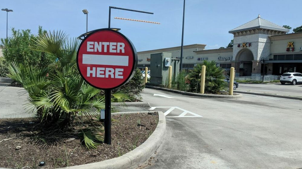
    They should have installed the electric chargers against the curb to the parking space and not across the sidewalk.

    View more comments
    #35

    What Could Go Wrong! (Btw It’s Pitch Black Until You Hit The Light Switch)

    Fire alarm and door opener switches placed awkwardly around a light switch, illustrating terrible product designs.

    Potential_Lock_5212 Report

    Verena
    Community Member
    2 weeks ago Created by potrace 1.15, written by Peter Selinger 2001-2017

    Top: Fire alarm. Bottom: opening emergency doors, not all emergencies are fire related. Fire alarm triggers emergeny doors, too. Middle light switch with an glow-in-the-dark tape

    View more comments
    #36

    This Diesel Conditioner Is Bottled Like Apple Juice

    Rows of diesel conditioner bottles with confusing packaging design on a store shelf showcasing terrible product designs.

    PM_ME_YOUR_HAMMER Report

    WindySwede
    Community Member
    2 weeks ago Created by potrace 1.15, written by Peter Selinger 2001-2017

    My first thought was vegetable oil before reading text.

    View more comments
    See Also on Bored Panda
    #37

    These Stairs At My Cabin Vacation Feel Designed To

    Unusual product design of wooden stairs with uneven steps and oddly placed handrails causing safety concerns.

    EAT_UR_VEGGIES Report

    Kira Okah
    Community Member
    2 weeks ago Created by potrace 1.15, written by Peter Selinger 2001-2017

    Words missing off the end of the title: kㅤill you.

    View more comments
    #38

    Motion Activated Sanitizer Dispenser Next To A Door Leads To Permanently Soaked Floor

    Confusing product design showing a hand sanitizer dispenser blocked by narrow space and metal bars on a train.

    DJ_Maxyyt Report

    BrunoVI
    Community Member
    2 weeks ago Created by potrace 1.15, written by Peter Selinger 2001-2017

    Yup. This happened in what I estimate to be MOST major U.S. workplaces during the coronavirus epidemic.

    View more comments
    #39

    This Bike Lane

    Bike lane design flaw ending abruptly into a parking area, illustrating terrible product designs that make no sense.

    reddit.com Report

    Geoffrey Scott
    Community Member
    2 weeks ago Created by potrace 1.15, written by Peter Selinger 2001-2017

    Looks like the very verge of grass is the 'desire path' as the bike lane picks up next to the R turn lane.

    View more comments
    #40

    Child Electric Outlet Cover With Top Pin That Activates The Bottom Live Sockets Whilst Making Them Accessible

    Hand holding a useless plug design next to a UK power socket, illustrating terrible product design that makes no sense.

    towerhil Report

    Kira Okah
    Community Member
    2 weeks ago Created by potrace 1.15, written by Peter Selinger 2001-2017

    This looks like a two prong socket adapter, defnitely not an outlet cover. Mislabelled maybe?

    View more comments
    #41

    Be Careful. This Is Just A Stretchy Gummy Toy. Not A Large Edible Candy. Technically They Say It On The Front Of You Look A Bit

    Hand holding a jumbo sweet-ish fish toy packaging illustrating terrible product designs with confusing food-like appearance.

    Amish-Hacker Report

    B
    Community Member
    2 weeks ago Created by potrace 1.15, written by Peter Selinger 2001-2017

    "100% stretchy"... Relative to what? And how do we verify that? What if it's actually 98% stretchy? Or 27.4%? Hang on, I'm starting to confuse myself.

    View more comments
    #42

    Stairway To Plumbing And Coax Cable Management Heaven

    Carpeted stairs with awkward design including a narrow, unusable step and large pipes obstructing the walkway in terrible product design.

    Typ0r8r Report

    Don't listen to me
    Community Member
    2 weeks ago Created by potrace 1.15, written by Peter Selinger 2001-2017

    A problem with adding plumbing/ cabling into old narrow houses.

    View more comments
    #43

    Vaguely Dangerous Playground Slide

    A small playground slide ending abruptly at a street, illustrating terrible product design that makes no sense.

    gavarnie Report

    #44

    This Toilet At The Hotel I Went To

    Bathroom with a toilet installed directly under a sink countertop, illustrating terrible product design choices.

    Independent-Eagle296 Report

    Kira Okah
    Community Member
    2 weeks ago Created by potrace 1.15, written by Peter Selinger 2001-2017

    Going to be a pain if something messes up in the cistern.

    View more comments
    #45

    Slide In Estepona

    Outdoor slide with multiple sharp bends installed on a steep hill, an example of terrible product designs that make no sense.

    HeartDry Report

    WindySwede
    Community Member
    2 weeks ago (edited) Created by potrace 1.15, written by Peter Selinger 2001-2017

    Here is a YT link, allegedly close[d] appon opening,, link below

    View more comments
    #46

    Curb To Trip On Between The Sidewalk And Crosswalk

    Sidewalk curb ramp missing a proper slope, illustrating a terrible product design flaw in urban accessibility features.

    HappyChandler Report

    Jesse
    Community Member
    2 weeks ago Created by potrace 1.15, written by Peter Selinger 2001-2017

    Or just cross where the ledge is dropped.

    View more comments
    See Also on Bored Panda
    #47

    Literal Hell For Budget Flyers.(Standing Seats)

    Three unusual airplane seats displayed at an exhibition, highlighting terrible product designs that make no sense.

    DistinctScene0 Report

    Kira Okah
    Community Member
    2 weeks ago Created by potrace 1.15, written by Peter Selinger 2001-2017

    No regulatory authority has approved a single one of these designs, and such designs have existed for 20 years now. They are certainly illegal in the UK.

    View more comments
    #48

    Sorry, What Am I Allowed To Do Between 3pm And 8pm?

    Traffic lights with confusing directional sign showing contradictory left and right turn arrows, a terrible product design example.

    mynamesethan Report

    Miracle Max
    Community Member
    2 weeks ago Created by potrace 1.15, written by Peter Selinger 2001-2017

    Between 3 and 8 you can turn right from the second lane, this one is not that difficult to understand.

    View more comments
    #49

    You Can't Drink Out Of This Bottle Without Hurting Your Nose

    Person drinking from a water bottle with a terrible product design that obstructs easy sipping.

    GinsengFlavouring Report

    Ace
    Community Member
    Premium
    2 weeks ago Created by potrace 1.15, written by Peter Selinger 2001-2017

    That's not designed to be tipped up like that. The nozzle is intended to be used with the bottle upright, it s***s from the bottom.

    View more comments