Get Premium
Dark mode theme is available exclusively for premium users. Learn more about the benefits of subscribing.
No fees, cancel anytime.

 Dark Mode Ad-Free Browsing Unlimited Content
 Ad-Free Browsing Unlimited Content Dark Mode
Join 1.2 million Panda readers who get the best art, memes, and fun stories every week!
It’s surreal to think that logos, some of the smallest and seemingly simplest pieces of graphic design, can carry an entire brand’s worth of meaning. A picture worth a thousand words.
Well, based on that formula, graphic designer Gary Dimi Pohty has so far told roughly 1,345,000 words on his Instagram, and he ain’t stopping here.
You see, he’s undertaken a challenge to create one logo each day (#onelogoaday), and is nearing the 4-year mark with 1,345 logos already up on his account.
Bored Panda got in touch with Gary for an exclusive interview, and has compiled a nifty little list of some of his best logos over the years. Scroll down to check them out, and why not vote and comment on the ones you enjoyed the most!
More Info: Instagram | Website | #OneLogoADay
This post may include affiliate links.
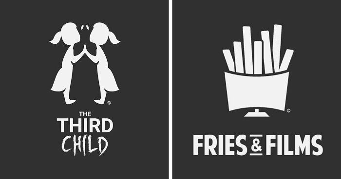
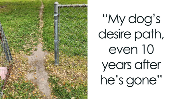
I am the third, last and only girl child and a lot younger than my two older brothers. However I see this picture as the third child as far as birth order is concerned, and it appears that he or she lacks any identity. It appears that he or she is just a part of the family but doesn't have any identifiable traits. They just are beige, uneventful, matter-of-fact people whereby the first twwo siblings have unique identities, personalities and traits. I see the third child as a male child being "squeeze out" by his or her two older siblings that are girls. He obviously is a little brother who is annoying and is treated like a mis-fit. He doesn't have anything in common with his older sisters except biology, whereby the sisters have lot's in common so they identify with one another but can't identify with him.
So, Gary Dimi Pohty is a graphic designer from India, who, several years ago, challenged himself to design a logo each day for… well, for nearly 4 years now.
Over that time, he’s created a slew of logos of varying design: minimalism, negative spaces, monochrome (or sometimes color) design, among a number of other techniques and styles.
But the cherry on top here is the “hidden” meaning in each logo—a creative way of expressing the idea of the design through the above mentioned techniques and styles.
https://www.instagram.com/p/BSovxpDl5dG/?utm_medium=copy_link&fbclid=IwAR1mW110we7gl-8i76xi-ft_YUU90sA-3nAsOpsTsnj9ThiA10_dBTqZD7o
Oh, I didn’t notice the egg until u pointed it out, so thx
Load More Replies...The ambitious idea to design a logo each day came from a very ambitious desire to simply become a better professional in the field, as explained Gary:
“To put it simply, I just wanted to be better at my skill. Instagram seemed to be the perfect place to do this because people from all over can freely interact with you and give you all kinds of valuable feedback on every logo posted every single day (best return on time invested).”
“Also, 4 years ago, I learned that to be a successful designer in this industry, you had to niche yourself and specialize in at least one design field. Logo design is my passion, so it naturally came to me to take up this challenge and to try to get better at it each day.”
I just concentrated on the picture, guessing what they are about. thought about an gynecologist on this one.
I don't follow. Americans pay fewer taxes compared to numerous other countries.
Load More Replies...So, how is this 3-year and [checks clock] 8-month journey treating Gary so far?
“Starting this challenge was the best decision I have ever made. I never imagined my work would be receiving so much love and support! I have not only made many amazing friends along the way, but have also been getting a lot of work inquiries on a regular basis.”
“During these 3 years, I have had the opportunity to meet and work with many wonderful clients from all over the world. The best thing in life is to do what you love to do the most and I am so thankful to God to be able to be doing just that.”
Is the Hoodie a food? or is a company that sells something like cake shaped like a hoodie? 🤔
A rose from a bunch of roses reaches high. The stem denotes the growth
Sounds like that guy from Harry Potter - horace slughorn - who turns into a chair to hide from people
Load More Replies..."This woman needs to sit down, we're in the middle of nowhere!" "What will we do, if she doesn't sit there's gonna be trouble... isn't there a chair man?" Enter the Incredible Chairman! "Did someone say Chairman???" *chairy theme song sounds*
Load More Replies...It looks like a logo for a TV series about corrupt corporate executives in the vein of The Sopranos/The Godfather maybe even with a little Breaking Bad into the mix, we have a winner here.
Besides Gary’s designs being the epiphany of creation—after all, doing this for over 3 years does require quite a bit of creativity to stay fresh—there’s also the question of discipline and being able to keep yourself going. So we asked Gary what pushes him to continue creating logos each and every day:
“One Logo a Day is no longer just a challenge for me, but a way of life. It has taught me that if you work hard each day and stay fiercely consistent, you can achieve ANYTHING in life. I have reached this far in design and want to keep pushing on because learning really never ends.”
“Also, I now use the same ‘one logo a day funda’ to achieve other goals in life as well. An example would be, I was obese for many years and finally managed to lose more than 25 pounds within 3 months last year just by ‘consistently’ sticking to my workouts and healthy eating habits each day.”
“I owe this to the consistent mindset of the One Logo a Day Challenge. Seeing results and progress due to consistent effort inspires me to keep going. I may even plan to start other similar challenges inspired by this one to address other passions I have in life, maybe like One Song a Day to get better at singing.”
the Speech: everyone's worst nightmare
Sounds posh, like after a nice meal. "Would everyone like tea or coffee in the beverage room?" Or hot choccy 😋
If this was a film/tv series/book I would watch or read it, sounds like a nice idea!
I'm gonna write a book about this, seems like a good book title
Even though logos may seem like a simple bit of graphic design, it’s far from it. And more so with the designs Gary makes:
“The most challenging part is to incorporate a hidden dual element within the design while maintaining logo functionality. I have to spend hours looking at and sketching various objects from all possible angles to finally see it. Sometimes, it even takes days, but there are also rare happy occasions where I find the solution within just a few seconds or minutes. I believe, like any other skill, consistent practice helps to make our process become better, quicker, and more efficient.”
I love this one. Hopefully, there's a brand called Monk soneday so it can be used.
There is! But is more meant for a Monkey logo. It sells skateboard clothes and accesories.
Load More Replies...I think i would prefer a sequel i cannot imagine someone else as monk!!
Load More Replies...I am sure whatever it is, he will get it straightened out.
Load More Replies...Tony Stark is not amuse, but the rest of the Avengers are LMAO hard now for sure.
As it was mentioned before, Gary has been doing this for years, and you can check it all out on his Instagram here. Or if you want more logo goodness, try this on for size.
But before you dash off, why not let us know what were some of your favorites in the comment section below!
It spells trap. Looks like the letter a is trapped in a box.
Load More Replies...I love all the work of Gary Dimi Pohty. So much imagination and skill !
That's really neat! And great for a business because it's an attention catcher- Takes you a second to see it!
The d and e are drawn to look like a spider. Like a black widow from a birds eye perspective
Load More Replies...Well you could always alter the design or make on that says kayak
Load More Replies...OK, maybe for Discovery or History Channel a reality tv about sanitation business people
5-star place. Killer view of a forest. I think there is a Great Wolf Lodge there as well.
Good concept for a horror movie, you know the so bad is good kind, low budget effects but great popular culture reception
For a gaming news site or a gaming controllers and accesories maker, and also a good pun, just divide game and bull, and add to bull S****
The "tent" created by the two elephants resembles the Taj Mahal; thus Indian
Load More Replies...It sure would be interesting to see a baboon fence!
Load More Replies...This design is just screaming tv opinion and political news also gives you The West Wing kind of vibe if this was for a drama tv
Yeah, i will see the movie for sure only for this logo, this artist is THAT good
Lol this reminds me of a game my mum plays with my dog, she says "wheeeeere's the burger?!" And throws it. My dog loves it!
This one has me stumped. Is it ok or a koala or something else entirely?
Is it supposed to spell anything, because I'm completely lost on what it's supposed to be.
I think it’s supposed to be a shovel and microphone in the m but don’t know why
Load More Replies...It's obviously a popsicle and a honey stick spoon, and the lettering is " 1m" like 3m but this company is called 1m

Sometimes, maybe 1 or 2 times a year, i'm asked to design a logo (not my job but can manage corel draw and photoshop) and these are very inspiring to me, to think beyond the name itself.
wow, I love when a logo don't need a title and therefor doesn't include one. That's why I did not like most of these. Also something whispers that author made some random logo ideas and then finished with a tittle (except for those where the whole idea contain a tittle itself). I mean, it's not bad but seeing some real life logos remade in same fashion would be way more intriguing.


 No fees, cancel anytime


")
")


