Get Premium
Dark mode theme is available exclusively for premium users. Learn more about the benefits of subscribing.
No fees, cancel anytime.

 Dark Mode Ad-Free Browsing Unlimited Content
 Ad-Free Browsing Unlimited Content Dark Mode
Join 1.2 million Panda readers who get the best art, memes, and fun stories every week!
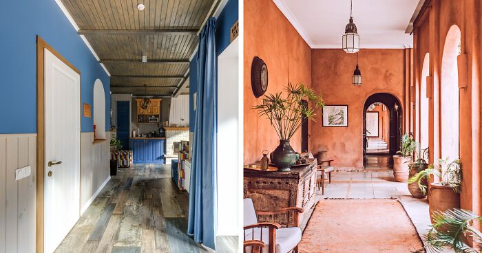
From all seasons, autumn stands as a masterpiece painted with the most enchanting hues nature offers. As the days gracefully surrender to cooler nights, the world transforms into a vibrant canvas of warmth. As a testament to the beauty of change, the Soft Autumn color palette is a symphony of muted hues and earthy tones that effortlessly transform any interior into a haven of comfort.
Imagine a living room adorned in the colors of autumn, where boho decor meets the gentle caress of softness, creating a welcoming look that resonates with the golden glow of the season. Wonderful sight, isn’t it?
In this guide, discover the endless possibilities of incorporating the Soft Autumn palette into your home. Together, we’ll explore popular palettes like True and Deep Autumn while keeping the Soft Autumn color palette as the primary focus. Additionally, we’ll share six Soft Autumn palettes, covering their purpose and origin.
Hence, if you don’t know how to adapt fall colors to your interior design, we can assure you that by the end of this article, you will. Frankly, it doesn’t matter how accurate you are with colors. We promise you’ll be satisfied to dig deeper into the topic by trying some styling tips!
Soft Autumn is a color tone that is warm and muted, meaning that the colors have yellow undertones and aren’t too bright or clear. As one of the three autumn subtypes, the Soft Autumn is inspired by the soft colors of the fall season, including dense, rich, non-vibrant, warm shades with a soft, cozy, and elegant quality.
To better grasp the nuances of Soft Autumn, exploring two other popular autumn color palettes might be helpful. The other two fall-inspired color schemes are:
Because all autumn palettes are pretty similar, we almost hear you saying, “So, what is a True Autumn color palette, then?” Essentially, it’s the original autumn subtype with yellow undertones. This palette is vibrant, bright, clear, and has a lot of depth and richness. It includes colors like Golden Yellow, Tobacco Brown, Burnt Orange, Salmon, Ochre, Rosemary shade 448 U, Copper, and Plum.
The Deep Autumn color palette is the darkest and most intense of the three. It includes rich, saturated colors and warm undertones. Unlike the True Autumn, this palette includes some cool colors alongside black and white. The Dark Autumn color palette reflects the depth of the autumn season, offering shades like Rust, Olive Green, Rustic Brown, Burgundy, Spicy Mustard, Deep Teal, Cranberry, and Terra Cotta.
The Soft Autumn color palette is the gentlest and most subdued among the autumn shades. It features muted primary colors and warm secondary tones. This means that the colors within the Soft Autumn palette aren’t too bright or vivid and are comparatively less warm than the colors found in other autumn palettes. The Soft Autumn palette includes neutrals, warm greens, warm browns, pinky reds, and bluish-greens. They are soft, light, and warm but not too dense or rich.
We invite you to check our curated Soft Autumn color palettes below! They’re organized into six palettes, each with five shades, linked to the Pantone Fashion, Home + Interiors (FHI) system. It provides a common language for communicating colors across different industries and applications, making finding the perfect hue for your interior easier than ever!
Classic and neutral colors play a crucial role in the Soft Autumn palette. The harmonious neutrals create a subtle base that enhances the beauty of the warm autumnal tones. The overall effect is peaceful and refined, with a touch of excitement. Here are some of our top pics:
Warm green tones present the earthy and comforting aesthetic of the season. These colors blend seamlessly with the Soft Autumn palette, creating a soothing and inviting atmosphere. We suggest combining them with mint green for a cooler touch.

Warm brown tones and a cozy, grounded atmosphere are a match! These soft, warm shades create a harmonious and inviting aesthetic, creating a timeless accent and a perfect atmosphere.
The pinky-red tones bring a sense of warmth and sophistication to the overall color scheme. Together, these pinky-red hues create a balanced and nuanced range, capturing the romantic and cozy mood of the season.
The blue tones bring a sense of calm and depth, complementing the soft Autumn color palette’s overall warm and muted aesthetic. Together, these blue hues contribute to a balanced and calming color scheme, adding a touch of coolness and contrast to the warm tones of this season.
The bluish-green tones bring a refreshing and nature-inspired element to the palette. Together, these bluish-green hues contribute to a balanced and soothing color scheme, capturing the understated beauty of the season.
Colors can be distinguished using three main attributes: hue, value, and chroma. In color theory, hue describes not specific shades but rather color families. There are 12 hue-based color families, each corresponding to one of the 12 colors on the color wheel.
Value defines a color by its proximity to white or black, indicating the lightness or darkness of the color. Speaking further, chroma represents saturation, indicating the purity of the color. To choose the most appropriate Soft Autumn colors for your interior, let’s describe their attributes in more detail.
The hue of the Soft Autumn palette is warm, meaning that the colors have yellow undertones and aren’t too cool or blue. These colors (except the neutrals) belong to green, red, and blue families. Neutrals have no hue or a very low one, meaning that primary or secondary colors don’t influence them.
The color value of Soft Autumn is lower than Deep Autumn’s, which is medium-dark, and higher than True Autumn’s, which is medium. The Soft Autumn color value is light-medium, meaning the colors are neither too light nor too dark but relatively balanced and gentle.
The chroma is the degree of brightness or dullness of the colors that comprise the palette. The Soft Autumn color palette has a low chroma, meaning the colors are soft, dusty, and delicate. The neutrals in the palette are achromatic, meaning they lack distinct chromatic characteristics.
Image credit: Ryutaro Tsukata
While delving into the purpose of the Autumn color palette, it’s worth reviewing its origin. This is where the usage of the Soft Autumn palette actually comes from.
One of the possible theories for the palette’s origins is based on the natural phenomenon of the fall season. As the days get shorter and colder, the green pigment in the leaves breaks down, revealing the other pigments that produce the warm, rich, and earthy colors that we associate with autumn, such as yellow, orange, red, and brown.
Another concept is based on the history and culture of different regions and countries. For example, in Japan, the autumn color palette is influenced by the traditional art and aesthetics of the country, such as the ukiyo-e paintings, the kimono fabrics, and the koyo (autumn foliage viewing) festivals.
A third explanation is based on the personal color analysis system developed in the 1980s by a fashion consultant and author Carole Jackson. She divided people into seasonal types based on skin tone, hair color, and eye color, assigning each type a specific color palette that would best complement and enhance their appearance.
Image credit: Max Rahubovskiy
When looking for autumn color palettes, you’ll soon learn that they are typically used for styling clothing, makeup, hair, and accessories. Despite this fact, Soft Autumn can be excellently adapted to interior design.
Matched with other elements in the room, these colors can create a warm, soothing, and harmonious atmosphere in any living space. The Soft Autumn palette can be used for paint colors, furniture, curtains, rugs, pillows, blankets, and other accessories and home decor items.
Image credit: bluespringshome
Image credit: Max Rahubovskiy
You can also add some natural elements, such as wood, stone, plants, and flowers, to bring warmth and texture to your home.
Image credit: Max Rahubovskiy
While decorating, don’t forget to add candles, lamps, and fairy lights to create a soft, romantic, and autumnal mood.

Image credit: Karolina Grabowska
Soft Autumn colors can bring warmth and sophistication to any home interior. If you seek to create a cozy and inviting atmosphere, apply these tips and discover how to infuse your home with the rich, earthy tones that define the soft, autumnal aesthetic.
Image credit: _halcyonhouse
Elevate your soft autumn-inspired interior by introducing patterns and prints. Consider incorporating throw pillows, area rugs, or curtains with subtle floral motifs, geometric designs, or gentle swirls that resonate with the muted tones of Soft Autumn.

Image credit: rebeccarebouche
The patterns add depth and visual interest to your space while maintaining the overall tranquility associated with this seasonal palette. Experiment with various textures and designs to strike the perfect balance between cohesion and individuality, allowing your home to reflect the nuanced beauty of the Soft Autumn color scheme.

Image credit: hdls_
To enhance the timeless allure of Soft Autumn colors in your home, turn your attention to the strategic integration of metal and wood accessories. Opt for metallic finishes in warm tones such as bronze, copper, or gold to add a touch of luxury and contrast against the soft, earthy hues.
Image credit: Lina Kivaka
Consider incorporating wooden elements through furniture, decor, or accent walls, introducing a natural warmth that complements the autumn-inspired palette. The accessories like a metallic-framed mirror or a wooden coffee table can enrich your space’s visual appeal and contribute to a harmonious blend of nature-inspired tones and modernity.
Let’s wrap up our comprehensive guide by addressing some frequently asked questions. Here, we’ll address your most pressing questions and provide answers, ensuring your journey to create a warm, inviting home is as seamless and delightful as the Soft Autumn color palette.
The worst shades for Soft Autumn’s interior design are those that are bright, very dark, and cool. These colors will clash with the Soft Autumn palette’s warm, muted, and delicate colors and create a disharmonious and unflattering effect. Instead, use warm, muted, and light-medium shades. Those will complement the Soft Autumn palette and create a cozy, inviting, and elegant effect.
If you want to match some colorful shades to the Soft Autumn palette, ensure they are warm, muted, and not too bright or cool. For a more colorful touch, you can use colors like teal, mustard, red, warm purple, or dusty rose. The key is to avoid colors that are too bright, cool, or clear, such as lime green, lavender, or crisp white.
3Kviews
Share on FacebookIf this is matching colors to someone's personal palette, are they obligated to only have significant others who have the same coloration, or do they have to live in a differently coloured wing of the house?
If this is matching colors to someone's personal palette, are they obligated to only have significant others who have the same coloration, or do they have to live in a differently coloured wing of the house?


 No fees, cancel anytime


9
1