Get Premium
Dark mode theme is available exclusively for premium users. Learn more about the benefits of subscribing.
No fees, cancel anytime.

 Dark Mode Ad-Free Browsing Unlimited Content
 Ad-Free Browsing Unlimited Content Dark Mode
Join 1.2 million Panda readers who get the best art, memes, and fun stories every week!
Color theory is one of the most essential elements of interior design and art. According toMental Health America, your home’s color spectrum can positively impact your mental health and well-being by controlling your mood and emotions.
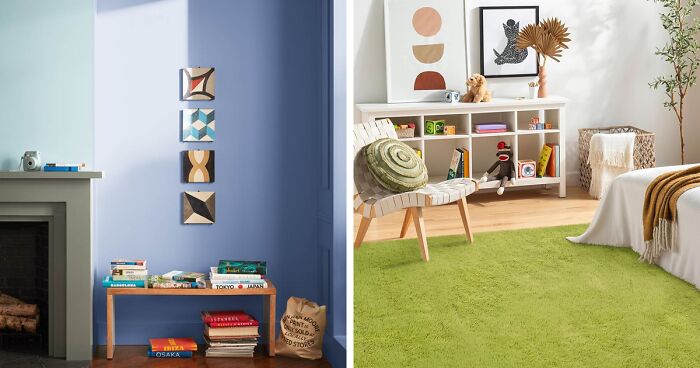
There are many ways we categorize colors, one being the color temperature. We can conveniently organize them from warm to cool. The latest trends show that interior design widely explores cool tone colors. Cool colors are associated with water, sky, and nature, and with the fast-paced life we’re currently living, cool colors in our home can make us feel much more calm and relaxed.

Image credit: benjaminmoore
It comes as no surprise that shades like blue were chosen as the color of 2024 by many top interior-related brands. Leading people in paint colors likeSherwin-Williams released breezy Upward, while Benjamin Moore—Blue Nova.
Another paint brand, Valspar, has introduced Renew Blue. It was inspired by natural elements such as fog, mist, and glacier lakes, as stated by their Director of Color Marketing perCISION PR Newswire.
Interior designer Abbey Koplovitz ofAbbeyK, Inc., confirmed to Business Insider that the blue color trend is here to stay: “It’s really important to think about what colors make you feel good in a space, and denim blue and soft teal are making people comfortable at home right now.”
We encourage you to try using cool colors to create top-notch and calming spaces, from living rooms to bathrooms. If you’re new to the world of colors, are confused with their definitions, or don’t know how to use cool colors in your home, read on, and we’ll go through everything—from color theory and palettes to decorating.
What is a cool color definition? These are the hues found on the blue side of the color wheel. The wheel or the circle of hues presents relationships between primary, secondary, and tertiary colors. Cool colors on the color wheel include blues, greens, purples, and variations of those three. As green is secondary, purple is a tertiary color, so blue is the only primary color within the cool side of the color wheel.
Cool tone colors can have different undertones, depending on the amount of red, yellow, or blue color they contain. For instance, a cool red with blue undertones differs from a warm red with yellow. To identify if the tone is warmer or cooler, look at their position on the color wheel and their dominant temperature.
As they are associated with relaxation and calmness, cool colors can create a peaceful mood, making an interior look more spacious at the same time. They are a perfect match for kitchens, living rooms, andbedrooms. However, too many cool colors can also create a feeling of coldness. To solve that, mix in some warm accents.

Cool hues can provide a sense of peace and relaxation, while warm colors can create a cozy and stimulating atmosphere. Warm colors consist of oranges, reds, yellows, and variations of those three hues. Red and yellow are primary colors, and orange is a secondary color—you’ll find them on a red side of the color wheel.
There is a significant difference between warm and cool colors. Warm tones tend to advance, while cool tones tend to recede. This means warm tones can make a space look smaller and more intimate. In contrast, cooler tones can make the interior look larger and less personal.
The theory behind color temperature is simple: warm colors have a higher temperature, while cool ones have a lower one. The temperature is measured according to its relation to a standard reference point of white light. The temperature of warm hues is above 5000 K, while cool colors are below 5000 K.
Not sure you want a warm or cool color interior? Warm interiors look lively and cozy, stimulating the appetite and the mood. That’s why warm colors are often used in designing dining rooms, children’s rooms, family rooms, and bedrooms.
On the other hand, too many warm hues can also create a feeling of agitation, anger, or anxiety. You can balance it by combining warm and cool accents or contrast them with complementary colors.
Let’s explore the category of cool tone colors, which have a lower temperature than warmer shades. To get a deeper understanding, we should look at some color palettes and how they can be used to design the interior. Using some of the most popular hues, we curated a palette with cool undertone colors.
Classic Blue 19-4052 is a medium-dark cool blue shade chosen as the Pantone Color of the Year 2020. This blue has a cool undertone and a lower color temperature (approx. 4500 K), which means it looks as though it recedes in the interior and creates an impression of spaciousness.
Timeless and elegant Classic Blue evokes a sense of serene confidence. According toColor Psychology, basic blue is considered a non-aggressive and mentally soothing color. That’s the reason it perfectly suits various materials and can be paired with metallic decor, such as silver-blue.
Pro tip: Choose the right shade of blue for your room’s orientation. If your room faces north or east, it might lack warm natural light, so you can use a blue with warm undertones. If your room faces south or west, it might receive more sunlight, so you can use a blue with cool undertones.
Turquoise 15-5519 is a blue-green shade chosen as the Pantone Color of the Year 2010. It has a cool undertone and a lower color temperature (approx. 4500 K), making it an excellent choice for creating a lively and refreshing interior.
It’s a vibrant, cheerful color that symbolizes healing and hope. If you want a serene focal point and a splash of color in your space, opt for Turquoise rugs or consider covering your walls with Turquoise paints for a striking backdrop.
Cerulean 15-4020 is a medium-light cyan-blue shade chosen as the Pantone Color of the Year in 2000. Associated with the sky and sea, the serene shade has a cool undertone and a low color temperature (approx. 4500 K).
Baby blue Cerulean can be used in interior design to create a calm and relaxing mood or complement other colors like neutrals, pastels, or brights. To add more depth, mix this universal shade with patterned prints, for example, stripped bed linen.
Greenery 15-0343 is a yellow-green shade that evokes the first days of spring when nature’s greens revive and renew. This Pantone Color of the year 2017 has a warm undertone and temperature (approx. 5700 K), making it ideal for adding natural light accents and bringing the feeling of cleanliness to a room.
As a dominant color in nature, versatile and trans-seasonal Greenery is regarded as the most restful and relaxing color for the human eye (viaColor Psychology). Create an energetic, lively focal point by placing exceptional Greenery carpet. You can also bring this color to your place with plants.
Pro tip. The green color is best for well-lit spaces. It may reflect or absorb too much light, creating a glare or a dull effect, unless you use lighter or softer greens, such as mint.
Emerald 17-5641 is a lush green shade with a cool undertone and medium temperature (approx. 5700 K), expressing edgy elegance and sophistication. As a Pantone Color of the Year 2013, it proves how long a hue can stay relevant in home decor.
Emerald can be reasonably awarded as the classy shade that evokes beauty, growth, and prosperity. This is one of the colors that makes a statement and is a perfect fit for painting the walls. Pair them with brown velvet pillows to achieve the impression of luxury.
Airy and light Green Ash 13-0117 belongs to the Pantone Spring/Summer 2023 Color Palette. It has a cool undertone and a medium color temperature (approx. 5700 K) that evokes a sense of tranquility you get in nature. That’s not so surprising, considering that this color resembles mint leaves.
Soothing Green Ash is suitable for decorating recreation areas like bedrooms or bathrooms. Incorporate the set of greenish bath accessories for a bright but subtle pop of color.
This radiant purple Ultra Violet 18-3838 deservedly earned a spot at the Pantone Color of the Year 2018. It has a cool undertone and a medium color temperature (approx. 5700 K), making it perfect to complement warm and neutral colors.
From a physiological perspective, purple has a calming effect on both the mind and body (perColor Psychology). Due to the depth and lushness of this violet shade, it’s often associated with luxury, power, dignity, and mysticism. If you seek to design a sophisticated, luxurious, yet soft interior, choose violet pillows and match them with natural wood and warm tones.
Pro tip. A fully violet interior may create a monotonous, overwhelming feeling. Opt for tiny home decor details and mix various purple shades to create variety.
Radiant Orchid 18-3224 is lush purple, the Pantone Color of the Year 2014. This timeless, luxurious shade evokes beauty, growth, and prosperity. It has a cool undertone and a medium color temperature (approx. 5700 K).
Radiant Orchid represents a mixture of joy and imagination, creating a harmonious and refined atmosphere. When used in interior design, this violet can create a striking and sophisticated look. Feel free to match the purple sofa with the neutral, modern interior.
One more example from the Pantone Spring/Summer 2023 Color Palette—soft and romantic Lavender 15-3817. Lavender shades will stay popular in 2024, as they are “excellent calming colors that may increase rest and relaxation,” according to architectural color consultant and interior designer Paula Kennedy ofTimeless Kitchen Design LLC (viaBusiness Insider).
Ethereal and weightless shade has a cool undertone and a medium color temperature (approx. 5700 K). It gives a soothing sense of nature, calm, and beauty. Speaking of the use in the interior, the Lavender is the perfect color to make a statement. If this is your case, look how chick this cushion with an ottoman seems in the modern interior.
Whether you want to create a color scheme for your bathroom or sunroom, you must understand some basic principles. Let’s explore how cool colors look when combined, how to create a color palette with cool hues, and what effects are created by mixing different cool colors.
Can’t decide to decorate with green or blue? Pick them both! The natural and refreshing combination ofClassic Blue 19-4052 and Green Ash 13-0117 evokes the feeling of being outdoors. You can add this touch to your interior by using freshly green-blue pillows.
Royal Purple 19-3642 TPX and Cool Gray 10C mix is one of the most cohesive, sophisticated, and elegant combinations possible. Even tiny deets like a purple-gray shower curtain add drama to your bath. You can also use this luxury combination for offices, studios, or kitchens.
Another color combination of Turquoise 15-5519 TCX andCoral 16-1539 combination gives a bright and cheerful mood, making it a well-aimed choice for warm gray interiors. Opt for colorful artwork to infuse your space with fun and adventure.
Thinking of choosing colors that have different temperatures? Feel free to unlock your inner colorist. You can definitely use warm colors and combine them with cool ones while decorating. Enjoy mixing together various shades and their saturations to create a matching color palette for your home interior.
Of course, combining warm and cool colors can be such a headache, particularly when trying to find the right combination of shades that work well together. Here are some ideas and tips on how to mix them.
Classic and proven guidelines of a 60-30-10 ratio are needed to create a pleasing color scheme. The rule is to use one color as a dominant 60% of the space, a secondary color as 30%, and an accent color as 10%.
For instance, you can use a cool color like blue as the dominant for the walls, a warm beige as the secondary color for the furniture, and a pop of orange as the accent color for the accessories.

As complementary colors are the opposite shades on the color wheel, they create a contrast between themselves. If you prefer to make the interior stand out, opt for red and green, blue and orange, or purple and yellow.
However, you should use them sparingly and carefully, as they may create a clash or tension. For example, if you pick up cool green as the primary color for the room, add a touch of warm red in the form of a vase, a lamp, or a painting.

Analogous colors are next to each other on the color wheel, such as blue and green, yellow and orange, or red and purple. All those pairs share a common hue, making them ideal combinations for harmonious and soothing effects.
If it’s too dull or monotonous for your rebellious soul, add some variety and contrast. For example, pick up orange as the base and add a shade of yellow with some greens. Opt for tangerine bath curtains or flowering plants.

As neutral colors don’t belong to the primary or secondary color categories, they aren’t part of the color wheel. This is because they have no hue; in other words, they lack a color. Neutrals are achromatic shades, including white, black, gray, brown, or beige.
Neutrals act as a bridge or a buffer between warm and cool undertone colors, also helping to tone down or enhance the intensity of other colors. Use a cool greige shade as the room’s backdrop and add warm colors such as pink, coral, or gold in artwork, furniture, or lighting.
It’s time to wrap it all up and answer the most frequently asked questions. Whether it’s about balancing color schemes or choosing the right undertone, we have you covered.
Regarding the latest design trends, one of the hottest cool shades is blue, at least for 2024. Another trend indicates that cool neutrals are still in high demand and considered fashionable. These colors include cool gray, beige, greige, and different shades of brown. In addition, the combo of black and white always remains classic.
While many colors can be considered calming, probably everyone agrees that blue water is the most soothing for human perception. Except for blue, other calming colors are green, gray, lavender, violet, pink, yellow, and white.
White belongs to achromatic neutrals, as it has no hue and specific wavelength of light. However, it can have different temperatures and warm or cool undertones. These undertones characterize the mood of a particular white.
Subtle warm white (approx. 2000K and 3000K) has a yellowish undertone and creates a cozy sensation. In contrast, cool white (approx. 3100K and 4500K) emphasizes the spaciousness and airiness of the room. You can tell the difference immediately between these whites.


 No fees, cancel anytime


-5
0