Get Premium
Dark mode theme is available exclusively for premium users. Learn more about the benefits of subscribing.
No fees, cancel anytime.

 Dark Mode Ad-Free Browsing Unlimited Content
 Ad-Free Browsing Unlimited Content Dark Mode
Join 1.2 million Panda readers who get the best art, memes, and fun stories every week!
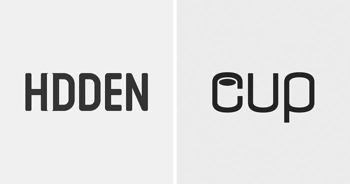
Creating a beautiful and clever logo is hard. But with a master's degree in design and 15 years of experience in the industry, Mustafa Ömerli has perfectly mastered the art of representing ideas. To show off his skills, Mustafa has been creating typography logos for random words. Parent. Tunnel. Disability. Whatever he's portraying, Mustafa seems to always pinpoint the essence of that particular word and it's truly captivating.
More info: omerli.co | Instagram
This post may include affiliate links.
"With these typography logos, I'm trying to show examples of what I believe is good design," Mustafa from Istanbul, Turkey, told Bored Panda. "It's all about function, aesthetics, and clever ideas."
His motto is 'positive mind, negative space.' "In my works, you can feel the positivity and see the negative space."
Web developer and graphic designer James George said that viewers like images with negative space because they don’t have to work too hard to get it: "A healthy balance between great negative space and intrigue will entice the viewer to spend extra time looking at [a] design."
"Your viewers will be more likely to remember the design’s intended message via the use of creative imagery," George added.
"When I'm creating something like this, my mind is working spontaneously but my design process is carefully planned," Mustafa said. "My approach to this typography logo project usually starts when I pick a word. I then try to truly understand its meaning. After that, I just come up with an idea to express this meaning."
For more interesting logo designs, check out Bored Panda's earlier posts about negative space and hidden symbols.
This actually took me a few seconds because in my country (Norway), we have three extra letters and this one looks a lot like the last one. It could have been written in a fancy way.
These are all so extraordinarily simple that you truly have to be very good at what you are doing in order to come up with them.
I can't begin to imagine what this word suppose to be. Someone please help.
LOL I thought it was a little sword pointing downwards at first. "Don't mess with my daughter..."
So funny you said that. I heard the song, thought the comment, then read your comment.
Load More Replies...The Mozart one is my Fav but this is a close second. Subtle but impactful at the same time.
Who is this? I don’t get it, can someone please explain?
To avoid confusion I think those arms should be placed slightly higer, if you know what I mean ;)
I thought of the spring that bounces up and down and couldn't figure out what this meant for a good 2 minutes.
since he died he is taking back all of his music. He's dis-composing...
Reading this without my glasses so I had to look closer to see which letters were in/out of focus
Her history is actually quite interesting. https://en.m.wikipedia.org/wiki/Ada_Lovelace

These are brilliant! I had to pause for a second to get the more subtle ones but that made it all the more interesting. Excellent work- more like this please BP!
They’re all really nice and clever, but it feels like he thought of the image first and then a word where it could be used. Normal company names aren’t always that clear cut.
I like this content. It might not be high energy concepts or anything but this is what we come here for, is it not? Cool art from regular people and a little commentary.
Nice work! F1RST is actually a surf shop here in Miami, owned by some friends.
Been a graphic designer for years. A few are OK. Some are straight out of 1975. Also it's easy to make a logo when you are choosing the word to use like 'orbit' or 'fold' or 'vibrate'. The talent comes in when you are trying to design a logo or wordmark for an actual company.
However, there are quite a few I didn't get since I'm not from his culture or part of the world.


 No fees, cancel anytime


")
")