Get Premium
Dark mode theme is available exclusively for premium users. Learn more about the benefits of subscribing.
No fees, cancel anytime.

 Dark Mode Ad-Free Browsing Unlimited Content
 Ad-Free Browsing Unlimited Content Dark Mode
Join 1.2 million Panda readers who get the best art, memes, and fun stories every week!
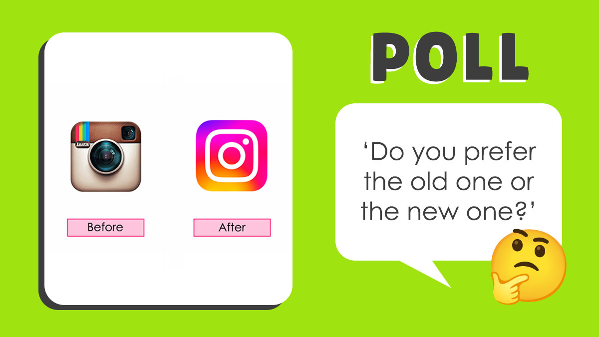
Many brands have gone for redesigning their logos for various reasons, including targeting a new audience, staying relevant, or achieving a modern look. There are many logos that we can recognize instantly and some others have been constantly changing. Some redesigns look very similar to the old ones, whereas others are unrecognizable. In this poll, there are 26 old and new versions of popular brand logos and you get to decide which ones look better.
Time to vote!
This post may include affiliate links.
People might be confused on this one. The "after" is the both the old AND the new logo, originally used from 1968-1999, then reintroduced in 2020.
Even the "old" one is maybe 15 years old at max. Back in 90's it looked different though
From a design point of view, the old logo does not fulfill basic logo design rules. A logo should work, no matter how big or small it is displayed. The knight and horse are way too intricate. While it's prettier and more unique than the new one, it would be hell to put it in an small affiliate banner for example. Would just be a black smudge.
Every time I see the new one, I think of the Nine Inch Nails logo.
Time to update this one, BP. Pepsi phased out that "new" logo last year.
They need to put more effort into the product, and less into the branding.
I was an English major and I have an English degree, and I normally DGAF about spelling/punctuation/capitalization, because no one loves a pedant. However, the use of all lowercase letters in the "new" logo looks absolutely hideous, because it actually literally reads as an entirely different thing; now it looks more like a Muppet like Elmo saying "us is open!" when someone is walking into the Muppet Restaurant rather than the acronym for the United States.
Well, there's only 4 people still alive on the entire planet that are old enough to remember the "before' logo, as it was last used in 1913. While the "after" logo, introduced in 2013, is just a variation of the famous logo they've been using for decades.
It would be kinda neat to bring back the old one on special edition trucks.
Seeing the new logo is comparable to putting on a new prescription pair of glasses : it's in focus now 🤓
The new one always reminds me of a washing instructions label. Do not iron or something.

Came here to say this. The "Fanta" one particularly annoyed me
Load More Replies...All the new ones are so flat and lacking personality. Unless the old logos are just overly complex, like Levi's, the rebrands are boring.
You really don’t get just how successful the Jaguar rebranding has become. It is absolutely viral and is getting more attention than they could have dreamed.
A boomer observation: Rebranding makes no sense to me, if you have had success with your product, why change it's signature? If you haven't, or the the sales have dropped significantly, you should be looking at why. Rebrand has NOTHING to do with it. The Detroit 3 are a prime example of this. "Oh...our small cars suck, rename them". Toyota and Honda have eaten your lunch not because they have a snazzy ad line or bitchin' logo, but because if they produce a bad model they refine and re-engineer it for success. The Accord and Camry are names that have never changed in decades because they are the mark of quality through dedication to problem solving and excellence.
Brand logo has to fit image. Rich customers - their market- can choose a brand, based purely on this.
Load More Replies...hmm my response is whether it's clear what it is. If it's hard to read or not clearly related to the product, it has failed.


 No fees, cancel anytime


")
")


