Get Premium
Dark mode theme is available exclusively for premium users. Learn more about the benefits of subscribing.
No fees, cancel anytime.

 Dark Mode Ad-Free Browsing Unlimited Content
 Ad-Free Browsing Unlimited Content Dark Mode
Join 1.2 million Panda readers who get the best art, memes, and fun stories every week!
35submissions
Finished
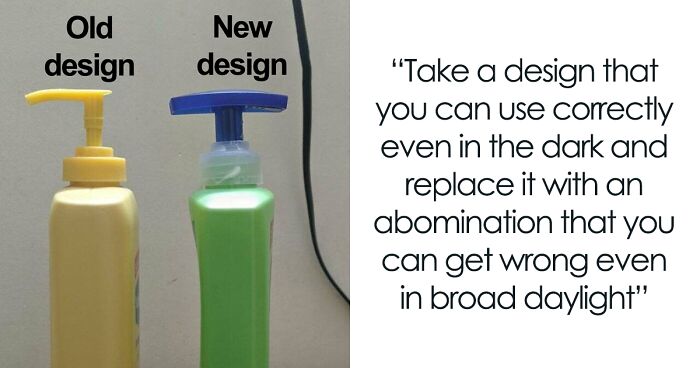
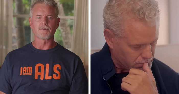
We get used to seeing big-name brands like Pringles or Warner Bros everywhere. Like it or not, we form deep and even emotional ties with their qualities, logos, and characteristics. So when these companies decide to shake things up and change their "face" with a great brand refresh, the public takes notice. And since the stakes are this high, an obvious step in the wrong direction fires up our inner critic and almost begs us to poke fun at the results.
The margin for error is thin when it comes to redesigns, but it’s not only brands that get impacted by the obvious flaws designers didn’t pick up from the start. From products to artwork to our favorite animated shows, some updates simply go awry. In fact, they have even inspired one subreddit to go on a quest to shed light on some of the most unfortunate ones.
Aptly titled 'Crappy Redesign', this online community prides itself on sharing only the cream-of-the-crop examples of terrible changes in our favorite brands — and they mercilessly shame them online. Below, we have gathered some of the best cases from the community to share with you all. So continue scrolling, upvote the ones you loved hating most and let us know what you think of them in the comments!
Psst! If you're in the mood for some more poor design madness, check out our earlier pieces here, here, and here.
This post may include affiliate links.


 No fees, cancel anytime


")
")


