Get Premium
Dark mode theme is available exclusively for premium users. Learn more about the benefits of subscribing.
No fees, cancel anytime.

 Dark Mode Ad-Free Browsing Unlimited Content
 Ad-Free Browsing Unlimited Content Dark Mode
Join 1.2 million Panda readers who get the best art, memes, and fun stories every week!
Think of some great designs of the modern era. Like iPhone, Tetra Pak, Post-It, Zippo, the list is endless. How would you describe it? Simple, smart, timeless, appealing, intriguing, engaging, well, basically everything but what you’re about to see in this post.
Because we’re about to dive into the collection of pics that put design to shame. Whether it’s a product, window, furniture, interior, poster design, you name it, they all have some pretty bad examples they would much rather forget.
So without further ado I leave the stage to a bunch of aesthetic apocalypses from this amusing corner of Reddit that will make you appreciate whatever it is that you have at home, even that old broken chair that’s barely alive, because it could be worse. Worse squared.
Psst! After you’re done, treat yourself with more epic design fails from our previous posts here, here and here.
This post may include affiliate links.
The idea of a bad design is somewhat universal. It looks awful, is utterly useless and hard to use. But if a product is not aesthetically pleasing, can we really dub it a bad design? After all, nothing is perfect (not even an iPhone, dear Steve) so some flaws should be tolerated.
Well, let’s take a look at what are the features of bad design and how can we spot one from meters away. First off, the design should be self-explanatory and intuitive. Also known as a customer-friendly trait, it’s something we all expect from apps, websites and so on. But the same rule applies to gadgets, devices, etc. Too many unnecessary features distract the consumer and render the product virtually unusable.
To be more precise, let's look at some examples. Oslo Opera House Porsgrund coffee cups have made headlines for their distinctive design and serious boiling hazard. The unique design of the handles forces you to grip a small tab protruding from the top of the cup. There’s a small groove excavated halfway, meaning every time you take a sip or hold the cup, you come very close to some-degree burn.
Back in 2010, an Indian cell phone startup called LAVA decided to introduce a revolutionary new product. It was probably one of the few mobile phone inventions that nobody used. The company decided to invent their own special way of typing, and installed the dual typing keyboard into their LAVA B5 which made little sense. Turned out that none of the consumers were willing to relearn such a basic thing as typing, surprise surprise!
Another historical fail in the product design hall of shame is this distinctive vehicle made by the Reliant Motor Company produced in 1973. The concept of driving was so revolutionized that the company removed a set of wheels. The result was The Reliant Robin, which became the first mass-produced three-wheeled car. And boy, it’s ugly.
One time in fashion that I wont miss and I hope never comes back- Bedazzled everything.
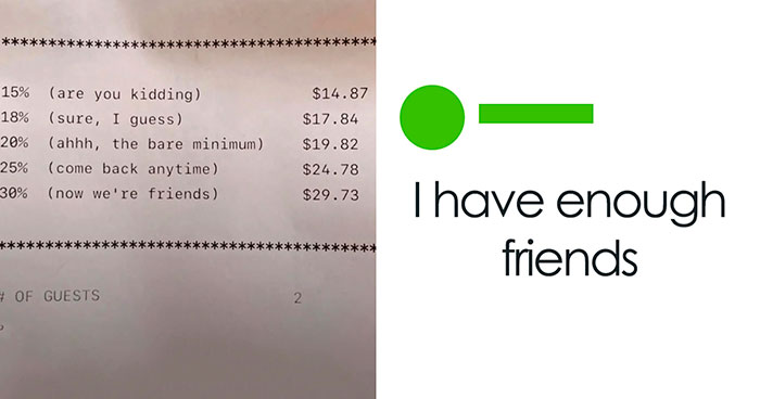
Why didn't they just put the bowl in the word pure? Now their the puke restaurant
That doesn't look like design to me, as I don't see any rails...
What is going on here?! Bad photoshop, floating feet, NOT a laptop, and her arms and hands? What is she doing there? Making my brain hurt.
I've seen these commercials...the arm hair is just the beginning. They are deeply disturbing.
i have an old grandpa with knee surgery......don't torture them more
What are those super large islands above Australia? That area is also a disaster.
Kick off your shoes and enjoy the soft fragrant plastic between your toes
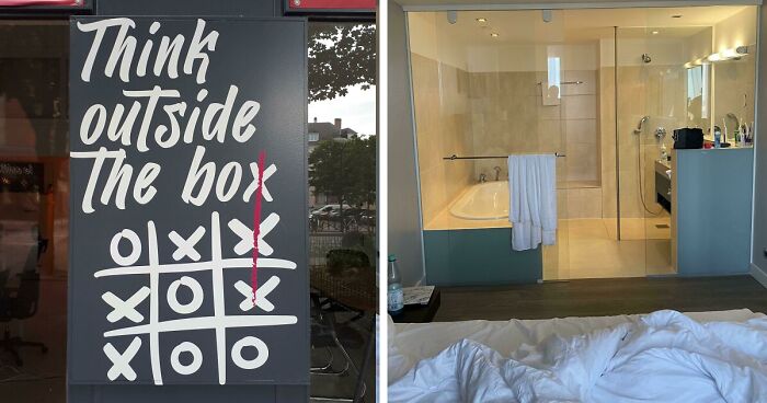
whilst i agree with the comment there is no indication that this is a women's bathroom or even any bathroom for that matter
Went to Iceland for a relaxing holiday, had a nervous breakdown five minutes after checking into the hotel
You know, this is probably because of idiots opening it up and fooling around. The same thing happened not too long after we got public defibrillators in my country. They had to install locks and you must call a number and give the location to get the code because idiots were opening them up and deliberately breaking them just because they could.
When I was looking for a home to purchase, the bathroom doors was this. I thought, "WHY"? Not only that, the owner was there cleaning with so much Pine Sol that I wondered what odor was she trying to hide. For those that may not know what Pine Sol is, it's a cleaner that smells way too much like pine. It's almost nauseating. So yup, that home was a big no-no.
Also the girl looking downwards all forlorn like she pissed her pants..
These must be labeled incorrectly. The temperature rise is more extreme near the equator, and it doesn't make sense for there to be a bunch of "5.0°+" slightly overlapping with "None."
That's probably somewhere aoutsode of a lab. If you ever get doused in a chemical substance, you have a shower nearby to rinse it of. Might not be a design fail.

What the hell does this photoplasty have to do with wedding photography catfishing?
You're expecting a lot for copy and pasted content.
Load More Replies...Can we had the google link to this page to this compilation? I came here to read a story about being catfished by a photographer...
What the hell does this photoplasty have to do with wedding photography catfishing?
You're expecting a lot for copy and pasted content.
Load More Replies...Can we had the google link to this page to this compilation? I came here to read a story about being catfished by a photographer...


 No fees, cancel anytime


")


")