Get Premium
Dark mode theme is available exclusively for premium users. Learn more about the benefits of subscribing.
No fees, cancel anytime.

 Dark Mode Ad-Free Browsing Unlimited Content
 Ad-Free Browsing Unlimited Content Dark Mode
Join 1.2 million Panda readers who get the best art, memes, and fun stories every week!
Logo design is deceptive. You’d think a tiny, quite minimal thing such as a logo would be easy to create using MS Paint—and while that is quite possible, if you have enough dedication to using simplistic tools—it is an entire science in and of itself.
Besides all of the artistic prowess and tools (and the skills to use those tools) you need to even start a logo design, there’s also things like significations and the meanings and the connotations and everything else that the logo represents explicitly and implicitly. And you gotta do all of it to have a significantly memorable logo.
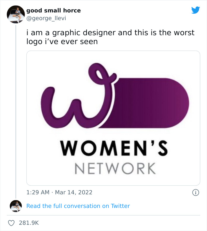
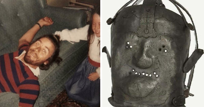
Image source: george_llevi
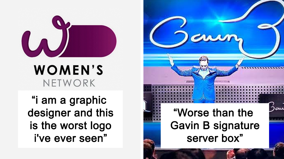
But there are also times when someone says “screw that” and creates a logo that causes an uproar. Like that one for the Women’s Network that, despite quite literally being dedicated to the concept of womanhood, has a huge symbol of masculinity kinda-sorta masked under it.
And graphic designers took note of it.
More Info: Twitter
This post may include affiliate links.
The Prime Minister and Cabinet’s “Women's Network” is a volunteer-based organization, an equal rights entity empowering cultural change and gender equality, inclusion and diversity. Quite recently, they have revealed their logo and… well, it was something.
In particular, while the logo was dedicated to the women’s network, it was vaguely reminiscent of a symbol for the opposite gender. And it wasn’t long till the internet took note of it.
Twitter user and graphic designer @george_llevi shared the controversial logo, saying that this is the worst logo he has ever seen. And he wasn’t kidding, as a lot—like, a lot—of people jumped in to agree and discuss the issue.
George’s tweet sparked quite a hailstorm of responses, mostly including tweets of other logo or graphic design fails around the world.
As of this article, the tweet got a whopping 282,200 likes since its posting on March 14th with over 16,000 retweets and several thousands of quoted tweets on top of it all.
Now, at first people thought it was some sort of form of satire and a joke. But nope, it wasn’t, adding even more fuel to the PR nightmare that the PM&C was getting.
A spokesperson to the PM&C Department told News.com.au that rebranding was done entirely internally, using existing resources (like the W that existed in previous iterations), and the design was consulted on widely. The PM’s office was also not a part of the design process.
Since the backlash, the logo was taken down.
If you're innocent you see a thumbs up. If you're not... Well good luck getting that out of your head.
If you have to rotate it and then still explain, you are the problem, not the logo
Why am I reminded of the three-breasted woman from "Total Recall"?
The tweet did, however, inspire a bunch of people to post design fails they saw around the world or on the internet. And as it seems, this isn’t the first time sexually suggestive content has popped up in public in logo form.
Many pointed out businesses and organizations that have had everything from pee-pees and bajingos to suggestive poses to abbreviation fails to straight up ugly choices in their logo designs.
You can check out the now-viral tweet in context here, but before you go, keep scrolling, there’s more, and why not upvote the logos that cracked you up the most and leave a comment with some design fails you’ve witnessed in the comment section below!
Given that a trump is a fart in the UK, I still can't get my head around that name. I know it's just a word and names are names, but if I was Pratt, D**k, Trump... I'd have changed it.
To be fair, the Washington monument was phallic way before these logo designers got started with it.
I like to think I'm as filthy minded and perverted as the next person but a lot of these had to be explained and even then it was a stretch.
Just a reminder, It's only a "fail" if it's accidental. 99% of these are absolutely on purpose.
I'm sorry, maybe I'm oblivious but what is wrong with the original logo? The women network one
if you absolutely want to, of course you see something sexual everywhere. but seriously- YMMV
This seems less of "bad logo design", and more of "why do you keep showing me pictures of people having sex, doctor?" vibe. The design is ok, your brain is a bit broken.
The single best one I have EVER seen, isn't even in there! ironyy-623...77-png.jpg 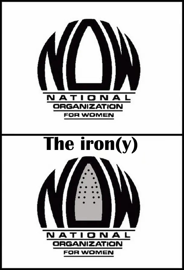
I love BP, sometimes like it too much and keep browsing when I should be doing other things, but this article was too far-fetched and annoying.
Seems like this is the appropriate place or this lovely logo that just came across my facebook feed. Great information but that is a TERRIBLE logo to pair with it!!! 17342588_1...50a20.jpeg 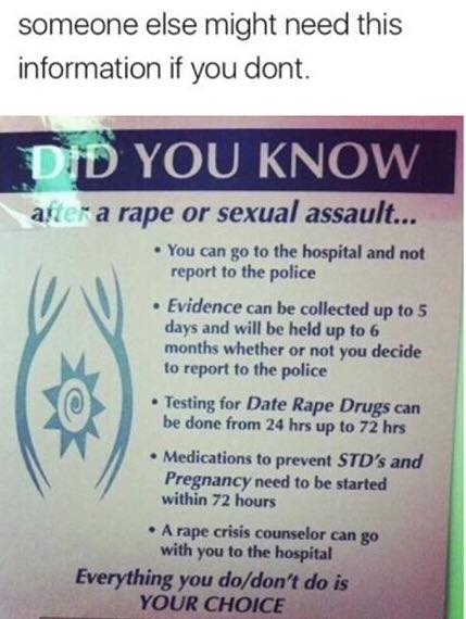
My girlfriend always tells me that any advertising company needs a cynic and a 12 year old boy on staff before names or logos were published.
Part of the issue with the original one has to do with rape accusations (and a tonne of sexist behaviour) in Australia’s federal parliament. The assistant minister for women said she didn’t “see it” but thanks to some immature people within the department, it was pointed out to her. I scoffed hearing her say it, it is really obvious and disgusting it passed by those who should have noted the logo isn’t appropriate. It was removed the day after release, waiting to see if the designers are over the age of 15 and able to come up with a decent alternative.
My local Thai at the food court. It's Bamboo Zoo ok. Not Poo! 😂🤣 Bamboo-Zoo...10f0c6.jpg 
Is everyone going to forget about Jeff Bezos phallic rocket?
I like to think I'm as filthy minded and perverted as the next person but a lot of these had to be explained and even then it was a stretch.
Just a reminder, It's only a "fail" if it's accidental. 99% of these are absolutely on purpose.
I'm sorry, maybe I'm oblivious but what is wrong with the original logo? The women network one
if you absolutely want to, of course you see something sexual everywhere. but seriously- YMMV
This seems less of "bad logo design", and more of "why do you keep showing me pictures of people having sex, doctor?" vibe. The design is ok, your brain is a bit broken.
The single best one I have EVER seen, isn't even in there! ironyy-623...77-png.jpg
I love BP, sometimes like it too much and keep browsing when I should be doing other things, but this article was too far-fetched and annoying.
Seems like this is the appropriate place or this lovely logo that just came across my facebook feed. Great information but that is a TERRIBLE logo to pair with it!!! 17342588_1...50a20.jpeg
My girlfriend always tells me that any advertising company needs a cynic and a 12 year old boy on staff before names or logos were published.
Part of the issue with the original one has to do with rape accusations (and a tonne of sexist behaviour) in Australia’s federal parliament. The assistant minister for women said she didn’t “see it” but thanks to some immature people within the department, it was pointed out to her. I scoffed hearing her say it, it is really obvious and disgusting it passed by those who should have noted the logo isn’t appropriate. It was removed the day after release, waiting to see if the designers are over the age of 15 and able to come up with a decent alternative.
My local Thai at the food court. It's Bamboo Zoo ok. Not Poo! 😂🤣 Bamboo-Zoo...10f0c6.jpg
Is everyone going to forget about Jeff Bezos phallic rocket?


 No fees, cancel anytime


")
")