ADVERTISEMENT
Article created by: Gabija Palšytė

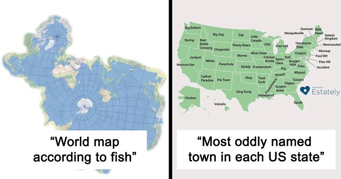
OK, folks, you might want to keep your GPS on while scrolling through this one because we're heading into the land of 'Terrible Maps.'

It's a bumpy ride, full of wrong coordinates and not-very-helpful legends, however, the unexpected twists and turns are what make it so memorable.

This fun online project, dedicated to geographically incorrect entertainment, features such gems as 'The World According To Fish' and 'What Pedestrian [Signs] Look Like Across Europe.'

Even though its content might not get you from point A to point B, the pictures can, in fact, teach you something and put a smile on your face.

More info: Instagram | Facebook | Twitter

#1

Map

World map highlighting countries using the mm/dd/yyyy date format in red, a funny and terrible map example.

terriblemap Report

Binky Melnik
Community Member
9 months ago Created by potrace 1.15, written by Peter Selinger 2001-2017

Likewise, the countries which don’t use the metric system: Myanmar, Liberia, and the US. 😞 That’s about 5% of the world. (For those especially sucky at math, it means that about 95% of the world uses the metric system.) (I’m spelling it out for those stupid Americans who believe “The whole world uses the metric system except for Great Britain.” No, you аssholes: the whole world uses the metric system, save for a tiny percentage (5%) who foolishly clings to a crazy base 8 system that’s difficult to use. “They” are the ones doing it right, and *we’re *doing it wrong!) (Go ahead and downvote me; you do every damned time I point this out. I couldn’t care less; I learned metric when I took up two hobbies that use it, and my life spent counting has been orders of magnitude easier!)

View more comments
RELATED:
    #2

    For Everyone In The UK Waiting For The 12th Of April. A Map Of Every Pub In The UK

    Map of the United Kingdom with an excessive number of location pins, illustrating a funny and terrible map example.

    terriblemap Report

    #3

    Terrible Map

    Map showing the United States and Mexico with arrows highlighting similar southern and northern border shapes, a terrible map.

    TerribleMaps Report

    Stephanie Did It
    Community Member
    9 months ago Created by potrace 1.15, written by Peter Selinger 2001-2017

    How could that possibly have happened??

    #4

    Earth

    Diagram of Earth highlighting Easter Island, Washington DC, and Stonehenge in a funny and useless map style.

    terriblemap Report

    ADVERTISEMENT
    #5

    World Map According To Fish

    Distorted world map highlighting oceans with landmasses oddly shaped, showing a terrible map that is both funny and useless.

    terriblemap Report

    ADVERTISEMENT
    #6

    Cat Earth Theory

    Map humor showing the world outlined as a cat playing with Australia, a funny and terrible map illustration.

    terriblemap Report

    #7

    How The Rest Of The World Sees The USA

    Simplified funny map of the USA showing mislabeled regions as part of terrible maps that are as funny as they're useless.

    terriblemap Report

    #8

    Map Of Earth If There Was No Land

    Cartoonish terrible map showing distorted countries in bright colors, highlighting funny and useless map features.

    terriblemap Report

    ADVERTISEMENT
    #9

    How To Find Kentucky On The Map

    Funny and useless map showing how to find Kentucky using a person-shaped figure made from US states and labeled parts.

    terriblemap Report

    ADVERTISEMENT
    #10

    Argentina

    Map comparison showing Argentina highlighted versus a humorous altered map labeled Are'ntgentina covering most of the Americas.

    terriblemap Report

    Binky Melnik
    Community Member
    9 months ago (edited) Created by potrace 1.15, written by Peter Selinger 2001-2017

    Ah, nuts. Even in a goofy meme, they got the punctuation wrong. 😰 This is what happens when the teachers seemingly know even less than the students. (Myself was lucky enough to have teachers who actually *knew* some English, and that punctuation was created for a reason.) Aside from my pedantic b******g, I enjoyed this; it’s funny!

    #11

    Antarctica, The Confusing Continent

    Map of Antarctica labeled with humorous and terrible directions highlighting confusing and useless map features.

    terriblemap Report

    #12

    Terrible Map

    Funny and useless maps comparing regions focused on religion versus science in 1018 and 2018.

    TerribleMaps Report

    ADVERTISEMENT
    #13

    Bosnians: I Wanna Swim Croatia: No

    Map of Croatia and surrounding countries with clear labels showing cities and geographic features, a funny and terrible map example.

    terriblemap Report

    Binky Melnik
    Community Member
    9 months ago Created by potrace 1.15, written by Peter Selinger 2001-2017

    The majority (nine of fourteen) of my friends has moved to Croatia. I giggled at the first three and decided it must be because of family. By the fourth, I quit giggling and took notice, and after the fifth, I looked Croatia up, and now I, too, have the Croatia bug! I hadn’t known it’s so awesome! The preventing Bosnians from having any coast seems extreme, but then having seen enough photos of the beaches, I get why they’d want it! 😀 They coulda given ‘em a few yards of it, though; they hafta live next to ‘em, after all!

    ADVERTISEMENT
    #14

    That's Going To Look Stupid In 60 Million Years

    Tattoo of a world map outlined in black ink on a forearm, representing one of the terrible maps that are funny and useless.

    TerribleMaps Report

    #15

    Restaurant Order Preferences In Africa

    Map of Africa showing restaurant order preferences with most countries marked for dine-in and one marked for takeout.

    terriblemap Report

    Stephanie Did It
    Community Member
    9 months ago Created by potrace 1.15, written by Peter Selinger 2001-2017

    You can always get "to go" food in Togo.

    #16

    Basically Every Data Map Of Europe

    Color-coded map of Europe with green, yellow, orange, and red areas showing data quality in terrible maps.

    terriblemap Report

    ADVERTISEMENT
    See Also on Bored Panda
    #17

    Map Of Roman Air Bases In 2nd Century Ad

    Simplified grey map of Europe with distorted shapes, illustrating a funny and useless terrible map concept.

    terriblemap Report

    ADVERTISEMENT
    See Also on Bored Panda
    #18

    Rolled Up

    Map showing Chile humorously rolled up like a scroll with surrounding countries Bolivia, Paraguay, and Argentina visible.

    terriblemap Report

    #19

    Europe But If Europe Colonised It

    Map of Europe with US state borders incorrectly overlaid, illustrating a terrible and funny map concept.

    TerribleMaps Report

    ADVERTISEMENT
    See Also on Bored Panda
    #20

    Nice People

    Map of France humorously categorizing most areas as not nice people and one small area as nice people, a terrible map.

    terriblemap Report

    Stephanie Did It
    Community Member
    9 months ago Created by potrace 1.15, written by Peter Selinger 2001-2017

    Everyone in France, except in the city of Nice, are not Nice people.

    View more comments
    #21

    Terrible Map

    Map of the United States highlighting Indiana in red and all other states labeled as Outdiana in yellow.

    TerribleMaps Report

    Binky Melnik
    Community Member
    9 months ago Created by potrace 1.15, written by Peter Selinger 2001-2017

    “Indiana. Outdiana. Indiana. Outdiana. Indiana. Outdiana. Indiana. Outdiana.” Oooh; sounds dirty! 😉 Or like CPR.

    ADVERTISEMENT
    See Also on Bored Panda
    #22

    What Pedestrians Look Like Across Europe

    Map of Europe with varying sizes of walking person icons representing a humorous and terrible map concept.

    terriblemap Report

    ADVERTISEMENT
    See Also on Bored Panda
    #23

    Danger Presented By Indiana

    Map showing states' safety levels with Indiana as a danger source, highlighting invasion risk and illusion of safety.

    terriblemap Report

    #24

    Egypt Is Smaller Than The United States, Russia And China Combined

    Misleading and funny map showing distorted country sizes for humor and entertainment in terrible maps collection.

    terriblemap Report

    Binky Melnik
    Community Member
    9 months ago Created by potrace 1.15, written by Peter Selinger 2001-2017

    The same is true of the US, Russia, and China!

    #25

    2,066 Americans Were Asked To Point Out Ukraine On A Map

    World map with scattered red and purple dots highlighting a peculiar distribution pattern, illustrating terrible maps.

    terriblemap Report

    Binky Melnik
    Community Member
    9 months ago Created by potrace 1.15, written by Peter Selinger 2001-2017

    They totally missed my hometown in Massachusetts! (Lots and LOTSA Ukrainians there.) It woulda been correcter than many of the dots they made. 😕

    ADVERTISEMENT
    See Also on Bored Panda
    #26

    Population Per Capita

    Map of Europe showing population per capita with each country labeled as 1, illustrating a terrible and funny map.

    terriblemap Report

    ADVERTISEMENT
    See Also on Bored Panda
    #27

    Statistic

    Humorous terrible map showing exaggerated world statistics with colorful regions, highlighting funny yet useless data visualization.

    TerribleMaps Report