ADVERTISEMENT
Article created by: Greta Jaruševičiūtė

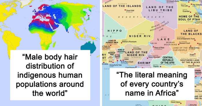
When most of us think about the word “data'' our eyes glaze over as a million Excel cells appear in our minds, putting us to sleep. So clever folks out there rolled up their sleeves and got to work, making visual depictions of data that help us better understand the world.

This online group shares various cool and interesting maps that help put all sorts of facts and figures into context. So get comfortable, prepare to brush up on some geography, and get to scrolling. Be sure to upvote your favorite posts and share your thoughts and observations in the comments section below. 

#1

Good Political Maps Of Oceania Are Hard To Come By

Map depicting countries in the Pacific region, including Australia and New Zealand.

RecordingFancy8515 Report

RELATED:
    #2

    The Literal Meaning Of Every Country's Name In Africa

    Etymological map of Africa highlighting names and historical origins, showcasing interesting world insights.

    Homesanto Report

    #3

    Endings Of Places In Poland

    Maps showing the distribution of Polish towns ending in "-owo" and "-ów" to broaden understanding of the world.

    DaveBensonPhilips Report

    #4

    Average Color Of US State Based On Satellite Imaging

    Map showing the average color of each US state based on Sentinel-2 satellite imagery.

    SnooMacarons8038 Report

    ADVERTISEMENT
    #5

    What’s The Most Popular Sport In Each Country?

    World map showing most popular sports by country: football, cricket, baseball, rugby, and more.

    geographyfacts Report

    ADVERTISEMENT
    #6

    Time Needed To Earn 1€ Million Earning On Average Wage

    Map illustrating years needed to earn 1 million dollars in Europe, highlighting economic differences by country.

    karinasnooodles_ Report

    #7

    Population Density In China

    Map showing population density in China, highlighting that 94% live in the eastern half, emphasizing interesting world map data.

    Ambitious_Aioli6954 Report

    #8

    How Many % Of People Would Not Want To Live Next Door To Lgbt People?

    Map showing European attitudes towards LGBT neighbors, with varying percentages indicating those unwilling to live nearby.

    theworldmaps Report

    ADVERTISEMENT
    #9

    World Map According To China In 1799

    Ancient world map with detailed Asian regions, illustrating traditional perspectives and enhancing world understanding.

    Redstream28 Report

    ADVERTISEMENT
    #10

    Percentage Of Population (25-64yrs) In Europe That Cant Speak Any Foreign Language

    Map showing Europe's foreign language proficiency percentages by country.

    MardukSyria Report

    #11

    Europe’s National Animals

    Map of Europe featuring native animals, enhancing understanding of the world's wildlife diversity.

    cloudtdaz Report

    #12

    Belief In Life After Death In Europe

    Map showing European belief in life after death percentages, highlighting varying levels across countries.

    cloudtdaz Report

    ADVERTISEMENT
    #13

    Average Money Spent On Weddings In US States

    Map showing average wedding costs across US states, highlighting variations from least to most expensive regions.

    Starry_Night0123 Report

    ADVERTISEMENT
    #14

    Roman Coin Hoards, From The 'Coinage In The Roman Empire' Project — 'Hoards Containing Coinage In Use In The Roman Empire Between 30 B.c. And A.d. 400.'

    Map showing concentrated data points in Europe and parts of Africa and Asia to enhance understanding of the world.

    idonotknowtodo Report

    #15

    When Is Weekend

    World map showing different weekend days by country, highlighting Friday and Saturday variations.

    two_plus_two_is_zero Report

    #16

    Asia's Counting System. How Do You Say The Number 57

    Map of Asia showing various methods of expressing the number 57 in different regions, highlighting diverse counting systems.

    Mokkasakka Report

    ADVERTISEMENT
    See Also on Bored Panda
    #17

    Unemployment Rates In Italian Provinces

    Map of Italy showing unemployment rates in various regions with color coding.

    JoeFalchetto Report

    ADVERTISEMENT
    See Also on Bored Panda
    #18

    Male Body Hair Distribution Of Indigenous Human Populations Around The World

    World map showing body hair distribution among indigenous male populations, using color gradients to indicate percentages.

    Homesanto Report

    #19

    Percentage Of Light vs. Brown Hair In European Countries

    Map showing distribution of light hair frequency in Europe, highlighting variations from 1% to over 80%.

    Specific_Ad_097 Report

    ADVERTISEMENT
    See Also on Bored Panda
    #20

    Most Wasteful Countries In The World

    World map showing municipal solid waste generated annually per capita in various countries.

    flyingcatwithhorns Report

    #21

    Dog Owning States vs. Cat Owning States

    Map showing U.S. states with more dog or cat owners, illustrating pet ownership trends.

    Thequietasober Report

    ADVERTISEMENT
    See Also on Bored Panda
    #22

    Air Polution In Europe

    Map showing PM2.5 levels across Europe, highlighting air quality variations and health impacts.

    therealcup_1 Report

    ADVERTISEMENT
    See Also on Bored Panda
    #23

    US States By Violent Crime Rate

    Map of the USA showing violent crime rates per state in 2020, highlighting differences to broaden world understanding.

    Specific_Ad_685 Report

    #24

    The Countries With The Most Island

    Map of countries with most islands, highlighting Sweden, Norway, and Finland as top three with detailed island counts.

    robertjan88 Report

    #25

    The Most Consumed Type Of Meat By Country Including Fish & Seafood

    World map showing most consumed meat types by country, highlighting consumption trends and global dietary preferences.

    giuliomagnifico Report

    ADVERTISEMENT
    See Also on Bored Panda
    #26

    The Most And Least Happy Countries In The World

    Map illustrating the Global Happiness Index 2023, highlighting the most and least happy countries worldwide.

    Intelligent_Store0 Report

    ADVERTISEMENT
    See Also on Bored Panda
    #27

    Projection Of Water Stress Level By Country In 2040

    Map showing global water stress levels by country for 2040, highlighting areas with varying withdrawal ratios to supply.

    giuliomagnifico Report

    #28

    Highest Temperature Recorded In Europe Countries

    Map showing highest temperatures in Europe, highlighting extreme heat zones with different colors and temperature labels in Celsius.

    Redstream28 Report