Most of us have a general idea of how we learn best. Some might retain information better by listening or taking notes, while others may prefer being hands-on with the topic or looking at tables and diagrams. When it comes down to it, there’s no one size fits all.
Today, visual learners are in luck because we’re looking at a subreddit called “Infographics,” a collection of data visualizations in various forms, like bar charts and heat maps. Full of colors and creative imagery, they’re both educational and fun. Scroll down to find the best ones that might change the way you see the world.
This post may include affiliate links.
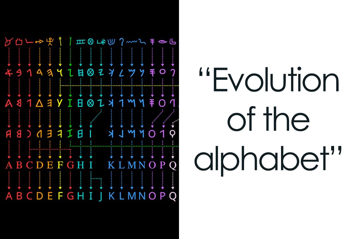
Evolution Of The Alphabet


The Average Cost Of Insulin By Country

Measure System In The United States And In The Rest Of The World

The date format is worse in Canada because it is supposed to be day/month/year but because of how much we trade with the US, you'll see a combination of the 2 formats being used. So fun trying to guess the date for the 1st-12th of the month
Infographics are a creative way to display data that breaks up complex information into bite-sized pieces. For this reason, it can be a great learning tool in education.
For one, such visualization can hold a person’s attention for longer. As people are exposed to more and more information every day, it’s hard to keep them focused and prevent them from quickly moving on to the next shiny piece of statistics.
Just for us to imagine how distracting it can get, 2.5 quintillion bytes of data were created daily in 2021, according to The Next Tech. Therefore, infographics can help by taking an overwhelming amount of facts and presenting them with engaging images and colors.
Best Kind Of Street Lamps

The Deadliest Hunters On Land (Based On Successful Kill Percentage)
")
The Current Us Healthcare System vs. A Single Payer System

Yeah we have a terrible system and its not likely to change anytime soon.
Besides, most people process visual material much faster and tend to recall it better.
Neuroscientists from MIT found that the brain analyzes an image in 13 milliseconds, making these visuals a great learning aid. Our mind also tends to attach emotion to pictures, which explains why the average person remembers 65% of visual information ten days later, while they can recall only 10% of something they heard ten days ago.
Furthermore, they often prove effective in education because they use images to highlight, explain, or enhance text-based information, which also encourages data retention for many learners.
15 Famous Cats In The History Of Mankind

Poor Oscar "Unsinkable Sam" must have wondered why they kept bringing him back onto boats!
We Live In A World Of

Life From Single Cell To Naked Ape

In addition, these visuals can be applied for a variety of uses. They are ideal for foregrounding important events in a historical period. They help us understand how certain occurrences interconnect and influence each other and how they have affected the world.
By using infographics, number-heavy statistics can be made more interesting, and adding diagrams and short text makes them easier to process and remember.
Everything Owned By Nestle

Guide To Different Types Of Forks

Like Rose told Jack in Titanic, "Just start from the outside and work your way in".
It was Kathy Bates' Molly Brown, not Rose. Brown had been a commoner who had come into money and had to learn, much like Jack was, how to behave in upper society.
Load More Replies...Must be caught up in legal limbo with the spoon people.
Load More Replies...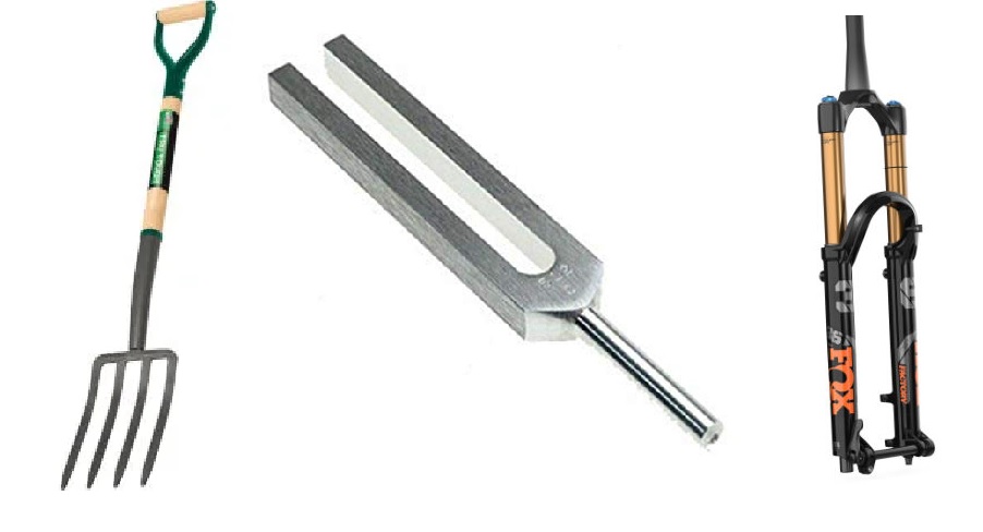
I don't see right-side-up forks, upside-down forks or parallelogram forks. This makes me sad, as it may lead to the believe that eatery is the only field of forkery. Which ain't.
I also don't see the fork in the road.
Load More Replies...I prefer to call the 'forks' with 3 tines "threeks" and those with 2 tines, 'two-ks.'
Fiddle with your napkin until someone in the know picks up a fork, them do the same. Besides, you're supposed to wait for your hostess to start eating, then it's very easy to know which fork.
I'm liking the spaghetti fork - that could save an awful lot of shirts!
All I need is a fork. a knife. a spoon. and if you all ever watched Alien Ressurection... according to Ripley, a (you know what)
Have only used seven. I have never seen a pasta fork on any dinner table but in thrift, second hand and antique shops. And people today don't even know what they are for.
I disagree, in the sense that all forks are cheese forks (and all other utensils are cheese utensils)
Why not have one fork, very nicely made, and one fork for fruit and seafood, and leave it at that. This way, there is more room for the food on the table. And also, one knife, sharp enough to cut meat. Fish can be cut with a fork. Fancy table wear, is for the rich and royalty, of which I am neither, but sitting at a table with that much silverware, is ridiculous! I have done that like once in my life, and never again. People also used to actually eat with just a knife! Like potatoes and 🥕 veggies, Stan it, eat it and move on! Actually, I like using my hands for things like fried chicken…. Also, take a chicken leg, smear mashed potatoes all over it drizzle some gravy on it and you then have… the perfect bite of food.
My Chinese SIL had a meltdown when she found out there's more than one kind of fork.
I think I‘m using fish forks as dessert forks…. And why the hell aren‘t Spaghetti forks common? I never heared of then! Where are they used? I want some! 😂
This is just elitist forking silliness. No one needs this many forks and a "table" fork stabs and collects all the foods just fine. When I stick a plain old fork in my mouth, my saliva licks it clean for the next course.
Some makes sense like the snail fork. A larger fork will not fit in the shell.
Load More Replies...If you find antique silverware marked as Georgian or earlier, check if it has fish forks and knives. If it has, it is Victorian at the earliest.
I like a bit smaller utensils, so I guess I've been using fish forks or dessert forks all these years.
When I was a child I was taught that for dessert forks, cake forks had four equally sized tines and pie forks had three tines, the left most one wider than the other two. (This was knowledge that I never once used in 82 years, so far, of my life.)
The Best Company Name Changes

Teachers can also use them as assignments for homework. Giving students a long text and letting them transform it into something more appealing provides them with the opportunity to be more creative and shakes up the ordinary routine.
While doing it, they also conduct research and try different applications of information. As a result, learners demonstrate critical thinking by filtering data, identifying patterns, and presenting carefully curated projects.
Batmobile, From 1966 To 2016

Highest Ocean Plastic Waste Polluters

History Of Rising Temperature

If it so happens that children are only taught through lectures or text, teachers are neglecting 65% of visual learners, and they miss the opportunity to increase retention rates, which are essential in the assessment strategies of schools.
Something To Consider Before Enrolling


Top 20 Major Companies In The Us With Worst Employee Retention

The Highest-Grossing Biopics Of All Time

Even though infographics might seem intimidating, there are plenty of tools online that can be helpful, such as Infogram, Canva, Easelly, and Edraw.
Their designers advise having an outline before starting the creative process. Try to decide which points are essential. Then, you can move on to ensuring that the readers are guided through the visuals and that the story you’re telling is coherent and has a gradual ending.
The Most Popular Car Colors In The Us

The Highest-Paid Dead Celebrities Of 2023

Hey! Elvis isn't dead! He's retired and living the quiet life in Erie, Indiana.
Coca-Cola vs. Pepsi Revenue [oc]
![Coca-Cola vs. Pepsi Revenue [oc]](https://www.boredpanda.com/blog/wp-content/uploads/2024/02/65cb14f79c1fc_0ubop32cakyb1__700.jpg "Coca-Cola vs. Pepsi Revenue [oc]")
This is across all brands though and Pepsi has a ton of brands that aren't Pepsi. Not just beverages like Mtn. Dew and Gatorade, but they own DORITOS and Frito Lay. They own Rice-A-Roni and Quaker Oats. They are a massive food conglomerate.
As for the aesthetic part, a step in the right direction would be choosing the right fonts. Two are more than enough – one for the title and one for the body text. A more fun and decorative one can be used for the header, while the remaining information can be formatted with a simpler one so it’s easily readable. The typeface should also reflect the topic. Storytelling that’s more youthful and entertaining deserves a font that portrays this.
The World’s Top 10 Electronics Exporters

World Economy

Popular Names That Died Off On The Us

Evolution Of Helmet Design

The implication seems to be that the helmet was invented in 600 CE. Did the Romans and Greeks wear tam-o'-shanters into battle, then?
The same goes for colors – try to keep them visually appealing and stick with three or four that work well together. Finally, the goal with these visual aids is to portray data in a simple way, so don’t overcrowd it. Leave plenty of space between images and statistics, and use as little text as possible.
The World’s 15 Most Popular Cocktails


The Busiest Airports In 2023

I remember when O'Hare was busiest in the world. Doesn't seem that long ago.
Cities With The Most Millionaires In The World

The Best-Selling Mobile Phones Of All Time

Good to see the old Nokia bricks still at the top of the list.


Spotify Still Can't Make Money

Note: this post originally had 55 images. It’s been shortened to the top 30 images based on user votes.

Poll Question
Thanks! Check out the results:
Subscribe to Access
Exclusive Polls
By entering your email and clicking Subscribe, you're agreeing to let us send you customized marketing messages about us and our advertising partners. You are also agreeing to our Privacy Policy.
Thank you! You've successfully subscribed to newsletters!


Why, why, why doesn't BP do more of these type of posting and a whole lot less of the Gossip column nonsense.
Presumably because the gossip ones are a better return on investment
Load More Replies...The ones I could read were really interesting! The other ones were too blurry for me to see well on the app, even after I pulled up the images to zoom in.
