The Opposite Of Design Fails: 50 Times Designers Nailed It And Got Praised On This Group
InterviewWhat do we consider good design? Packaging that's pleasing to the eye? A product that makes our lives easier? A structure that blends in seamlessly with nature? A design that's sustainable but practical all at once? Maybe it's something that fits the criteria for all of the above.
Here is a collection of examples that implement all of the above in design. The subreddit r/GoodDesign is for those who appreciate pleasing visuals and mindful execution. Check out these design innovations that prove not everything has to suck. Product and packaging design can be practical, original and beautiful at the same time.
Bored Panda also reached out to the mods of the subreddit. So scroll away to find the best of r/GoodDesign and read on for our interview with one of the moderators of the community.
This post may include affiliate links.
This Should Be The Standard


The community we're covering this time has a pretty straightforward name – r/GoodDesign. It's where people find and showcase great design. It's not particularly large in numbers. Although created in 2012, in more than 11 years it has amassed a modest 30k members.
And although that might not seem like a lot in these times of viral content, it's still in the top 5% of all Reddit communities. Bored Panda reached out to the moderator KingDrude of the subreddit. He was kind enough to tell us more about how the community is doing and what it's like moderating it.
Clever!

Love The Design For The Spine Of These Books

The story of how KingDrude became the moderator is pretty straightforward. "They needed moderators and I applied," the Redditor simply says. "I had been following the sub for a while and I quite enjoy moderating."
Small numbers don't always mean less work. The mod tells us that the workload depends on the activity of the community members. "I have been [a] mod on other subreddits with the same amount of people and that was much more work because it was more active," KingDrude tells Bored Panda. "This sub isn't extremely active, so not a lot to do."
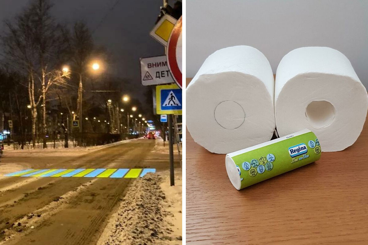
Crosswalk Projected On A Dirty Winter Road

Incorporating A Wheelchair Ramp Into Stairway Design

I love the out-of-the-box thinking that went into the design. Thank you for name-checking the landscape architect!
Good in theory. But read the comments. It's not that practical in terms of safety.
Load More Replies...It looks wonderful, but it isn't the best design for a wheelchair user. There should be a greater flat section between the ramps, and there should also be a barrier to prevent a person wheeling up the first ramp, and flying off down the stairs. It's a good try, but still needs improvement.
I was going to say the same thing! It looks good but would be a smidge dangerous.
Load More Replies...It's great that more people are trying to mainstream disability access etc. However, as a wheelchair user, no way in heck am I using that. I'd be terrified of my chair missing a turn and tumbling down the stairs. That's not safe to use.
And I would also think unless you have a power chair or someone to push you in a manual chair that's an awful lot of work to push yourself up and that an elevator might be better.
Load More Replies...Raise your hand if you think this looks even a little safe for someone wheelchair bound? Looks like a lawsuit to me.
Cat Chat is correct. Many wheelchair users are not wheelchair bound, but need them to reduce pain and increase mobility. Even those who can't walk at all most often see wheelchairs as vital independence devices, not restrictions. It varies, of course! People do have different preferences. That said, I agree on this ramp. I have heard wheelchair users respond to this picture, and they say it's extremely unsafe. Nice for non-disabled people to see, but not actually useful.
Load More Replies...I think that in the perspective of wheelchair users, maybe it would be more convenient for them to just have a seperate ramp. Very aesthetic design though.
My Mom was in a wheelchair when we were outside the house, I was the one pushing and there is no way in hell I would have tried something like this "ramp." It's to narrow and the turns are to tight to navigate for anyone in a wheelchair or transport chair. Add into the fact that I'm only 5'3" and it's a recipe for disaster, especially in the winter when there is ice or snow on top of the stairs and ramp. It's a lawsuit waiting to happen!
Funny, how you just don’t know how inaccessible things are until you start using walkers/wheelchairs. I do applaud the attempt to include the disabled in these stairs, but they look pretty dangerous to me. I would hope future designers include actual users in their designs.
As a wheelchair user. That a massive NO. Gradient too severe, going up or down. One false move and..........................
I might be a Debbie downer but I only see an accident waiting to happen
It’s attractive but both ramp and stairs are exponentially more precarious now. I’d be uncomfortable with it, but it looks great.
I'm all for making things accessible, but I think that some people may have trouble descending those stairs, especially of they have balance difficulties.
I have an extra wheelchair, would you like to try it yourself? That's not safe at all, you might want knee and wrist guards and a helmet, and probably some other padding as well.
Load More Replies...This is a terrible, terrible ramp if you're actually trying to use it as intended. Cool sentiment, bad execution.
I doubt that meets ADA requirements and it looks incredibly dangerous for the person in the wheelchair
Looks amazing, but practicality and safety wise it doesn't comply, those corners and the steps encountering the edge of the ramp are not safe, you are going up on a line that suddenly ends, you may find one foot with a partial or not step at all. It isn't a stair you cant go through without looking down.
It’s pretty, yes. But there’s no railing, and that’s a Wheelchair accident waiting to happen! 😔
What a stupid design. Yes wheel chair users should have a ramp. But should it be at the risk of breaking someone's ankle?
I love the concept but I'm too clumsy to use the stairs, id be using the ramp lmao
Cool design, ngl I kinda want to skateboard down it, that is if nobody is using it at the time
Hard to believe, in this day of accessibility, anyone would deisn buildings with so many steps.
difficult on such a steep slope i think, it should start much further
Load More Replies...Never Crane My Neck Again!

Finally I can see around big trucks without fearing driving through a red!
r/GoodDesign is not the only community that KingDrude moderates. He is the head moderator of r/AntiA-holeDesign. Or, more accurately, was. "It's no longer active because me and my team decided to join the protest against the API changes back in June," the Redditor admits.
These Shoes Are Pretty Neat!

This Is A 1954 Camper With A Boat As Its Top

Decathlon Now Sews The Labels Onto Small Scraps Of Fabric Instead Of The Actual Clothing Item, So It's Easier To Cut Them And They Don't Leave Any Itchy Residue Behind

Since he's been moderator of two design communities, it's pretty obvious KingDrude enjoys interesting design solutions. "I am a fan of satisfying and innovative design," the Redditor says. "Although the main reason I moderate is because I love moderating. I do quite enjoy the content of the subs though," he adds.
(X-Post) "The Middle Snap On My Baby's Onesie Is A Different Color To Help Align The Buttons."
 \"The Middle Snap On My Baby's Onesie Is A Different Color To Help Align The Buttons.\"")
The Tear Offs On This Poster For Domestic Abuse Have The Phone Number Disguised As A Bar Code

You will actually see these inside the male restrooms of senior centers in Baltimore County, Maryland.
This Pasta Packaging

What makes a design good? This time, let's talk about the graphic design world. Whether it's a website, a book cover or a poster, there are seven main principles that designers should adhere to. The first one is emphasis. It's the first piece of information the designer wants the audience to see. It should stand out – either be the largest, in an eye-catching font or a contrasting color.
The Tiger Face On My Bag Of Nuts Spells Out Tiger Nuts

This Chair In The Food Court Of A Mall Has A Notch Cut Out For Your Bags

You Only Can See This At Night

The second principle is to balance and align the elements of the piece so that the visual weight is distributed equally. Think about designing a piece as a room. You wouldn't want to cram all your furniture in one corner, would you? The same applies here. That doesn't mean good design can't be asymmetrical, but it still has to have a balance.
Love That!

These Public Benches Are Reversible, So You Can Choose To Look At People, Or Boats

My Puzzle Came With A Stand For The Box

The third principle has to do with contrast. It's how well a designer arranges opposing elements to entice the viewer visually. Designers do this either with color, texture, shape and size. Graphic designer Meg Reid refers to this as what people mean when they say that a design "pops!" Examples can be a bright background with dark colors or small objects positioned next to a large one.
This Toilet Paper With A Mini Roll Of Toilet Paper Inside Instead Of An Hollow Cardboard Roll!

Really Appreciated The Removable Sticker Brand Name For A Reusable Canister

Hmmm. Reuse, so 'Good'. Throwaway plastic, so 'Bad'. Decisions, decisions...
I Possibly Found The Best Ever Pencils. After Using Them You Can Plant Them In The Soil And Then A Sapling Will Grow From The Green Bottom!

Repetition is the fourth principle of good design. Repeating a font, a group of colors or a text can create a motif. That in turn helps brands create an identity. If something appears only once, it can be simply an error. If it appears more than once – that's already a pattern.
This Remote Has A Headphone Plug In It To Listen To TV Quietly

OMG this could have saved me from getting scolded by my parents at 2 am trying to watch tv
Someone Requested A Pop-Up Sloth Hook

This Is Exactly What Makes Good Design! Oklahoma Manhole Covers Have A City Map On It With A White Dot Showing Where In The City You Are

Who says you're not being followed? How do those maps always know where you are?
The fifth principle of good design is proportion. There can be bright colors and differently sized elements in a design, yet it still can be pleasing to the eye. What's the secret to that? Looking at a design in sections rather than as a whole.
Designers can group small elements together to establish their relationship with the parts around them. Ticket information on a concert poster, for example, is in a small box at the bottom of the poster.
My Shirt Has A Cloth For Cleaning Glasses Sewn Into It

4 Handles So That More People Can Hold It + These The Handles Don’t Connect To The Floor So That The Floor Can Be Cleaned Easily


My Empanada Says What Meat Is Inside

A good design should lead the eye from the most important information to the least important. That's where movement comes in. If there's one element that draws the eye as if it's in the wrong place – it might need adjusting. The viewer's gaze should move organically from one design element to the other.
Where Are These When I Forget My Sunglasses. They Put Rails Under The Benches In This Park So You Can Always Be In The Shadow

This Pill Can Be Split Into 5mg Doses Or 7.5mg Doses Depending On Which Side You Break It

These Posters

The last principle of good design might be the trickiest. It's not about what a designer does, but more about what they choose to leave out. It's white space, also referred to as negative space. Particularly perilous to beginner designers, it's the unmarked area that lets the viewer's eyes rest.
A Drum Pedal Was Repurposed To Provide A Zero-Contact Hand Sanitizer Station

This Is Perfect

Good Design Is Right Where You Need It

I Would Apply

The Door Handles Turn Red If You Lock The Door

Nail Polish Bottle Has A Swatch Of The Colour Attached To The Bottle So You Can See How The Colour Looks On You


This Dishwasher Projects A Timer Onto The Floor

Tesla Cars Have A Feature That Lets Bystanders Know That The Car Is Air-Conditioned And The Pen Inside Is Safe

Thought This Would Belong Here

its a pity most saucepan/pot designers have forgotten what the holes on the pot handles are for. originlly they were for putting your utensil handles in so they dripped back into the pot but now the designers seem to think they are hanging them up to catch dirt. if you look at your grandparents old pots and utensils you will find the utensils handle fits nicely in the holes and the untensil end drips into the pot. now everything has a slick modern look but nothing fits as it should.
The "One A Day Banana" Pack, Containing Several Bananas Of Different Ripeness So That You Can Eat Them Over Several Days (Korea)
")
Genius Ad For A Funeral Company

I've seen a funeral flower services van with a roughly translated message on the back: drive over the speed limit and pass us, we'll be happy to deliver flowers to your funeral.
Shades By Design Logo Is Correct When Read Up And Down And When Read Left To Right!

My School Mascot Is The Bulldogs, This Is The Logo They Came Up With For Their Esports Team

Cool

My 3 Tacos Came In A Container That Was Made To Hold 3 Tacos Upright 🌮

This Track To Help People Bring Their Bikes Up Or Down Stairs


My TV Mount Has A Spirit Level In It

Integrated Storage For Chocks In Space Above Fender

That's really cool. I hate having to carry around log wedges for when I park the trailer.
Amazon Has Reflective Panels In The Top Of Their Lockers So You Don't Have To Jump Around Like A Maniac To Make Sure You Got All Your Stuff

A Trash Can For Cyclists To Toss Things While They Bike

I just imagine all the small pieces of trash falling through the net and ending up in that body of water. They could have had some sort of bin underneath?
Note: this post originally had 93 images. It’s been shortened to the top 50 images based on user votes.