Get Premium
Dark mode theme is available exclusively for premium users. Learn more about the benefits of subscribing.
No fees, cancel anytime.

 Dark Mode Ad-Free Browsing Unlimited Content
 Ad-Free Browsing Unlimited Content Dark Mode
Join 1.2 million Panda readers who get the best art, memes, and fun stories every week!
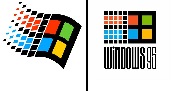
Have you realized that you’re able to instantly identify a business by looking at its logo, even if its name isn’t a part of the logo? Perhaps you’ve noticed that you can correctly guess the nature of a business by looking at its logo for the first time, even if you’ve never heard of the business before? Logos can be an efficient way of communicating information clearly without using words.
Many mascots have been around for decades. As new brands forge their way into our homes, some brands are taking time to re-develop their logos completely.
Type designer and lettering artist Rafael Serra decided to go out of his way and re-design some of the most well-known brand logos out there, giving us a completely new perspective. The artist’s work can be easily described as being old-school, and we can say for sure that we are definitely seeing that in some of his redesigns even if some of them have a twist that involves a touch of his own style.
More info: behance.net | Instagram
This post may include affiliate links.
This is a good logo for marketing, it has those bubbly letters that would make you want to drink one.
Cool font. But didn't get it what the meaning of that red symbol..
Without reading what it says I thought it was going to be a hippie company
me: I wonder if theres gonna be a covid joke Leilani Ortiz: Virus
It's not that I don't appreciate his work. But the designer had an issue for "being too obsessed with elongating letter"
Most of these are just stretched vertically. That's not that creative.
Ugh this can be summed up weird font stretched with possible repetition.
After scrolling through this, I can seem to get the smell of 1975 out of my clothes.
This would be better if the last half were cut out- they all started to look the same
Most of these are unreadable tbh. Props to the designer, they're pretty creative and they've evoked the 80's feel pretty well, but the point of a logo is to be recognisable to the brand, and if you can't read it, that doesn't work
Nice, but they got repetitive after a while. Enough elongation already!
*sigh, sucks through teeth* Ok, I will be as nice as I can. I like the ones that he/she seems to put any REAL effort into. Oreo, for example. I like that one. Buuuuuut, Samsung is NOT one I would say I like. Too much elongation, not enough creativity. I am a LITTLE disappointed with. Well, maybe a little more than a little. Ok, A LOT.
Some were cool. But so many were just stretched out version of the current logo. Meh.
A few of these are great but don't like the ones with elongated letters.
Too many of these are just elongated logos. Another huge problem with these is many, many of these companies already have old logos. It's interesting to invent old-style logos for new companies, but old ones are already in existence for many of these.


 No fees, cancel anytime


")
")