ADVERTISEMENT

Most of us, if not all, are aware of what a typical map looks like. It usually represents a part of the Earth, showing the locations of countries, cities, and natural landmarks like rivers and mountains, as well as man-made features like roads and buildings. 

However, some cartographers try to mix it up and stray from the norm, creating not-so-conventional maps that, at first glance, have no usefulness at all. How many Switzerlands fit in Brazil and tomato Europe vs. potato Europe are just a few examples awaiting you on the best-of-all-time list of Terrible Maps. Scroll down to find them, and don’t forget to upvote the ones you think failed at geography the most!

Bored Panda also reached out to cartographer and designer Liz [private part], who kindly agreed to answer a few questions about all things maps.

Click here & follow us for more lists, facts, and stories.

#1

Brown paper bag stained with grease resembling a world map, illustrating one of the terrible but funny maps.

Terrible Maps Report

Widdershins66
Community Member
1 month ago Created by potrace 1.15, written by Peter Selinger 2001-2017

As per usual, where's New Zealand? 🤷🏻‍♀️

RELATED:
    #2

    Funny world map showing the continents outlined as a cat playing with Australia in a terrible but funny map style.

    Terrible Maps Report

    Widdershins66
    Community Member
    1 month ago Created by potrace 1.15, written by Peter Selinger 2001-2017

    I took it as elephant first 🤦🏻‍♀️

    #3

    World map highlighting countries where achieving the American Dream is easier, featuring a funny and terrible map concept.

    Terrible Maps Report

    When asked what inspired her to become a cartographer, Liz told us, “I have always been a right-brained, creative person and was set on pursuing music and creative writing. I was also obsessed with geography, memorizing random facts about different countries and learning about new cultures around the world was my nerdy fun (I used to even paint teeny flags on my toenails).”

    ADVERTISEMENT
    #4

    Map of the UK densely marked with location pins showing a funny and terrible map of pubs distribution.

    Terrible Maps Report

    Widdershins66
    Community Member
    1 month ago (edited) Created by potrace 1.15, written by Peter Selinger 2001-2017

    Awwww the poor Wee Highlanders 🥹

    #5

    Humorous map of Antarctica labeling all directions as north in a funny, terrible map style.

    Terrible Maps Report

    ADVERTISEMENT
    #6

    Facebook post from Terrible Maps showing Saudi Arabia mapped only by its rivers for funny terrible maps content.

    Terrible Maps Report

    Widdershins66
    Community Member
    1 month ago Created by potrace 1.15, written by Peter Selinger 2001-2017

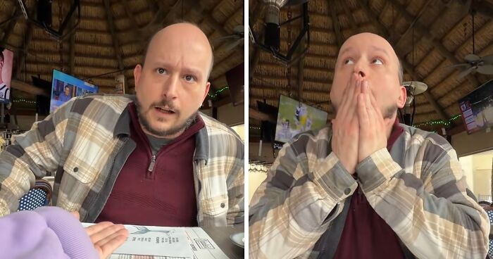
    I thought I'd seen a river! But it's just the crack in my screen protector 🙄

    “Undiagnosed ADHD had me bouncing around from interest to interest most of my life. Cartography was never something I planned to get into, but it was the perfect fit for my neuro-spicy brain. I get to continually learn about new places, use a ton of creativity and love of graphic design, and challenge myself with analytical skills. It's really the perfect fit for me,” Liz fondly shared.

    ADVERTISEMENT
    #7

    Map of Croatia and Bosnia humorously showing restricted access to swimming, highlighting terrible but funny maps concept.

    Terrible Maps Report

    #8

    World map tattoo outline on forearm showcasing a simple and funny geography design in black ink.

    That's going to look stupid in 60 million years

    Terrible Maps Report

    #9

    Antarctic-centric world map showing continents around the South Pole in a funny and terrible map style.

    Terrible Maps Report

    ADVERTISEMENT

    It turns out the terrible maps with a pinch of humor are not only enjoyed by an occasional passerby but also by the specialists themselves. “I LOVE the Terrible Maps account and am so excited to buy the book,” Liz tells us.

    ADVERTISEMENT
    #10

    Map of North America showing Native American territories before illegal immigration with terrible but funny map style.

    Terrible Maps Report

    #11

    Map showing a funny and terrible depiction of how to find Kentucky using body parts and fried chicken references.

    Terrible Maps Report

    #12

    Funny map of the USA showing stereotypes with labeled regions like Los Angeles, New York, Disney World, and Yee Haw.

    Terrible Maps Report

    “After stressful days digging through unorganized data for mapping, sending co-workers some of these map memes is the best way to lighten up the environment. I am never disappointed with the newest "Terrible Map." I love seeing the dad-humor-infused maps and think we could all use a LOT more giggling in our lives!”

    ADVERTISEMENT
    #13

    Unique Spilhaus Projection world map showing oceans as one continuous body of water, highlighting unusual geography perspective.

    Terrible Maps Report

    ADVERTISEMENT
    #14

    Map of Africa showing restaurant order preferences, mostly dining in with one country preferring takeout, funny terrible maps.

    Terrible Maps Report

    #15

    Map of Africa showing regional giraffe skin patterns with color-coded areas in a funny terrible map style.

    Terrible Maps Report

    The book Liz talks about is Terrible Maps: Hilarious Maps for a Ridiculous World. It’s Michael Howe’s child of labor—the guy behind the Terrible Maps social media project. Online, it's described as the ultimate gift book for budding geographers or anyone who wants to have a laugh.

    ADVERTISEMENT
    #16

    Map of Iceland showing 35 place names to humorously explain dyslexia in funny and terrible maps.

    Terrible Maps Report

    #17

    Funny maps showing changes in science and religion focus between 1018 and 2018 across Europe and surrounding regions.

    Terrible Maps Report

    ADVERTISEMENT

    So if you prefer having a physical book related to your interests it might be worth checking out. “Ever wondered about the average jean colour across the United States? Or what ‘pedestrians’ look like in Denmark? What unites Brokenwind, Upton Snodsbury and Crackpot? And have you ever tried to take a train in Antarctica? Well, Terrible Maps is the book for you!” the description further reads.

    ADVERTISEMENT
    #19

    Chart illustrating humorous risk of bear attack on planets as a funny map from terrible maps collection.

    Terrible Maps Report

    #20

    Vintage US map showing hog populations by dots, a funny and terrible map from a unique geography collection.

    Terrible Maps Report

    #21

    Map comparing 2016 EU referendum results with 1992 mad cow disease outbreak areas in the UK, shown in color-coded regions.

    Terrible Maps Report

    ADVERTISEMENT

    Liz describes these particular maps by saying, “I think a terrible map that fits into this specific realm is all about the factual display of data with the perfect twist of wit and absurdity.”

    #22

    Funny map of a dog with labeled zones like treat detector, belly rubs area, and destruction zone, a humorous map concept.

    Terrible Maps Report

    ADVERTISEMENT
    #23

    Unusual world map centered on New Zealand, showcasing a funny and terrible geography perspective.

    Terrible Maps Report

    #24

    Culinary map of Europe humorously categorized by food quality according to Italy in a terrible but funny maps style.

    Terrible Maps Report

    But if we’re talking about a terrible map intended for actual professional use, Liz believes that incorrect information, bad data, poor analysis, and horrid design skills can greatly contribute to a map becoming user-unfriendly and even unusable.

    #25

    Two globes showing Argentina's location on one and a humorous distorted map labeled Are'ntgentina on the other.

    Terrible Maps Report

    ADVERTISEMENT
    See Also on Bored Panda
    #26

    Map showing multiple cities named Rome in the United States connected by driving routes, a funny terrible map example.

    Terrible Maps Report

    ADVERTISEMENT
    See Also on Bored Panda
    #27

    Map of the world showing time zones with green outlines on a black background, a funny and unusual geography map example.

    Terrible Maps Report

    To check out how the opposite of terrible maps looks, make sure to check out our previous publications about the most informative maps that weren’t taught in schools.

    #28

    Map of France humorously showing one red dot for nice people and blue for not nice people in a funny maps collection.

    Terrible Maps Report

    #29

    Orange peel map creatively shaped like Japan on a dark table, showcasing a funny and terrible map concept.

    Terrible Maps Report

    ADVERTISEMENT
    ADVERTISEMENT
    See Also on Bored Panda
    #30

    Colorful outlines of Switzerland repeatedly placed over a map of Brazil showing how many fit inside, a funny terrible map.

    Terrible Maps Report

    #31

    World map highlighting countries using the mm/dd/yyyy date format in a funny and terrible maps style.

    Terrible Maps Report

    #32

    Funny map showing Oklahoma split into three parts labeled Oklahoma, goodlahoma, and badlahoma in different colors.

    Terrible Maps Report

    #33

    Funny map showing exaggerated features and humorous labels, part of terrible but funny maps collection.

    Map of earth if there was no land

    Terrible Maps Report

    ADVERTISEMENT
    ADVERTISEMENT
    See Also on Bored Panda
    #34

    Map showing Europe divided into Tomato Europe in red and Potato Europe in yellow, a terrible but funny map concept.

    Terrible Maps Report

    #35

    Funny and terrible map of Austria shaped like an ostrich, a creative example of unusual and humorous maps.

    Terrible Maps Report

    #36

    Map of Africa made from orange peel pieces showing a creative and funny terrible map concept.

    Terrible Maps Report

    #37

    Map showing Chile humorously rolled up like a scroll off the coast of South America in a funny geography map style.

    Rolled up

    Terrible Maps Report

    ADVERTISEMENT
    ADVERTISEMENT
    See Also on Bored Panda
    #38

    Map of Europe with states divided like a US map, illustrating terrible but funny maps for humor and geography fans.

    Europe but if Europe colonized it

    Terrible Maps Report

    #39

    Map of Australia with a small outline of Austria to highlight a terrible but funny geography map comparison.

    Terrible Maps Report

    #40

    Map of the United States showing texting and driving fatalities in 1960, a terrible but funny geographical map.

    Terrible Maps Report

    #41

    Map showing countries that use the metric system vs countries that lose wars to Vietnamese farmers, a funny terrible map.

    Terrible Maps Report

    ADVERTISEMENT
    ADVERTISEMENT
    See Also on Bored Panda
    #42

    Map showing Chile divided and color-coded to match the size and shape of various European countries for funny geography comparison.

    Terrible Maps Report

    #43

    Map of Europe with varying sizes of walking person icons humorously representing countries in funny maps collection.

    What pedestrians look like across Europe

    Terrible Maps Report

    #44

    Map of Europe showing regions by preference for olive oil, butter, or both, highlighting funny and terrible map concepts.

    Terrible Maps Report

    ADVERTISEMENT
    See Also on Bored Panda