Get Premium
Dark mode theme is available exclusively for premium users. Learn more about the benefits of subscribing.
No fees, cancel anytime.

 Dark Mode Ad-Free Browsing Unlimited Content
 Ad-Free Browsing Unlimited Content Dark Mode
Join 1.2 million Panda readers who get the best art, memes, and fun stories every week!
We get used to seeing big-name brands like Pringles or Warner Bros everywhere. Like it or not, we form deep and even emotional ties with their qualities, logos, and characteristics. So when these companies decide to shake things up and change their "face" with a great brand refresh, the public takes notice. And since the stakes are this high, an obvious step in the wrong direction fires up our inner critic and almost begs us to poke fun at the results.
The margin for error is thin when it comes to redesigns, but it’s not only brands that get impacted by the obvious flaws designers didn’t pick up from the start. From products to artwork to our favorite animated shows, some updates simply go awry. In fact, they have even inspired one subreddit to go on a quest to shed light on some of the most unfortunate ones.
Aptly titled 'Crappy Redesign', this online community prides itself on sharing only the cream-of-the-crop examples of terrible changes in our favorite brands — and they mercilessly shame them online. Below, we have gathered some of the best cases from the community to share with you all. So continue scrolling, upvote the ones you loved hating most and let us know what you think of them in the comments!
Psst! If you're in the mood for some more poor design madness, check out our earlier pieces here, here, and here.
This post may include affiliate links.
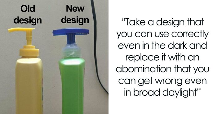
This is to this date probably the worst redesign I've ever seen. I cannot grasp how this design could ever pass trough multiple layers of confirmation and release to public.
I used to be able to scan my icons and find what I was looking for automatically. Now I am forever opening the wrong app by accident. BOO!!!
Load More Replies..."We have stylized icons that are recognisable at a glance. Quick make them all almost identical so people have to stop and look!"
I have to stare at my google apps folder on my phone for the longest time to see what they actually are.
At least they tell you they are Google apps, you might have several different email apps, document readers, messaging apps ect with similar logos. These all tell you immediately that the version you're looking for is Google with the colours.
Nah, I only use the Google apps cuz they are cleaner than any others. These icons are so dumb cuz at first glance they all look the same and blend together.
Load More Replies...Google of the past: "Don't be evil." Google of the present: "We're totally evil."
Admittedly I'm okay with the first three. I still know that's mail, calendar, and drive. WTF is the fourth one? I mean it's docs but I wouldn't get that looking at it. Vague camera shaped thing wouldn't strike me as hangouts either.
the docs and media icons---especially Docs--really WTF? How are people supposed to recognize that, when it's a tiny figure on a phone or tablet? *shakes old lady fist in the air* Come on!
This change resulted in my giving up on Microsoft apps. I couldn’t remember what was what, so I just gave up.
These are Google apps logos. Sorry for the pedantry.
Load More Replies...I always did see the detail in a logo as representation of a company's effort, it seems Google's gotten too lazy.
Surprised they didn't put '28' in the calendar icon so no month would feel neglected or slighted.
I am so relieved to hear from others who have no idea what the icons stand for any more. I thought it was either because I was losing my ability for abstract thought or just getting more out of touch
I hate the mail icon because on my phone I have it next to the map icon and I always click on the mail one by accident when I need the GPS... grrrr
So that's why I couldn't seem to understand why my brain was struggling to recognise the apps. My eyes didn't really recognise the icons anymore.
The thing is, the docs one just isn't in use. I have all of those new logos. Except for docs. The new docs looks pretty trash but honestly I like how they all fit together. It's very aesthetically pleasing
The doc and video one are bad cuz they're basically just squares in the patented colors. I can imagine how this could be very difficult and confusing for older people to distinguish between them on a small screen. The triangle n calender ones are ok because of the date n shape they are distinguishable. As for the Gmail one I actually love that logo.
Otherwise it reads MDOVM, ( maniacal dictum or verbal madness… A MOOt point!
MOOOOO, as spelled by a preschooler with a lot of coaching on the letters….
They use the same color and shape way too much. Harsh on the eyes when they're that close together.
Personally, I like the new design more. I don't find them confusing, though I get why down might feel like they're indistinguishable.
Its great because it is fatser to recognise these icons then the old ones and makes the brand Google stronger. When working with docs you wont be looking for Just the document icon, but the Google icon which resembles de doc app. Thats great brand designing imo and to my own experience works flawless and is not confusing at all When used to it. And getting used to it is everything(!) in this redesign.
I had only noticed the Gmail change because I don't use any of the others
The Google Docs one is definitely the worst! Doesn't even look like a paper anymore!
This is what happens when your company implements a "design system" - it's supposed to unify all the elements, incorporate branding guidelines, and help users understand that the apps are all part of a single ecosphere. The original icons don't accomplish this, but the updated ones (horrible and an offence to anyone except mantis shrimps (seriously, look it up - those things can see colours not even Google has thought up yet) though they may be) do.
These are some of the worst I can think of. When I'm in google, and click the grid icon to open one of my apps, it takes me far too long to find what I'm looking for because they all look the same. At least with Adobe they went with different colours for each app.
I have a Google phone and can barely tell which app is which. Terrible!
You can at least understand the first three symbols. After that, it's freaking runes. WHY?
We managed to get in touch with the creator of the 'Crappy Redesign' subreddit, Patrick, who was kind enough to have a little chat about the community, its background, and the common redesign trends that get featured on the group. When asked what inspired the subreddit in the first place, he told us that one post on the multi-million-member strong subreddit named 'Crappy Design' is to blame.
"It all started when I saw a post in 'Crappy Design' about a redesigned Tucan. When I went into the comment section, I saw that a user had commented 'r/CrappyRedesigns', Patrick told Bored Panda. "I could not believe that such a subreddit didn't yet exist, so I created it.” And from the looks of it, he didn’t look back.
"The subreddit, to my huge surprise, blew up immediately and received thousands of members in under a day! I couldn't believe it," the creator added. "Currently, the subreddit has close to 8k members. I never expected it to grow that big!"
Ever since this online community was created over two years ago, it has served as the perfect outlet for design enthusiasts to vent their frustrations. With the tagline "Cal Arts Galore", Patrick and the whole moderator team invites its members to share and poke fun at the unfortunate examples they come across online, as well as participate in meaningful discussions.
"The year is 2050, Cal Arts has taken over all forms of creative expression. Can be referred to oversimplified logos/etc..." writes the moderators in the description. The cases featured on the forum include some of the worst redesigns that range from cartoons to objects to our beloved brands and services. This online community is very open to new members and posts, as long as they follow some basic guidelines.
From artistic and interesting to boring and wouldn't even catch my eye 🙄
The number one rule on the subreddit is in the name — the post needs to be an example of a crappy redesign. Although when the brand refresh is very minimal (the moderators provided Google’s redesign as an example), it "doesn't change anything because they're similar to the older design." But if the update is clear and very poorly executed, members need to put the before and after images on both sides in the right order. The last thing to consider before posting is that the redesign must be official and made by the company listed.
I reject that, that cannot be meant to be Bob the Builder! It can't be! It looks awful, and nothing like him.
Bored Panda was also curious to learn more about the community and what the past two years have been like for the subreddit. Patrick opened up that a few things have changed since he created the group. "The activity in the subreddit has decreased a lot since then, but we do still receive posts every now and then."
"Volunteers have largely taken over with the moderation, so I don't really take care of it anymore," he continued. "It was pretty stressful to manage such a large group for the first time though." But even in the most challenging times, he’s grateful for the people who joined him on this journey. "I really want to thank all the people who joined the subreddit! You really made this an interesting experience for me."
The vast majority of the posts that end up shared on the group feature oversimplified logos. When asked about this modern trend in the design world, Patrick said he’s not sure where it came from. "Companies are trying to appear more trendy by redesigning logos, but unfortunately, it quite often results in an oversimplification of the logo," he added.
To the creator, however, 'Crappy Redesign' means more than only oversimplified logos. "Crappy Redesigns can be seen everywhere, whether it is a drop in quality of a product in order to reduce manufacturing costs or another way of making a device less repairable for consumers. I would hope to see different types of Crappy Redesigns in the subreddit in the future. Not just oversimplified logos all the time."
As you’re scrolling through this list, you may feel a sense of frustration when seeing these well-known products and brands fail so epically with their redesign. But the truth is that sometimes it’s not only the design flaws that make our blood boil. Turns out, there’s a deeper problem in the way our brains are wired — we humans simply don’t like change.
As growth marketer Kushaan Shah explained in a piece on Medium, two factors contribute to the consumer-fueled backlash when it comes to brand redesigns. The first one is the visual disruption: "How different is the logo from the old logo? Does it pass the internet maturity test?" The second one is identity integration: "How integrated is the brand to our own identity?"
Brands that got a positive first reception to a redesign "capitalize on something we know in psychology as the familiarity heuristic — a well-documented shortcut our brains take that makes us feel calm with the familiar, and apprehensive about novel experiences — regardless of their advantages," Shah said, explaining that brands who opt to visually disrupt usually receive all the outrage.
I'll always prefer the old ones. Bring back so many memories of my childhood.
When it comes to identity integration, Shah mentioned a study conducted by Pennsylvania State University called "The Starbucks effect". After surveying 632 college students and asking them to respond to various redesigns, it was found that consumers who are strongly committed to a brand tend to react more negatively toward new logos, while more casual customers typically view the redesigns as a positive development. "When we see a brand that we’ve built an emotional relationship with modify its logo or design," Shah added, "we panic."
Probably to save money. Printing in one colour is a lot cheaper than printing in four colours.
"Redesigns take time, effort, and an investment into an identity and visual cue that will stay with the company for the foreseeable future. They’re rarely done on a whim and rarely done without a conversation that spans many layers of a company."
"What we’ve learned above is that there is at least one easy way to avoid backlash altogether and thrive: Make your logo changes simple. Focus on colors and symbols that your customers recognize. Remove ambiguity," Shah suggested.
And in 10/15 years, we'll have the exact same list. Except the now new and redesigned logo will be considered better.
Sure, there are lots of ways how to screw things up even more.
Load More Replies...I have so little emotional investment in corporate logo design that I can't even imagine giving a c**p about any of this. And yet, I scrolled the whole thing. I should probably get to work...
Waste waste waste a buck, mess the logo up. Verily horribly awfully wrong. Let traditions get lost in a snap!
So...things change? And you can't stand it? That's the first sign of becoming old.
Oh my gosh yess! The newest my little pony design is horrifying compared to the original
Load More Replies...Some of these you can see they made their logos more simple to make it easier and cheaper to reproduce them and print. With the childrens programs it is because tech nerds like me learn how to use 3D modelling programs and it's easier and cheaper to use them to create programs.
When the urge to re-design a logo strike, people should just lie down for a bit until it passes. It's usually a waste of time and money. In the 1970s NBC decided to replaces its iconic peacock logo (created to ballyhoo first color broadcasts), it hired a design firm to come up with a new one. For several million dollars NBC got a bland stylized upper-case letter 'N.' No sooner had the network begun using it than they were informed that a small midwestern public-TV station had been using an almost identical logo for about 20 years, and it had cost nothing--some joe at the station had come up with it on his own. NBC made a deal with the PBS station and restored its peacock--but not without damaging it in another-design effort. Google Images probably has examples of both.
When I saw pringles new logo i was like : EmOTiNaL DAMaGe
Why isn't the GM redesign included? As a Ford guy I love they made such a bad decision
Some of these changed so long ago I don't remember the old ones. Some of these I'm yet to see the new ones anywhere other than in lists like these
This topic really depressed me. It's just a small sample cause something's happening and many companies change their logo to something minimalistic and boring...
As a graphic designer myself, I'm so glad I don't work in this field anymore. The flat (that's what it's called) designs and overly-simplified logos are a sad sign. We are too lazy to put effort into the designs anymore, and we have to keep it simple because every freaking thing has to be politically correct or we might offend someone. Or we might get sued for copyright.
Suave childrens shampoo :( I was so mad when they changed the designs


 No fees, cancel anytime


")


, Little Mole And Friends Becomes Little Bad Cgi And Panda???!")


")
")