Get Premium
Dark mode theme is available exclusively for premium users. Learn more about the benefits of subscribing.
No fees, cancel anytime.

 Dark Mode Ad-Free Browsing Unlimited Content
 Ad-Free Browsing Unlimited Content Dark Mode
Join 1.2 million Panda readers who get the best art, memes, and fun stories every week!
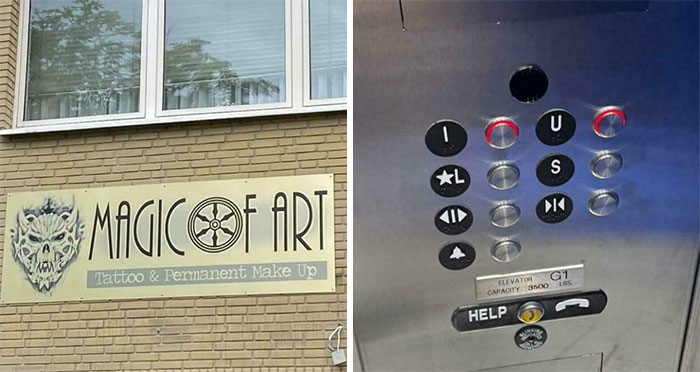
Being positive towards anything can be difficult, especially in 2021. However, it's forever a great idea to bathe your brain with some good thoughts once in a while. It's not a secret – our world has been through a lot, and society can be particularly toxic, which is why it's important to put love above everything. Everyone deserves respect and appreciation... except for whoever was responsible for creating these kerning fails.
Jokes aside, the spacing between individual letters plays a crucial role in general – but especially when you're designing a project for print. Without kerning, things can end up looking a little rough and will most likely completely change the meaning of the text.
By all means, it's not ideal when it happens, but it will probably make someone laugh. These Reddit users decided to share character spacing disasters that they noticed on posters, clothes etc. The subreddit was created in 2012 and currently has 248K members. Here we've gathered some of the best ones!
More info: Reddit
This post may include affiliate links.
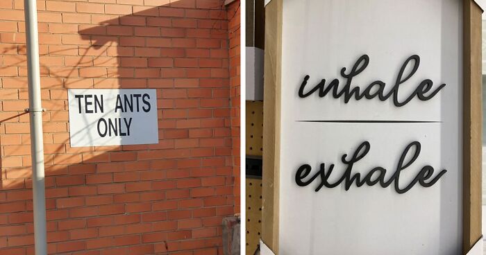
That's what happens when they stopped teaching kids to read/write cursive. Clearly not a W. It isn't connected properly to the H to be a *W*
Right? It's clearly inhale if you know how to read cursive. I had to struggle to figure out what the "mistake" was.
Load More Replies...Font fail, not kerning fail. Kerning is space between letters. The spacing here is correct. It's just a poorly designed font.
I have a shirt with pic of a person meditating that either says "imperfect" or "I'm perfect"
People buy this stuff? Regardless of the "whale" thing? I can see Captain Ahab going for it, but normal people? Do they really need a reminder?
"Breathe the pressure...Come play my game, I'll test ya...Psycho-somatic addict-insane...Come play my game..."
sounds like a disappointed southern women : " darn it, *resigned look* ah whale *sighs*
Looks like inhale/exhale to me. But imagine if a doctor had written it.
As someone who used to have to design products similar to this, there isn’t really any other way of doing this with that particular font. The letters are 3 dimensional cutouts and the dot above the i has to be connected to the rest of the text, otherwise a HUGE extra assembly fee would be applied just for that little dot to be separate. Not to mention it would probably fall off or get knocked off in shipping or in the stores. That said, a script “w” still would not look like that based on the font, so people are “reading into this” too much. :)
I liked the" Xt ra Shot" if put some accent in the "r" it will look like a lot Italian :)
I feel like Kidsor Kidults is a specific person who has wronged this manufacturer, and now the manufacturer won't let them anywhere near their products.
Hey, at least you can r e a d it without your eyes e x p l o d e I n g

As a typesetter I cringe at most of the printed material you see today, but these make me scared.
Most of these are technically not kerning problems. Kerning is adjusting the space between a pair of letters. A lot of these are spaces missing between words, which is a different kind of problem. Some are tracking fails (tracking is the spacing between all letters in a line), primarily caused by bad justification.
I never saw the movie advertised at my local cinema "TOM BRAIDER" So I still don't know who he is.
I once saw a place called “laptop lab” but the sign really said “laptoplab”
All this crap seems almost made up... But I do own pair of china made hiking boots where the label reads "SOF TSHELL" tho
Taken individually, think a lot of people don’t notice these “out in the wild,” but a whole slew of them means either that the country’s manufacturing sector is gone and they sent their seconds off to less well-off country, or their educational system is totally broken.
Load More Replies...As a typesetter I cringe at most of the printed material you see today, but these make me scared.
Most of these are technically not kerning problems. Kerning is adjusting the space between a pair of letters. A lot of these are spaces missing between words, which is a different kind of problem. Some are tracking fails (tracking is the spacing between all letters in a line), primarily caused by bad justification.
I never saw the movie advertised at my local cinema "TOM BRAIDER" So I still don't know who he is.
I once saw a place called “laptop lab” but the sign really said “laptoplab”
All this crap seems almost made up... But I do own pair of china made hiking boots where the label reads "SOF TSHELL" tho
Taken individually, think a lot of people don’t notice these “out in the wild,” but a whole slew of them means either that the country’s manufacturing sector is gone and they sent their seconds off to less well-off country, or their educational system is totally broken.
Load More Replies...


 No fees, cancel anytime


")
")


