ADVERTISEMENT
Article created by: Darja Zinina

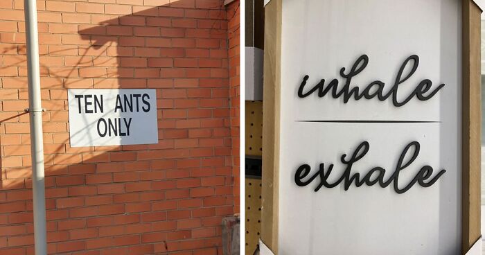
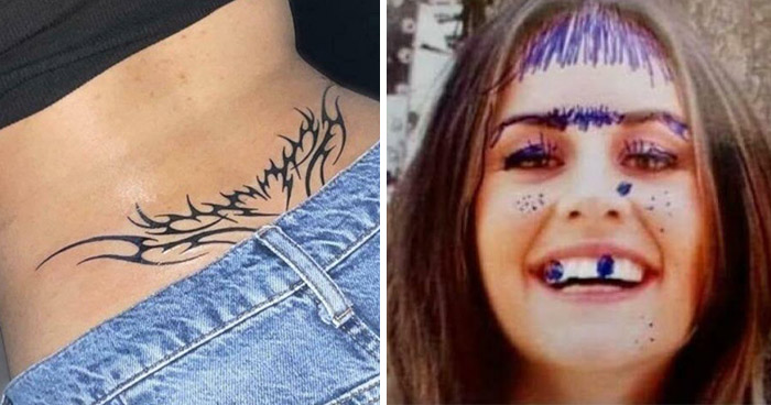
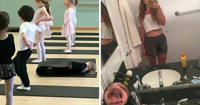
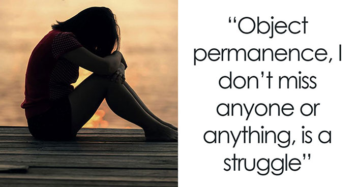
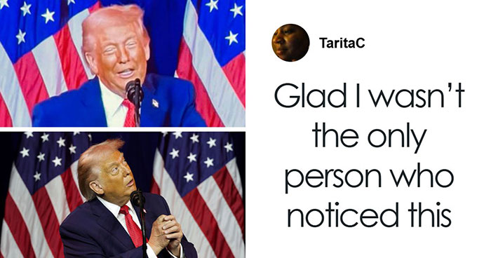
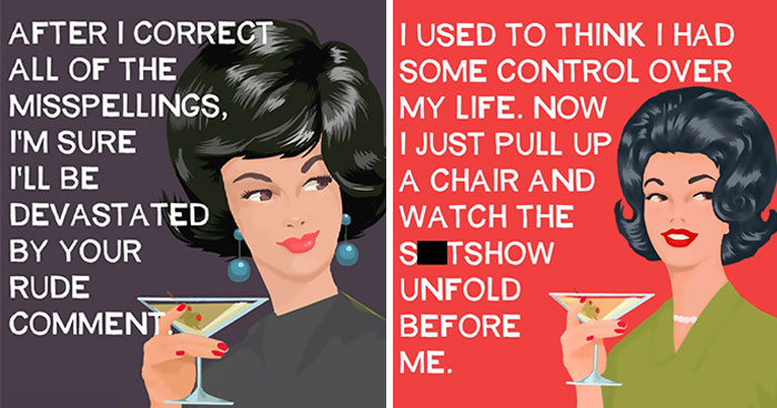
Being positive towards anything can be difficult, especially in 2021. However, it's forever a great idea to bathe your brain with some good thoughts once in a while. It's not a secret – our world has been through a lot, and society can be particularly toxic, which is why it's important to put love above everything. Everyone deserves respect and appreciation... except for whoever was responsible for creating these kerning fails.

Jokes aside, the spacing between individual letters plays a crucial role in general – but especially when you're designing a project for print. Without kerning, things can end up looking a little rough and will most likely completely change the meaning of the text.

By all means, it's not ideal when it happens, but it will probably make someone laugh. These Reddit users decided to share character spacing disasters that they noticed on posters, clothes etc. The subreddit was created in 2012 and currently has 248K members. Here we've gathered some of the best ones!

More info: Reddit

#1

Limit Of Ten

Sign on brick wall showing kerning fail with text reading TEN ANTS ONLY highlighting the importance of character spacing.

PeppermintPhatty Report

RELATED:
    #2

    Can Adult Also

    Blue letters spelling CAN TEEN are spaced too far apart on frosted glass, illustrating a kerning fail affecting readability.

    taenanaman Report

    #3

    *Whale Emoji*

    Wooden framed sign with kerning fails in black cursive lettering spelling inhale and exhale, highlighting character spacing issues.

    apple_fritterer Report

    #4

    Sounds Savory...

    Wooden coaster with kerning fail text "You had meat merlot" and a wine glass illustration next to wine bottle and corkscrew.

    Dokidokidude Report

    ADVERTISEMENT
    #5

    Bean Outsider

    Stainless steel tumbler with kerning fail in text showing character spacing issues on product display.

    Sir-Frederick-III Report

    ADVERTISEMENT
    #6

    The Entry Of The Carps

    Worn baseball cap showing a kerning fail with the word carpentry split awkwardly as CARP ENTRY.

    QueanbeyanPride Report

    #7

    What A Terrible Day To Have Eyes

    Menu board showing kerning fails with irregular character spacing in coffee drink names and prices, highlighting kerning importance.

    PsychicGamingFTW Report

    #8

    You Had Meat Coffee

    Beige cap with a kerning fail showing the text you had meat coffee, highlighting poor character spacing.

    scorpius_rex Report

    ADVERTISEMENT
    #9

    Well That’s A Long Word

    Close-up of a book page showing kerning fails with irregular character spacing affecting readability and flow.

    ninetieths Report

    ADVERTISEMENT
    #10

    #ronics2020

    Store sign with a kerning fail in the word electronics showing how crucial character spacing is in signage design.

    530josh Report

    #11

    Absolutely Noink In This Area

    Warning sign with kerning fail showing the phrase no ink with uneven character spacing on a plastic-covered surface.

    cabbageofvitrol Report

    #12

    Kidsor Kidults

    Warning label with kerning fails and poor character spacing, making the text hard to read and confusing to understand.

    MiniMcCarthy Report

    ADVERTISEMENT
    #13

    I'm A Gine?

    Framed artwork with kerning fail showing spaced letters spelling IM A GINE, highlighting crucial character spacing issues.

    maryamorevnas Report

    ADVERTISEMENT
    #14

    Тhis Sign That Came With A Nutcracker My Mom Recently Bought

    Small hanging sign with kerning fails in text saying Days Till chns tmas showing importance of character spacing.

    givemebackwardsknees Report

    #15

    Thewotldbel

    Plastic bag with kerning fails that highlight crucial character spacing issues affecting readability and design quality.

    xEdwardBlom1337 Report

    #16

    Nearly Had A Hemorrhage Trying To Read This

    Warning sign with poor kerning, showing how crucial character spacing is for clear and readable text on a beach safety warning.

    djfatman Report

    ADVERTISEMENT
    See Also on Bored Panda
    #17

    I Think This Belongs Here..

    Poster with poorly spaced yellow text showing a kerning fail, emphasizing the importance of character spacing in design.

    kenwards Report

    ADVERTISEMENT
    See Also on Bored Panda
    #18

    I Love A Good Activitie Shub, Me

    Colorful arch sign with kerning fails in letter spacing spelling activities hub against a cloudy sky at an outdoor event.

    daephraelle Report

    #19

    Has This Been Done Yet

    Pink kettle with a kerning fail in spaced-out text showing how crucial character spacing is for readability.

    seventeenMachine Report

    ADVERTISEMENT
    See Also on Bored Panda
    #20

    Starw Arst O Re

    Storefront sign with a kerning fail showing misplaced character spacing spelling starwars store as starw arst ore.

    ___cian__ Report

    #21

    S E R I O U S L Y

    Newspaper excerpt showing a kerning fail with the word seriously spaced out, illustrating kerning fails and character spacing.

    EoinM17 Report

    ADVERTISEMENT
    See Also on Bored Panda
    #22

    Dentists Notice

    Clipboard showing a privacy notice with extreme kerning fails, highlighting issues of character spacing in text readability.

    Megatrondj Report

    ADVERTISEMENT
    See Also on Bored Panda
    #23

    Listen Up Kids! The Word Of The Day Is: "Productis"

    Clothing label with a kerning fail showing incorrect character spacing that affects readability and design quality.

    isakdombestein Report

    #24

    Federallaw Requires Thatthisarea Bevacated Whenneeded Bywheelchair Users

    Blue accessibility sign with poorly spaced text showing a kerning fail that confuses character spacing for wheelchair users.

    OtterSou Report

    #25

    Oh Microsoft…

    Text showing a kerning fail with tight and uneven character spacing in the phrase closing checklist on a smartphone screen.

    yorsminround Report

    ADVERTISEMENT
    See Also on Bored Panda
    #26

    Antioxid Ant

    Packaging of watermelon hard seltzer showing kerning fails that highlight the importance of character spacing.

    Ninja11211 Report

    ADVERTISEMENT
    See Also on Bored Panda
    #27

    Bemy Angel

    Pink heart-shaped fabric patch with kerning fails in the text spacing showing BEMY ANGEL instead of BE MY ANGEL.

    mademelosemymarbles Report

    #28

    But Not So Proud Of That Keming, I Hope

    Sign with kerning fail making "British meat" look like "Brit is h meat," showing the importance of character spacing in typography.

    mmuskO Report

    ADVERTISEMENT
    ADVERTISEMENT
    #30

    Happy Hall Oween

    Halloween banner with kerning fails in character spacing at a pharmacy counter emphasizing kerning fails and character spacing importance.

    jumpixx Report