ADVERTISEMENT
Article created by: Justinas Keturka

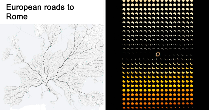
Struggling to remember or make sense of complicated information? Maybe a visual makeover with an eye-catching chart or graph will help! And if you have doubts about its effectiveness, allow us to introduce you to a subreddit called “Data Art”. It's a community dedicated to sharing “aesthetically satisfying data visualizations that you'd be proud to hang on your wall”.

Since its creation in 2017, "Data Art" has grown into a thriving community of over 65 thousand members who share passion for blending aesthetics and data. From evolution of the Shanghai Metro to the largest empires of history, these visualizations are not only informative but also pleasing to the eye. Scroll down to experience the beautifully presented data.

#1

How Different Piano Notes Reverberate Through A Bowl Of Water

Detailed visualization of sound frequencies in interesting charts summarizing data with clear and intricate patterns.

MusicMadeVisible Report

RELATED:
    #2

    U.S. Flag But Each Star Is Scaled Proportionally To Their State’s Population, In Roughly It’s Geographical Position

    American flag with stars arranged in a spiral pattern, illustrating a unique and interesting data visualization chart.

    jmerlinb Report

    #3

    A Cool Guide To The Evolution Of The Alphabet

    Chart showing the evolution of the alphabet with colorful symbols illustrating data summarized in an interesting chart.

    Global-Cheesecake131 Report

    #4

    European Roads To Rome

    Map-style chart illustrating river systems and data connections in an interesting data visualization style.

    jmerlinb Report

    ADVERTISEMENT
    #5

    Long Exposure Of A Roomba Vacuum With A Color Changing Light On Top

    Colorful overlapping light patterns on a bedroom floor creating an abstract chart-like visual representation of data.

    zoliva Report

    #6

    Language Family Tree

    Illustrated tree chart showing Indo-European language families with branch sizes representing native speakers, an interesting data summary.

    Stand Still. Stay Silent Report

    #7

    Literal Art!

    Fabric map of Africa showing traditional textile patterns by region, an interesting chart summarizing cultural data visually.

    Earl Sweatshirt Report

    #8

    All These Countries Fit Inside Africa

    Map of Africa showing comparative sizes of countries like United States, China, and India to illustrate data in an interesting chart.

    Kai Krause Report

    ADVERTISEMENT
    ADVERTISEMENT
    #9

    Nyt's Front Page For 21 Feb. Each Dot Represents A Life Lost To Covid-19 In The Us

    New York Times front page data visualization showing U.S. Covid death toll in an interesting chart format.

    sendhelpandthensome Report

    #10

    Paths Of 800 Unmanned Bicycles Being Pushed Until They Fall Over

    Abstract black lines forming a complex flow chart visualization summarizing data in an interesting and clear way.

    GJenkins4 Report

    #11

    These Diagrams Show The Paths Traced By Mercury, Venus, Mars, Jupiter And Saturn As Seen From Earth

    Line charts showing orbital paths of Mercury, Venus, Mars, Jupiter, and Saturn, summarizing data in interesting charts.

    Vanilla35 Report

    #12

    A Map Of Finland's Bear Population, Made Up Of Bears

    Map of Finland showing bear population density using illustrated bears in an interesting chart summarizing data visually.

    jmerlinb Report

    ADVERTISEMENT
    #13

    This Map Is Drawn Entirely From Shipping Logs From 1945

    World map visualized with interconnected lines representing summarized data in interesting charts for clear insights.

    jmerlinb Report

    #14

    Hey Jude Lyrical Composition [oc]

    Pie chart summarizing lyrical composition of Hey Jude with data visualizations showing word distribution percentages.

    BoMcCready Report

    #15

    [oc] My Wife Made This Blanket That Indicates A Certain Temperature For Every Day Of The Year. 2016 Pennsylvania

    Two cats sitting on a colorful zigzag knitted blanket in a living room with gray sofas and hanging plants.

    jmerlinb Report

    #16

    How Long Animals Live - The Lifespan Of 50 Animals Visualized On A Spiral

    Chart summarizing animal lifespans with interesting data visualizations illustrating how long various species live.

    alansfactoryoutlet Report

    ADVERTISEMENT
    #17

    [oc] I Rendered Every Single Road In Tokyo Area On One Map. Love The Results

    Map of Tokyo created by summarizing data in an interesting chart showing all roads and layout in detail.

    jmerlinb Report

    #18

    Every Lighthouse In Ireland, With Accurate Timings, Flash Patterns And Colours

    Map of Ireland showing lighthouses visualized with bright light beams in an interesting data chart visualization.

    jmerlinb Report

    #19

    Smarties Colour Distribution

    Colorful candy arranged in an interesting chart visualizing data in a creative and clear way for easy understanding.

    Koljax Report

    #20

    Anatomy Of The Human Body, In The Style Of The London Underground Map

    Chart illustrating human body anatomy using subway map style with labeled systems and color-coded pathways for data visualization.

    jcsimmo Report

    #21

    [oc] Words For "Mother" Descended From A Common Proto-Indo-European Root

    Chart illustrating the evolution of the word mother from a common Indo-European root in an interesting data summary.

    UWillAlwaysBALoser Report

    #22

    [oc] This World Map Is Made Of Only Air Currents. If You Look Closely, You'll See Country Outlines

    Air currents visualized in a detailed chart summarizing data trends in an interesting and clear way.

    Jack Merlin Bruce Report

    #23

    Morse Code Guide By Google

    Infographic summarizing data with creative icons representing words with silent letters in an interesting chart format.

    11irondoggy11 Report

    #24

    Wow!!!

    Chart showing the phases of a solar eclipse with detailed data visualizations summarizing the event in interesting patterns.

    akasaiga Report

    #25

    History Of The Mississippi River, As Drawn In 1944

    Colorful historical data chart showing the ancient courses of the Mississippi River meander belt with detailed geographic annotations.

    Harold Fisk Report

    #26

    Worldwide Earthquake Density 1965-2006 [oc]

    World map showing earthquake density data from 1965 to 2016 with magnitude 5.5+ visualized in interesting charts.

    ZachBowders Report

    See Also on Bored Panda
    #27

    From Flowing Data. Coral-Like Cities To Show Road Networks

    Colorful data visualization charts representing connections and patterns across multiple UK cities in an interesting data summary.

    redflavormp3 Report

    #28

    Real Proportions Of All Land Masses Revealing Actual Areas Of Countries, Territories And Major Islands Without Any Distortions (By Art.lebedev)

    Chart summarizing total land surface area by country, using interesting data visualization to clarify global geography.

    artlebedev Report

    #29

    How To Build A Human

    Colorful spiral chart illustrating human embryo and fetus development stages summarized in an interesting infographic on data visualization.

    tabletopwhale Report

    #30

    I Made A Bar Graph Of My Favorite Quarantine Beers

    Stacks of empty beverage boxes arranged like a bar chart, an interesting way people summarized data visually.

    reddit.com Report

    #31

    The Globe Centred On Honolulu - Topographic Map From A Single Spiral Line

    Circular data visualization chart representing the globe centered on Honolulu, illustrating summarized data with interesting charts.

    onionleafprints Report

    #32

    This "Photo" Of The Sun Uses Neutrinos Instead Of Light, And Is Taken At Night By Looking Through The Earth

    Heatmap style chart with bright center and surrounding colors, summarizing data in an interesting visual format.

    jmerlinb Report

    #33

    The Sentiment Scale: How Positive Or Negative A Word Sounds

    Color-coded chart summarizing how positive or negative different descriptive words are perceived based on data visualization.

    yougov Report

    #34

    World Temperature Anomalies [oc]

    Heatmap chart showing average world temperature anomalies by month and year since 1850 summarizing data in interesting charts.

    cavedave Report

    #35

    139 Years Of Global Temperatures Knit Into A Baby Blanket

    Colorful knitted blanket with horizontal stripes in shades of red, pink, white, and blue illustrating data in interesting charts.

    itsacalamity Report

    #36

    Lat And Long Data Of Every Town In The World With More Than 1000 People

    World map highlighting population density with bright yellow lights, an interesting data chart visualization.

    black_red_ranger Report

    See Also on Bored Panda
    #37

    (Some Of) The Largest Empires Of History, Visualised As Planets Orbiting Earth

    Visualization of data in interesting charts comparing the size of empires to Planet Earth in a clear summary.

    Jack Merlin Bruce Report

    #38

    90 Minute Public Transit Commuter Zone For London vs. San Francisco

    Satellite maps comparing public transport coverage in London and San Francisco within 90 minutes, illustrating data in interesting charts.

    undertheraedar Report

    #39

    Most Common Themes Of 8000 Picasso Paintings, Visualised In The Style Of Picasso

    Colorful infographic chart titled Frames of Mind breaking down types of intelligence in an interesting data visualization.

    Alberto Lucas López Report