Get Premium
Dark mode theme is available exclusively for premium users. Learn more about the benefits of subscribing.
No fees, cancel anytime.

 Dark Mode Ad-Free Browsing Unlimited Content
 Ad-Free Browsing Unlimited Content Dark Mode
Join 1.2 million Panda readers who get the best art, memes, and fun stories every week!
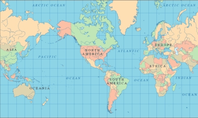
Ever wondered why Greenland looks as big as Africa on the map? It’s because of something called the Mercator projection. Putting a 3-D planet on a two-dimensional world map was challenging for early cartographers. So, a Flemish geographer and cartographer named Gerardus Mercator came up with a solution for the most accurate world map.
In 1569, he designed an atlas that could be accurately used for navigation. Still, the downside was that his system distorted the size of objects depending on their position relative to the equator.
Because of this, landmasses like Antarctica and Greenland appear much bigger than they are. Though there are around 40 types of map projections, from conical to polyhedral and retroazimuthal, depicting the actual size of the world, this one is still used the most because of its convenience and simplicity, even by Google Maps. None of these projections can be titled the real world map because they all depict the same Earth through a different lens.
So, what does the real-world map look like? To show how incorrect our understanding of countries by size is, a website called thetruesize.com lets you move land masses into different locations. This helps you understand the actual size of countries.
We at Bored Panda played a bit with this tool, and what we found will change your perspective on our planet’s geography. The website lets you juxtapose two countries to compare their relative size, and if you’re wondering which countries are the best to live in, we explored that too.
Here’s what the real size of countries looks like.
This post may include affiliate links.
Size of contiguous United States Not counting Alaska & Hawaii, the 48 contiguous states occupy a combined area of 3.12 million sq. mi. While Australia is 2.99 million sq miles - I never realized they were so close in size!
There's a lot of empty space in the middle. Most of us live along the coast or within a few hundred kilometers of it.
Load More Replies...Actually, Australia is incredibly large and thinly populated. 33 people per km² compares to 3,1....i.e. the US is ten times more densely populated (fun fact: central european states such as the netherlands are ten times more densely populated than the US...)
The UK is about a 40th of the size of the US, but the US only has 5X the number of people. The UK is dense!
Load More Replies...No big surprise. If anything, Australia looks smaller; it is, after all, a continent.
No it doesn't. Knowing how large Australia (which by the way is an entire continent) is, I'd say the U.S. looks pretty damned big.
Australia, Tasmania, New Guinea, Seram, possibly Timor is the Australian continent which is different than the country
Load More Replies..."Looks believably small" I'm sorry, but I am not sure how putting the 3rd largest country in the world next to the 6th largest country in the world by land mass makes either of them look small?
The picture doesn't take into account Alaska which is almost 20% of the area of the USA
Load More Replies...I'm pretty sure that the USA are a bit bigger than Australia, and no, it does not look 'unbelievably small ' Really...
Australia is densely populated cause around 35% gets very little rain which makes living there hard, if you click on the picture it will show you where the desert is 800px-Dese...97-png.jpg 
Yup. Australia only inhabits 0.77 km2 of 7.6 million km2 of land, the US inhabits 4.61 million km2 out of 9.6 million km2. Just because we have all that land in Australia, doesn't mean we can use it. 70% is semi-arid, 35% is desert. Much higher percent than the US.
Load More Replies...Oh how wrong you are. The average waist size of America is 42 inches, far surpassing all other countries. (except Germany)
Load More Replies...A mass of land that we arbitrarily drew a line around is about the same size as the world's biggest island? oooh so interesting... if you're a really really low effort thinker.
I used to tell friends in the US - Western Australia is bigger than Texas!
You have to explain the problem of projections giving wrong size impressions.
The fact is that USA is 9.8 mill km² whereas Australia is 7,7 mill km². That is quite a substantial difference..
Okay for all you non believers. How can you explain this? https://tinyurl.com/yb6nyd9w Well, what is this you say and how come the world and countries look different. Well because this is the actual size of the countries. Well, you ask yourself why is Greenland so small. Well that is because it is small. It is only 836,300 mi² compared to the United States 3.797 million mi². Wow that is a big difference. No, I did not make up these numbers. Go look them up if you think different. Also funny how when one describes Greenland they call it massive but it is around 4,5 times smaller than the United States. Why is it distorted / Well the maps were made from a globes perspective. When it was drawn to paper and put on a flat map the images stayed the same size. They never adjusted the size. As you go near the equator objects become smaller. Why well maybe they were trying to hide something. Who knows. Why were they drawn so big? Oh by the way here is the website to move countries around and fi
The misleading proportions of the old Mercator projection maps are well known. Today different ways of flattening the ball are much more in use, and most people will have seen a globus.
Interesting perspective that USA is described as 'as small as australia', I have always considered aus to be almost as big as the USA. I KNOW Aus is big not small!
USA is 2.2 million square kilometers larger than Australia. This map doesn't take into account Alaska which is almost 20% of the area of USA.
Load More Replies...This makes sence now about the size. The long semi trains that haul products across Australia . As it was always shown as a smaller isle did not make sence to have massave trucks .
And they are still both mostly empty ;-). Having lived on both continents I can attest to driving for hours and hardly seeing another soul. Unlike England where I was born, you trip over someone every 50 feet LOL
Believe me, that's the way ("unbelievably small") we see US here in Europe.
When I visit US I am ALWAYS having to correct people on how big my country is. (One guy thought it was only as big as the UK! They never believe me. Maybe now they will!
They look like they have similar shapes (if you turn Australia upside down....even a shape like the a Great Lakes is there! (And they are "down under"...right?)
Yanks refuse to believe that the continent of Africa is bigger than the continent of North America. Typical ignorance.
The reason why the north is biger than south, is because de real form of the earth is a flat circle!! Think about. Tries transform a circle into a plane and you have a mercator projection!!
If you flipped Australia upside down it's shaped a lot like the US.
Nah, mate. Flip the US around and it looks like Australia
Load More Replies...Don't know why someone would say how small America looks next to Australia...looks about the same size from here.
The US doesn't show Alaska or the Hawaiian Islands. Map comparison is not at all accurate.
How ironic or is it by coincidence that the true size of the earth countries matches the picture or is by coincidence. flat20eart...er_905.jpg 
Here play with the tool. It'll make sense http://thetruesize.com/#?borders=1~!MTY2MjIwMDM.Mjg2MzE1NA*MjUwNzQxODk(MTI0MTc5Mzk~!CONTIGUOUS_US*OTk3NjIwMA.MjgwMzA4MDM(MTc1)Mg~!IN*NTI2NDA1MQ.Nzg2MzQyMQ)MA~!CN*OTkyMTY5Nw.NzMxNDcwNQ(MjI1)MQ
This Earth is Flat and Staionary !!!! Go to facebook and join Flat and Stationary Earth. You will be dazzelt
They also forgot the Australian islands as well
Load More Replies..."US...looks unbelievably small" is a veeery telling interpretation! Just not as dominant as the writer had presumed is my guess! I'm not at all surprised by the comparative sizes, I'm from UK.
Pour une représentation plus exacte du monde, voyez plutôt authagraph. http://www.authagraph.com/top/?lang=en
I think the Indian Ocean (surrounded in blue) is bigger than Austria, but I may be wrong
Lol, and Australia is a SMALL continent. Continents aren't categorised on size you know ahahaha :)
Load More Replies...Except 35% of Australia receives so little rainfall, it is classified as desert, 70% is semi-arid, and we only live on 18% of the land for that reason. Australia only inhabits 0.77 km2 of 7.6 million km2 of land, the US inhabits 4.61 million km2 out of 9.6 million km2. Increasing our population will mean we won't have enough water, which we already struggle with when we have decade long droughts.
Load More Replies...Australia has approximately 24.1 million people.
Load More Replies...I don't get why the map was done so inaccuratelly? can somone explain?
Yes, Africa is significantly larger than it appears on many traditional maps. An interesting fact about the Mercator projection is that it distorts the sizes of landmasses as they get farther from the equator. This distortion disproportionately enlarges countries near the poles while diminishing the size of equatorial regions. As a result, Africa, which straddles the equator, is typically misrepresented as much smaller than it is in reality.
In reality, Africa covers an expansive area of about 11.7 million square miles. Its vastness is often underestimated on conventional maps, leading to misconceptions about its size and significance. On an accurate world map, Africa would appear three times the size of US.
The map of the earth is a 2 d representation of a 3 d object, that's why the size is different, because the map is distorted.
Nope. The width of South America at its widest point is 2,705 miles (4,353 km), The width of Canada at its widest point is 5,780 miles (9,306 km).
The AuthaGraph is considered to be the real world map that shows the true size of countries.
Unlike the Mercator projection, which distorts the sizes of landmasses, the AuthaGraph projection aims to maintain equal area property. This means that the relative size of continents and countries is preserved accurately. This is essential for understanding the true proportions of different regions of the world.
The AuthaGraph projection minimizes distortion by dividing the Earth’s surface into 96 regions, which are then transferred to a tetrahedron. This tetrahedron is unfolded and flattened to create a two-dimensional map.
While no projection can be perfect in preserving both area and shape, the AuthaGraph projection comes really close to showing the real size of countries.
It all has to do with putting a round object onto a flat, rectangular presentation. Locations near the poles get stretched and distorted, appearing much larger. The point of the map is that IF Japan was in that particular geographic location (closer to the North Pole), it would look much larger when transcribed onto a flat map.
Greenland appears disproportionately large on the maps due to an inherent distortion in translating the Earth’s three-dimensional, spherical surface onto a two-dimensional map.
The Mercator projection is widely used for navigational purposes because it preserves angles and, therefore, helps sailors navigate straight lines or constant compass headings. However, it doesn’t preserve area or size accurately, particularly as you move away from the equator.
It exaggerates the sizes of landmasses as they approach the poles, causing polar regions to appear much larger than they are in reality.
Greenland is situated near the North Pole, and as a result, it is significantly distorted on Mercator maps. In reality, Greenland is much smaller than it appears on traditional maps. It covers an area of approximately 850,000 square miles, making it only slightly larger than Saudi Arabia (830,000 square miles).
Wholly Molley! No wonder I get so many customer service agents in India.... that is one HUGE country.
but 2/3rds of Canada is uninhabitable because it's in the f-ing article circle.
You should move this to the top for the dimwits. This is a great series of posts. Thanks for sharing - fun stuff :D
The True Size Of… is an interactive tool that lets you visually compare landmass. It provides a more accurate representation of landmass sizes and minimizes distortion.
"Peters" (actually Gall-Peters, as Gall came up with the projection long before) is no truer than Mercator overall. The key phrase here is area: Gall-Peters is designed to preserve relative areas, while Mercator preserves direction and shape. "True representation of land area" and "Incorrect/false representation of land area" are not entirely false statements, but they are too easily read as "Gall-Peters good, Mercator bad!" Which is simply not the case. But despite the famous West Wing scene, in fact there are many better projections than Gall-Peters for showing the whole world — and they have been and continue to be in use in most major publications related to maps and geography for many, many years. There's no single most popular projection, but Mollweide, Winkel Tripel, and perhaps Robinson remain some of the most common. In short: each projection has its own uses, and its own shortcomings. Mercator was never meant to be the only projection ever used.
By almost the same size do you really mean less than half as big as Alaska?
The second article discusses the inaccuracies of the Mercator projection, similar to the detailed exploration in the first article.
For a deeper look into how maps can distort perceptions of country sizes, you might explore the interesting ways countries are depicted in size.

This is widely known phenomenon: the problem with our world maps is that we try to map a round object on a flat surface. As far as I know, there is no mathematical method to map it 1:1. Because of this setup, our view on countries on world maps are distorted. Also nice fact: depending on where you buy your map, it's different everywhere, as each country places itself in the middle of the map
Fun & true fact : Canada don't place himself in the center on the map, we actually put the Atlantic Ocean/Europe in the center (like #12; #14). This way we don't hurt anyone.
Load More Replies...One thing that never amazes me is the ignorance of people. :)
Load More Replies...Too bad the countries of the African continent are so underrepresented in the compared photo's. As far as I know they represent a very big part of the world in actual size!
EXACLTY my thought. Interesting that it's the only land mass not shown.
Load More Replies...It is a funny and tragic thing at the same time that SO many people don't understand how the geographic projection works. This is elementary school knowledge people, at least where I come from - in fifth grade when children start learning geography they are taught the basics first - like shape of the Earth, the map projections, rotation and revolution of the Earth and it's consequences, etc...
Thank you Mr Mercator for giving generations a completely wrong view of the world.
I don't fully understand this. Can the publisher please explain? I get how California is about the the same size as the UK but the rest are puzzling.
Map distortions are caused by trying to project features on a sphere onto a flat surface. Globes are better for size comparisons between countries and/or continents. About the best map to view earth's features with little distorionon a flat surface is a Bucky Fuller dymaxion map.
Load More Replies...I don't get it. In #28 (Alaska next to the 48 Contiguous States) Alaska (moved South) looks like half (of 48 Contiguous States) and in #29 Texas (moved North) alone looks as the whole Alaska? It shouldn't scale with the same percentage if you move/compare to the North or South of it's original position?
Sigh .. Read about the Merc projection. But I will explain, Texas is closer to the equator so it looks smaller than it should compared to other states. So don't imagine the USA as havin'the same scale.
Load More Replies...I think you failed to properly explain how you've moved countries around but that they don't actually appear that way in real life (like the Indonesia on Russia map.) I can see a lot of people coming to this page, not reading the intro paragraph, and just looking at the maps and thinking "Wow, Romania's huge!" You really need to make sure that people understand what they're looking at, that intro paragraph does not make it clear for most people that these are not actual sizes. Trust me, my 8th grade students would absolutely NOT read that intro and just look at the maps and take them as fact.
This is great stuff. I had not previously appreciated how the distortion introduced by the converging longitudinal lines increases as you get near the poles. Above about 50 degrees n or s.
what's wrong with being curious, if I didn't know something in school my teacher didn't scorn me.
Hi, I don't believe in a globe, I'm a FLAT EARTH believer, so I also believe that all these maps are wrong. I just wonder if some days we will find a true map of the Earth so people will not be deceived anymore.
Globes have accurate proportionality. But it is difficult to fold one and store it. Although there are some one may deflate.
Perhaps too many examples of the very same concept. The Mercator projection distorts sizes. That's all.
BORING PANDA IS STUPID,LIKE IT WAS SELLING OF ALASKA FOR US RUSSIANS,OR REVOLUTION,BECAUSE FINLAND UKRAINE POLAND,BELARUS KAZAKHSTAN,ETC.,OR 100 YEARS BEFORE.....LIKE THEY DIDNT,BUT EXPLAIN ME PANDA IN KALIFORNIA,THERE IS STILL OLD RUSSIAN MILITARY KAMP..DID YOU HEARD OF THAT MIRACLE??,NOW RUSSIA HAS 17 MILION SQUARE KM AND 11 TIME ZONES,SO IT BIGEST,COUNTRY,WITH STILL ONE OF BEST STATE SEC. ANALITIC, SERVICES,AND ONE OF GREATEST PATRIOTISM AFTER ALL IN RUSSIA NOW LIWES 147 MIL PEOPLE,ONE MAN ON 1000KM2,OR MORE?BIGEST OIL,GAS,WATER,URANIUM ETC.AFTER MONGOLS,KATHOLICS,FALL OF FIRST EMPIRE WITH IVAN THE 4TH,SO CALLED TERIBLE,AND TURKS,OTOMAN EMPIRE,PERSIAN EMPIRE,NAPOLEON,KRIMEAN WAR,WW1.,KOMUNIST REVOLUTION,FALL OF ROMANOVS EMPIRE,STALIN LENIN,USSR,WW2,--HITLER,...CHERCHILL,US,COLD WAR,ETC..RUSSIA ALWAYAS,WON,SO IT WAS THE BIGEST COUNTRY,ONLY WILL RISE,NOT FALL,SERTANLY NOT APART,?OR BECAUSE SOME CASE LIKE CHECNIYA, 33 000 KM2....
You forgot Africa and have massively bigger it is than some countries and continents.
Bottom line: Buy a globe if you want to see how countries really compare, size wise, to one another. Because a flat map distorts the sizes of continents the further they are from the equator.
but, but, but... lands get "higher" on maps if out of equatorial areas... but things on this maps do get "wider", which simply is not true...
As far as I'm concerned all countries have the same world map.
Just allow that the lower the latitude more accurate the representation. On Mercator an object at 40 degrees is less accurately represented than one at 15 degrees latitude.
As much as I love maps, why not just make a list of countries showing total square kilometers.....
Because countries aren'squares, and width plays a role on how big they appear
Load More Replies...if you want to see countries as they are sized exactly relative to each other, buy a globe
Any attempt to project the surface of a sphere onto a rectangle necessarily involves involves distortions. There are hundreds of different projections, but one recent projection unusually preserves both the relative size and shape of countries, which people might find interesting: http://www.authagraph.com/projects/description/【作品解説】記事01/?lang=en
They didn't want to touch the misrepresentation of Africa's size. 🤔
This pictures are still misleading (the other way around compared to "usual" maps). For example, China (10 billion km2) is far from being as big as Russia (17). Here it looks about 80% of its size
It's interesting you didn't compare the continent of Africa, (just the Congo), hum?
Hoax? Rank - Country - Area Sq Km 1Russia17,075,200 2Canada9,984,670 3United States of America9,826,630 4China9,596,960 5Brazil8,511,965 6Australia7,686,850 7India3,287,590 8Argentina2,766,890 9Kazakhstan2,717,300 10Algeria2,381,740
so your saying Sth Africa is actually the same width as the Nth of Africa, and Sth America is wide as the United States? what a load of B.S
why don't you move countries of South America to the northem of earth? still doesn't work for you?
This is why I prefer to use maps with the "Gall–Peters projection" https://en.wikipedia.org/wiki/Gall–Peters_projection
i would like to see Sudan, Zaire ,Nigeria or even south Africa put on this scale
это наебалово, в России 10 часовых поясов, а в Африке 4 но по этой карте они почти равны. Омерикосы опять хуйню подсунули всем - хавайте.
india map is depicted wrongly . Remember 7-year jail, Rs 100 crore fine for wrong depiction of India map, Check the link below http://timesofindia.indiatimes.com/india/7-year-jail-Rs-100-crore-fine-for-wrong-depiction-of-India-map/articleshow/52133221.cms
I am not so sure with your facts. How did this becomes a fact though?#curious
РОССИЯ САМАЯ ЛУЧШАЯ СТРАНА НА СВЕТЕ! И ВСЕ ОСТАЛЬНЫЕ СТРАНЫ НАМ ЗАВИДУЮТ! 57971f996536f.jpg 
Yes but Canada's population is less than the state of California and a lot of their land is uninhabitable.
Low population, yes, uninhabitable land, no. Look up "Inuit" for further clarification.
Load More Replies...Interested people out there, there is a much better way of mapping the world, called 'Dymaxion Map' (https://en.wikipedia.org/wiki/Dymaxion_map), which was developed by Buckminster Fuller. He even considered not having a South nor North on his map as it is equated with 'rich/more developed North' and 'poor/undevelopped South'.
I'd like to see the UK placed in East Asia (or next to Japan). Once my British friend said, 'Sometimes British people say Japan is a tiny island country, but in fact the UK is much smaller than Japan.' Is Great Britain (the main island of the UK) bigger than the Korean peninsula?
well to get the most accurate figure... i divide land area (sq mile) of the apparent largest by the smallest... atleast u will see by how many times the largest is bigger than the smallest
I wonder why they did not do Africa. I think people would of been blown out of their mind I'd they saw how big Africa is.
Because Africa is close to the Equator and there is very little distortion going on there during the mapping. So Africa is the most accurate drawn continent on the world map.
Load More Replies...This is cool but I don't full understand it... Could someone explain
The problem is there is no completely accurate way to map a round object on a flat map. Think of trying to wrap a soccer ball as a present with flat wrapping paper (or even try it with a small ball and writing paper). You just cannot do it neatly. You end up with lots or folds or wrinkles, or you have to cut the paper into many slices, and you still have overlap and wrinkles. Well, you could wrap the ball in very stretchy cloth. Then you could write "For Bobby, Happy Birthday!" on the cloth. But when you unwrapped the cloth, the message would be badly distorted. So every flat map of the earth is really a lie because the earth is not flat. The standard flat map makes things near the equator look smaller (in comparison to other places) smaller than they are.
Load More Replies...What about Africa? Does it stay the same, because of the position of it being both north & South? Thanks for the interesting take on the world...
Because much of Africa is near the equator, it looks much smaller on a flat map than it is actually is.
Load More Replies...Why? The way maps in Mercator Projection are made lead to wrong impressions. To truly compare sizes, you need images like the ones above, flat maps, or something like https://en.wikipedia.org/wiki/List_of_sovereign_states_and_dependencies_by_area
Load More Replies...:)) Будете много выебываться все будет Россией. Не с чем сравнивать будет.
es totalmente cierto, solo hace falta ver como funciona el mapa mundi clasico (el que sigue usando google maps en modo "mapa" por ejemplo") y el de un globo terraquio (o google maps en modo "earth"). Se llama proyeccion de Mercator y es uno de los modos más populares de distorcionar una esfera como nuestro planeta para que pueda ser representada en el plano. A su vez es una representación que obviamente favorece a la posición en el mapa de Europa y Norte América (arriba del mapa y mas grande), por eso se sigue usando tanto.
Load More Replies...I can't be the only one who wants to see my penis mapped over Greenland.
This is widely known phenomenon: the problem with our world maps is that we try to map a round object on a flat surface. As far as I know, there is no mathematical method to map it 1:1. Because of this setup, our view on countries on world maps are distorted. Also nice fact: depending on where you buy your map, it's different everywhere, as each country places itself in the middle of the map
Fun & true fact : Canada don't place himself in the center on the map, we actually put the Atlantic Ocean/Europe in the center (like #12; #14). This way we don't hurt anyone.
Load More Replies...One thing that never amazes me is the ignorance of people. :)
Load More Replies...Too bad the countries of the African continent are so underrepresented in the compared photo's. As far as I know they represent a very big part of the world in actual size!
EXACLTY my thought. Interesting that it's the only land mass not shown.
Load More Replies...It is a funny and tragic thing at the same time that SO many people don't understand how the geographic projection works. This is elementary school knowledge people, at least where I come from - in fifth grade when children start learning geography they are taught the basics first - like shape of the Earth, the map projections, rotation and revolution of the Earth and it's consequences, etc...
Thank you Mr Mercator for giving generations a completely wrong view of the world.
I don't fully understand this. Can the publisher please explain? I get how California is about the the same size as the UK but the rest are puzzling.
Map distortions are caused by trying to project features on a sphere onto a flat surface. Globes are better for size comparisons between countries and/or continents. About the best map to view earth's features with little distorionon a flat surface is a Bucky Fuller dymaxion map.
Load More Replies...I don't get it. In #28 (Alaska next to the 48 Contiguous States) Alaska (moved South) looks like half (of 48 Contiguous States) and in #29 Texas (moved North) alone looks as the whole Alaska? It shouldn't scale with the same percentage if you move/compare to the North or South of it's original position?
Sigh .. Read about the Merc projection. But I will explain, Texas is closer to the equator so it looks smaller than it should compared to other states. So don't imagine the USA as havin'the same scale.
Load More Replies...I think you failed to properly explain how you've moved countries around but that they don't actually appear that way in real life (like the Indonesia on Russia map.) I can see a lot of people coming to this page, not reading the intro paragraph, and just looking at the maps and thinking "Wow, Romania's huge!" You really need to make sure that people understand what they're looking at, that intro paragraph does not make it clear for most people that these are not actual sizes. Trust me, my 8th grade students would absolutely NOT read that intro and just look at the maps and take them as fact.
This is great stuff. I had not previously appreciated how the distortion introduced by the converging longitudinal lines increases as you get near the poles. Above about 50 degrees n or s.
what's wrong with being curious, if I didn't know something in school my teacher didn't scorn me.
Hi, I don't believe in a globe, I'm a FLAT EARTH believer, so I also believe that all these maps are wrong. I just wonder if some days we will find a true map of the Earth so people will not be deceived anymore.
Globes have accurate proportionality. But it is difficult to fold one and store it. Although there are some one may deflate.
Perhaps too many examples of the very same concept. The Mercator projection distorts sizes. That's all.
BORING PANDA IS STUPID,LIKE IT WAS SELLING OF ALASKA FOR US RUSSIANS,OR REVOLUTION,BECAUSE FINLAND UKRAINE POLAND,BELARUS KAZAKHSTAN,ETC.,OR 100 YEARS BEFORE.....LIKE THEY DIDNT,BUT EXPLAIN ME PANDA IN KALIFORNIA,THERE IS STILL OLD RUSSIAN MILITARY KAMP..DID YOU HEARD OF THAT MIRACLE??,NOW RUSSIA HAS 17 MILION SQUARE KM AND 11 TIME ZONES,SO IT BIGEST,COUNTRY,WITH STILL ONE OF BEST STATE SEC. ANALITIC, SERVICES,AND ONE OF GREATEST PATRIOTISM AFTER ALL IN RUSSIA NOW LIWES 147 MIL PEOPLE,ONE MAN ON 1000KM2,OR MORE?BIGEST OIL,GAS,WATER,URANIUM ETC.AFTER MONGOLS,KATHOLICS,FALL OF FIRST EMPIRE WITH IVAN THE 4TH,SO CALLED TERIBLE,AND TURKS,OTOMAN EMPIRE,PERSIAN EMPIRE,NAPOLEON,KRIMEAN WAR,WW1.,KOMUNIST REVOLUTION,FALL OF ROMANOVS EMPIRE,STALIN LENIN,USSR,WW2,--HITLER,...CHERCHILL,US,COLD WAR,ETC..RUSSIA ALWAYAS,WON,SO IT WAS THE BIGEST COUNTRY,ONLY WILL RISE,NOT FALL,SERTANLY NOT APART,?OR BECAUSE SOME CASE LIKE CHECNIYA, 33 000 KM2....
You forgot Africa and have massively bigger it is than some countries and continents.
Bottom line: Buy a globe if you want to see how countries really compare, size wise, to one another. Because a flat map distorts the sizes of continents the further they are from the equator.
but, but, but... lands get "higher" on maps if out of equatorial areas... but things on this maps do get "wider", which simply is not true...
As far as I'm concerned all countries have the same world map.
Just allow that the lower the latitude more accurate the representation. On Mercator an object at 40 degrees is less accurately represented than one at 15 degrees latitude.
As much as I love maps, why not just make a list of countries showing total square kilometers.....
Because countries aren'squares, and width plays a role on how big they appear
Load More Replies...if you want to see countries as they are sized exactly relative to each other, buy a globe
Any attempt to project the surface of a sphere onto a rectangle necessarily involves involves distortions. There are hundreds of different projections, but one recent projection unusually preserves both the relative size and shape of countries, which people might find interesting: http://www.authagraph.com/projects/description/【作品解説】記事01/?lang=en
They didn't want to touch the misrepresentation of Africa's size. 🤔
This pictures are still misleading (the other way around compared to "usual" maps). For example, China (10 billion km2) is far from being as big as Russia (17). Here it looks about 80% of its size
It's interesting you didn't compare the continent of Africa, (just the Congo), hum?
Hoax? Rank - Country - Area Sq Km 1Russia17,075,200 2Canada9,984,670 3United States of America9,826,630 4China9,596,960 5Brazil8,511,965 6Australia7,686,850 7India3,287,590 8Argentina2,766,890 9Kazakhstan2,717,300 10Algeria2,381,740
so your saying Sth Africa is actually the same width as the Nth of Africa, and Sth America is wide as the United States? what a load of B.S
why don't you move countries of South America to the northem of earth? still doesn't work for you?
This is why I prefer to use maps with the "Gall–Peters projection" https://en.wikipedia.org/wiki/Gall–Peters_projection
i would like to see Sudan, Zaire ,Nigeria or even south Africa put on this scale
это наебалово, в России 10 часовых поясов, а в Африке 4 но по этой карте они почти равны. Омерикосы опять хуйню подсунули всем - хавайте.
india map is depicted wrongly . Remember 7-year jail, Rs 100 crore fine for wrong depiction of India map, Check the link below http://timesofindia.indiatimes.com/india/7-year-jail-Rs-100-crore-fine-for-wrong-depiction-of-India-map/articleshow/52133221.cms
I am not so sure with your facts. How did this becomes a fact though?#curious
РОССИЯ САМАЯ ЛУЧШАЯ СТРАНА НА СВЕТЕ! И ВСЕ ОСТАЛЬНЫЕ СТРАНЫ НАМ ЗАВИДУЮТ! 57971f996536f.jpg
Yes but Canada's population is less than the state of California and a lot of their land is uninhabitable.
Low population, yes, uninhabitable land, no. Look up "Inuit" for further clarification.
Load More Replies...Interested people out there, there is a much better way of mapping the world, called 'Dymaxion Map' (https://en.wikipedia.org/wiki/Dymaxion_map), which was developed by Buckminster Fuller. He even considered not having a South nor North on his map as it is equated with 'rich/more developed North' and 'poor/undevelopped South'.
I'd like to see the UK placed in East Asia (or next to Japan). Once my British friend said, 'Sometimes British people say Japan is a tiny island country, but in fact the UK is much smaller than Japan.' Is Great Britain (the main island of the UK) bigger than the Korean peninsula?
well to get the most accurate figure... i divide land area (sq mile) of the apparent largest by the smallest... atleast u will see by how many times the largest is bigger than the smallest
I wonder why they did not do Africa. I think people would of been blown out of their mind I'd they saw how big Africa is.
Because Africa is close to the Equator and there is very little distortion going on there during the mapping. So Africa is the most accurate drawn continent on the world map.
Load More Replies...This is cool but I don't full understand it... Could someone explain
The problem is there is no completely accurate way to map a round object on a flat map. Think of trying to wrap a soccer ball as a present with flat wrapping paper (or even try it with a small ball and writing paper). You just cannot do it neatly. You end up with lots or folds or wrinkles, or you have to cut the paper into many slices, and you still have overlap and wrinkles. Well, you could wrap the ball in very stretchy cloth. Then you could write "For Bobby, Happy Birthday!" on the cloth. But when you unwrapped the cloth, the message would be badly distorted. So every flat map of the earth is really a lie because the earth is not flat. The standard flat map makes things near the equator look smaller (in comparison to other places) smaller than they are.
Load More Replies...What about Africa? Does it stay the same, because of the position of it being both north & South? Thanks for the interesting take on the world...
Because much of Africa is near the equator, it looks much smaller on a flat map than it is actually is.
Load More Replies...Why? The way maps in Mercator Projection are made lead to wrong impressions. To truly compare sizes, you need images like the ones above, flat maps, or something like https://en.wikipedia.org/wiki/List_of_sovereign_states_and_dependencies_by_area
Load More Replies...:)) Будете много выебываться все будет Россией. Не с чем сравнивать будет.
es totalmente cierto, solo hace falta ver como funciona el mapa mundi clasico (el que sigue usando google maps en modo "mapa" por ejemplo") y el de un globo terraquio (o google maps en modo "earth"). Se llama proyeccion de Mercator y es uno de los modos más populares de distorcionar una esfera como nuestro planeta para que pueda ser representada en el plano. A su vez es una representación que obviamente favorece a la posición en el mapa de Europa y Norte América (arriba del mapa y mas grande), por eso se sigue usando tanto.
Load More Replies...I can't be the only one who wants to see my penis mapped over Greenland.


 No fees, cancel anytime


")
")