Get Premium
Dark mode theme is available exclusively for premium users. Learn more about the benefits of subscribing.
No fees, cancel anytime.

 Dark Mode Ad-Free Browsing Unlimited Content
 Ad-Free Browsing Unlimited Content Dark Mode
Join 1.2 million Panda readers who get the best art, memes, and fun stories every week!
While we might recognize most of these masterpieces and their artists, we probably don’t know much about the stories behind them. From personal experiences to hidden messages, each painting has an origin story that’s as captivating as the artwork itself. Some artworks weren’t understood, while others received critical acclaim. But what they all have in common is that they became revolutionary pieces of art that broke barriers in their time. We’ve compiled a list of 21 paintings that changed art forever, along with the intriguing stories behind them.
This post may include affiliate links.
We really don’t have to dig very deep into the history of this painting to figure out how it came about. Vincent Van Gogh himself described his work in a letter to his sister, detailing the reasons why he didn’t want to use black, despite painting a night scene. It turns out that he wanted to capture the true colors of the night and portray it as full of life rather than darkness.
I can't help but appreciate the stroke-work. It's not as pronounced in this one as in something like The Starry Night, but it still pulls your eye along with it if you look close enough.
Initially, this 20th-century painting of a woman enjoying nature seems pretty ordinary; however, the true scene is actually quite sad. The woman depicted in the artwork was Andrew Wyeth’s neighbor, Anna Christina Olson. She suffered from a muscle disorder that left her unable to walk and would often be seen dragging herself across the grass on her family’s farm to make it home.
What appears to be a picture of natural beauty is, in fact, a picture of painful struggle.
Though critics labeled this painting as unfinished, messy, and slightly amateurish, it became an important artwork in history because it gave rise to Impressionism. Instead of painting the finer, realistic details, Claude Monet focused on perception and emotion, aiming to capture the movement and impression of a moment. When describing how the term Impressionism came about, Monet said, “They wanted a title for the catalog; it couldn't really pass as a view of Le Havre, so I answered: 'Put down Impression.’ Out of that, they got impressionism…”
I studied art history at varsity, and love this. It's about as Impressionist as you can get.
Considered one of the earliest examples of Pointillism, this 19th-century painting by Georges Seurat initially received mixed reviews, but has now become a symbol of the neo-impressionist movement. Despite being incredibly disciplined in his personal life, Seurat pushed boundaries and forever changed the history of art with his rebellious techniques. This painting is now celebrated as a masterpiece, along with many of his others that were created using tiny dots or strokes of pure color.
While this painting doesn’t look haunting at first glance, it does, however, take on a different form when you discover that Edvard Munch captured his own raw emotions in the artwork. He painted the distraught figure and the menacing surroundings to convey what he felt when he heard an "infinite scream passing through nature" while taking a walk.
Whose writing these? OF COURSE it looks haunting at first glance!
For decades, there was much debate about whether the Lady with an Ermine painting was a Leonardo da Vinci piece or not. This was mostly because the painting was found to have layers of overpaint, and Leonardo’s signature appeared to have been added to it way after its creation. But when the painting underwent extensive analysis from 2012 to 2014, the stylistic and material consistency of the original work confirmed, without a doubt, that it was a Leonardo da Vinci masterpiece.
Giovanni di Nicolao Arnolfini and his wife are said to be the couple depicted in this 15th-century painting by Jan Van Eyck. While the exact reason why they commissioned the portrait remains a mystery, every detail in it is thought to carry some meaning. Historians speculate that the couple might have been marking a marriage, taking an oath, or simply showing off their wealth.
If you can get close enough, the reflection in the mirror is very nearly perfect.
Considered one of the most famous paintings in American art, this 20th-century piece became an important part of the American Realism movement. Interestingly, its original name was Night Hawks, which could’ve been a reference to people who stay up late or maybe even the beak-like nose of the man behind the counter. When critics pointed out that the painting expressed loneliness and emptiness, Hopper commented, "Unconsciously, probably, I was painting the loneliness of a large city."
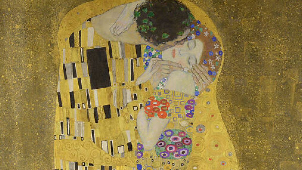
Gustav Klimt’s reputation had taken a serious knock after the public called his earlier work, the Vienna Ceiling series, too scandalous. However, he still took a chance on creating new artwork, starting on The Kiss. This painting was so well-received by critics and the public alike that the Belvedere Museum scooped it up before it was even finished, at a very high price, too.
I have always loved this piece. At the local marché I picked up a scarf with this painting as well as a tote bag, and I love them both.
Henri de Toulouse-Lautrec’s physical condition and the isolation he experienced because of it inspired his art in many ways. He was drawn to Montmartre’s nightlife and felt a strong connection to the marginalized in society, which became evident in his work. Unlike many artists of his time who portrayed those sidelined in society as caricatures, Toulouse-Lautrec depicted them as real people.
Subject-wise, this painting does nothing for me. Color-wise, I have to admit there's something so unique about the mix of colors chosen.
American Gothic is a famous early 20th-century painting inspired by the Dibble House Grant Wood spotted in Eldon, Iowa. Without knowing its residents, Wood used his imagination to recreate the people he thought might live in the home, and this is how the famous painting came to life. An interesting, but slightly strange detail is that he modeled the man and woman after his dentist and his sister.
There are a lot of Grant Wood's artwork in the Cedar Rapids Museum of Art, Cedar Rapids, Iowa.
Much like René Magritte’s other paintings, this artwork continues to puzzle historians. Some interpret it to have religious meaning, but its true message remains uncertain. Magritte himself fueled the mystery when he said, “Everything we see hides another thing, we always want to see what is hidden by what we see. There is an interest in that which is hidden and which the visible does not show us. This interest can take the form of a quite intense feeling, a sort of conflict, one might say, between the visible that is hidden and the visible that is present.”
Giuseppe Arcimboldo was best known for creating portraits entirely out of objects such as fruits, flowers, fish, or, in this case, books and book accessories. The Librarian painting is said to depict historian and humanist Wolfgang Lazius. There has been much debate among art historians as to whether the painting is a celebration of scholars like Lazius or a mockery of those who own books but don’t read them.
Sorry, but the only real "The Librarian" ever: says "ook" and eats bananas.
Recognized as one of the most famous works of Surrealism, this 20th-century painting by Salvador Dalí aimed to explore how time, memory, and reality become distorted in dreams. In a review of the masterpiece, art historian Dawn Adès wrote, "The soft watches are an unconscious symbol of the relativity of space and time, a Surrealist meditation on the collapse of our notions of a fixed cosmic order." This interpretation reflects Dalí's fascination with challenging the perceptions of reality.
This is one of my favorite paintings, and the poster's overblown analysis of the painting is exactly why. When confronted with some deep explanation of what someone though the painting could mean, Dalí gave an interesting explanation. There is no deeper meaning. Dalí explained that he got the idea for the painting when he accidentally left some cheese out and it melted. The beauty of this painting is is that you look at it and expect deep meaning, but Dalí never intended it as such. Sometimes art doesn't need a deeper meaning. Though I'm certain Dalí never intended it as a commentary on how we see paintings, it stands as a powerful tentmate to how little we understand of the meaning behind the painting. We seek a deeper understanding, and the irony is that there isn't one. It's a completely subjective experience that, SOMETIMES, the painter directs with their own context of what the painting means. We assign meaning to them regardless of what the intent was.
This 16th-century painting depicting French ambassador Jean de Dinteville and Catholic Bishop Georges de Selve isn’t just a double portrait; it’s also a still life masterpiece. What makes the artwork particularly special is that all the objects used in it carry meaning and have been the subject of debate for centuries.
Unlike most of the paintings in this list, the Girl With A Pearl Earring was a “tronie”. Johannes Vermeer didn’t paint the artwork as a portrait, but instead intended it to be an imagined figure dressed in exotic clothing. This is why not much is known about the woman depicted in the painting, although some historians believe the sitter might’ve been his sister.
The Mona Lisa painting is believed to depict Lisa del Giocondo, an Italian noblewoman. It’s said that Leonardo was commissioned to paint her to mark a special occasion; however, instead of delivering the painting as promised, he kept it for the rest of his life. Today, historians still debate why he chose to do this.
Considered one of history’s most famous oil artworks, Bedroom in Arles was also one of Van Gogh’s most personal pieces since it was a painting of his own room. Like some of his other pieces, Van Gogh describes his painting process in a letter addressed to his brother, detailing how he chose unusual colors to express calm and comfort. He also explained that he painted this masterpiece during a turbulent period in his life, when an illness left him bedridden for days.
I suspect that this looks 'fresher' than the room actually was. Still a fantastic work.
Surprisingly, this Marcel Duchamp painting was severely criticized and rejected by artists in the Cubist movement for being “too Futurist.” One even went as far as saying, “There is in my bathroom a really good Navajo rug which, on any proper interpretation of the Cubist theory, is a far more satisfactory and decorative picture.” Despite this, the painting is now celebrated as a modernist classic.
Georgia O’Keeffe is best known for her 20th-century series of charcoal drawings. Her work stood out from the rest at that time since she used natural, flowing forms, while other artists preferred to paint geometric shapes. Photographer Alfred Stieglitz liked her work so much that he exhibited some of her drawings in his gallery without getting O’Keeffe’s consent first. She confronted him, but agreed to let him keep them on display, a move that kick-started her successful career as an artist.
Um... isn't she best known for her brightly colored, vibrant, extreme close-ups of flowers (that people say are suggestive, but she always denied that was her intention), rather than her charcoal drawings?
Andy Warhol’s “32 Campbell’s Soup Cans” paintings were an immediate hit and became part of the pop art movement. Warhol’s goal when creating this artwork was to blur the lines between fine art and mass production by challenging the traditional ideas of what art was at the time. When asked about his intent, Warhol said, “I only want to get you started thinking and feeling, like what's art?”
O never, and still don't, appreciated Warhol's works as paintings, but t even I can't deny that the points he made in his painting were potent. One of the few artists that I'm willing to admit that understanding the deeper meaning of the painting is not just preferred but required. I've always hated art that can be understood only with context provided by the painter, but he message's behind Warhol's paintings are one of few exceptions.
I appreciate this. I feel better educated but not talked down to.
Right? There are plenty of artworks the I don't understand, and it's great to be provided with the intended perspective to better understand them.
Load More Replies...The Fighting Temeraire by J M W Turner. I don't know why but I just think this is stunning. Turner-El-...f7e298.jpg 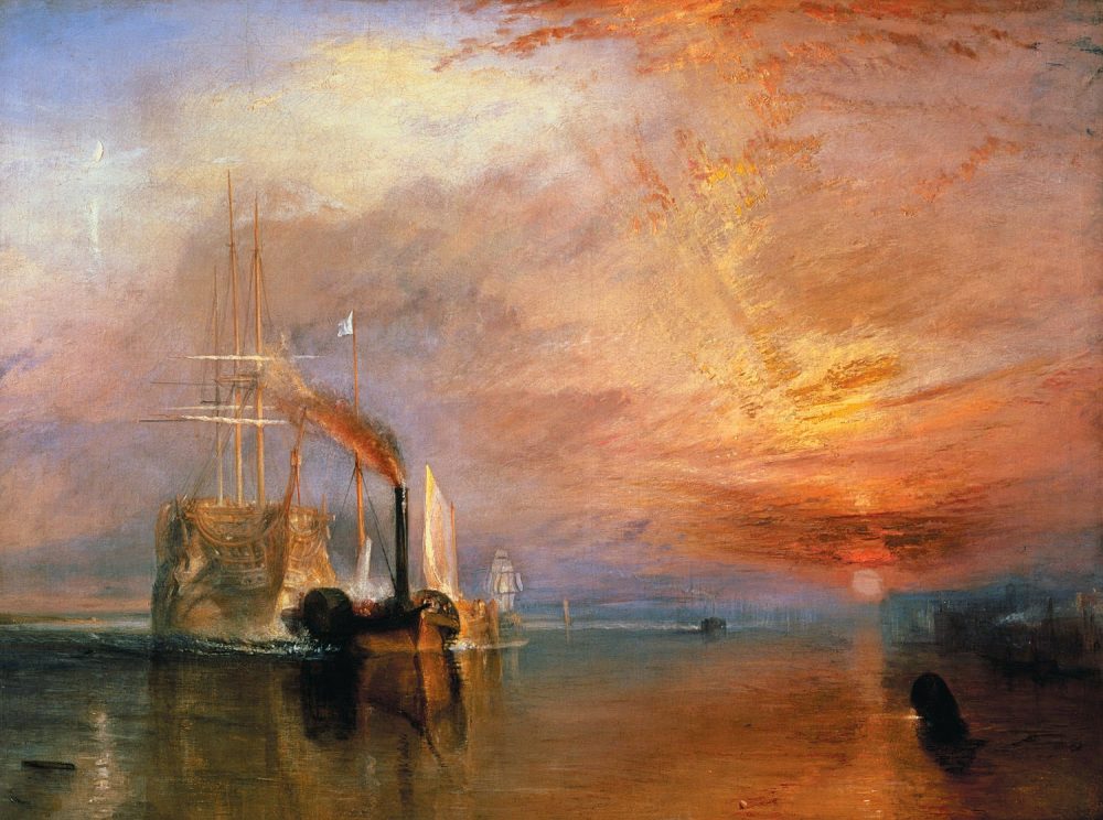
You have no idea how much I needed an article like this lol. Even with artworks I don't understand, it's nice to be able to consider what they COULD mean.
I appreciate this. I feel better educated but not talked down to.
Right? There are plenty of artworks the I don't understand, and it's great to be provided with the intended perspective to better understand them.
Load More Replies...The Fighting Temeraire by J M W Turner. I don't know why but I just think this is stunning. Turner-El-...f7e298.jpg
You have no idea how much I needed an article like this lol. Even with artworks I don't understand, it's nice to be able to consider what they COULD mean.


 No fees, cancel anytime


")
")